Years of Missing Housing

The Housing Market is Tighter than Ever

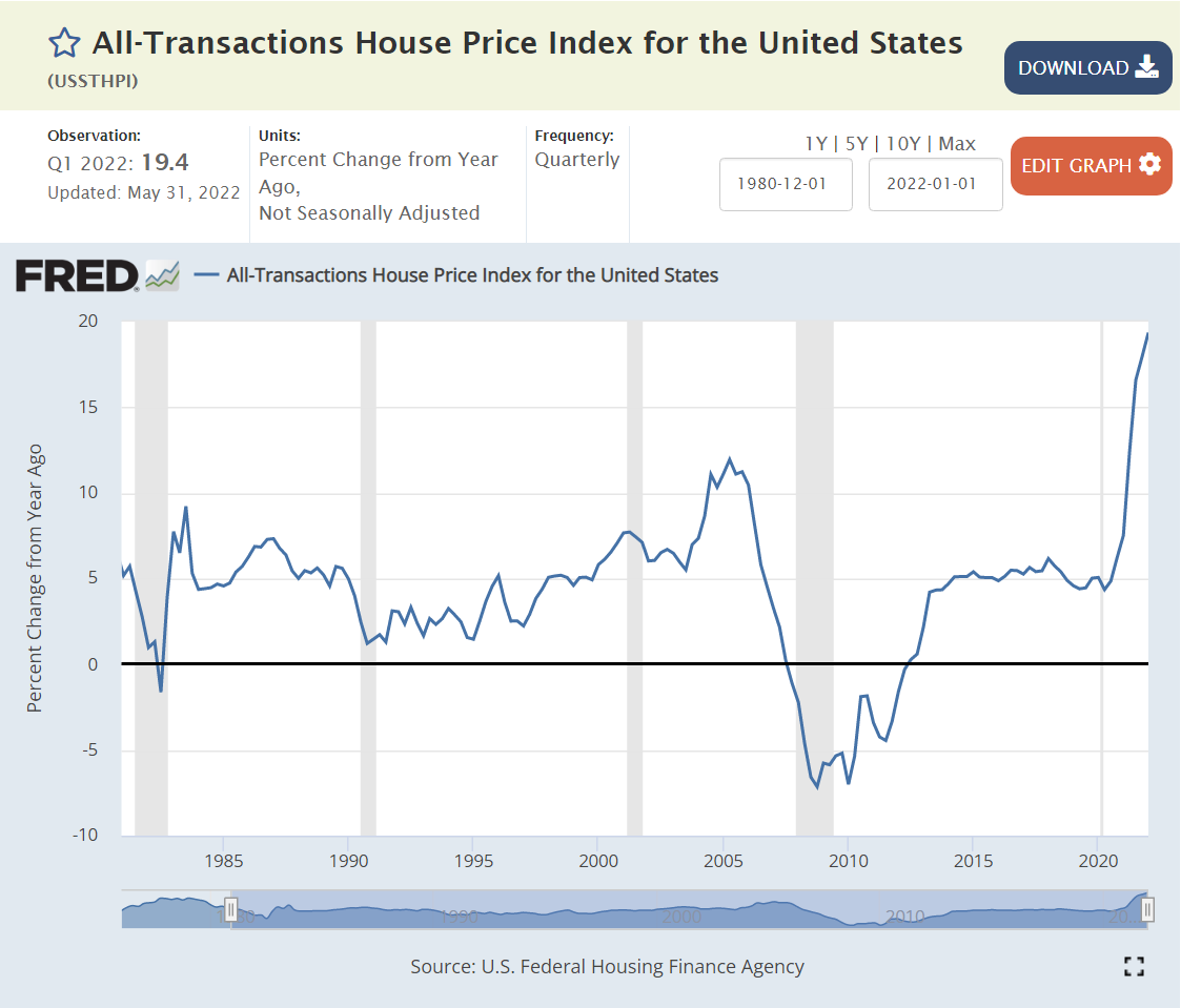
20% housing price inflation.
Typical house sells in one month.
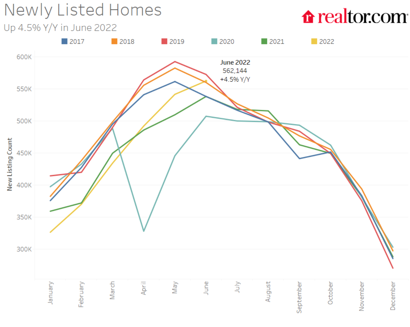
Listings down by 70%.

https://eyeonhousing.org/2020/01/a-decade-of-home-building-the-long-recovery-of-the-2010s/
https://www.whitehouse.gov/cea/written-materials/2021/09/01/alleviating-supply-constraints-in-the-housing-market/

Existing homes available for sale cut in half, even before the recent decline.

https://www.realtor.com/research/topics/housing-supply/

Even with record prices, new listings lagged during 2020-22.

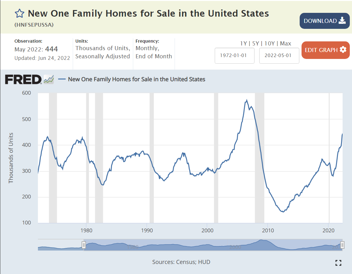
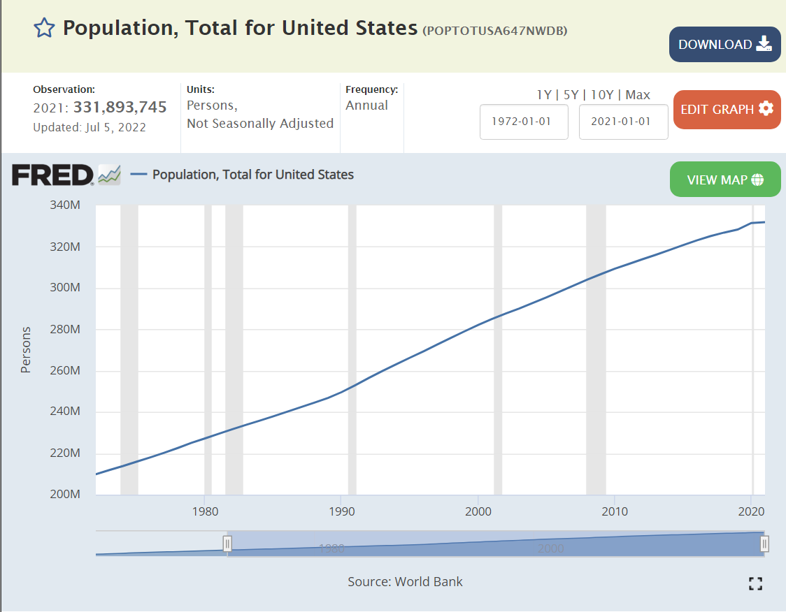
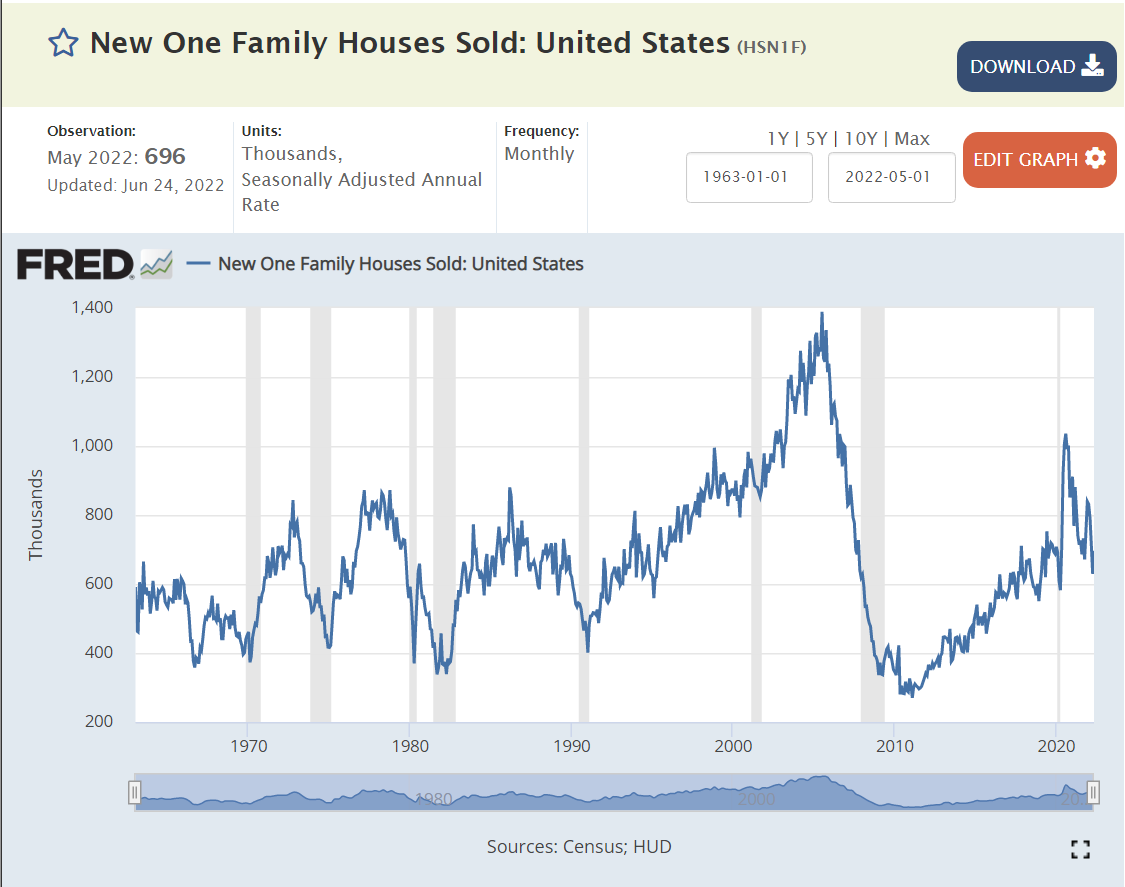
The supply of new homes available for sale, has remained flat at 300,000 for the last 50 years, while the population has grown by 50%.

The home vacancy rate is at one-half of its historic level.

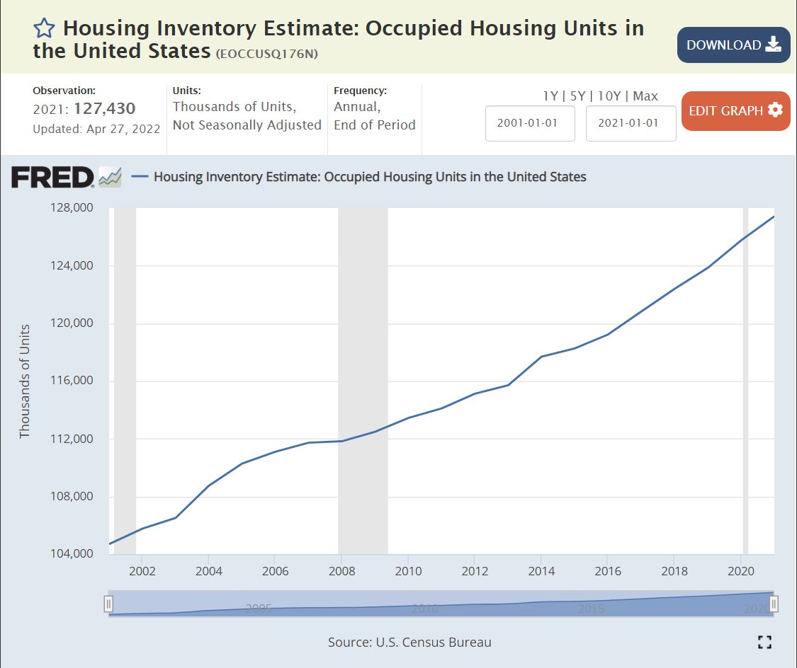
Housing Units

The ratio of housing units to population in 2021 is 0.38, a little higher than the 0.37 in 2001.

The “American dream” of single family home-ownership remains. Buyers continue to try to recover from the decline from 69% in 2006 to less that 64% in 2015.

The number of owner-occupied (single-family) homes reached a peak of 76 million in 2006 and then flat-lined for eleven (11) years through 2017. An estimated 8 million homes have been added in the last 5 years, about 1.8M per year after zero per year for 11 years.

Supply Has Not Recovered from the Great Recession

https://www.freddiemac.com/research/insight/20181205-major-challenge-to-u.s.-housing-supply

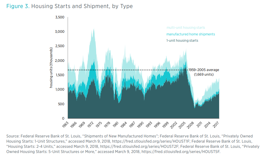
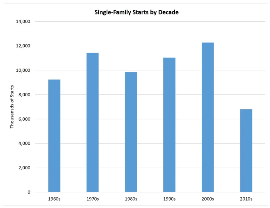
A thorough analysis of supply and demand would include dozens of factors and 100 metro housing markets. However, at the simple trend-based macro level, we see 1.5-1.6 million units per year added from 1960-2010. We see a trough from 2007-2020 with a deficit of more than 5 million missing housing starts.

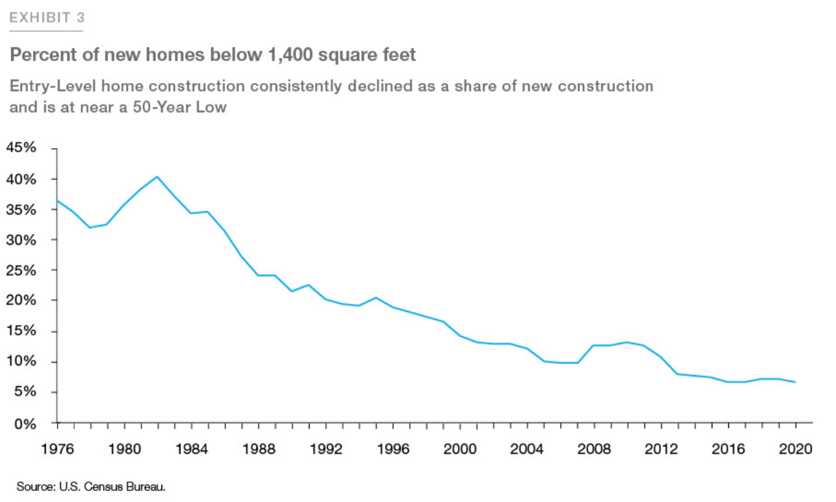
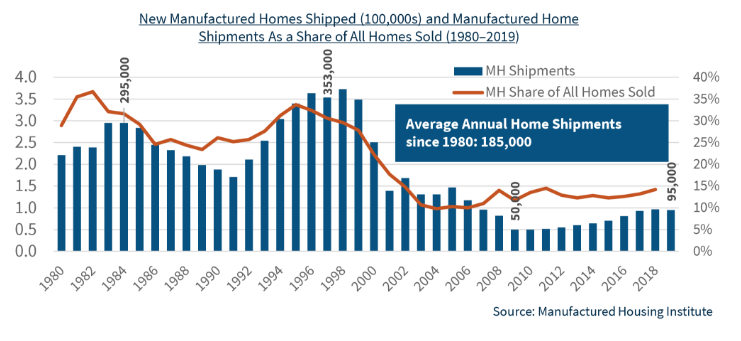
Even Worse, Starter Homes and Manufactured Housing Have Almost Disappeared, Driving an Affordability “Crisis”.

https://www.freddiemac.com/research/insight/20210507-housing-supply

https://myhome.freddiemac.com/blog/research-and-analysis/20211013-starter-homes

https://www.mercatus.org/system/files/erdmann_-mophousing_was_undersupplied_during_the_great_housing_bubble-_v1.pdf
https://multifamily.fanniemae.com/news-insights/multifamily-market-commentary/manufactured-housing-landscape-2020

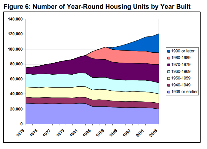
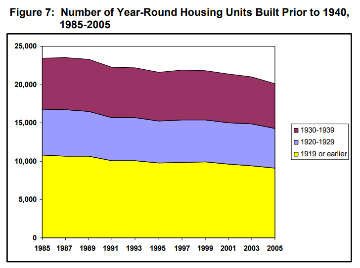
Aging of the Housing Stock: The 2010-19 Decade Was a Huge Outlier

https://www.huduser.gov/datasets/ahs/ahs_taskc.pdf

During every decade, except WW II, the US added 10 million+ housing units. They have an expected life of nearly 100 years.

https://eyeonhousing.org/2020/01/a-decade-of-home-building-the-long-recovery-of-the-2010s/
https://eyeonhousing.org/2022/06/the-aging-housing-stock-5/

The US added less than one-half of the usual amount in the teens, driving the median housing stock (owner-occupied) age up from 33 to 39 years. So, it’s even more than the 5 million housing units that weren’t built. The whole stock is older. More units require maintenance. More people are waiting to have the new or “newer” home ownership experience.

Many Ratios Echo the Simple “Missing” Housing Stock Claim

https://www.mercatus.org/system/files/erdmann_-mophousing_was_undersupplied_during_the_great_housing_bubble-_v1.pdf

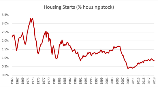
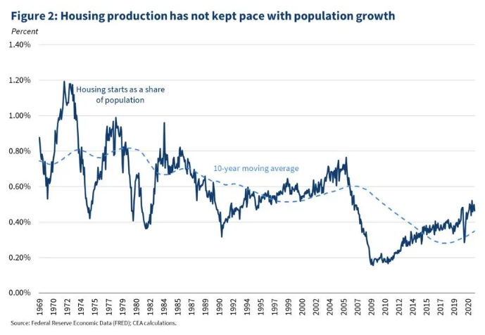
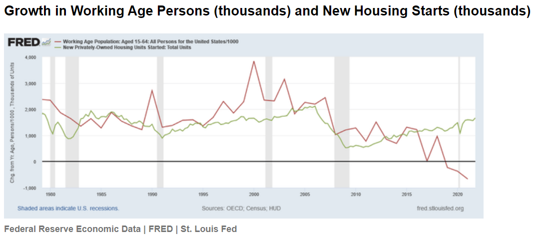
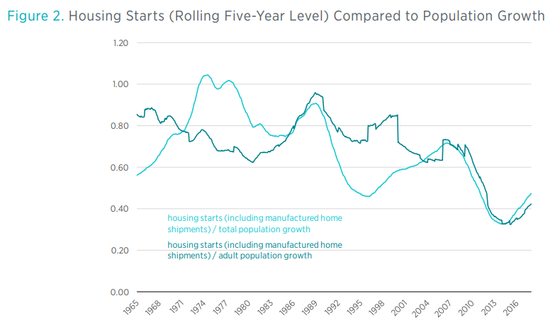
Housing units per capita has declined. New housing starts have not kept up with population growth.

https://www.mercatus.org/bridge/commentary/us-data-housing-starts-can-be-misleading

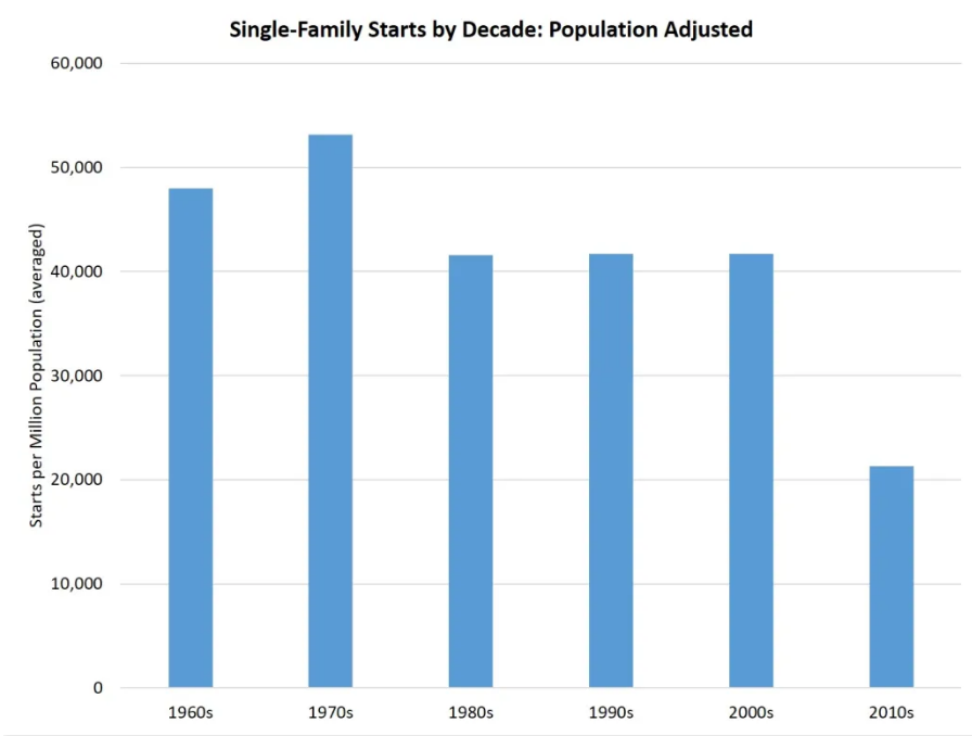
Compared with the overall size of the market, housing starts have become a smaller and smaller share.

https://www.freddiemac.com/research/forecast/20170726-lean-inventory-of-houses
https://www.whitehouse.gov/cea/written-materials/2021/09/01/alleviating-supply-constraints-in-the-housing-market/

The last graph is most persuasive for me. Housing starts are less than one-half of what they were in the 1970’s. That’s a big drop. It’s possible that consumers have just chosen to consume less housing and more of other goods and services, but that does not appear to be the case.

https://www.mercatus.org/system/files/erdmann_-mophousing_was_undersupplied_during_the_great_housing_bubble-_v1.pdf

Overall, we’re missing 5-8 million units out of 128 million units in a market that is struggling to deliver 1.6 million units to meet the normal demand.

The Freddie Mac experts come up with a smaller number, just 3.8 million.

https://www.freddiemac.com/research/insight/20181205-major-challenge-to-u.s.-housing-supply

https://www.freddiemac.com/research/insight/20210507-housing-supply

Contrary Views: Supply is OK, Too Much Short-term Demand

https://seekingalpha.com/article/4498666-us-housing-is-a-dead-man-walking
https://www.forbes.com/sites/billconerly/2021/02/03/housing-boom-will-end-after-2021/?sh=27038d981e41

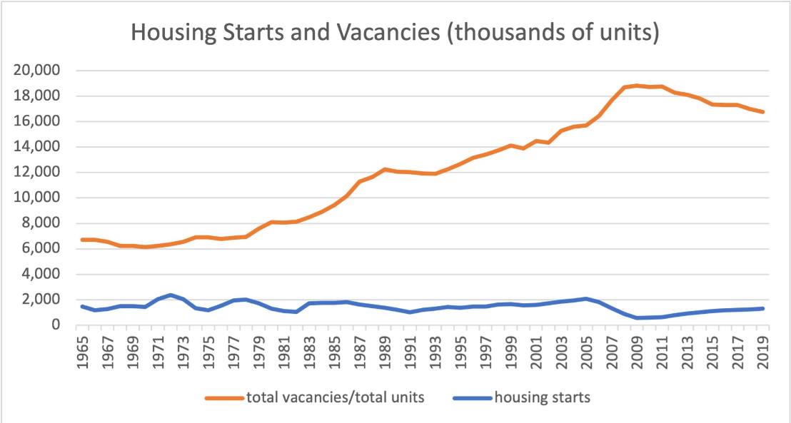
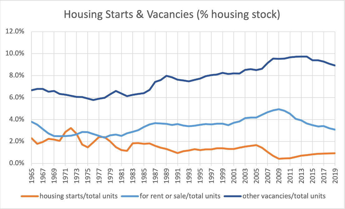
As noted earlier, the total housing units per capita ratio is relatively consistent. “Everybody gotta be somewhere”. The total housing units level has grown, with rental units replacing the desired and missing single-family units. The other graphs are comparing two rates of change and concluding that the rates of change are roughly equal, so there cannot be a shortage. I believe that the very deep and historically unprecedented (except for WW II) catastrophic decline in single family home construction from 2006-2020 created a material deficit in the stock of single family homes. The very weak economic recovery after the “Great Recession” held back new household formation and effective demand for new single family homes, so the construction industry did not recover back to its prior level for a full decade or more. The deficit remains.

Summary

One of the most important concepts in Economics 101 is “stocks and flows”. Stocks are a summary quantity at a single point in time, like all of the gallons of water in Lake Erie behind Niagara Falls. Flows are a quantity per unit of time, like the gallons of water flowing over Niagara Falls per minute, hour or day. Our economy contains both “stocks and flows”, especially relevant in the housing market. The flow of new home construction (single family or multi-family) is one of the most volatile components of GDP (flow of $ produced per year).

Historically, major changes in home construction have driven a majority of all business cycle declines. Bank runs and changes in interest rates account for another one-third. Supply shocks and international trade/currency changes account for the remainder.

Most markets “clear” in a relatively short time period and we collectively quickly benefit from the increases in prices that attract producers and drive consumers to find “next best” options and from the decreases in prices that force producers to leave an industry and reallocate capital elsewhere and the relative increase in consumer demand that limits price declines.

Unfortunately, the real estate industry works across much longer time frames. Consumers “want” to own single-family homes, but they can rent or live with relatives for many years. Construction firms are unable to quickly increase their supply capacity when demand increases. This is an industry where “learning by doing” remains a core factor.

The construction industry was truly “decimated” in 2006-7-8. One-half, two-thirds, three-fourths or four-fifths of all firms in any local market (general contractors and suppliers) were bankrupted. It has been slow to recover as banks were “burned” by construction loans and slow to extend credit to anyone.

The remaining construction firms reached new “critical mass” by 2017 and have been expanding rapidly, subject to zoning, land acquisition, labor and materials constraints.

Nonetheless, the cumulative supply deficit is quite large and will drive housing price increases for many years, perhaps another decade!

Good News: Urban America is Growing Very Nicely

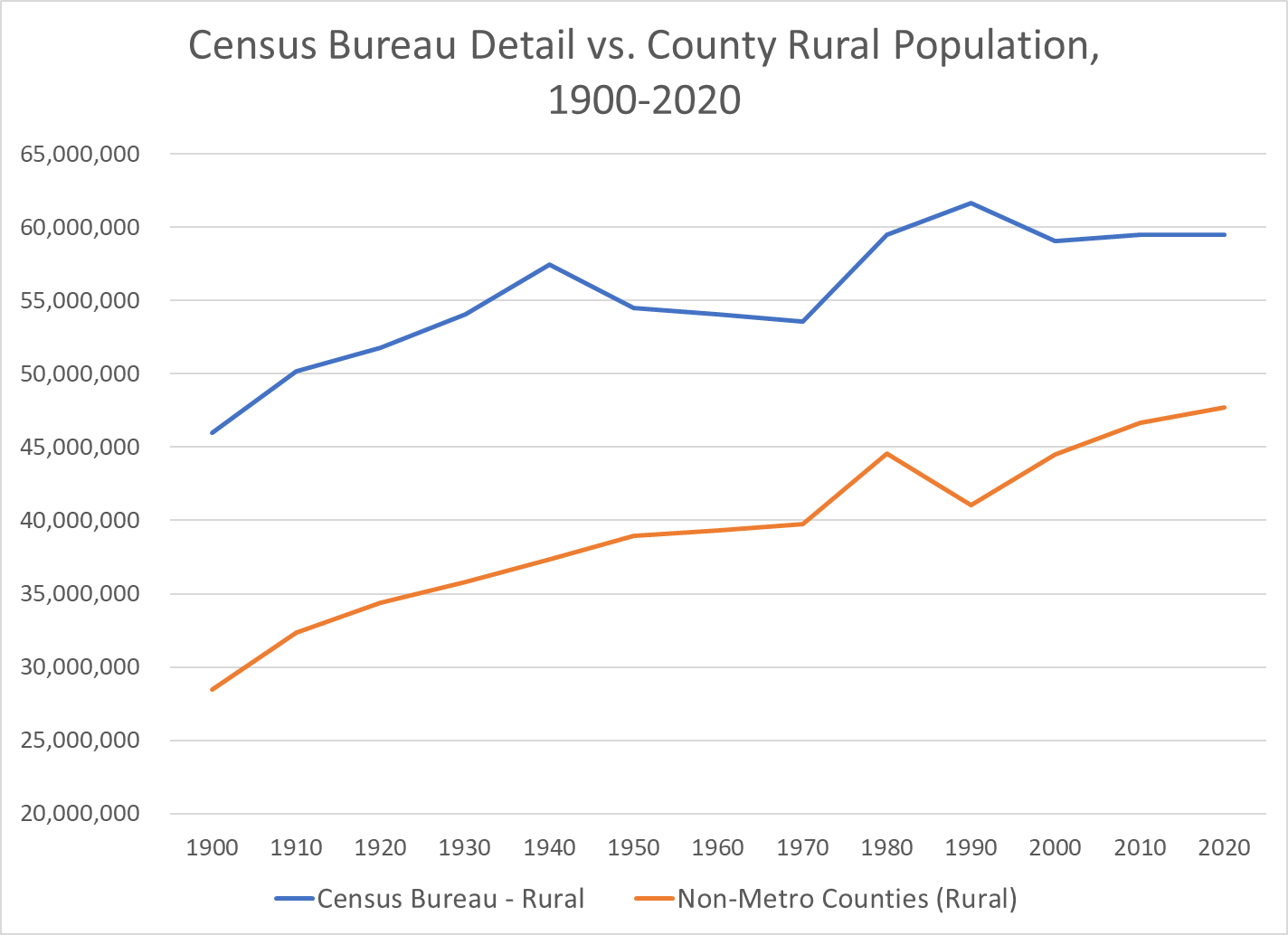
Rural America Grew Very Slowly in the 20th Century, Flattened and May Now be Declining

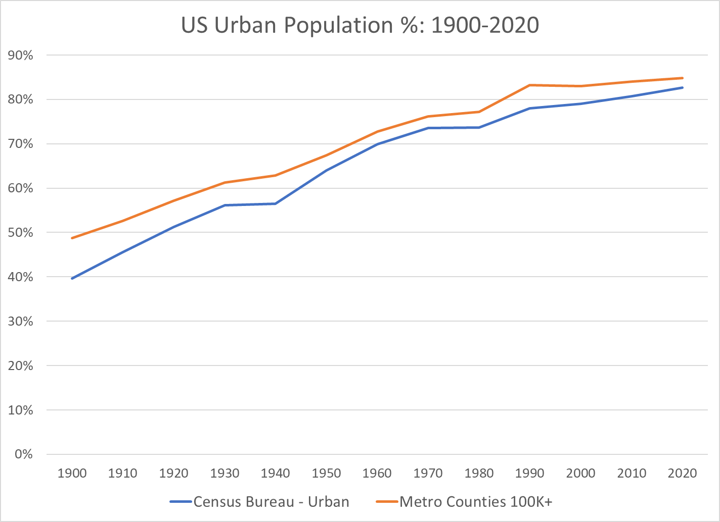
There are a variety of measures of “rural” US population. The Census Bureau has used local populations of 2,500+ to define urban. It focuses on population density and commuting to define urban counties that map to metropolitan (urban) areas. Other federal agencies use other definitions. Overall, the basic trends are clear.

https://www.hrsa.gov/rural-health/about-us/what-is-rural

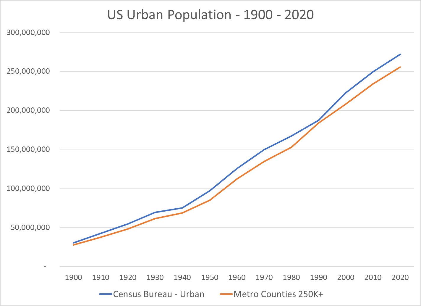
The US Census Bureau’s detailed measure of “urban areas” essentially says that any area with 2,500+ people is an “urban” area. This clearly exaggerates the urban population, but this approach has been used for more than a century on a consistent basis, providing useful data. The 2020 measure of urban has been proposed using about 5,000 as the minimum for “urban”, but this definition has not been finalized.

I have focused on the Metropolitan Statistical Areas (MSA) as defined in 2020 and recreated their populations back to 1900 based upon the county to MSA maps.

The measure of “percent urban” based upon the metro areas with 100K+ population or 250K+ populations very closely tracks the US Census Bureau’s detailed definition of urban areas (and therefor rural areas).

In summary, US urban population grew from 40% of the total in 1900 to 70% in 1970, about 3/7ths (0.42) of a percent more urban every year for 70 years. The move to “urban” continued in the next 50 years, but at a much slower rate, just 1/5th of a percent per year. But, this accumulates to move the urban percentage from 70% to 80%.

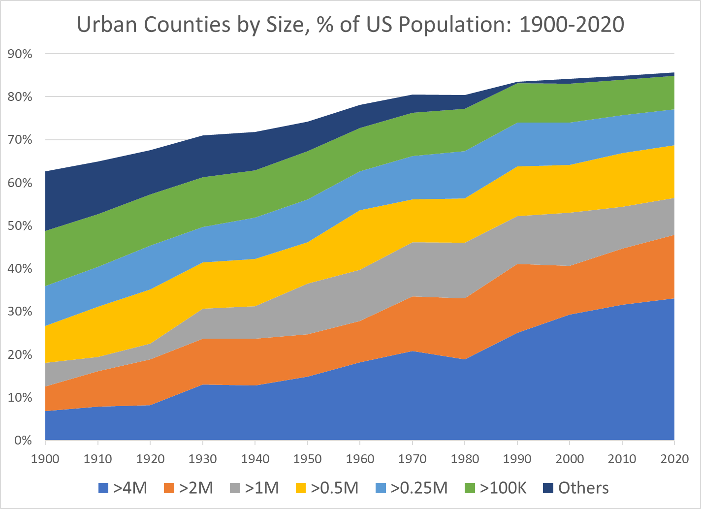
Growth of Very Large Metro Areas Has Driven the Growth in Urban Areas

The 4M+ metro areas have grown the most. The 2M+ and 1M+ areas have also grown. The smaller metro areas have made a smaller contribution to the growth of “urban” America.

The 50th Largest US Metro Area’s Population Has Increased 5-Fold Between 1900 and 2020

The Number of US Metro Areas with 1M, 2M or 4M Populations Has Expanded for a Century

Decade Reaching 1 Million Population                    

1900 New York Chicago Philadelphia Boston Pittsburgh St. Louis
1910
1920 Detroit Cleveland
1930 Los Angeles San Francisco Mpls-St Paul Baltimore Cincinnati Providence
1940 Washington
1950 Dallas-Ft Worth Houston Atlanta Seattle
1950 Kansas City Milwaukee Buffalo
1960 San Diego Columbus, OH Indianapolis
1970 San Bernardino Phoenix Tampa-St. Pete Denver Portland, OR
1970 Charlotte San Jose Virginia Beach New Orleans Hartford
1980 Miami Sacramento San Antonio
1990 Orlando Nashville Memphis Rochester
2000 Austin Las Vegas Louisville Oklahoma City Richmond Jacksonville
2010 Birmingham Salt Lake City Raleigh
2020 Tulsa Fresno Tucson

Decade Reaching 2 Million Population                    

1900 New York Chicago Philadelphia
1910 Boston
1920 Pittsburgh
1930 Detroit Los Angeles
1940
1950 San Francisco
1960 St. Louis Cleveland
1970 Mpls-St Paul Baltimore Washington Dallas-Ft Worth Houston
1980 Atlanta Seattle
1990 San Diego San Bernardino Phoenix Tampa-St. Pete Miami
2000 Cincinnati Denver
2010 Kansas City Portland, OR Charlotte Sacramento San Antonio Orlando
2020 Columbus, OH Indianapolis Austin Las Vegas

Decade Reaching 4 Million Population            

1900 New York
1910
1920
1930 Chicago
1940
1950 Los Angeles
1960 Philadelphia
1970 Detroit
1980
1990 Boston Washington Dallas-Ft Worth Miami
2000 San Francisco Houston Atlanta
2010 San Bernardino Phoenix
2020 Seattle

The Rapid Growth of the Largest US Metro Areas Has Driven the Growth of the Total Population

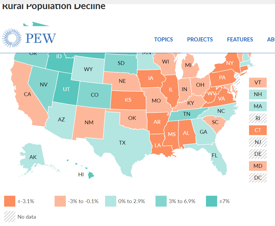
The Tipping From Very Slow Rural Growth to Possible Decline Has Attracted Attention from Demographers and Political Commentators

https://www.census.gov/library/visualizations/2021/dec/percent-change-county-population.html
https://carsey.unh.edu/publication/rural-depopulation
https://www.pewtrusts.org/en/research-and-analysis/blogs/stateline/2021/08/10/shrinking-rural-america-faces-state-power-struggle
https://www.ers.usda.gov/data-products/charts-of-note/charts-of-note/?topicId=4e8a0642-e40d-4299-906e-906bbaaf9e4d

https://www.businessinsider.com/how-the-2020-election-revealed-divide-in-american-dream-2020-11

https://dailyyonder.com/rural-population-declines-slightly-over-last-decade-census-shows/2021/09/07/

https://www.richmondfed.org/publications/research/econ_focus/2020/q1/district_digest

Summary

The disproportionate growth of “urban” and very large urban metro areas has continued in the last 50 years. This has a tremendous impact on the lives and perspectives of those in relatively declining rural and growing urban areas.

Indy Metro Area vs Rest of Indiana (1970-2020)

The Indy Metro Area is comprised of Marion County plus the 7 surrounding “donut” counties. Marion has grown throughout the half-century, adding 175,000 people (22%). Rural Morgan and Shelby counties have not grown much. Hancock, Boone and Johnson counties have doubled their populations. Hendricks has grown from 50,000 to 175,000. Hamilton has grown exponentially from 50,000 to 350,000. This relatively rapid growth has made the metro area grow from 21% to 28% of the state total, adding state senators and representatives and causing increasing tensions between the one large, growing area and the slower growing, largely rural, rest of the state. There are suburban Chicago, Louisville and Cincinnati counties that have shown decent percentage growth, but they are a small share of the state. Lake County (Gary) is a special case, declining in population decade after decade.

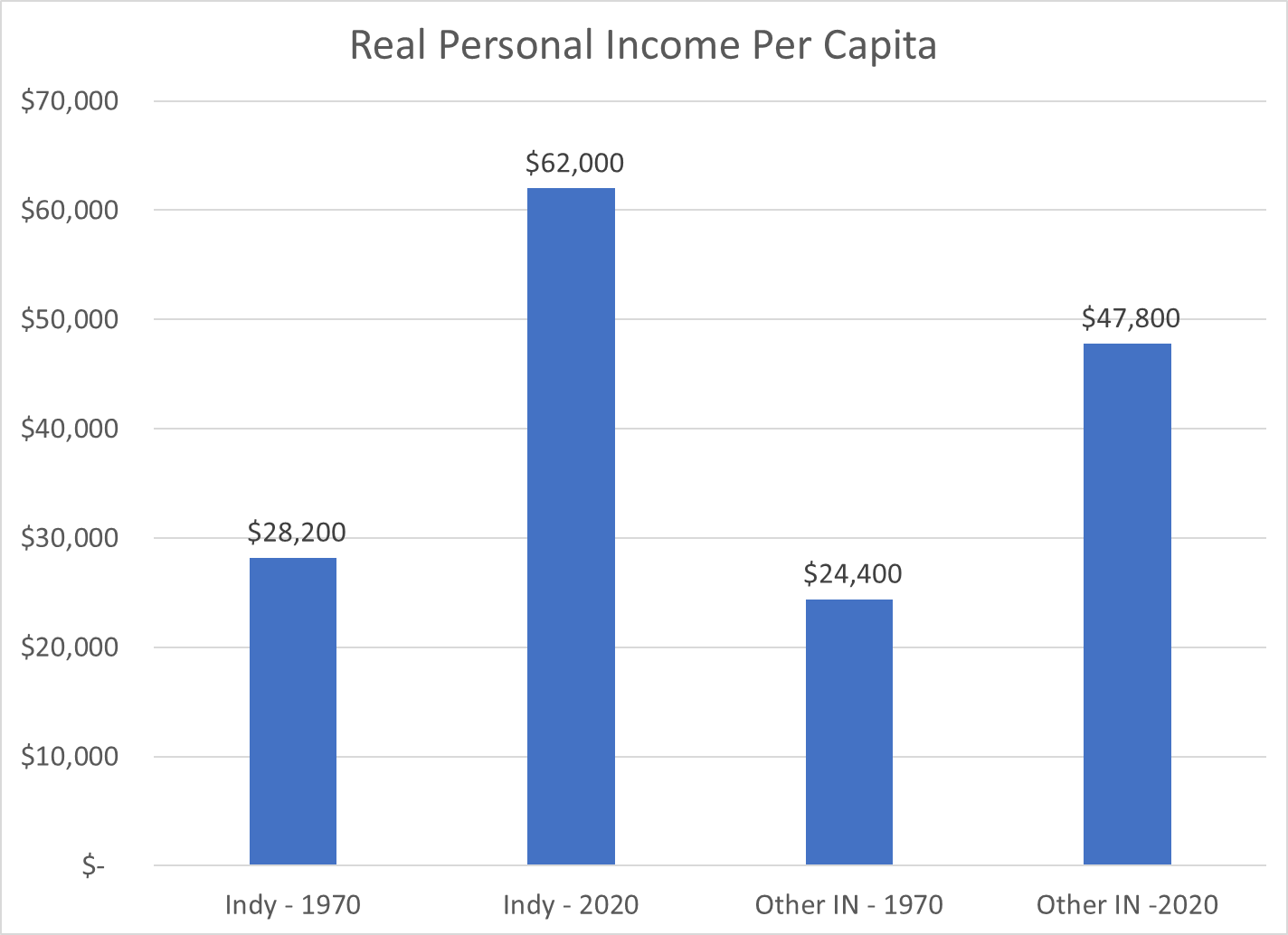
The Indy Metro counties started 1970 with slightly higher per capita personal incomes, so the share of the state total was 24%, a bit above the 21% population share. By 2020, the Indy Metro area had captured one-third of the state’s personal income (34%), much higher than its 28% share of the population. Per capita incomes and population had both grown in the capital region.

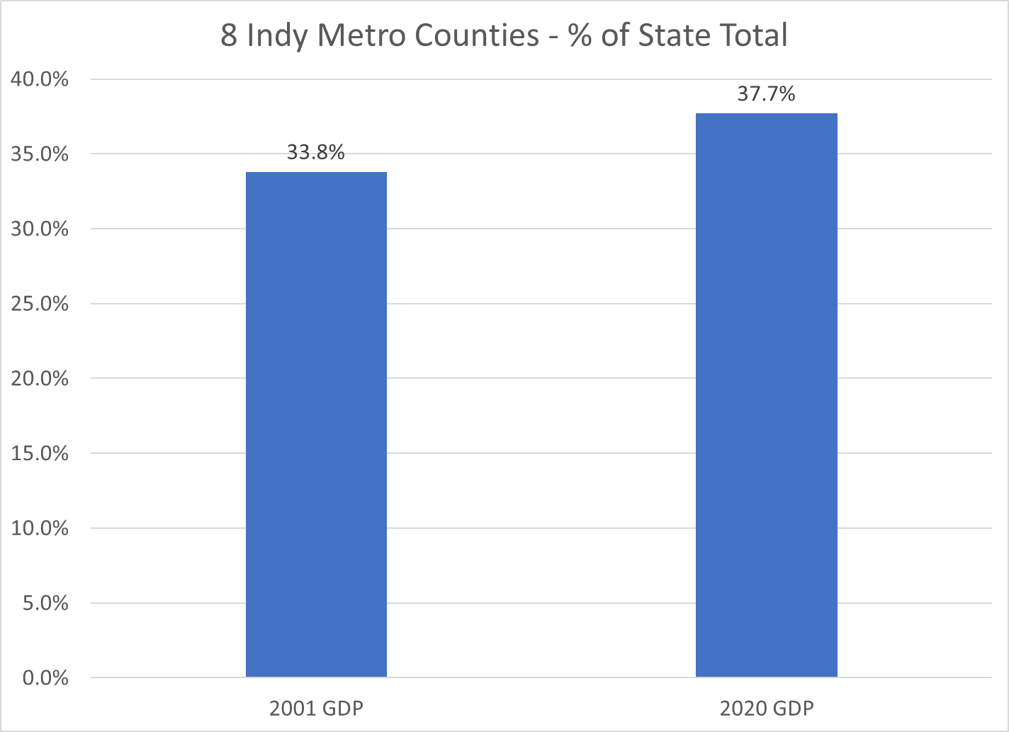
Gross Domestic Product, the value of goods and services produced in Metro Indy, was one-third of the state total in 2001, the first year of available statistics. This measure increased to 38% by 2020. Nearly 2 out of every 5 dollars of statewide value-added output was generated by the Indy Metro area in 2020.

Indiana is a mostly rural state with Indy, a dozen small cities, a cluster of northern Indiana manufacturing counties, Gary (Lake County), Ft. Wayne (Allen) and Evansville (Vanderburgh). The Indy Metro Region has 9 times the density of people, income and production as the most rural counties. For example, it takes the 67 lowest population counties to equal the 1.9 million people living in the Indy Metro area.

The Indianapolis Metro area grew by a respectable 72% during this period, above the national average of 63%. The other Indiana counties grew by only 19%, about one-fourth as fast.

The Indy Metro area added 900,000 people, the same growth as the rest of the state.

With population and per capita income gains, the Indy Metro area’s real personal income grew almost four-fold, while the rest of the state grew by roughly 150%.

Indy Metro per capita income was 15% above the rest of the state in 1970 and twice as high (30%) by 2020.

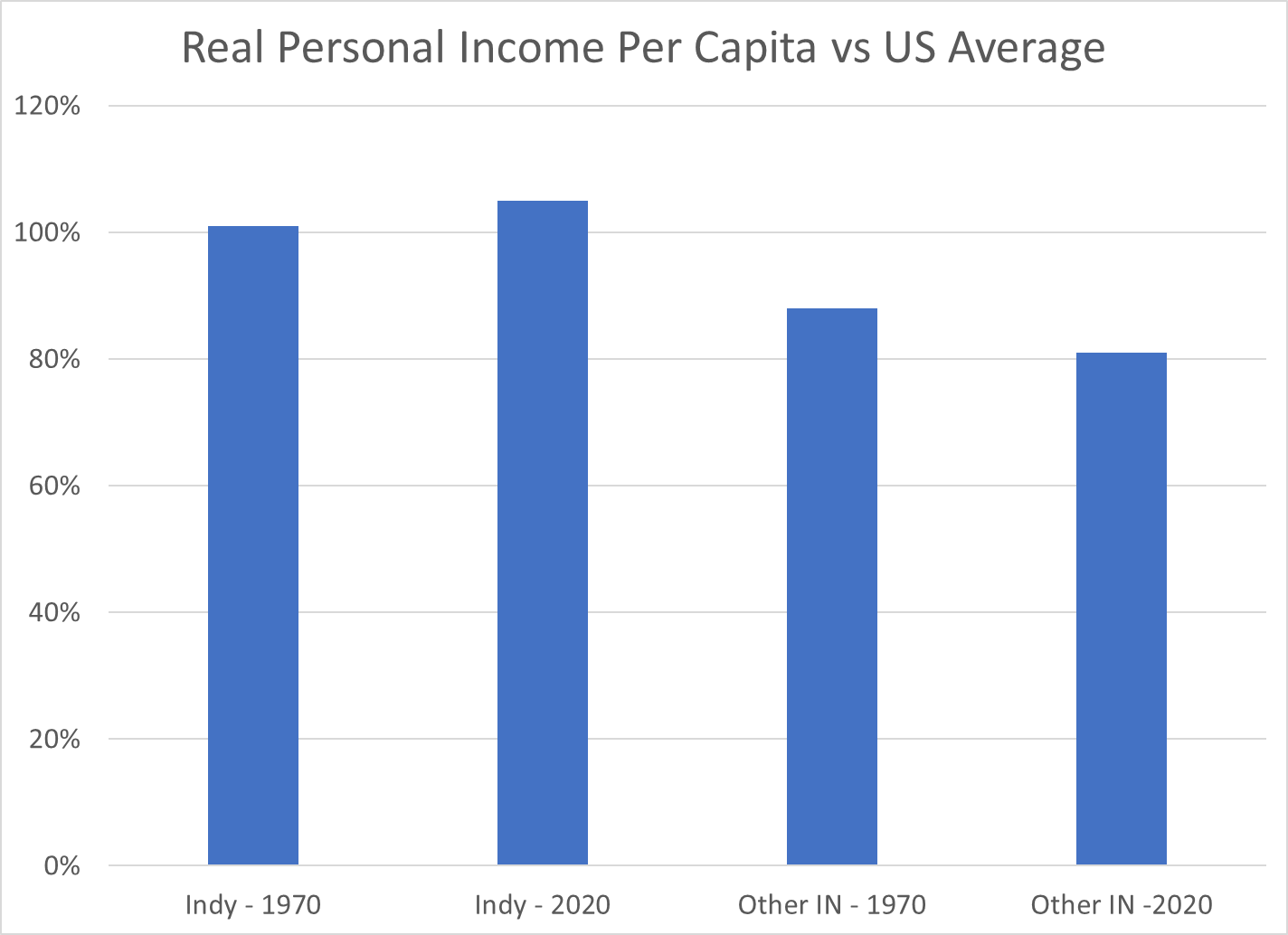
The Indy Metro area has improved its per capita income versus the US average by 4 points, from 101 to 105. The other-Indiana counties have declined from 88% to 81% of the national average.

While the per capita income in the Indy Metro area is 30% higher than the rest of the state, the value of goods and services produced (GDP) per person is more than 50% higher than the rest of the state.

These wide, and growing, disparities in economic results may lead to increasing tensions between the relatively prosperous center and the largely “left behind” periphery. Fortunately, the real personal income per capita in the “other” counties did increase by 95%, from 24 to 48K during these 5 decades, even though the Indy folk’s income grew by 120%, from 28 to 62K.

https://www.stats.indiana.edu/population/PopTotals/historic_counts_counties.asp

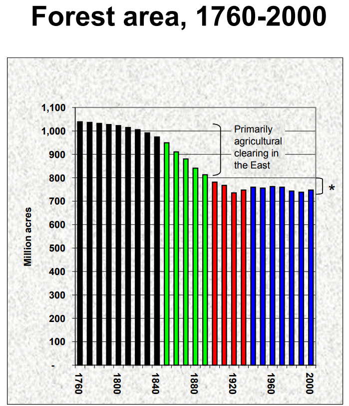
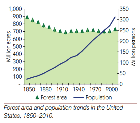
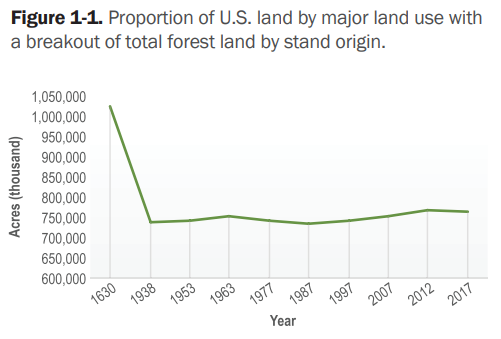
Good News: US Forests Are Growing

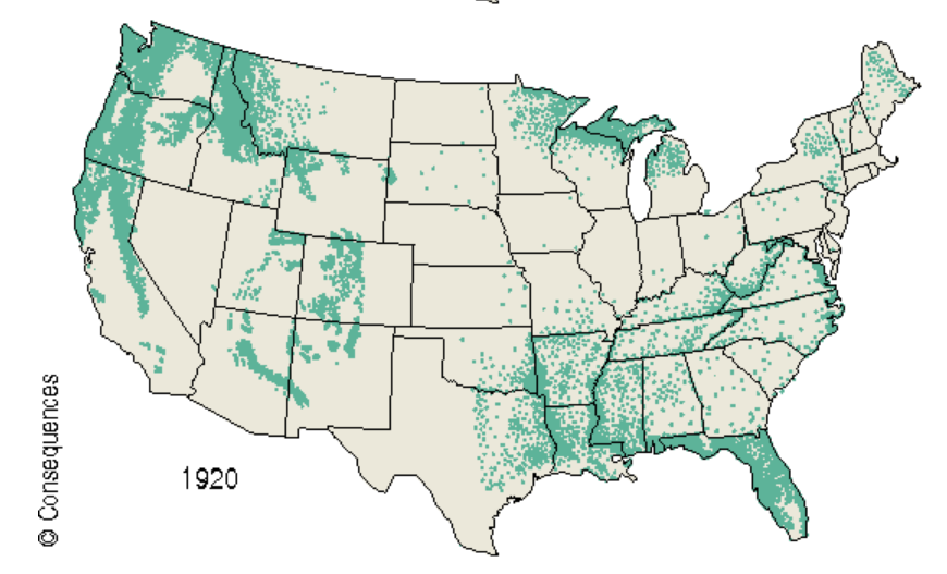
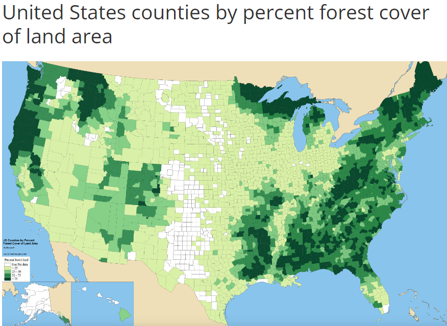
Forest Coverage is Up for a Century

Added 51M Sq Miles, 1987-2017: Size of North Carolina

Added 28M Sq Miles, 1990-2020: Size of South Carolina

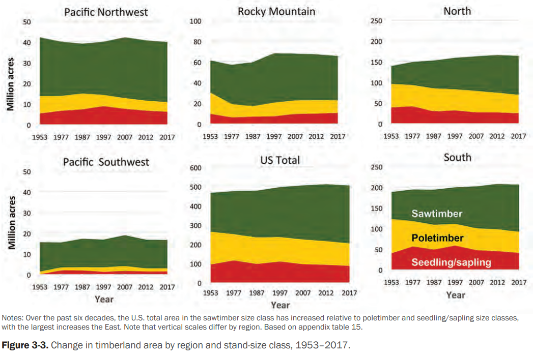
Timberland Has Grown as Part of Total Forest

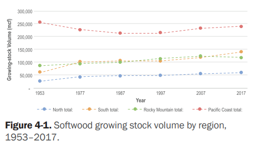
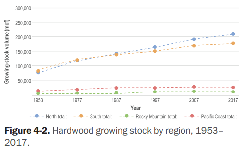
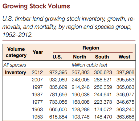
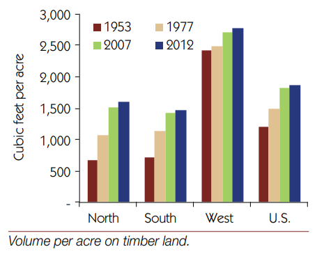
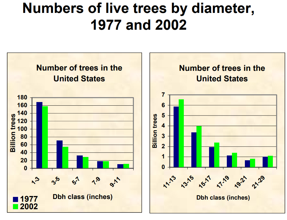
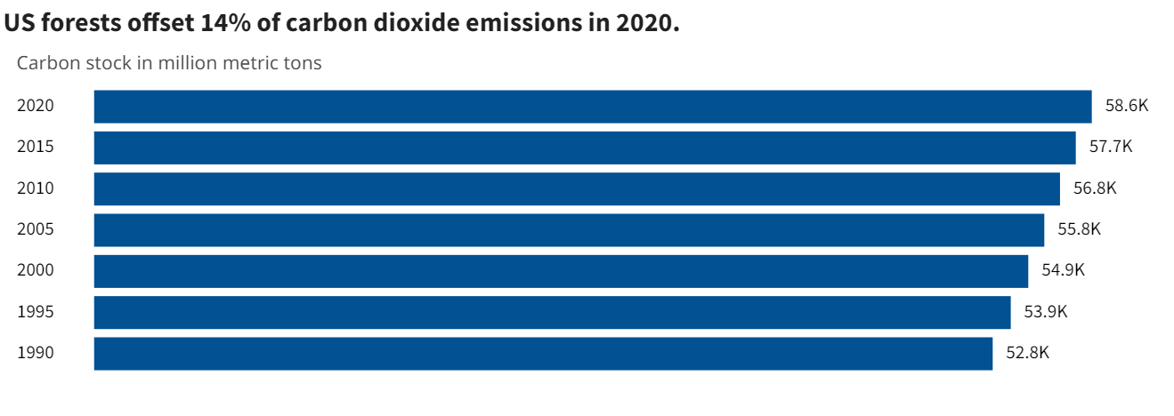
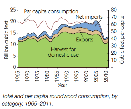
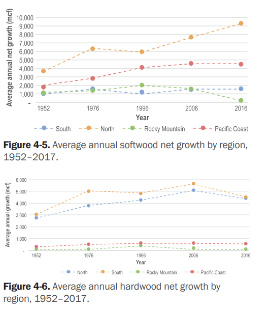
Healthy Stock by Volume, Diameter, Age, Carbon

https://usafacts.org/articles/how-us-forests-affect-the-environment-and-help-stabilize-the-climate/

https://crsreports.congress.gov/product/pdf/R/R46313

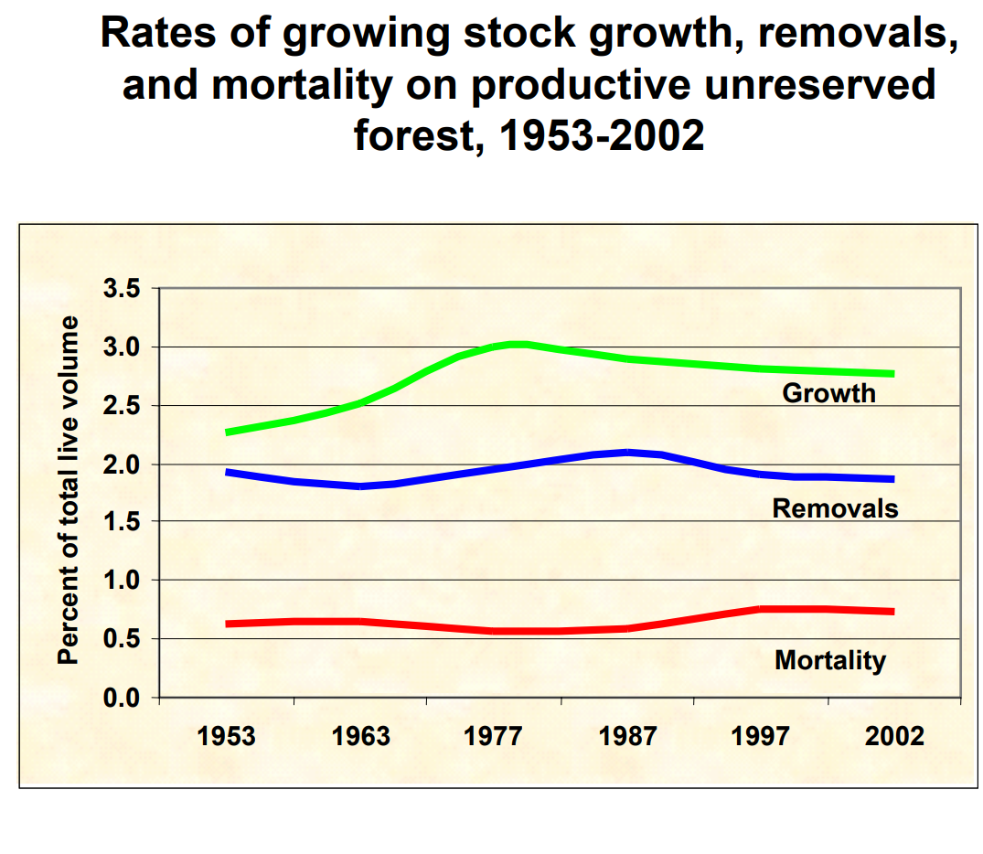
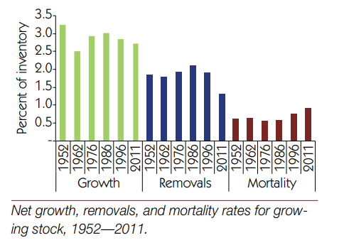
Annual Growth and Harvest are Sustainable

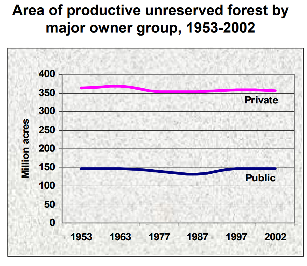
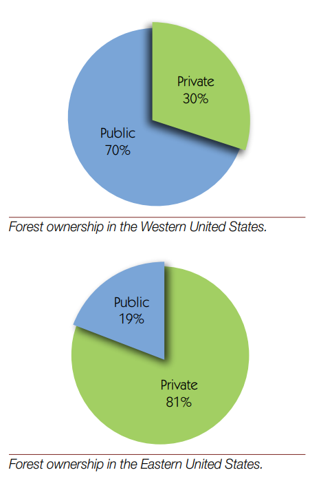
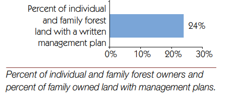
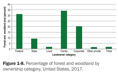
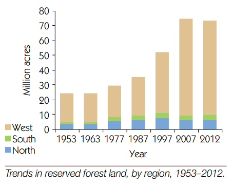
Ownership, Preservation, Management Plans

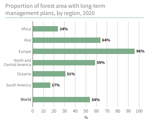
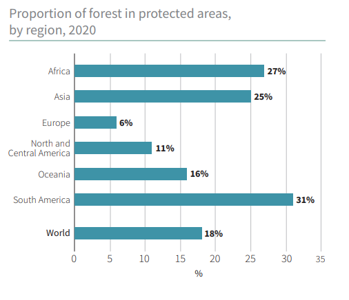
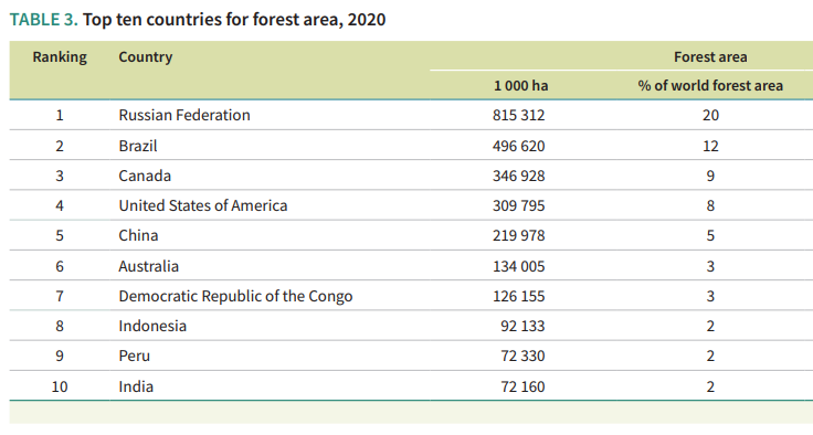
US in Global Context

Threats are Real, But Often Exaggerated

“Many challenges are associated with drought, wildfire, invasive species, and outbreaks of insects and disease—all made worse by climate change. Warming temperatures mean more energy in the atmosphere, which is consistent with severe weather events, such as floods, tornadoes, blizzards, ice storms, and hurricanes.” 

https://www.fs.usda.gov/speeches/state-forests-and-forestry-united-states-1

https://www.cnn.com/2019/07/20/health/iyw-cities-losing-36-million-trees-how-to-help-trnd/index.html

https://www.treehugger.com/more-trees-than-there-were-years-ago-its-true-4864115

https://usafacts.org/articles/how-us-forests-affect-the-environment-and-help-stabilize-the-climate/

https://ourworldindata.org/grapher/proportion-of-forest-area-with-long-term-management-plan?time=2020

Indiana Population Grew Half as Fast as the US from 1970-2020.

The US population increased by 61%, from 205 to 330 million.

Indiana population increased by 30%, from 5.2 to 6.8 million. Indiana added nearly 1.6 million people during these 5 decades. It would have added another 1.6 million if it grew as fast as the US average.

Indy Metro Area Grew by a Strong 72%.

The 8-county area grew from 1.1 to 1.9 million, adding 800,000 people and accounting for one-half of the whole state’s growth during this period. Growth has been consistently strong in each of the last 3 decades, adding 230,000, 220,000 and 220,000. The Indy Metro area has grown from 21% to 28% of the state’s total population.

6 Other Suburbs Grew by 76%

Porter (CHI) added 84K. Dearborn (CIN) added 20K. Warrick (EVN) added 35K. Harrison (20K), Floyd (23K) and Clark (43K) added to the metro Louisville population. In total, these 6 counties added 226,000 people to their 296,000 base, reaching 523,000 in 2020. They grew from 6% to 8% of the Indiana total.

Indiana and Purdue University Counties Grew by 79%

Monroe (76%) and Tippecanoe Counties (81%) displayed very similar growth rates. Their combined population increased by 153K, from 194K to 348K. Their share of the Indiana total increased from 4% to 5%.

These 18 counties out of Indiana’s 92, accounted for 76% of the population growth, increasing by 1.2M, from 1.6M to 2.8M people! Their share of the state total grew from 31% to 41%!

Northern Indiana Tier (South Bend, Elkhart, Ft. Wayne) Added 38%

The 10 counties stretching from St. Joseph (South Bend) to Allen (Ft. Wayne) showed modest, but consistent growth throughout the period. Elkhart was most successful, adding 81,000 people (64%). Ft. Wayne added 101,000 people, but just 36% growth. St. Joseph managed to add 27,000, but just an 11% growth rate. Marshall, Kosciusko, LaGrange, Noble, Whitley, Steuben and DeKalb counties each added at least 10,000 residents.

In total, this section added 326,000 citizens, growing from 860,000 to 1,190,000. It’s share of Indiana’s population shaded up from 16% to 17%.

Lake County (Gary) Lost 11%

Population dropped by 62K, from 546K to 484K. Lake County reduced its Indiana population share from 10.5% to 7.2%.

8 Small City Counties Lost 5%

These stand-alone counties each had at least 75,000 citizens in 1970. Together, with 902,000 people they accounted for 17.4% of Indiana’s total. Their population fell by 48,000 to 855,000, representing just 12.4% of the Indiana total in 2020. From best to worst population growth, using their main city for easy identification: Evansville (+13K), LaPorte (+1K), Kokomo (-1K), Terre Haute (-8K), Anderson (-9K), Richmond (-14K), Muncie (-15K) and Marion (-19K).

57 Rural Counties Added 13%

These counties all started with populations of less than 60,000 in 1970. The average county had 23,000 residents. This increased to 25,000 by 2020. 17 counties actually lost population across 50 years. Another 24 counties added less than 5,000 people. Just 16 counties added 6,000 people or more (including the next 5). Jaspers, Dubois, Jackson and Putnam each added more than 10,000 people. Bartholomew (Columbus) was the outlier, adding 28,000 people, growing by 48%, from 57,000 to 85,000 people.

In total, this group added 167,000 people, growing slowly from 1.283 to 1.449 million. Their share of the state total population dropped from 24.7% to 21.4%.

These 3 slower growing areas represent 66 counties, or 70% of the Indiana total. Their combined population increased by 2% in a half-century, edging up from 2.7 to 2.8 million. Their share of the Indiana total has declined from 53% to 41%, so possible future slow growth will have a relatively lesser impact on the state total.

Summary

The Indianapolis area, 6 other suburban counties and the homes of Indiana and Purdue Universities grew nicely at 75%, above the 61% national growth rate. 10 counties in the northern tier and Columbus showed modest growth. Two-thirds of Indiana’s counties grew at close to zero percent across 50 years. The 2000-2010 and 2010-2020 periods showed the same overall results.

Indiana shares these stagnant rural and old tech manufacturing county challenges with its neighboring states.

Good News: Growing US Hotel Capacity, More Consumer Choice

Hotel capacity increased by 50% from 1995 to 2019.

Demand grew at the same 50% rate, although not always in lockstep.

Occupancy averaged a healthy 63% (almost two-thirds) through this period, with significant differences due to changes in construction and the economy.

The price per room averaged about $125 per night in real 2020 dollars, again varying based on supply and demand, but overall, relatively constant.

Total hotel industry real revenue ($2020) for the 21 years from 1998 through 2019 increased by a little less than 50% according to Bureau of Economic Analysis (BEA) figures.

Real consumer only (leisure) sales increased by nearly 100% during this period.

Real consumer sales per person increased by about two-thirds.

Resources

https://www.cushmanwakefield.com/en/united-states/insights/hospitality-and-gaming-lodging-industry-overview

https://apps.bea.gov/scb/2022/02-february/0222-travel-tourism-satellite-account.htm

https://www.bea.gov/tourism-satellite-accounts-data-sheets

https://fred.stlouisfed.org/series/CPIAUCSL#0

https://www.multpl.com/united-states-population/table/by-year

Other Historical Views

Domestic leisure travel doubled in the first 40 years of the 20th century.

https://data.bls.gov/pdq/SurveyOutputServlet

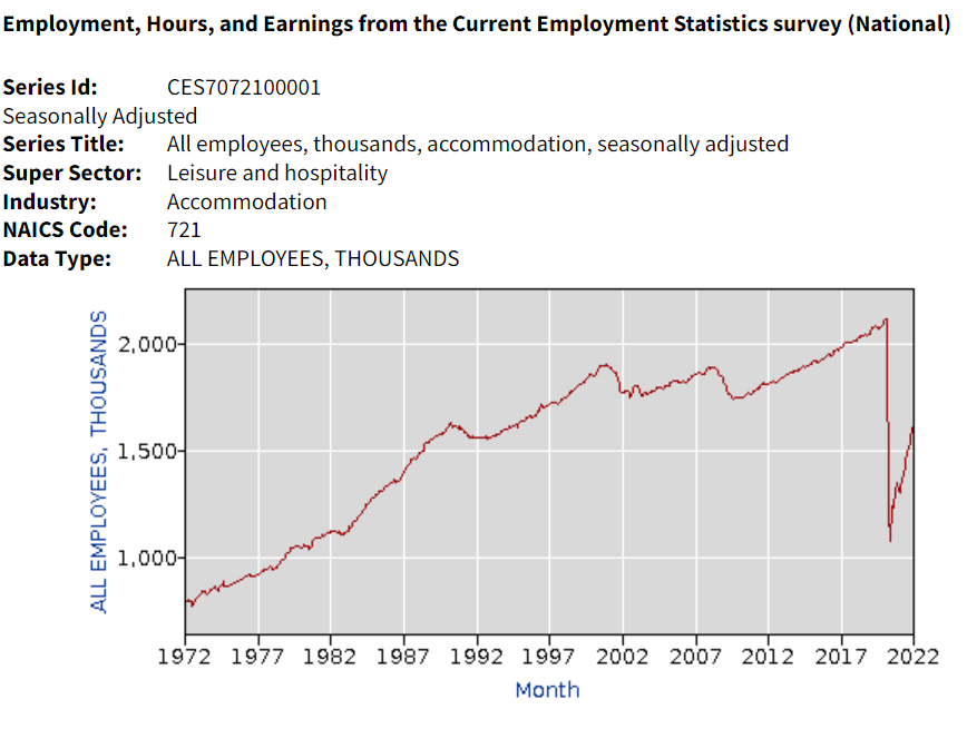
Hotel industry operating statistics before 1995 are not readily available. The tremendous growth of the industry in the last 30 years of the twentieth century is illustrated by the more than three-fold growth in industry employment, from one-half million to 1.8 million. Note that employment did not follow the growth of rooms during the first 20 years of the next century.

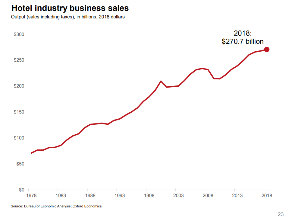
Oxford Economics developed an industry promotion brochure in 2019 that has some longer-term data. Total real (inflation adjusted) revenue is up more than 4 times in 40 years. Our 1995-2018 data shows relatively small changes in average hotel prices. I suspect that there were “real” increases from 1978 – 1995 as the industry was growing quickly in response to consumer demand.

A similar measure, gross domestic product (GDP), or production value added, net of the cost of inputs, increased 3-fold in 40 years.

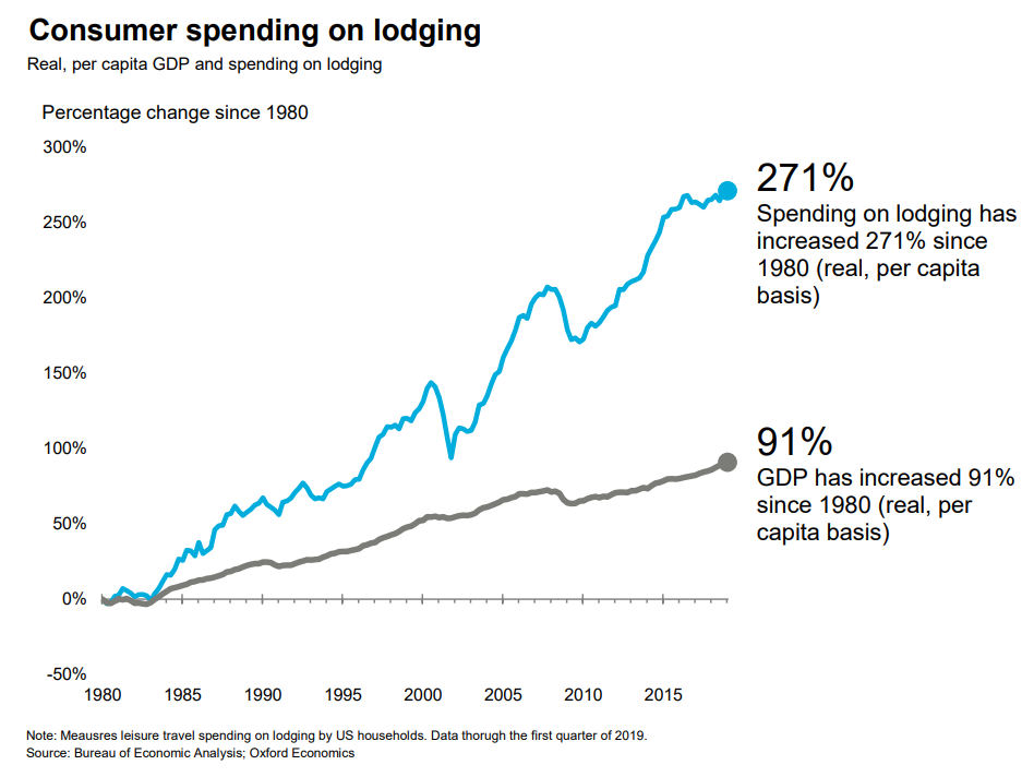
Consumer spending on accommodations has increased about 3 times as fast as GDP overall in the last 40 years.

Hotel purchases as a share of total consumer spending has increased by more than 80% in these 40 years.

Overall demand for hotel rooms per citizen for all uses (personal, business, government and foreign travelers) has increased by 20% across 30 years. Personal and foreign travel have grown at a faster rate.

https://www.hvs.com/article/8587-How-Many-Rooms-Is-Too-Many-Per-capita-Demand-and-the-Hotel-Cycle

Short-term Rentals

The short-term rental market (personal vacation rentals, Airbnb) has grown from zero to 10% of the hotel room volume and appears to have years of growth ahead of it. This growth is not included in the industry summary figures.

https://www.phocuswright.com/Travel-Research/Research-Updates/2017/US-Private-Accommodation-Market-to-Reach-36B-by-2018

https://www.grandviewresearch.com/industry-analysis/vacation-rental-market

Pandemic Impact and Future

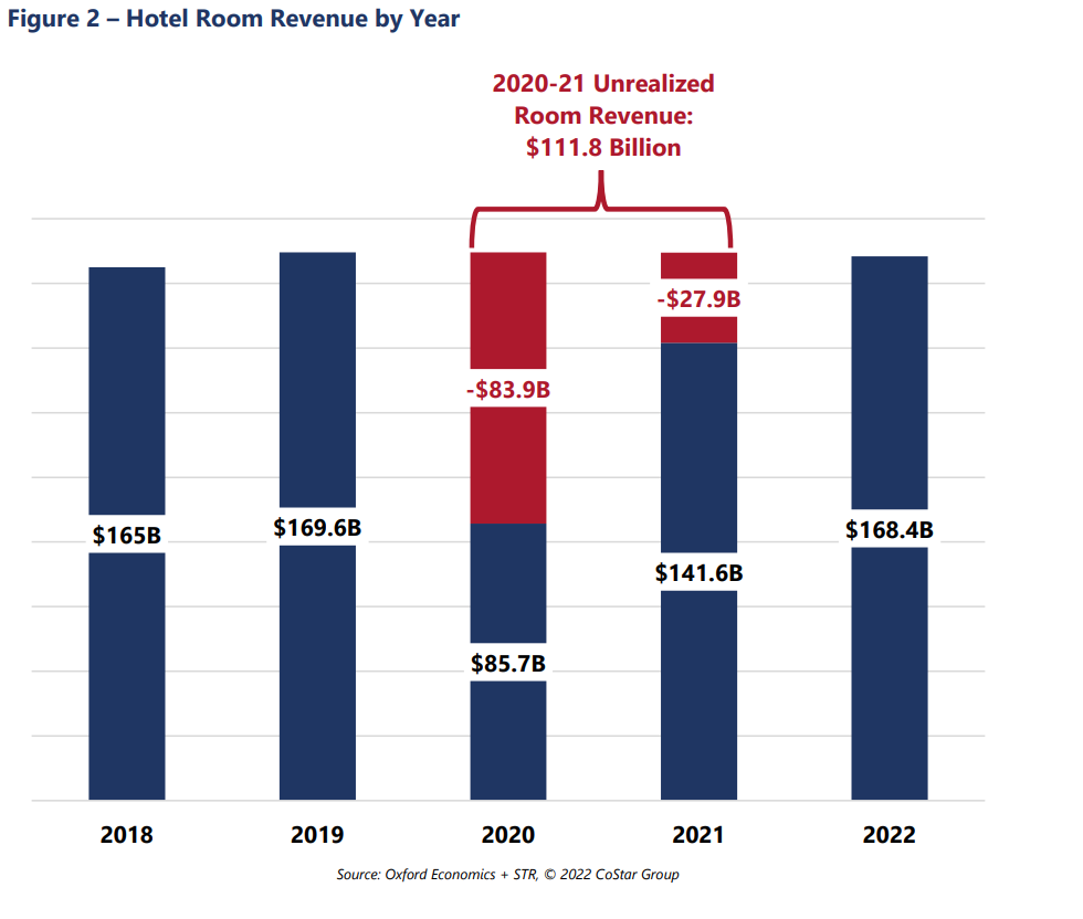
Occupancy is forecast to return to the historical average of 63% for 2022 and increase further in the following years. The industry “lost” more than $100B of revenues due to the pandemic, so analysts estimate that the industry will return to “normal” employment, prices, profitability and reserves by 2025.

https://www.pwc.com/us/en/industries/hospitality-leisure/us-hospitality-directions.html

Summary

Consumer access to hotels and private rentals has increased by 3 or 4 times in the last 50 years, at a faster rate in the first 25 years, and somewhat slower in the last 25 years. Hotel business models at 63% occupancy seem to justify continued capital investments in new supply. Prices have been relatively flat for 25 years. Competition between brands, pricing segments, corporations and private owners seem to be effective at providing adequate capacity and service options at competitive prices.

Good Economic News

Better off, job seekers/job openings.

US GDP/Capita versus Other Countries

Long-term Real US GDP Growth

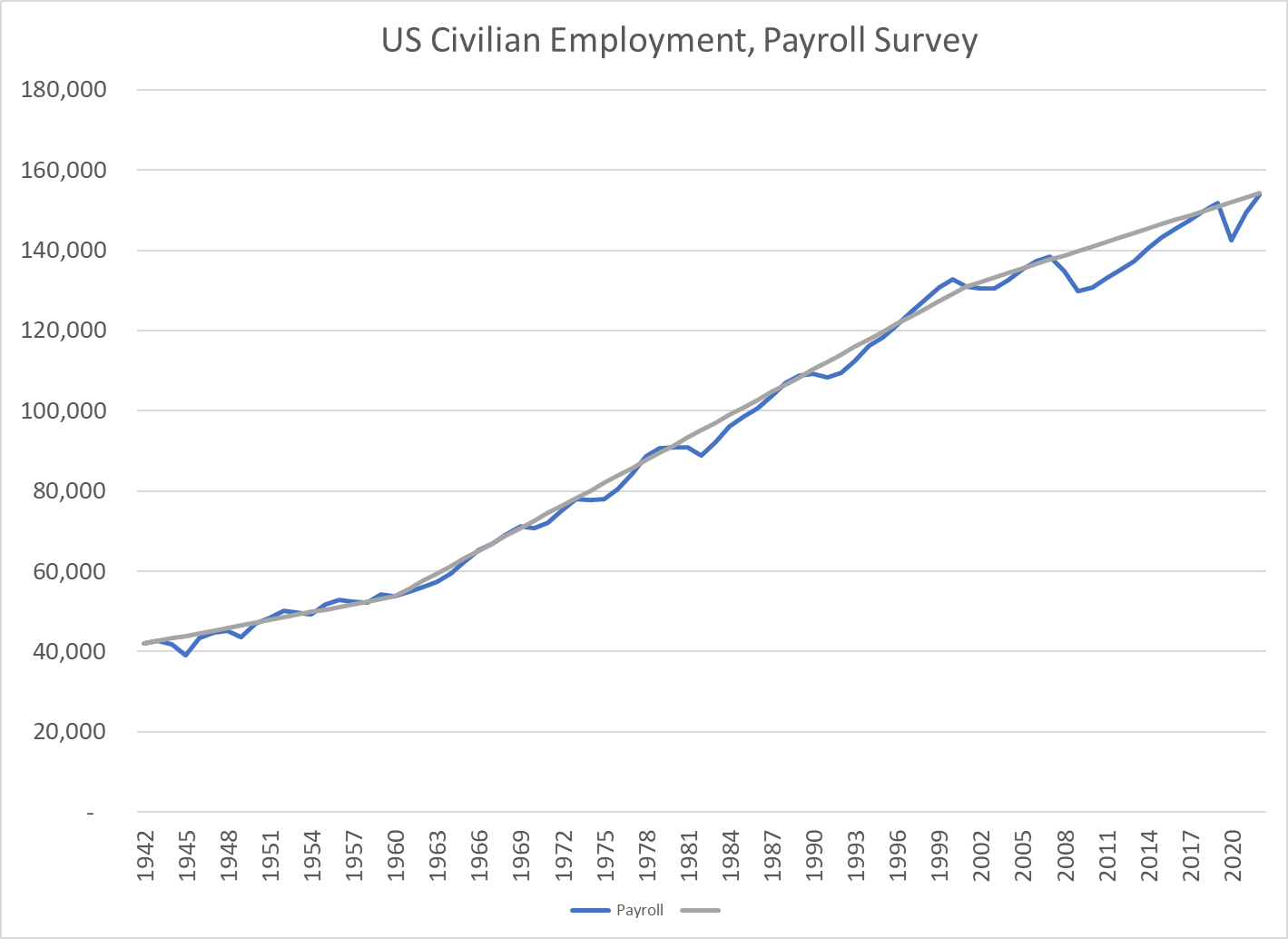
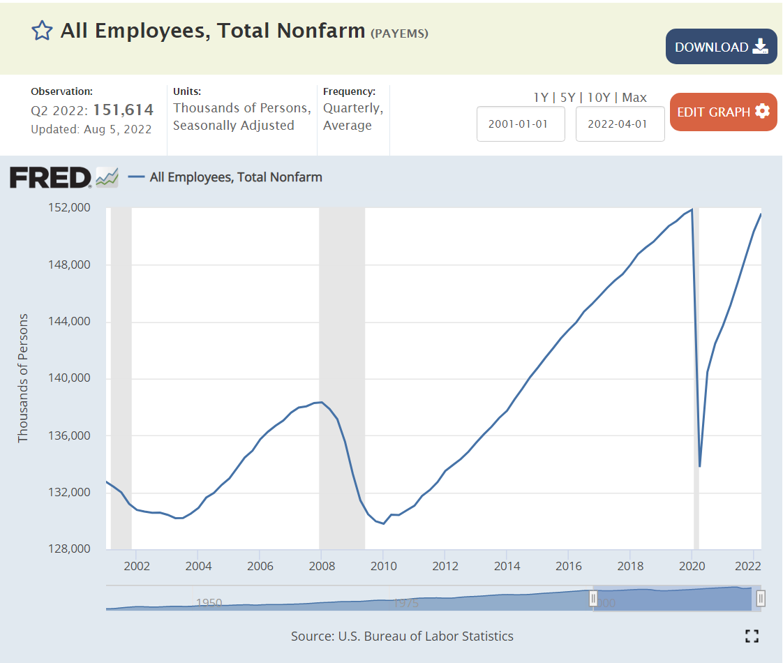
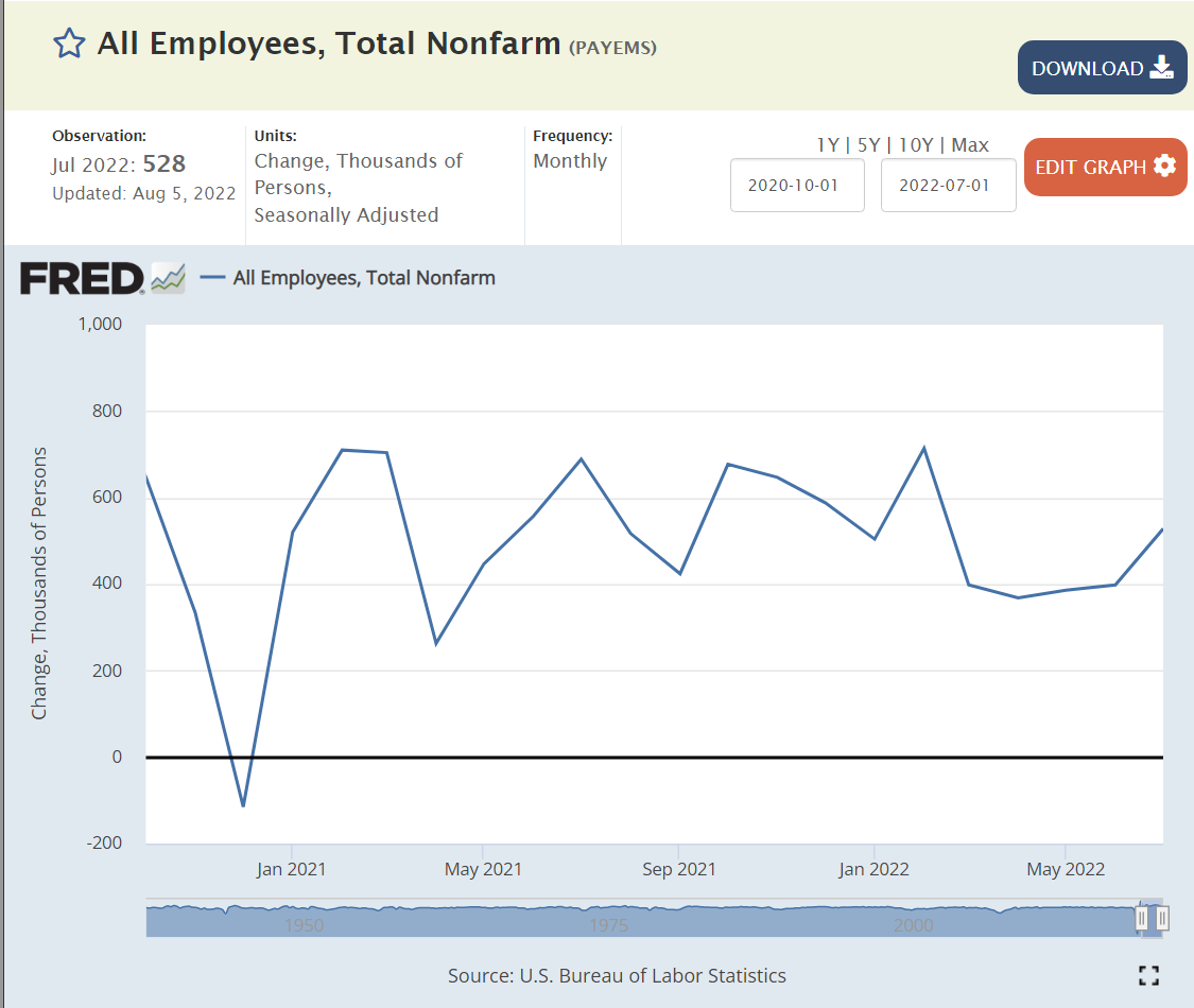
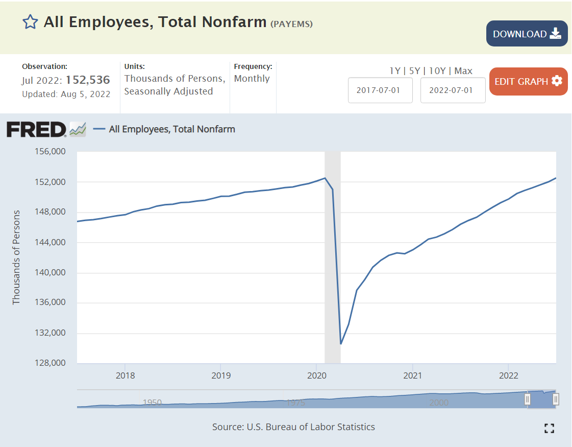
6 million jobs added in 2021

Great Labor Market

Higher Effective Minimum Wage

Very Low Unemployment

Are You Better Off Economically? Yes!

Labor Productivity

Labor Force Participation

Good News: Are You Better Off? (2)

Ronald Reagan taunted Jimmy Carter with this question to voters in the 1980 debates. It helped him win.

Twelve years later, James Carville helped Democrats return from the political wilderness in 1992 with his advice to Bill Clinton that “it’s the economy, stupid”.

https://en.wikipedia.org/wiki/It%27s_the_economy,_stupid

Politicians have used various measures, from unemployment to inflation to the “misery index” to jobs created to productivity to the stock market, to promote their success and detract from their opponents.

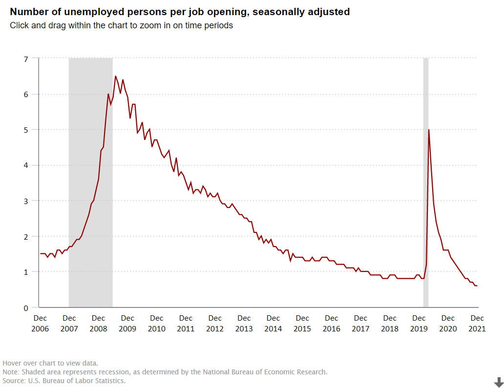
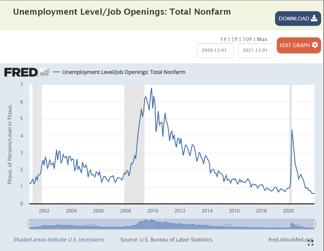
I want to focus on one measure, the ratio of the number unemployed to the number of job openings, to highlight the strength of the American economy in the last dozen years.

https://www.bls.gov/charts/job-openings-and-labor-turnover/unemp-per-job-opening.htm

https://fred.stlouisfed.org/graph/?g=p9aA

George W. Bush: Jobless Recovery in the “aughts”

The Bush economy was widely criticized for its “jobless recovery” following the economically healthier Reagan and Clinton presidencies. The presidency started at close to 1 unemployed person per job opening. The recession pushed this up to 2.5x and then 3.0x. In labor market terms, this is a huge difference. At 1:1 or 1.5:1, unemployed workers expect to be re-employed quickly. At 3:1, some may enter the dark days of the “long-term unemployed”. After 3 years, the economy DID recover to 1.5:1, but it was unable to improve further. The “Great Recession” was a brutal job killer, pushing this measure of labor market tightness up four-fold, from 1.5X to more than 6X before its peak in the first half of 2010, as Obama and congress and the federal reserve bank wrestled with the situation.

Obama: Recovery and “New Territory”

Between April, 2010 and April, 2012, the economy cut this ratio in half, from 6x to 3x, a very solid performance. It took 3 years, until April, 2015, to complete the next 50% reduction, from 3x to the historically “very solid” 1.5X. The economy continued its growth for the next 2 years, but at a slower pace, reducing this ratio to 1.3X.

Trump: Even Better

The Trump economy continued to improve for the first 18 months of his term, reducing this ratio from 1.3X to 0.8X by September, 2018. This was a time of record low unemployment and economists recalculating their standard of “full employment”. While the economy continued to grow, the unemployment rate continued to decline and the stock market continued to climb, THIS measure had reached its minimum before the 2018 mid-term elections. It remained steady at the very positive level of 4 job seekers for every 5 jobs (0.8) for the next 17 months, until the pandemic disrupted everything. The ratio quickly shot up to 5X, not as high as the 6X that Obama faced, but very high. It quickly recovered to 1.4X by the end of Trump’s term. This was partly job recovery and partly fewer job seekers, but it was an amazing recovery in historic terms. Recall that 1.5X was “a good as it got” during George W. Bush’s presidency.

Biden: Even Better, Again !

In the first 6 months of the Biden presidency, this ratio dropped from 1.4X back down to the prior record level of 0.8X. Yes, by July, 2021, there were 5 jobs available for every 4 job seekers. This was as low as the ratio had previously fallen, even as the Trump economy piggybacked on the Obama economy and continued its extraordinary run. The ratio continued to fall in the next 6 months to 0.6X, an unheard-of level. 5 jobs for every 3 job seekers. It’s “no wonder” that voluntary job quits are at unprecedented levels. For, perhaps, the first time in American history, “everyone who wants to work, can find a job”. Whether you are right or left, Dem or Rep, this is “good news”. This is “great news”. Wages for the “bottom 20%” are rising in real terms. Income inequality is declining, a bit. The economy seems to be able to digest this new condition. And, the economy is not done growing, innovating, creating businesses, creating jobs, exporting, etc. About 2% of Americans are likely to be attracted back into the workforce in the next year or two, keeping the headline unemployment rate from going much below 4%, but pushing US real GDP growth to 4% in 2022 and close to 4% in 2023.

Summary

The “Great Recession” and the “once in a century pandemic” have been unable to disrupt the ongoing progress of the American economy and labor market. As a nation, IMHO, we have cultural and political challenges, but we “aught” to appreciate the power of the American economy to move forward.

Good News: We’re (Almost) All On-line

Cable TV Subscriptions

https://www.economist.com/business/2019/05/09/american-pay-television-is-in-decline

https://en.wikipedia.org/wiki/Cable_television_in_the_United_States

Hey! Quick Summary

Cable TV subscribers and networks grew rapidly through the 1980’s and 1990’s reaching near universal availability. US subscribers plateaued from 2009-2014 at 100 million before rapidly declining to 74million in 2021. As the first graph shows, much of the decline has been a substitution of internet for cable access to media content. This is “good news” because everyone that wants it has access, but a new, better product has started to rapidly displace this 50 year-old technology.

Desktop/Laptop Computers

Ownership of a home desktop or laptop computer also remains near universal, at 77% in 2021. The ownership of tablet computers has risen from 14% in 2012 to a majority of homes (53%) in 2021.

Broadband Internet Access at Home

Broadband internet access has rapidly grown from 1% of homes in 2000 to 58% in 2008 to 77% in 2021. The retired generation (65+) lags behind at 64% connectivity. Black (71%) and Hispanic (65%) homes are below the average. Rural residents are also less connected (72%).

Internet Users

Pew Research also reports that the percentage of individuals that are internet users has nearly doubled from 52% in 2000 to (near universal) 93% in 2021. About three-fourths of older individuals (65+) are “surfing the web”. 97% of others are connected. There is no major difference between racial categories. Rural citizens are little less engaged (90%).

Mobile Phone and Smart Phone Owners

Mobile phone ownership has grown from 62% in 2002 to 97% today. Seniors (65+) have slightly lower ownership rates (92%). Racial groups have the same ownership. Rural residents have slightly lower ownership rates (94%).

Smart phone ownership has grown rapidly from 35% in 2011 to 77% in 2016 to 85% in 2021. Ownership rates vary by age: 18-49 (95%), 50-64 (83%) and 65+ (61%). There is no racial ownership gap. Rural residents have an 80% ownership rate.

Summary

Although we saw news coverage during the pandemic which highlighted the imperfect access to electronic devices and network required for effective on-line learning, the US is approaching a state where nearly everyone has access. Cable TV access is now post-peak. TV network access is increasingly through the internet. Broadband access is the weakest measure at 77% ownership. Cell phone ownership is universal and smart phone ownership will reach that level before the end of the decade.

Postscript: Economic Impact = 10% of GDP

Industry associations, journalists and consultants wrestle with each other to capture and communicate the economic value added by personal computers, smart phones and the internet. In rough terms, about 10% of GDP is due to the direct and indirect value of these technologies that did not exist in any economically material amount in 1980, just 40 years ago. Good news? No, GREAT NEWS.

https://www.reuters.com/article/us-usa-internet-economy/internet-sector-contributes-2-1-trillion-to-u-s-economy-industry-group-idUSKBN1WB2QB

https://www.iab.com/news/study-finds-internet-economy-grew-seven-times-faster/

Good News: US Agriculture

At the height of the cold war, in the year on my birth (1956), Soviet First Secretary Nikita Khrushchev warned the US that “we will bury you”. Agriculture was still a very large share of the USSR and US economies. He couldn’t have been more wrong.

https://en.wikipedia.org/wiki/We_will_bury_you

US statisticians have long separated the farm and nonfarm economies. A “census of agriculture” is conducted every 5 years to complement other economic statistics collected. The USDA Economic Research Service (ERS) does a great job of compiling statistics for the narrow (farming), moderate (fishing, timber) and broad (ag based production) agriculture industries.

I’ve chosen to examine the near 60-year period from 1959-2017 covered by the censuses of agriculture. During this time, Real (inflation adjusted) US Gross Domestic Product (GDP), the value of all goods and services produced, increased from $3 to $18 trillion dollars, a near 6-fold increase, or 3% annually, year after year after year.

We don’t have an economic series that tracks wage and salary income back before 1979, but real disposable income per capita exists for this whole time period. This indicator or labor costs increased 3.4 times, from $12,600 to $42,900, or 2.1% annually. Given the strong growth of the US economy and its many new opportunities AND the increase in labor costs facing the oldest industry, one might have agreed with the Soviet premier back in 1956, at least regarding US agriculture. But, that prediction was wrong.

Index of Unit Outputs

The US agricultural economy grew to more than 2.5 times its 1959 base by 2017. It grew by 75% in the first 30 years and an additional 50% on top of that new base. The consistent pattern of growth is striking.

Real Market Value Produced

The Ag economy grew (based on variable market prices) 5-fold from $80B to $390B during these six decades, increasing by 110% in the first 30 years and a compounded 130% in the most recent 30 years.

Land Input (Acres)

The amount of land dedicated to production agriculture has decreased by 20% during our period of focus, from 1.1B to 0.9B. The decline was faster in the first 30 years (14%) than the second 30 years (7%). Despite this reduced demand for agricultural land, the value of such land has increased in real terms as its productivity has grown.

Labor Inputs FTE

The full-time equivalent labor force in the ag industry, as best as the USDA can measure it, dropped by nearly two-thirds in our six decades, from 2 million to about 700,000. It fell more rapidly in the first 30 years (50%), but a solid 25% in the most recent 30 years.

Total Factor Productivity

Economists try to measure land, labor and capital as inputs to the agricultural production process. As noted above, land and labor have declined. Capital – equipment, improvements, patents, inventory, etc. has increased. Overall, the total inputs have remained roughly flat for 60 years. Hence, almost ALL of the increased unit output is due to increases in productivity. Better crops, better labor skills, better processes, better methods, better irrigation, better crop rotation and selection, etc. Economists call this “total factor productivity”. After accounting for measurable increased inputs, the remaining improvement is called “productivity”.

The oldest industry in the world, increased its productivity in the US by 150% in these six decades; by two-thirds in the first 30 years and by one-half on the higher base in the second 30 years.

Output per Labor Unit (Labor Productivity)

The strong increase in production combined with the two-thirds reduction in FTE labor required resulted in a 7-fold measure of improved labor productivity. The land input was down by 20% and the capital input increased significantly, but in simple terms, each hour of labor in 2017 delivered 7 times as much output as the labor in 1959. The increase was 2.5x in the first 30 years and a solid 2x in the more recent 30 years.

US Agriculture Output Price Index

The index of agricultural industry output prices has increased by 3-4x versus 8x for the consumer price index or GDP price index.

Real Market Value Produced Per Acre

The real market value of ag goods produced increased 5-fold. The land acres required declined by 20%. The output value per acre figure improved 6-fold. Again, labor inputs declined and capital inputs increased. This measure of land productivity improved by 150% in both of the first and second 30-year periods.

Real Agricultural Exports

Real ag exports increased 4-fold in these 6 decades, doubling in the first and second 30-year periods.

Summary

Less land and labor. More capital (equipment). Much better R&D and processes. Total factor productivity up by 150% across 6 decades, an average of 1.6% year after year after year.

The US ag industry faces many challenges today. Environmental issues and climate change. Water shortages. Lower public and private R&D investment. Brain drain. Political polarization. Concentration of key property rights. Low wage labor access. Changing trade rules. Nonetheless, the last 60 years indicates that this industry is capable of delivering further increases in production and productivity for the next 60 years.

Sources

https://fred.stlouisfed.org/series/B359RC1A027NBEA

https://www.ers.usda.gov/data-products/agricultural-productivity-in-the-u-s/

https://data.ers.usda.gov/reports.aspx?ID=17835

https://www.ers.usda.gov/topics/farm-economy/land-use-land-value-tenure/farmland-value/

https://www.ers.usda.gov/topics/international-markets-u-s-trade/u-s-agricultural-trade/us-agricultural-trade-at-a-glance/

https://fred.stlouisfed.org/series/B181RC1Q027SBEA#0

https://www.ers.usda.gov/topics/international-markets-u-s-trade/u-s-agricultural-trade/outlook-for-u-s-agricultural-trade/

https://www.govinfo.gov/app/collection/ERP/2005

https://view.officeapps.live.com/op/view.aspx?src=https%3A%2F%2Fwww.govinfo.gov%2Fcontent%2Fpkg%2FERP-2005%2Fxls%2FERP-2005-table102.xls&wdOrigin=BROWSELINK

https://www.ers.usda.gov/data-products/ag-and-food-statistics-charting-the-essentials/farming-and-farm-income/

https://www.ers.usda.gov/data-products/ag-and-food-statistics-charting-the-essentials/agricultural-trade/

https://www.ers.usda.gov/data-products/ag-and-food-statistics-charting-the-essentials/agricultural-production-and-prices/

https://www.ers.usda.gov/data-products/agricultural-productivity-in-the-u-s/summary-of-recent-findings/

https://view.officeapps.live.com/op/view.aspx?src=https%3A%2F%2Fwww.ers.usda.gov%2Fwebdocs%2FDataFiles%2F47679%2Ftable01.xlsx%3Fv%3D6711.9&wdOrigin=BROWSELINK

https://www.ers.usda.gov/topics/farm-economy/land-use-land-value-tenure/farmland-value/

https://www.ers.usda.gov/topics/international-markets-u-s-trade/u-s-agricultural-trade/us-agricultural-trade-at-a-glance/

https://fred.stlouisfed.org/series/B181RC1Q027SBEA#0

https://www.govinfo.gov/app/collection/ERP/2005

https://view.officeapps.live.com/op/view.aspx?src=https%3A%2F%2Fwww.govinfo.gov%2Fcontent%2Fpkg%2FERP-2005%2Fxls%2FERP-2005-table102.xls&wdOrigin=BROWSELINK

https://fred.stlouisfed.org/series/OPHNFB