Cable TV subscribers and networks grew rapidly through the 1980’s and 1990’s reaching near universal availability. US subscribers plateaued from 2009-2014 at 100 million before rapidly declining to 74million in 2021. As the first graph shows, much of the decline has been a substitution of internet for cable access to media content. This is “good news” because everyone that wants it has access, but a new, better product has started to rapidly displace this 50 year-old technology.
Ownership of a home desktop or laptop computer also remains near universal, at 77% in 2021. The ownership of tablet computers has risen from 14% in 2012 to a majority of homes (53%) in 2021.
Broadband internet access has rapidly grown from 1% of homes in 2000 to 58% in 2008 to 77% in 2021. The retired generation (65+) lags behind at 64% connectivity. Black (71%) and Hispanic (65%) homes are below the average. Rural residents are also less connected (72%).
Internet Users
Pew Research also reports that the percentage of individuals that are internet users has nearly doubled from 52% in 2000 to (near universal) 93% in 2021. About three-fourths of older individuals (65+) are “surfing the web”. 97% of others are connected. There is no major difference between racial categories. Rural citizens are little less engaged (90%).
Mobile phone ownership has grown from 62% in 2002 to 97% today. Seniors (65+) have slightly lower ownership rates (92%). Racial groups have the same ownership. Rural residents have slightly lower ownership rates (94%).
Smart phone ownership has grown rapidly from 35% in 2011 to 77% in 2016 to 85% in 2021. Ownership rates vary by age: 18-49 (95%), 50-64 (83%) and 65+ (61%). There is no racial ownership gap. Rural residents have an 80% ownership rate.
Summary
Although we saw news coverage during the pandemic which highlighted the imperfect access to electronic devices and network required for effective on-line learning, the US is approaching a state where nearly everyone has access. Cable TV access is now post-peak. TV network access is increasingly through the internet. Broadband access is the weakest measure at 77% ownership. Cell phone ownership is universal and smart phone ownership will reach that level before the end of the decade.
Postscript: Economic Impact = 10% of GDP
Industry associations, journalists and consultants wrestle with each other to capture and communicate the economic value added by personal computers, smart phones and the internet. In rough terms, about 10% of GDP is due to the direct and indirect value of these technologies that did not exist in any economically material amount in 1980, just 40 years ago. Good news? No, GREAT NEWS.
At the height of the cold war, in the year on my birth (1956), Soviet First Secretary Nikita Khrushchev warned the US that “we will bury you”. Agriculture was still a very large share of the USSR and US economies. He couldn’t have been more wrong.
US statisticians have long separated the farm and nonfarm economies. A “census of agriculture” is conducted every 5 years to complement other economic statistics collected. The USDA Economic Research Service (ERS) does a great job of compiling statistics for the narrow (farming), moderate (fishing, timber) and broad (ag based production) agriculture industries.
I’ve chosen to examine the near 60-year period from 1959-2017 covered by the censuses of agriculture. During this time, Real (inflation adjusted) US Gross Domestic Product (GDP), the value of all goods and services produced, increased from $3 to $18 trillion dollars, a near 6-fold increase, or 3% annually, year after year after year.
We don’t have an economic series that tracks wage and salary income back before 1979, but real disposable income per capita exists for this whole time period. This indicator or labor costs increased 3.4 times, from $12,600 to $42,900, or 2.1% annually. Given the strong growth of the US economy and its many new opportunities AND the increase in labor costs facing the oldest industry, one might have agreed with the Soviet premier back in 1956, at least regarding US agriculture. But, that prediction was wrong.
Index of Unit Outputs
The US agricultural economy grew to more than 2.5 times its 1959 base by 2017. It grew by 75% in the first 30 years and an additional 50% on top of that new base. The consistent pattern of growth is striking.
Real Market Value Produced
The Ag economy grew (based on variable market prices) 5-fold from $80B to $390B during these six decades, increasing by 110% in the first 30 years and a compounded 130% in the most recent 30 years.
Land Input (Acres)
The amount of land dedicated to production agriculture has decreased by 20% during our period of focus, from 1.1B to 0.9B. The decline was faster in the first 30 years (14%) than the second 30 years (7%). Despite this reduced demand for agricultural land, the value of such land has increased in real terms as its productivity has grown.
Labor Inputs FTE
The full-time equivalent labor force in the ag industry, as best as the USDA can measure it, dropped by nearly two-thirds in our six decades, from 2 million to about 700,000. It fell more rapidly in the first 30 years (50%), but a solid 25% in the most recent 30 years.
Total Factor Productivity
Economists try to measure land, labor and capital as inputs to the agricultural production process. As noted above, land and labor have declined. Capital – equipment, improvements, patents, inventory, etc. has increased. Overall, the total inputs have remained roughly flat for 60 years. Hence, almost ALL of the increased unit output is due to increases in productivity. Better crops, better labor skills, better processes, better methods, better irrigation, better crop rotation and selection, etc. Economists call this “total factor productivity”. After accounting for measurable increased inputs, the remaining improvement is called “productivity”.
The oldest industry in the world, increased its productivity in the US by 150% in these six decades; by two-thirds in the first 30 years and by one-half on the higher base in the second 30 years.
Output per Labor Unit (Labor Productivity)
The strong increase in production combined with the two-thirds reduction in FTE labor required resulted in a 7-fold measure of improved labor productivity. The land input was down by 20% and the capital input increased significantly, but in simple terms, each hour of labor in 2017 delivered 7 times as much output as the labor in 1959. The increase was 2.5x in the first 30 years and a solid 2x in the more recent 30 years.
US Agriculture Output Price Index
The index of agricultural industry output prices has increased by 3-4x versus 8x for the consumer price index or GDP price index.
Real Market Value Produced Per Acre
The real market value of ag goods produced increased 5-fold. The land acres required declined by 20%. The output value per acre figure improved 6-fold. Again, labor inputs declined and capital inputs increased. This measure of land productivity improved by 150% in both of the first and second 30-year periods.
Real Agricultural Exports
Real ag exports increased 4-fold in these 6 decades, doubling in the first and second 30-year periods.
Summary
Less land and labor. More capital (equipment). Much better R&D and processes. Total factor productivity up by 150% across 6 decades, an average of 1.6% year after year after year.
The US ag industry faces many challenges today. Environmental issues and climate change. Water shortages. Lower public and private R&D investment. Brain drain. Political polarization. Concentration of key property rights. Low wage labor access. Changing trade rules. Nonetheless, the last 60 years indicates that this industry is capable of delivering further increases in production and productivity for the next 60 years.
US GDP/Capita remains the world leader among large countries in 2018. I’ve extracted comparison data for a dozen representative countries covering the period of 1900 through 2018.
Kuwait/Qatar/Brunei, Singapore/Hong Kong and Iceland/Norway/Luxembourg have higher GDP/Person. For reference, Saudi Arabia is just below the US, while other potential key comparison countries are much lower: South Korea ($39), Russia ($26) and China ($17).
Taking the long view (120 years), this above (table) set of countries grew their real (inflation adjusted) GDP per person 9-fold, from just $4,000 to $36,000. The US increased 7-fold, from an $8,000 initial position (twice as high) to $55,000 (still 60% higher).
Sweden (14x), Brazil (16x) and Japan (18x) lead the way in century long growth. Argentina (4x) and the UK (5x) were the only countries with slower percentage growth than the US. The US was the world-leader in 1900, providing an advantage for generating growth dollars and a governor on generating percentage growth. The history of the twentieth century was one of less developed countries using technology transfer and increased trade to “catch up” with the historic leaders.
Prior to WW II, most countries grew by the average 60%. Germany and Brazil grew a little faster (80%). Japan and Sweden grew much faster (130%).
Growth from 1960 until 2018 averaged a remarkable 240%! Japan grew 5-fold, leading the way for the “Asian Tigers”. Brazil, Hungary and Germany grew 4-fold. The UK continued its subpar performance (180%), despite the alleged Thatcher revolution and Argentina fell even further behind (110%). US growth was a little slower than average (210%) in the last 60 years, from a starting base of $18,000 versus the average of $10,000 (80% higher).
On a percentage basis, the US growth in output per person was slower than average. On a dollars basis, it remained the market leader overall and added more value than all other countries.
For the whole 120 year period, the US added $47,000 to its GDP/person, growing from $8,000 to $55,000. Australia (43), Germany (41), Sweden (41) and Canada (40) were solid competitors. Japan, France, UK and Italy added more than $30,000 per person. Hungary, Argentina, Mexico and Brazil lagged, adding just $10-20,000.
In the last 60 years, the US added $37,000 to $GDP/capita, tripling its $18,000 base. Australia (36), Germany (34), Sweden (31), Canada (31) and Japan (32) were close competitors. France, UK, Italy and Hungary added $20-27,000. Argentina, Mexico and Brazil grew more slowly ($10-12,000).
Per Capita GDP as % of USA
Another way to place the US performance in perspective is to use it as the baseline and plot other countries’ per capita GDP as a percentage of the US level.
There are different ways to compare GDP across countries. There is not a full consensus among economists. I’m using data from the Maddison Project Database. The data shown on the Worldometer website uses a different method, but the basic results are comparable.
First, we see that the US has had the highest $GDP/capita throughout the 120 year period. In 1900, the US was at $8,000 and second place UK was at $7,600, beginning its long relative decline from being THE imperial power to a mid-level (nuclear armed) European country. In 2018, the US produces $55,000 per person versus second place Australia at $50,000 and third place Germany at $46,000. Adjacent Canada generates 20% less value at $45,000. Formerly high-flying Japan now rests at $39,000 per person.
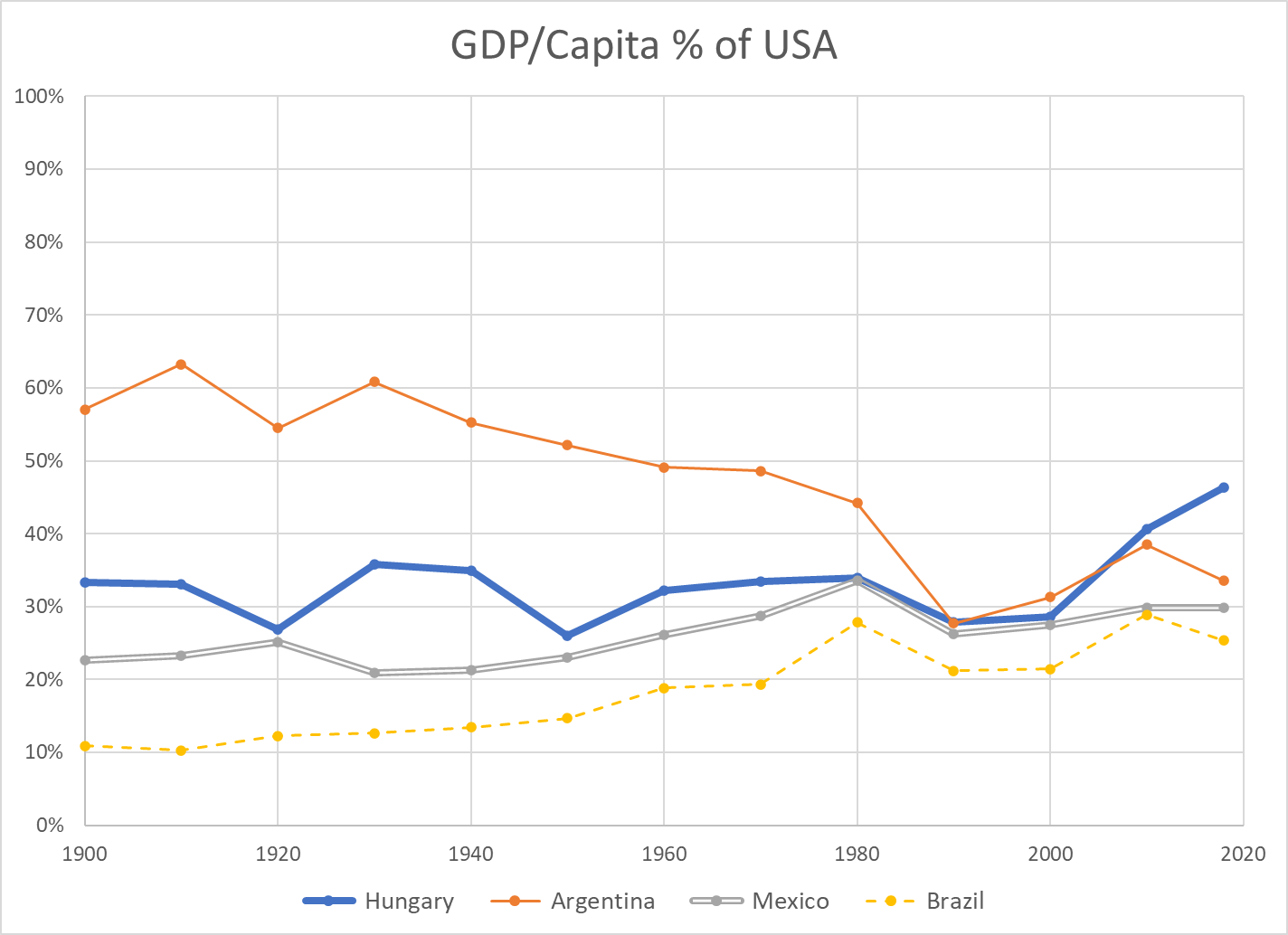
Argentina is an outlier, dropping from 60% to just 35% of US income per person for various political, financial, economic and trade reasons. Hungary is representative of smaller eastern European nations that remained at just 35% of US levels until the fall of the Berlin wall and subsequent integration into the European economy, allowing them to grow towards 50% of the US level. Mexico has slowly grown from 20% to 30% of the US level, but not been able to accelerate further. Brazil has grown from just 10% to nearly 30% of the US level, with significant volatility.
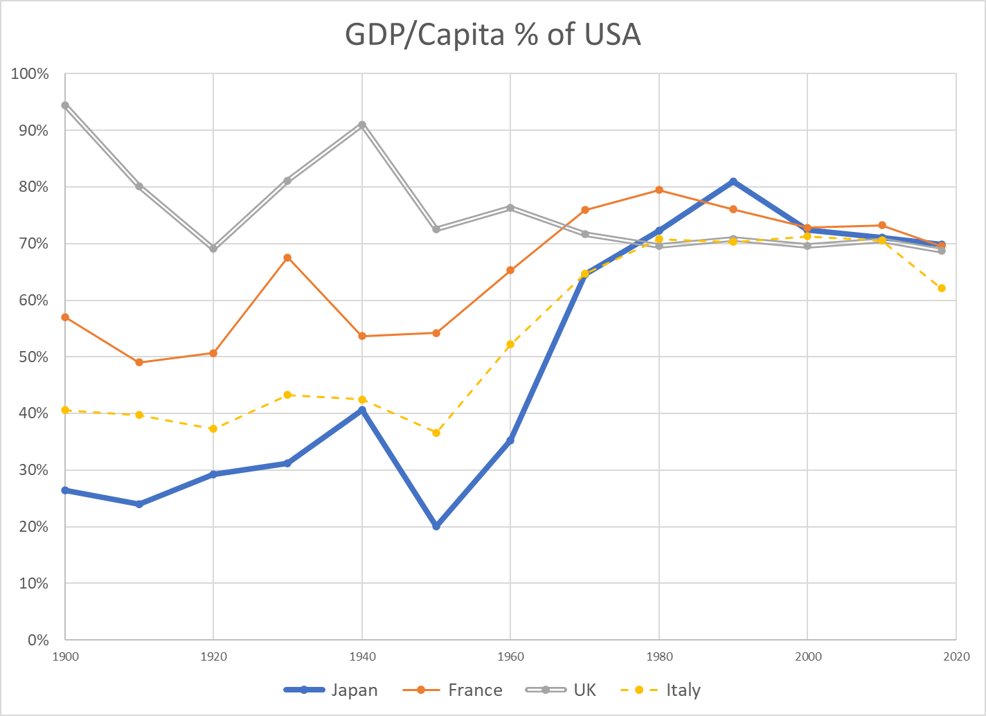
The UK fell from 90% to 70% of the US value added per citizen level by 1970, where it has remained. France weathered the 2 world wars at 55% of the US income level. It recovered nicely to 75% by 1970, peaked near 80% and then drifted back to 70% with its 4-day work weeks. Italy remained at just 40% of the US level through the war years. It grew remarkably to 70% of the US level by 1970, where it remained, before falling back somewhat in the last decade. Japan also struggled through the war years, averaging 30% of the US level. It rocketed to 80% of the US level by 1990, riding total quality management, manufacturing, peacetime and expanded trade. It has dropped back to 70% of the US level.
Australia level pegged the US at 80% for much of the period, until the China lead commodities demand boom pulled it up to 90% recently. Canada grew from a rural, thinly populated, commodities-oriented country at 60% of the US up to 80% by 1970 and has remained in the low 80 percents since then. Germany began the century at 60% of the US level. Following two failed wars, it attained 70% of the US level by 1960. Digesting East Germany was a challenge, but Germany was at 75% of US levels in the early 2000’s and exceeded 80% soon thereafter, riding its manufacturing export capabilities.
Summary
US $GDP/Capita continues to lead the world, as it has done for more than a century. The US percentage growth rate has slowed, but the incremental value added has remained first among large countries. Some other countries have shown periods of relatively strong growth, but none has demonstrated an ability to challenge the US. A number of European countries have found a “mixed” market approach that is competitive with the US, leveraging lower trade barriers within the EU and across the world.
China Postscript
China $GDP/capita (000’s) numbers for 1950 through 2018 are 0.8, 1.1, 1.4, 1.9, 3.0, 4.7, 9.7 and 13.1. Low scoring Argentina (19), Mexico (16) and Brazil (14) each have higher productivity per person. China per capita GROWTH per decade figures are 0.3, 0.3, 0.5, 1.1, 1.6, 5.0, and 3.4 (thousands). The percentage figures are very impressive. Considering China’s 1.4 billion population, they are very impressive. Comparable US decade growth (thousands/person) figures are 3, 6, 5, 7, 9, 3 and 6.
The US has a century-long track record of generating an extra $5,000 per person of value-added output each decade. China has leveraged its low-wage labor, a young work force, manufacturing technology transfer, willing investors, willing importers and an international free trade system to drive its growth. The country has maintained political stability and invested in its economic infrastructure, using economic progress and some level of economic freedom to offset the risks of its political and social restrictions. It faces a flat population and shrinking working-age population before it transitions its remaining rural work force into the manufacturing or urban environment.
It is facing what economists call the “middle income trap”, where countries with rapid economic growth based upon manufacturing or resource extraction need to transition a large part of their economy to higher value-added services and advanced manufacturing. Many countries have failed to make this transition. Some have done so.
I’ve worked closely with Chinese electronics firms for more than 25 years. Their capabilities are much greater than what is recorded in the US media. They have solid manufacturing capabilities, including Japanese-style process improvement. They have very strong sales, marketing and account management capabilities, focused on their global business-to-business customers. They have strong product development engineering capabilities and growing project management skills. They have modern MBA management skills and business styles. Their “clusters” of manufacturing, parts, R&D, resources and logistics skills point to long-term competitive advantages in many industries.
I believe that China will continue to be a manufacturing powerhouse, despite trade restrictions. China is well positioned to deliver products to growing markets in Asia, Africa, the Middle East and Latin America.
That being said, I am not concerned that China will eclipse the US in total productivity per citizen in the next 50 years. The gap is simply too large. In 50 years, the US will very conservatively grow from $55,000 to $80,000 of output per person (8%/decade). Mathematically, this requires 3.7% growth in China each year for 50 years, or 44% growth per decade compounded to reach 6.2 times the current level. The historical data contains 1 or 2 decades of 40% growth for some exceptional countries, but not 8 (3 in the bank, plus 5 in the future). If China can grow by 6% annually for one decade (79%) and 5% annually for the next decade (63%), it COULD then grow by just 2.5% annually (28%/decade) to catch the US in 2070.
China has 1.4 billion people versus 330 million in the US. Even including Canada and Mexico, the North American population is just 0.5 million. Europe has roughly 750 million people. Japan, South Korea, Australia and New Zealand have just over 200 million people. Indian has 1.4 billion people, Africa 1.2 billion and Latin America 0.7 billion. China will be a growing world economic and military power, even with its population peaking in 2025-30. The US should consider China to be its primary global rival, perhaps with less “us versus them” posturing. China aims to protect its economic, political and military interests, never again to be dominated and humiliated by outsiders. But, China truly considers itself to be the “center of the universe” and has no “need” to dominate the rest of the world or export its ideology. There are low confrontation options available.
Real (inflation adjusted) Gross Domestic Product (GDP), the value of all goods and services produced in the US reached $20.8 trillion in 2020, compared with only $0.7 trillion in 1900. This is a nearly 30-fold growth across 120 years.
Year
Real $GDP (T)
Added $GDP
Percent
1900
0.7
1910
1.0
0.3
46%
1920
1.3
0.3
21%
1930
1.5
0.3
22%
1940
1.8
0.3
20%
1950
2.7
0.8
45%
1960
3.7
1.1
41%
1970
5.6
1.9
50%
1980
7.8
2.1
38%
1990
10.6
2.9
37%
2000
14.9
4.3
40%
2010
17.6
2.7
18%
2020
20.8
3.2
18%
It’s difficult to “digest” 20.8 trillion dollars. But, it is true that the US economy in 2020 was ten (10) times as large as it was in 1952, well into the post-war economic boom period. The population had more than doubled and the productivity of the economy had increased more than three-fold across this period.
The economy is 3 times as large as it was in 1975, when it was entering a challenging period of stagflation, foreign competition, high interest rates, energy shortages, environmental concerns and divided politics.
The economy is twice as large (in real terms) as it was in 1990.
The economy grew by an average of 42% per decade from 1940 through 2000. The last two decades have grown by 18% each, similar to the growth from 1910 through 1940.
However, the amount of growth, measured in real dollars, has continued at a very strong pace. The economy averaged growth of $2.8 trillion per decade from 1970 through 2020. That is roughly the size of the whole economy in 1950! The latest decade recorded a $3.2 trillion increase, larger than the output of the whole economy in 1950, and the second largest growth ever.
US Population
Year
Population (M)
Added (M)
Percent
1900
76
1910
92
16
21%
1920
106
14
15%
1930
123
17
16%
1940
132
9
7%
1950
151
19
14%
1960
179
28
19%
1970
203
24
13%
1980
227
23
12%
1990
249
22
10%
2000
281
33
13%
2010
309
27
10%
2020
331
23
7%
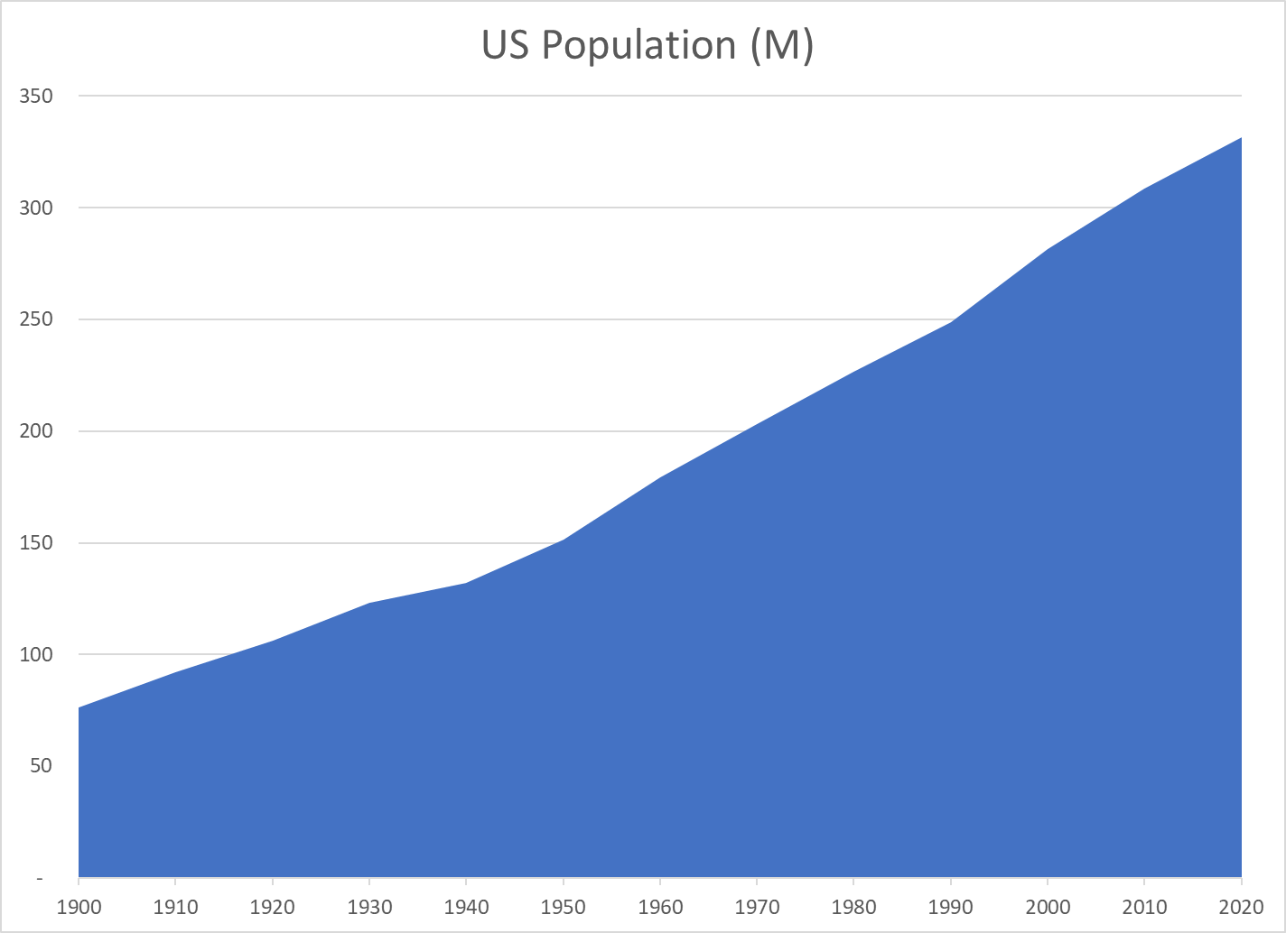
The US population has increased by 4.3 times since 1900, from 76 to 331 million people.
The population doubled from 1900 to 1950 and then doubled again since 1955.
The US added an average of 25 million new residents per decade from 1940 to 2020 (12%).
In the last 30 years, the US has added 85 million residents; the same number as its total population in 1905!
Despite many challenges in the last century, the US population has grown consistently and significantly.
Real $GDP Per Capita
Year
Real $GDP/Capita
$ Added
Percent
1900
9,300
1910
11,200
1,900
20%
1920
11,800
600
5%
1930
12,400
600
5%
1940
13,900
1,500
12%
1950
17,600
3,700
27%
1960
20,900
3,300
19%
1970
27,700
6,800
33%
1980
34,300
6,600
24%
1990
42,800
8,500
25%
2000
53,100
10,300
24%
2010
57,100
4,000
8%
2020
62,700
5,600
10%
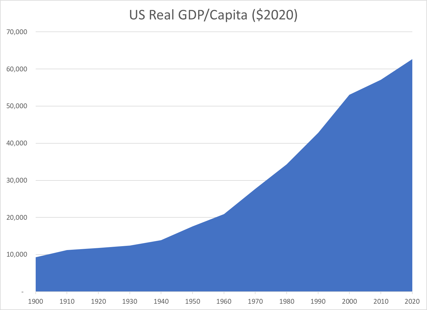
Real (inflation-adjusted) output per person has grown 6.7 times since 1900!
It has doubled since 1975, tripled since 1960 and quadrupled since 1945. Yes, today’s economy produces four times as much, per person, as the supercharged Word War II winning “arsenal of democracy”. It produces twice as much per person as the 1975 economy which then appeared to plateau in the face of Japanese import competition.
From 1960 through 2020, the economy has added an average of $7,000 more output per American for each decade.
While improved output/productivity in the last 2 decades has not matched that of 1960-2000, it still added $9,600 of output per resident, more than the total output per resident in 1900. In the last 3 decades combined, the economy has added nearly $20,000 of output/income per person, an amount equal to the total output/income per person in the late 1950’s.
Ronald Reagan skewered Jimmy Carter with this taunt in the 1980 presidential debate. Joe Biden’s approval rating is falling quickly in recent months. US voters need to assess the true state of the US economy under Biden’s leadership after 2 years of a global pandemic, last seen in 1918.
Real Disposable Personal Income Per Capita
Real, inflation adjusted income per person continues to rise. In 2000, average income was just $33,000 per year. It rises quite significantly to $38,000 in booming 2007-10. It remains at this level through 2013. This is a 15% increase over 13 years, a little better than 1% per year. The economy adds another $6,000 in the next 7 years before the pandemic. That’s growth twice as fast, 2% per year during this boom time. Real income has grown another $2,000 to $47,000 in the last 2 years, 2% annually, after the pandemic. Very good news.
Employed Persons
US employment was typically 130M from 2000-2012. Great growth occurred from 2012 to 2020, reaching an unprecedented 152M. The pandemic dropped employment to 130M, an incredible 22M lower. Employment quickly rebounded about half-way to 142M during 2020. It has grown by another 6M in the last year. The employment growth from 2010-20 averaged 2M per year. The 2021 record is a very strong performance, reflecting a healthy economy that has robustly adapted to the challenges of a pandemic environment.
Unemployment Rate
Unemployment averaged about 5% during the first decade of the century, a generally good result compared with 20th century history. It doubled to 10% during the “Great Recession” and then slowly declined to 5% by 2015 and then even further, exceeding economists’ expectations, to 3% in 2018-2020. The pandemic rocketed it up to 15%, but it quickly recovered to 7%. It has since declined to less than 5%, which has historically been the typical definition of “full employment”.
Job Quits
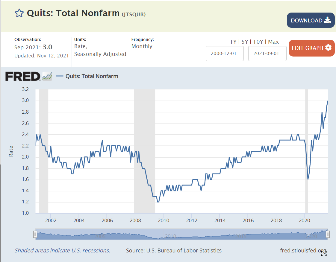
From 2000-2008, about 2% of employees voluntarily left their positions in any given month. The quit rate dropped to 1.5% in the aftermath of the “Great Recession” (2010-13). It very slowly recovered to 2.2% during 2016-18. It increased a little bit to 2.3% in 2019-2020. It rebounded to 2.3% in 2020, and has since increased to an unprecedented 3%. This reflects a labor market where 50% more employees are making a voluntary choice to leave their current employer, apparently confident that they can find an equal or better position.
Job Openings
Job openings averaged 4M from 2000-2014. Openings fell to 3M in 2010-12 after the “Great Recession”. Job openings then grew to 6M in 2017-18 and further to 7M in 2019-20. Job openings quickly returned to 7M early in the pandemic and then began their climb to the current 11M level. Again, these are unprecedented levels, twice as many open jobs as in any time from 2000-15.
Unemployed Persons Per Job Opening
The 2006-7 baseline was 1.5 unemployed persons per open position. The “Great Recession” peak was 6 to 1, an incredibly different labor market, where many older people “retired”; new college graduates went to graduate school, accepted lower positions or remained unemployed; and mid-career professionals accepted positions at 20% lower salary levels. It took 5 years to return to the typical 1.5/1 ratio. This ratio declined a little bit further to 1/1 during 2017-2020 in a tight labor market. The ratio very quickly returned to the historical 1.5 baseline during 2020. It is now at an unprecedented 0.8/1 level. Fewer unemployed people than jobs, not 1.5 to 1, but 0.75/1, half as many potential applicants. This is the first “employees” labor market since the 1960’s.
Home Values
The US Home Price Index was set to 100 in 2000. It increased to 180 during 2005-7. It dropped back to 140 in 2010-13, indicating that part of the rise before “the Great Recession” was a bubble. Prices climbed steadily from 140 to 210 (50% increase) from 2013 to 2020. Despite the pandemic, house prices have continued their climb, exceeding 260, another 25% increase in the last 2 years.
Mortgage Interest Rates
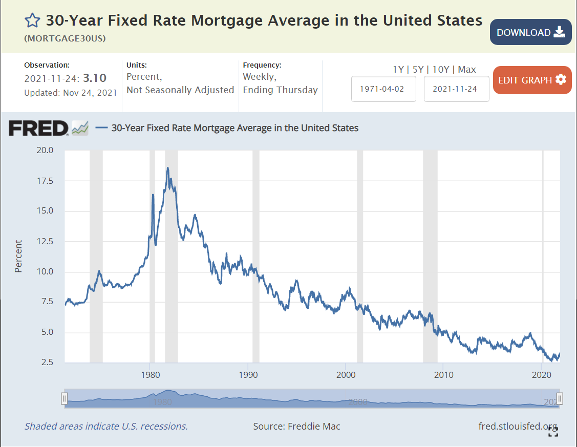
Mortgage interest rates averaged 8% during the 1990’s. They averaged 7% in the 2000’s. They declined even further to 4% during the 2010’s. They fell even further to 3% in 2020-21. The interest cost to finance a house is at an all-time low.
Stock Market
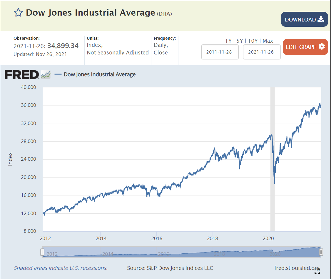
The US stock market averaged 16,000 points from 2014-16. It increased by 50% to 24,000 in 2018, and then climbed to 26,000 and 28,000 before the 2020 pandemic crash. Despite the real financial costs of the pandemic, the market quickly rebounded to 25,000 in the middle of 2020. It has since continued its climb to 36,000, 20% above the pre-pandemic level.
In 1992 James Carville claimed that “it’s the economy, stupid”.
If so, voters should provide some support to president Biden’s results. Real income is up 2% annually, a record level. Reduction in number of unemployed is 6M in 1 year, another record. Unemployment rate is at 4.6%, below historical “full employment” level. Voluntary quit rate is 50% higher than history, indicating tremendous worker confidence. Nearly twice as many job openings as the historical level, providing great options for job seekers to find their “best” opportunities. Mortgage interest rates remain at historical lows, supporting home purchases. House values have grown by another 25%. The stock market is 20% higher.
This is all at a time when the pandemic unfortunately continues to claim lives and greatly disrupt life and the economy. Overall, the recovery is proceeding at a rate far faster what anyone thought was possible during 2020.
We moved to Indy in 1988 from Cleveland by way of Dallas. My wife was transferred to Indy by her employer and I was able to transfer with my employer. We visited for one weekend, noted the quietness and bought a house. We expected to stay for 3 years. We’ve stayed for 30 years.
Once we moved, we saw that Indy presented a “can do” atmosphere that was more like Dallas than like Cleveland. What does the population data say?
From 1970 to 2019, the Indy 9 county area grew from 1.2M to 2.0M people. The growth from 1970 to 1990 was negligible, a little more than 100K in 20 years. But each of the next 3 decades added 200,000 people, more than 10% growth each decade.
On a ranking of metro areas, Indy started in 29th place and has fallen 4 notches to 33rd place, so on that measure it has lost some ground.
Comparing cities across time is complicated, as the census bureau definitions change, but the data tells some stories. I restricted the comparison to the 64 cities that were “top 50” for at least one of the last 7 decades. 5 dropped out by 1970: Scranton, Youngstown, Syracuse, New Haven and Knoxville. 9 dropped out more recently: Dayton, Akron, Albany, Toledo, Rochester, Omaha, Bridgeport, Tucson and Honolulu. No big surprises. Tucson and Honolulu remain close to 50th place. 8 cities grew into the top 50: Virginia Beach/Norfolk, Tampa/St. Pete, Charlotte, Orlando, Raleigh, Austin, Riverside and Las Vegas.
For the US as a whole, 14 cities dropped 8 or more places, 6 dropped 4-7 places, 10 gained 4 or more places and 12 had small changes in rank (+/-3). By this measure across nearly 50 years, the median city dropped 4 places, the same as Indy, so it can claim an average growth rate during this time.
Looking at just the Midwest, Indy looks much better. 6 cities dropped out of the top 50. 6 dropped 8 or more places: Cleveland, Milwaukee, St. Louis, Kansas City, Cincinnati and Detroit. Minneapolis joins Indy at -4 near the top of this group. Columbus, OH nearly maintained its 31st place rating, slipping to 32nd. Chicago kept its 3rd place ranking.
Other “comparable” central U.S. cities include Buffalo (-26), Pittsburgh (-16), Louisville (-13), Memphis (-8) and Nashville (+11).
The bottom line is that Indy is holding its own at the national level and overperforming in the heartland.
Peggy Noonan’s suggestion to use a 36 inch ruler to gauge right versus left in politics does help to explain the opposing views of tea partiers, Republicans and Democrats. Noonan describes 0 inches as pure right and 36 inches as pure left (opposite of what you might expect). She bemoans her perception that modern-day politicians negotiate between the 25 and 30 inch mark on the far left end of the ruler. She asserts that tea partiers will try to move back to the 5 inch mark.
In politics, he who sets the framework usually wins the game. Using American history since the agricultural 1770’s, urbanizing 1860’s, industrial 1920’s or depression 1930’s as a base, a case can be made that post-war politics and economics has been debated on the left end of the ruler, with a mixed economy government share of GDP at 20% and government spending/taxing share of GDP at 25-30%. These shares of the economy double those of laissez-faire capitalism, the roaring twenties or the depression. Noonan takes this long-run historical view of how the yardstick should be labeled.
Noonan is right in pointing out that politicians of both parties in a democratic system inherently seek to spend more money. The rise in government spending in the Bush presidency after the unusual decline in government spending in the Clinton presidency (with Republican congress) is a modern reminder. Tea partiers are right to have gut level concerns that government spending will continue to climb unchecked. The trend in 2000-2008 was up. Extraordinary banking and industry bail-out funds were piled on top of the stimulus spending for the Great Recession. Health care and social security spending increases are expected in the next two decades. Whether the various spending increases are justified or not, the trend is clearly up, without any clear countervailing force in Washington.
Those on the left might agree with the challenge to be faced, but they use a different scale to gauge left versus right, object to the accusation that they have driven up government spending, hold the Republicans responsible for inciting anger in the tea partiers and offer different long-run solutions.
If the scale is set between 100% individual, 0% government pure libertarianism versus 0% individual, 100% government pure socialism, the Democrats argue that the post-war game has all been played on the right (0-18 inch) side of the ruler. Government share of GDP is 20%. Government spending and taxes share of GDP is 30-35%, including all transfers. This did not increase between 1960 and 2008. The US tax burden at 27% of GDP is only 75% of the 36% average level for 30 developed countries. Only Mexico, Turkey, Korea and Japan spend less than the US. Total government spending in western European democracies is 40-55%. Government spending did increase with the Vietnam War and Great Society policies, but was reduced by the Reagan revolution. Government spending fell from 37.2% of GDP in 1992 to 32.6% in 2000.
Democrats argue that their fiscal discipline was demonstrated in 1992 to 2000 when they balanced the federal budget and reduced the deficit, employing the “pay as you go” policy to force spending cuts to offset spending increases. They point to Bush led Medicaid and defense spending increases as the cause of increased government by 2008. They see the Bush tax cuts as redistribution to the wealthy and don’t see the overall tax-cut initiated economic growth claimed to increase net tax revenues.
Democrats argue that they have not purposely increased the long-run share of government in the economy. They claim that the one-time investments/guarantees for the banking/auto industries were necessary for the whole economy, addressed issues that had grown for decades, will be partially recaptured and do not require continued funding. Similarly, they pursued a moderate one-time Keynesian fiscal stimulus in response to a deep recession, just as was done by other governments of all parties in all countries for the last 60 years. The stimulus spending lies between the 4.7% of GDP boost in 1982 and the 2.3% growth in 1992. Democrats argue that these actions are necessary and moderate and would have been undertaken by a responsible Republican successor to the Bush administration.
Democrats argue they are unfairly characterized as “big spenders” by the Republicans. This simple accusation has stirred a populist response from “regular Americans”. While Democrats have historically focused populist rage on big business and big banking, the Republicans and tea partiers have effectively used big government, Washington, elites, foreign countries and religions as targets, tying them to the Democratic Party. Democrats argue that the monetarist, supply side, tax cut economic policies of the Republican Party since Reagan have been adopted for their populist simplicity and political effectiveness alone, further polarizing economic policy making.
Finally, Democrats have adopted part of the Republican play book in fundamentally looking to the private sector to drive the future economic growth required to support even the historic level of government spending. The stimulus spending was partially focused on future industrial growth and infrastructure. The banks and auto firms are returning to pure private ownership. Small business lending and investment tax credits have become a focus. Health care reform maintained private providers and insurers as the core of the system. The costs of the war in Iran have been reduced. A bipartisan group has been appointed to work on the Medicare/social security future. Steps are being taken to promote exports. A reduced public sector role for the mortgage industry has been proposed. Obama and many Democrats have continued the pro-business approach used by Clinton.
On the other hand, Republicans can fairly point to steps taken by the Democrats that indicate a continued desire to “tax and spend”. The stimulus bill benefited state government, construction and other Democratic interests disproportionately. Health care reform achieved growth in government commitments without structural cost solutions. Labor unions were given special treatment in the auto bail-out. Fannie Mae and Freddie Mac’s roles were not touched in the banking reform. The financial consumer protection agency smacks of unlimited and uninformed regulation. The proposed increase in taxes for high earners is significant and is not coupled with structural spending reforms. A second mini-stimulus has been approved and unemployment benefits have been extended to record lengths.
The current economic situation has raised the stakes for politics. We should expect to see ongoing attempts to define the ruler and place the participants at marks that favor one group or another in the public eye.
The Baby Boomers may have digested more workplace changes (1970-2010) than any prior generation, moving from an industrial to a post-industrial, services, or virtual world. The post-Civil War generation saw the initial transition from an agricultural to an industrial society (1880-1920). Their grandchildren saw the full flowering of the industrial world, with incredible advances in manufacturing, transportation and communications (1920-1960).
Nearly every usual business practice or function in 1970 has been superseded or turned upside down in the last 4 decades.
The office world of 1970 looked much like 1920. It was hierarchical, manual and rigid. Secretaries assisted managers. Typing, filing, shorthand and bookkeeping were essential skills. Today, only a few senior execs or sales staff members have administrative or executive assistants. Everyone else completes their own clerical functions as an integral part of work. Paper ledger forms and 10-key adding machines have been replaced by Enterprise Resource Planning (ERP) systems in even the smallest firms. QuickBooks offers capabilities that were unimaginable in 1970.
Mainframe computers automated high volume transaction and office tasks in large firms in 1970. Computers have since expanded to touch every function, moving through minicomputer, PC, network and cloud phases. Sophisticated applications exist today for every function and industry, including a dozen end-user tools such as spreadsheets, databases, word processing and collaboration/time/task management.
Communications has progressed from rotary phones, party lines and PBX systems to WiFi, VOIP systems, wireless phones and personal digital assistants. Media has progressed from AM transistor radios through 8-track and VHS tapes to disks, digital downloads, massively multiplayer games and social media entities.
Companies today pursue core competencies, partnerships and virtual structures in contrast with the old vertically integrated ideal or financial portfolios of conglomerates. Firms are financed through a broad range of instruments and investors throughout their lives rather than with simple stocks, bonds and preferred stocks.
Companies today compete globally and engage in partnerships with suppliers, customers and competitors. They also compete with suppliers, customers and competitors, including small entrepreneurial start-ups.
Support functions are more important today. The Personnel function has become Human Resources. Marketing has assumed a strategically important role in product development and sales management. Finance is a strategic partner in decisions. Many functions are outsourced.
Product development is managed through a gates and phases process.
Operations functions have been totally transformed. Quality has evolved from a technical necessity to an organizing principle. Processes shape decisions. Variability and waste are shunned. The near-perfection of Six Sigma is pursued and achieved. Firms benchmark and copy best practices. Forecast based push systems have been replaced with JIT pull systems, reducing inventories to zero and lot sizes to units of one. Mass production has been replaced by a network of focused factories, modular manufacturing and outsourcing.
Strategic planning has migrated from an infrequent fully integrated top-down approach to an iterative process that massages top-down and bottom-up factors within a balanced scorecard composed of assets, operations, stakeholders and final goals.
Suppliers are managed as long-term partners, instead of short-term contractors. Staff members are treated as partners, even though company and staff initiated turnover is much higher. Simplistic theory X and Y approaches (employees are good or bad) have evolved into situational leadership type approaches that match task/people dimensions to current needs.
These generic changes have occurred seen in every industry and function, layered on top of the major technical and professional progress seen in each area. We are rapidly approaching a time when virtual organizations are a reality because they are more effective than forms suited to an industrial era. Baby Boomers have experienced this whole cycle of change and are well situated to mange the final transitions.
In a recent speech at the Carmel Rotary Club, Indianapolis Star editor Dennis Ryerson warned the audience of the risk of a central city meltdown in Indianapolis as he had observed in Cleveland 20 years ago. As someone who has lived in each region for more than 20 years, this prompted me to collect some historical statistics and speculate on the differential success of these two mid-sized Midwest areas.
In 1900, Indy was two-thirds the size of Cleveland, which at 654,000 people, was the nation’s seventh or eighth largest urban area by various definitions. Indianapolis was in the 21st-25th range.
By 1930, Cleveland had grown by an astonishing 173%, adding 1.1 million people for a total of 1.8 million, reaching a peak national ranking of 6th to 8th. Indianapolis was the turtle in this race, adding a mere 200,000 residents to grow by 50% to reach Cleveland’s 1900 650,000 population level, while maintaining a 21st-25th highest population ranking.
By 1960, Cleveland had added another one million residents (50%), reaching 2.7 million residents and maintaining a top 10 population ranking. Indianapolis grew a little faster on a percentage basis, adding 400,000 residents to reach the 1.1 million population level. Its national population rank slid to 26th as Sunbelt and west coast cities began to grow.
In the next five decades to 2009, Indianapolis continued its modest 1-1.5% annual growth rate, adding 750,000 residents to reach a population of 1.8M, while sliding to 34th place in the national metro population rankings. Cleveland reached a peak population of 3M in 1970 before declining to 2.8M in 2009, good for a 26th place metro population ranking.
In summary, Cleveland grew by 1 million people from 1900-1930 and from 1930-1960, but added ZERO population in the next 50 years! Indianapolis added a quarter, half and three-quarters of a million people in those 3 periods. What could possibly account for these divergent trends in cities located only 300 miles apart?
The locations are not very different. Indy claims to be the “crossroads of America”, while Cleveland has said it is “the best location in the nation”. Cleveland is on the New York to Chicago train line, the Great Lakes and interstates I-80, I-90 and I-77. Indy boasts I-70, I-65, I-74 and I-69 interstate access. Indy has leveraged its location and lower labor costs to become a greater distribution hub. Cleveland has enjoyed a decade as a mini-hub for Continental, while Indy once served as a minor USAir hub. Both cities have attracted rural residents from a 100 mile circle, but Cleveland’s area is only half as large due to Lake Erie.
Both cities had strong historic banking companies. All of the Indy companies are gone. Cleveland maintained National City Bank and KeyCorp as major banks through most of the period.
Cleveland has maintained a large Fortune 500 headquarters lead. Firestone, Republic Steel, Uniroyal, Goodrich. TRW, Std Oil, White Motor, Eaton, Sherwin-Williams, Cleveland-Cliffs, Hanna Mining and Reliance Electric appeared in the 1960 list. Cleveland had grown from 12 to 15 firms by 2009, adding Progressive Insurance, National City, KeyCorp, Parker-Hannifin, PolyOne, Lubrizol and Travel Centers of America. Indy had 5 firms in 1960: RCA, Lilly, Curtis Publishing, Stokely Van Camp and Inland Containers. It maintained only Lilly, WellPoint and Conseco in 2009.
On the professional sports scene, Cleveland has maintained football and baseball teams, while adding basketball, but dropping the second level hockey Barons. Indy added the Colts and moved the Pacers from the ABA to the NBA. Indy has successfully pursued an amateur sports strategy, attracting the Pan-Am games, the NCAA and many collegiate tournaments.
The cities share historical strengths in their art museums and orchestras, with Cleveland’s ranked higher. Indy has added the Children’s Museum and Eiteljorg Museum, while Cleveland added the Rock n Roll Hall of Fame museum and lost the Salvador Dali museum. Neither city has a major state university, with IUPUI and Cleveland State growing in parallel. Cleveland has Case Western Reserve as a local research university. Greater Cleveland has a much stronger community college system. The Cleveland Playhouse and theatre groups offer more than Indy’s scene. Cleveland’s Coventry/University Heights area is more vibrant than Indy’s Broad Ripple. Cleveland adopted Michael Stanley while Indy embraced John Mellencamp.
Both cities focused on manufacturing for growth, especially automotive and metal forming manufacturing. Cleveland had a greater emphasis on basic manufacturing in steel, rubber and plastics. Indianapolis attracted a significant amount of investment from Japanese manufacturers. Indianapolis’ health care industry has benefited from Lilly, Roche and IU, while Cleveland has leveraged CWRU University Hospitals and the Cleveland Clinic.
Net, net, Cleveland should have continued to grow slightly faster based on the factors above. The drivers for Indianapolis’ positive differential growth include:
Better public relations regarding momentum. Cleveland’s river fire and “mistake on the lake” moniker have hurt. Indy was able to overcome the “naptown” label through continued positive growth and publicity.
Indianapolis and Indiana have maintained a low tax and low service environment conducive to business investment.
Indy has benefited from being the state capital and the only large city in Indiana, while Cleveland has battled Columbus and Cincinnati for state leadership.
Indianapolis has avoided major racial conflicts. The 1966 Hough riots in Cleveland contrast with the calming Bobby Kennedy speech after Martin Luther King’s 1968 assassination.
Indianapolis public schools have not fallen as far as IPS. Busing and white flight had a bigger negative impact in Cleveland where a more established Catholic school system option existed.
Downtown Indianapolis has recovered based upon major public and private investment in the Circle Center Mall, convention center and sports arenas. Cleveland’s investment in the Brown’s stadium, Jacobs Field, Cavaliers arena, major office buildings and “the flats” has never reached the critical mass required for downtown growth. Indianapolis’ downtown residential growth has been modest, but adequate.
Indianapolis pioneered the concept of uni-gov, merging the city into the county. Cleveland has remained an island within Cuyahoga County and a small island within the metro area.
Indianapolis civic leaders found a variety of ways to preserve and grow the central city and avoid having widespread areas of decay. As Mr. Ryerson noted, this strategy will be more difficult to maintain as the surrounding counties grow at the expense of Marion County. Both cities could benefit from some degree of regional government and taxing authority that aligns the interests of suburbs with the central city.