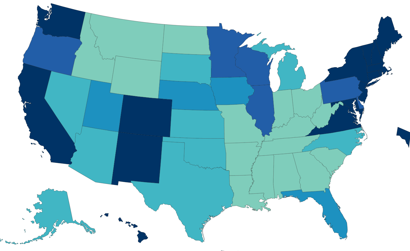
Many states have legislatures and governors from the same party and voted for this party in both the 2016 and 2020 presidential elections. These states have adopted quite different Covid management strategies. There are 14 solidly Democratic states and 21 solidly Republican states, leaving 15 states with some level of “mixed” political control and influence.
Democratic states average 80%, Republican states 66% and Mixed states 73%. The national average is 72%. Nevada (69%) is the only Blue state below 75%. Alabama, Wyoming and Mississippi have the lowest scores for the GOP at 59-60%. Florida has the highest rate at 75%. The split in world views is confirmed by this measure. The mixed group ranges from Louisiana and Georgia at 63% to Massachusetts (85%) and Vermont (86%).
The overall death rate for the country is 256. The mixed states are similar at 265. The Democratic states average 221 deaths per 100K people. The Republican states average 282 deaths per 100K people. If the Republican states had the same rate as the Democratic states, they would have 59 fewer deaths per 100K people, for a cumulative total of 70,000. Economists use $10M as the value of a life in many cost-benefit calculations, so one measure of the difference is $700B.
California (196) and New York (227) drive the lower D result, but the Dems include higher fatality states such as Rhode Island (305) and New Jersey (344). The mixed states include some relatively high death rates in Michigan (315), Louisiana (329) and Arizona (350). The Republican group includes 3 states below the D average in Utah, Alaska and Nebraska, but 7 states at 300 or higher: Oklahoma, Indiana, West Virginia, Arkansas, Tennessee, Alabama and Mississippi.
Nonfarm Employment Recovery: Nov 2021 vs. Feb 2020
Overall employment is within 2% of the February, 2020 peak for the country as a whole. The “mixed” states have recovered to within 2.3% of the peak. The Democratic states are only at 96.4% of the peak, while the Republican states, on average, are just below breakeven at 99.9%. If the D states had the same level of recovery, there would be 1.8M jobs added in the recovery to date. At the recent median $1,000 per week wage, this would generate $94 billion of income annually.
I used the Feb 2015 to Feb 2020 period to generate a pre-Covid trend growth rate. This was 6.4% for the country, 5.4% for the mixed states, 7.0% for the D states and 6.7% for the R states. This indicates that the Republican faster recovery is not due to prior momentum. I used the 2020/2015 growth rate to create a solid estimate of the 2021/2020 recovery rate for each state (r = 0.63). It confirmed the 3%+ gap between the 2 parties was not due to prior trends. I also checked the percentage of 2019 employment in the leisure and hospitality sector, to see if this was driving the difference, but it did not have a material effect.
US GDP/Capita remains the world leader among large countries in 2018. I’ve extracted comparison data for a dozen representative countries covering the period of 1900 through 2018.
Kuwait/Qatar/Brunei, Singapore/Hong Kong and Iceland/Norway/Luxembourg have higher GDP/Person. For reference, Saudi Arabia is just below the US, while other potential key comparison countries are much lower: South Korea ($39), Russia ($26) and China ($17).
Taking the long view (120 years), this above (table) set of countries grew their real (inflation adjusted) GDP per person 9-fold, from just $4,000 to $36,000. The US increased 7-fold, from an $8,000 initial position (twice as high) to $55,000 (still 60% higher).
Sweden (14x), Brazil (16x) and Japan (18x) lead the way in century long growth. Argentina (4x) and the UK (5x) were the only countries with slower percentage growth than the US. The US was the world-leader in 1900, providing an advantage for generating growth dollars and a governor on generating percentage growth. The history of the twentieth century was one of less developed countries using technology transfer and increased trade to “catch up” with the historic leaders.
Prior to WW II, most countries grew by the average 60%. Germany and Brazil grew a little faster (80%). Japan and Sweden grew much faster (130%).
Growth from 1960 until 2018 averaged a remarkable 240%! Japan grew 5-fold, leading the way for the “Asian Tigers”. Brazil, Hungary and Germany grew 4-fold. The UK continued its subpar performance (180%), despite the alleged Thatcher revolution and Argentina fell even further behind (110%). US growth was a little slower than average (210%) in the last 60 years, from a starting base of $18,000 versus the average of $10,000 (80% higher).
On a percentage basis, the US growth in output per person was slower than average. On a dollars basis, it remained the market leader overall and added more value than all other countries.
For the whole 120 year period, the US added $47,000 to its GDP/person, growing from $8,000 to $55,000. Australia (43), Germany (41), Sweden (41) and Canada (40) were solid competitors. Japan, France, UK and Italy added more than $30,000 per person. Hungary, Argentina, Mexico and Brazil lagged, adding just $10-20,000.
In the last 60 years, the US added $37,000 to $GDP/capita, tripling its $18,000 base. Australia (36), Germany (34), Sweden (31), Canada (31) and Japan (32) were close competitors. France, UK, Italy and Hungary added $20-27,000. Argentina, Mexico and Brazil grew more slowly ($10-12,000).
Per Capita GDP as % of USA
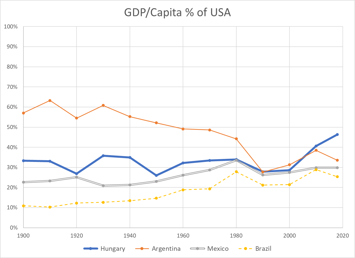
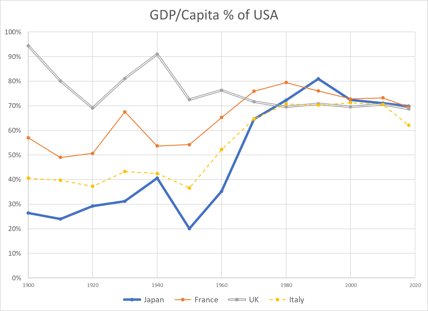
Another way to place the US performance in perspective is to use it as the baseline and plot other countries’ per capita GDP as a percentage of the US level.
There are different ways to compare GDP across countries. There is not a full consensus among economists. I’m using data from the Maddison Project Database. The data shown on the Worldometer website uses a different method, but the basic results are comparable.
First, we see that the US has had the highest $GDP/capita throughout the 120 year period. In 1900, the US was at $8,000 and second place UK was at $7,600, beginning its long relative decline from being THE imperial power to a mid-level (nuclear armed) European country. In 2018, the US produces $55,000 per person versus second place Australia at $50,000 and third place Germany at $46,000. Adjacent Canada generates 20% less value at $45,000. Formerly high-flying Japan now rests at $39,000 per person.
Argentina is an outlier, dropping from 60% to just 35% of US income per person for various political, financial, economic and trade reasons. Hungary is representative of smaller eastern European nations that remained at just 35% of US levels until the fall of the Berlin wall and subsequent integration into the European economy, allowing them to grow towards 50% of the US level. Mexico has slowly grown from 20% to 30% of the US level, but not been able to accelerate further. Brazil has grown from just 10% to nearly 30% of the US level, with significant volatility.
The UK fell from 90% to 70% of the US value added per citizen level by 1970, where it has remained. France weathered the 2 world wars at 55% of the US income level. It recovered nicely to 75% by 1970, peaked near 80% and then drifted back to 70% with its 4-day work weeks. Italy remained at just 40% of the US level through the war years. It grew remarkably to 70% of the US level by 1970, where it remained, before falling back somewhat in the last decade. Japan also struggled through the war years, averaging 30% of the US level. It rocketed to 80% of the US level by 1990, riding total quality management, manufacturing, peacetime and expanded trade. It has dropped back to 70% of the US level.
Australia level pegged the US at 80% for much of the period, until the China lead commodities demand boom pulled it up to 90% recently. Canada grew from a rural, thinly populated, commodities-oriented country at 60% of the US up to 80% by 1970 and has remained in the low 80 percents since then. Germany began the century at 60% of the US level. Following two failed wars, it attained 70% of the US level by 1960. Digesting East Germany was a challenge, but Germany was at 75% of US levels in the early 2000’s and exceeded 80% soon thereafter, riding its manufacturing export capabilities.
Summary
US $GDP/Capita continues to lead the world, as it has done for more than a century. The US percentage growth rate has slowed, but the incremental value added has remained first among large countries. Some other countries have shown periods of relatively strong growth, but none has demonstrated an ability to challenge the US. A number of European countries have found a “mixed” market approach that is competitive with the US, leveraging lower trade barriers within the EU and across the world.
China Postscript
China $GDP/capita (000’s) numbers for 1950 through 2018 are 0.8, 1.1, 1.4, 1.9, 3.0, 4.7, 9.7 and 13.1. Low scoring Argentina (19), Mexico (16) and Brazil (14) each have higher productivity per person. China per capita GROWTH per decade figures are 0.3, 0.3, 0.5, 1.1, 1.6, 5.0, and 3.4 (thousands). The percentage figures are very impressive. Considering China’s 1.4 billion population, they are very impressive. Comparable US decade growth (thousands/person) figures are 3, 6, 5, 7, 9, 3 and 6.
The US has a century-long track record of generating an extra $5,000 per person of value-added output each decade. China has leveraged its low-wage labor, a young work force, manufacturing technology transfer, willing investors, willing importers and an international free trade system to drive its growth. The country has maintained political stability and invested in its economic infrastructure, using economic progress and some level of economic freedom to offset the risks of its political and social restrictions. It faces a flat population and shrinking working-age population before it transitions its remaining rural work force into the manufacturing or urban environment.
It is facing what economists call the “middle income trap”, where countries with rapid economic growth based upon manufacturing or resource extraction need to transition a large part of their economy to higher value-added services and advanced manufacturing. Many countries have failed to make this transition. Some have done so.
I’ve worked closely with Chinese electronics firms for more than 25 years. Their capabilities are much greater than what is recorded in the US media. They have solid manufacturing capabilities, including Japanese-style process improvement. They have very strong sales, marketing and account management capabilities, focused on their global business-to-business customers. They have strong product development engineering capabilities and growing project management skills. They have modern MBA management skills and business styles. Their “clusters” of manufacturing, parts, R&D, resources and logistics skills point to long-term competitive advantages in many industries.
I believe that China will continue to be a manufacturing powerhouse, despite trade restrictions. China is well positioned to deliver products to growing markets in Asia, Africa, the Middle East and Latin America.
That being said, I am not concerned that China will eclipse the US in total productivity per citizen in the next 50 years. The gap is simply too large. In 50 years, the US will very conservatively grow from $55,000 to $80,000 of output per person (8%/decade). Mathematically, this requires 3.7% growth in China each year for 50 years, or 44% growth per decade compounded to reach 6.2 times the current level. The historical data contains 1 or 2 decades of 40% growth for some exceptional countries, but not 8 (3 in the bank, plus 5 in the future). If China can grow by 6% annually for one decade (79%) and 5% annually for the next decade (63%), it COULD then grow by just 2.5% annually (28%/decade) to catch the US in 2070.
China has 1.4 billion people versus 330 million in the US. Even including Canada and Mexico, the North American population is just 0.5 million. Europe has roughly 750 million people. Japan, South Korea, Australia and New Zealand have just over 200 million people. Indian has 1.4 billion people, Africa 1.2 billion and Latin America 0.7 billion. China will be a growing world economic and military power, even with its population peaking in 2025-30. The US should consider China to be its primary global rival, perhaps with less “us versus them” posturing. China aims to protect its economic, political and military interests, never again to be dominated and humiliated by outsiders. But, China truly considers itself to be the “center of the universe” and has no “need” to dominate the rest of the world or export its ideology. There are low confrontation options available.
Real (inflation adjusted) Gross Domestic Product (GDP), the value of all goods and services produced in the US reached $20.8 trillion in 2020, compared with only $0.7 trillion in 1900. This is a nearly 30-fold growth across 120 years.
Year
Real $GDP (T)
Added $GDP
Percent
1900
0.7
1910
1.0
0.3
46%
1920
1.3
0.3
21%
1930
1.5
0.3
22%
1940
1.8
0.3
20%
1950
2.7
0.8
45%
1960
3.7
1.1
41%
1970
5.6
1.9
50%
1980
7.8
2.1
38%
1990
10.6
2.9
37%
2000
14.9
4.3
40%
2010
17.6
2.7
18%
2020
20.8
3.2
18%
It’s difficult to “digest” 20.8 trillion dollars. But, it is true that the US economy in 2020 was ten (10) times as large as it was in 1952, well into the post-war economic boom period. The population had more than doubled and the productivity of the economy had increased more than three-fold across this period.
The economy is 3 times as large as it was in 1975, when it was entering a challenging period of stagflation, foreign competition, high interest rates, energy shortages, environmental concerns and divided politics.
The economy is twice as large (in real terms) as it was in 1990.
The economy grew by an average of 42% per decade from 1940 through 2000. The last two decades have grown by 18% each, similar to the growth from 1910 through 1940.
However, the amount of growth, measured in real dollars, has continued at a very strong pace. The economy averaged growth of $2.8 trillion per decade from 1970 through 2020. That is roughly the size of the whole economy in 1950! The latest decade recorded a $3.2 trillion increase, larger than the output of the whole economy in 1950, and the second largest growth ever.
US Population
Year
Population (M)
Added (M)
Percent
1900
76
1910
92
16
21%
1920
106
14
15%
1930
123
17
16%
1940
132
9
7%
1950
151
19
14%
1960
179
28
19%
1970
203
24
13%
1980
227
23
12%
1990
249
22
10%
2000
281
33
13%
2010
309
27
10%
2020
331
23
7%
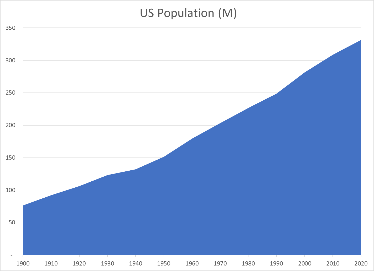
The US population has increased by 4.3 times since 1900, from 76 to 331 million people.
The population doubled from 1900 to 1950 and then doubled again since 1955.
The US added an average of 25 million new residents per decade from 1940 to 2020 (12%).
In the last 30 years, the US has added 85 million residents; the same number as its total population in 1905!
Despite many challenges in the last century, the US population has grown consistently and significantly.
Real $GDP Per Capita
Year
Real $GDP/Capita
$ Added
Percent
1900
9,300
1910
11,200
1,900
20%
1920
11,800
600
5%
1930
12,400
600
5%
1940
13,900
1,500
12%
1950
17,600
3,700
27%
1960
20,900
3,300
19%
1970
27,700
6,800
33%
1980
34,300
6,600
24%
1990
42,800
8,500
25%
2000
53,100
10,300
24%
2010
57,100
4,000
8%
2020
62,700
5,600
10%
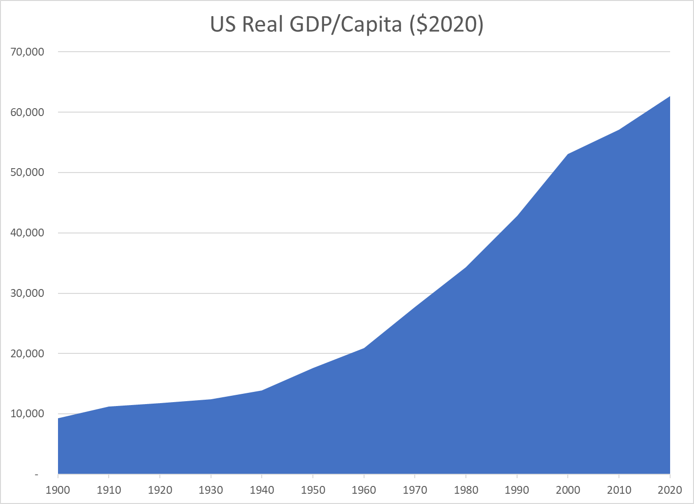
Real (inflation-adjusted) output per person has grown 6.7 times since 1900!
It has doubled since 1975, tripled since 1960 and quadrupled since 1945. Yes, today’s economy produces four times as much, per person, as the supercharged Word War II winning “arsenal of democracy”. It produces twice as much per person as the 1975 economy which then appeared to plateau in the face of Japanese import competition.
From 1960 through 2020, the economy has added an average of $7,000 more output per American for each decade.
While improved output/productivity in the last 2 decades has not matched that of 1960-2000, it still added $9,600 of output per resident, more than the total output per resident in 1900. In the last 3 decades combined, the economy has added nearly $20,000 of output/income per person, an amount equal to the total output/income per person in the late 1950’s.
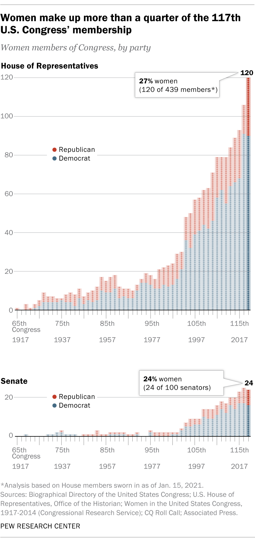
27% in the House and 24% in the Senate.. Consistent increases, especially since the large increase in 1992. Democrats have more than twice as many women representatives, at 38% versus 14% for Republicans.
Women hold 31% of the seats in state legislatures. This number was flat at 25% from 2009 through 2018 before increasing to 29% in 2019. Two-thirds of these reps were Democrats. States that lean Democratic have significantly more women representatives. Only one state, Nevada, has a majority of female legislators.
The Pew Research Organization tracks several other measures of female participation in leadership positions. Biden’s cabinet has a record 48% female proportion. 7% of Fortune 500 CEOs are women. 27% of corporate board seats are now held by women. 31% of college presidencies are held by women.
In general, the growth in participation by women in these public and private leadership positions has been relatively consistent for the last 25 years. Additional progress appears highly likely during the next 25 years.
Politico takes a more negative view of progress, highlighting the continuing inequality, weak progress in some states and stalled progress by some measures. It provides helpful state level data.
The overall US labor force participation rate is the ratio of those employed plus those actively looking for work among the non-institutional (military, prison, etc.) working age (16-64) population. It rose a quite substantial 8 points, from 59% in 1950 to 67% in 1990, mainly due to increased female participation rates. It remained in the 66-67% range through 2007, before declining by 5% in the last 14 years, a quite rapid decline. Note that the years selected are the ends of business cycle expansions plus the current year.
The overall rate mirrors the White rate as White’s make up the largest share of the population and because other racial participation rates are similar to the White rate. Black labor force participation has followed the White pattern, but been 2-3% lower than the White rate for most periods. The Hispanic rate started just below the White rate, but exceeded it by 1990, growing to a 3% advantage in 2021 at 65% versus 62%. The Asian participation rate has matched the White rate, sometimes being 1% higher.
The decline in the White share of the US population, especially in new births and school age children has been highly publicized and politicized for 40 years. The White share of the population has fallen from 5/6ths to just 3/5ths since 1950. African-American share grew by 2% in the 50’s and 60’s before settling at 12%. The Hispanic population has grown rapidly, from just 2% to 19%, passing the Black share by 2001. The broadly defined Asian population has grown from less than 1% to 6%. This breakdown does not include multi-race categories, which now amount to 3%. For labor force participation purposes, racial composition plays a minor role in the total rate.
Male participation in the labor force has fallen by 20 percentage points, from 87% to 67%. The increase in the 65+ age group from less than 4% to almost 8% of the total population accounts for more than 4% of this 20% decline, but 3/4ths or more is due to other factors. Female participation rates, working against this same 4% reduction due to the mix of older residents, grew from just 33% to a peak of 60% in 2001 before declining by 4%, about half of the male decline from 2001 to 2021. The expansion of opportunities for women and their choices to pursue the opportunities in the US is well understood. The increased share of aged 65+ women accounts for almost 3% of the 4% female decline. The reduction in male labor force participation is the big story.
Women, aged 55+ averaged just 22% participation through 1990. Most of the increased labor force participation in these 40 years was among younger women. More than one-third (35%) of women aged 55+ are now active labor market participants.
Their male counterparts in this age bracket show a 21 point decline, mirroring the overall male decline, but starting at the lower rate of 67% and ending at 46%. There is a mix variance here, as 55-64 year olds made up 4% of the population in the first 50 years, but now account for 6%, while the 65+ age group started at 4% for the first 25 years and then grew to 8%, so the share of 65+ citizens out of the 55+ total has risen from 45% to 56%. The mix variance accounts for a 5% decline in the participation rate, but the other 16% is due to other factors.
Demographers refer to the 25-54 year age group as the prime labor force. Here, we see women double their participation rate from 1950 (39%) to 2001 (77%) before falling off a bit to 74%.
For prime age men, we see a 9% point drop, from a near universal participation rate (97%) in 1950-60 down to 88% by 2018.
The White women data follows the total. A majority of Black women were labor force participants in 1970, 10 points higher than White women. They increased their labor force participation by 14 points, to a peak of 65% in 2001, before falling back by 5 points to 60% in 2021. This generally matches the pattern of White women, except that Black women have averaged an extra 4 participation points. Hispanic women started between the other two groups, at 45% in 1970 and then climbing to 60% in 2001. Their participation has remained close to 60%. Overall, relatively minor racial differences in female participation. About a 25 point increase in the second half of the 20th century followed by a 2 point decline in the last 20 years.
White men make up the largest share of the male total, so their data is close to the total, declining by 18 points, from 88% to 70%: from 7 out of 8 in the labor force to just 7 in 10. Black men follow the same Total pattern, but are consistently 4% less active in the labor market versus White men. Hispanic men first appear in the data in 1970, with an 85% participation rate, just above the 83% White male rate. However, Hispanic males stay at this level through 2007, while the White rate falls by 7%. In the last 14 years, the Hispanic male participation rate has dropped by the same 5% as the White and Black male rates, ending at 79%, 9 points above the 70% White rate.
Let’s start with the prime age labor force (25-54). From 1950 to 2001, we see a 19 point increase, from 65% to 84%. This is all due to the increase in female participation, which more than offset the significant decline in male participation. In total, from an economic point of view, this is great news. The total participation rate has slipped back a bit, from 84% to 81% in the last 2 decades, with men and women both falling back, but men falling faster. Aside from the distortion of the baby boom when it declined to 46%, the prime age group has typically been about 52-53% of the population. It has fallen by 1% in the last decade as the growth in older population groups has been faster than the decline in the childhood group.
The non-working age 0-15 year old childhood group reached a full 31% of the population total in 1960 and has since fallen to 19%. From an economic point of view, this too is good news, as the dependency ratio of non-workers to workers declines.
The teenager participation averaged 46% from 1950-1970. It averaged 55% in the mid-70’s to mid-90’s, but has quickly declined to just 34% in recent years. As teenagers make up 11% of the working age population, this drives a 2% decrease in the overall workforce participation rate. From an economic point of view, it is possible that the other activities of teens today are more valuable in creating human capital than the part-time entry level work that many more were performing in the 1970’s-90’s.
The labor force participation for young 20’s rose quickly from 64% to 77% by 1979 with increased participation by young women in the economy. The rate has declined to 70%. As this group accounts for 11% of the work age population, this has driven a nearly 1% point decrease in the overall work age participation rate.
The 55-64 year old group has a different pattern, averaging 61% in the 1950’s to 1970’s, decreasing 5 points to 56% in the mid-70’s through mid 90’s, before growing all the way back to 65% recently. The increased female participation rate did not impact this group significantly. During the 1975-95 time, more men took advantage of early retirement possibilities, some forced and some voluntary. This group increased from 9% to 12% of the total population. The 9 point participation rate increase since 1990 adds about one and one-half points to the overall participation rate, offsetting some of the 16-25 year old reduction.
The 65+ group pattern is similar to the 55-64 year olds, starting above 20%, falling down to 11% and returning to 20%. Economically, this recovery adds to the nation’s output, even if this group is not considered part of the work age population. This group has more than doubled as a share of the total population, reaching 15%.
With men and women combined, the total participation rate drops 5 points, from 67% in 2001 to 62% in 2021. The prime age group accounts for one-half of the working age population and shows a 3 point decline from 84% to 81%, with a one and one-half percent negative impact on the total rate. The significant declines in the 16-25 age group drives the rest of the 5 point decrease.
Data on labor force participation by educational attainment for ages 25-64 is available for 1970 through 2018. During this nearly 50 year period, the total participation rate increased from 70% to 79%, with a peak of 81% in 2001. Recall that the official total participation rate included the 16-24 year age brackets where participation fell significantly. We have only a 2 point decline from 2001 to 2018 rather than 5 points.
The big take-away is that participation rates for each group don’t change much through time. Those who didn’t complete high school average 61% pretty consistently. There are changes in the male and female participation rates and racial composition rippling through the data, but on average 3 of 5 people without a high school diploma participate in the labor market.
High school graduates average 76%, with a 3 point decline to 73% for 2018.
Individuals with some college classes have averaged 82% participation, except in 1970 when it was only 74%.
Those holding a college degree have averaged 86% participation, except in 1970 when they averaged 82%.
The proportion of citizens in each group has changed dramatically. Less than high school graduates dropped from 45% to just 10% of the post college working age population. College degree holders increased from11% to 35%. College attendees grew from 10% to 26%. High school grads started at 33%, increased to 38% and then declined to 29%. In total, the country shifted one-third of the population from non-high school education to college degree holders (BA and AA).
Given the consistency of labor force participation by level of educational attainment, the overall increase from 70% to 79% makes sense. Applying “typical” participation rates to each group (61.8, 74.5, 80.5, 85.7) produces an estimated participation rate for each year: 70, 73, 74, 77, 78 and 79. The 1990 and 2001 years stand out as having significantly higher actual than estimated labor force participation rates (+5 and +4). Perhaps some of the decrease in various rates since 1990 is due to there being an unusually high participation rate during this period as the economy expanded for relatively long periods with relatively mild recessions.
The prime age category is more than one-half of the labor force and contains individuals with the greatest earning power. Most attention has been focused on the 3 point drop from 2001 to 2021. It is also important to note the 19 point increase from 1950. We have data for men and women in this age group. Female participation essentially doubled from 1950 to 2001, before flattening out (down 2 points).
The male participation rate declines throughout the 70 year period, not just in the last 20 years. It falls from near universal 97% to 88%, meaning that 1 in 8 prime age males is not in the work force. As usually, the White rate matches the Total rate. Hispanic men have seen a 5 point decline from 1970-2018 while Whites fell 8 points. Hispanic men in 2018 had a higher participation rate than Whites. Black men started 7 points behind Whites at 90% and declined by an even larger 11% to just 79%. Whatever factors are driving prime age White men out of the labor force appear to be negatively impacting Hispanics and Blacks as well.
The overall participation rate for work age individuals (16-64) increased from 59% in 1950 to 67% in 1990 and has since dropped to 62%. The prime age group (25-54) increased from 65% to 84% before sliding back to 81%. For various age groups, the female participation rate doubled from mid 30 percent to high 60 percent range between 1950 and 2000 before slipping back a little. This drove the overall participation increase through 2001. The male participation rate for ages 16+ fell from 87% to 67% between 1950 and 2021. The prime age male (25-54%) rate dropped from 97% to 88%. Similar declines were seen for all races. The Obama white paper above (CEA) provides relevant details. The IBD article below is a good summary of this situation.
The good news is that infant mortality rates (deaths/1,000 live births in 1st year) declined by 80% between 1950 and 2000, from 35 to just 7 and have declined an additional 14% to a little less than 6 by 2018.
The main CDC page highlights the 5 main causes of death, the significant state differences (higher rates in the south central states, Ohio and WV, and differences by race. Black infant mortality rates (IMR) remain more than twice as high as non-Hispanic Whites. Asians have lower rates than Whites. Hispanic White infant mortality rates are “close” to the White rates.
The Petersen-KFF website provides clear summaries of the main dimensions of this public health area. About 2/3rds of deaths occur in the first month and are termed neonatal. The remainder in the first year of life are termed postnatal. Both neonatal and postnatal death rates have declined in the last 20 years.
Petersen provides more details on state level death rates, showing that the Great Lakes states have high rates similar to the southern states (7), while much of the country has much lower rates (5).
Births for mothers under 20 show death rates almost twice as high as those in their twenties and thirties.
Ten factors account for two-thirds of deaths, lead by congenital defects and early delivery/low birth weight which account for one-third.
The US mortality rate (5.8) is 75% higher than other countries with similar income levels (3.5). The world-class results in Japan and Finland come in at 2. Details in the way the US reports its figures may account for one-third of the difference versus comparable countries. While the US rate has declined from 7 to 5.8 in the last 20 years, the comparable group reduced its rate from 4.6 to 3.3. Various sources propose that socioeconomic inequality, racial differences and health care system differences account for the US’s poor performance.
The US Health & Human Services website highlights black-white differences in birth weights, SIDS occurrence, early births/low birth rates and causes of death.
The statistical analyses to disentangle socioeconomic status and race are very complicated. Most show that socioeconomic status accounts for half of differences, but not nearly 100%. This study found that maternal education, maternal marital status and maternal age “explained” much of the racial differences. Of course, the authors then point to poverty and income differences as underlying factors.
Several more recent studies point to systematic racism working through a large number of lifetime events which impact the mother’s health as the primary cause of racial differences in infant mortality rates.
One study of Florida births indicated that having a black doctor reduced deaths by 40% for black infant births. White infant mortality was not effected by the race of the doctor.
In summary, great progress has been made since WW II and continues to be made in the US. However, the reduction in death rates has slowed down. The US death rates are much higher than in other higher income nations and death rates in Europe and Japan have declined faster than in the US. US state death rates range widely, from 4 to 8. Black death rates are twice as high as white death rates.
There remains room for significant progress. World class 2 deaths per 1,000 versus 4.7 for American whites, 11 for American blacks, 4.2 for Californians, 4.6 for New Yorkers, 6.1 for Illinoisans and Floridians, 7.2 for Buckeyes, Hoosiers and Georgians, more than 8 for Mississippians and Arkansans.
Life expectancy has dropped by more than one year. The recent COVID effect is overshadowing the role of “deaths of despair”: opioids, alcoholism and suicide.
The US life expectancy rate is much lower than countries at the same level of economic development. The US suffers from the negative impact of smoking, obesity, homicides, suicides, traffic fatalities, infant mortality and unequal health care access.
The difference in expected lifetimes by zip codes (income/wealth) has recently been highlighted, indicating a difference of as much as 30 years between the poorest and wealthiest locations.
US abortion rates have declined significantly for nearly 40 years. Reported abortions increased from near zero through 1967 to 1.5M in 1979 and a peak of 1.6M in 1990, before declining to one-third of that level by 2018. The abortion rate per 1,000 child-bearing women reached 16.3 in 1973 when the US Supreme Court issued its Roe vs. Wade ruling. The rate peaked at nearly twice as high in 1981 at 29.3. The rate fell back to the 1973 level by 2012 and has fallen 20% further in recent years to 13.5.
Indiana maintained its 11th place rank from 1920 through 1970.
Since 1970 it has fallen 6 places to just 17th.
Of the 9 “nearby” states, only Iowa, dropping 7 places performs worse at attracting and retaining citizens. Missouri, Wisconsin and West Virginia are essentially the same as Indiana, dropping 5 places each in this half century. Michigan and Kentucky slipped by 3 places. Illinois and Ohio, starting near the top at 5th and 6th place, declined just one place. Tennessee gained one place, from 17th to 16th, moving ahead of Indiana.
The economic recovery between 2007 and 2019 was one of the slowest after a recession. Average U.S. personal income grew by 2.0% overall. Indiana’s 4 way tie for 19th place at 1.9% is above the median state, even though it is slightly below the U.S. 2.0% average. 10 states grew by 2.4% annually or faster. 19 grew by 1.5% or less per year. Among the nearby states, Indiana was the second fastest grower, trailing only Tennessee at 2.2%. Iowa, Wisconsin, Ohio and Kentucky grew just a little less quickly, with 1.5-1.6% rates. Michigan (1.4%), Missouri (1.3%), West Virginia (1.1% and Illinois (1.0%) trailed significantly.
Indiana per capita income has trailed the national average throughout the last half century, starting at 91% of the national figure. Indiana gained a small amount in the first 30 years, reaching 92%. Indiana has slipped quite significantly to 86% in the last 20 years.
In the 20 years from 1998-2018, Indiana per capita GDP grew by an average level for the heartland, 19%, the same as Ohio, West Virginia and Tennessee. Kentucky, Missouri and Michigan grew by only 10-14%. Illinois, Wisconsin and Iowa grew by 24% or more, close to the national average.
During this time, Indiana dropped from a middling 27th rank to a lower 32nd rank. Ohio and Tennessee also dropped by 5 places. Kentucky dropped by 9, Michigan by 11 and Missouri by 15 places. Illinois and West Virginia slipped by 1 notch. Iowa and Wisconsin increased their rankings.
Over a slightly longer time period, 1984-2018, Indiana again slipped by a few places, from 30th to 34th place. Four states dropped by 8 or more places: Wisconsin, Ohio, Missouri and Michigan. Illinois and Kentucky maintained their relative positions. West Virginia, Tennessee and Iowa improved their rankings.
Indiana has been average or above average versus its “peer group” of 9 nearby states, but it has lost position versus the nation on all 5 measures. Personal income growth since 2007 is the best result, at 1.9% versus 2.0% national average. Indiana population has fallen 6 spots to 17th in 50 years. Per capita income versus the nation has slipped by 6% to just 86% of the average in 20 or 50 years. Per capita state GDP has dropped 5 places to 32nd place in 20 years. Median household income has fallen 4 places to 34th place in 34 years.
Indiana’s business friendly low tax/low service strategy has helped the state do better than its peers, but has not delivered above average growth by any measure.
In the 2020 elections, Democrats once again earned a smaller share of votes than expected. Republican candidates in national, state and local election outperformed. Candidate Trump registered 74M votes, 11M more votes than in 2016. Americans were voting for the “real Trump”, not just the imagined populist candidate Trump. He earned 47.0%, up from 46.4%. Biden registered 81M votes, 15M more than Hillary’s performance. The Democratic share increased from 48.5% to 51.3%. A presidential win, a narrow House win and a very narrow Senate win.
“How can this be?” questioned the Democratic party leaders and supporters. “Where is our landslide victory?”
There was a higher voting percentage, which usually helps Democrats.
There were more registered and voting minorities, which always helps Democrats.
There were more young voters and fewer older voters, which helps Democrats.
The “special” negatives of Hillary as a candidate could not effect the results.
America is becoming less religious and less evangelical, which helps Democratic results.
Voter surveys show 60% plus support for many leading Democratic policies.
Despite the 2010 “Citizens United” Supreme Court case that eliminated restrictions on campaign contributions, Democrats raised money as effectively as Republicans.
Obama was able to win convincingly in 2008 and 2012 as a moderate Democrat, increasing the number of independents who would consider voting for Democrats at all levels.
Democrats deliver results on social, environmental, international, military and economic issues.
Like all political parties, Democrats “know we are right”.
Setting aside the “policy content” of the 2020 election for this article, Republicans had their own advantages in these elections.
The “megatrend” in the US and west continues to lean toward conservative politicians since the Reagan/Thatcher switch. There is great momentum in voting.
The U.S. Senate and electoral college provide an advantage to Republican leading states, adding 2-4% to the pure voting totals.
Republicans captured a greater share of state legislatures in 2010 and took advantage of this position to gerrymander state and national districts in their favor. At the national level, this adds 1-2% to the Republican House team.
The Republican supporting media (Fox) and talking heads continue to be more effective than the Democrats who are still “catching up.” Republicans have effectively undercut the legitimacy of the “mainstream media” for many, causing them to abandon centrist platforms and consume only Republican supporting sources.
The Republican advantage in the public policy “think tank” arena continues. See the article aggregators at RealClearPolitics or RealClearMarkets for samples of “policy pieces”. Left-leaning contributors from the academy, unions, not-for-profits, entertainment industry and Democratic party publish fewer articles and generally restrict their content to research articles.
Republicans continue to have an advantage in painting Democrats as extremists, socialists, communists, radicals, anarchists, irresponsible, anti-American, soft on crime, atheists, secularists, relativists, opportunists, special interest supporters, pinkos, big spenders, etc.
While Democrats always considered themselves “the party of the big tent”, Ronald Reagan was able to erect a tent which welcomed various somewhat incompatible streams of “conservativism”: philosophical, main street, wall street, religious, social, economic, libertarian, traditional, military and American. Republicans have leveraged this advantage, cooperating on “conservative” policies and ignoring those with conflicts.
Republicans since Newt Gingrich have effectively defined a very polarized world view. Democrats are the enemy. Party discipline is paramount. Results matter most. Insufficiently conservative or loyal reps have been chased from the party. This means that all Republicans vote for all Republican candidates in the general election. Any Republican is better than any Democrat.
Far left, new left, progressive Democrats take a different stance. They support progressive policies and candidates. They are not sure that a moderate, center-left Democrat is “better” than a Republican. They may not vote, cast a write-in ballot, or choose the libertarian or the socialist option. This costs mainstream Democratic candidates 1-4% of the general election vote. In Europe, they would have a party to vote for and the coalition building stage of a parliamentary government would give them influence, from time to time.
Republicans continue to win the framing and communications wars, better positioning their policies and candidates. Pro-choice versus pro-life. American versus globalist. Free market versus government control. States rights versus central government. Regulations versus necessary limits. Common man versus elites. Balanced budget versus deficit spending! US versus UN.
In recent years, Republicans have started to shape election laws to favor turnout from their supporters and discourage turnout from their opponents. This did not appear to have a major impact on the 2020 results, but could do so in the future.
“politics ain’t beanbag”.
Republicans have very effectively managed their political resources and campaigns in recent years. The Democratic demographic trends are simply not enough to assure wins in the short-run.