Good News: Urban America is Growing Very Nicely

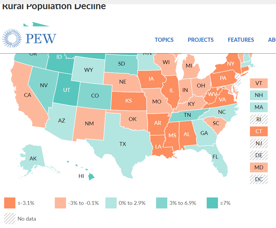
Rural America Grew Very Slowly in the 20th Century, Flattened and May Now be Declining
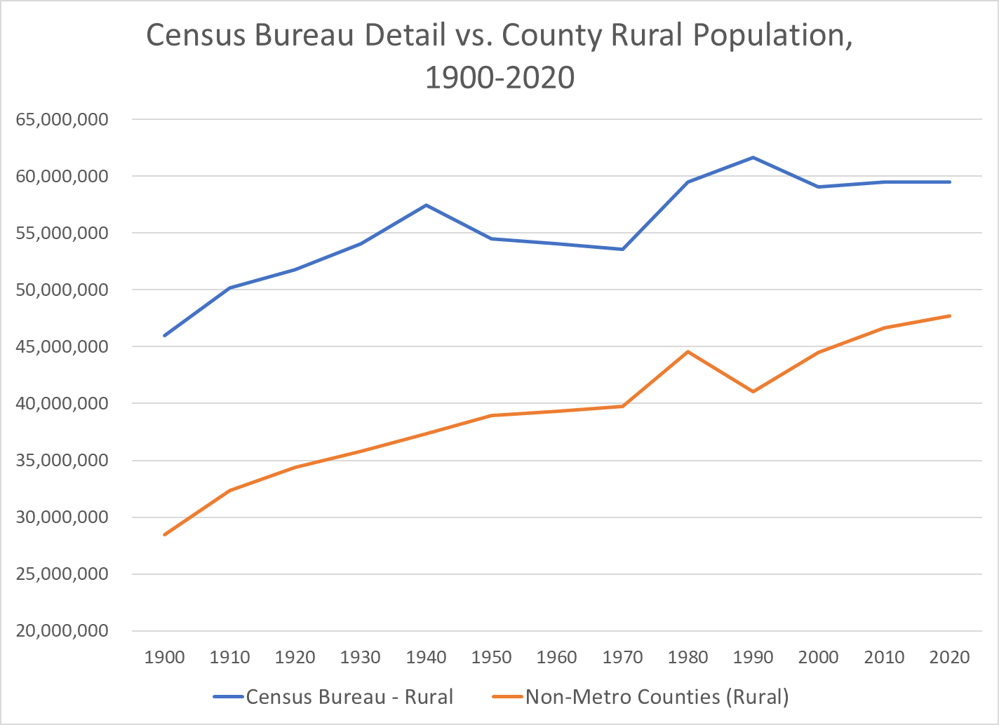
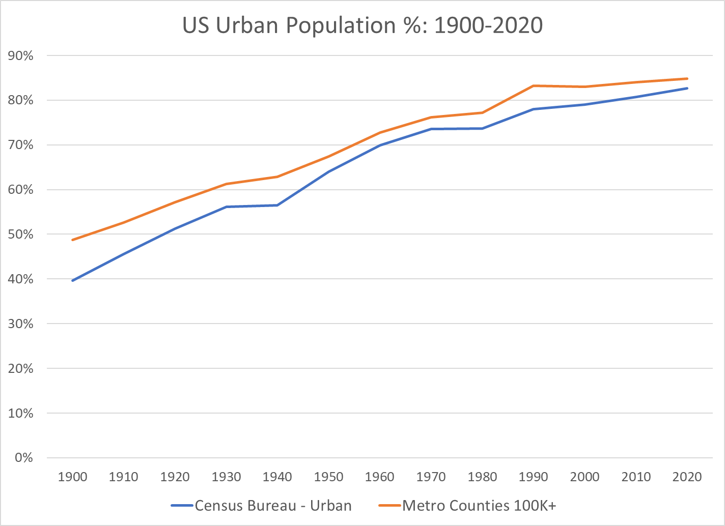
There are a variety of measures of “rural” US population. The Census Bureau has used local populations of 2,500+ to define urban. It focuses on population density and commuting to define urban counties that map to metropolitan (urban) areas. Other federal agencies use other definitions. Overall, the basic trends are clear.

https://www.hrsa.gov/rural-health/about-us/what-is-rural

The US Census Bureau’s detailed measure of “urban areas” essentially says that any area with 2,500+ people is an “urban” area. This clearly exaggerates the urban population, but this approach has been used for more than a century on a consistent basis, providing useful data. The 2020 measure of urban has been proposed using about 5,000 as the minimum for “urban”, but this definition has not been finalized.

I have focused on the Metropolitan Statistical Areas (MSA) as defined in 2020 and recreated their populations back to 1900 based upon the county to MSA maps.

The measure of “percent urban” based upon the metro areas with 100K+ population or 250K+ populations very closely tracks the US Census Bureau’s detailed definition of urban areas (and therefor rural areas).
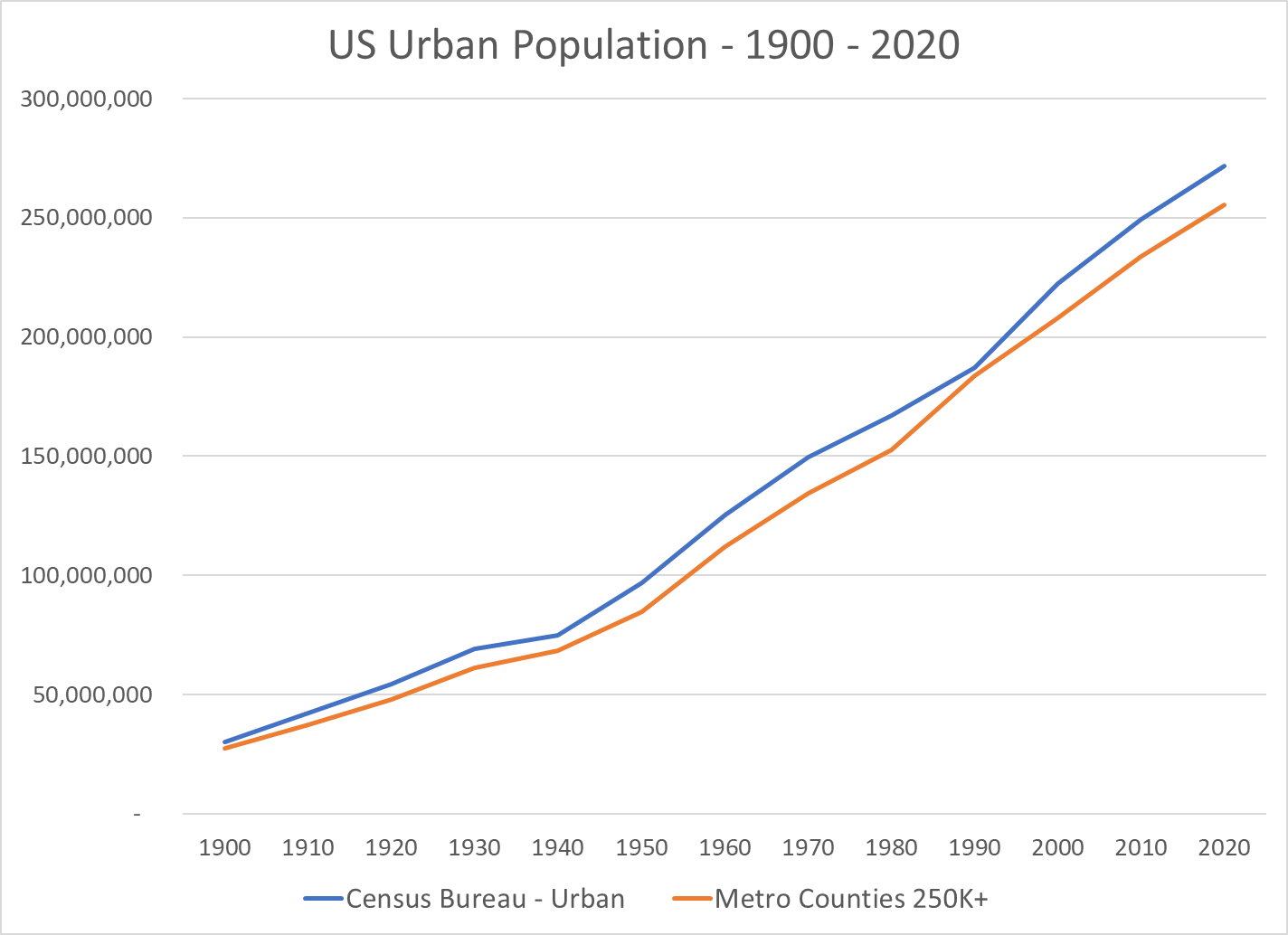
In summary, US urban population grew from 40% of the total in 1900 to 70% in 1970, about 3/7ths (0.42) of a percent more urban every year for 70 years. The move to “urban” continued in the next 50 years, but at a much slower rate, just 1/5th of a percent per year. But, this accumulates to move the urban percentage from 70% to 80%.

Growth of Very Large Metro Areas Has Driven the Growth in Urban Areas
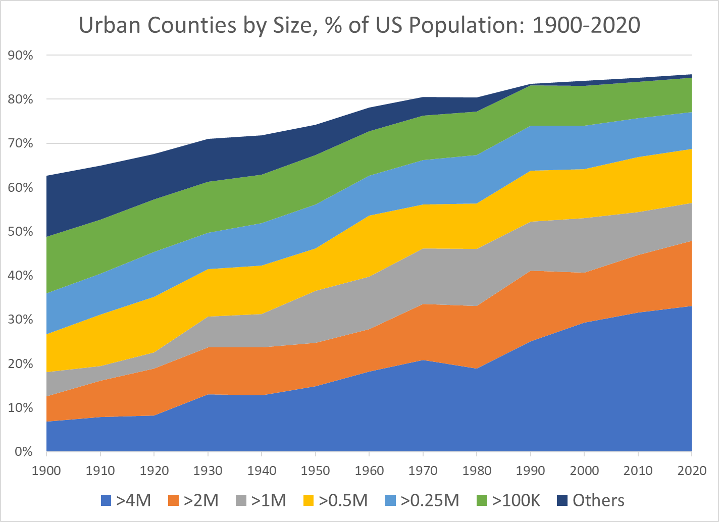
The 4M+ metro areas have grown the most. The 2M+ and 1M+ areas have also grown. The smaller metro areas have made a smaller contribution to the growth of “urban” America.

The 50th Largest US Metro Area’s Population Has Increased 5-Fold Between 1900 and 2020

The Number of US Metro Areas with 1M, 2M or 4M Populations Has Expanded for a Century

Decade Reaching 1 Million Population                    

1900 New York Chicago Philadelphia Boston Pittsburgh St. Louis
1910
1920 Detroit Cleveland
1930 Los Angeles San Francisco Mpls-St Paul Baltimore Cincinnati Providence
1940 Washington
1950 Dallas-Ft Worth Houston Atlanta Seattle
1950 Kansas City Milwaukee Buffalo
1960 San Diego Columbus, OH Indianapolis
1970 San Bernardino Phoenix Tampa-St. Pete Denver Portland, OR
1970 Charlotte San Jose Virginia Beach New Orleans Hartford
1980 Miami Sacramento San Antonio
1990 Orlando Nashville Memphis Rochester
2000 Austin Las Vegas Louisville Oklahoma City Richmond Jacksonville
2010 Birmingham Salt Lake City Raleigh
2020 Tulsa Fresno Tucson

Decade Reaching 2 Million Population                    

1900 New York Chicago Philadelphia
1910 Boston
1920 Pittsburgh
1930 Detroit Los Angeles
1940
1950 San Francisco
1960 St. Louis Cleveland
1970 Mpls-St Paul Baltimore Washington Dallas-Ft Worth Houston
1980 Atlanta Seattle
1990 San Diego San Bernardino Phoenix Tampa-St. Pete Miami
2000 Cincinnati Denver
2010 Kansas City Portland, OR Charlotte Sacramento San Antonio Orlando
2020 Columbus, OH Indianapolis Austin Las Vegas

Decade Reaching 4 Million Population            

1900 New York
1910
1920
1930 Chicago
1940
1950 Los Angeles
1960 Philadelphia
1970 Detroit
1980
1990 Boston Washington Dallas-Ft Worth Miami
2000 San Francisco Houston Atlanta
2010 San Bernardino Phoenix
2020 Seattle

The Rapid Growth of the Largest US Metro Areas Has Driven the Growth of the Total Population

The Tipping From Very Slow Rural Growth to Possible Decline Has Attracted Attention from Demographers and Political Commentators

https://www.census.gov/library/visualizations/2021/dec/percent-change-county-population.html
https://carsey.unh.edu/publication/rural-depopulation
https://www.pewtrusts.org/en/research-and-analysis/blogs/stateline/2021/08/10/shrinking-rural-america-faces-state-power-struggle
https://www.ers.usda.gov/data-products/charts-of-note/charts-of-note/?topicId=4e8a0642-e40d-4299-906e-906bbaaf9e4d

https://www.businessinsider.com/how-the-2020-election-revealed-divide-in-american-dream-2020-11

https://dailyyonder.com/rural-population-declines-slightly-over-last-decade-census-shows/2021/09/07/

https://www.richmondfed.org/publications/research/econ_focus/2020/q1/district_digest

Summary

The disproportionate growth of “urban” and very large urban metro areas has continued in the last 50 years. This has a tremendous impact on the lives and perspectives of those in relatively declining rural and growing urban areas.

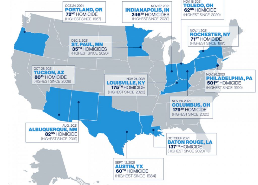
US Murder Rates Up in 2020-21

https://www.cnn.com/2021/12/12/us/homicides-major-cities-increase-end-of-year-2021/index.html

Above: Another Murder in Bridgeport Neighborhood of Chicago, My Home 2010-18

https://crime-data-explorer.app.cloud.gov/pages/explorer/crime/crime-trend

1985-95 8/100K. 1999-2008 5.5/100K. 2009-19 5/100K.

1966-2020 Context. 1970-95 Very High Rates.

https://www.pewresearch.org/fact-tank/2021/10/27/what-we-know-about-the-increase-in-u-s-murders-in-2020/

Twentieth Century Context: US Has High Homicide Rates

https://en.wikipedia.org/wiki/Crime_in_the_United_States#/media/File:Homicide_rates1900-2001.jpg
https://www.jrsa.org/projects/Historical.pdf

Relative Violent Crime Rates

https://usafacts.org/data/topics/security-safety/crime-and-justice/crime-and-police/violent-crimes/?utm_source=google&utm_medium=cpc&utm_campaign=ND-StatsData&gclid=Cj0KCQjw8_qRBhCXARIsAE2AtRYrdjEGFcHhSe1xpRQXCK59y0pe3Dkh9pOCg2WBHhO3fRPrXWDCz0QaAuqYEALw_wcB

Firearms Involved in Homicides and Suicides

https://usafacts.org/state-of-the-union/crime/

Homicide Rate Up 30% in 2020, 5% in 2021

https://www.pewresearch.org/fact-tank/2021/10/27/what-we-know-about-the-increase-in-u-s-murders-in-2020/

Focus on Rates Per 100K for US or All Cities, Not Counts in Individual Cities

https://abcnews.go.com/US/12-major-us-cities-top-annual-homicide-records/story?id=81466453

Many Factors Proposed to Explain the Increase

https://www.vox.com/2020/8/3/21334149/murders-crime-shootings-protests-riots-trump-biden

https://www.theatlantic.com/ideas/archive/2021/09/america-having-violence-wave-not-crime-wave/620234/

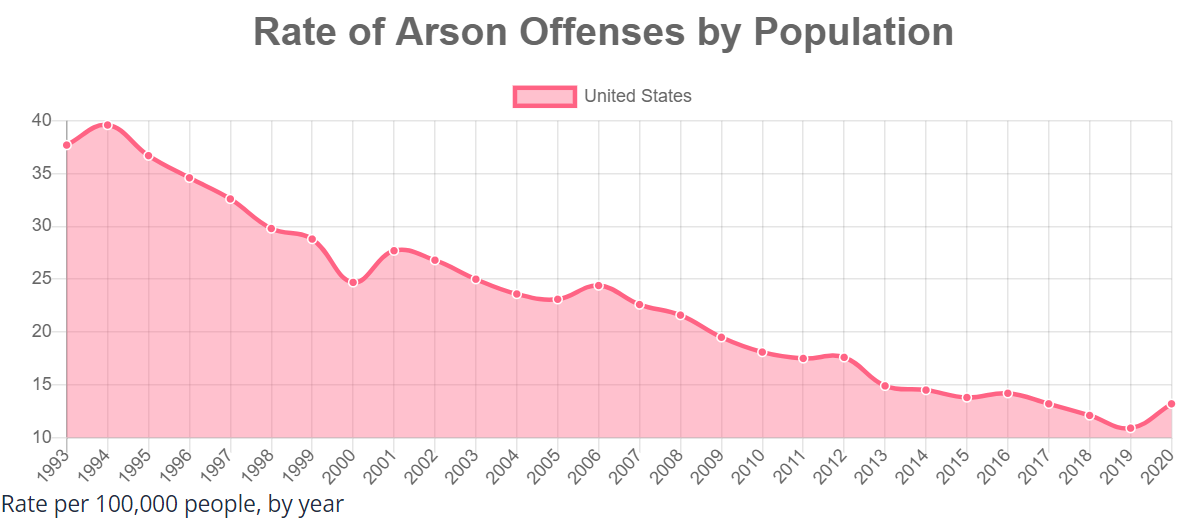
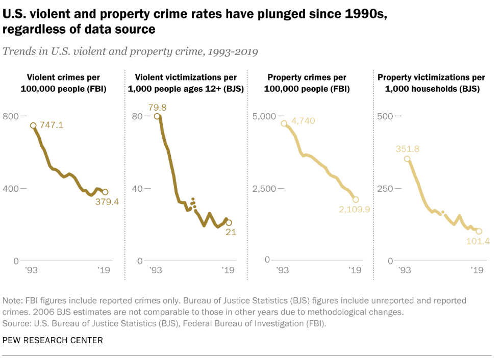
Good News: US Property Crime Rates Cut in Half Since 1998

https://crime-data-explorer.app.cloud.gov/pages/explorer/crime/crime-trend
https://ncvs.bjs.ojp.gov/multi-year-trends/crimeType

Property Crime Rates Were Very High 1975-90

https://www.factcheck.org/2020/06/trump-wrong-on-crime-record/

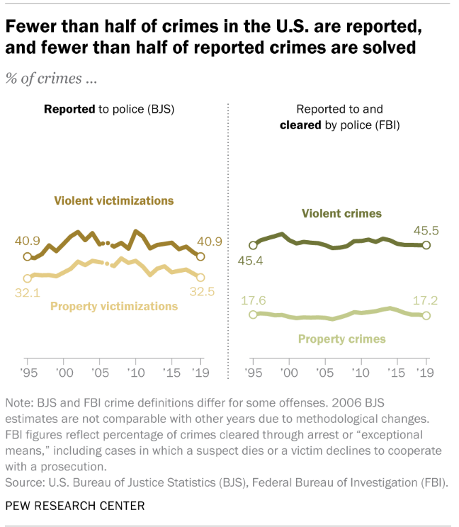
FBI and Bureau of Justice Data Both Show Declines, Reporting of Crimes Remains Consistent

https://www.pewresearch.org/fact-tank/2020/11/20/facts-about-crime-in-the-u-s/

Property Crime Rates Have Fallen Despite Changes

https://porch.com/advice/most-urbanized-states
https://www.pewresearch.org/social-trends/2018/05/22/demographic-and-economic-trends-in-urban-suburban-and-rural-communities/
https://www.pewresearch.org/fact-tank/2020/08/20/key-findings-about-u-s-immigrants/
https://www.pewresearch.org/fact-tank/2021/08/23/most-americans-say-the-declining-share-of-white-people-in-the-u-s-is-neither-good-nor-bad-for-society/
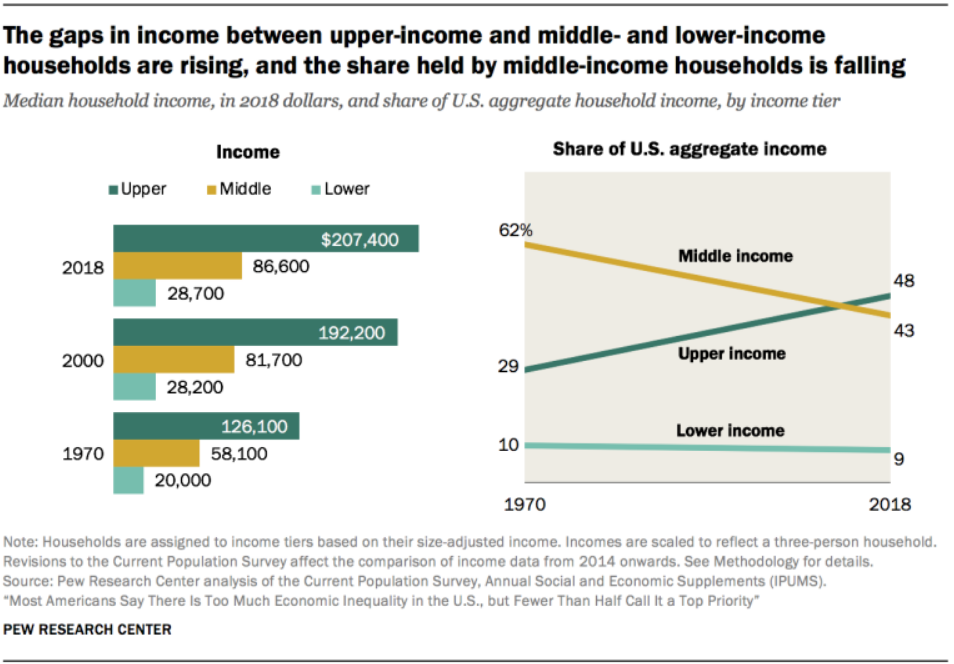
https://www.pewresearch.org/social-trends/2020/01/09/trends-in-income-and-wealth-inequality/
https://theconversation.com/gun-violence-has-fuelled-enduring-trust-issues-for-many-americans-144413
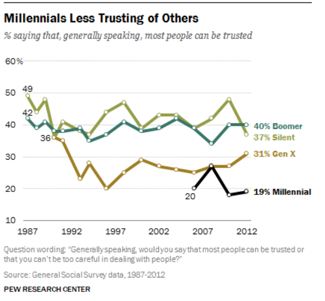
https://www.pewresearch.org/social-trends/2014/03/07/millennials-in-adulthood/
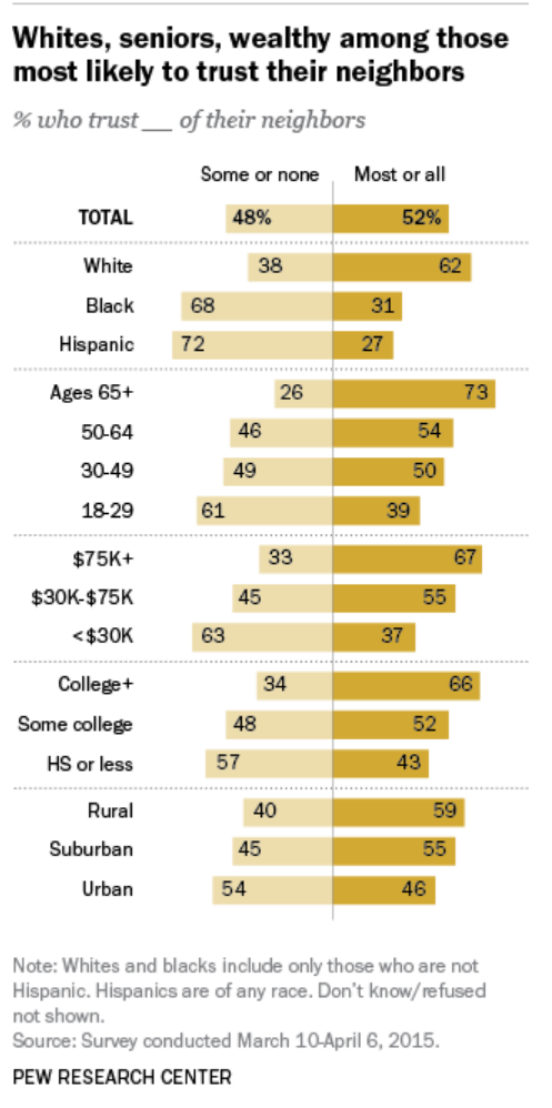
https://www.pewresearch.org/fact-tank/2016/04/13/americans-divided-on-how-much-they-trust-their-neighbors/

Indy Metro Area vs Rest of Indiana (1970-2020)

The Indy Metro Area is comprised of Marion County plus the 7 surrounding “donut” counties. Marion has grown throughout the half-century, adding 175,000 people (22%). Rural Morgan and Shelby counties have not grown much. Hancock, Boone and Johnson counties have doubled their populations. Hendricks has grown from 50,000 to 175,000. Hamilton has grown exponentially from 50,000 to 350,000. This relatively rapid growth has made the metro area grow from 21% to 28% of the state total, adding state senators and representatives and causing increasing tensions between the one large, growing area and the slower growing, largely rural, rest of the state. There are suburban Chicago, Louisville and Cincinnati counties that have shown decent percentage growth, but they are a small share of the state. Lake County (Gary) is a special case, declining in population decade after decade.
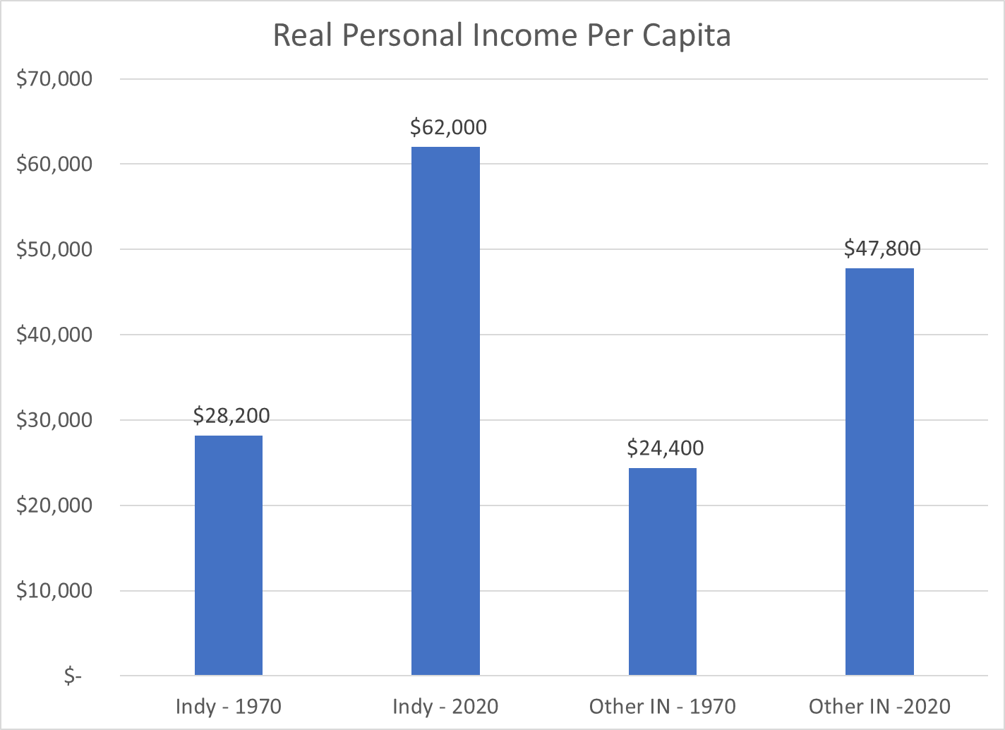
The Indy Metro counties started 1970 with slightly higher per capita personal incomes, so the share of the state total was 24%, a bit above the 21% population share. By 2020, the Indy Metro area had captured one-third of the state’s personal income (34%), much higher than its 28% share of the population. Per capita incomes and population had both grown in the capital region.

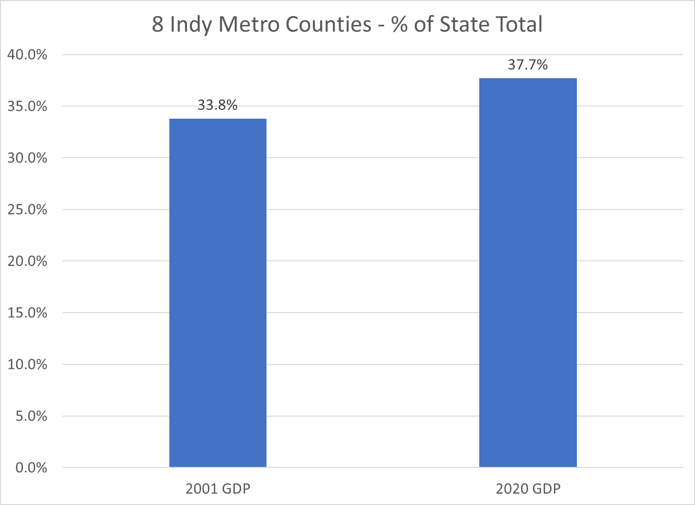
Gross Domestic Product, the value of goods and services produced in Metro Indy, was one-third of the state total in 2001, the first year of available statistics. This measure increased to 38% by 2020. Nearly 2 out of every 5 dollars of statewide value-added output was generated by the Indy Metro area in 2020.

Indiana is a mostly rural state with Indy, a dozen small cities, a cluster of northern Indiana manufacturing counties, Gary (Lake County), Ft. Wayne (Allen) and Evansville (Vanderburgh). The Indy Metro Region has 9 times the density of people, income and production as the most rural counties. For example, it takes the 67 lowest population counties to equal the 1.9 million people living in the Indy Metro area.

The Indianapolis Metro area grew by a respectable 72% during this period, above the national average of 63%. The other Indiana counties grew by only 19%, about one-fourth as fast.

The Indy Metro area added 900,000 people, the same growth as the rest of the state.

With population and per capita income gains, the Indy Metro area’s real personal income grew almost four-fold, while the rest of the state grew by roughly 150%.

Indy Metro per capita income was 15% above the rest of the state in 1970 and twice as high (30%) by 2020.

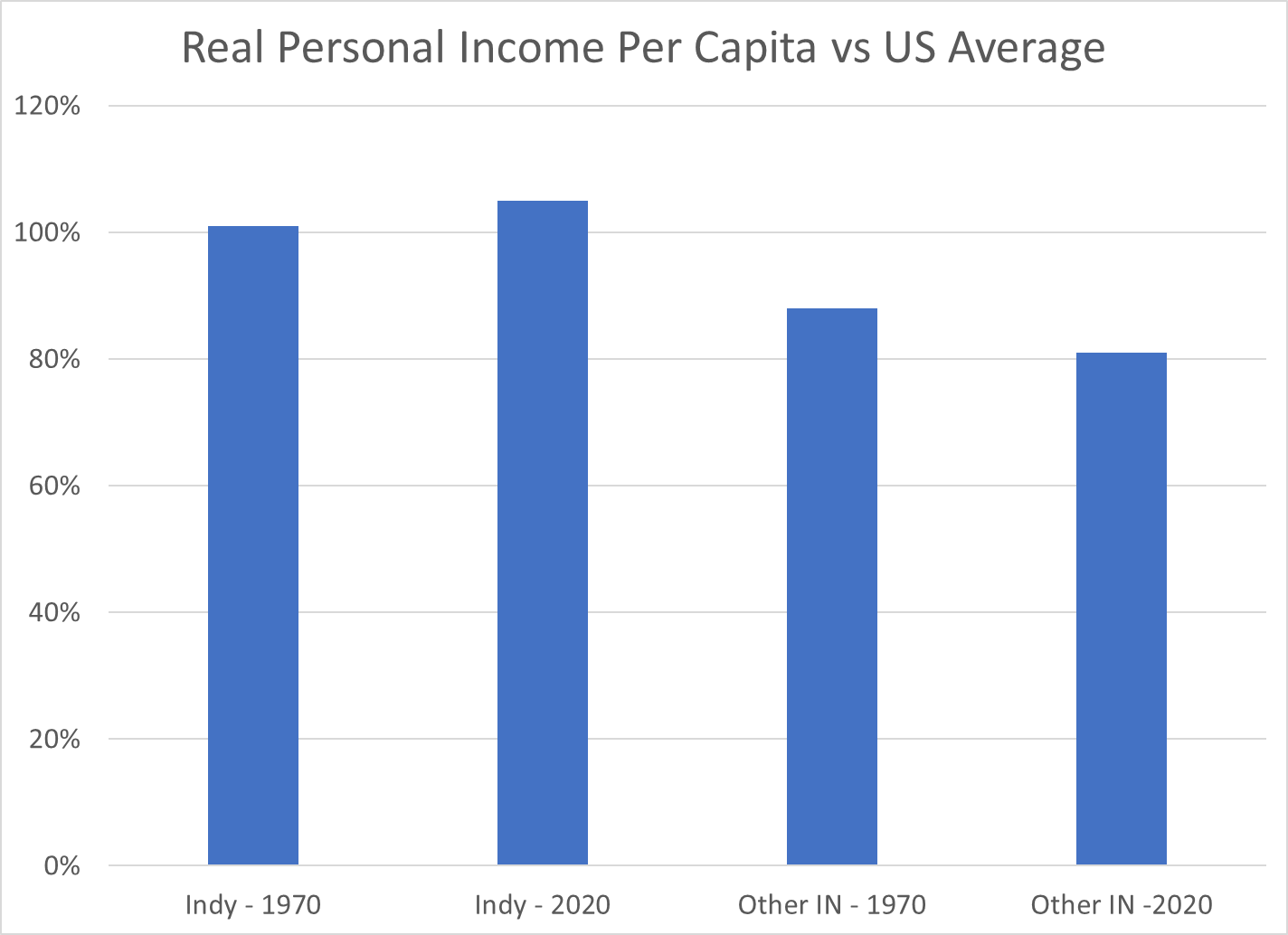
The Indy Metro area has improved its per capita income versus the US average by 4 points, from 101 to 105. The other-Indiana counties have declined from 88% to 81% of the national average.

While the per capita income in the Indy Metro area is 30% higher than the rest of the state, the value of goods and services produced (GDP) per person is more than 50% higher than the rest of the state.

These wide, and growing, disparities in economic results may lead to increasing tensions between the relatively prosperous center and the largely “left behind” periphery. Fortunately, the real personal income per capita in the “other” counties did increase by 95%, from 24 to 48K during these 5 decades, even though the Indy folk’s income grew by 120%, from 28 to 62K.

https://www.stats.indiana.edu/population/PopTotals/historic_counts_counties.asp

Good News: God is NOT Dead In the US

Nietzsche Declared It In 1882: 7 Generations Ago

https://philosophybreak.com/articles/god-is-dead-nietzsche-famous-statement-explained/

Time Magazine Taunted 1966: 3 Generations Ago

80-90% Believe in God or a “Higher Power”

https://www.pewtrusts.org/en/trust/archive/fall-2018/when-you-say-you-believe-in-god-what-do-you-mean

56% believe in God as described in the Bible. Another 23% have a less literal belief in God. Of the 20% who answer “no”, fully one-half believe in some kind of higher power or spiritual force. Only 10%, in 2017, fully rejected any supreme being/force/concept.

Time Says 90% Believe in God

https://time.com/4283975/god-belief-religion-americans/

Gallup Poll Reinforces 80-90% Belief

https://news.gallup.com/poll/268205/americans-believe-god.aspx

US Belief In God Is Twice as High as In Europe

56% in US believe in Biblical God versus 27% in Europe.

https://www.pewtrusts.org/en/trust/archive/fall-2018/when-you-say-you-believe-in-god-what-do-you-mean

U.S. adults are more religious than Western Europeans

Belief in God Forecast to Grow Globally

The Future of World Religions: Population Growth Projections, 2010-2050

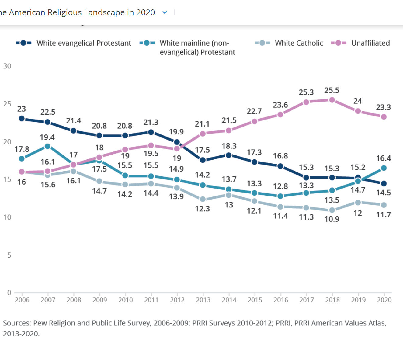
However: Non-Religion Affiliated Folks Grew

https://www.christianitytoday.com/news/2019/march/evangelical-nones-mainline-us-general-social-survey-gss.html

From 7% to 22% by this measure!

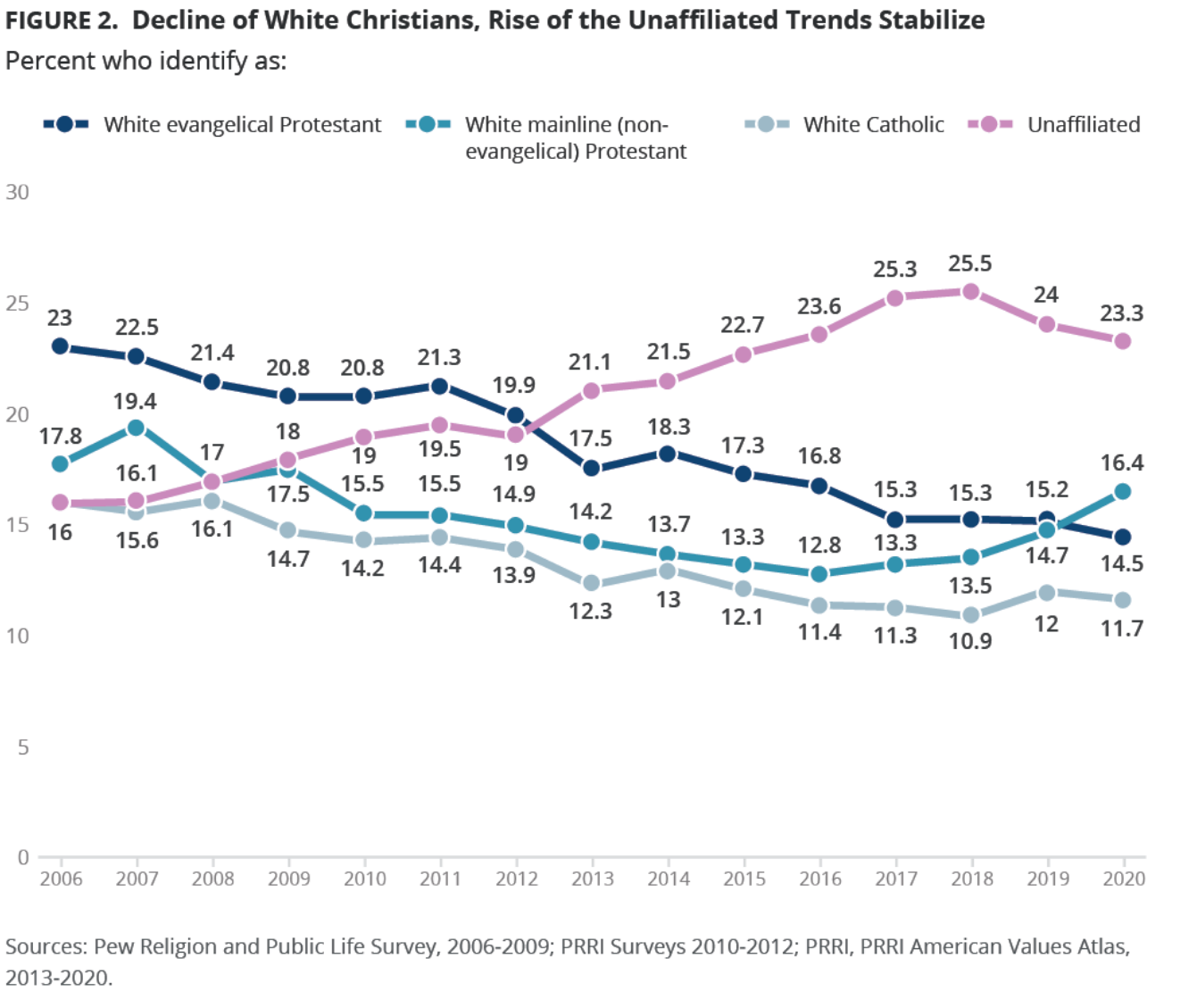
PRRI summarizes their data and Pew data to assert that the unaffiliated population grew from 16% to 25% but has recently fallen back to 23%.

Other analysts conclude that the “nones” account for up to 30% of the population.

https://www.deseret.com/faith/2022/4/14/23022509/god-is-not-dead-religion-data-politics-faith-in-america

https://www.nbcnews.com/think/opinion/2010s-spelled-end-white-christian-america-ncna1106936

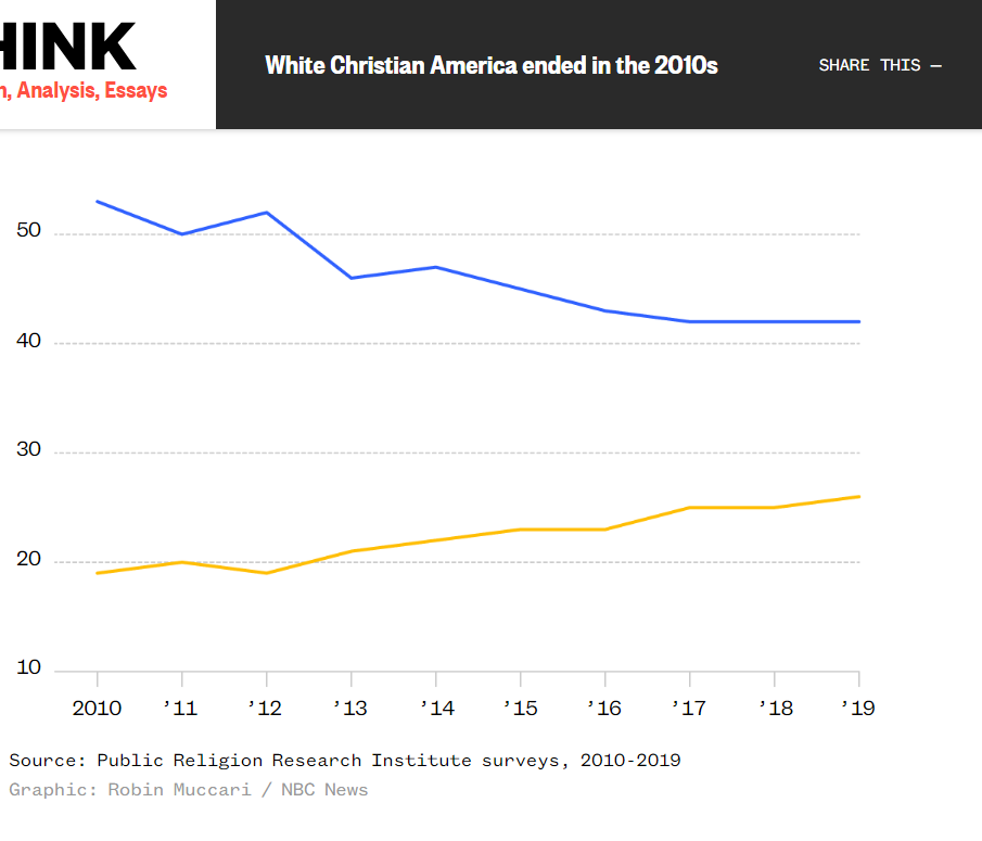
This survey shows the “unaffiliated” category increases from 20% to 26%.

Fewer Young Adults Belong to Churches

Religious Believers Maintain Same Activities

https://www.deseret.com/faith/2022/4/14/23022509/god-is-not-dead-religion-data-politics-faith-in-america

Mainstream Protestants Fell, Bottomed, Recovered

https://www.christianitytoday.com/news/2019/march/evangelical-nones-mainline-us-general-social-survey-gss.html

From 28% to 12%, or from 18% to 13%.

Evangelicals Grew, Then Declined

https://www.christianitytoday.com/news/2019/march/evangelical-nones-mainline-us-general-social-survey-gss.html

About Three-in-Ten U.S. Adults Are Now Religiously Unaffiliated

Based on a “born again” definition, evangelicals have declined by 6%.

https://www.cnn.com/2021/07/10/opinions/american-evangelicals-protestantism-butler-bass/index.html

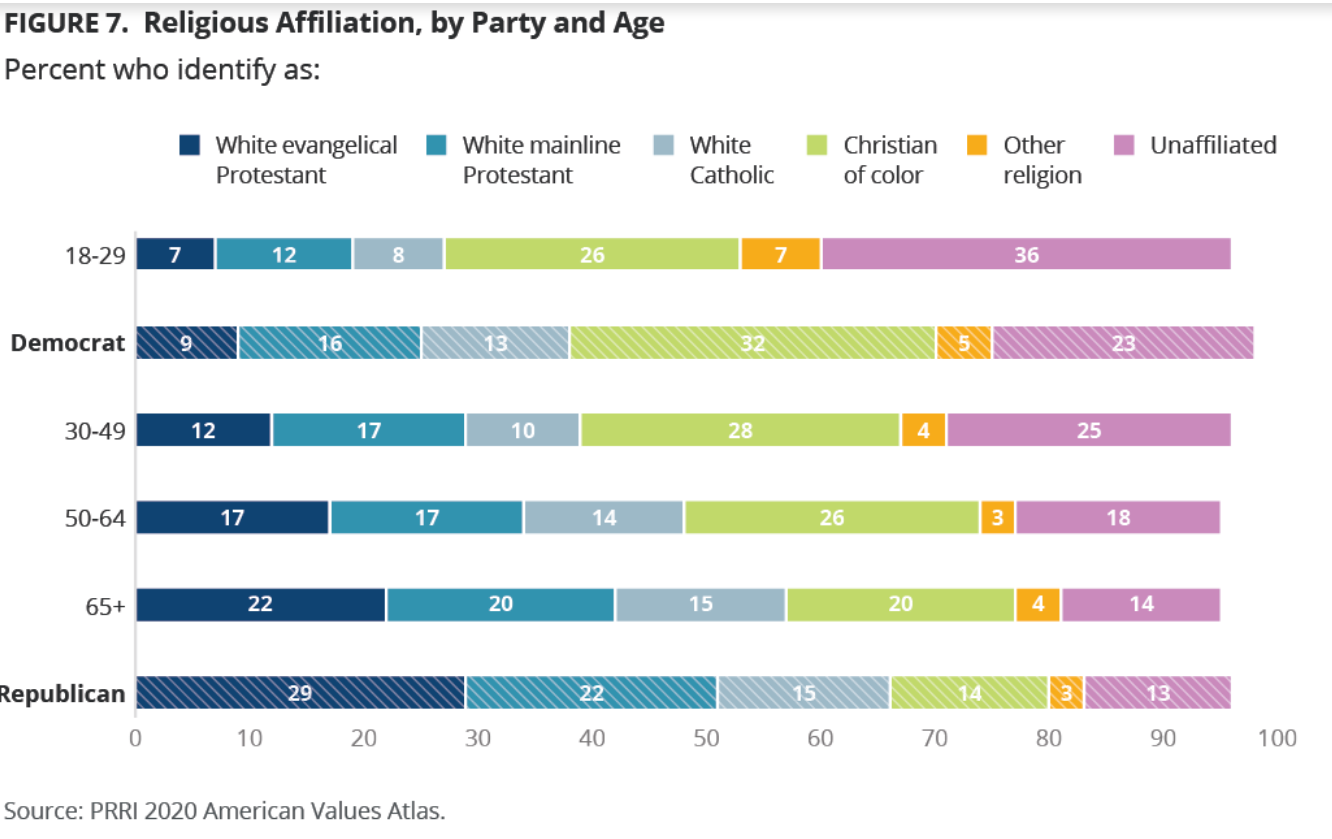
Evangelicals Increasingly Overlap With Republican Party Identification

https://www.christianitytoday.com/news/2019/march/evangelical-nones-mainline-us-general-social-survey-gss.html

https://www.sltrib.com/opinion/commentary/2021/10/27/ryan-burge-why/

Summary

US citizens belief in God remains strong, between 80-90%. Church affiliation has declined to 70%. Mainline (liberal-centrist) Protestant believers have declined dramatically, but recently stabilized. Evangelical Protestant believers increased in the 1980’s and 1990’s, but have declined somewhat since then. Catholic membership has remained roughly constant, with Hispanics replacing Whites.

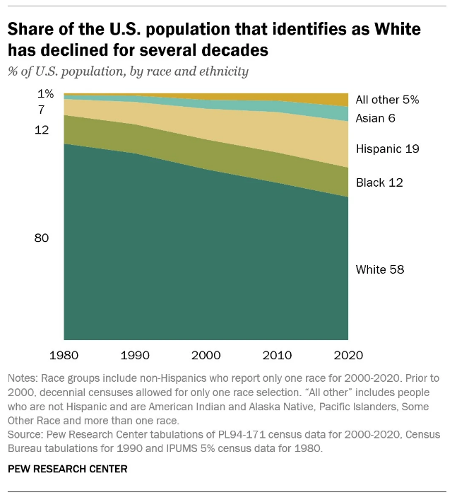
The decline in Whites as a percentage of the US population, combined with the increase in non/other believers has lead to headlines proclaiming the end of a majority White Christian America. This is true statistically, with politicians attempting to take advantage of the situation.

https://www.nbcnews.com/think/opinion/2010s-spelled-end-white-christian-america-ncna1106936

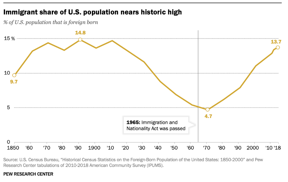
Good News: US and Immigrants

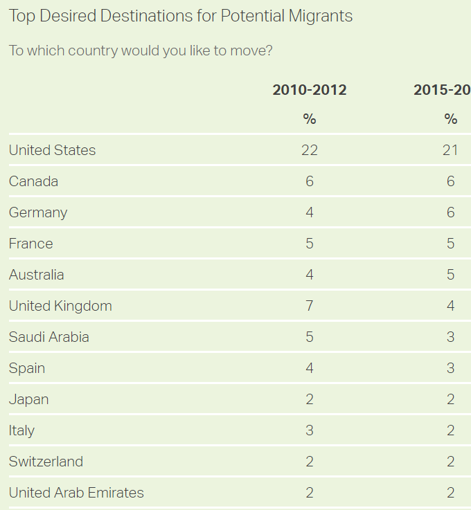
US is top desired destination for immigrants

https://news.gallup.com/poll/245255/750-million-worldwide-migrate.aspx

https://www.weforum.org/agenda/2017/11/these-are-the-countries-migrants-want-to-move-to/

New Zealand is Most Attractive Based on Immigrant Desires Per Destination Population

Best Countries to Migrate to

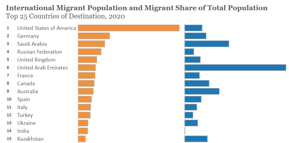
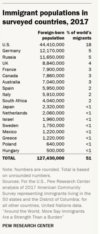
Immigrants “Vote With Their Feet”. 50 Million in US.

https://www.migrationpolicy.org/programs/data-hub/charts/top-25-destinations-international-migrants

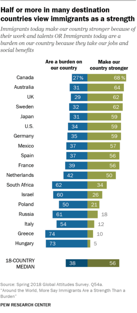
US Remains a Welcoming Country, Overall

Good News: Living (Much) Longer

https://pubmed.ncbi.nlm.nih.gov/7565998/#:~:text=The%20average%20life%20expectancy%20in,France%2C%20England%2C%20and%20Japan.

https://www.populationpyramid.net/united-states-of-america/1950/

https://www.infoplease.com/us/health-statistics/life-expectancy-age-1850-2011

https://knoema.com/atlas/United-States-of-America/topics/Demographics/Age/Life-expectancy-at-age-80-years

https://www.ssa.gov/history/lifeexpect.html

https://www.ncbi.nlm.nih.gov/pmc/articles/PMC4861644/

https://www.infoplease.com/us/health-statistics/life-expectancy-age-1850-2011

It’s not all “good news”. Recent data indicates that life expectancy varies greatly between US states, counties, cities and census tracts. My hometown’s life expectancy is just 73.6 years, about 5% (3.7 years) less than the national average of 77.3 years. My suburban Indianapolis home for the last 30 years shows an 81.6 year life expectancy, about 5% (4.3 years) higher. That’s an 8 year (10%) difference between two midwestern cities.

https://www.rwjf.org/en/library/interactives/whereyouliveaffectshowlongyoulive.html

Good News: Record Voter Turnout in 2018 and 2020 Elections

https://www.fairvote.org/voter_turnout#measuring_voter_turnout

Setting aside turnout ratios, the growth in actual voters has been strong for a century. 40-48M voted in FDR’s elections. Kennedy and Nixon fought over 69M voters. Clinton and Bush, Sr. attracted 105M voters in 1992. But, Biden vs. Trump shattered records with 158M casting ballots.

Midterm Elections: 2018

https://www.fairvote.org/voter_turnout#voter_turnout_101

https://www.census.gov/library/stories/2019/04/behind-2018-united-states-midterm-election-turnout.html

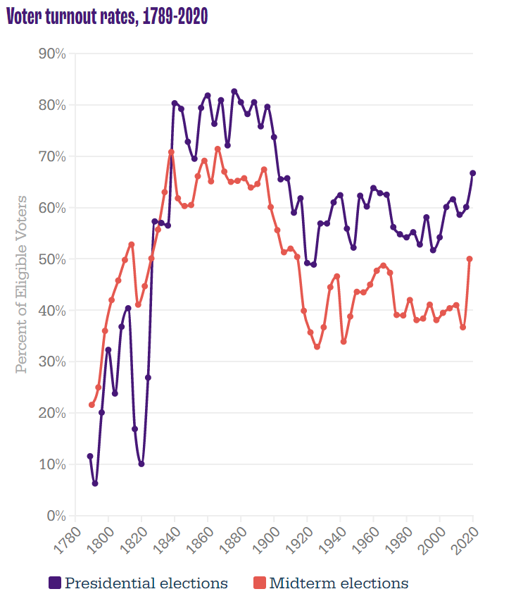
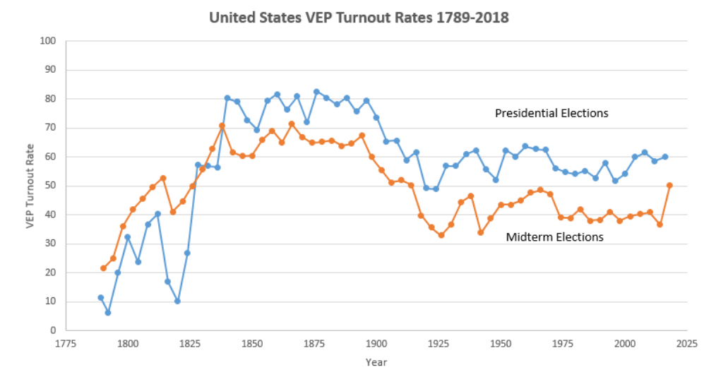
Midterm voting rates (as % of eligible voters) soared at 65% in the 19th century. They dropped to 50% at the start of the 20th century and then down to 45% for most of the 30’s to 60’s. They settled down to 40% thereafter. The 2018 election reached 50%, a full 13% points above the all-time low in 2014.

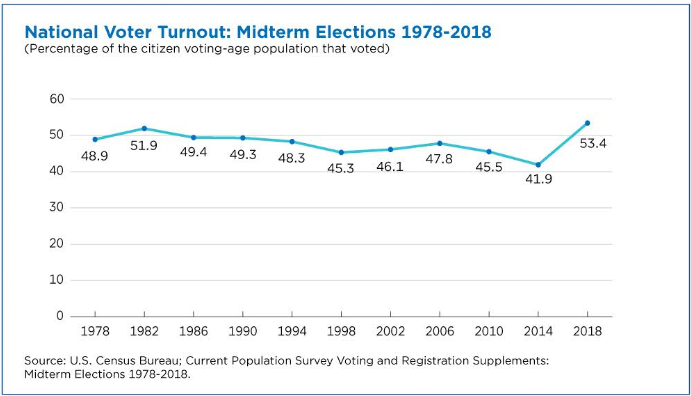
The slightly different measure, percentage of voting age population, shows the same pattern. 49% voting from 1978-94. Just 46% from 1998-2010. Record low of 42% in 2014, followed by an 11%-point climb to 53% in 2018.

https://www.census.gov/library/stories/2019/04/behind-2018-united-states-midterm-election-turnout.html

Younger voters increased their turnout by 14 points (18-44), while older voters increased by a solid 8%. High school or less educated voters increased turnout by 7 points, while college educated voters added 12 points.

Presidential Elections: 2020

https://www.fairvote.org/voter_turnout#measuring_voter_turnout

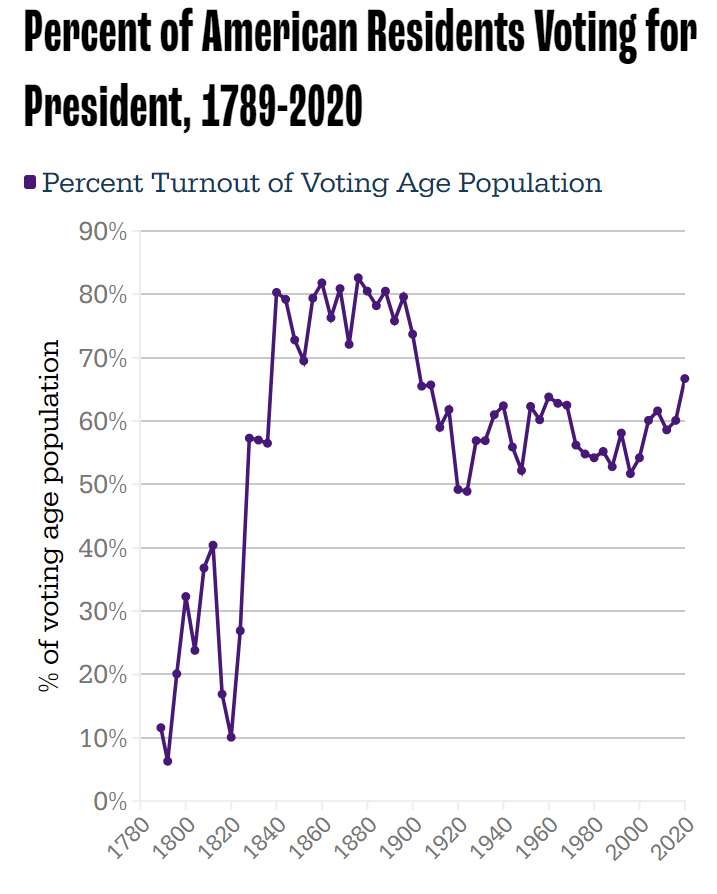
Long-term presidential and midterm voting (% of eligible voters) follows the same pattern. 80% turnout in the 19th century, dropping to 59% by 1912, then averaging 60% in the 30’s to 60’s. Further decline to just 55% for the 70’s-90’s. Minor increase to 60% in the oughts and teens, followed by 67% in 2020.

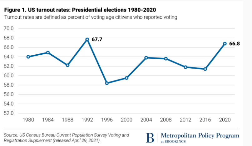
The more recent percent of voting age population shows 64% from 80-88, a one-time spike to 68% in 1992, decline to 59% from 96-200, slight increase to 61% for 04-16, and then a big jump to 67% in 2020.

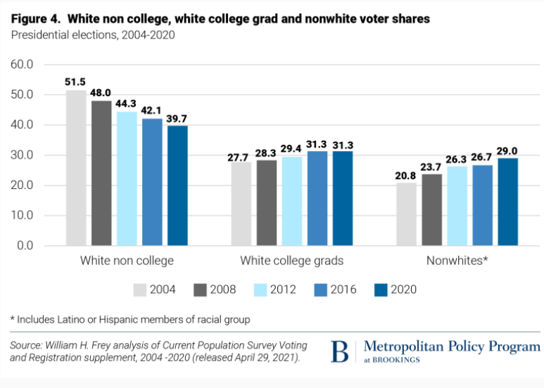
Turnout was up in all categories, but especially among Asian, 18-29 year olds and white non-college educated populations.

Voting by all racial groups of 18-24 year-olds was up significantly.

Other Sources Show The Same Results

http://www.electproject.org/national-1789-present

https://www.nationalaffairs.com/publications/detail/does-high-voter-turnout-help-one-party

The two measures (% of eligible voters and % of population) track closely. The “election project” numbers show VEP at 63% from 1952-68, declining to 58% for 72-00, increasing a little to 61% for 04-16, before spiking to 66% in 2020.

More Details

Income really matters for voter turnout, with rates ranging from one-third to one-half to two-thirds. With increased lower income support for the Republican party, this is less of a partisan issue today.

https://www.theatlantic.com/ideas/archive/2019/08/emerging-republican-majority/595504/

Since 1969, Democrats have argued that demographic trends will overturn Kevin Phillip’s description of the Emerging Republican Majority. This remains a hotly debated topic.

https://www.census.gov/library/stories/2019/04/behind-2018-united-states-midterm-election-turnout.html

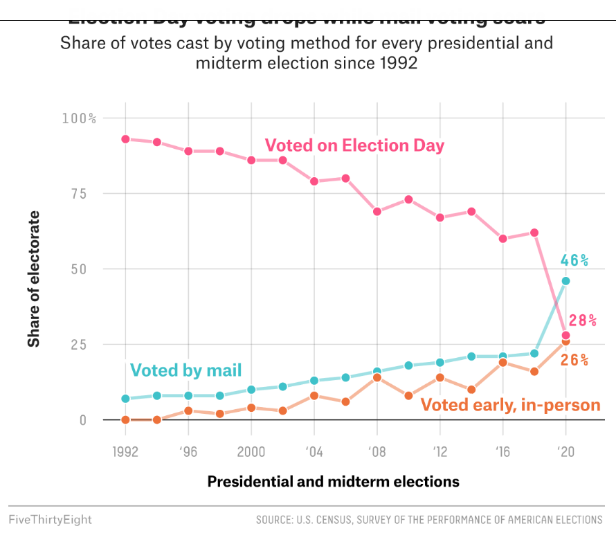
Election day voting decreased in 2018 and 2020 as mail and early, in-person voting increased. Many commentators claim that this change is a large driver of the increased turnout levels.

Indiana Population Grew Half as Fast as the US from 1970-2020.

The US population increased by 61%, from 205 to 330 million.

Indiana population increased by 30%, from 5.2 to 6.8 million. Indiana added nearly 1.6 million people during these 5 decades. It would have added another 1.6 million if it grew as fast as the US average.

Indy Metro Area Grew by a Strong 72%.

The 8-county area grew from 1.1 to 1.9 million, adding 800,000 people and accounting for one-half of the whole state’s growth during this period. Growth has been consistently strong in each of the last 3 decades, adding 230,000, 220,000 and 220,000. The Indy Metro area has grown from 21% to 28% of the state’s total population.

6 Other Suburbs Grew by 76%

Porter (CHI) added 84K. Dearborn (CIN) added 20K. Warrick (EVN) added 35K. Harrison (20K), Floyd (23K) and Clark (43K) added to the metro Louisville population. In total, these 6 counties added 226,000 people to their 296,000 base, reaching 523,000 in 2020. They grew from 6% to 8% of the Indiana total.

Indiana and Purdue University Counties Grew by 79%

Monroe (76%) and Tippecanoe Counties (81%) displayed very similar growth rates. Their combined population increased by 153K, from 194K to 348K. Their share of the Indiana total increased from 4% to 5%.

These 18 counties out of Indiana’s 92, accounted for 76% of the population growth, increasing by 1.2M, from 1.6M to 2.8M people! Their share of the state total grew from 31% to 41%!

Northern Indiana Tier (South Bend, Elkhart, Ft. Wayne) Added 38%

The 10 counties stretching from St. Joseph (South Bend) to Allen (Ft. Wayne) showed modest, but consistent growth throughout the period. Elkhart was most successful, adding 81,000 people (64%). Ft. Wayne added 101,000 people, but just 36% growth. St. Joseph managed to add 27,000, but just an 11% growth rate. Marshall, Kosciusko, LaGrange, Noble, Whitley, Steuben and DeKalb counties each added at least 10,000 residents.

In total, this section added 326,000 citizens, growing from 860,000 to 1,190,000. It’s share of Indiana’s population shaded up from 16% to 17%.

Lake County (Gary) Lost 11%

Population dropped by 62K, from 546K to 484K. Lake County reduced its Indiana population share from 10.5% to 7.2%.

8 Small City Counties Lost 5%

These stand-alone counties each had at least 75,000 citizens in 1970. Together, with 902,000 people they accounted for 17.4% of Indiana’s total. Their population fell by 48,000 to 855,000, representing just 12.4% of the Indiana total in 2020. From best to worst population growth, using their main city for easy identification: Evansville (+13K), LaPorte (+1K), Kokomo (-1K), Terre Haute (-8K), Anderson (-9K), Richmond (-14K), Muncie (-15K) and Marion (-19K).

57 Rural Counties Added 13%

These counties all started with populations of less than 60,000 in 1970. The average county had 23,000 residents. This increased to 25,000 by 2020. 17 counties actually lost population across 50 years. Another 24 counties added less than 5,000 people. Just 16 counties added 6,000 people or more (including the next 5). Jaspers, Dubois, Jackson and Putnam each added more than 10,000 people. Bartholomew (Columbus) was the outlier, adding 28,000 people, growing by 48%, from 57,000 to 85,000 people.

In total, this group added 167,000 people, growing slowly from 1.283 to 1.449 million. Their share of the state total population dropped from 24.7% to 21.4%.

These 3 slower growing areas represent 66 counties, or 70% of the Indiana total. Their combined population increased by 2% in a half-century, edging up from 2.7 to 2.8 million. Their share of the Indiana total has declined from 53% to 41%, so possible future slow growth will have a relatively lesser impact on the state total.

Summary

The Indianapolis area, 6 other suburban counties and the homes of Indiana and Purdue Universities grew nicely at 75%, above the 61% national growth rate. 10 counties in the northern tier and Columbus showed modest growth. Two-thirds of Indiana’s counties grew at close to zero percent across 50 years. The 2000-2010 and 2010-2020 periods showed the same overall results.

Indiana shares these stagnant rural and old tech manufacturing county challenges with its neighboring states.

Good News: US Housing Market

Real Interest Rates Remain at Record Lows

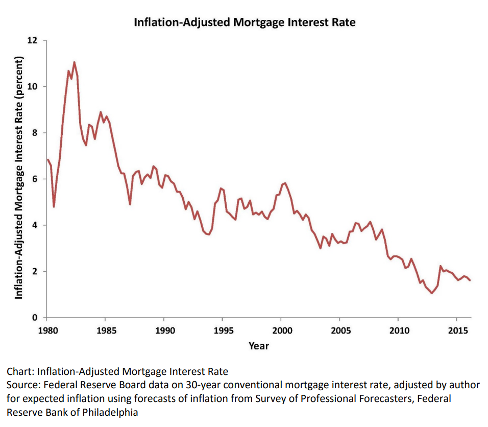
Real, inflation-adjusted, interest rates have declined greatly since 1980. At that time, with the risks of variable inflation and surging oil prices, the real mortgage interest rate was 8%. It declined to 5% in the 1990’s and 4% in the 2000’s before falling to 2% in the 2010’s. The financial cost of owning property has rarely been lower.

House Values are Up, Way Up

House prices grew relatively consistently from 1970 through 2000, with a spike in 2005-9 and a return to trend values in 2010-12. In the last 10 years, house prices have increased by 6% annually in nominal terms, or 4% annually in real terms.

Home Ownership Rate is Rebounding, Up 2%

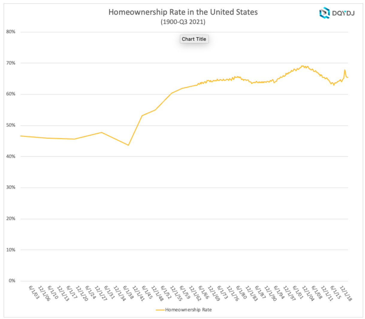
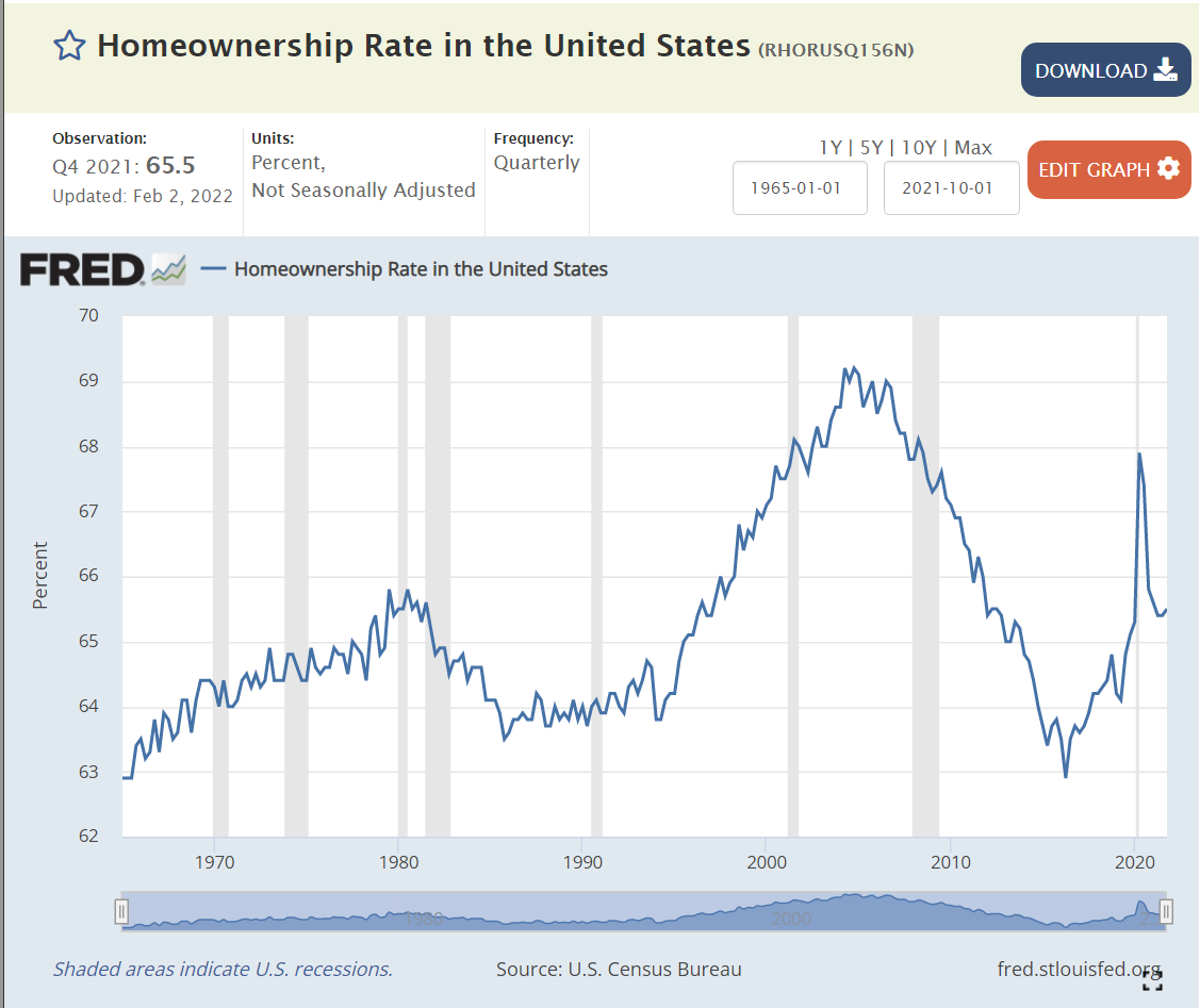
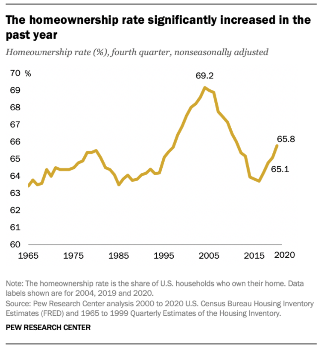
The US homeownership rate averaged 47% from 1900-40. It increased smartly in post WWII times to 60% by 1955 and 64% by 1965. Homeownership averaged 64%+ for the decade of 1969-78. It increased by 1% during 1979-81. In the midst of a difficult depression, homeownership rates dropped back to 64% by 1985, about the same for the last 20 years, setting a “normal” level. Homeownership rates stayed at 64% for the next decade. Ownership rates increased from 64% to 69% in the next decade before declining right back to 63% by 2015. In the last 7 years, despite many headwinds, the home ownership rate has increased by 2%.

Number of Homeowners has Jumped by 7 Million

In 2000, there were 69M owner-occupied homes in the US. This increased by a solid 7M to 76M by 2005. The housing market hit a lull and the number of owner-occupied homes essentially stayed flat for a dozen years, through 2017. The supply of owner-occupied homes then rose by a strong 7M in the next 4 years to 83M!

International Comparisons

https://en.wikipedia.org/wiki/Home-ownership_in_the_United_States

https://www.urban.org/urban-wire/us-homeownership-rate-has-lost-ground-compared-other-developed-countries

US homeownership rates are similar to other developed economies.

Housing Supply

https://www.mercatus.org/bridge/commentary/what-are-homeownership-rates-telling-us


The housing market is inherently volatile, typically rising by 2 times the trend and then falling to one-half of the trend. Annual housing starts averaged 1.6M from 1960-2008. They declined by a severe 75% to just 0.5M in 2009. Housing starts have subsequently grown 3-fold to 1.6M annual housing starts, but the accumulated lack of new supply is impacting housing markets today.

Housing Market by Segments

By Age Group

https://www.mercatus.org/bridge/commentary/what-are-homeownership-rates-telling-us

The period from 1982-2000 showed homeownership rates by the 5 age segments remaining relatively constant; 65+ 78%, 55-64 80%, 45-54 76%, 35-44 67% and <35 40%. The 65+ group increased homeownership from 75% to 80%. During this time, the overall US homeownership rate increased from 65% to 69%, mostly due to the aging of the population, now more heavily weighted towards the groups with 76-80% homeownership versus the 40-67% younger groups.

Homeownership rates grew from 2000 to peak rates in 2004, before declining significantly for all groups except for the 65+ cohort which essentially held it’s own. The adjacent 55-64 class fell 4%. The middle 45-54 group dropped 7%. The typically homeownership growing 35-44 group cratered by 9%. The young <35 group fell by 5%. Hence, the overall rate fell dramatically during this time.

https://www.bloomberg.com/opinion/articles/2021-04-15/home-ownership-for-millennials-may-finally-be-within-reach

This difference in home ownership experience is reflected in generational wealth summaries.

By Marital Status

https://en.wikipedia.org/wiki/Home-ownership_in_the_United_States

There is a 30 point gap between married couples and other groups, with 84% of married couples owning homes versus about 55% for other family structures.

By Location Type

https://www.census.gov/library/stories/2017/09/rural-home-ownership.html#:~:text=Rural%20areas%20have%20higher%20homeownership,holds%20in%20all%20four%20regions.

https://www.census.gov/newsroom/blogs/random-samplings/2016/12/homes_on_the_range.html

https://www.freddiemac.com/research/insight/20210602-rural-home-purchases

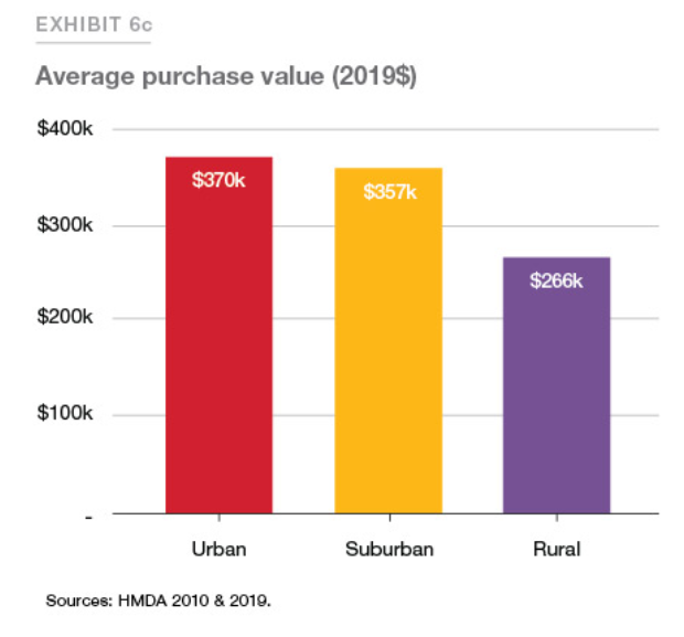
81% of rural households own their homes versus just 60% for urban households.

By Income Group

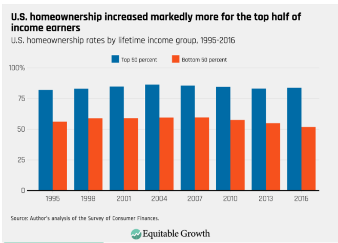
Historically, 80% of the top half of household incomes have been homeowners, while in the bottom half, just 50-60% have owned their homes.

By Racial Group

The US shows dramatically different homeownership rates by racial category. The differences between the 1995 non-Hispanic White rate (70%) and Others/Asians (50%), Hispanics (42%) and Blacks (42%) remain large in 2021 where we see White (74%), Other (57%), Hispanic (48%) and Black (44%). The groups homeownership share gain from 1995 to 2005 were similar, ranging from 6-10%, but the decline from 2005-2015 was only 3-4% for Whites and Hispanics, but 7% for Blacks and Others. The improvement from 2015 to 2021 has been 2% for 3 groups and 4% for the Other/Asian group.

Summary

The Great Recession flattened the housing market. The number of owner-occupied homes in the US remained level at 76 million from 2006 – 2017. The number of housing starts plummeted from 2.0M to 0.5M per year, compared with an historic average of 1.6M. New home construction first exceeded 1.2M units (75% of historic average) again only in 2020, a dozen years later. New home-owning households have increased by 7M units in the last 4 years! The homeownership rate is up 2 points, from 63.5% to 65.5%. Supply is responding to increased demand and higher home prices. Homeownership rates will increase with the economic recovery, but be constrained by higher home prices.