Knobstone Trail is the highlight of Indiana Hiking. Pick a trailhead and enjoy. Check with your doctor to be sure you’re ready for repeated 400 foot climbs and descents.
Nice variety of rail trails, state and county parks, nature preserves, a quarry and an arboretum. This is mostly flat walking. St. Joseph County offers many options.
A village, a historic canal, a deep valley and a rail trail provide options in Delphi, along the Wabash. The bridge is under reconstruction, but you can hike up to one end and you can hike beneath it in the valley.
Travelers have come to know and love the outdoor recreational facilities of France Park, with scenic trails, beautiful waterfall, clear swimming lake with picturesque cliffs, quiet fishing areas, and spacious camping facilities.
The Nickel Plate Trail runs from Kokomo to Rochester. There are a dozen trailheads along its 40 mile length. Although mostly flat, this is a surprisingly scenic trail where it crosses 3 major rivers and approaches Lake Manitou south of Rochester.
The prairie and stream trails are enjoyable. The Gabis arboretum resources and gardens are nice. But the highlight is the outdoor model train and landscaping.
Potato Creek is west of South Bend. The trails take advantage of a lake, historical and planted areas. The state is investing in this park for the future.
The Erie Trail is a straight 20 mile rail-trail segment of the American Discovery Trail, starting north of the Tippecanoe River SP and heading WNW to North Judson, IN.
Located out of the way, near the headlands of the Wabash, this state park is more developed than expected, with a dammed lake, pine woods and bison area.
“Typical welfare family”, a single parent and 2 children (cue the video), receives $35,000 of welfare benefits annually claims the Wisconsin congressman in 2014. That number has stuck in our minds, just like the “welfare queen” and escaped prisoner “Willie Horton”.
Fact checkers debunked this claim, but it’s important to work through the details to get back to a reasonable “order of magnitude” estimate of “welfare benefits”.
If a family has ZERO income, they may receive maximum benefits. The Clinton “welfare reforms” limited the primary benefits to a total of 60 months. Families cannot receive benefits “forever”. Most household heads do work and have some income during the year. The maximum benefit number is an inappropriate “anchor”.
Temporary Assistance for Needy Families (TANF) (welfare) participation rates have fallen from 80% of those eligible to less than 25% since “reform” was implemented. The reform has had it’s intended effect. Two-thirds of those previously participating no longer do so. Some have become more productive and income earning members of society. Others “make do”.
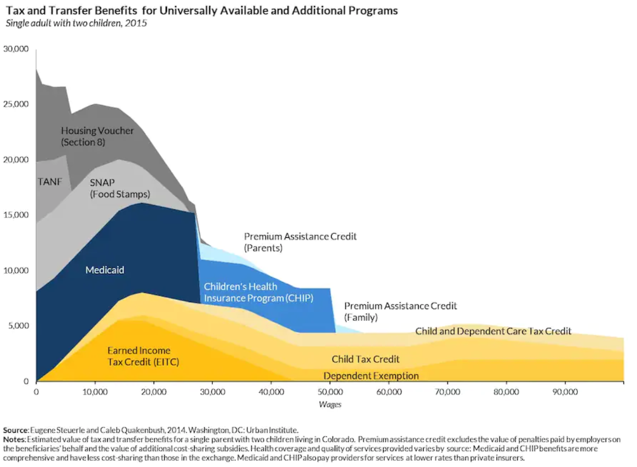
Current average TANF benefits in my home state of Indiana are $346/month or $4,152. That’s a long way from $35,000 of cash benefits, which is the “anchor” that needs to be removed. $4,000 per year of cash is the typical Indiana welfare benefit. The maximum is $700/month or $8,400/year, twice as high. More kids, no income, still eligible. This is possible, but it’s not a useful reference point. The normal received benefit is just one-half of the maximum.
Supplemental Nutritional Assistance Program (SNAP of food stamps) is the next welfare program. For an Indiana family of 3, current benefit value is $6,240 per year. A family of 3 can earn up to $25,000 annually before benefits start to decline. The national ratio of SNAP to TANF recipients is 82%. In Indiana, just 75% of those eligible receive ANY SNAP benefits.
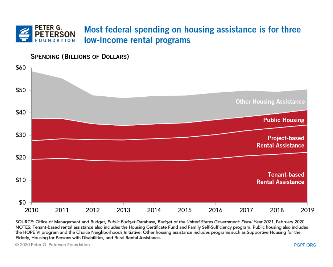
Housing assistance is listed at $9,000. There are various federal and state programs. This is like “winning the lottery” for low income families. In Indiana, 1 in 8 eligible families (12%) receive housing subsidies. These average $736/month or $8,832 per year. On an “expected value” basis, this is only $1,060 per year. From a public policy point of view, this is the relevant number.
In the Wisconsin representative’s model, there is $7,000 of higher education benefits. This is clearly irrelevant to public policy. Individuals do not make ongoing annual work choices based on education benefits.
The Cato Institute started this “conversation” about “welfare versus work” in 1995 and updated their analysis in 2013.
Like the congressman, they note that the “welfare benefits” received are in “after-tax” dollars, so they “should” be translated back into pre-tax dollars to be “fair”. Since the marginal tax rate for low-income wage earners is often just 10%, this is immaterial. More importantly, the emotional, political currency is cash. “how much do THEY receive?” is THE question. This is an after-tax amount. No “grossing up” is required.
The Cato folks also include the full value of Medicaid benefits received by those below the eligible income transition. The value paid per child ($2,145) and per adult ($4,211) yields an $8,501 annual “benefit” currently. Is this a “welfare” benefit or a “citizen” benefit? The US health care system is primarily funded through tax-deductible employer plans. Medical plan subsidies are now available up to 400% of the federal poverty level. From a federal budget perspective, lowest income families receive more value. From an “incentive” perspective, low income families are generally indifferent between federal and employer sponsored plans. This $9,000 does not belong in “the cost of welfare”.
The Cato analysis includes the cost of the “earned income tax credit” (EITC) as a welfare benefit. The EITC was created and enhanced as an incentive for unemployed persons to work and earn some income, thereby providing themselves with short-term and long-term benefits and reducing the cash level welfare benefits. It grows quickly with earned income up to about $18,000 and then falls back down nearly as quickly as income grows to $40,000 per year. This is not what most people think of as a “welfare benefit”.
The Cato analysis also focuses on welfare benefits versus the minimum wage, emphasizing that overly generous welfare benefits provide a disincentive for recipients to seek paid employment (ignoring the 60 month TANF benefits limit). As the effective minimum wage in 2021 approaches $15/hour and $31,200/year, we won’t be hearing this comparison again.
As a professional “cost accountant” since 1978, I was often asked to provide the “exact cost” of various products or services. College courses, residence hall rooms, food service meals, buildings for rent, account managers, computer hardware, installed cables, telephone services, computer maintenance, software development, dresses, tops, retail stores, extension cords, surge protectors, imported goods, cell phones, returned cell phones, etc. The answer is always “it depends”. This is never a popular answer. It depends on what decision you are making. Short-term, medium-term or long-term timeframe. Do we include opportunity costs? Which externalities should we consider, if any? Do we include strategic, brand or cultural consistency as factors?
For the “welfare benefits” question, I think that the relevant public policy/budget and personal incentive numbers are largely the same. Welfare/TANF and food stamps/SNAP matter. EITC, medicaid, education benefits, housing assistance, and income taxes don’t matter.
Welfare/TANF for an Indiana family of 3 is worth $4,152 annually. The complementary food stamp/SNAP benefits are worth $6,240. The total quasi-cash welfare payment is $10,392 per year of eligibility. Maximum of 5 years. This is the right “anchoring” number: $10,000 per year for a family of 3. They will be going to the local food pantry every week. They will be seeking family and private charity. They will be leaning on friends, relatives and neighbors for “subsidized” child care. They will be working and seeking to advance themselves.
There are disincentive challenges remaining in our current systems.
But, these technical, marginal, incremental, opportunity rates are not the heart of the matter. Lower income families are not “optimizing” their benefits. I volunteered to provide low income/elderly federal income tax services for several years. The benefit and tax rules are complex beyond comprehension.
The core public policy question is “Is $10,000 of annual benefits a reasonable amount for our state to pay to a family of 3 with no income?”. I would argue that it is too low, half what it ought to be.
Support for a universal basic income (UBI) has grown in recent years, as the economy, productivity and equity returns have grown by 3% annually but wages have remained flat for 40-50 years in the US.
Indiana maintained its 11th place rank from 1920 through 1970.
Since 1970 it has fallen 6 places to just 17th.
Of the 9 “nearby” states, only Iowa, dropping 7 places performs worse at attracting and retaining citizens. Missouri, Wisconsin and West Virginia are essentially the same as Indiana, dropping 5 places each in this half century. Michigan and Kentucky slipped by 3 places. Illinois and Ohio, starting near the top at 5th and 6th place, declined just one place. Tennessee gained one place, from 17th to 16th, moving ahead of Indiana.
The economic recovery between 2007 and 2019 was one of the slowest after a recession. Average U.S. personal income grew by 2.0% overall. Indiana’s 4 way tie for 19th place at 1.9% is above the median state, even though it is slightly below the U.S. 2.0% average. 10 states grew by 2.4% annually or faster. 19 grew by 1.5% or less per year. Among the nearby states, Indiana was the second fastest grower, trailing only Tennessee at 2.2%. Iowa, Wisconsin, Ohio and Kentucky grew just a little less quickly, with 1.5-1.6% rates. Michigan (1.4%), Missouri (1.3%), West Virginia (1.1% and Illinois (1.0%) trailed significantly.
Indiana per capita income has trailed the national average throughout the last half century, starting at 91% of the national figure. Indiana gained a small amount in the first 30 years, reaching 92%. Indiana has slipped quite significantly to 86% in the last 20 years.
In the 20 years from 1998-2018, Indiana per capita GDP grew by an average level for the heartland, 19%, the same as Ohio, West Virginia and Tennessee. Kentucky, Missouri and Michigan grew by only 10-14%. Illinois, Wisconsin and Iowa grew by 24% or more, close to the national average.
During this time, Indiana dropped from a middling 27th rank to a lower 32nd rank. Ohio and Tennessee also dropped by 5 places. Kentucky dropped by 9, Michigan by 11 and Missouri by 15 places. Illinois and West Virginia slipped by 1 notch. Iowa and Wisconsin increased their rankings.
Over a slightly longer time period, 1984-2018, Indiana again slipped by a few places, from 30th to 34th place. Four states dropped by 8 or more places: Wisconsin, Ohio, Missouri and Michigan. Illinois and Kentucky maintained their relative positions. West Virginia, Tennessee and Iowa improved their rankings.
Indiana has been average or above average versus its “peer group” of 9 nearby states, but it has lost position versus the nation on all 5 measures. Personal income growth since 2007 is the best result, at 1.9% versus 2.0% national average. Indiana population has fallen 6 spots to 17th in 50 years. Per capita income versus the nation has slipped by 6% to just 86% of the average in 20 or 50 years. Per capita state GDP has dropped 5 places to 32nd place in 20 years. Median household income has fallen 4 places to 34th place in 34 years.
Indiana’s business friendly low tax/low service strategy has helped the state do better than its peers, but has not delivered above average growth by any measure.
Indiana Coronavirus update. Daily cases are a little (-10%) lower. Last 3 weeks averaged 1,032 versus 1,144 in prior 3 weeks. This is up a little from the March average of 800 but way down from the Nov-Jan peak average of 4,700. Daily deaths have dropped even faster, from 75 at the peak to 11 in March to 7 in April/May.
The death rate is now less than 1%, compared with 2% last Fall and 1.6% during the peak infection period (improved treatment and age profile).
Indiana vaccination rate has lagged, after a positive early start, with 31% fully vaccinated. This is 39th best state. Median state is 36% vaccinated. 4 adjacent states are 35-37% vaccinated. Indiana’s vaccination rate (74%) for seniors (65+) is slightly better than the national average (72%).
National vaccines per day increased to 2M by the end of Feb and 3M by the end of Mar, peaking in early April. Daily vaccine rate declined to 2.6M at the end of April and continues to fall. Indiana follows the same pattern with 35,000 per day at the end of Feb, 42,000 at the end of March and April, but just 30,000 in mid-May.
At the county level in metro Indianapolis, the vaccine rates vary widely. Central Marion County is at 28% fully vaccinated. 4 counties are at 30-33% (Morgan, Johnson, Shelby and Madison). 4 others are at 40-41% (Boone, Hendricks, Hancock and Hamilton)
In presidential elections since 1960, Republicans have won 14/16 races. LBJ won 56% of the vote in 1964. Obama won 50% of the vote in 2012. Democrats earned just 33-38% of the vote in 6 of those elections, including 2016. Democrats earned only 40-42% of the vote in 4 elections, including in 2020. The median Democratic result is 41%.
Indiana leans Republican in surveys of party affiliation. Voters do not permanently register for a party. They declare a party only when they vote in each election. According to one survey, Indiana voters are tied for 18th most Republican leaning. Indiana has just 42% of voters reporting as strong or “leaning” Democratic.
In the last 6 presidential elections, 15 states have always voted for Democrats and 20 states have always voted for Republicans. Indiana is part of the 15 in the mixed middle due to the Obama result. Indiana has not been highlighted as a “swing state” in recent years.
Since 1984, the results have been similarly divided, with 6 Republican and 4 Democratic terms. From 1988-2000, Evan Bayh and Joe Kernan won 71/92 counties (77%), on average. In 2002, Mitch Daniels won his first term with 53% of the vote, but carried 73 (79%) of the counties. This broad geographical Republican dominance has continued, with Democrats winning just 13, 19, 13 and 3 counties in the last 4 elections. When Mike Pence won with 50% of the vote in 2012, he carried 73 counties. When Eric Holcomb won with 51% in 2016, he carried 80 counties.
At the U.S. Senate level, Indiana has elected 10 different senators, with Republicans serving 13 of the 22 terms (59%). Democrat Joe Donnelly was replaced by Republican Mike Braun in 2019.
Since 1960, Republicans have won 42 of the 68 congressional races (62%). Since 2000, the median party split has been 7 Republicans and 2 Democrats. This balance has been consistent in each of the last 5 terms. Democrats did hold a small 5-4 advantage in 2006 and 2008.
The Indiana House is closer to the overall 40% +/- Democratic population, with Dems holding an average of 31% of the seats in recent years. The concentration of Democrats in a relatively small number of counties drives some of this situation.
Since 1970, Marion County and Indianapolis have been combined into a common City-County Council and Mayor system, usually termed unigov. Since Mayor Lugar’s first term in 1968, Republicans have held the mayor’s office for 16 of 26 terms (62%). Democrats have held office for 10 of the last 14 terms (71%).
The City-County Council has been a competitive body. Democrats held a 15-14 majority in 2003. Republicans lead 16-12 in 2007. Democrats resumed the majority by 16-12 in 2011, and more narrowly by 13-12 in 2015 when the “at large” districts were removed. Democrats won a large victory in 2019 of 20-5. It is unclear if this lopsided result will continue in the future.
Since Obama’s surprising presidential win in 2012, metropolitan Indianapolis area Democrats have become more active, with more candidates running for suburban offices, more financial and volunteer support and a few of them winning. This has been newsworthy, because many suburban counties and cities had zero or only nominal Democratic candidates historically. Joe Biden narrowly won some precincts in the 2020 presidential election, generating more news coverage.
However, Biden’s relative progress in the Indianapolis suburbs, like his results in other U.S. suburbs, did not translate into Democratic gains in the state and local races, where Republicans consistently outperformed Trump and won races by margins significantly higher than pollsters forecast.
The 19 counties that voted for John Gregg (D) against Mike Pence (R) in the close 2012 race account for 43% of the state’s 2019 population. That is consistent with 43% in 2010 and down a little from the 44% share in 2000. The Democratic leaning counties are not growing faster than the Republican leaning counties.
Indiana Democrats like Evan Bayh, Joe Kernan and Joe Donnelly appear to be unable to re-assemble a winning “blue dog” coalition of voters at the state level. Barrack Obama’s narrow 1% point victory over John McCain and Sarah Palin looks like an “outlier” result. Indianapolis seems to be an increasingly solid base for the party and its suburbs may fall from 70% to 55% Republican through time. However, for the foreseeable future, Indiana will be a solid Republican (Red) state.
Indiana has 11 electoral college votes, tied for 13th most of all states. Indiana did not lose an electoral college vote in the latest census, although 3 neighboring states did. With 538 total votes, the average state has almost 11 votes, so Indiana is average by this measure. From 1872-1926, Indiana had 15 electoral votes. From 1932-40 it had 14. From 1944-88 it had 13. From 1984-2000 it had 12, so the trend is clearly downward.
Indiana can claim its fair share of U.S. presidents. 1 out of 46, with the 23rd president, Benjamin Harrison (1889-93). Indiana can partly claim Harrison’s grandfather William Henry Harrison who briefly served as the 9th president and who served as governor of the Indiana Territory from 1801-12, although he was not born there. Indiana also claims to be Lincoln’s boyhood home (1816-30).
Indiana also has its fair share of losing presidential candidates with Wendell Wilkie (1940) and Socialist Party stalwart Eugene Debs (1900-20).
Indiana truly stands out at the VP level, with 4 serving in this office: Charles Fairbanks (1905-9), Thomas Marshall (1913-21), Dan Quayle (1989-93) and Mike Pence (2017-21). It has provided 12 VP candidates.
At the Supreme Court, Indiana claims more than its fair share of the 120 justices with 4: Willis Van Devanter (1911), Sherman Minter (1949), current Chief Justice John Roberts (2005) and recently appointed Amy Coney Barrett (2021).
Since WWII there have been 35 individuals serving in the top political appointment office, the White House Chief of Staff. Ron Klain currently holds that role, as the only Hoosier to do so.
We moved to Indy in 1988 from Cleveland by way of Dallas. My wife was transferred to Indy by her employer and I was able to transfer with my employer. We visited for one weekend, noted the quietness and bought a house. We expected to stay for 3 years. We’ve stayed for 30 years.
Once we moved, we saw that Indy presented a “can do” atmosphere that was more like Dallas than like Cleveland. What does the population data say?
From 1970 to 2019, the Indy 9 county area grew from 1.2M to 2.0M people. The growth from 1970 to 1990 was negligible, a little more than 100K in 20 years. But each of the next 3 decades added 200,000 people, more than 10% growth each decade.
On a ranking of metro areas, Indy started in 29th place and has fallen 4 notches to 33rd place, so on that measure it has lost some ground.
Comparing cities across time is complicated, as the census bureau definitions change, but the data tells some stories. I restricted the comparison to the 64 cities that were “top 50” for at least one of the last 7 decades. 5 dropped out by 1970: Scranton, Youngstown, Syracuse, New Haven and Knoxville. 9 dropped out more recently: Dayton, Akron, Albany, Toledo, Rochester, Omaha, Bridgeport, Tucson and Honolulu. No big surprises. Tucson and Honolulu remain close to 50th place. 8 cities grew into the top 50: Virginia Beach/Norfolk, Tampa/St. Pete, Charlotte, Orlando, Raleigh, Austin, Riverside and Las Vegas.
For the US as a whole, 14 cities dropped 8 or more places, 6 dropped 4-7 places, 10 gained 4 or more places and 12 had small changes in rank (+/-3). By this measure across nearly 50 years, the median city dropped 4 places, the same as Indy, so it can claim an average growth rate during this time.
Looking at just the Midwest, Indy looks much better. 6 cities dropped out of the top 50. 6 dropped 8 or more places: Cleveland, Milwaukee, St. Louis, Kansas City, Cincinnati and Detroit. Minneapolis joins Indy at -4 near the top of this group. Columbus, OH nearly maintained its 31st place rating, slipping to 32nd. Chicago kept its 3rd place ranking.
Other “comparable” central U.S. cities include Buffalo (-26), Pittsburgh (-16), Louisville (-13), Memphis (-8) and Nashville (+11).
The bottom line is that Indy is holding its own at the national level and overperforming in the heartland.