After 28 Years, Carmel’s Next Mayor is Probably City Councilor Sue Finkam

Finkam won 36% of the primary vote versus 32% each for Woody Rider and Fred Glynn. Her 4,595 vote total was just 400 higher than her two opponents. Finkam and Rider are experienced city council persons who have mostly supported the pro-growth, pro-density, pro-investment, pro-debt, pro-quality of life policies of 28-year mayor Jim Brainard. The mayor has been able to pursue a moderate, activist strategy as a Republican in this high income, growing suburb because he has delivered positive results. Finkam emphasized transparency and governance improvements in her campaign. Glynn campaigned and voted as a “fiscal conservative”, previously winning district elections for county council but losing elections for mayor and state representative. Rider was endorsed by Mayor Brainard and mostly campaigned on a continuation of the mayor’s policies, even though he had opposed the mayor on a number of issues historically.

Carmel has 63 precincts. Finkam won 25 while Rider and Glynn each won 19. This was a true three-way election. Finkam exceeded the neutral one-third of the vote in her winning precincts by 480 votes while Glynn beat the 33.3% benchmark by 323 votes and Rider gained 158 net votes in his winning precincts. In her 25 winning precincts, Finkam mostly pulled extra votes from Glynn. In Glynn’s winning precincts he earned 284 votes above the neutral level, reducing Rider’s votes by 188, but Finkam’s by just 96. In Rider’s winning precincts he earned an extra 193 votes, reducing Glynn’s votes by 158 and Finkam’s by just 34. To summarize, Finkam won the most precincts, and she won a few extra votes in the precincts that she did win. She and Rider both won votes from Glynn while Glynn mainly took votes from Rider.

Finkam enjoyed an average winning margin of 29 votes in her winning precincts compared with 23 for Glynn and 16 for Rider.

Finkam’s top 10 winning precincts delivered 518 extra votes versus 430 for Glynn’s top 10 and 238 for Rider’s top 10.

Two measures of “clearly winning” precincts mostly provide the same results. I used the standard deviation of percentage votes earned and the standard deviation of votes won above the one-third expected level to determine “clear” precinct winners.

Finkam clearly won 12 precincts, Glynn 10 precincts and Rider 5 precincts. Finkam clearly lost just 5 precincts while Gynn lost 12 and Rider lost 9. On a net basis, Finkam clearly won 7 precincts, Glynn lost 2 and Rider lost 4.

In a close 3-way race, two candidates can win more than one-third of the votes. Carmel has 63 precincts so 21 is the minimum required for a win. Finkam earned at least one-third of the votes in 39 precincts compared with Rider’s 26 and Glynn’s 24.

Finkam had the fewest 3rd place finishes, losing 17 districts, compared with 21 for Rider and 25 for Glynn.

Another way to slice the vote is to compare the number of votes versus a neutral 33.3% finish. The distribution of votes at the precinct level points to 15 extra or short votes as a material win or loss. Finkam earned a dozen such wins and just 4 losses by this measure. The net vote result in these precincts was 297, indicating that vote differences in just one-fourth of the precincts delivered her win. Glynn had 8 positive and 12 negative precincts with a net loss of 114 votes. Rider had 3 winning and 10 losing precincts, resulting in a loss of 142 votes.

Finkam’s precinct votes were most opposed to Glynn’s, with a negative correlation (R) of -0.60. Her correlation with Rider was a much lower -0.39. Glynn and Rider reported a middle level correlation of -0.52.

Rider’s 5 clearly winning precincts were broadly scattered. Foster Grove, Northwood Hills, Windemere, Lennox Trace and Westfield. He was competitive in most precincts but did not have a clear winning pattern.

Glynn leveraged his strengths around his home and campaign history near 106th and Keystone. He strongly won 7 precincts in this area: Orchard Park, The Woodlands, Holaday Hills and Dales, Homeplace, College Plaza, Chesterton and Carolina Commons. He also won 3 older areas of Carmel: west of Clay Terrace, 136th/Guilford = Old Meridian/Main Street and Thistlewood at 136th/Spring Mill.

Finkam’s strength was in the newer and wealthier areas north of Main Street (131st Street). She won Cool Creek North and Foster Ridge in the central area of Carmel. On the west side, she won Hunter’s Knoll, Spring Mill Ponds, Spring Mill Streams, Spring Mill Farms and Kingsborough. On the east side she won Plum Creek Farms, Avian Way, Settlers Ridge, Cherry Tree Grove, Briarwood and Legacy at 146th/River Road.

Carmel’s voting precincts can be divided into 9 geographical areas using 116th and 131st/Main Street to divide vertically and Spring Mill Road and Keystone/Carey Road to divide horizontally. By this split, Finkam won 4 regions (W, N, NE and NW), Glynn won 4 regions (C, S, SE and SW) and Rider won a single region (E). Finkam won a very strong 44% of the vote in the northeast, gaining 258 votes, mostly at the expense of Glynn. She also won a solid 39% in the northwest, winning 65 votes, mostly from Glynn. Glynn had a strong showing in his home South area, earning 46% and 142 votes, but his advantage was divided between lost votes by Finkam and Rider. He also earned a strong 39% share in the Southeast, but these extra 58 votes were mostly taken from Rider. Glynn had small wins in the Central district, taking 17 votes from Finkam and in the Southwest district, capturing 26 votes from Rider. Finkam’s fourth winning district (W) mainly took 38 votes from Glynn. Rider’s single winning district was a near tie with Finkam, taking a total of 92 votes from Glynn.

Overall turnout was just 19.7% in Carmel in this municipal election. 86% of voters cast ballots for the Republican mayor’s race. This makes the ratio of Republican primary voters to registered voters just 16.4%, or one out of six registered residents.

Turnout in the precincts won by Finkam, Rider and Gynn varied materially from 18.3% to 16.0% to 14.2%, respectively. If the precincts all had 16.4% Republican primary voter turnout, Finkam would have lost 62 votes and Glynn would have earned 76 additonal votes, a small fraction of the 400 vote margin.

Rider and Finkam together won 68% of the vote, confirming that two-thirds of Carmel voters generally approve of the retiring mayor’s general strategy and policies. Finkam was able to solidly convince the northern subdevelopment residents that she would do a better job than Woody Rider.

https://www.hamiltoncounty.in.gov/DocumentCenter/View/18494/2023-Primary-Election-Unofficial-Office-Detail?bidId=

https://www.hamiltoncounty.in.gov/DocumentCenter/View/18495/2023-Primary-Election-Unofficial-Turnout?bidId=

Democrat Miles Nelson was elected to the city council in 2019. He is running for mayor this year. Carmel has become more Democratic in the last 20 years. I don’t think that a majority of Carmel voters will reject the path of the last 3 decades.

Conservative, suburban, small town Indiana Carmel elected Jane Reiman and Dottie Hancock as women mayors from 1980-1992. I think that Sue Finkam gets a small advantage as a woman candidate in this environment.

30 Indiana Workforce Development Recommendations

https://www.indystar.com/story/money/2022/11/18/indiana-governor-workforce-cabinet-recommends-new-programs/69657309007/

The IndyStar reported on the final recommendations of the “Governor’s Taskforce” earlier this month. I didn’t see much response locally. I believe this is a HUGE opportunity to cooperatively invest in Indiana’s future, by both parties. Indiana’s governor and two houses have been governed by a single party for many years. The historical low-tax, low-service, selective investment strategy has delivered low taxes, responsible local government services, respectable education, solid infrastructure, a diversified economy but mostly growth in just the Indy metro area and lower average incomes for the other 80 counties. The current very low unemployment rates are further squeezing employers reliant upon abundant relatively low wage/skills employees.

Focus. 30 Items are Too Many.

Eliminate One-third of the Lowest Value Initiatives.

  1. Digital development grants. Employers will invest in high ROI projects by themselves.

2. Indiana Talent Agency. No extra bureaucracy.

3. Career Network. No extra bureaucracy. Finding jobs on-line is easy today.

6. College retention incentives. Colleges already have incentives.

10. Immigration reform. Yes, but Indiana will not drive this nationally.

11. Miscellaneous student grants. These would help, but not critically.

12. Transportation funding. Helpful, but not critical.

21. High school diploma flexibility. Critical thinking skills or true CTE skills are essential, Don’t dilute them further.

23. Incentivize CTE credentials. Not needed. If credentials were clearly defined and understood, students and workers would pursue them out of self-interest.

24. STEM curriculum, courses, etc. Focus on schools and teachers first.

29. Scholarship for dual credit completers. These highly talented and motivated students are already moving in the right direction.

Digital Skills (1)

No need for #4 bureaucracy. Basic digital skills should be completed in junior high school. Is the state requirement clear? Advanced digital skills courses should be required in HS and community college for graduation. Make existing courses available for free to firms for remedial on-site training. Make relevant Western Governor’s University courses free. Digital skills should be like “breathing” for Indiana residents. No extra state overhead is required.

University STEM Degrees (2)

No incentives to universities required (5). Provide STEM degree completers with a $25K graduation cash rebate. IU/Purdue (7) should offer more diverse STEM degrees, but so should all Indiana publicly funded universities. Let the students drive the faculty levels.

Career and Technical Education Certifications (3)

Fine-tune the certification program to really recognize workplace, digital, team, industry and technical skills. If the program was recognized like a CPA, licensed plumber, six sigma blackbelt, PMP project manager, Microsoft IT skills, state licensed professional, etc., it would have great value, increasing employee pay and transferable value. (8, 9, 22, 30).

Early Childhood Education (4)

Fund pre-K and K for all. Fix the detailed regulatory limits (13). Defining pre-K detailed results is not essential (26).

Community College (5)

Clearly define “advanced manufacturing” curriculum and degree (1). Reduce community college tuition fees further with state subsidies to encourage universal participation in higher education (like Tennessee). Radically change community college to be local county (or county groups) funded and managed educational institution. Ivy Tech has failed repeatedly as a state-run organization to graduate students. Let local counties decide if they want to invest in education and actively manage this.

Reading (6)

Invest whatever it takes to ensure that all 3rd graders can read at grade level. This is the most essential gateway (28).

Administrative Improvements/Investments (7)

15. Offer employers a $1K fee per class to offer on-site classes.

16. Simplify criminal expungement.

17. Auto enroll eligible students in 21st C scholars.

18. Require HS seniors to file FAFSA.

19. Increase college funding grants for lower income students.

20. Increase credit for prior learning.

28. Fund Dolly Parton library to encourage reading.

High School STEM Classes (8)

25. Allow any person with a BS degree to teach any STEM class at HS and community college level. No need for more detailed subject matter or education course qualifications. They will “figure it out”.

Background on Indiana’s Historical Progress

https://tomkapostasy.com/2021/06/10/is-indiana-better-off/

Summary

Indiana is not winning the modern global competition for value added jobs and firms. Students and adults must have modern skills. Educational institutions must provide these skills. This requires focused investments and administrative changes.

Hamilton County Growth Continues

https://www.chacompanies.com/news/chas-96th-street-and-keystone-parkway-project-awarded-indy-chamber-monumental-award/

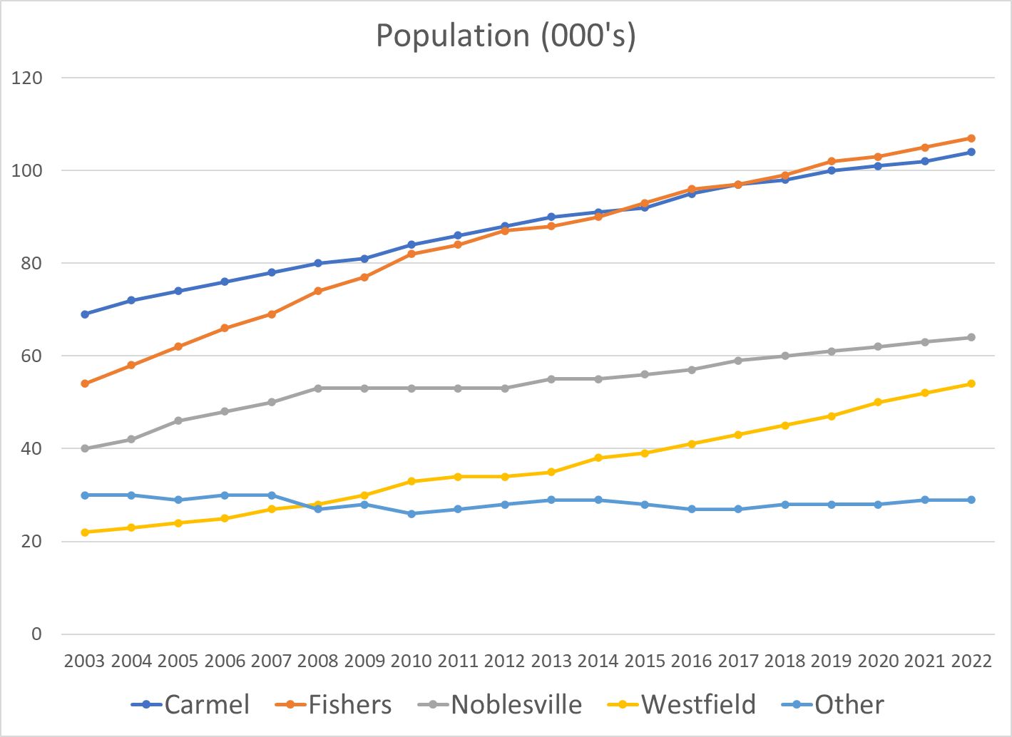
Fishers has overtaken Carmel to become the largest city. Westfield is growing at the fastest percentage rate, with Noblesville close behind.

The county continues to add about 7,000 people each year to its base of 360,000, the fourth largest county in Indiana.

https://www.census.gov/data/datasets/time-series/demo/popest/intercensal-2000-2010-cities-and-towns.html

https://www.stats.indiana.edu/population/sub_cnty_estimates/2020/e2020_townships.asp

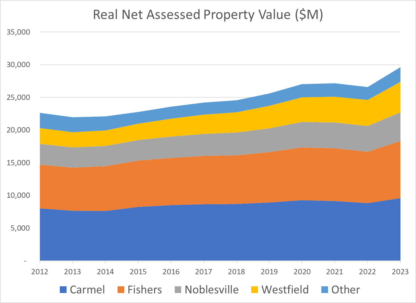
The net assessed valuation for property taxes has grown in line with the population, with faster growth in the last 5 years.

Property values have grown less rapidly, but still significantly, on an inflation adjusted basis.

https://fred.stlouisfed.org/series/CPIAUCSL#0

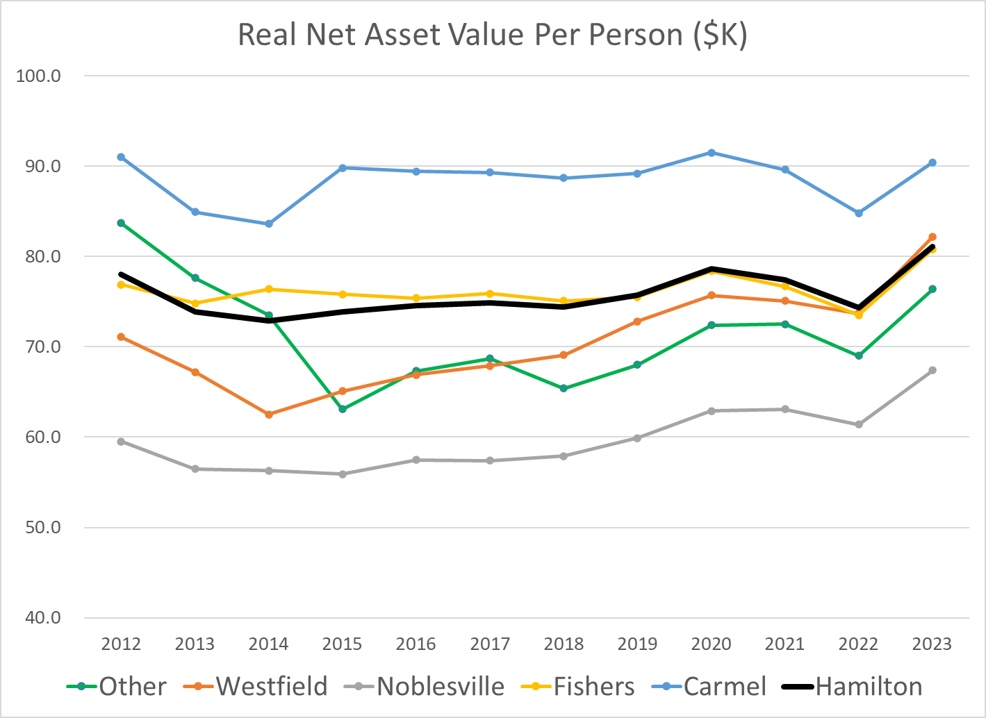
The real property value per person has remained roughly flat as the county has grown during the last decade. Carmel has higher real estate values and Noblesville has lower real estate values.

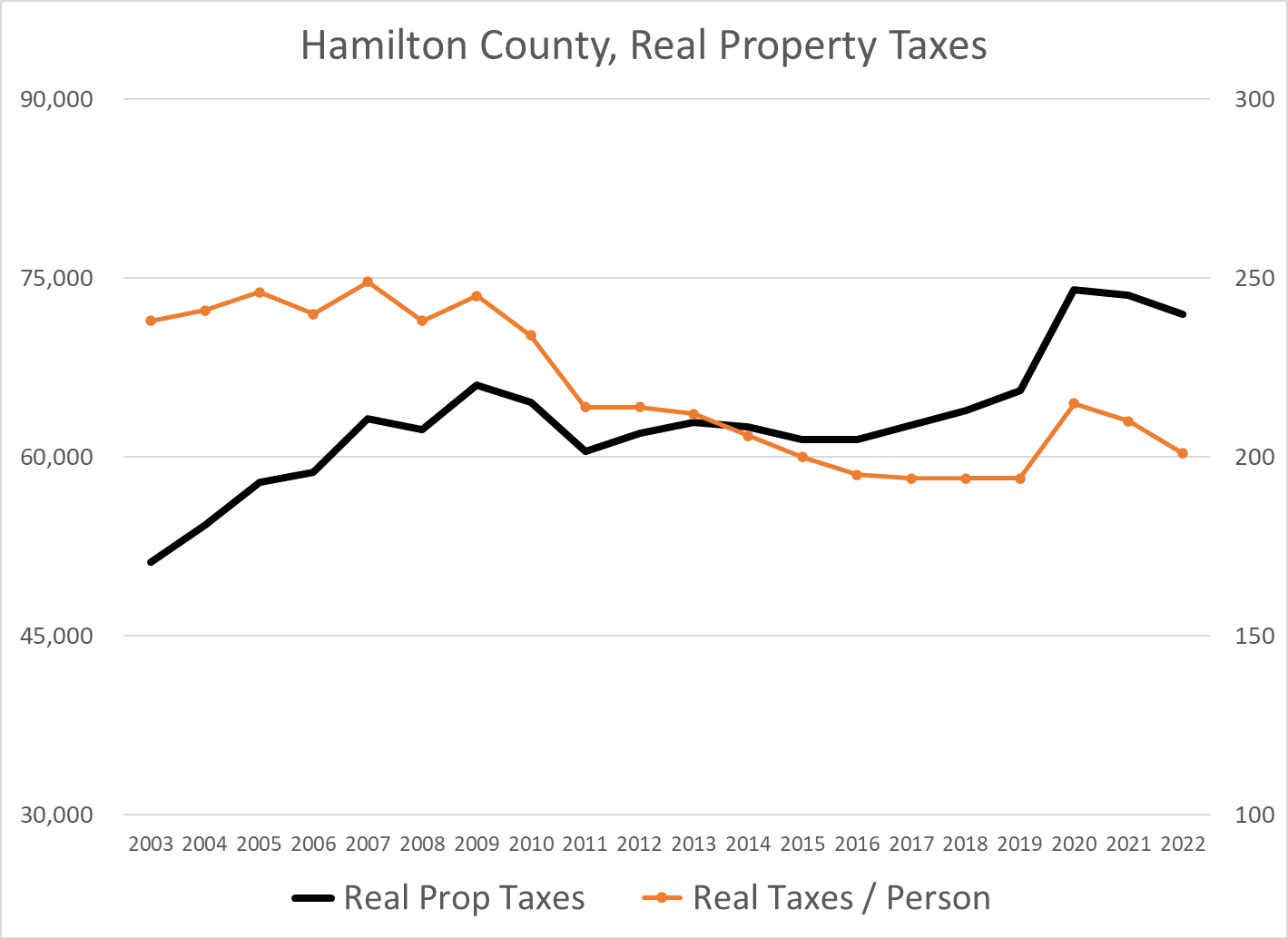
Real estate taxes levied by the county itself increased for payments due in 2020, but the real taxes per person remain 20% lower than they were in the “teens”. The county consolidated the provision of certain “emergency” services from the towns and cities in 2020.

https://www.hamiltoncounty.in.gov/ArchiveCenter/ViewFile/Item/214

https://www.hamiltoncounty.in.gov/ArchiveCenter/ViewFile/Item/95

https://gateway.ifionline.org/public/pts/pts-overview.aspx

Summary

Hamilton County’s growth looks to continue at a sustainable rate, with open land in Fall Creek, Westfield, Noblesville available for development.
Indianapolis Crime Rate

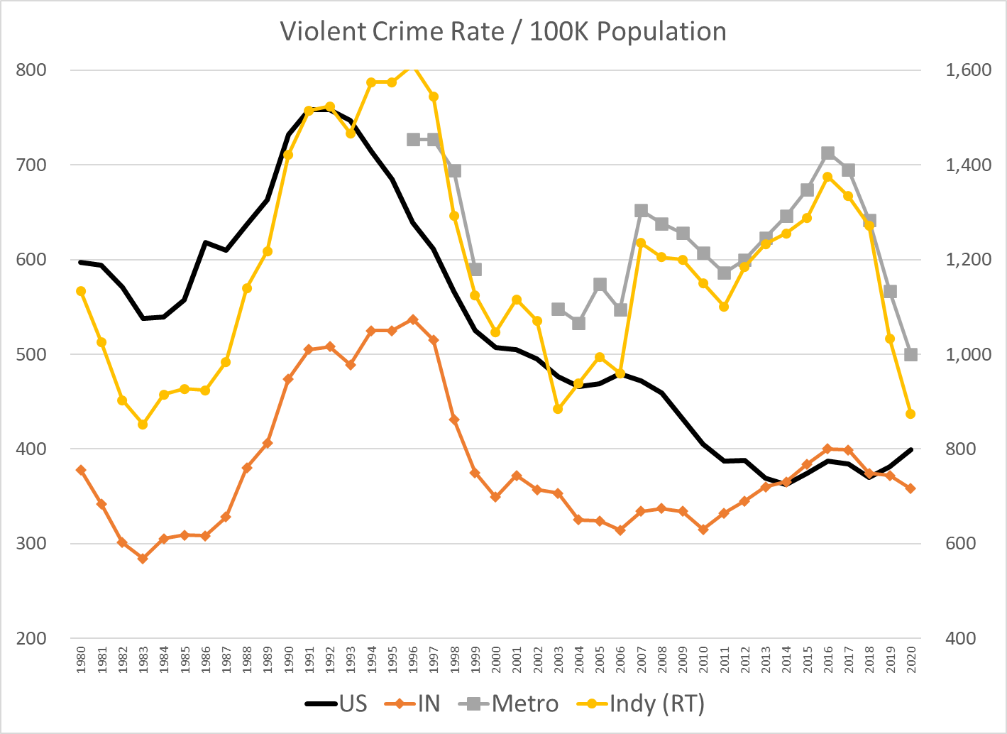
I’m using data from the FBI Unified Crime Reports. Total country violent crime increased by 25% from 600 events per 100,000 people in 1980 to 758 events in 1991 (thick black line). Violent crimes dropped dramatically to 500 events (33%) by 2001. There was a minor decline to 479 in the next 5 years and then another major decline to a minimum of 362 events, a 52% decline from the peak. Violent crime has increased to 399 in 2020, a 10% increase from the 4-decade minimum, but still 47% below the 1991 peak rate. In summary, the total country violent crime rate increased by 25% in the 1980’s, dropped by more than half in the next 25 years and has bumped back up to a level about one-half of the peak and one-third lower than the 1980 start. This is a quite positive result.

Indiana’s (orange line) general pattern mirrors the national figures. However, Indiana started at 378 violent events per 100K people in 1980, more than one-third lower than the national average. This is a quite significantly lower crime rate. Indiana’s violent crime rate increased by a larger 42% to a peak of 537 events in 1996. This was half again faster than the 27% increase for the country as a whole. Indiana was becoming more like the rest of the nation. Indiana’s violent crime rate dropped very quickly to just 349 events by 2000 (-35%), returning to 69% of the national level from 84% of the national level in 1996, a modest amount above the 63% ratio in 1980. Indiana violent crime inched down by 10% to 314 by 2010. The national crime rate was falling twice as fast, so Indiana was now at 78% of the average. In the “teens” decade, Indiana violent crime increased by 10%, returning to where it had been in 2000. National violent crime was flat during the “teens”, ending at 400 events. Indiana violent crime rate was essentially the same as the national rate during the “teens”, no longer one-third lower. It had returned to its starting point of roughly 400 events per year.

The city of Indianapolis (yellow line) is measured by the right hand scale, twice as high as the other 3 measures. Like most central cities, its violent crime rate is much higher than the national average. The Indianapolis crime chart follows the nation from 1980 through 2006. It starts at 1,134 events per 100K people, increases by 42% (like IN) to 1,611 in 1996, then drops by 45% to 884 events in 2003. The city’s violent crime rate is 1.9 times the national average at the beginning and the end of this 23-year period, but peaked at 2.5 times the average in 1996. The crime rate leapt up by 28% in 2007, reaching 2.6 times the national average. Violent crime in Indianapolis grew by 11% by the peak in 2016, 3.6 times the national average. The reported Indy crime rate has fallen by more than one-third in the last four years, ending at 2.2 times the national average. Looking at ten-year averages to smooth out the difficult to interpret variability, Indy has increased from 1.8 to 3.0 times the national average. The last 2 years look suspiciously low, just like 2007 looked suspiciously high. The 1,300 level for most of the last decade is more than 10% below the 1,500 peak level of the 1990’s. So … Indiananapolis violent crime is now down a little compared with the peak, up very significantly compared with the national average and roughly within the range of the first 30 years.

The Indy metro data follows the city of Indianapolis pattern very closely.

The national homicide rate per 100,000 people averaged 9 from 1980 to 1995. It dropped by one-third to just 6 by 2000 and stayed at that level through 2007. It declined to an average of just 5 for the next decade, before spiking up in 2020 (and 2021, FBI official data unavailable). The national homicide rate is up significantly, but one-third lower than in the eighties and early nineties.

Indiana started at an unusually high 9 homicides per 100,000 people in 1980, but averaged just 6 for most of the eighties, just two-thirds of the national level. Indiana homicides jumped quickly to a peak of 8.2 in 1992 and remained near 8 for six years. The national homicide rate fell rapidly from 10 to 6 during the nineties, leading to a six-year period (1997-2002) where Indiana homicide rates were slightly above the national average. Indiana homicide rates closely matched the national average for the next decade, falling to 5 in 2008. Indiana homicides increased by 50% between 2014 and 2020, from 5.0 to 7.5 while the national average increased about 50% from 4.4 to 6.5 events per 100K people. Indiana has averaged about 6 homicides per 100K people during this 4-decade period except for the 8 homicides rate in the mid-nineties. The most recent murder rate has returned to that peak level.

The city of Indianapolis very closely matches the Indiana pattern for the first two decades, with 12 homicides per 100K people in 2000, about double the national average of 6. The Indy rate pops back up to 14.2 in 2001 versus the 5.6 rate for the country (2.5 times higher). Indy follows the slow national decline through 2012 to 11.6 events versus the 4.7 country level (2.5X). Indy’s murder rate jumped 31% to 15.2 in 2013, and has climbed steeply since then. It reached 19.5 in 2019, a two-thirds increase in 7 years. It jumped again in 2020 to 24.2 and is estimated to be more than 28 in 2021. Indy averaged about 14 murders per 100,000 people in the first 32 years of this period. 2019 was a 40% increase. 2020 was a 73% increase. 2021 is a doubling.

The Indy metro area pattern follows the city of Indianapolis. Metro Indy’s homicide rate averaged 1.35 times the national rate from 2003-2011. It has averaged 1.76 times the national average from 2012 to 2020.

Summary

Indianapolis has a huge violence and murder problem. Period. Violence at the national level is way down. Murders at the national level are much lower than the peak period. Indianapolis’ violence rate shot up in 2007 and only declined in the past 2 years. Indianapolis’ murder rate shot up in 2013 and has continued to climb. I try to highlight the “good news”. I emphasize long-term data to provide context. I try to minimize/offset the sirens of local and national journalists. But, for this topic, there is no apparent “silver lining” or “on the other hand” conclusion.

https://www.fbi.gov/services/cjis/ucr/publications

https://ucr.fbi.gov/crime-in-the-u.s/1999

https://www.macrotrends.net/cities/us/in/indianapolis/crime-rate-statistics

https://www.disastercenter.com/crime/incrime.htm

https://crime-data-explorer.app.cloud.gov/pages/explorer/crime/crime-trend

https://ucr.fbi.gov/crime-in-the-u.s/2019/crime-in-the-u.s.-2019

https://www.themarshallproject.org/2016/08/18/crime-in-context

https://www.savi.org/feature_report/equity-and-criminal-justice-the-cradle-to-prison-pipeline-in-indianapolis/

https://abcnews.go.com/US/12-major-us-cities-top-annual-homicide-records/story?id=81466453

https://www.wrtv.com/news/local-news/crime/2022-indianapolis-homicide-map

https://www.wrtv.com/news/local-news/crime/indianapolis-had-271-homicides-in-record-breaking-2021

https://fox59.com/news/indycrime/crime-mapping-neighborhoods-impacted-the-most-by-homicides-in-2021/

https://www.wthr.com/article/news/crime/762-people-shot-in-indianapolis-in-2021-shooting-cold-case-violence-indiana-impd/531-7e477cf2-31cc-4147-9005-4e4dab7b3366

https://www.wfyi.org/news/articles/law-enforcement-community-work-to-solve-more-homicides

Indy Metro Housing Market: Not the Hottest!

All of the national indicators point to an overheated housing market.

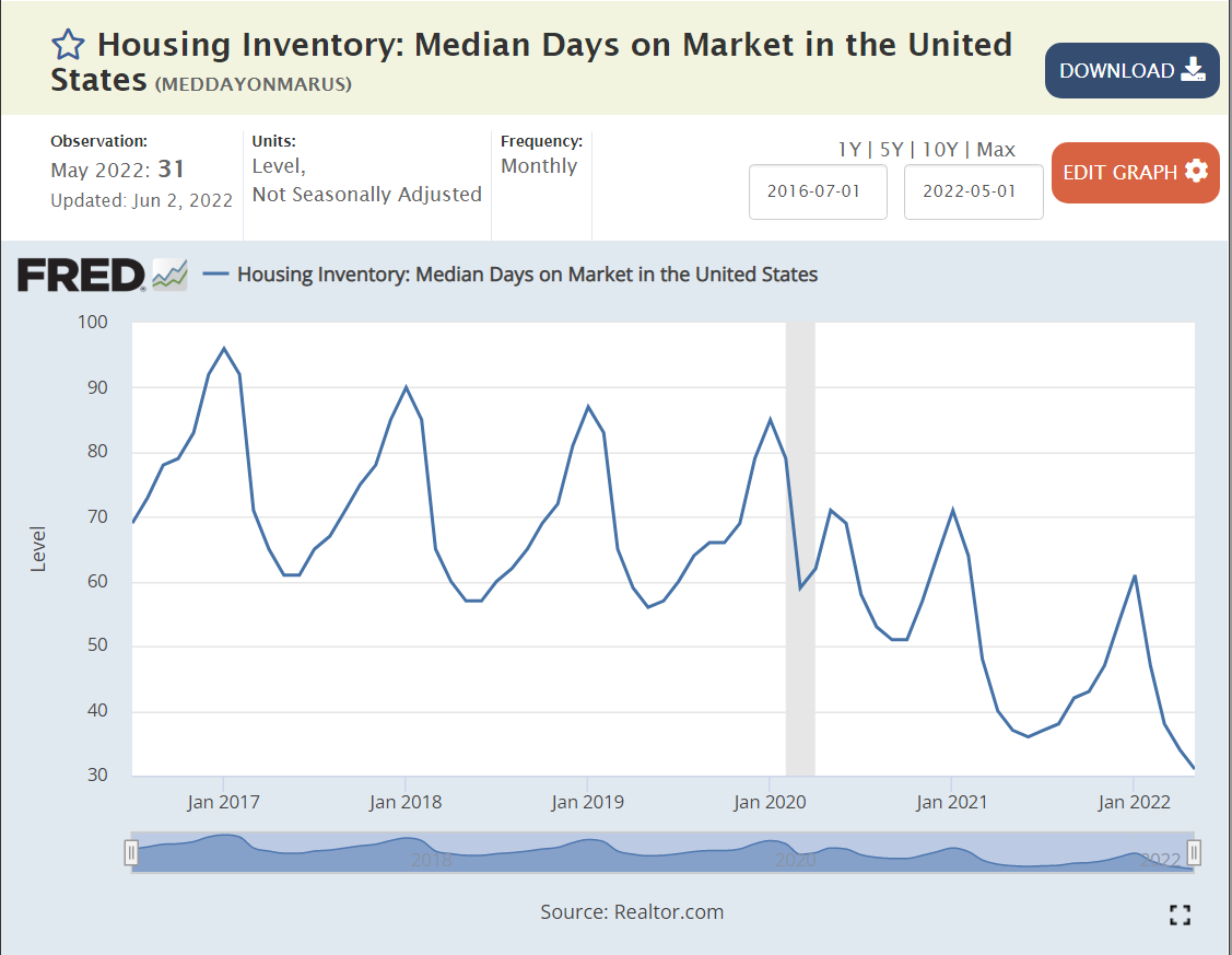
Houses are selling in 30 days, 60% faster than their usual 75 days on the market.

The median home sold for $320,000 throughout 2017-18-19-20. Homes now sell for $100,000 more at $420,000. That’s a 30% increase. We’ve had 10% inflation during this time, so that’s still 20% extra.

Builders have joined the party, showing the same pattern.

https://www.corelogic.com/intelligence/april-jump-in-us-rent-price-growth-puts-pressure-on-inflation-corelogic-reports/

Single family rental prices have also followed suit.

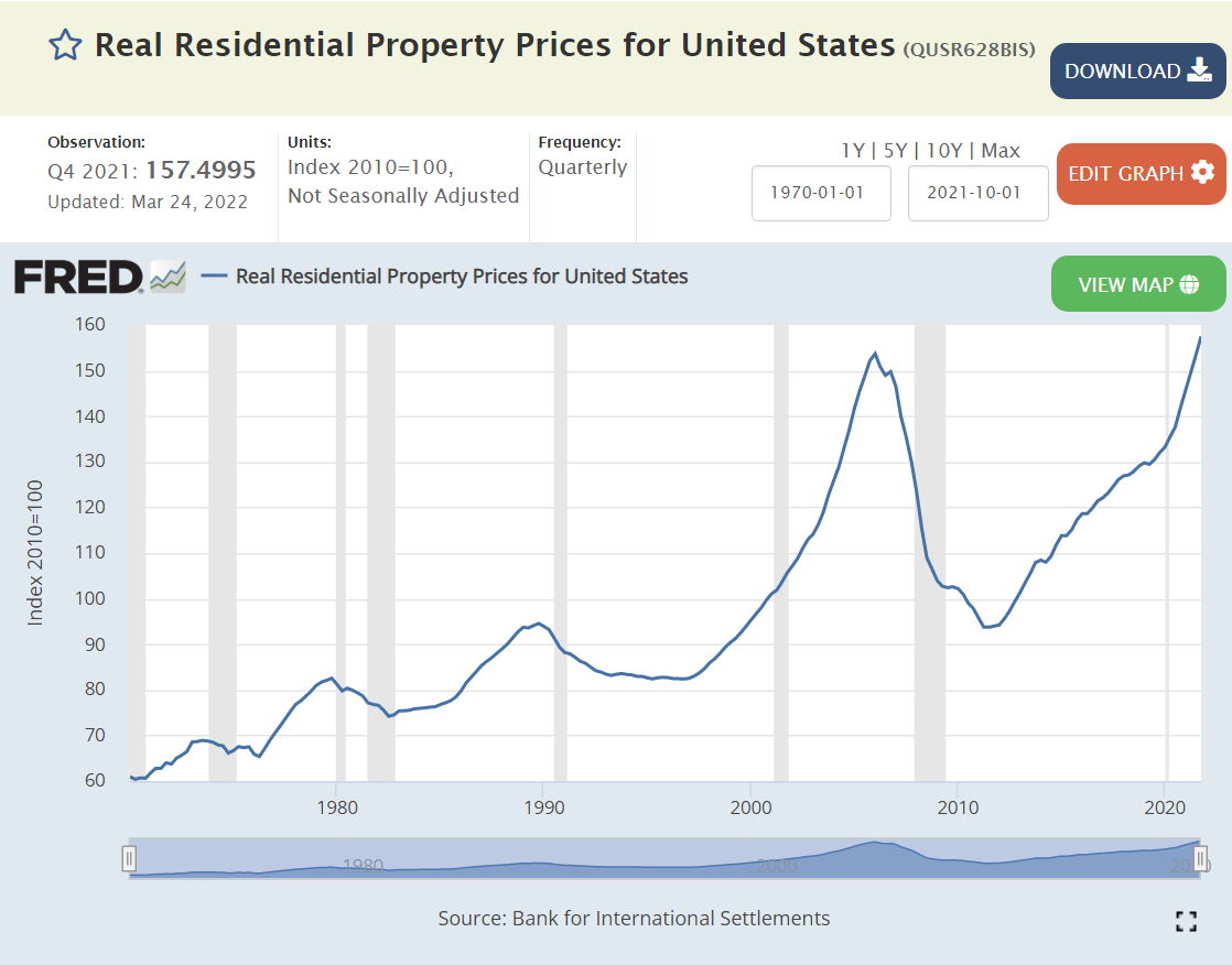
Real, inflation-adjusted, home prices are at an all-time high, equal to those just before the bubble popped starting the “Great Recession”.

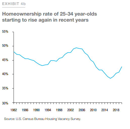
Are current house prices sustainable? I think so. Will they continue to increase by 15% per year? No. Prices will level off based on the slow-down of the overall economy, lower consumer confidence, higher mortage rates, etc. Prices are sustainable due to supply and demand. Population growth in the US has continued, especially those aged 25-34 who form the age range where ownership increases.

https://www.freddiemac.com/fmac-resources/research/pdf/202105-Note-Housing_Supply-08.pdf

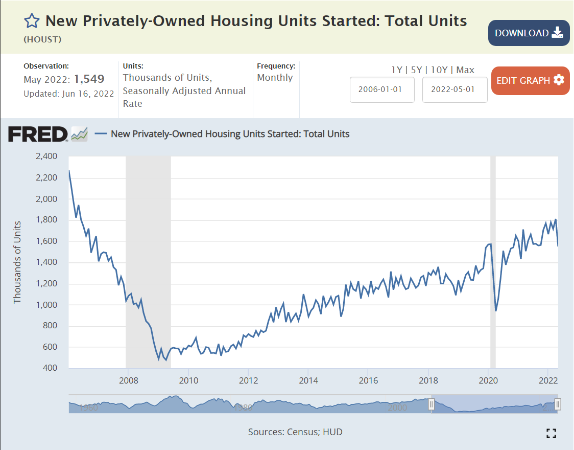
The supply of new housing has lagged greatly since the Great Recession, compared with history and population. The supply of “starter homes” has been especially low.

The US population has not quite doubled since 1960, but we’re getting close.

Let’s use 1.5 million housing starts as the typical level for 1960-1970. The comparable level today would be at least 2.25 million, even accounting for the “catch-up” in the 1950’s and 1960’s to make up for the housing shortfall in the 1930’s and 1940’s. The 1970’s and 1980’s were very weak decades due to international competition, energy crises, crazy high mortgage rates, recessions, stagflation, etc. The Clinton economic recovery in the 1990’s was strong for employment, low inflation, lower mortgage rates and zero federal budget deficits, but the economic gains were not disproportionately invested in the housing market. The population had increased from 180 to 280 million (55%), but housing starts were essentially “flat”.

The turn of the millennium saw a 25% increase in housing starts, from 1.6 to 2.0 million per year. This level was artificially supported by low interest rates and unsustainable mortgage lending practices. Based on the population, 2 million new homes built per year was sustainable in theory, but not in practice. The construction market dropped to near-zero. (0.5 million starts/year). It reached the 1959 (think about this) level of 1.6 million starts again only in 2020.

Let’s estimate the “lost” construction units of this 16-year period. Assume 1.6 million units per year is the long-term requirement. 2.9 million units were lost during 2007-10. Another 5.3 million units were lost from 2011-20. That’s a total of 8.2 million units, or about 4-5 years’ worth of construction. We can throw out the first period and assume this was offsetting unreasonable demand and supply before the Great Recession. But that still leaves 5.3 million missing units, 3 years worth of current construction. If we assume that 1.8 million units per year is the real long-term requirement, then the 2011-21 period was short another 2.2 million units, for a total of 7.5 million units, or nearly 5 years worth of current construction. At a national level, we still have a severe housing deficit.

https://www.freddiemac.com/research/insight/20210507-housing-supply

The decreased building of “starter homes” aggravates the situation. Home builders try to optimize the profit on their investment in land, within zoning rules, so they disproportionately build larger single-family homes.

The Freddie Mac folks estimate a 4 million home deficit, about one-half of my “back of the envelope” estimate. Even at that level, we have a 2.5-year shortfall. This shortfall will work to increase home prices at a rate above inflation for at least the next 5 years.

Indy metro population has grown at about the same rate as the nation in recent decades, so it is not surprising that it’s housing starts pattern is quite similar. Perhaps 1,200 permits per month, or 14,000 per year at the peak. Dropping by 75%, eliminating most of the local builders by 2008. The “recovery” has been even slower, reaching 800 permits per month only in late 2020 (2/3rds of the base). Doing the same kind of “rough” math, Indy has a minimum 400 permits per month deficit for 15 years, or 72,000 missing units. At 6,000 units per month, we have a 7-8 year shortfall!!! (flyover country) Assuming that metro Indy continues to be relatively attractive as a destination for college graduates and movers, existing housing prices should increase by more than inflation for the next decade, even though Indy is “cursed” by being a relatively small city with many freeways and housing development options in all directions (tongue placed firmly in cheek)

https://www.storagecafe.com/blog/despite-rising-home-prices-indiana-and-mid-atlantic-states-step-up-with-starter-homes/

Although Indy residents complain about recent increases in housing prices, even the higher end suburbs of Fishers and Carmel show up in an “affordable” housing article.

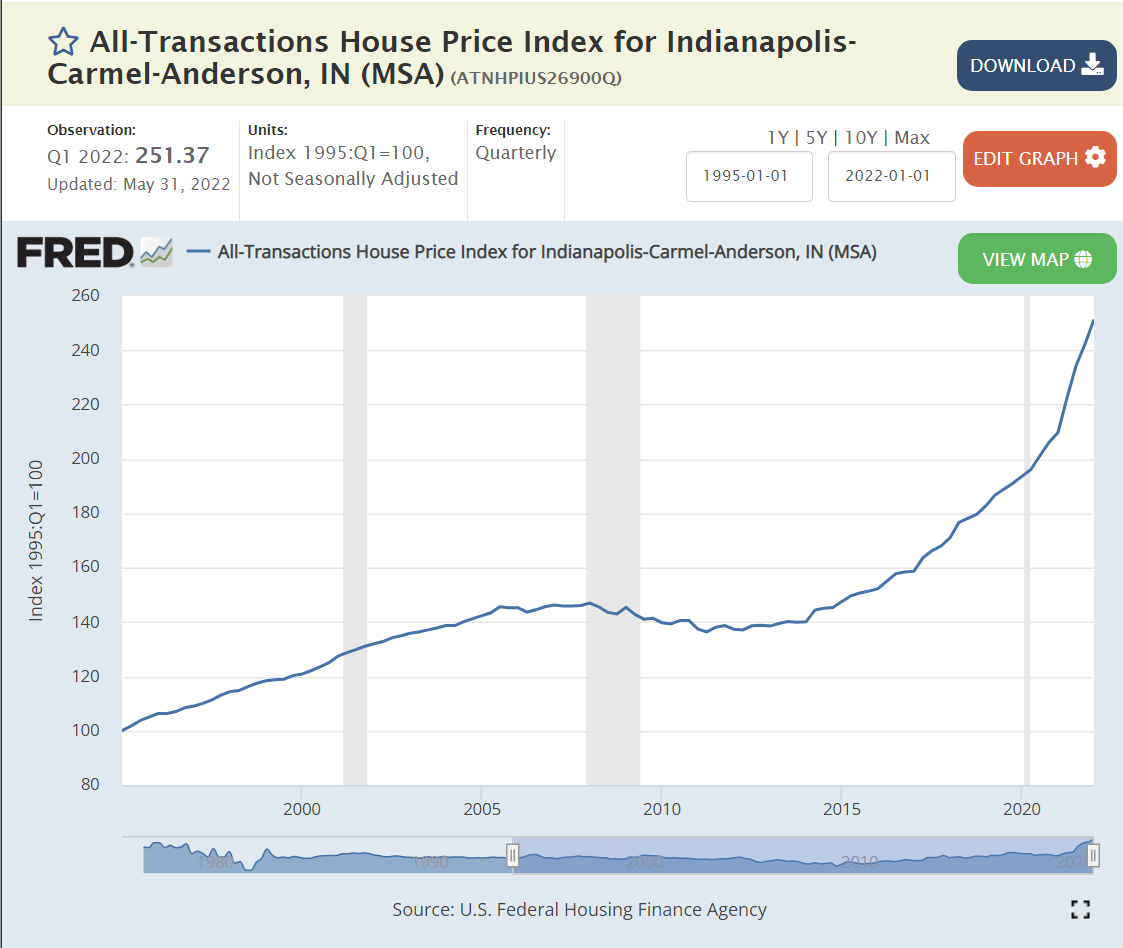
Metro Indy house prices increased by 40% from 1995-2005, but then flat-lined for the next decade, showing just a 40% increase over 20 years or less than 2% growth per year, slower than inflation. They grew by another 40% from 2015-20 in 6 years, 3 times faster than the previous 20 years. They grew much faster in the last year!

The 2%ish price increase rate bumped up to 5% from 2015-2020, before spiking to 20%.

https://www.realtor.com/research/topics/housing-supply/

Realtor.com says Indy has a $320K median list price, up 16% for the year, with 30 days listing to accepted offer.

FHA reports 15% price increases in Indy home sales. Indy ranks 63/100 metro areas, slightly below the average 17% rate, and well below the 30% price increases in southwest Florida.

https://www.fhfa.gov/DataTools/Tools/Pages/FHFA-HPI-Top-100-Metro-Area-Rankings.aspx?

https://www.redfin.com/news/redfin-rental-report-may-2022/

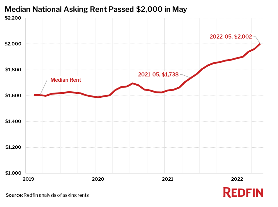
US rents are up by 25% in the last year and a half. Places like Cincinnati and Nashville are seeing 30% asking rent increases. Redfin reports 20% increases in Indy asking prices, but the $1,471 monthly rent remains in the bottom 20%.

Realtor.com reports a less “frothy” Indy rental market with 11% actual increases and a $1,275 per month rate.

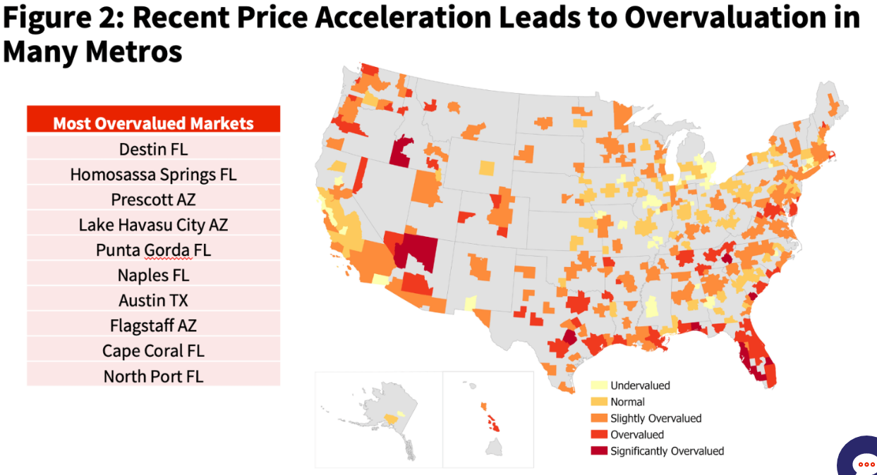
As housing prices have spiked, analysts have attempted to identify the bubble areas. Indy is in the below average risk catgeory.

https://www.corelogic.com/intelligence/potential-risks-of-price-declines-in-the-real-estate-market/
https://fortune.com/2022/05/31/is-housing-market-bubble-which-markets-overvalued-home-prices/

Summary

The US housing industry is not like a typical consumer product or services market where the forces of supply and demand determine a market price and the equilibrium quantity of housing is delivered instantaneously. Households adapt, calculate, defer, overextend their housing demand based on many factors. Given the four-fold difference between peak and bottom supply, the construction industry is inherently unstable. Zoning rules and approvals change. Mortgage interest rates change. The economy moves through business cycles. Houses are built with 40-60-80 year expected lives, but consumed one year at a time.

The US economy has underinvested in housing for 15 years. The population has grown and median household incomes have grown. Households have aged and decided they prefer single family houses. There is a 3-5-7 year deficit of new housing. Housing prices will increase faster than inflation for the next decade. Indianapolis may see housing prices rise even faster than the national average since it has built relatively fewer new homes.

Indy Metro Area vs Rest of Indiana (1970-2020)

The Indy Metro Area is comprised of Marion County plus the 7 surrounding “donut” counties. Marion has grown throughout the half-century, adding 175,000 people (22%). Rural Morgan and Shelby counties have not grown much. Hancock, Boone and Johnson counties have doubled their populations. Hendricks has grown from 50,000 to 175,000. Hamilton has grown exponentially from 50,000 to 350,000. This relatively rapid growth has made the metro area grow from 21% to 28% of the state total, adding state senators and representatives and causing increasing tensions between the one large, growing area and the slower growing, largely rural, rest of the state. There are suburban Chicago, Louisville and Cincinnati counties that have shown decent percentage growth, but they are a small share of the state. Lake County (Gary) is a special case, declining in population decade after decade.

The Indy Metro counties started 1970 with slightly higher per capita personal incomes, so the share of the state total was 24%, a bit above the 21% population share. By 2020, the Indy Metro area had captured one-third of the state’s personal income (34%), much higher than its 28% share of the population. Per capita incomes and population had both grown in the capital region.

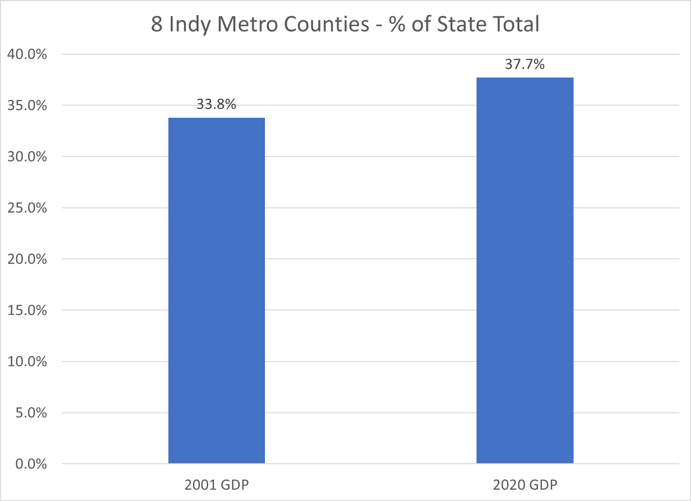
Gross Domestic Product, the value of goods and services produced in Metro Indy, was one-third of the state total in 2001, the first year of available statistics. This measure increased to 38% by 2020. Nearly 2 out of every 5 dollars of statewide value-added output was generated by the Indy Metro area in 2020.

Indiana is a mostly rural state with Indy, a dozen small cities, a cluster of northern Indiana manufacturing counties, Gary (Lake County), Ft. Wayne (Allen) and Evansville (Vanderburgh). The Indy Metro Region has 9 times the density of people, income and production as the most rural counties. For example, it takes the 67 lowest population counties to equal the 1.9 million people living in the Indy Metro area.

The Indianapolis Metro area grew by a respectable 72% during this period, above the national average of 63%. The other Indiana counties grew by only 19%, about one-fourth as fast.

The Indy Metro area added 900,000 people, the same growth as the rest of the state.

With population and per capita income gains, the Indy Metro area’s real personal income grew almost four-fold, while the rest of the state grew by roughly 150%.

Indy Metro per capita income was 15% above the rest of the state in 1970 and twice as high (30%) by 2020.

The Indy Metro area has improved its per capita income versus the US average by 4 points, from 101 to 105. The other-Indiana counties have declined from 88% to 81% of the national average.

While the per capita income in the Indy Metro area is 30% higher than the rest of the state, the value of goods and services produced (GDP) per person is more than 50% higher than the rest of the state.

These wide, and growing, disparities in economic results may lead to increasing tensions between the relatively prosperous center and the largely “left behind” periphery. Fortunately, the real personal income per capita in the “other” counties did increase by 95%, from 24 to 48K during these 5 decades, even though the Indy folk’s income grew by 120%, from 28 to 62K.

https://www.stats.indiana.edu/population/PopTotals/historic_counts_counties.asp

Little Pink Houses …

I’ve lived in the Indy suburbs for 34 years, 80 miles away from Johnny Cougar Mellencamp’s hometown of Seymour, IN. These songs were published in 1983 and 1985, VERY early warning signs of the rapidly growing gap between rural and urban America.

Let’s take a look at 2020 per capita income levels for the 92 counties in Indiana.

Indiana per capita income was $51,900, now just 87% of the US average of $59,500.

In 1970, Indiana per capita income was indistinguishable from the national average: $3,020 versus $3,119 (nominal/current dollars). Indiana was the 18th highest rated state, leveraging its manufacturing prowess, highly productive agriculture, central logistics location, proximity to Chicago and ports on the Great Lakes and the Ohio River.

In 2020, just 5 Indiana counties had per capita incomes above the US average. 87 had lower levels. In just 2 generations, nearly the whole state had moved from a proud “average American” level to well below average.

In 2020, only 11 of Indiana’s 92 counties earned 90% of the national average. Just 41 of 92 Indiana counties earned even 80% of the national average.

The distribution of per capita income levels within Indiana expanded. In 2020, just 13 of 92 counties were “above average” compared with the Indiana average, which was already 13% below the national average.

Indianapolis suburban counties Hamilton and Boone averaged $80,000 of per capita income in 2020, far above the US and Indiana averages. No other Indiana counties averaged as much as 80% of this level. Just 4 others reached 70% of this aspirational level: $56,300. Only 11 of 92 counties earned two-thirds of the wealthy suburban level at $53,600. 39 of 92 Indiana counties had per capita incomes above 60% of the suburban winners.

Income distribution matters within counties and across counties. The increasing disparity in incomes is driving American politics.

https://www.bea.gov/data/income-saving/personal-income-county-metro-and-other-areas

Indiana Population Grew Half as Fast as the US from 1970-2020.

The US population increased by 61%, from 205 to 330 million.

Indiana population increased by 30%, from 5.2 to 6.8 million. Indiana added nearly 1.6 million people during these 5 decades. It would have added another 1.6 million if it grew as fast as the US average.

Indy Metro Area Grew by a Strong 72%.

The 8-county area grew from 1.1 to 1.9 million, adding 800,000 people and accounting for one-half of the whole state’s growth during this period. Growth has been consistently strong in each of the last 3 decades, adding 230,000, 220,000 and 220,000. The Indy Metro area has grown from 21% to 28% of the state’s total population.

6 Other Suburbs Grew by 76%

Porter (CHI) added 84K. Dearborn (CIN) added 20K. Warrick (EVN) added 35K. Harrison (20K), Floyd (23K) and Clark (43K) added to the metro Louisville population. In total, these 6 counties added 226,000 people to their 296,000 base, reaching 523,000 in 2020. They grew from 6% to 8% of the Indiana total.

Indiana and Purdue University Counties Grew by 79%

Monroe (76%) and Tippecanoe Counties (81%) displayed very similar growth rates. Their combined population increased by 153K, from 194K to 348K. Their share of the Indiana total increased from 4% to 5%.

These 18 counties out of Indiana’s 92, accounted for 76% of the population growth, increasing by 1.2M, from 1.6M to 2.8M people! Their share of the state total grew from 31% to 41%!

Northern Indiana Tier (South Bend, Elkhart, Ft. Wayne) Added 38%

The 10 counties stretching from St. Joseph (South Bend) to Allen (Ft. Wayne) showed modest, but consistent growth throughout the period. Elkhart was most successful, adding 81,000 people (64%). Ft. Wayne added 101,000 people, but just 36% growth. St. Joseph managed to add 27,000, but just an 11% growth rate. Marshall, Kosciusko, LaGrange, Noble, Whitley, Steuben and DeKalb counties each added at least 10,000 residents.

In total, this section added 326,000 citizens, growing from 860,000 to 1,190,000. It’s share of Indiana’s population shaded up from 16% to 17%.

Lake County (Gary) Lost 11%

Population dropped by 62K, from 546K to 484K. Lake County reduced its Indiana population share from 10.5% to 7.2%.

8 Small City Counties Lost 5%

These stand-alone counties each had at least 75,000 citizens in 1970. Together, with 902,000 people they accounted for 17.4% of Indiana’s total. Their population fell by 48,000 to 855,000, representing just 12.4% of the Indiana total in 2020. From best to worst population growth, using their main city for easy identification: Evansville (+13K), LaPorte (+1K), Kokomo (-1K), Terre Haute (-8K), Anderson (-9K), Richmond (-14K), Muncie (-15K) and Marion (-19K).

57 Rural Counties Added 13%

These counties all started with populations of less than 60,000 in 1970. The average county had 23,000 residents. This increased to 25,000 by 2020. 17 counties actually lost population across 50 years. Another 24 counties added less than 5,000 people. Just 16 counties added 6,000 people or more (including the next 5). Jaspers, Dubois, Jackson and Putnam each added more than 10,000 people. Bartholomew (Columbus) was the outlier, adding 28,000 people, growing by 48%, from 57,000 to 85,000 people.

In total, this group added 167,000 people, growing slowly from 1.283 to 1.449 million. Their share of the state total population dropped from 24.7% to 21.4%.

These 3 slower growing areas represent 66 counties, or 70% of the Indiana total. Their combined population increased by 2% in a half-century, edging up from 2.7 to 2.8 million. Their share of the Indiana total has declined from 53% to 41%, so possible future slow growth will have a relatively lesser impact on the state total.

Summary

The Indianapolis area, 6 other suburban counties and the homes of Indiana and Purdue Universities grew nicely at 75%, above the 61% national growth rate. 10 counties in the northern tier and Columbus showed modest growth. Two-thirds of Indiana’s counties grew at close to zero percent across 50 years. The 2000-2010 and 2010-2020 periods showed the same overall results.

Indiana shares these stagnant rural and old tech manufacturing county challenges with its neighboring states.