
US Infant Mortality Rate: It’s Complicated

The good news is that infant mortality rates (deaths/1,000 live births in 1st year) declined by 80% between 1950 and 2000, from 35 to just 7 and have declined an additional 14% to a little less than 6 by 2018.

• United States: infant mortality rate 1935-2020 | Statista

Infant Mortality Rate for the United States (SPDYNIMRTINUSA) | FRED | St. Louis Fed (stlouisfed.org)

The main CDC page highlights the 5 main causes of death, the significant state differences (higher rates in the south central states, Ohio and WV, and differences by race. Black infant mortality rates (IMR) remain more than twice as high as non-Hispanic Whites. Asians have lower rates than Whites. Hispanic White infant mortality rates are “close” to the White rates.

Infant Mortality | Maternal and Infant Health | Reproductive Health | CDC

The Petersen-KFF website provides clear summaries of the main dimensions of this public health area. About 2/3rds of deaths occur in the first month and are termed neonatal. The remainder in the first year of life are termed postnatal. Both neonatal and postnatal death rates have declined in the last 20 years.

Petersen provides more details on state level death rates, showing that the Great Lakes states have high rates similar to the southern states (7), while much of the country has much lower rates (5).

Births for mothers under 20 show death rates almost twice as high as those in their twenties and thirties.

Ten factors account for two-thirds of deaths, lead by congenital defects and early delivery/low birth weight which account for one-third.

The US mortality rate (5.8) is 75% higher than other countries with similar income levels (3.5). The world-class results in Japan and Finland come in at 2. Details in the way the US reports its figures may account for one-third of the difference versus comparable countries. While the US rate has declined from 7 to 5.8 in the last 20 years, the comparable group reduced its rate from 4.6 to 3.3. Various sources propose that socioeconomic inequality, racial differences and health care system differences account for the US’s poor performance.

What do we know about infant mortality in the U.S. and comparable countries? – Peterson-KFF Health System Tracker

Health status – Infant mortality rates – OECD Data

The racial disparities in infant mortality rates are addressed in various ways.

The very different rates by state seem to show that differing health care policies matter greatly.

Regional variation in Black infant mortality: The contribution of contextual factors (plos.org)

Socioeconomic and racial differences at the county level can be clearly seen in Indiana.

Infant mortality in Indiana | County Health Rankings & Roadmaps

The US Health & Human Services website highlights black-white differences in birth weights, SIDS occurrence, early births/low birth rates and causes of death.

Infant Mortality and African Americans – The Office of Minority Health (hhs.gov)

The statistical analyses to disentangle socioeconomic status and race are very complicated. Most show that socioeconomic status accounts for half of differences, but not nearly 100%. This study found that maternal education, maternal marital status and maternal age “explained” much of the racial differences. Of course, the authors then point to poverty and income differences as underlying factors.

Racial and Ethnic Infant Mortality Gaps and the Role of Socio-Economic Status (nih.gov)

Several more recent studies point to systematic racism working through a large number of lifetime events which impact the mother’s health as the primary cause of racial differences in infant mortality rates.

Exploring African Americans’ High Maternal and Infant Death Rates – Center for American Progress

Eliminating Racial Disparities in Maternal and Infant Mortality – Center for American Progress

One study of Florida births indicated that having a black doctor reduced deaths by 40% for black infant births. White infant mortality was not effected by the race of the doctor.

Black newborns 3 times more likely to die when looked after by White doctors – CNN

In summary, great progress has been made since WW II and continues to be made in the US. However, the reduction in death rates has slowed down. The US death rates are much higher than in other higher income nations and death rates in Europe and Japan have declined faster than in the US. US state death rates range widely, from 4 to 8. Black death rates are twice as high as white death rates.

There remains room for significant progress. World class 2 deaths per 1,000 versus 4.7 for American whites, 11 for American blacks, 4.2 for Californians, 4.6 for New Yorkers, 6.1 for Illinoisans and Floridians, 7.2 for Buckeyes, Hoosiers and Georgians, more than 8 for Mississippians and Arkansans.
US Life Expectancy

Historically, this was one of the “good news” items. It went up and up and up.

The results in the last 3 years have not been so positive.

Vital Statistics Rapid Release, Number 010 (February 2021) (cdc.gov)

Life expectancy has dropped by more than one year. The recent COVID effect is overshadowing the role of “deaths of despair”: opioids, alcoholism and suicide.

U.S. Life Expectancy Dropped In First Half Of 2020 : NPR

U.S. life expectancy plummets amid pandemic – POLITICO

The US life expectancy rate is much lower than countries at the same level of economic development. The US suffers from the negative impact of smoking, obesity, homicides, suicides, traffic fatalities, infant mortality and unequal health care access.

Why is life expectancy in the US lower than in other rich countries? – Our World in Data

How does U.S. life expectancy compare to other countries? – Peterson-KFF Health System Tracker

The difference in expected lifetimes by zip codes (income/wealth) has recently been highlighted, indicating a difference of as much as 30 years between the poorest and wealthiest locations.

ZIP Code Effect: Neighborhood Can Affect Life Expectancy by 30 Years – Blue Zones

Life expectancy in the United States, mapped by neighborhood — Quartz (qz.com)

US Abortion Rates

US abortion rates have declined significantly for nearly 40 years. Reported abortions increased from near zero through 1967 to 1.5M in 1979 and a peak of 1.6M in 1990, before declining to one-third of that level by 2018. The abortion rate per 1,000 child-bearing women reached 16.3 in 1973 when the US Supreme Court issued its Roe vs. Wade ruling. The rate peaked at nearly twice as high in 1981 at 29.3. The rate fell back to the 1973 level by 2012 and has fallen 20% further in recent years to 13.5.

Historical abortion statistics, United States (johnstonsarchive.net)

Abortion Rate In U.S. Falls To Lowest Level Since Roe v. Wade : The Two-Way : NPR

6 Charts Show How US Abortion Rate Reached Lowest Level Since 1973 (businessinsider.com)

U.S. Abortion Rate Continues to Decline, Reaching Historic Low in 2017 | Guttmacher Institute

• Chart: U.S. Abortion Rate Falls to Lowest Level Since Roe v. Wade | Statista

CDCs Abortion Surveillance System FAQs | CDC

Abortion statistics in the United States – Wikipedia

Is Indiana Better Off?

Population Rank of 50 States

Indiana maintained its 11th place rank from 1920 through 1970.

Since 1970 it has fallen 6 places to just 17th.

Of the 9 “nearby” states, only Iowa, dropping 7 places performs worse at attracting and retaining citizens. Missouri, Wisconsin and West Virginia are essentially the same as Indiana, dropping 5 places each in this half century. Michigan and Kentucky slipped by 3 places. Illinois and Ohio, starting near the top at 5th and 6th place, declined just one place. Tennessee gained one place, from 17th to 16th, moving ahead of Indiana.

Indiana Population 2021 (Demographics, Maps, Graphs) (worldpopulationreview.com)

Indiana’s Population Gains: What’s Our Rank?

90 Years and Indiana Doubles Its Population (January-February 2015)

Census 2020: Indiana population up, Midwest population down in 2020 (indystar.com)

Personal Income Growth Since the Great Recession

The economic recovery between 2007 and 2019 was one of the slowest after a recession. Average U.S. personal income grew by 2.0% overall. Indiana’s 4 way tie for 19th place at 1.9% is above the median state, even though it is slightly below the U.S. 2.0% average. 10 states grew by 2.4% annually or faster. 19 grew by 1.5% or less per year. Among the nearby states, Indiana was the second fastest grower, trailing only Tennessee at 2.2%. Iowa, Wisconsin, Ohio and Kentucky grew just a little less quickly, with 1.5-1.6% rates. Michigan (1.4%), Missouri (1.3%), West Virginia (1.1% and Illinois (1.0%) trailed significantly.

States 2020 Personal Income Growth Was Highest in 20 Years | The Pew Charitable Trusts (pewtrusts.org)

Relative Per Capita Income

YearINUSIN/USDecade IN – US %
19703,8494,21891.3
19809,36510,20491.8+1%
199017,76819,64190.5-3%
200028,23330,64092.1+3%
201035,45340,51887.5-7%
202051,34059,75485.9-3%

Indiana per capita income has trailed the national average throughout the last half century, starting at 91% of the national figure. Indiana gained a small amount in the first 30 years, reaching 92%. Indiana has slipped quite significantly to 86% in the last 20 years.

Per Capita Personal Income in Indiana (INPCPI) | FRED | St. Louis Fed (stlouisfed.org)

Personal income per capita (A792RC0A052NBEA) | FRED | St. Louis Fed (stlouisfed.org)

• Indiana: per capita real GDP 2000-2019 | Statista

United States | Per Capita Personal Income Trends over 1958-2020 (reaproject

Per Capita State GDP Rankings

State19982018Change
IL1112-1
IA3321+12
WI2824+4
OH2025-5
IN2732-5
TN3136-5
MI2637-11
MO2338-15
KY3544-9
WV4748-1

In the 20 years from 1998-2018, Indiana per capita GDP grew by an average level for the heartland, 19%, the same as Ohio, West Virginia and Tennessee. Kentucky, Missouri and Michigan grew by only 10-14%. Illinois, Wisconsin and Iowa grew by 24% or more, close to the national average.

During this time, Indiana dropped from a middling 27th rank to a lower 32nd rank. Ohio and Tennessee also dropped by 5 places. Kentucky dropped by 9, Michigan by 11 and Missouri by 15 places. Illinois and West Virginia slipped by 1 notch. Iowa and Wisconsin increased their rankings.

Useful Stats: Per Capita Gross State Product, 1998-2018 | SSTI

Median Household Income Rank

State19842018Change
IL14140
IA2918+11
WI1826-8
MO1731-14
OH1932-13
MI1633-17
IN3034-4
TN4741+6
KY4244-2
WV5247+5

Over a slightly longer time period, 1984-2018, Indiana again slipped by a few places, from 30th to 34th place. Four states dropped by 8 or more places: Wisconsin, Ohio, Missouri and Michigan. Illinois and Kentucky maintained their relative positions. West Virginia, Tennessee and Iowa improved their rankings.

Median Household Income by State: 2018 Update – dshort – Advisor Perspectives

Useful Stats: Median Household Income by State, 1984-2018 | SSTI

Summary

Indiana has been average or above average versus its “peer group” of 9 nearby states, but it has lost position versus the nation on all 5 measures. Personal income growth since 2007 is the best result, at 1.9% versus 2.0% national average. Indiana population has fallen 6 spots to 17th in 50 years. Per capita income versus the nation has slipped by 6% to just 86% of the average in 20 or 50 years. Per capita state GDP has dropped 5 places to 32nd place in 20 years. Median household income has fallen 4 places to 34th place in 34 years.

Indiana’s business friendly low tax/low service strategy has helped the state do better than its peers, but has not delivered above average growth by any measure.

Good News: U.S. Air Travel Climbs.

YearAir-Miles10 Year % Change
196033
1970118258%
198021986%
199035964%
200053148%
20105555%
201975436%

• U.S. passenger-miles in air traffic 2007-2020 | Statista

U.S. Passenger-Miles | Bureau of Transportation Statistics (bts.gov)

Revenue Passenger Miles for U.S. Air Carrier Domestic and International, Scheduled Passenger Flights (RPM) | FRED | St. Louis Fed (stlouisfed.org)

BTS | Table 1-37: U.S. Passenger-Miles (umich.edu)

Since 1970, US air travel has grown by 4% annually, year after year after year.

Air travel in 2019 is more than 6 times as large as 1970 and more than 20 times as large as 1960 when the term “jet-setters” was coined.

How Could We Lose? Democrats Lament.

In the 2020 elections, Democrats once again earned a smaller share of votes than expected. Republican candidates in national, state and local election outperformed. Candidate Trump registered 74M votes, 11M more votes than in 2016. Americans were voting for the “real Trump”, not just the imagined populist candidate Trump. He earned 47.0%, up from 46.4%. Biden registered 81M votes, 15M more than Hillary’s performance. The Democratic share increased from 48.5% to 51.3%. A presidential win, a narrow House win and a very narrow Senate win.

“How can this be?” questioned the Democratic party leaders and supporters. “Where is our landslide victory?”

There was a higher voting percentage, which usually helps Democrats.

There were more registered and voting minorities, which always helps Democrats.

There were more young voters and fewer older voters, which helps Democrats.

The “special” negatives of Hillary as a candidate could not effect the results.

America is becoming less religious and less evangelical, which helps Democratic results.

Voter surveys show 60% plus support for many leading Democratic policies.

Despite the 2010 “Citizens United” Supreme Court case that eliminated restrictions on campaign contributions, Democrats raised money as effectively as Republicans.

Obama was able to win convincingly in 2008 and 2012 as a moderate Democrat, increasing the number of independents who would consider voting for Democrats at all levels.

Democrats deliver results on social, environmental, international, military and economic issues.

Like all political parties, Democrats “know we are right”.

Setting aside the “policy content” of the 2020 election for this article, Republicans had their own advantages in these elections.

The “megatrend” in the US and west continues to lean toward conservative politicians since the Reagan/Thatcher switch. There is great momentum in voting.

The U.S. Senate and electoral college provide an advantage to Republican leading states, adding 2-4% to the pure voting totals.

Republicans captured a greater share of state legislatures in 2010 and took advantage of this position to gerrymander state and national districts in their favor. At the national level, this adds 1-2% to the Republican House team.

The Republican supporting media (Fox) and talking heads continue to be more effective than the Democrats who are still “catching up.” Republicans have effectively undercut the legitimacy of the “mainstream media” for many, causing them to abandon centrist platforms and consume only Republican supporting sources.

The Republican advantage in the public policy “think tank” arena continues. See the article aggregators at RealClearPolitics or RealClearMarkets for samples of “policy pieces”. Left-leaning contributors from the academy, unions, not-for-profits, entertainment industry and Democratic party publish fewer articles and generally restrict their content to research articles.

Republicans continue to have an advantage in painting Democrats as extremists, socialists, communists, radicals, anarchists, irresponsible, anti-American, soft on crime, atheists, secularists, relativists, opportunists, special interest supporters, pinkos, big spenders, etc.

While Democrats always considered themselves “the party of the big tent”, Ronald Reagan was able to erect a tent which welcomed various somewhat incompatible streams of “conservativism”: philosophical, main street, wall street, religious, social, economic, libertarian, traditional, military and American. Republicans have leveraged this advantage, cooperating on “conservative” policies and ignoring those with conflicts.

Republicans since Newt Gingrich have effectively defined a very polarized world view. Democrats are the enemy. Party discipline is paramount. Results matter most. Insufficiently conservative or loyal reps have been chased from the party. This means that all Republicans vote for all Republican candidates in the general election. Any Republican is better than any Democrat.

Far left, new left, progressive Democrats take a different stance. They support progressive policies and candidates. They are not sure that a moderate, center-left Democrat is “better” than a Republican. They may not vote, cast a write-in ballot, or choose the libertarian or the socialist option. This costs mainstream Democratic candidates 1-4% of the general election vote. In Europe, they would have a party to vote for and the coalition building stage of a parliamentary government would give them influence, from time to time.

Republicans continue to win the framing and communications wars, better positioning their policies and candidates. Pro-choice versus pro-life. American versus globalist. Free market versus government control. States rights versus central government. Regulations versus necessary limits. Common man versus elites. Balanced budget versus deficit spending! US versus UN.

In recent years, Republicans have started to shape election laws to favor turnout from their supporters and discourage turnout from their opponents. This did not appear to have a major impact on the 2020 results, but could do so in the future.

“politics ain’t beanbag”.

Republicans have very effectively managed their political resources and campaigns in recent years. The Democratic demographic trends are simply not enough to assure wins in the short-run.

Free Trade

Historically, for more than 200 years, economists, conservatives, industrialists and western countries have supported free trade, based upon the theories of Smith and Ricardo. Free trade creates more valuable goods and services. Free trade provides opportunities. Free trade forces domestic firms to become more competitive. The losers from free trade can have their losses mitigated through enlightened government policies. Leftists and labor unions have opposed free trade because governments have not always provided those “enlightened” policies to offset the negative effects on workers and because far leftists cannot support any positive results from capitalism.

3 typical pro trade arguments.

Benefits of free trade – Economics Help

Why is free trade good? | The Economist

Why Free Trade? | IFT (ifreetrade.org)

Conservatives in the west have generally supported free trade for these last two centuries. Western firms and their beneficial owners were positioned to benefit (on average) from free trade. Part of this was the justification for imperialism and economic extraction from “less developed countries”, but most advocates saw the local, corporate and global benefits of trade. Republican support of free trade has been consistent in the post WW II era. Most Republican policy wonks agree with their Democratic colleagues that the great depression was deepened and prolonged by anti-trade legislation in the US and elsewhere.

The Benefits of Free Trade: Addressing Key Myths | Mercatus Center

7 Reasons to Support Free Trade – Foundation for Economic Education (fee.org)

The Benefits of International Trade | U.S. Chamber of Commerce (uschamber.com)

Economists of mainstream political views tend to support “free trade” as a government policy which can provide benefits for countries and the global economy.

Is free trade always the answer? | Business | The Guardian

Economists Actually Agree on This: The Wisdom of Free Trade – The New York Times (nytimes.com)

A Super-Majority of Economists Agree: Trade Barriers Should Go | Cato at Liberty Blog

Center for Economic Research and Forecasting | Economists Do Agree on Something! (clucerf.org)

4 Politically Controversial Issues Where All Economists Agree – The Atlantic

The free trade position has been opposed in the last 200 years by many. Leftists and less developed countries see this as gloss to justify exploitation. Marxists oppose capitalism. Labor sees the negative impact on domestic wages. Environmentalists see trade as a way to export pollution. Anti-globalization advocates see trade as a way to provide power to multinational corporations, so oppose it. Supporters of “less developed countries” argue that pure free trade unfairly prevents firms from developing. Incumbent firms argue that competitors have “unfair” advantages, including government support, that must be offset.

Why do economists support Free Trade? | Jobs Back (JobsBack.com)

Free Trade Is Killing American Manufacturing | IndustryWeek

Free trade in economic theories | Exploring Economics (exploring-economics.org)

Economists on the Run – Foreign Policy

The Folly of Free Trade (hbr.org)

While the “science” and “interests” of free trade may be clear, the “politics” is less clear. In a simple, win/lose, Manichean view, evil foreigners attempt to defeat good domestic firms and their employees. Populist politicians of both left and right views are tempted to tap this voting block.

Here’s why everyone is arguing about free trade (cnbc.com)

Failing at Free Trade: Why Economists Haven’t Won the Debate (dtnpf.com)

Finally, 2 articles that consider both sides.

Free Trade Agreement Pros and Cons (thebalance.com)

4 Reasons Free Trade Has Become A Contentious Political And Economic Issue (forbes.com)

As with many modern public policy issues, there is a professionally supported position (pro, with some limits or compensations). However, the gap between the relatively complex analysis (comparative advantage, history, statistics) required to support these conclusions and votes is wide and used by politicians to frame and tell stories in their best interest, not the interest of the nation or its citizens.

Good News: Fewer Fires

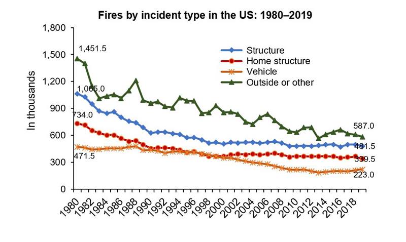
Fire Incidents

NFPA report – Fire loss in the United States

YearOutsideStructureVehicle
19801,4001,000470
19901,000650450
2000900550350
2010700500220
2020600500220

As with most well-defined problems and risks, the incidence or occurrence of fires has declined through time. In the last 40 years, the incident rate has been cut in half for outside, structure and vehicle fires. The US population grew by 45%, from 227M to 330M during this period. Hence, the incident rate per person declined by 70%.

Fire Deaths

Fire-related Fatalities and Injuries – Injury Facts (nsc.org)

YearDeathsUS Pop (M)Deaths/M
19787,50022334
19885,80024524
19983,90027614
20083,60030412
20183,60032711

Fire deaths have been cut in half over the last 50 years. The population has increased by 47%. The number of fire deaths per million has decreased by two-thirds, from 34 to just 11.

Real Cost of Fires Per Person

Archived Tables | III

US Population by Year (multpl.com)

Consumer Price Index, 1913- | Federal Reserve Bank of Minneapolis (minneapolisfed.

YearNominal Cost $B2019 Real Cost/Person
19991269
20001472
20011787
20021888
200321102
20041781
20052193
20062087
200724101
200831121
200928110
20102078
20112072
20122486
20131966
20142275
20152067
20162478
201737116
201847146
201937113

While the incident and deaths figures show a clear pattern of significant decline from 1980 to 2010, with relative stability from 2010 to 2020, the real cost of fires per person has much greater annual variability and a less certain trend in the last 20 years. Using 1990-2016 as the time period, the trend is clearly downward, from $90 to $80 per person per year. Adding the last 3 years, with their higher costs, the trend line moves upward from $80 to $100 per person per year.

Overall, the cost of fires per person is flat in the last 20 years, even though the outside incident rate has declined by one-third, the vehicle fire rate has declined by one-third and the structure rate has declined by 10%. Clearly, structure fires have the greatest weight on the cost measure. The unusually high costs in the last 3 years must be driven by a greater number of very high cost incidents.

Federal Government Employees

YearExecPostalEx+PostActMilTotalSubDefSubCivilianU.S. Pop
19551.9.42.32.95.24.11.1166
19601.8.42.22.54.73.51.2181
19651.9.42.42.75.03.71.3194
19702.2.52.83.15.94.31.6206
19752.1.62.82.14.93.21.7216
19802.2.52.82.14.83.01.8227
19852.3.73.02.25.23.31.9238
19902.3.83.12.15.13.12.0250
19952.0.82.81.54.32.32.0265
20001.8.82.61.44.02.02.0282
20051.9.72.61.44.02.02.0295
20102.1.62.81.44.22.22.0309
20152.1.52.61.34.02.11.9321
20202.2.52.81.44.12.12.1331
YearExecPostalEx+PostActMilTotalSubDefSubCivilian
19551.1%.22%1.4%1.8%3.1%2.5%.64%
19601.0%.23%1.2%1.4%2.6%2.0%.66%
19651.0%.23%1.2%1.4%2.6%1.9%.69%
19701.1%.27%1.4%1.5%2.8%2.1%.76%
19751.0%.26%1.3%1.0%2.3%1.5%.79%
19801.0%.24%1.2%0.9%2.1%1.3%.79%
19851.0%.30%1.3%0.9%2.2%1.4%.80%
19900.9%.30%1.2%0.8%2.1%1.2%.82%
19950.8%.28%1.1%0.6%1.6%0.9%.76%
20000.6%.28%0.9%0.5%1.4%0.7%.70%
20050.6%.24%0.9%0.5%1.4%0.7%.68%
20100.7%.19%0.9%0.5%1.4%0.7%.65%
20150.7%.15%0.8%0.4%1.2%0.6%.59%
20200.7%.15%0.8%0.4%1.3%0.6%.62%

All Employees, Federal (CES9091000001) | FRED | St. Louis Fed (stlouisfed.org)

All Employees, Federal, Except U.S. Postal Service (CES9091100001) | FRED | St. Louis Fed (stlouisfed.org)

All Employees, U.S. Postal Service (CES9091912001) | FRED | St. Louis Fed (stlouisfed.org)

1970 (usps.com)

US Population by Year (multpl.com)

DCAS Reports – Active Duty Deaths by Year and Manner (osd.mil)

U.S. Military Personnel 1954-2014: The Numbers (historyinpieces.com)

How Many People Does the U.S. Federal Government Employ? (historyinpieces.com)

Federal Workforce Statistics Sources: OPM and OMB (fas.org)

Executive Branch Civilian Employment Since 1940 (opm.gov)

Total Federal Government employment has ranged from 4-5 million across the last 65 years, from 1955, when post WW II changes were in effect until today, 2020.

While Federal Government jobs have been flat to down 20%, the U.S. population has doubled, from 166 million to 331 million people.

Hence, the ratio of federal jobs to population has dropped from 3.1% in 1955, or 2.6% in 1960-1965 to just 1.25% in 2020. The much maligned and mistrusted federal government is less than half as large, in relative terms, as it was from 1955-1965.

The detailed components are somewhat complex. The judicial and legislative branches have employed a relatively immaterial 30,000 to 66,000 during this time, doubling with the population.

The Executive Branch includes both the Department of Defense and other civilian agencies. It does not include active military employees. It typically does not include the postal service (USPS), which is seen as a truly independent agency. The Executive Branch started with 1.860 M employees and ended with 2.206 M in 2020. The low was 1.778 M in 2000 and the high was 2.252 M in 1990. In rough terms, flat employment for 65 years. As a percentage of the population, it has ranged from 1.12% to 0.65%, declining throughout the period.

The postal service started with 367,000 in 1955, grew to 761,000 in 1990, flattened out for 1995-2000, before declining to 492,000 in 2015 and 496,000 in 2020. So, we have a doubling in the first 45 years, adding 400,000 staff, followed by a reduction of one-quarter million in the last 20 years. As a percentage of the population, it grew from 0.22% to 0.30%, before declining to 0.15% in 2015-2020.

Combining the executive, legislative, judicial and postal branches, we get a subtotal that excludes the active military category. This is what most people think of as “federal” employees. This started at 2.3 M in 1955, grew to 3.1 M in 1990 before settling down a bit to 2.8 M in 2020. As a percentage of the population, it began at 1.36% and ended at 0.84%. This is a 38% reduction, removing more than 0.5% of the population from government employment.

The active military population has declined from 2.9M in 1955 and 3.1M in 1970 (Vietnam winding down) to 1.4M in 2000 (peace dividend), where it has remained. As a percentage of the population, this function declined from 1.77% in 1955 to 0.99% in 1975 to 0.49% in 2000 to 0.42% today. This is a 3/4ths reduction. moving 1.25% of the population out of military service.

The “Total” column shows the 5.2M start and 4.2M end. The percent of population falls from 3.13% down to 1.25%. The Federal Government is a much smaller employer today than in the “post-war” era.

The next column combines the Department of Defense in the Executive Branch with the active military to give a total military. This does not include the Veterans Affairs or Department of Homeland Security which serve quasi-military functions. We start with 4.1M in 1955, touch 4.3M in 1970, fall to 3.2M in 1975 and 2.0M in 2000, ending at 2.1M in 2020. The percentage of populations falls from 2.5% down to 0.6%.

The remaining federal employees began with 1.1 M in 1955 and grew fairly constantly to 2.0M in 1990, remaining flat for the next 30 years, ending at 2.05M in 2020. As a percentage of the population, this measure started at 0.64%, peaked at 0.82% in 1990 and has since declined to 0.62%, just below where it started.

After the Clinton/congress budget compromises in the mid-1990’s, criticism of the size and growth of Federal employment quieted down for the next 2 decades. Some criticism has restarted, as Federal agencies have increased the amount and variety of outsourcing employed through contracting and grants. The main summary shows that “contract” employees, those who work directly on Federal contracts, have been in the 3-5 million range since 1985. It reports that grant funded employees have been 1-2 million per year. The total is 4-7 million, the same order of magnitude as “regular” federal employment. I was unable to find comparable numbers for the 1955-1980 timeframe, so cannot be sure that this category has grown faster than the U.S. population. My guess is that there is some degree of “employee shifting” from regular to contracted employment. A subset of this is probably politically motivated, to please congressional oversight committees. On the other hand, corporate America discovered outsourcing to foreign factories and specialized firms in the 1980’s and probably moved 15-25% of jobs out of the Fortune 500. At one point, firms like GM and AT&T had 1 million employees.

Public service and the federal government (brookings.edu)

How big is the federal workforce? Much bigger than you think. – The Washington Post

The True Size of Government | The Volcker Alliance

The true size of government is nearing a record high (brookings.edu)

The sheer size of our government workforce is an alarming problem | TheHill

Good News: US STEM Degrees Up 50% in 8 Years

Number and percentage distribution of science, technology, engineering, and mathematics (STEM) degrees/certificates conferred by postsecondary institutions, by race/ethnicity, level of degree/certificate, and sex of student: 2009-10 through 2018-19

Group201120122013201420152016201720182019
Total378404424447476512545565581
Residents322344361377393410431448468
Male210224235246255264276286297
Female112120125131138146154163171
Black232527272829313234
Hispanic242730343842475157
Asian444649505357616569

STEM degrees awarded at the bachelors, masters and doctoral level continue to increase in response to market demands from 2011 to 2019, increasing by 54% in total and by 45% for U.S. residents. Most of the increase has been at the bachelors level, from 255,000 to 379,000 degrees (+49%). Masters degrees have increased from 53,000 to 72,000 (+36%). Doctoral degrees have increased from 14,000 to 17,000 (21%).

African-American degree earners have increased by 46%. Hispanic Americans have increased by 137%. Asian-Americans have increased by 57%. White Americans have increased by 28%, from 224,000 to 287,000 (+63,000).

US resident male degree earners increased from 210,000 to 297,000 (41%). Female degree earners increased from 112,000 to 171,000 (52%).

By contrast, the US population increased by just 5% during this period, from 312M to 329M.

I don’t find many news stories highlighting this very good news. In a world that requires technological innovation, application, maintenance and understanding, the US is quickly increasing the number of graduates with these skills. Women and minorities are increasing their relative share of the graduates in these subject areas, which historically have been well paid.

Data check: U.S. producing more STEM graduates even without proposed initiatives | Science | AAAS (sciencemag.org)

More Students Earning Degrees in STEM Fields, Report Shows | STEM Solutions | US News

There is room for improvement. Women and minorities are still underrepresented. They graduate at lower rates than white whites. Non-residents earn a significant (19%) share of US degrees awarded.

6 facts about America’s STEM workforce and those training for it | Pew Research Center

STEM crisis or STEM surplus? Yes and yes : Monthly Labor Review: U.S. Bureau of Labor Statistics (bls.gov)

STEM Education Stats for 2021 | Jobs & Careers, Growth, Minorities & Degree Statistics (idtech.com)

In the prior decade, between 2000 and 2010, the number of STEM bachelors degrees awarded increased by 31%.

STEM Education Data and Trends (nsf.gov)

Bottom line: US residents are earning about one-half million STEM degrees each year. This is double the one-quarter million degrees awarded in 2000. Note that compounding of 31% and 54% growth yields 102% total growth, not just 85% (a core STEM skill).