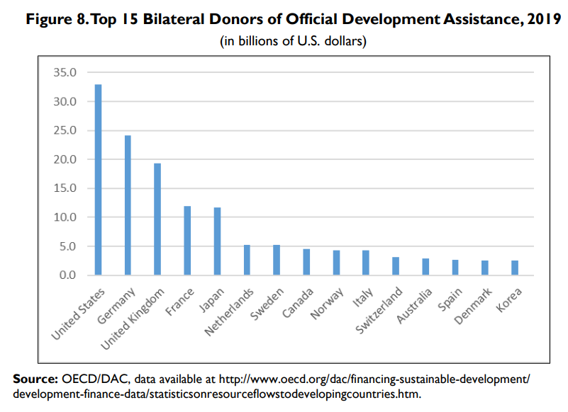
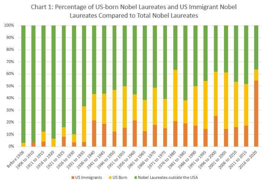
Africa 25%. Middle East 25%. Afghanistan $5B, Israel $3B, Jordan $2B, Egypt, Iraq, Ethiopia, Yemen, Colombia, Nigeria, Lebanon $1B each. Top 10 $16B, one-third of total.
Criticisms of Foreign Aid
Limited evidence that specific country investments provide political returns
Limited evidence of anti-terrorism campaign effectiveness (counterexamples)
Weak administrative structure and oversight at all levels
Direct evidence of individual country economic growth due to aid is limited
Some autocratic governments have benefitted from aid
Some aid is diverted to corrupt governments and individuals
Specific high priority countries have provided weak returns (Egypt, Pakistan, Afghanistan, Iraq)
Higher returns could be gained from investing in Western Hemisphere, Eastern Europe.
Health measures, disease rates, lifespans. Global health. Economic development results globally and in individual countries. US trade benefits from developing trade lanes. Global education. Increased number of democracies, commitment to mixed capitalist economies. Lower cost of defense. Terrorism activities thwarted. Improved strength of US alliances. Improved flow through NGOs, multilateral organizations improves effectiveness. Dollar allocation provides US policy leverage.
6-month time limit. A dozen or less bipartisan dignitaries. Retired ambassadors, investors, CEO’s, federal reserve presidents, etc. Make Mitch Daniels the chair.
Assign 2 projects. One to cut government waste. The other anti-inflation policies. No more than a dozen recommendations in each half. Presented to congress for simple yes/no vote, without major amendments allowed.
2. Spend Less Government Money
Fiscal spending is too expansionary for the current situation. Back off. Reduce infrastructure spending for now, spend it in the next recession. Reduce marginal defense programs that only have political reasons. Cut state government spending by 3%, which is budgeted to increased by 9%.
Increase immigration to improve labor supply. Cut tariffs to reduce supplies costs. Lean on local regulators to reduce zoning restraints and one size fits all building codes. Strategically require a higher share of affordable housing and multifamily permits annually in each metropolitan region. Phase-out the mortgage interest tax deduction for second homes.
Loosen regulations for 5 years to encourage increased “all of the above supplies” energy through drilling, coal, oil and nuclear. Suspend federal gas tax for 3 years. Negotiate oil price minimums/maximums between US/Europe/Japan and OPEC.
Reducing inflation is a complicated policy area. The solutions proposed by “experts” are rarely politically appealing. Competing political parties hesitate to provide “wins” to the other. However, 8% inflation after a 2-year pandemic while the US faces Russian war actions is a “national emergency”, worthy of an FDR like approach to “try a few things”. It is an opportunity to overcome individual industry opposition to things that make sense for the country. It is an opportunity to try some left and right solutions.
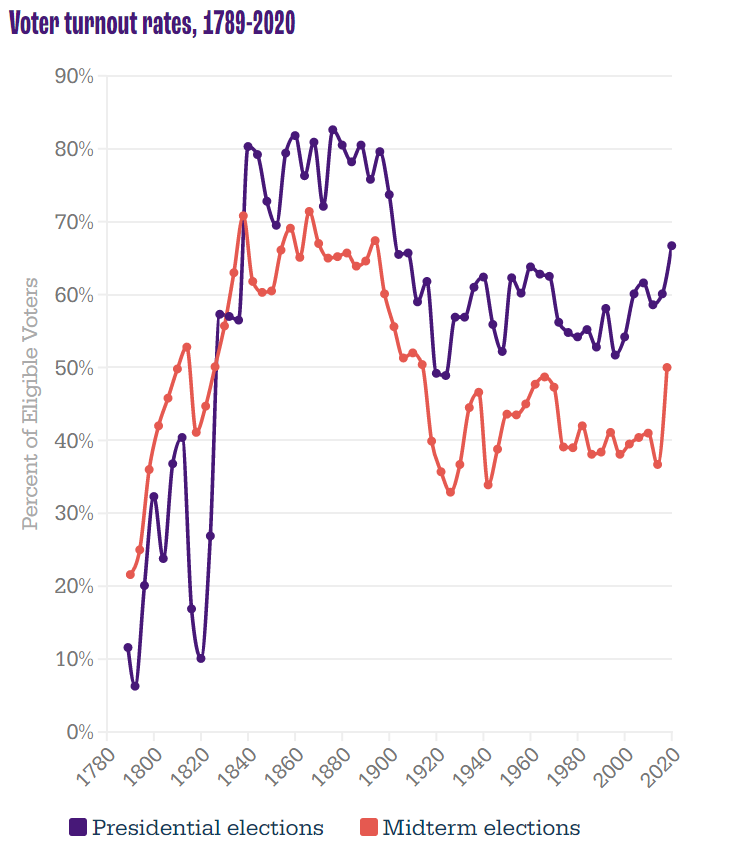
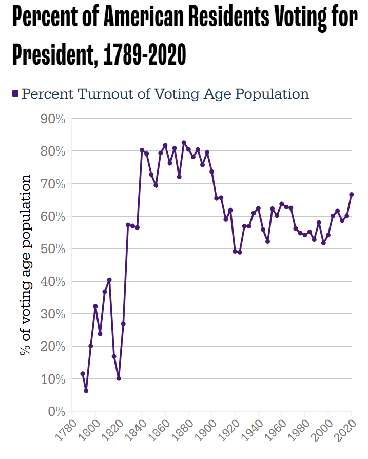
Setting aside turnout ratios, the growth in actual voters has been strong for a century. 40-48M voted in FDR’s elections. Kennedy and Nixon fought over 69M voters. Clinton and Bush, Sr. attracted 105M voters in 1992. But, Biden vs. Trump shattered records with 158M casting ballots.
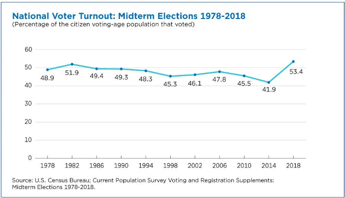
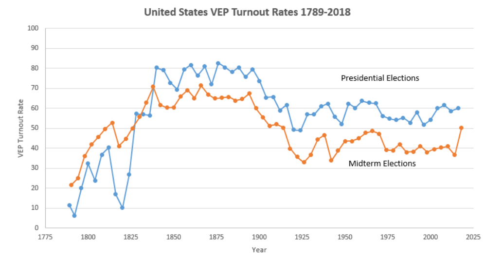
Midterm voting rates (as % of eligible voters) soared at 65% in the 19th century. They dropped to 50% at the start of the 20th century and then down to 45% for most of the 30’s to 60’s. They settled down to 40% thereafter. The 2018 election reached 50%, a full 13% points above the all-time low in 2014.
The slightly different measure, percentage of voting age population, shows the same pattern. 49% voting from 1978-94. Just 46% from 1998-2010. Record low of 42% in 2014, followed by an 11%-point climb to 53% in 2018.
Younger voters increased their turnout by 14 points (18-44), while older voters increased by a solid 8%. High school or less educated voters increased turnout by 7 points, while college educated voters added 12 points.
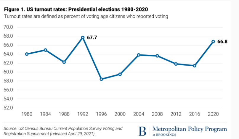
Long-term presidential and midterm voting (% of eligible voters) follows the same pattern. 80% turnout in the 19th century, dropping to 59% by 1912, then averaging 60% in the 30’s to 60’s. Further decline to just 55% for the 70’s-90’s. Minor increase to 60% in the oughts and teens, followed by 67% in 2020.
The more recent percent of voting age population shows 64% from 80-88, a one-time spike to 68% in 1992, decline to 59% from 96-200, slight increase to 61% for 04-16, and then a big jump to 67% in 2020.
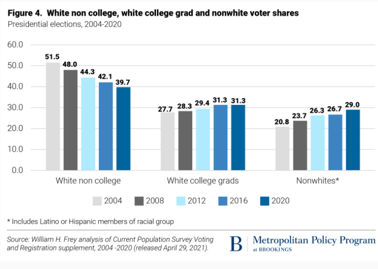
Turnout was up in all categories, but especially among Asian, 18-29 year olds and white non-college educated populations.
Voting by all racial groups of 18-24 year-olds was up significantly.
The two measures (% of eligible voters and % of population) track closely. The “election project” numbers show VEP at 63% from 1952-68, declining to 58% for 72-00, increasing a little to 61% for 04-16, before spiking to 66% in 2020.
Income really matters for voter turnout, with rates ranging from one-third to one-half to two-thirds. With increased lower income support for the Republican party, this is less of a partisan issue today.
Since 1969, Democrats have argued that demographic trends will overturn Kevin Phillip’s description of the Emerging Republican Majority. This remains a hotly debated topic.
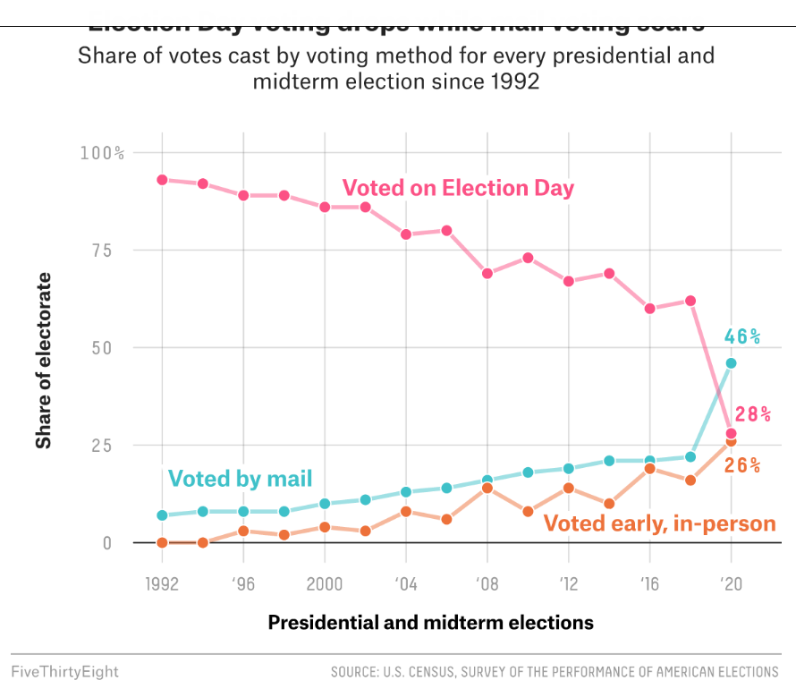
Election day voting decreased in 2018 and 2020 as mail and early, in-person voting increased. Many commentators claim that this change is a large driver of the increased turnout levels.
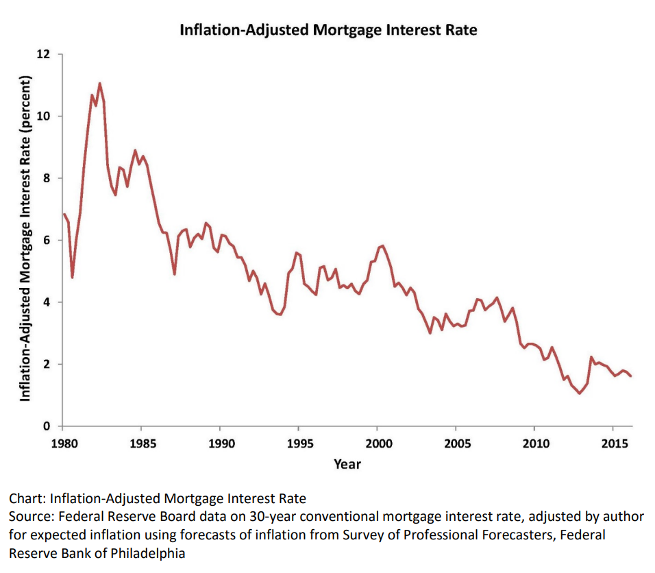
Real, inflation-adjusted, interest rates have declined greatly since 1980. At that time, with the risks of variable inflation and surging oil prices, the real mortgage interest rate was 8%. It declined to 5% in the 1990’s and 4% in the 2000’s before falling to 2% in the 2010’s. The financial cost of owning property has rarely been lower.
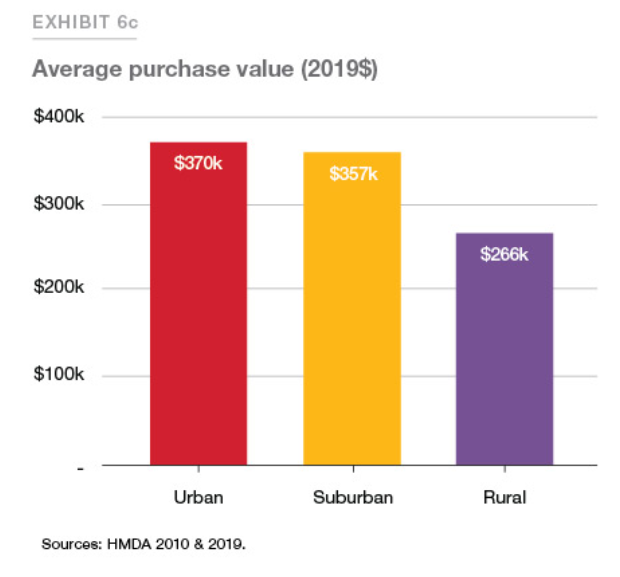
House Values are Up, Way Up
House prices grew relatively consistently from 1970 through 2000, with a spike in 2005-9 and a return to trend values in 2010-12. In the last 10 years, house prices have increased by 6% annually in nominal terms, or 4% annually in real terms.
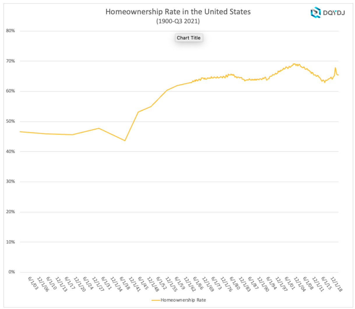
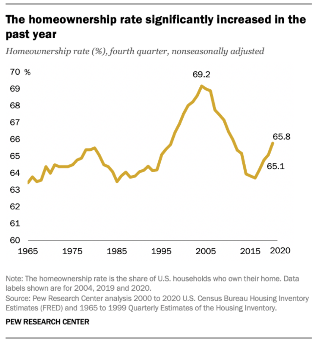
Home Ownership Rate is Rebounding, Up 2%
The US homeownership rate averaged 47% from 1900-40. It increased smartly in post WWII times to 60% by 1955 and 64% by 1965. Homeownership averaged 64%+ for the decade of 1969-78. It increased by 1% during 1979-81. In the midst of a difficult depression, homeownership rates dropped back to 64% by 1985, about the same for the last 20 years, setting a “normal” level. Homeownership rates stayed at 64% for the next decade. Ownership rates increased from 64% to 69% in the next decade before declining right back to 63% by 2015. In the last 7 years, despite many headwinds, the home ownership rate has increased by 2%.
Number of Homeowners has Jumped by 7 Million
In 2000, there were 69M owner-occupied homes in the US. This increased by a solid 7M to 76M by 2005. The housing market hit a lull and the number of owner-occupied homes essentially stayed flat for a dozen years, through 2017. The supply of owner-occupied homes then rose by a strong 7M in the next 4 years to 83M!
The housing market is inherently volatile, typically rising by 2 times the trend and then falling to one-half of the trend. Annual housing starts averaged 1.6M from 1960-2008. They declined by a severe 75% to just 0.5M in 2009. Housing starts have subsequently grown 3-fold to 1.6M annual housing starts, but the accumulated lack of new supply is impacting housing markets today.
The period from 1982-2000 showed homeownership rates by the 5 age segments remaining relatively constant; 65+ 78%, 55-64 80%, 45-54 76%, 35-44 67% and <35 40%. The 65+ group increased homeownership from 75% to 80%. During this time, the overall US homeownership rate increased from 65% to 69%, mostly due to the aging of the population, now more heavily weighted towards the groups with 76-80% homeownership versus the 40-67% younger groups.
Homeownership rates grew from 2000 to peak rates in 2004, before declining significantly for all groups except for the 65+ cohort which essentially held it’s own. The adjacent 55-64 class fell 4%. The middle 45-54 group dropped 7%. The typically homeownership growing 35-44 group cratered by 9%. The young <35 group fell by 5%. Hence, the overall rate fell dramatically during this time.
There is a 30 point gap between married couples and other groups, with 84% of married couples owning homes versus about 55% for other family structures.
The US shows dramatically different homeownership rates by racial category. The differences between the 1995 non-Hispanic White rate (70%) and Others/Asians (50%), Hispanics (42%) and Blacks (42%) remain large in 2021 where we see White (74%), Other (57%), Hispanic (48%) and Black (44%). The groups homeownership share gain from 1995 to 2005 were similar, ranging from 6-10%, but the decline from 2005-2015 was only 3-4% for Whites and Hispanics, but 7% for Blacks and Others. The improvement from 2015 to 2021 has been 2% for 3 groups and 4% for the Other/Asian group.
Summary
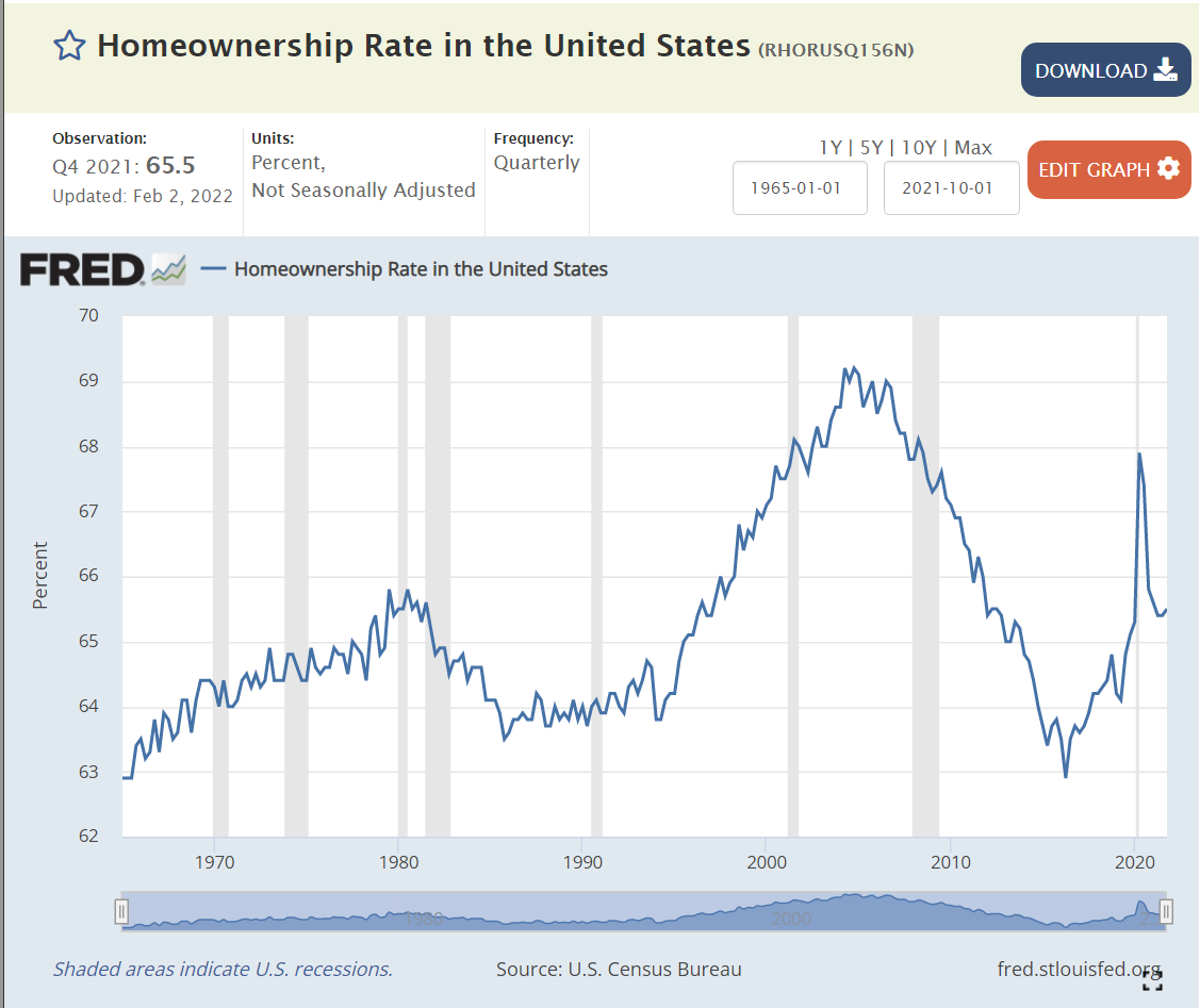
The Great Recession flattened the housing market. The number of owner-occupied homes in the US remained level at 76 million from 2006 – 2017. The number of housing starts plummeted from 2.0M to 0.5M per year, compared with an historic average of 1.6M. New home construction first exceeded 1.2M units (75% of historic average) again only in 2020, a dozen years later. New home-owning households have increased by 7M units in the last 4 years! The homeownership rate is up 2 points, from 63.5% to 65.5%. Supply is responding to increased demand and higher home prices. Homeownership rates will increase with the economic recovery, but be constrained by higher home prices.
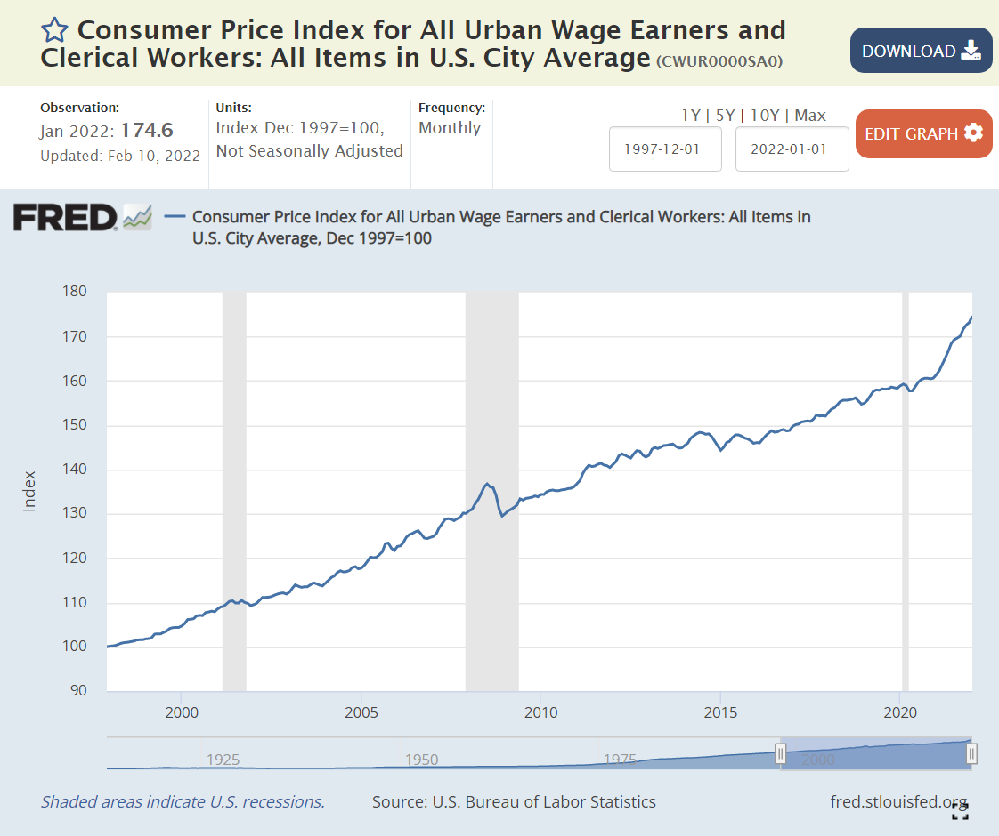
Inflation is back in the news after several quiet decades. The components of the All Urban Wage Earners and Clerical Workers are listed above, comparing Feb 2020 with a 1997 base of 100, and then Jan 2022 with the same base. The most recent weighting of categories is in the rightmost column.
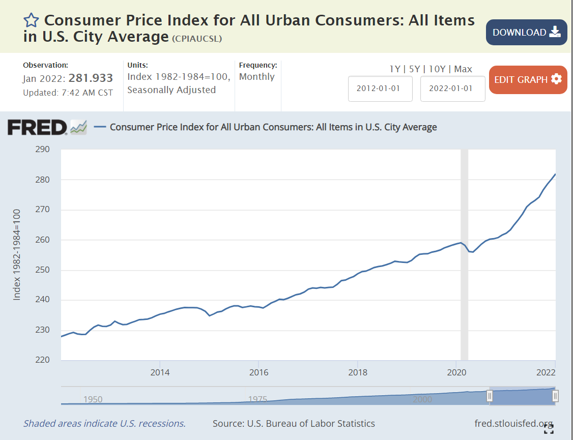
Overall, consumer prices have risen by a modest 2-2.5% annually, just 59% through Feb 2020 and 75% through Jan 2022. Yes, that is a 10% price increase in the last 2 years: 175/159.
The 3 largest components have shown price rises close to the overall average. The biggest sector, Housing (39%), displays slightly higher inflation, at 72% and 85%, closer to 3% annually, with a possibility of higher rises for the next few years. Transportation (22%) reveals lower than 2% annual inflation with a 45% increase across the full period. Food and Beverage (15%) is close to the average with 64% and 82% growth.
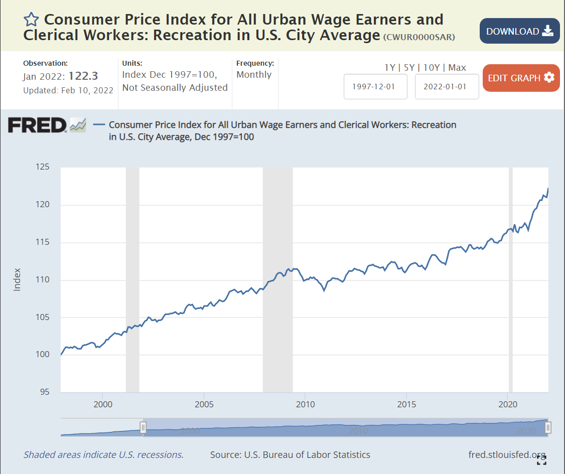
Some smaller areas have seen slow price growth. Apparel (3%) has declined in actual prices during this period. Recreation prices (4%) have grown by less than 1% annually.
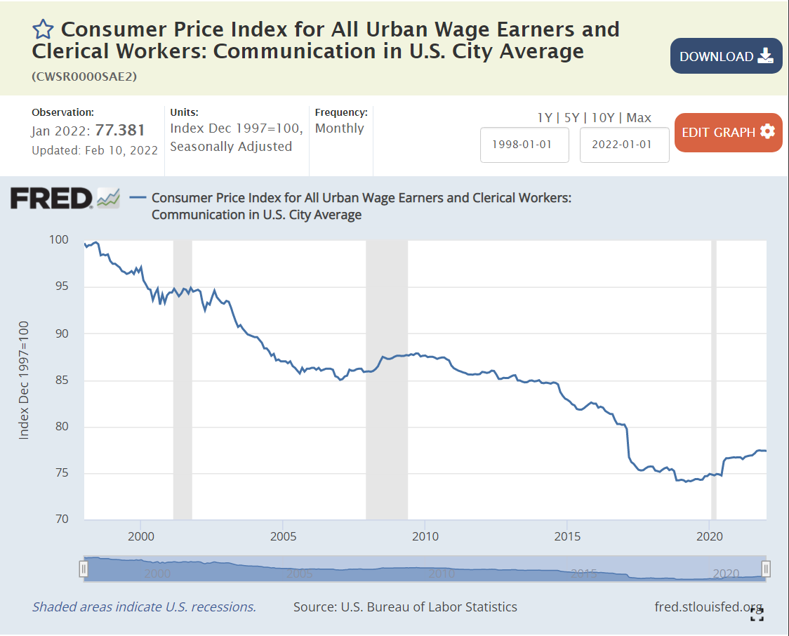
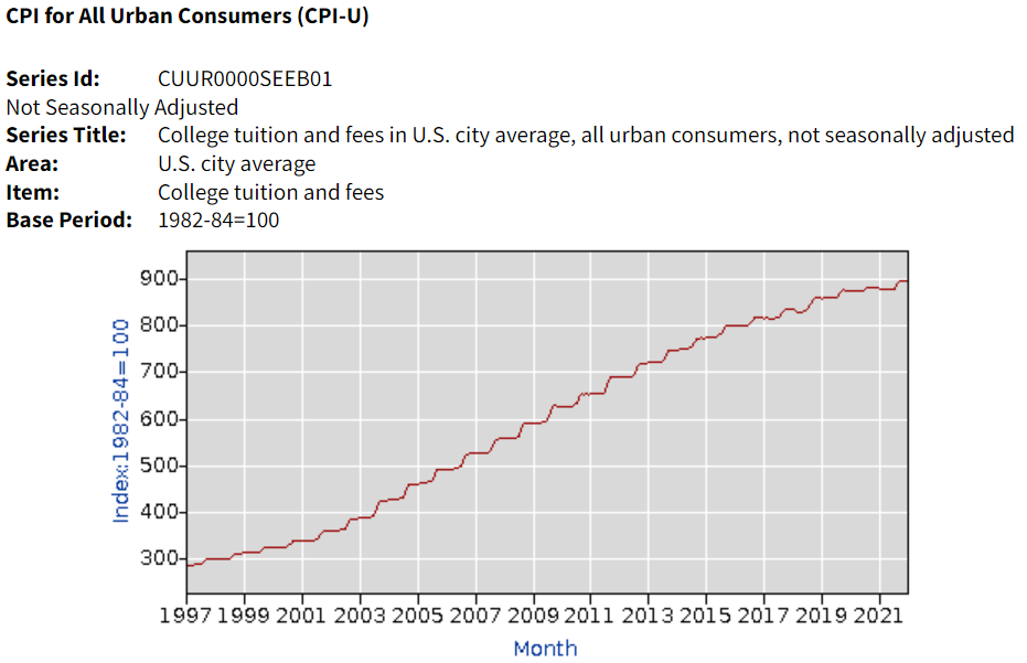
Education and Information (6%) prices have grown by 1% annually, but this category includes 3 very different subsectors. Information Technology prices have declined throughout the period. No simple 25- year summary is available. Communications prices have dropped by an average of 1% annually. Education prices have grown much faster, more than offsetting the decline in IT and communications prices. The Tuition, Fees and Child Care measure of prices increased by 165% and 171%, more than twice as fast as overall inflation, roughly 4% annually. College tuition (data not in Fred database) increased by 191% and 196%, about 4.5% per year.
The Other Goods and Services (3%) category mostly contains miscellaneous items that don’t fit cleanly in Housing or Food/Beverage. The category displays faster price increases (3.5%) on average due to the very sharp increase in Tobacco prices (taxes) which have grown 4-fold in 25 years (7%/year). Note that alcoholic beverage prices increased by a little more than 2% annually
Finally, Medical Care (7%) has grown by 116% – 125% during these 25 years, about 3.5% annually.
Overall goods prices have grown slowly and service prices more rapidly. Medical care and college prices stand out for their increases, while the price of housing/rentals is flashing warning signs.
The “real” interest rate is the nominal interest rate minus the inflation rate. It reflects the “real” cost of borrowing. Prior to the “Great Recession”, 2% was a typical “real cost” of borrowing money. To entice lenders to lend, borrowers had to pay some “real” amount extra per year, 2%.
The Federal Reserve did what it could to “ease” monetary conditions and lower interest rates to offset the negative impact of the Great Recession in 2008-9.
By the end of 2011, real rates were ZERO or negative. In other words, the Fed went too far. By June, 2013, rates returned to positive territory, but only reached 0.5%, where they remained through the end of 2017, despite president Trump’s complaints that the Fed was constraining the Trump economy. Monetary policies were “easy” for a very long 7-year period.
By May, 2019, real interest rates were back to just 0.5%, having reached a peak of just 1% for 3 months at the end of 2018. With further “easy” money policy, real rates dropped back to ZERO percent by August, 2019. The economy was now 9 years into recovery. Interest rates should have been higher.
The Fed found new ways to “ease” monetary policy as the pandemic struck in 2020. Real interest rates dropped to -1% and stayed there. Monetary policy has been “easy” for more than a decade. Time for inflation. “Too much money chasing too few goods”. “Inflation is always and everywhere a monetary phenomenon”.
Supply Chain Disruption
The recovery has been faster than anyone expected, but most critically, with consumers less eager to buy “in-person” services, they have greatly increased their purchases of goods. The modern US economy relies on imports and modern manufacturers and retailers hold lower inventories to buffer changes.
Standard macroeconomic theory focuses on aggregate demand versus aggregate supply as the key driver of output, unemployment and inflation. When total demand grows faster than remaining excess capacity of total supply, inflation results. The biggest driver of changes in aggregate demand is the level of government spending (demand) minus government taxation (reduces demand).
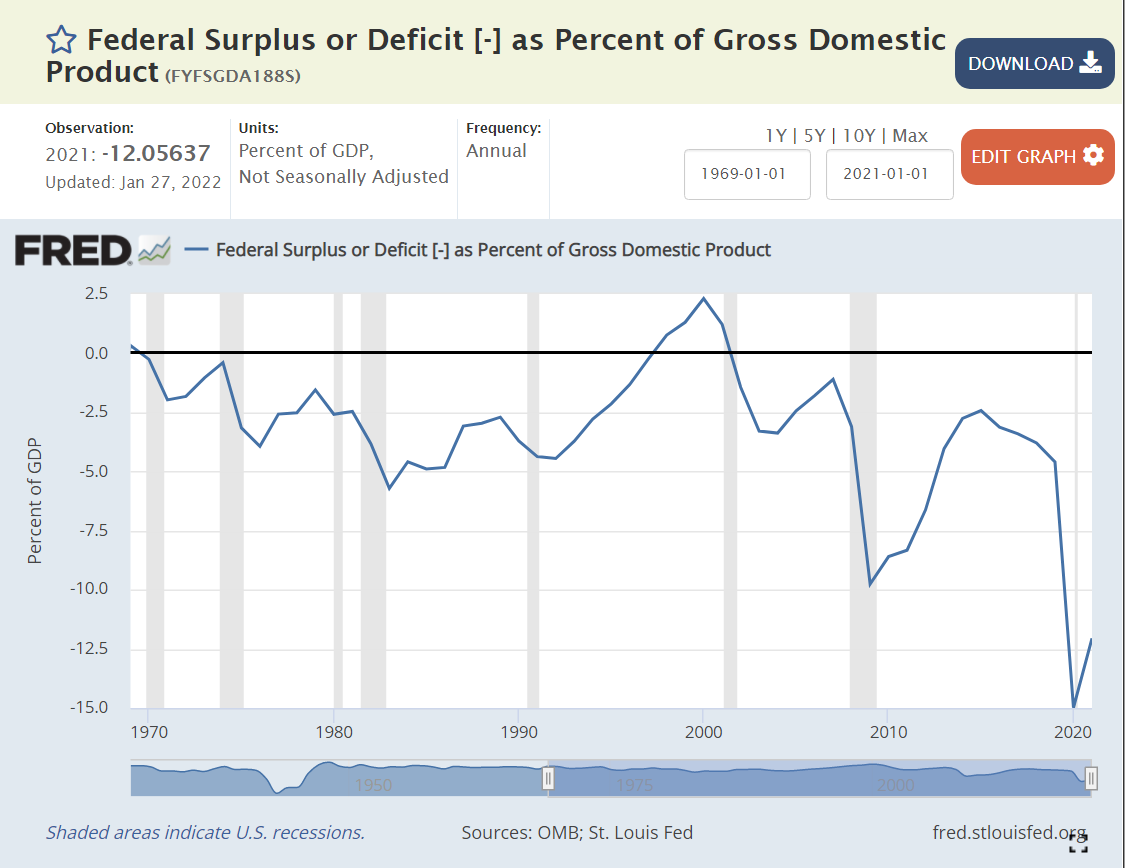
Historically, various pressures have kept the federal budget deficit between -3% and +3% of GDP, allowing the government to buffer change in private demand through the business cycle. The large drop from -2.5% to -5% in 1979-82 was a factor that contributed to the last major round of US inflation. A similar decline from -2.5% to -4% in 1989-91 increased inflation, but not on such a large scale. It also served to convince President Clinton and congress to reduce the deficit to ZERO by 1997 and run a surplus for a few years.
The 2001 recession caused a 2.5% decrease in this ratio, from a surplus to a deficit. Bush tax cuts, foreign wars and congressional agreement lead to deeper deficits at 3.3% in 2003-4, before some recovery to -1% in 2007, prior to the Great Recession.
Bush, Obama and congress agreed to spend more to fight the Great Recession, pushing the deficit to a worryingly low -9.8% in 2009. There was no agreement on a second major round of spending, so the deficit improved a bit to -6.6% by 2012 and then to a more reasonable -2.5% in 2014-15. Instead of continuing to improve with the economic recovery, it fell a little, to 3.1% in the last year of the Obama economy.
President Trump’s first order of business was to enact “job creating” tax cuts. Unfortunately, the desired boost to economic growth to fund these tax cuts did not occur. The budget deficit increased from 3.1% to 4.6% of GDP, as the economy reached a record long recovery period of a full decade.
To address the pandemic, congress and Trump agreed to spend money to protect the economy and workers, leading to very large budget deficits of 15% and 12% in 2020 and 2021, respectively. Too much aggregate demand for the level of aggregate supply, so we have major inflation.
Summary
Easy money, easy fiscal policy and a 20% increase in demand for goods leads to major inflation. Like a frog getting boiled as a pot slowly warms up, we became complacent based on the apparently “just right” conditions of the late teens (2012-19). The federal budget deficit needs to get back above -5%, real interest rates need to become positive and consumers need to rebalance to consume more services and less goods. I don’t think we’ll see 7% inflation for 2022, but it looks like 4-5% is a good bet. Hold on.
Politics
Biden deserves a good share of responsibility for the government spending budget deficit, as he was seeking to make it even larger. I give him a “pass” on consumer demand for durable goods since it mostly occurred before he started. I also give him a “pass” for the loose Fed monetary policy which has been going on for a decade or so. He was wise to reappoint the Fed chairman, who I believe will raise interest rates as needed to get the real interest rate back to a proper level. In the meantime, Biden will pay politically for higher inflation, which has a “real” impact on the wallets of voters.
Ronald Reagan taunted Jimmy Carter with this question to voters in the 1980 debates. It helped him win.
Twelve years later, James Carville helped Democrats return from the political wilderness in 1992 with his advice to Bill Clinton that “it’s the economy, stupid”.
Politicians have used various measures, from unemployment to inflation to the “misery index” to jobs created to productivity to the stock market, to promote their success and detract from their opponents.
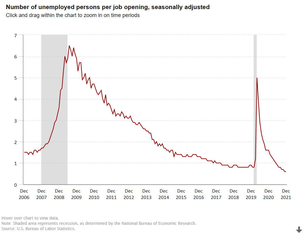
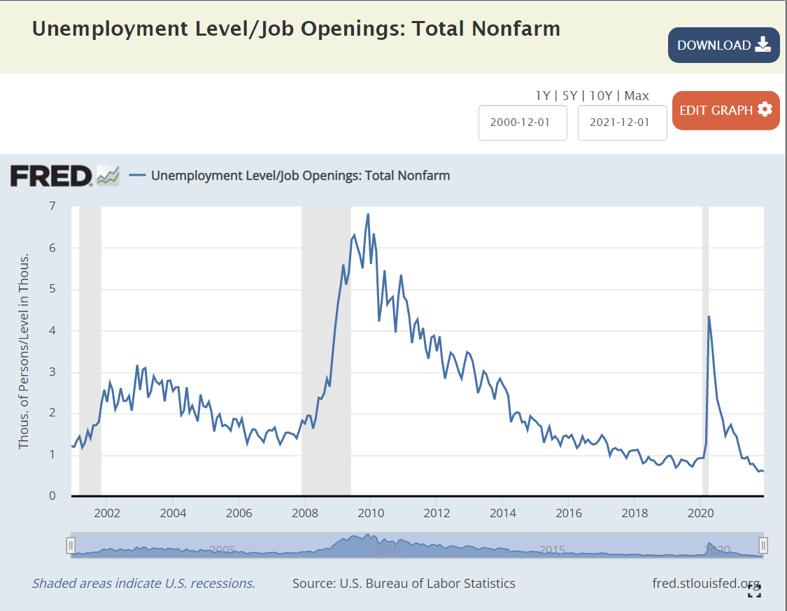
I want to focus on one measure, the ratio of the number unemployed to the number of job openings, to highlight the strength of the American economy in the last dozen years.
The Bush economy was widely criticized for its “jobless recovery” following the economically healthier Reagan and Clinton presidencies. The presidency started at close to 1 unemployed person per job opening. The recession pushed this up to 2.5x and then 3.0x. In labor market terms, this is a huge difference. At 1:1 or 1.5:1, unemployed workers expect to be re-employed quickly. At 3:1, some may enter the dark days of the “long-term unemployed”. After 3 years, the economy DID recover to 1.5:1, but it was unable to improve further. The “Great Recession” was a brutal job killer, pushing this measure of labor market tightness up four-fold, from 1.5X to more than 6X before its peak in the first half of 2010, as Obama and congress and the federal reserve bank wrestled with the situation.
Obama: Recovery and “New Territory”
Between April, 2010 and April, 2012, the economy cut this ratio in half, from 6x to 3x, a very solid performance. It took 3 years, until April, 2015, to complete the next 50% reduction, from 3x to the historically “very solid” 1.5X. The economy continued its growth for the next 2 years, but at a slower pace, reducing this ratio to 1.3X.
Trump: Even Better
The Trump economy continued to improve for the first 18 months of his term, reducing this ratio from 1.3X to 0.8X by September, 2018. This was a time of record low unemployment and economists recalculating their standard of “full employment”. While the economy continued to grow, the unemployment rate continued to decline and the stock market continued to climb, THIS measure had reached its minimum before the 2018 mid-term elections. It remained steady at the very positive level of 4 job seekers for every 5 jobs (0.8) for the next 17 months, until the pandemic disrupted everything. The ratio quickly shot up to 5X, not as high as the 6X that Obama faced, but very high. It quickly recovered to 1.4X by the end of Trump’s term. This was partly job recovery and partly fewer job seekers, but it was an amazing recovery in historic terms. Recall that 1.5X was “a good as it got” during George W. Bush’s presidency.
Biden: Even Better, Again !
In the first 6 months of the Biden presidency, this ratio dropped from 1.4X back down to the prior record level of 0.8X. Yes, by July, 2021, there were 5 jobs available for every 4 job seekers. This was as low as the ratio had previously fallen, even as the Trump economy piggybacked on the Obama economy and continued its extraordinary run. The ratio continued to fall in the next 6 months to 0.6X, an unheard-of level. 5 jobs for every 3 job seekers. It’s “no wonder” that voluntary job quits are at unprecedented levels. For, perhaps, the first time in American history, “everyone who wants to work, can find a job”. Whether you are right or left, Dem or Rep, this is “good news”. This is “great news”. Wages for the “bottom 20%” are rising in real terms. Income inequality is declining, a bit. The economy seems to be able to digest this new condition. And, the economy is not done growing, innovating, creating businesses, creating jobs, exporting, etc. About 2% of Americans are likely to be attracted back into the workforce in the next year or two, keeping the headline unemployment rate from going much below 4%, but pushing US real GDP growth to 4% in 2022 and close to 4% in 2023.
Summary
The “Great Recession” and the “once in a century pandemic” have been unable to disrupt the ongoing progress of the American economy and labor market. As a nation, IMHO, we have cultural and political challenges, but we “aught” to appreciate the power of the American economy to move forward.
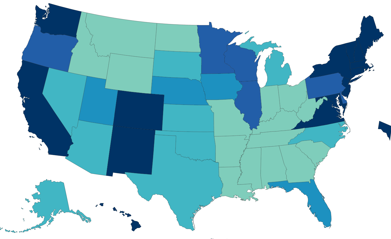
Many states have legislatures and governors from the same party and voted for this party in both the 2016 and 2020 presidential elections. These states have adopted quite different Covid management strategies. There are 14 solidly Democratic states and 21 solidly Republican states, leaving 15 states with some level of “mixed” political control and influence.
Democratic states average 80%, Republican states 66% and Mixed states 73%. The national average is 72%. Nevada (69%) is the only Blue state below 75%. Alabama, Wyoming and Mississippi have the lowest scores for the GOP at 59-60%. Florida has the highest rate at 75%. The split in world views is confirmed by this measure. The mixed group ranges from Louisiana and Georgia at 63% to Massachusetts (85%) and Vermont (86%).
The overall death rate for the country is 256. The mixed states are similar at 265. The Democratic states average 221 deaths per 100K people. The Republican states average 282 deaths per 100K people. If the Republican states had the same rate as the Democratic states, they would have 59 fewer deaths per 100K people, for a cumulative total of 70,000. Economists use $10M as the value of a life in many cost-benefit calculations, so one measure of the difference is $700B.
California (196) and New York (227) drive the lower D result, but the Dems include higher fatality states such as Rhode Island (305) and New Jersey (344). The mixed states include some relatively high death rates in Michigan (315), Louisiana (329) and Arizona (350). The Republican group includes 3 states below the D average in Utah, Alaska and Nebraska, but 7 states at 300 or higher: Oklahoma, Indiana, West Virginia, Arkansas, Tennessee, Alabama and Mississippi.
Nonfarm Employment Recovery: Nov 2021 vs. Feb 2020
Overall employment is within 2% of the February, 2020 peak for the country as a whole. The “mixed” states have recovered to within 2.3% of the peak. The Democratic states are only at 96.4% of the peak, while the Republican states, on average, are just below breakeven at 99.9%. If the D states had the same level of recovery, there would be 1.8M jobs added in the recovery to date. At the recent median $1,000 per week wage, this would generate $94 billion of income annually.
I used the Feb 2015 to Feb 2020 period to generate a pre-Covid trend growth rate. This was 6.4% for the country, 5.4% for the mixed states, 7.0% for the D states and 6.7% for the R states. This indicates that the Republican faster recovery is not due to prior momentum. I used the 2020/2015 growth rate to create a solid estimate of the 2021/2020 recovery rate for each state (r = 0.63). It confirmed the 3%+ gap between the 2 parties was not due to prior trends. I also checked the percentage of 2019 employment in the leisure and hospitality sector, to see if this was driving the difference, but it did not have a material effect.