Good News: US Economy Added 6 Million Jobs in 2021

Today’s news releases show 6.0M jobs added during 2021 according to the household survey and 6.5M jobs added according to the employer survey. The ADP employer jobs survey released this week showed 6.2M jobs added. The employer reported number of open jobs increased from 6.8M to 10.6M this year. Hence the total filled plus open jobs increased by 10.6M, from 149.3M to 159.6M, a truly incredible expansion of the US economy’s production potential and demand for labor. This is 1M more filled plus open jobs than the December, 2019 peak of 158.6M. Employers are clearly struggling to work this backlog down from the 10-11M range back to the pre-pandemic 6-7M level. This provides the demand side for another 8-12 months’ worth of 500K filled jobs added per month.

The 3 underlying measures use different definitions and survey methods, but in the long-run they generally agree.

https://www.bls.gov/web/empsit/ces_cps_trends.htm#intro

The monthly changes are much less consistent. Much of the media highlighted that the employer survey data showed just 200K jobs added in December. The household survey indicated 600K jobs added, while ADP reported 900K jobs.

It’s best to look at all 3 measures to try to get a best estimate of the most recent changes. I see roughly 500K new jobs added each month from July through December. A flat number, not an increasing one. The first half of the year was probably adding a few more jobs each month, closer to 600K each.

https://adpemploymentreport.com/2021/December/NER/NER-December-2021.aspx

Look Past the “Spin”

https://www.foxbusiness.com/economy/biden-december-jobs-figure-unemployment-decline

https://www.dailymail.co.uk/news/article-10379015/US-employment-report-misses-expectations-Just-199-000-jobs-added-December.html

 https://www.realclearpolitics.com/2022/01/07/another_disastrous_jobs_report_lands_on_bidens_desk_560237.html


Good News: A Great Labor Market

Layoffs

From 2000-2009, the dynamic US labor market laid off workers at a consistent 2M per year rate. This declined a bit to 1.8M per year in the next decade. After the pandemic, the economy quickly returned to this 1.8M per year rate from July to December, 2020.

It has dropped and remained at a 1.4M per year rate at the end of 2021, fully 30% lower than its normal level. Good news, indeed.

Unemployment Claims

Historically, the US economy generated 350,000 new unemployment claims each week. This measure declined slowly after the Great Recession, reaching a nice 300,000 level in 2014. It slowly declined to a record low of 205,000 in Feb, 2020. The disruption rate dropped back down to the very high but stable 800,000 level from Aug, 2020 through Apr, 2021. In the last 8 months the rate has dropped very quickly back down to the record low 200,000 level!

Cumulative individuals claiming unemployment benefits has historically varied with the business cycle. We can see the increase from 2M to 4M at the turn of the century. The “Great Recession” had a greater negative impact, driving this number from 2M – 4M – 7M. This number fell throughout the extended business cycle recovery period, breaching 2M in Feb, 2017 and reaching a low of 1.7M in Feb, 2020. The unemployed number reached a full order of magnitude higher at 23M during the pandemic, then dropping to 13M in Sep, 2020 and 4M in Mar, 2021 and 2M in Nov, 2021 and finally equaling the record low in December, 2021 at 1.7M. This is great news!

Unemployment Rate

The unemployment rate has reached 4.2% and will return to its historical low of 3.5% in the next 4-6 months.

Minority Unemployment Rate

African-American unemployment was typically in the 8-10% range. It was driven down to the 5-6% level after the Great Recession during the extended business cycle expansion period. The rate is now below 7% and falling.

Hispanic American unemployment averaged 5-7% in the 2000’s. It spiked after the Great Recession to 13%, then slowly declined to 4.3%. It has since recovered to 5.2% and is dropping quickly.

Broadly Defined Unemployment

Broader definitions of unemployment show the same swift recovery from the pandemic situation.

Labor Force Participation

Labor force participation among the core 25-55 year age group reached an historic, and possibly unsustainable high of 83% in late 2019. It stayed around 81% at the end of 2020 and has since improved to 81.8%. This is one of the few labor market indicators that clearly shows that we have NOT “fully recovered”. There is 1% of the population waiting to be attracted back into the labor force.

Quits Rate

The voluntary “quit” rate has doubled since the good side of the “Great Recession”. It is 50% higher than during the very favorable labor market of 2018-2020. Employees are confident that they can leave their current employer and find another position quickly.

Job Openings

This is the CRAZY positive labor market chart. Historically, we see 3-5M job openings. Expansion to 6M in 2016-17 as the post Great Recession recovery faced its “end”. But, the expansion continued even further, with 7M open positions available in 2018-20. The economy recovered to 6.8M open positions in Dec, 2020. This figure has since climbed to an incredible 11M open positions, more than double the historic norm.

This is truly a “good news” labor market!

Good News: Minimum Wage Continues to Increase

States and cities have been increasing their minimum wages annually since before the pandemic struck in early 2020 and have set higher rates for 2022.

https://www.cnn.com/2021/12/31/politics/minimum-wage-increase-2022-15-dollars/index.html

https://www.paycor.com/resource-center/articles/minimum-wage-by-state/

Public Policy is More Favorable

Historically, corporations and supporters have highlighted the negative impacts of small/large and narrow/broad minimum wage increases (2019 example).

https://fee.org/articles/support-for-15-minimum-wage-plummets-when-americans-are-told-its-economic-impact/?gclid=Cj0KCQiAlMCOBhCZARIsANLid6ZmQXEJ_4xmXTiQ3n16kSGLLqLvgeS_hdpoSlXwUR_oD-_b9NK3AfcaAtBvEALw_wcB

Historically, economists generally emphasized the negative short-term and long-term impacts of significantly higher, broadly applied minimum wage increases. Studies in the 1990’s indicated that the negative effects of moderate minimum wage increases could be relatively small, so economists’ articles have been more balanced in the past 3 decades.

https://en.wikipedia.org/wiki/Minimum_wage

Some more liberal leaning economists have been actively suppporting minimum wage increases as the US minimum wage has continued to decline on a real, after inflation basis, US minimums have fallen compared with other developed countries and the US distribution of income has become more unequal and poverty rates have not fallen despite US economic progress.

Some economists even point to the self-serving benefits of higher minimum wages for corporations, including greater productivity, innovation and retention.

There does not appear to be widespread business or general public support for Biden’s across the board $15 per hour minimum wage proposal.

https://www.pbs.org/newshour/health/how-economists-see-bidens-15-wage-proposal

Biden has been able to increase minimum wages on government contracts.

https://news.bloomberglaw.com/daily-labor-report/biden-orders-15-minimum-wage-on-federal-contracts-by-march?context=article-related

But, large corporations are increasing their own minimum wages and trying to position themselves as supportive of “common sense” public policy changes that do not impact themselves very much. Some critics say that this is because large corporations can absorb higher minimum wages through their economies of scale and pricing power, while smaller businesses cannot and will go out of business, resulting in further growth of power for large businesses.

https://www.usatoday.com/story/opinion/2021/02/26/big-business-behind-push-for-15-minimum-wage-column/4545386001/

Surprisingly, recent survey research indicates that many small businesses also do not stridently oppose modest minimum wage increases.

https://www.verizon.com/business/small-business-essentials/resources/most-small-businesses-support-minimum-wage-hikes/

Corporate Minimum Wage Increases

Perhaps more importantly, large corporations in a variety of industries have voluntarily increased their minimum wages from the $12/hour to the $15/hour plus range in the last 2 years. (Out of self interest).

Banking

https://www.americanbanker.com/news/fifth-third-is-latest-bank-to-raise-its-minimum-wage

https://www.yahoo.com/now/wells-fargo-raises-minimum-wage-215921054.html

https://www.bizjournals.com/boston/news/2018/01/25/santander-to-raise-minimum-wage-to-15-per-hour.html

Health Care

https://www.lexology.com/library/detail.aspx?g=cdb8465e-3eaf-45aa-8d9d-e7946210ba3a#:~:text=Walgreens%20is%20the%20latest%20retail,more%20workers%20with%20larger%20wages.

https://www.courant.com/business/hc-biz-cigna-tax-benefits-20180131-story.html

Fast Food

https://thehill.com/business-a-lobbying/business-a-lobbying/578847-starbucks-to-raise-us-minimum-wage-to-15-by-next?rl=1

https://www.businessinsider.com/mcdonalds-raises-minimum-wage-aims-average-15-per-hour-2021-5

https://www.restaurantdive.com/news/taco-bell-to-raise-average-minimum-wage-to-15-an-hour-by-2024/611490/

Various Industries

https://qz.com/2060508/what-amazons-18-average-hourly-wage-means-for-other-employers/

https://www.masslive.com/business/2021/01/wayfair-sets-15-minimum-wage-for-all-us-workers.html

Retailers

https://www.npr.org/2021/02/25/971338686/costco-to-raise-minimum-wage-to-16-an-hour-this-isnt-altruism

https://www.cnbc.com/2020/06/17/target-raises-minimum-wage-to-15-an-hour-months-before-its-deadline.html

https://www.npr.org/2021/02/25/971338686/costco-to-raise-minimum-wage-to-16-an-hour-this-isnt-altruism

https://www.cnbc.com/2021/09/14/sams-club-raises-minimum-wage-to-15-as-tight-labor-market-continues.html#:~:text=Sam%27s%20Club%20said%20Tuesday%20that,than%20its%20parent%20company%2C%20Walmart.

https://www.businessinsider.com/under-armour-minimum-wage-us-canadian-labor-shortage-2021-5

Summary

https://www.goodreads.com/quotes/25909-you-don-t-need-a-weatherman-to-know-which-way-the

Wages for less skilled and less experienced positions are increasing – dramatically – in the USA – in the last 5 years, especially since the pandemic reduced the supply of labor, and going forward. Larger companies have seen the costs of higher turnover and decided that they are going to offer relatively higher wages and find ways to generate enough economic value added to justify these marginal (incremental) investments. Politicians in left-leaning and centrist areas have pushed through higher minimum wages. Lower experience and lower skilled workers are able to take advantage of this situation. This is “good news” for these individuals. It is also “good news” for the economy because it has prompted firms to find ways to restructure work, processes, tools, technology, etc. to add more value from each employee.

Good News: Lawyers Have Less Power in the US.

https://en.wikipedia.org/wiki/Let%27s_kill_all_the_lawyers

The US population has doubled from 1960-2020, so the share of new lawyers remains roughly at the same percentage, despite the greatly increased complexity of modern business, communications, intellectual property and society. This ratio is now way down from the 2000’s when it was unusually elevated.

Supply and demand drove lower salaries and higher unemployment after 2010.

https://abovethelaw.com/2021/08/law-schools-are-building-another-giant-lawyer-bubble-destined-to-burst-in-the-legal-job-market/

Starting salaries at major law firms have always been attractive to undergraduates. The distribution of starting salaries shows that the legal profession is divided between those in the top one-fourth and all of the rest. The median starting salary at $100K for 7 years of college education looks more like an engineer, pharmacist, actuary, data scientist, financial analyst or market researcher than a world changing persuader.

The percentage of US congress reps with a legal background has declined decade after decade.

Lawyers occupy 9% of CEO roles; far less than their MBA competitors.

https://hbr.org/2017/08/do-lawyers-make-better-ceos-than-mbas

In general, public opinion has less and less support for the “advocate” model of legal representation.

https://medium.com/indian-thoughts/devils-advocate-the-new-age-sophists-bf25c928eefdhttps:/

New lawyer debt is at a record high level ($150K). (page 27).

The legal profession remains 86% white, far removed from the American population distribution. (page 34).

Legal wage growth accelerated in the “oughts” and then rose by less than inflation in the teens (page 47).

The number of law school applicants dropped nearly in half from 2004 to 2015, from 101,000 to 54,000. (page 55).

Despite the great reduction in new law school entrants, the bar exam pass rate has declined from 80% to 70%. (page 80).

The highest skilled lawyers remain in high demand in the US, earning $120-180K for starting salaries. They are typically not “changing the world”. But, they are helping the owners of great wealth to maintain and improve their positions. As an accountant, engaged to measure and advise, I appreciate this value-added role in society.

Hey Joe, Hey Joe … Reverse the Trump Tariffs

There are few policy choices that have 90-95% positive results compared with 5-10% negative results. Cutting international trade tariffs is one of those “rare birds”.

President Trump “delivered” on his 2016 campaign promises regarding trade deals. He unilaterally increased tariffs on imported aluminum, steel and manufactured goods from China and the rest of the world, including our trade and military allies. As with most “trade killers” (which used to be a minority Democratic party position), he claimed that this would save or restore American jobs. As usual, it had no measurable positive effect. He also claimed that this would lead to a renaissance in American manufacturing. Didn’t happen. He claimed that these actions would make America more self-sufficient in critical military and economic areas. Didn’t happen. Note pandemic issues. Finally, he claimed that these actions would form the basis for “new and improved” trade deals to replace the “awful” deals negotiated by Democrats and Republicans alike for 70 years in the post- WWII era. NAFTA 2 was concluded with minor changes. Small China commitments were obtained to buy things China wanted to buy. But, mostly the response was “HUGE” retaliatory tariffs from China and our allies.

https://en.wikipedia.org/wiki/Trump_tariffs

https://www.npr.org/2021/11/27/1054293073/whiskey-distilleries-europe-tariffs-lift

The “root cause” of the failed results in this situation, and in most other trade fights, is a logical / intellectual error. Proponents of trade restrictions believe that bilateral trade negotiations are a simple “win/lose” game. A real estate deal is a simple “win/lose” game. Bilateral trade deals are more complex. There are many winners and losers in both countries, some direct and some indirect. Higher tariffs or trade restrictions benefit the importing country’s manufacturers and their employees. However, these tariffs typically result in much higher prices for the importing country’s consumers, so the net effect for the importing country is negative. Unfortunately, bilateral trade deals or actions often don’t even help the importing country’s producers. Whatever country is “next most” competitive takes the place of the target country which has been made less competitive by the new tariffs. In the case where a country holds a large share of the global market, neither the “next best” country, nor the domestic producers benefit. The “target” country has such a strong competitive, cost, price advantage that even with added tariffs they are the preferred supplier. This is a very disappointing result for those who wish to take direct action to “save jobs”, but global markets truly matter.

Columnists, journalists and politicians say that Joe can’t reverse the tariffs for political reasons. The American voting public is too unsophisticated to understand complex trade logic. Given Trump’s framing of his actions, this will look like a capitulation to China. The progressive left doesn’t believe in “free” international trade, which undercuts worker’s pay and the environment. American “labor” is a required part of the Democratic Party coalition and opposes “free” trade. Consumers do not link tariffs to goods inflation. American business and agriculture are fully committed to the Republican Party, so will not repay beneficial actions.

https://www.cnbc.com/2021/11/30/removing-us-china-trade-tariffs-would-ease-inflation-jacob-lew.html

https://www.cnn.com/2021/10/03/politics/global-supply-chain-collapse-biden-tariffs/index.html

The American people elect leaders (of either party) to lead. Step up. The benefits of “free trade” are well known, well documented and supported by 90% of professional economists of both parties. Assign Kamala Harris, Pette Buttigieg and Jared Kushner (just kidding) to develop the communications plan for this policy decision.

The American People Benefit Directly: Taxes, Inflation and Jobs

Tariffs are simply taxes with a longer name. Exporters pay a small share, less than one-third of the total. Importing firms pay a slightly larger share, again less than one-third of the total. Consumers typically pay more than one-half of the tariffs in the form of higher prices. This is a tax, plain and simple. Estimates of the taxes paid by Americans for the Trump Tariffs range from $50-80B.

https://www.americanactionforum.org/research/the-total-cost-of-tariffs/

Tariffs provide importers with an excuse, reason, justification to increase prices. This is contributing to the current round of inflation at a level last seen in the 1980s. American consumers are paying $700 annually for these taxes.

https://www.cnn.com/2021/03/24/politics/china-tariffs-biden-policy/index.html

Tariffs are imposed to “save jobs”, but the “indirect” impact is usually larger than the “direct” impact. Domestic manufacturers who use imported products find their costs to be higher and some become uncompetitive. Domestic retailers who now sell more expensive products find their sales lower and reduce their work force accordingly. Target countries impose retaliatory tariffs on domestic export products. This is the main source of job losses. The Trump Tariffs are estimated to have cost Americans 250,000 jobs.

https://carnegieendowment.org/chinafinancialmarkets/83746

https://www.cnn.com/2021/03/24/politics/china-tariffs-biden-policy/index.html

Make American Businesses More Competitive Globally

American businesses pay one-fifth to one-third of the $80B of annual tariffs imposed. This drops straight to the bottom-line. Reduced profits result in reduced capital investments, R&D, product innovation and new markets.

Tariff administration has an overhead cost and it distracts supply chain, logistics and international trade staff from higher value added work.

Tariffs require profit-maximizing firms to accelerate their consideration of import sourcing and domestic production options. Some of this has a minor impact. Some of this activity displaces other higher value-added sourcing projects.

One estimate indicated that 8% of stock market value was destroyed by the Trump Tariffs.

https://www.forbes.com/sites/stuartanderson/2021/05/20/trumps-tariffs-were-much-more-damaging-than-thought/?sh=527605ba65bd

Sharply higher tariffs disrupt existing supply chain relationships and remove some sources as economically feasible sources. In a time of supply chain challenges, tariff make a bad situation even worse.

Farmers were most negatively impacted by the Trump Tariffs. Trump provided temporary subsidies to offset some of the pain, but farmers complained that they were seeing decades old trade lanes being permanently disrupted. Reduced tariffs and reduced retaliatory tariffs might restore these natural trade lanes.

https://www.npr.org/2021/11/27/1054293073/whiskey-distilleries-europe-tariffs-lift

Resume American Trade Leadership that Benefits America

Revert to the 70 year bipartisan American “free trade” strategy that delivered tremendous value for the US and the world. US exports tripled from 4% of GDP in 1955 to 12% in 2007 forward.

https://fred.stlouisfed.org/series/B020RE1Q156NBEA

Restore positive relationships with our historic trading partners.

Re-engage in leadership at the World Trade Organization (WTO) and regional agreements like the Asian Pacific Trade Agreement to establish beneficial trade rules for services and intellectual property.

Conclusion

Reversing the Trump Tariffs can create 250,000 jobs, reverse an $80B consumer tax increase, help American manufacturers and farmers to compete globally, improve supply chain performance, and help the U.S. to craft international trade deals that greatly benefit a country that mostly provides “world class” services.

Are You Better Off? Yes, Today, November, 2021.

Ronald Reagan skewered Jimmy Carter with this taunt in the 1980 presidential debate. Joe Biden’s approval rating is falling quickly in recent months. US voters need to assess the true state of the US economy under Biden’s leadership after 2 years of a global pandemic, last seen in 1918.

Real Disposable Personal Income Per Capita

Real, inflation adjusted income per person continues to rise. In 2000, average income was just $33,000 per year. It rises quite significantly to $38,000 in booming 2007-10. It remains at this level through 2013. This is a 15% increase over 13 years, a little better than 1% per year. The economy adds another $6,000 in the next 7 years before the pandemic. That’s growth twice as fast, 2% per year during this boom time. Real income has grown another $2,000 to $47,000 in the last 2 years, 2% annually, after the pandemic. Very good news.

Employed Persons

US employment was typically 130M from 2000-2012. Great growth occurred from 2012 to 2020, reaching an unprecedented 152M. The pandemic dropped employment to 130M, an incredible 22M lower. Employment quickly rebounded about half-way to 142M during 2020. It has grown by another 6M in the last year. The employment growth from 2010-20 averaged 2M per year. The 2021 record is a very strong performance, reflecting a healthy economy that has robustly adapted to the challenges of a pandemic environment.

Unemployment Rate

Unemployment averaged about 5% during the first decade of the century, a generally good result compared with 20th century history. It doubled to 10% during the “Great Recession” and then slowly declined to 5% by 2015 and then even further, exceeding economists’ expectations, to 3% in 2018-2020. The pandemic rocketed it up to 15%, but it quickly recovered to 7%. It has since declined to less than 5%, which has historically been the typical definition of “full employment”.

Job Quits

From 2000-2008, about 2% of employees voluntarily left their positions in any given month. The quit rate dropped to 1.5% in the aftermath of the “Great Recession” (2010-13). It very slowly recovered to 2.2% during 2016-18. It increased a little bit to 2.3% in 2019-2020. It rebounded to 2.3% in 2020, and has since increased to an unprecedented 3%. This reflects a labor market where 50% more employees are making a voluntary choice to leave their current employer, apparently confident that they can find an equal or better position.

Job Openings

Job openings averaged 4M from 2000-2014. Openings fell to 3M in 2010-12 after the “Great Recession”. Job openings then grew to 6M in 2017-18 and further to 7M in 2019-20. Job openings quickly returned to 7M early in the pandemic and then began their climb to the current 11M level. Again, these are unprecedented levels, twice as many open jobs as in any time from 2000-15.

Unemployed Persons Per Job Opening

The 2006-7 baseline was 1.5 unemployed persons per open position. The “Great Recession” peak was 6 to 1, an incredibly different labor market, where many older people “retired”; new college graduates went to graduate school, accepted lower positions or remained unemployed; and mid-career professionals accepted positions at 20% lower salary levels. It took 5 years to return to the typical 1.5/1 ratio. This ratio declined a little bit further to 1/1 during 2017-2020 in a tight labor market. The ratio very quickly returned to the historical 1.5 baseline during 2020. It is now at an unprecedented 0.8/1 level. Fewer unemployed people than jobs, not 1.5 to 1, but 0.75/1, half as many potential applicants. This is the first “employees” labor market since the 1960’s.

Home Values

The US Home Price Index was set to 100 in 2000. It increased to 180 during 2005-7. It dropped back to 140 in 2010-13, indicating that part of the rise before “the Great Recession” was a bubble. Prices climbed steadily from 140 to 210 (50% increase) from 2013 to 2020. Despite the pandemic, house prices have continued their climb, exceeding 260, another 25% increase in the last 2 years.

Mortgage Interest Rates

Mortgage interest rates averaged 8% during the 1990’s. They averaged 7% in the 2000’s. They declined even further to 4% during the 2010’s. They fell even further to 3% in 2020-21. The interest cost to finance a house is at an all-time low.

Stock Market

The US stock market averaged 16,000 points from 2014-16. It increased by 50% to 24,000 in 2018, and then climbed to 26,000 and 28,000 before the 2020 pandemic crash. Despite the real financial costs of the pandemic, the market quickly rebounded to 25,000 in the middle of 2020. It has since continued its climb to 36,000, 20% above the pre-pandemic level.

In 1992 James Carville claimed that “it’s the economy, stupid”.

https://en.wikipedia.org/wiki/It%27s_the_economy,_stupid

If so, voters should provide some support to president Biden’s results. Real income is up 2% annually, a record level. Reduction in number of unemployed is 6M in 1 year, another record. Unemployment rate is at 4.6%, below historical “full employment” level. Voluntary quit rate is 50% higher than history, indicating tremendous worker confidence. Nearly twice as many job openings as the historical level, providing great options for job seekers to find their “best” opportunities. Mortgage interest rates remain at historical lows, supporting home purchases. House values have grown by another 25%. The stock market is 20% higher.

This is all at a time when the pandemic unfortunately continues to claim lives and greatly disrupt life and the economy. Overall, the recovery is proceeding at a rate far faster what anyone thought was possible during 2020.

Welfare Benefits: Order of Magnitude

“Typical welfare family”, a single parent and 2 children (cue the video), receives $35,000 of welfare benefits annually claims the Wisconsin congressman in 2014. That number has stuck in our minds, just like the “welfare queen” and escaped prisoner “Willie Horton”.

https://www.washingtonpost.com/news/fact-checker/wp/2014/12/05/grothman-single-parents-welfare/

Fact checkers debunked this claim, but it’s important to work through the details to get back to a reasonable “order of magnitude” estimate of “welfare benefits”.

If a family has ZERO income, they may receive maximum benefits. The Clinton “welfare reforms” limited the primary benefits to a total of 60 months. Families cannot receive benefits “forever”. Most household heads do work and have some income during the year. The maximum benefit number is an inappropriate “anchor”.

Temporary Assistance for Needy Families (TANF) (welfare) participation rates have fallen from 80% of those eligible to less than 25% since “reform” was implemented. The reform has had it’s intended effect. Two-thirds of those previously participating no longer do so. Some have become more productive and income earning members of society. Others “make do”.

Click to access what_was_the_tanf_participation_rate_in_2016_0.pdf

The percentage of families “in poverty” receiving welfare benefits has fallen from 68% to 23%.

https://www.cbpp.org/research/family-income-support/temporary-assistance-for-needy-families-tanf-at-25

Current average TANF benefits in my home state of Indiana are $346/month or $4,152. That’s a long way from $35,000 of cash benefits, which is the “anchor” that needs to be removed. $4,000 per year of cash is the typical Indiana welfare benefit. The maximum is $700/month or $8,400/year, twice as high. More kids, no income, still eligible. This is possible, but it’s not a useful reference point. The normal received benefit is just one-half of the maximum.

https://www.needhelppayingbills.com/html/indiana_cash_assistance.html

Supplemental Nutritional Assistance Program (SNAP of food stamps) is the next welfare program. For an Indiana family of 3, current benefit value is $6,240 per year. A family of 3 can earn up to $25,000 annually before benefits start to decline. The national ratio of SNAP to TANF recipients is 82%. In Indiana, just 75% of those eligible receive ANY SNAP benefits.

https://www.fns.usda.gov/usamap/2018#

https://www.in.gov/fssa/dfr/snap-food-assistance/about-snap/income/

Housing assistance is listed at $9,000. There are various federal and state programs. This is like “winning the lottery” for low income families. In Indiana, 1 in 8 eligible families (12%) receive housing subsidies. These average $736/month or $8,832 per year. On an “expected value” basis, this is only $1,060 per year. From a public policy point of view, this is the relevant number.

See pages 23-24.

Support has not increased materially since 2013.

https://www.pgpf.org/blog/2020/07/how-does-the-federal-government-support-housing-for-low-income-households

In the Wisconsin representative’s model, there is $7,000 of higher education benefits. This is clearly irrelevant to public policy. Individuals do not make ongoing annual work choices based on education benefits.

The Cato Institute started this “conversation” about “welfare versus work” in 1995 and updated their analysis in 2013.

Like the congressman, they note that the “welfare benefits” received are in “after-tax” dollars, so they “should” be translated back into pre-tax dollars to be “fair”. Since the marginal tax rate for low-income wage earners is often just 10%, this is immaterial. More importantly, the emotional, political currency is cash. “how much do THEY receive?” is THE question. This is an after-tax amount. No “grossing up” is required.

The Cato folks also include the full value of Medicaid benefits received by those below the eligible income transition. The value paid per child ($2,145) and per adult ($4,211) yields an $8,501 annual “benefit” currently. Is this a “welfare” benefit or a “citizen” benefit? The US health care system is primarily funded through tax-deductible employer plans. Medical plan subsidies are now available up to 400% of the federal poverty level. From a federal budget perspective, lowest income families receive more value. From an “incentive” perspective, low income families are generally indifferent between federal and employer sponsored plans. This $9,000 does not belong in “the cost of welfare”.

The Cato analysis includes the cost of the “earned income tax credit” (EITC) as a welfare benefit. The EITC was created and enhanced as an incentive for unemployed persons to work and earn some income, thereby providing themselves with short-term and long-term benefits and reducing the cash level welfare benefits. It grows quickly with earned income up to about $18,000 and then falls back down nearly as quickly as income grows to $40,000 per year. This is not what most people think of as a “welfare benefit”.

https://en.wikipedia.org/wiki/Earned_income_tax_credit

The Cato analysis also focuses on welfare benefits versus the minimum wage, emphasizing that overly generous welfare benefits provide a disincentive for recipients to seek paid employment (ignoring the 60 month TANF benefits limit). As the effective minimum wage in 2021 approaches $15/hour and $31,200/year, we won’t be hearing this comparison again.

As a professional “cost accountant” since 1978, I was often asked to provide the “exact cost” of various products or services. College courses, residence hall rooms, food service meals, buildings for rent, account managers, computer hardware, installed cables, telephone services, computer maintenance, software development, dresses, tops, retail stores, extension cords, surge protectors, imported goods, cell phones, returned cell phones, etc. The answer is always “it depends”. This is never a popular answer. It depends on what decision you are making. Short-term, medium-term or long-term timeframe. Do we include opportunity costs? Which externalities should we consider, if any? Do we include strategic, brand or cultural consistency as factors?

For the “welfare benefits” question, I think that the relevant public policy/budget and personal incentive numbers are largely the same. Welfare/TANF and food stamps/SNAP matter. EITC, medicaid, education benefits, housing assistance, and income taxes don’t matter.

Welfare/TANF for an Indiana family of 3 is worth $4,152 annually. The complementary food stamp/SNAP benefits are worth $6,240. The total quasi-cash welfare payment is $10,392 per year of eligibility. Maximum of 5 years. This is the right “anchoring” number: $10,000 per year for a family of 3. They will be going to the local food pantry every week. They will be seeking family and private charity. They will be leaning on friends, relatives and neighbors for “subsidized” child care. They will be working and seeking to advance themselves.

There are disincentive challenges remaining in our current systems.

https://www.washingtonpost.com/news/fact-checker/wp/2014/12/05/grothman-single-parents-welfare/

But, these technical, marginal, incremental, opportunity rates are not the heart of the matter. Lower income families are not “optimizing” their benefits. I volunteered to provide low income/elderly federal income tax services for several years. The benefit and tax rules are complex beyond comprehension.

The core public policy question is “Is $10,000 of annual benefits a reasonable amount for our state to pay to a family of 3 with no income?”. I would argue that it is too low, half what it ought to be.

Support for a universal basic income (UBI) has grown in recent years, as the economy, productivity and equity returns have grown by 3% annually but wages have remained flat for 40-50 years in the US.

https://www.investopedia.com/news/history-of-universal-basic-income/

Typical welfare benefits at $10,000 are now irrelevant compared with $30,000 effective minimum wage.

The U.S. Senate: Unrepresentative

The United States was founded as an aspirational representative democracy. No taxation without representation. One man, one vote. Yet, the Senate was created at the 1787 Constitutional Convention to equally represent the states in the federation, not to equally represent the citizens. This was a compromise between the small states and the large states.

How the Great Compromise and the Electoral College Affects Politics Today – HISTORY

The Unconstitutional Implications of the Two-Senator-Per-State Rule — Northwestern Undergraduate Law Journal (thenulj.org)

Distortions

Recent critics focus on the extent of the distortions favoring the citizens of small versus large population states.

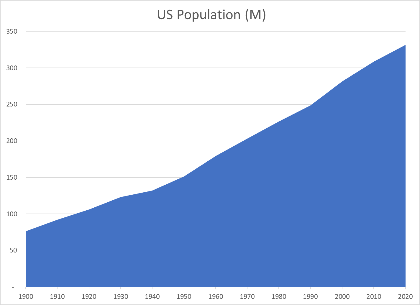
California’s 39M residents have the same representation as Wyoming, Vermont, Alaska and North Dakota who each have three-quarters of one million residents. This is a larger than 50 to 1 advantage for these four states. The California-Wyoming ratio is 68X, meaning that California citizens have just 1.5% as much power as Wyoming citizens.

A majority of states comprised of the 26 with the lowest populations represent 18% of the population. In theory, they could combine to outvote the other 24 states with 82% of the population. States with 57M people have more power than states with 269M citizens. The “lucky duckies” in the small population states, on average, get more than 5 times as much power as those in the large population states.

Distorted democracy: Change the Constitution or the states to fix it (usatoday.com)

The 9 most populous states contain more than one-half of the US population, but get only 18% of the Senators. The other 41 states with less than half of the people get 82% of the Senators. The filibuster rules that allow 40% of Senators to block Senate action give 41 Senators representing 11% of the country a potential veto. The two-thirds requirement for constitutional amendments and treaties gives this power to 34 Senators representing 5% of the population.

Abolish the Senate (bestdemocracy.org)

The 50/50 Democratic/Republican split in the Senate shows Democrats representing 185M residents versus 143M for Republicans. Democrats represent 40M more people with the same number of Senators. They represent 29% more citizens each. If California (D) and Texas (R) are removed from the calculation, Democrats have 30M extra voters to represent for the same number of Senators.

Demographers estimate that the disproportionate influence of small states will increase further in the next 20 years. In 2040, the 15 largest states will have 30% of the Senators (power) and 70% of the population, while the 35 states with 30% of the population will have 70% of the power.

‘The Senate is broken’: system empowers white conservatives, threatening US democracy | US Senate | The Guardian

Who Benefits from the Small State Advantage?

Republicans tend to be more popular in small states. In the 30 least populous states, Republicans have 35 Senators versus 25 for the Democrats, a 10 seat advantage. In the 20 most populous states, Republicans have 16 Senators versus 24 for the Democrats, an 8 seat disadvantage (2018).

Small states are getting a much bigger say in who gets on the court | CNN Politics

Most statisticians estimate the Republican advantage in the Senate to be the equivalent of 3%.

The Senate is a much bigger problem than the Electoral College – Vox

In 1950-1960, the impact of small states was more evenly split between Republicans and Democrats. The benefit to Republicans grew through time.

‘The Senate is broken’: system empowers white conservatives, threatening US democracy | US Senate | The Guardian

The Senate Has Always Favored Smaller States. It Just Didn’t Help Republicans Until Now. | FiveThirtyEight

Historically, small population states (mostly rural) have taken advantage of their relative power advantage to gain proportionately more federal spending, military bases and employment (earmarks, committee chair advantages). They have looked out for the interests of their citizens with distinctive federal policies for agriculture, natural resources/oil, highways versus mass transit, gun control/gun rights, criminal justice views, etc.

Lower population states have lower levels of immigration, fewer non-English speaking residents, higher per capita health care spending, higher % households with student debt, lower poverty rates and higher % of home owners.

the-senate-is-an-irredeemable-institution.pdf (filesforprogress.org)

Various calculations indicate that minorities lose representation and power versus Whites. Non college grad whites +12% extra representation. Non college grad blacks -20%. Non college grad Hispanics -30%.

the-senate-is-an-irredeemable-institution.pdf (filesforprogress.org)

As Blacks make up 11% of the 26 least populated states, but 15% of the 24 most populated states, they are 25% underrepresented.

Distorted democracy: Change the Constitution or the states to fix it (usatoday.com)

One author estimates that Whites get 0.35 Senators per 1M population, while Blacks get 0.26/1M and Hispanics just 0.19/1M.

‘The Senate is broken’: system empowers white conservatives, threatening US democracy | US Senate | The Guardian

Another author says that rural residents get 37% extra say, Whites get 13% extra compared to the average voter while non-Whites get 22% less for a total 35% minority voter penalty.

The 2021 Senate Will be Unrepresentative | by Michael Ettlinger | Medium

Why is This Such a Hot Issue?

The Republican advantage is material and is likely to continue.

The country’s political parties are more clearly aligned on a single conservative-liberal dimension, making parties and voters more polarized and reducing the opportunity for compromises based on other dimensions.

Starting with Newt Gingrich, the Republican Party discovered the power of 100% party discipline in both the House and Senate, making trade-offs, compromises, deals and log rolling less likely.

While rural/urban differences have always existed in the US (Federalists vs Democratic Republicans, North/South, Farm populists), the alignment of cultural and economic interests with the 2 parties now reinforces these differences.

The electoral college includes a vote for each Senator, so distortions are reflected to a lesser, but material, extent in presidential contests. US Supreme Court nominees require Senate confirmation.

The White/minority power difference.

With a divided population, the legitimacy of government is threatened.

Not a Problem (Opposing Views)

US Congress has stood the test of time with its “checks and balances”, including the purposeful compromise between large and small population states.

In the long-run, the advantages to one political party have faded.

The Pareto Principle (80/20) rule applies to many calculations like these. The forecast 30% of people with 70% of votes is less distorted than 80/20.

The US was formed as a federation of states with equal rights, like the sovereignty rights of nation states.

Voters do get “equal representation” in the House.

Geography and property are valid dimensions of political power, with a right to be represented.

There are many dimensions to political power. Urban areas are over represented in the economy, universities, media and culture. This gives rural areas/citizens an opportunity to be heard.

Constitutional Amendment?

Article 5 states that “no state, without its consent, shall be deprived of its equal suffrage in the Senate”. Hence, some would argue that no amendment can change these voting rules. Perhaps unanimous consent of the original 13 states would be sufficient. If a regular amendment was possible, it would require the support of two-thirds of the Senators and three-fourths of the states. Realistically, any amendment would require the potential support of 40 states, with only 10 left behind. This would require support from a majority of Republican states and all Democratic states. A Constitutional Convention with all options on the table may be required to change the basic 2 Senators per state rule.

The Senate is a much bigger problem than the Electoral College – Vox

Potential Solutions

Replace House and Senate with a unicameral legislature.

Abolish the Senate (bestdemocracy.org)

Allow states with some high ratio of the smallest or average state to divide into 2 or 3 or more states. “Encourage”/incentivize states with less than 1% of national population to merge with another state. Start with California and Texas.

The United States Senate was explicitly designed to be undemocratic. (milforddailynews.com)

Assign a “bonus” Senator to states with a population greater than 3 times the average population.

Redraw the whole state map to reflect natural economic areas with population differences of no more than 5 to 1.

Assign Senators based on 1 per state plus 1 per population with 110 total Senate seats.

The Unconstitutional Implications of the Two-Senator-Per-State Rule — Northwestern Undergraduate Law Journal (thenulj.org)

Change Senate election rules to have both Senators from a state be elected in the same election. Allow 2 candidates per party. If 1st place winner does not win at least 52.5% of votes, choose second Senator from party with second highest vote total.

U.S. Senate has fewest split delegations since direct elections began | Pew Research Center

Add District of Columbia and Puerto Rico as states. Consider Guam, American Samoa, Northern Marianas and US Virgin Islands.

Finally, some “political” solutions.

Provide economic development assistance grants for 10 smallest states to increase their population, especially their urban population.

Target economic policies/incentives to small, rural states to support the Democratic party.

Examining America’s Farm Subsidy Problem | Cato Institute

Provide incentives for 400,000 Democrats to move from California to Wyoming (125K), Montana (61K), Alaska (45K), North Dakota (36K) and South Dakota (132K) to narrowly win elections in 5 small states!!

US Poverty Rate, 1965-2019

YearRateAdjusted RateAdjustSingle Female HOH Pov RateSingle % of FamiliesSingle % of PoorNon Single Rate
20199.07.41.62518515.4
201511.59.32.23119526.9
201010.68.62.02919526.2
20059.88.11.72818515.8
20009.98.11.83018535.6
199511.69.52.13518536.6
199010.68.91.73417526.1
198511.710.21.63516477.4
19809.58.31.13215495.7
19759.38.70.63313446.0
197010.610.40.23311347.9
196516.016.00.040102613.3

Table 13.

Historical Poverty Tables: People and Families – 1959 to 2019 (census.gov)

I summarized the data in this table into 5 year buckets, just 4 years for the most recent 2016-19 period, to make it easier to review.

The poverty rate is the number of families out of 100 who meet the Census Bureau’s evolving standard of being poor, based on family size and location. For the last 4 years, 9.0% of families were considered poor.

The adjusted rate in the 3rd column calculates what the poverty rate would be in each period, if the nation had a constant 10.2% of families in the female head of household, no spouse present category (single moms), as was the case in 1965.

The adjustment is shown in the fourth column, reducing the average measured poverty rate.

The poverty rate for only single moms is shown in the 5th column.

The share of ALL families headed by single moms is in the 6th column.

The share of all POOR families headed by a single mom is displayed in the 7th column.

The poverty rate for families headed by a male is listed in column 8.

The OVERALL poverty rate dropped sharply (by 42%) from the early 1960’s at 16% to nearly 9% in the early 1970’s. The overall poverty rate was finally a shade lower in the 2016-2019 period, down to 9%. The overall poverty rate was in the 11% range throughout the 1980’s and first half of the 1990’s. It improved to 10% at the turn of the millennium, but rose back to 11% for the next decade. Overall, the rate was roughly flat for 50 years, ranging from 9-11%.

Partisans love to argue about the “war on poverty”. This data indicates that the early war was effective, but the enemy fought the proponents to a draw for the next 50 years.

Table 13 highlights the growing number and share of single female headed households. Single moms were just 10% of all households in 1965. They increased by 80% to 18% of the total by the early 1990’s, and have stayed in the 18-19% range thereafter.

The single mom poverty rate was unusually high in the early 1960’s at 40%. From 1970 through 1995 it averaged one-third. Single mom poverty rates were reduced by 10% to 30% for the next 20 years. The rate has fallen again, to 25% in the latest period. However, the single mom poverty rate has consistently been 4+ times as high as the male head of household group. Single mom headed households doubled their share of all poor households, from 26% to 52% in the last 50 years..

The male head of household group started with a 13% poverty rate. It dropped to 6% by 1970 and generally remained there for 40 years, aside from 7% rates in the 1985 and 2015 periods. Note that this is a greater than 50% reduction in the share of poor families. The “war on poverty” appears more successful from this vantage point. The rate edged down to a record low of 5.4% in the most recent period, as the extended economic recovery reduced unemployment and started to increase wages for lower skilled workers. This is a 60% reduction in poor families since the early 1960’s for this subgroup.

Column 4 shows the negative impact (mix variance) of having nearly twice as many families in the 33% poverty rate group versus the 6-7% poverty rate core group. By 1980, this change increased the poverty rate by 1%. By 1995, the impact was 2% and has remained in this range.

The adjusted poverty rate, standardized at the 1965 10.2% share of single moms may be a better measure of the effectiveness of overall policies and economic results. The adjusted rate starts with the same 16%. The effective poverty rate drops to 10% in 1970 and further to 8.5% in 1975-80. There is a spike back up above 10% in 1985 before falling back to 9% for 1990-95. The revised rate drifts down to 8% for 2000-2005 (50% reduction from 1965). It pops back up to 9% for 2010-15, before falling to 7.4%, a record low, finally less than half of the starting rate.

Adjusting for the mix of single mom households versus others provides a better view of the country’s effectiveness in reducing poverty. The adjusted poverty rate has been reduced by 60%, not just by 44%.

We can review poverty rates by age, race and education another day. The recent COVID-19 funding bills appear to be very effective at further reducing the US poverty rate. A relatively small amount of money seems to be working. The causes of more single mom headed households and focused policy solutions is also a topic for another day.

Is Indiana Better Off?

Population Rank of 50 States

Indiana maintained its 11th place rank from 1920 through 1970.

Since 1970 it has fallen 6 places to just 17th.

Of the 9 “nearby” states, only Iowa, dropping 7 places performs worse at attracting and retaining citizens. Missouri, Wisconsin and West Virginia are essentially the same as Indiana, dropping 5 places each in this half century. Michigan and Kentucky slipped by 3 places. Illinois and Ohio, starting near the top at 5th and 6th place, declined just one place. Tennessee gained one place, from 17th to 16th, moving ahead of Indiana.

Indiana Population 2021 (Demographics, Maps, Graphs) (worldpopulationreview.com)

Indiana’s Population Gains: What’s Our Rank?

90 Years and Indiana Doubles Its Population (January-February 2015)

Census 2020: Indiana population up, Midwest population down in 2020 (indystar.com)

Personal Income Growth Since the Great Recession

The economic recovery between 2007 and 2019 was one of the slowest after a recession. Average U.S. personal income grew by 2.0% overall. Indiana’s 4 way tie for 19th place at 1.9% is above the median state, even though it is slightly below the U.S. 2.0% average. 10 states grew by 2.4% annually or faster. 19 grew by 1.5% or less per year. Among the nearby states, Indiana was the second fastest grower, trailing only Tennessee at 2.2%. Iowa, Wisconsin, Ohio and Kentucky grew just a little less quickly, with 1.5-1.6% rates. Michigan (1.4%), Missouri (1.3%), West Virginia (1.1% and Illinois (1.0%) trailed significantly.

States 2020 Personal Income Growth Was Highest in 20 Years | The Pew Charitable Trusts (pewtrusts.org)

Relative Per Capita Income

YearINUSIN/USDecade IN – US %
19703,8494,21891.3
19809,36510,20491.8+1%
199017,76819,64190.5-3%
200028,23330,64092.1+3%
201035,45340,51887.5-7%
202051,34059,75485.9-3%

Indiana per capita income has trailed the national average throughout the last half century, starting at 91% of the national figure. Indiana gained a small amount in the first 30 years, reaching 92%. Indiana has slipped quite significantly to 86% in the last 20 years.

Per Capita Personal Income in Indiana (INPCPI) | FRED | St. Louis Fed (stlouisfed.org)

Personal income per capita (A792RC0A052NBEA) | FRED | St. Louis Fed (stlouisfed.org)

• Indiana: per capita real GDP 2000-2019 | Statista

United States | Per Capita Personal Income Trends over 1958-2020 (reaproject

Per Capita State GDP Rankings

State19982018Change
IL1112-1
IA3321+12
WI2824+4
OH2025-5
IN2732-5
TN3136-5
MI2637-11
MO2338-15
KY3544-9
WV4748-1

In the 20 years from 1998-2018, Indiana per capita GDP grew by an average level for the heartland, 19%, the same as Ohio, West Virginia and Tennessee. Kentucky, Missouri and Michigan grew by only 10-14%. Illinois, Wisconsin and Iowa grew by 24% or more, close to the national average.

During this time, Indiana dropped from a middling 27th rank to a lower 32nd rank. Ohio and Tennessee also dropped by 5 places. Kentucky dropped by 9, Michigan by 11 and Missouri by 15 places. Illinois and West Virginia slipped by 1 notch. Iowa and Wisconsin increased their rankings.

Useful Stats: Per Capita Gross State Product, 1998-2018 | SSTI

Median Household Income Rank

State19842018Change
IL14140
IA2918+11
WI1826-8
MO1731-14
OH1932-13
MI1633-17
IN3034-4
TN4741+6
KY4244-2
WV5247+5

Over a slightly longer time period, 1984-2018, Indiana again slipped by a few places, from 30th to 34th place. Four states dropped by 8 or more places: Wisconsin, Ohio, Missouri and Michigan. Illinois and Kentucky maintained their relative positions. West Virginia, Tennessee and Iowa improved their rankings.

Median Household Income by State: 2018 Update – dshort – Advisor Perspectives

Useful Stats: Median Household Income by State, 1984-2018 | SSTI

Summary

Indiana has been average or above average versus its “peer group” of 9 nearby states, but it has lost position versus the nation on all 5 measures. Personal income growth since 2007 is the best result, at 1.9% versus 2.0% national average. Indiana population has fallen 6 spots to 17th in 50 years. Per capita income versus the nation has slipped by 6% to just 86% of the average in 20 or 50 years. Per capita state GDP has dropped 5 places to 32nd place in 20 years. Median household income has fallen 4 places to 34th place in 34 years.

Indiana’s business friendly low tax/low service strategy has helped the state do better than its peers, but has not delivered above average growth by any measure.