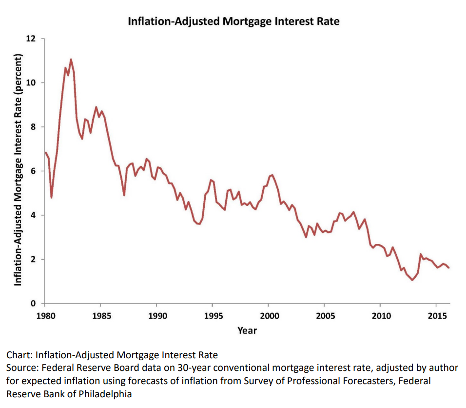
Real, inflation-adjusted, interest rates have declined greatly since 1980. At that time, with the risks of variable inflation and surging oil prices, the real mortgage interest rate was 8%. It declined to 5% in the 1990’s and 4% in the 2000’s before falling to 2% in the 2010’s. The financial cost of owning property has rarely been lower.
House Values are Up, Way Up
House prices grew relatively consistently from 1970 through 2000, with a spike in 2005-9 and a return to trend values in 2010-12. In the last 10 years, house prices have increased by 6% annually in nominal terms, or 4% annually in real terms.
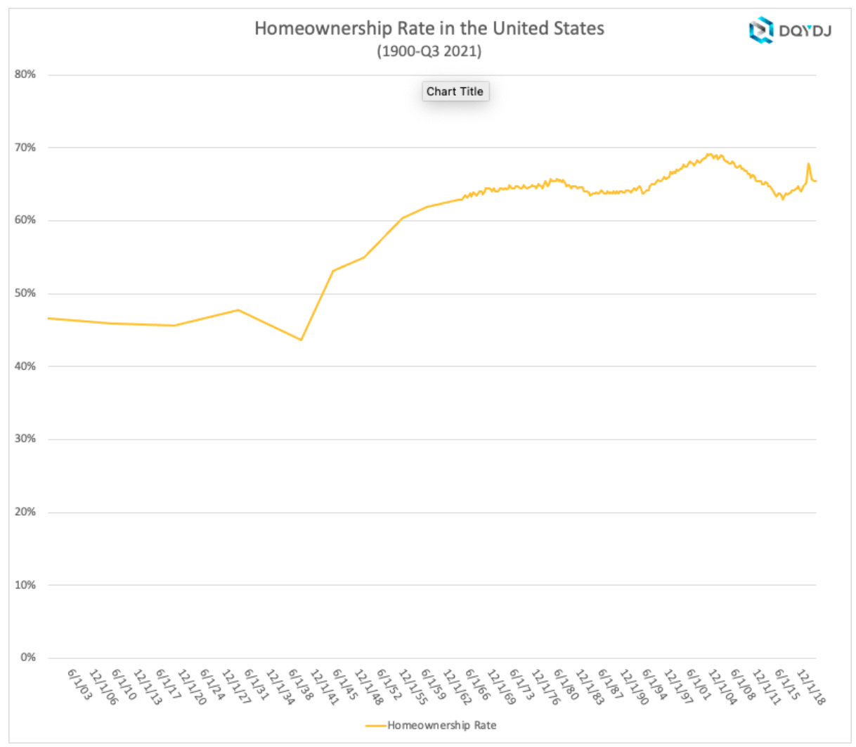
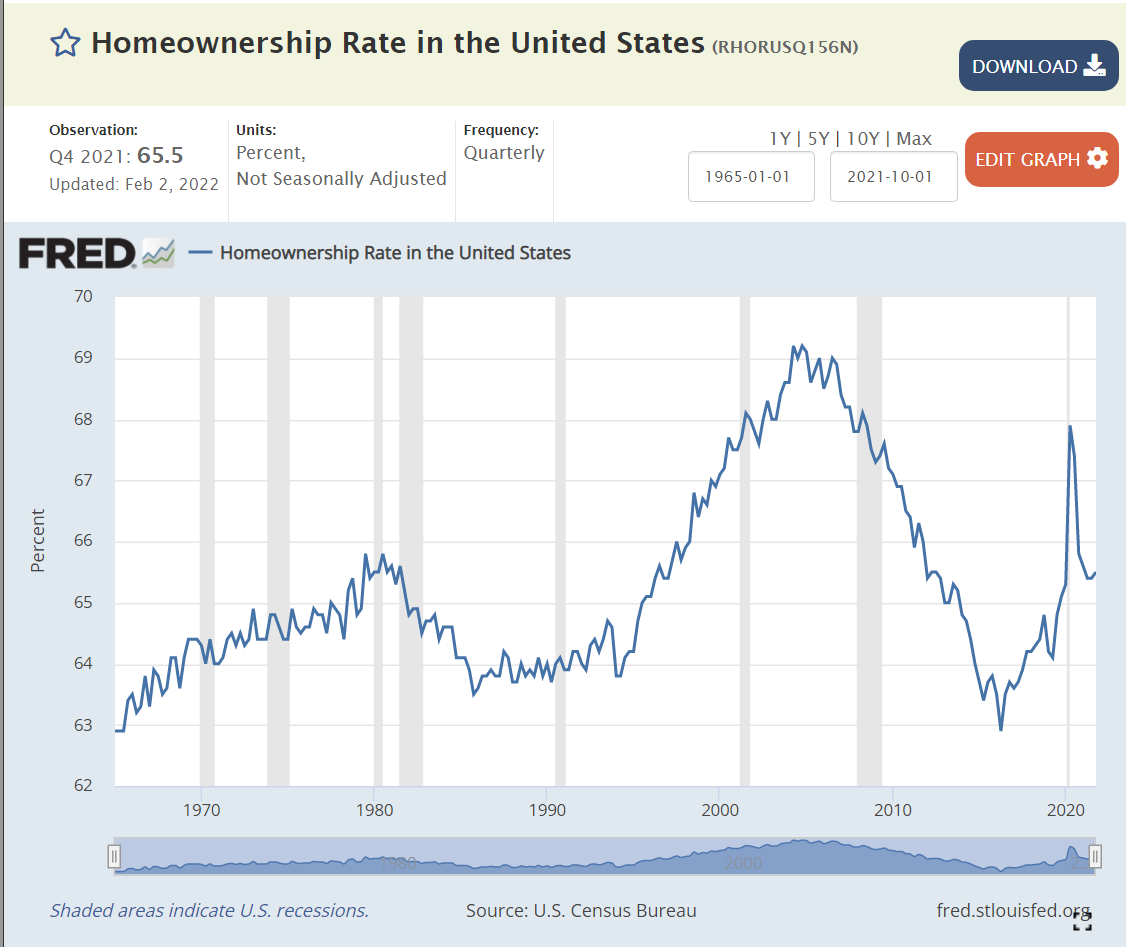
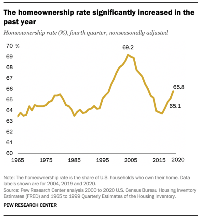
Home Ownership Rate is Rebounding, Up 2%
The US homeownership rate averaged 47% from 1900-40. It increased smartly in post WWII times to 60% by 1955 and 64% by 1965. Homeownership averaged 64%+ for the decade of 1969-78. It increased by 1% during 1979-81. In the midst of a difficult depression, homeownership rates dropped back to 64% by 1985, about the same for the last 20 years, setting a “normal” level. Homeownership rates stayed at 64% for the next decade. Ownership rates increased from 64% to 69% in the next decade before declining right back to 63% by 2015. In the last 7 years, despite many headwinds, the home ownership rate has increased by 2%.
Number of Homeowners has Jumped by 7 Million
In 2000, there were 69M owner-occupied homes in the US. This increased by a solid 7M to 76M by 2005. The housing market hit a lull and the number of owner-occupied homes essentially stayed flat for a dozen years, through 2017. The supply of owner-occupied homes then rose by a strong 7M in the next 4 years to 83M!
The housing market is inherently volatile, typically rising by 2 times the trend and then falling to one-half of the trend. Annual housing starts averaged 1.6M from 1960-2008. They declined by a severe 75% to just 0.5M in 2009. Housing starts have subsequently grown 3-fold to 1.6M annual housing starts, but the accumulated lack of new supply is impacting housing markets today.
The period from 1982-2000 showed homeownership rates by the 5 age segments remaining relatively constant; 65+ 78%, 55-64 80%, 45-54 76%, 35-44 67% and <35 40%. The 65+ group increased homeownership from 75% to 80%. During this time, the overall US homeownership rate increased from 65% to 69%, mostly due to the aging of the population, now more heavily weighted towards the groups with 76-80% homeownership versus the 40-67% younger groups.
Homeownership rates grew from 2000 to peak rates in 2004, before declining significantly for all groups except for the 65+ cohort which essentially held it’s own. The adjacent 55-64 class fell 4%. The middle 45-54 group dropped 7%. The typically homeownership growing 35-44 group cratered by 9%. The young <35 group fell by 5%. Hence, the overall rate fell dramatically during this time.
There is a 30 point gap between married couples and other groups, with 84% of married couples owning homes versus about 55% for other family structures.
The US shows dramatically different homeownership rates by racial category. The differences between the 1995 non-Hispanic White rate (70%) and Others/Asians (50%), Hispanics (42%) and Blacks (42%) remain large in 2021 where we see White (74%), Other (57%), Hispanic (48%) and Black (44%). The groups homeownership share gain from 1995 to 2005 were similar, ranging from 6-10%, but the decline from 2005-2015 was only 3-4% for Whites and Hispanics, but 7% for Blacks and Others. The improvement from 2015 to 2021 has been 2% for 3 groups and 4% for the Other/Asian group.
Summary
The Great Recession flattened the housing market. The number of owner-occupied homes in the US remained level at 76 million from 2006 – 2017. The number of housing starts plummeted from 2.0M to 0.5M per year, compared with an historic average of 1.6M. New home construction first exceeded 1.2M units (75% of historic average) again only in 2020, a dozen years later. New home-owning households have increased by 7M units in the last 4 years! The homeownership rate is up 2 points, from 63.5% to 65.5%. Supply is responding to increased demand and higher home prices. Homeownership rates will increase with the economic recovery, but be constrained by higher home prices.
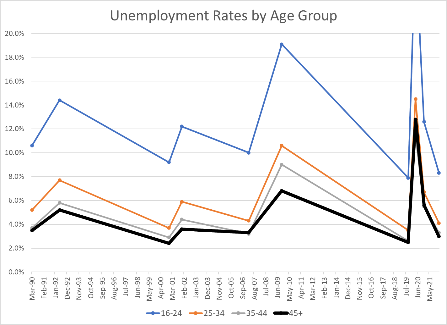
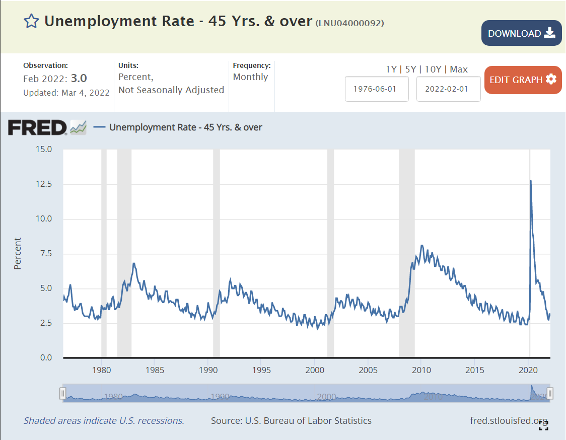
I’ve summarized the last 30+/- years of US labor market experience with just the peak unemployment rates of the business cycle, plus December, 2020 as a secondary indicator of the peak Covid/pandemic impact, since the actual peak numbers in April, 2020 were so extreme and short-lived.
Less experienced individuals have historically had higher unemployment rates in the US. Compared with the 45+ age group, the 35-44 age group has averaged 0.3% higher unemployment; 5.2% versus 4.9%, a relatively minor difference. The 25-34 year age group has averaged 6.6% unemployment, a substantial 1.7% higher rate. The job-seeking 16-24 year age group has averaged 13.2% unemployment, more than twice as high as the 25-34 year age group and more than 2.5 times the 45+ age group (8.3% extra).
The “extra” unemployment for 35-44 year olds versus the 45+ group has been zero for the last 15 years, versus a minor 0.5% premium historically. It appears that workers are reaching full employment value at an earlier age.
The “extra” unemployment for 25-34 year olds versus the 45+ group has been 1.0% for the last 15 years, a small reduction from the prior 1.5% premium.
The “extra” unemployment for 16-24 year olds at the peak of the business cycle versus the 45+ group averaged just 5.3% recently versus 7% historically.
The 2007-2009 recession showed a greater impact on modestly younger (25-44 year old) workers, with their unemployment rates increasing by 2.5% more than the 45+ group.
Despite the reduction in the inexperience penalty for youngest workers (16-24) in the last few years, they did experience much higher “extra” unemployment during both the 2007 and 2020 recessions.
Very young workers continue to be penalized for their inexperience, but other workers from ages 25+ seem to have relatively equal economic value today.
Note that the current unemployment rates for those aged 25+ already matches the average MINIMUM rates of the last 4 business cycles: 3-4%. The 8.3% unemployment rate for the 16-24 year age group is below the minimum in 1990, 2000 and 2007, and just above the 7.9% level of Sep, 2019.
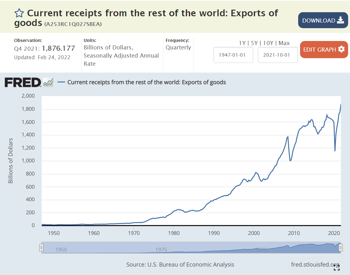
Critics complain about the US economy’s weak international performance in recent decades. Let’s set aside the trade balance (exports – imports) and focus just on exports. US exports occur when US goods and services are more competitive than ALL other countries in the world, subject to limits based upon transportation and purchasing costs, currency values and trade barriers. In real (inflation-adjusted) terms, US exports have increased by 180% since 1980, or 2.5% per year, year after year after year. Despite the 10% increased real cost of labor in the US, firms have leveraged their advantages, developed new products, found new markets and used better financing structures to greatly improve the US export results.
Total Goods and Services
Real goods and services exports increased by 180% from 1980 until today. They increased 9-fold in nominal terms, but consumer prices increased by 230% (3.3x).
The US Dollar fell in value significantly in the 1980’s as US inflation exceeded inflation in other countries, but has since been relatively constant against a market basket of other currencies. The increase in exports is not due to a weaker US dollar.
Goods Exports
US goods exports have increased by 140% or 2.1% per year in real terms since 1980. They have fallen from 4/5ths to a little more than 2/3rds of the total as services exports have grown more rapidly.
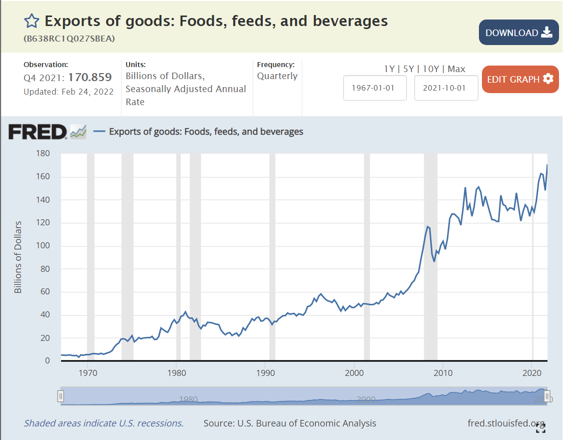
Agriculture
Ag exports grew very rapidly in the 1970’s and then flattened through the 80’s and 90’s before rapidly accelerating in the “oughts”. Ag exports grew by 30% in real terms over these 4 decades, a little less than 1% per year.
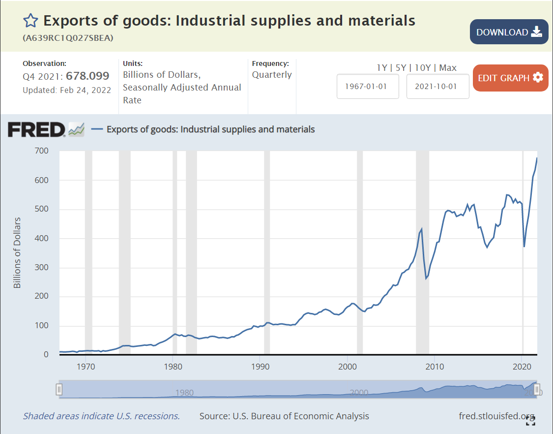
Industrial Supplies Exports
US chemistry based and other engineered supplies and components grew by 210%, or a strong 2.8% annually.
Petroleum Exports
From zero to something, now 10% of US exports.
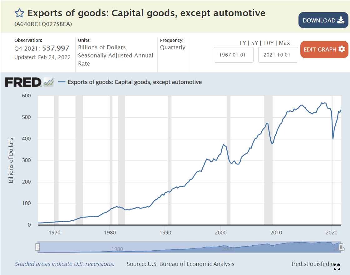
Capital Goods Exports
US exports of highly engineered capital goods increased by 100%, or 1.7% per year.
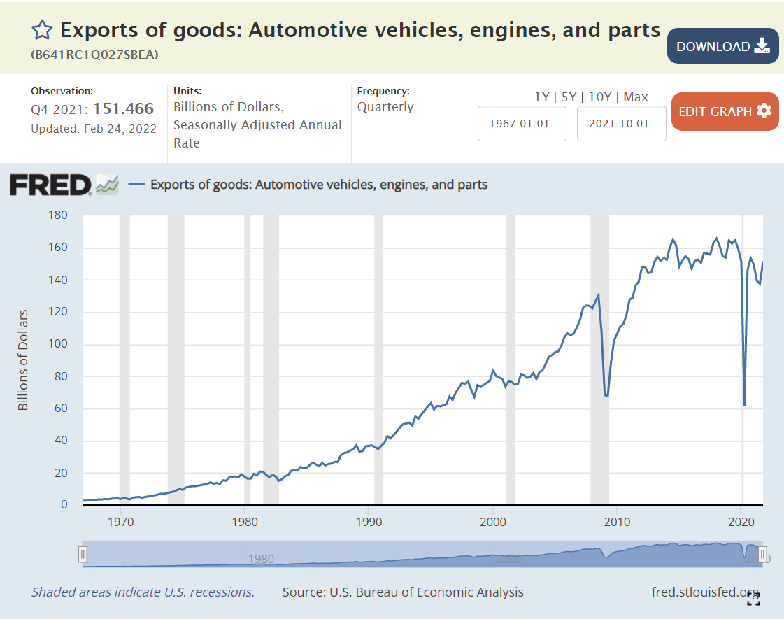
Automotive Exports
Another positive result. US auto exports are up 140% in real terms, or 2.1% per year.
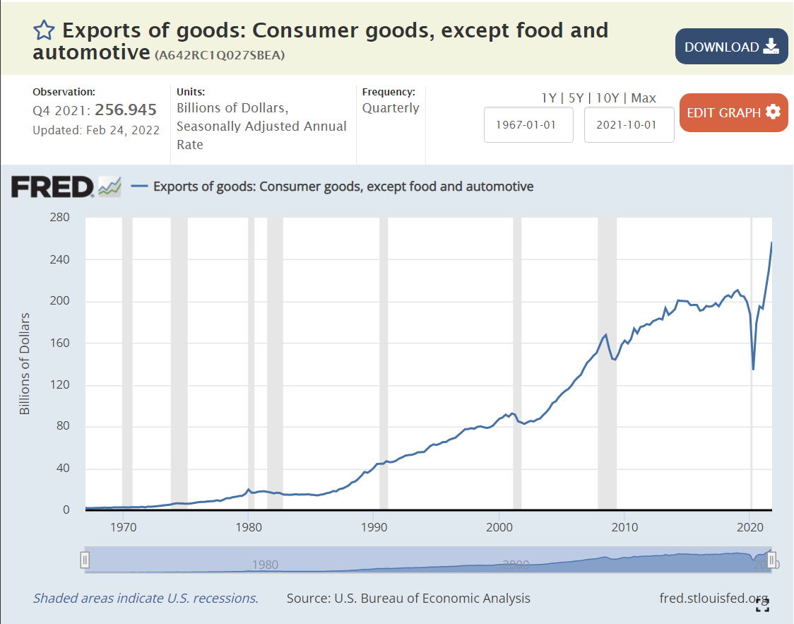
Consumer Goods Exports
Miscellaneous consumer goods exports increased by 340% or 3.6% annually, an amazing performance!
Services Exports
US services exports grew by 350% in these 4 decades, by 3.7% annually. The US is very competitive in the “most competitive” areas of international trade.
Summary
The US economy continues to increase its internationally competitive real exports at a rate of 2.5% per year in the long-term. The US is very well positioned to prosper in an era of increased global and free trade.
Hotel capacity increased by 50% from 1995 to 2019.
Demand grew at the same 50% rate, although not always in lockstep.
Occupancy averaged a healthy 63% (almost two-thirds) through this period, with significant differences due to changes in construction and the economy.
The price per room averaged about $125 per night in real 2020 dollars, again varying based on supply and demand, but overall, relatively constant.
Total hotel industry real revenue ($2020) for the 21 years from 1998 through 2019 increased by a little less than 50% according to Bureau of Economic Analysis (BEA) figures.
Real consumer only (leisure) sales increased by nearly 100% during this period.
Real consumer sales per person increased by about two-thirds.
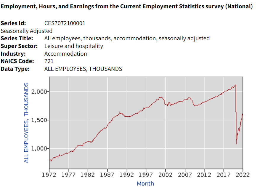
Hotel industry operating statistics before 1995 are not readily available. The tremendous growth of the industry in the last 30 years of the twentieth century is illustrated by the more than three-fold growth in industry employment, from one-half million to 1.8 million. Note that employment did not follow the growth of rooms during the first 20 years of the next century.
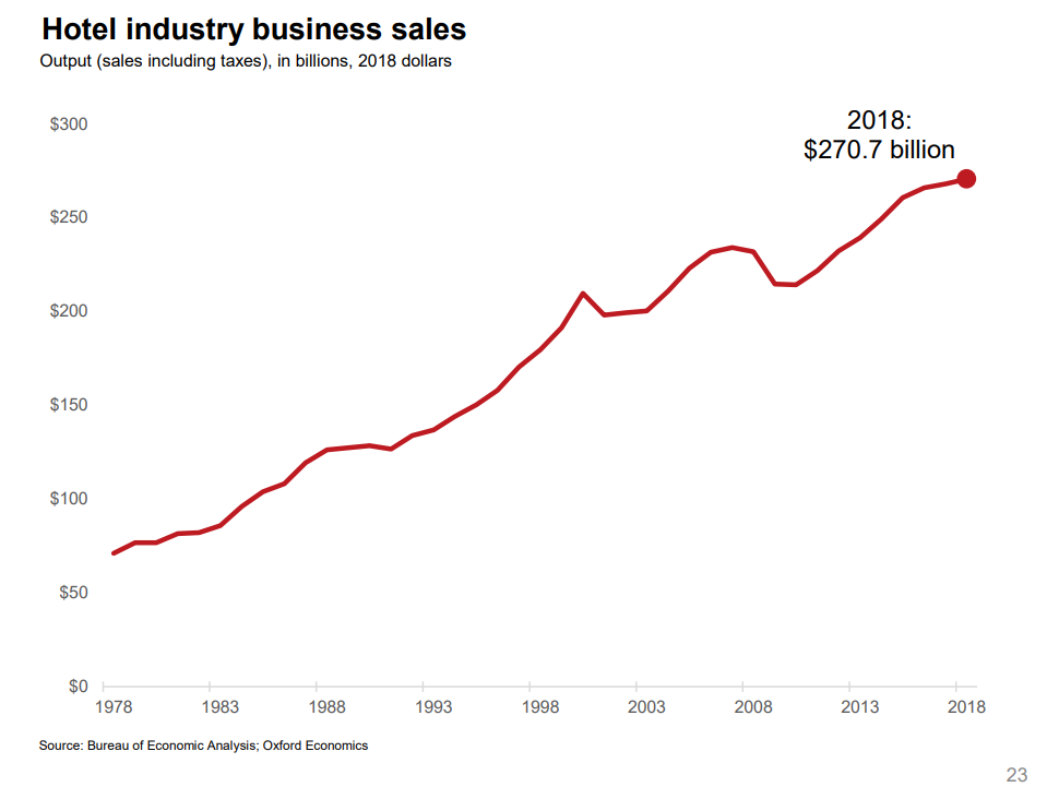
Oxford Economics developed an industry promotion brochure in 2019 that has some longer-term data. Total real (inflation adjusted) revenue is up more than 4 times in 40 years. Our 1995-2018 data shows relatively small changes in average hotel prices. I suspect that there were “real” increases from 1978 – 1995 as the industry was growing quickly in response to consumer demand.
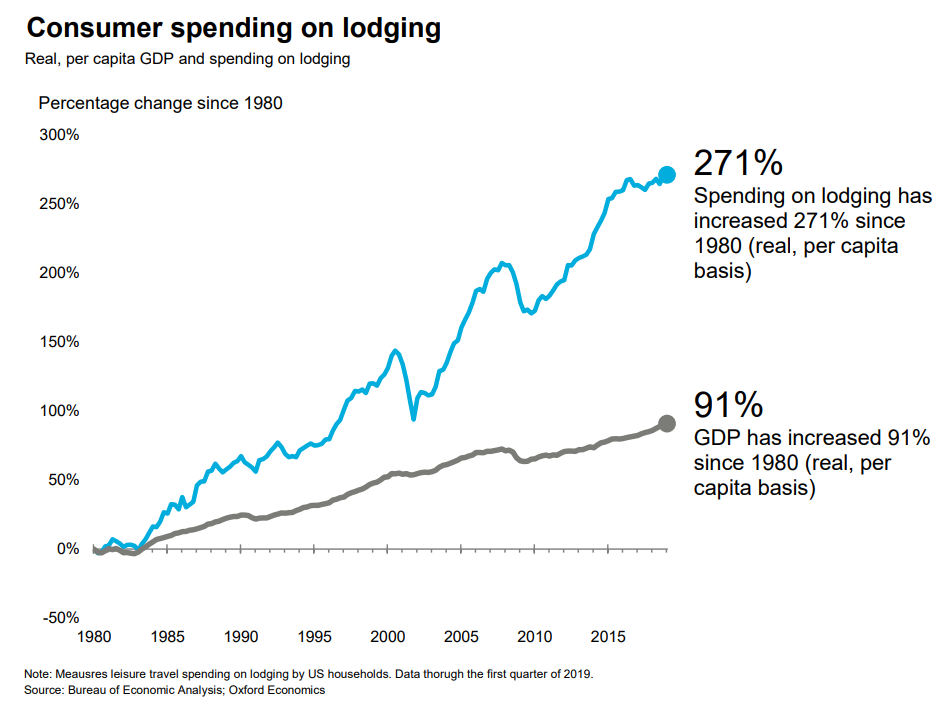
A similar measure, gross domestic product (GDP), or production value added, net of the cost of inputs, increased 3-fold in 40 years.
Consumer spending on accommodations has increased about 3 times as fast as GDP overall in the last 40 years.
Hotel purchases as a share of total consumer spending has increased by more than 80% in these 40 years.
Overall demand for hotel rooms per citizen for all uses (personal, business, government and foreign travelers) has increased by 20% across 30 years. Personal and foreign travel have grown at a faster rate.
The short-term rental market (personal vacation rentals, Airbnb) has grown from zero to 10% of the hotel room volume and appears to have years of growth ahead of it. This growth is not included in the industry summary figures.
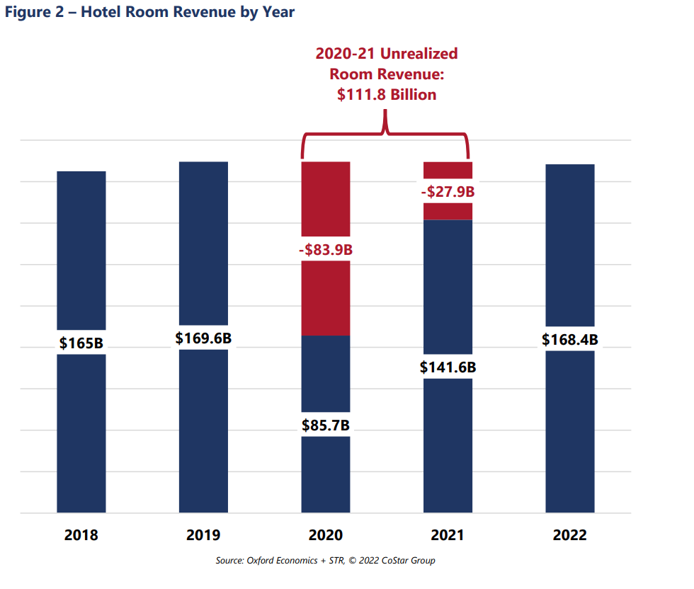
Occupancy is forecast to return to the historical average of 63% for 2022 and increase further in the following years. The industry “lost” more than $100B of revenues due to the pandemic, so analysts estimate that the industry will return to “normal” employment, prices, profitability and reserves by 2025.
Consumer access to hotels and private rentals has increased by 3 or 4 times in the last 50 years, at a faster rate in the first 25 years, and somewhat slower in the last 25 years. Hotel business models at 63% occupancy seem to justify continued capital investments in new supply. Prices have been relatively flat for 25 years. Competition between brands, pricing segments, corporations and private owners seem to be effective at providing adequate capacity and service options at competitive prices.
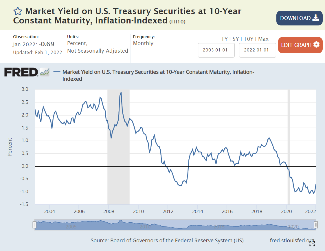
The “real” interest rate is the nominal interest rate minus the inflation rate. It reflects the “real” cost of borrowing. Prior to the “Great Recession”, 2% was a typical “real cost” of borrowing money. To entice lenders to lend, borrowers had to pay some “real” amount extra per year, 2%.
The Federal Reserve did what it could to “ease” monetary conditions and lower interest rates to offset the negative impact of the Great Recession in 2008-9.
By the end of 2011, real rates were ZERO or negative. In other words, the Fed went too far. By June, 2013, rates returned to positive territory, but only reached 0.5%, where they remained through the end of 2017, despite president Trump’s complaints that the Fed was constraining the Trump economy. Monetary policies were “easy” for a very long 7-year period.
By May, 2019, real interest rates were back to just 0.5%, having reached a peak of just 1% for 3 months at the end of 2018. With further “easy” money policy, real rates dropped back to ZERO percent by August, 2019. The economy was now 9 years into recovery. Interest rates should have been higher.
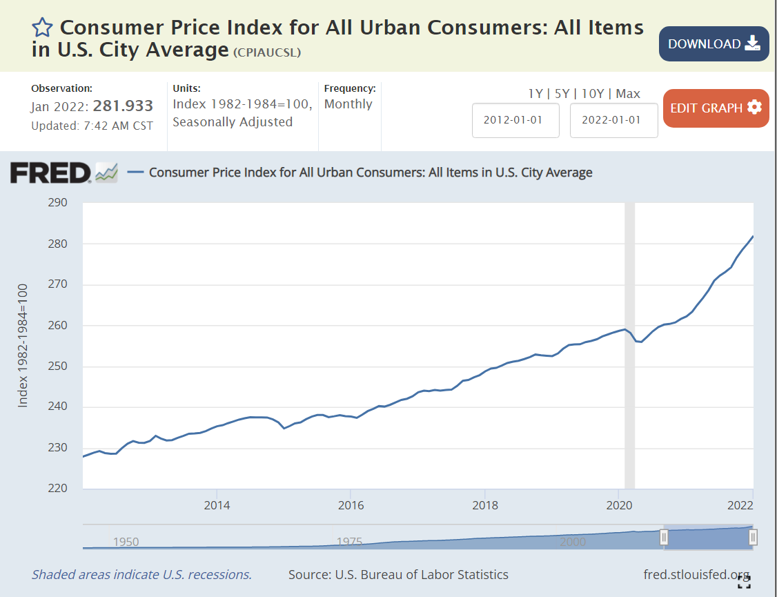
The Fed found new ways to “ease” monetary policy as the pandemic struck in 2020. Real interest rates dropped to -1% and stayed there. Monetary policy has been “easy” for more than a decade. Time for inflation. “Too much money chasing too few goods”. “Inflation is always and everywhere a monetary phenomenon”.
Supply Chain Disruption
The recovery has been faster than anyone expected, but most critically, with consumers less eager to buy “in-person” services, they have greatly increased their purchases of goods. The modern US economy relies on imports and modern manufacturers and retailers hold lower inventories to buffer changes.
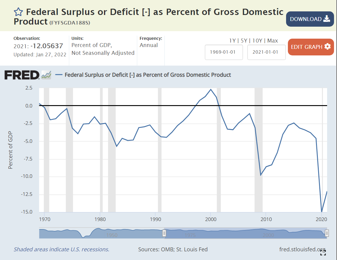
Standard macroeconomic theory focuses on aggregate demand versus aggregate supply as the key driver of output, unemployment and inflation. When total demand grows faster than remaining excess capacity of total supply, inflation results. The biggest driver of changes in aggregate demand is the level of government spending (demand) minus government taxation (reduces demand).
Historically, various pressures have kept the federal budget deficit between -3% and +3% of GDP, allowing the government to buffer change in private demand through the business cycle. The large drop from -2.5% to -5% in 1979-82 was a factor that contributed to the last major round of US inflation. A similar decline from -2.5% to -4% in 1989-91 increased inflation, but not on such a large scale. It also served to convince President Clinton and congress to reduce the deficit to ZERO by 1997 and run a surplus for a few years.
The 2001 recession caused a 2.5% decrease in this ratio, from a surplus to a deficit. Bush tax cuts, foreign wars and congressional agreement lead to deeper deficits at 3.3% in 2003-4, before some recovery to -1% in 2007, prior to the Great Recession.
Bush, Obama and congress agreed to spend more to fight the Great Recession, pushing the deficit to a worryingly low -9.8% in 2009. There was no agreement on a second major round of spending, so the deficit improved a bit to -6.6% by 2012 and then to a more reasonable -2.5% in 2014-15. Instead of continuing to improve with the economic recovery, it fell a little, to 3.1% in the last year of the Obama economy.
President Trump’s first order of business was to enact “job creating” tax cuts. Unfortunately, the desired boost to economic growth to fund these tax cuts did not occur. The budget deficit increased from 3.1% to 4.6% of GDP, as the economy reached a record long recovery period of a full decade.
To address the pandemic, congress and Trump agreed to spend money to protect the economy and workers, leading to very large budget deficits of 15% and 12% in 2020 and 2021, respectively. Too much aggregate demand for the level of aggregate supply, so we have major inflation.
Summary
Easy money, easy fiscal policy and a 20% increase in demand for goods leads to major inflation. Like a frog getting boiled as a pot slowly warms up, we became complacent based on the apparently “just right” conditions of the late teens (2012-19). The federal budget deficit needs to get back above -5%, real interest rates need to become positive and consumers need to rebalance to consume more services and less goods. I don’t think we’ll see 7% inflation for 2022, but it looks like 4-5% is a good bet. Hold on.
Politics
Biden deserves a good share of responsibility for the government spending budget deficit, as he was seeking to make it even larger. I give him a “pass” on consumer demand for durable goods since it mostly occurred before he started. I also give him a “pass” for the loose Fed monetary policy which has been going on for a decade or so. He was wise to reappoint the Fed chairman, who I believe will raise interest rates as needed to get the real interest rate back to a proper level. In the meantime, Biden will pay politically for higher inflation, which has a “real” impact on the wallets of voters.
Ronald Reagan taunted Jimmy Carter with this question to voters in the 1980 debates. It helped him win.
Twelve years later, James Carville helped Democrats return from the political wilderness in 1992 with his advice to Bill Clinton that “it’s the economy, stupid”.
Politicians have used various measures, from unemployment to inflation to the “misery index” to jobs created to productivity to the stock market, to promote their success and detract from their opponents.
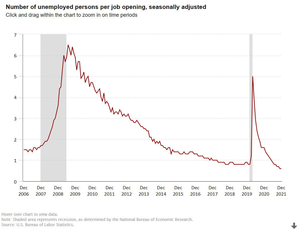
I want to focus on one measure, the ratio of the number unemployed to the number of job openings, to highlight the strength of the American economy in the last dozen years.
The Bush economy was widely criticized for its “jobless recovery” following the economically healthier Reagan and Clinton presidencies. The presidency started at close to 1 unemployed person per job opening. The recession pushed this up to 2.5x and then 3.0x. In labor market terms, this is a huge difference. At 1:1 or 1.5:1, unemployed workers expect to be re-employed quickly. At 3:1, some may enter the dark days of the “long-term unemployed”. After 3 years, the economy DID recover to 1.5:1, but it was unable to improve further. The “Great Recession” was a brutal job killer, pushing this measure of labor market tightness up four-fold, from 1.5X to more than 6X before its peak in the first half of 2010, as Obama and congress and the federal reserve bank wrestled with the situation.
Obama: Recovery and “New Territory”
Between April, 2010 and April, 2012, the economy cut this ratio in half, from 6x to 3x, a very solid performance. It took 3 years, until April, 2015, to complete the next 50% reduction, from 3x to the historically “very solid” 1.5X. The economy continued its growth for the next 2 years, but at a slower pace, reducing this ratio to 1.3X.
Trump: Even Better
The Trump economy continued to improve for the first 18 months of his term, reducing this ratio from 1.3X to 0.8X by September, 2018. This was a time of record low unemployment and economists recalculating their standard of “full employment”. While the economy continued to grow, the unemployment rate continued to decline and the stock market continued to climb, THIS measure had reached its minimum before the 2018 mid-term elections. It remained steady at the very positive level of 4 job seekers for every 5 jobs (0.8) for the next 17 months, until the pandemic disrupted everything. The ratio quickly shot up to 5X, not as high as the 6X that Obama faced, but very high. It quickly recovered to 1.4X by the end of Trump’s term. This was partly job recovery and partly fewer job seekers, but it was an amazing recovery in historic terms. Recall that 1.5X was “a good as it got” during George W. Bush’s presidency.
Biden: Even Better, Again !
In the first 6 months of the Biden presidency, this ratio dropped from 1.4X back down to the prior record level of 0.8X. Yes, by July, 2021, there were 5 jobs available for every 4 job seekers. This was as low as the ratio had previously fallen, even as the Trump economy piggybacked on the Obama economy and continued its extraordinary run. The ratio continued to fall in the next 6 months to 0.6X, an unheard-of level. 5 jobs for every 3 job seekers. It’s “no wonder” that voluntary job quits are at unprecedented levels. For, perhaps, the first time in American history, “everyone who wants to work, can find a job”. Whether you are right or left, Dem or Rep, this is “good news”. This is “great news”. Wages for the “bottom 20%” are rising in real terms. Income inequality is declining, a bit. The economy seems to be able to digest this new condition. And, the economy is not done growing, innovating, creating businesses, creating jobs, exporting, etc. About 2% of Americans are likely to be attracted back into the workforce in the next year or two, keeping the headline unemployment rate from going much below 4%, but pushing US real GDP growth to 4% in 2022 and close to 4% in 2023.
Summary
The “Great Recession” and the “once in a century pandemic” have been unable to disrupt the ongoing progress of the American economy and labor market. As a nation, IMHO, we have cultural and political challenges, but we “aught” to appreciate the power of the American economy to move forward.
Many states have legislatures and governors from the same party and voted for this party in both the 2016 and 2020 presidential elections. These states have adopted quite different Covid management strategies. There are 14 solidly Democratic states and 21 solidly Republican states, leaving 15 states with some level of “mixed” political control and influence.
Democratic states average 80%, Republican states 66% and Mixed states 73%. The national average is 72%. Nevada (69%) is the only Blue state below 75%. Alabama, Wyoming and Mississippi have the lowest scores for the GOP at 59-60%. Florida has the highest rate at 75%. The split in world views is confirmed by this measure. The mixed group ranges from Louisiana and Georgia at 63% to Massachusetts (85%) and Vermont (86%).
The overall death rate for the country is 256. The mixed states are similar at 265. The Democratic states average 221 deaths per 100K people. The Republican states average 282 deaths per 100K people. If the Republican states had the same rate as the Democratic states, they would have 59 fewer deaths per 100K people, for a cumulative total of 70,000. Economists use $10M as the value of a life in many cost-benefit calculations, so one measure of the difference is $700B.
California (196) and New York (227) drive the lower D result, but the Dems include higher fatality states such as Rhode Island (305) and New Jersey (344). The mixed states include some relatively high death rates in Michigan (315), Louisiana (329) and Arizona (350). The Republican group includes 3 states below the D average in Utah, Alaska and Nebraska, but 7 states at 300 or higher: Oklahoma, Indiana, West Virginia, Arkansas, Tennessee, Alabama and Mississippi.
Nonfarm Employment Recovery: Nov 2021 vs. Feb 2020
Overall employment is within 2% of the February, 2020 peak for the country as a whole. The “mixed” states have recovered to within 2.3% of the peak. The Democratic states are only at 96.4% of the peak, while the Republican states, on average, are just below breakeven at 99.9%. If the D states had the same level of recovery, there would be 1.8M jobs added in the recovery to date. At the recent median $1,000 per week wage, this would generate $94 billion of income annually.
I used the Feb 2015 to Feb 2020 period to generate a pre-Covid trend growth rate. This was 6.4% for the country, 5.4% for the mixed states, 7.0% for the D states and 6.7% for the R states. This indicates that the Republican faster recovery is not due to prior momentum. I used the 2020/2015 growth rate to create a solid estimate of the 2021/2020 recovery rate for each state (r = 0.63). It confirmed the 3%+ gap between the 2 parties was not due to prior trends. I also checked the percentage of 2019 employment in the leisure and hospitality sector, to see if this was driving the difference, but it did not have a material effect.
At the height of the cold war, in the year on my birth (1956), Soviet First Secretary Nikita Khrushchev warned the US that “we will bury you”. Agriculture was still a very large share of the USSR and US economies. He couldn’t have been more wrong.
US statisticians have long separated the farm and nonfarm economies. A “census of agriculture” is conducted every 5 years to complement other economic statistics collected. The USDA Economic Research Service (ERS) does a great job of compiling statistics for the narrow (farming), moderate (fishing, timber) and broad (ag based production) agriculture industries.
I’ve chosen to examine the near 60-year period from 1959-2017 covered by the censuses of agriculture. During this time, Real (inflation adjusted) US Gross Domestic Product (GDP), the value of all goods and services produced, increased from $3 to $18 trillion dollars, a near 6-fold increase, or 3% annually, year after year after year.
We don’t have an economic series that tracks wage and salary income back before 1979, but real disposable income per capita exists for this whole time period. This indicator or labor costs increased 3.4 times, from $12,600 to $42,900, or 2.1% annually. Given the strong growth of the US economy and its many new opportunities AND the increase in labor costs facing the oldest industry, one might have agreed with the Soviet premier back in 1956, at least regarding US agriculture. But, that prediction was wrong.
Index of Unit Outputs
The US agricultural economy grew to more than 2.5 times its 1959 base by 2017. It grew by 75% in the first 30 years and an additional 50% on top of that new base. The consistent pattern of growth is striking.
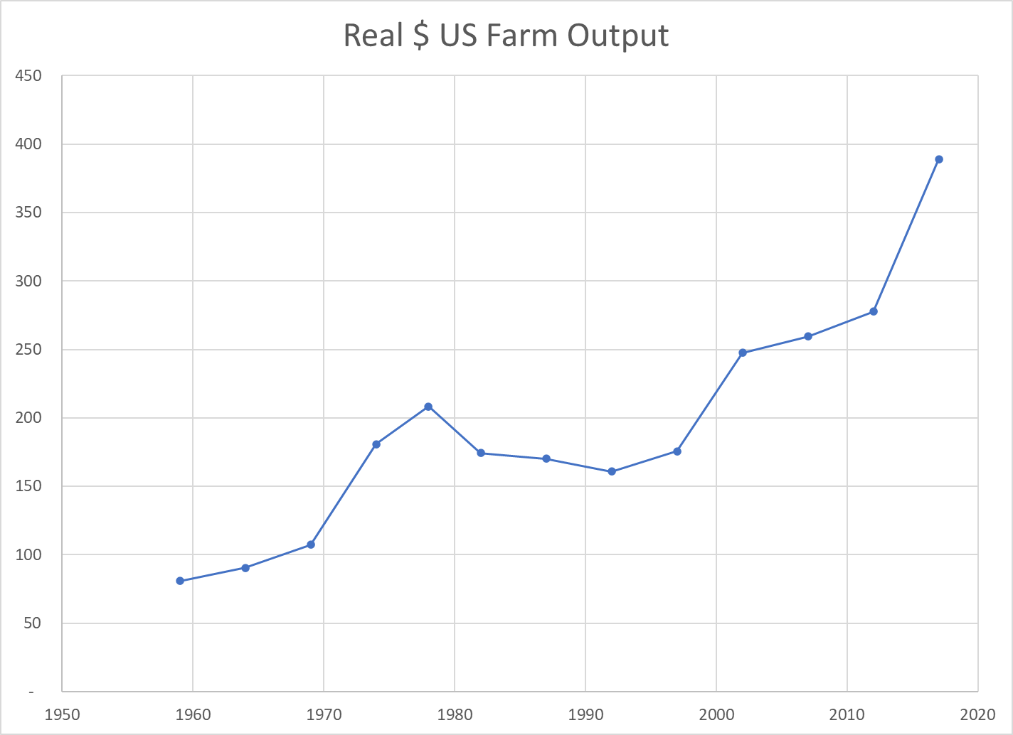
Real Market Value Produced
The Ag economy grew (based on variable market prices) 5-fold from $80B to $390B during these six decades, increasing by 110% in the first 30 years and a compounded 130% in the most recent 30 years.
Land Input (Acres)
The amount of land dedicated to production agriculture has decreased by 20% during our period of focus, from 1.1B to 0.9B. The decline was faster in the first 30 years (14%) than the second 30 years (7%). Despite this reduced demand for agricultural land, the value of such land has increased in real terms as its productivity has grown.
Labor Inputs FTE
The full-time equivalent labor force in the ag industry, as best as the USDA can measure it, dropped by nearly two-thirds in our six decades, from 2 million to about 700,000. It fell more rapidly in the first 30 years (50%), but a solid 25% in the most recent 30 years.
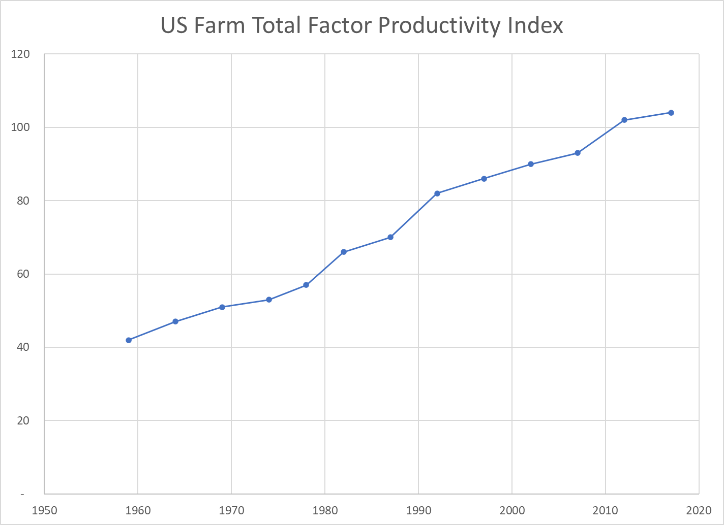
Total Factor Productivity
Economists try to measure land, labor and capital as inputs to the agricultural production process. As noted above, land and labor have declined. Capital – equipment, improvements, patents, inventory, etc. has increased. Overall, the total inputs have remained roughly flat for 60 years. Hence, almost ALL of the increased unit output is due to increases in productivity. Better crops, better labor skills, better processes, better methods, better irrigation, better crop rotation and selection, etc. Economists call this “total factor productivity”. After accounting for measurable increased inputs, the remaining improvement is called “productivity”.
The oldest industry in the world, increased its productivity in the US by 150% in these six decades; by two-thirds in the first 30 years and by one-half on the higher base in the second 30 years.
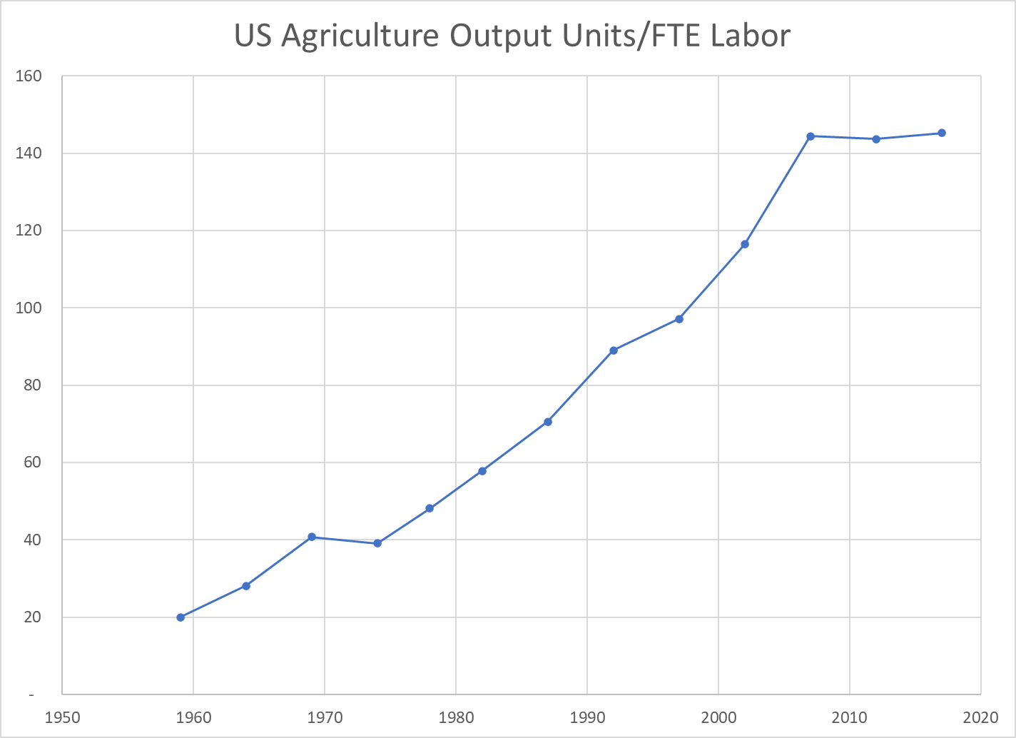
Output per Labor Unit (Labor Productivity)
The strong increase in production combined with the two-thirds reduction in FTE labor required resulted in a 7-fold measure of improved labor productivity. The land input was down by 20% and the capital input increased significantly, but in simple terms, each hour of labor in 2017 delivered 7 times as much output as the labor in 1959. The increase was 2.5x in the first 30 years and a solid 2x in the more recent 30 years.
US Agriculture Output Price Index
The index of agricultural industry output prices has increased by 3-4x versus 8x for the consumer price index or GDP price index.
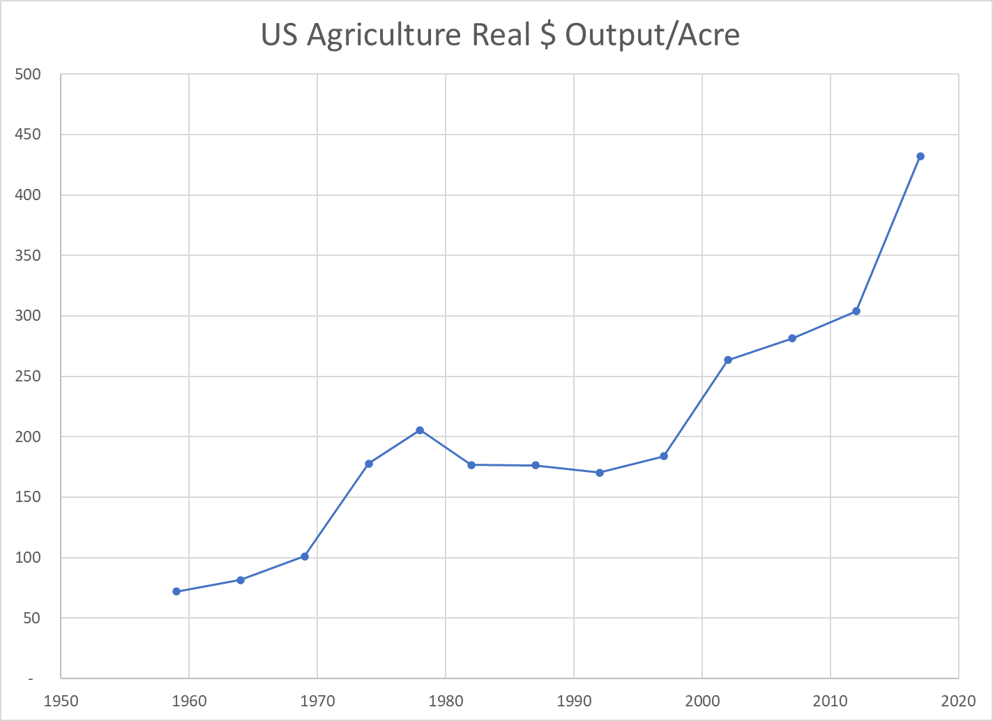
Real Market Value Produced Per Acre
The real market value of ag goods produced increased 5-fold. The land acres required declined by 20%. The output value per acre figure improved 6-fold. Again, labor inputs declined and capital inputs increased. This measure of land productivity improved by 150% in both of the first and second 30-year periods.
Real Agricultural Exports
Real ag exports increased 4-fold in these 6 decades, doubling in the first and second 30-year periods.
Summary
Less land and labor. More capital (equipment). Much better R&D and processes. Total factor productivity up by 150% across 6 decades, an average of 1.6% year after year after year.
The US ag industry faces many challenges today. Environmental issues and climate change. Water shortages. Lower public and private R&D investment. Brain drain. Political polarization. Concentration of key property rights. Low wage labor access. Changing trade rules. Nonetheless, the last 60 years indicates that this industry is capable of delivering further increases in production and productivity for the next 60 years.