
Labor Force Participation Rates

Rates by Racial Group

Racial Grp195019601970197919902001200720182021
Total595960646767666362
White (non-Hisp)585960646767666361
Black616465646361
Hispanic60636870696765
Asian68666363
Non-white626668676563

The overall US labor force participation rate is the ratio of those employed plus those actively looking for work among the non-institutional (military, prison, etc.) working age (16-64) population. It rose a quite substantial 8 points, from 59% in 1950 to 67% in 1990, mainly due to increased female participation rates. It remained in the 66-67% range through 2007, before declining by 5% in the last 14 years, a quite rapid decline. Note that the years selected are the ends of business cycle expansions plus the current year.

The overall rate mirrors the White rate as White’s make up the largest share of the population and because other racial participation rates are similar to the White rate. Black labor force participation has followed the White pattern, but been 2-3% lower than the White rate for most periods. The Hispanic rate started just below the White rate, but exceeded it by 1990, growing to a 3% advantage in 2021 at 65% versus 62%. The Asian participation rate has matched the White rate, sometimes being 1% higher.

Labor Force Participation Rate (CIVPART) | FRED | St. Louis Fed (stlouisfed.org)

Labor Force Participation Rate – Black or African American (LNS11300006) | FRED | St. Louis Fed (stlouisfed.org)

Labor Force Participation Rate – Hispanic or Latino (LNS11300009) | FRED | St. Louis Fed (stlouisfed.org)

Labor Force Participation Rate – Asian (LNU01332183) | FRED | St. Louis Fed (stlouisfed.org)

Racial Groups Percent of US Total Population

Racial Group195019601970197919902001200720182021
White (non-Hisp.)878583797669666060
Black101111121212121212
Hispanic2356913161819
Asian001234566

The decline in the White share of the US population, especially in new births and school age children has been highly publicized and politicized for 40 years. The White share of the population has fallen from 5/6ths to just 3/5ths since 1950. African-American share grew by 2% in the 50’s and 60’s before settling at 12%. The Hispanic population has grown rapidly, from just 2% to 19%, passing the Black share by 2001. The broadly defined Asian population has grown from less than 1% to 6%. This breakdown does not include multi-race categories, which now amount to 3%. For labor force participation purposes, racial composition plays a minor role in the total rate.

U.S. Census Bureau QuickFacts: United States

Male/Female Rates, Ages 16+

Group195019601970197919902001200720182021
Total595960646767666362
Men878480787775736967
Women333743525860595756
55+ Men6761574740414646
55+ Women2022262222273235
25-64 Men9797969493909088
25-64 Women3942506273777674

Male participation in the labor force has fallen by 20 percentage points, from 87% to 67%. The increase in the 65+ age group from less than 4% to almost 8% of the total population accounts for more than 4% of this 20% decline, but 3/4ths or more is due to other factors. Female participation rates, working against this same 4% reduction due to the mix of older residents, grew from just 33% to a peak of 60% in 2001 before declining by 4%, about half of the male decline from 2001 to 2021. The expansion of opportunities for women and their choices to pursue the opportunities in the US is well understood. The increased share of aged 65+ women accounts for almost 3% of the 4% female decline. The reduction in male labor force participation is the big story.

Women, aged 55+ averaged just 22% participation through 1990. Most of the increased labor force participation in these 40 years was among younger women. More than one-third (35%) of women aged 55+ are now active labor market participants.

Their male counterparts in this age bracket show a 21 point decline, mirroring the overall male decline, but starting at the lower rate of 67% and ending at 46%. There is a mix variance here, as 55-64 year olds made up 4% of the population in the first 50 years, but now account for 6%, while the 65+ age group started at 4% for the first 25 years and then grew to 8%, so the share of 65+ citizens out of the 55+ total has risen from 45% to 56%. The mix variance accounts for a 5% decline in the participation rate, but the other 16% is due to other factors.

Demographers refer to the 25-54 year age group as the prime labor force. Here, we see women double their participation rate from 1950 (39%) to 2001 (77%) before falling off a bit to 74%.

For prime age men, we see a 9% point drop, from a near universal participation rate (97%) in 1950-60 down to 88% by 2018.

Labor Force Participation Rate – Women (LNS11300002) | FRED | St. Louis Fed (stlouisfed.org)

Labor Force Participation Rate – Men (LNU01300001) | FRED | St. Louis Fed (stlouisfed.org)

Participation Rates by Race within Gender

Group195019601970197919902001200720182021
Men878480787775736967
White Men888683807877767270
Black Men79767472716866
Hisp Men85858585848079
Women333743525860595756
White Women333641495860605857
Black Women51556165646260
Hisp Women45495660596058

The White women data follows the total. A majority of Black women were labor force participants in 1970, 10 points higher than White women. They increased their labor force participation by 14 points, to a peak of 65% in 2001, before falling back by 5 points to 60% in 2021. This generally matches the pattern of White women, except that Black women have averaged an extra 4 participation points. Hispanic women started between the other two groups, at 45% in 1970 and then climbing to 60% in 2001. Their participation has remained close to 60%. Overall, relatively minor racial differences in female participation. About a 25 point increase in the second half of the 20th century followed by a 2 point decline in the last 20 years.

White men make up the largest share of the male total, so their data is close to the total, declining by 18 points, from 88% to 70%: from 7 out of 8 in the labor force to just 7 in 10. Black men follow the same Total pattern, but are consistently 4% less active in the labor market versus White men. Hispanic men first appear in the data in 1970, with an 85% participation rate, just above the 83% White male rate. However, Hispanic males stay at this level through 2007, while the White rate falls by 7%. In the last 14 years, the Hispanic male participation rate has dropped by the same 5% as the White and Black male rates, ending at 79%, 9 points above the 70% White rate.

Labor Force Participation Rate – 20 Yrs. & Over, White Men (LNS11300028) | FRED | St. Louis Fed (stlouisfed.org)

Labor Force Participation Rate – 20 Yrs. & Over, White Women (LNS11300029) | FRED | St. Louis Fed (stlouisfed.org)

Labor Force Participation Rate – 20 Yrs. & Over, Black or African American Women (LNS11300032) | FRED | St. Louis Fed (stlouisfed.org)

Labor Force Participation Rate – 20 Yrs. & Over, Black or African American Men (LNS11300031) | FRED | St. Louis Fed (stlouisfed.org)

Labor Force Participation Rate – 20 Yrs. & Over, Hispanic or Latino Men (LNU01300034) | FRED | St. Louis Fed (stlouisfed.org)

Labor Force Participation Rate – 20 Yrs. & Over, Hispanic or Latino Women (LNU01300035) | FRED | St. Louis Fed (stlouisfed.org)

Participation Rates by Age Group

Age Group195019601970197919902001200720182021
Total595960646767666362
16-19504448565350403434
20-24646568777878747170
25-54656972788384838281
55-64616162565660646565
65+282018121112172020
55+434139333032394039
25-64646870757981807978
non-prime504748504645464443

Age Group Percent of Population

Age195019601970197919902001200720182021
0-1527.231.428.823.822.222.221.219.018.6
16-197.27.49.49.67.47.47.46.66.6
20-247.66.27.89.48.06.87.27.06.8
25-5450.646.645.848.052.053.253.853.252.4
55+16.417.017.018.218.419.021.026.828.0
55-649.08.68.89.08.08.610.612.612.4
65+7.48.48.29.210.410.410.414.215.6
25-54 % 16-6469.567.964.363.066.868.468.365.764.4
non-prime % work age30.532.135.737.033.231.631.734.335.6

Let’s start with the prime age labor force (25-54). From 1950 to 2001, we see a 19 point increase, from 65% to 84%. This is all due to the increase in female participation, which more than offset the significant decline in male participation. In total, from an economic point of view, this is great news. The total participation rate has slipped back a bit, from 84% to 81% in the last 2 decades, with men and women both falling back, but men falling faster. Aside from the distortion of the baby boom when it declined to 46%, the prime age group has typically been about 52-53% of the population. It has fallen by 1% in the last decade as the growth in older population groups has been faster than the decline in the childhood group.

The non-working age 0-15 year old childhood group reached a full 31% of the population total in 1960 and has since fallen to 19%. From an economic point of view, this too is good news, as the dependency ratio of non-workers to workers declines.

The teenager participation averaged 46% from 1950-1970. It averaged 55% in the mid-70’s to mid-90’s, but has quickly declined to just 34% in recent years. As teenagers make up 11% of the working age population, this drives a 2% decrease in the overall workforce participation rate. From an economic point of view, it is possible that the other activities of teens today are more valuable in creating human capital than the part-time entry level work that many more were performing in the 1970’s-90’s.

The labor force participation for young 20’s rose quickly from 64% to 77% by 1979 with increased participation by young women in the economy. The rate has declined to 70%. As this group accounts for 11% of the work age population, this has driven a nearly 1% point decrease in the overall work age participation rate.

The 55-64 year old group has a different pattern, averaging 61% in the 1950’s to 1970’s, decreasing 5 points to 56% in the mid-70’s through mid 90’s, before growing all the way back to 65% recently. The increased female participation rate did not impact this group significantly. During the 1975-95 time, more men took advantage of early retirement possibilities, some forced and some voluntary. This group increased from 9% to 12% of the total population. The 9 point participation rate increase since 1990 adds about one and one-half points to the overall participation rate, offsetting some of the 16-25 year old reduction.

The 65+ group pattern is similar to the 55-64 year olds, starting above 20%, falling down to 11% and returning to 20%. Economically, this recovery adds to the nation’s output, even if this group is not considered part of the work age population. This group has more than doubled as a share of the total population, reaching 15%.

With men and women combined, the total participation rate drops 5 points, from 67% in 2001 to 62% in 2021. The prime age group accounts for one-half of the working age population and shows a 3 point decline from 84% to 81%, with a one and one-half percent negative impact on the total rate. The significant declines in the 16-25 age group drives the rest of the 5 point decrease.

An Aging Labor Force and the Challenges of 65+ Jobseekers – AARP Insight on the Issues

Civilian labor force participation rate by age, sex, race, and ethnicity : U.S. Bureau of Labor Statistics (bls.gov)

Labor Force Participation Rate – 16-19 Yrs. (LNS11300012) | FRED | St. Louis Fed (stlouisfed.org)

Labor Force Participation Rate – 20-24 Yrs. (LNS11300036) | FRED | St. Louis Fed (stlouisfed.org)

Labor Force Participation Rate – 25-54 Yrs. (LNU01300060) | FRED | St. Louis Fed (stlouisfed.org)

Activity Rate: Aged 55-64: All Persons for the United States (LRAC55TTUSA156S) | FRED | St. Louis Fed (stlouisfed.org)

Labor Force Participation Rate – 55 Yrs. & Over (LNS11324230) | FRED | St. Louis Fed (stlouisfed.org)

Labor Force Participation Rate – With No Disability, 65 Years and Over (LNU01375379) | FRED | St. Louis Fed (stlouisfed.org)

Population of United States of America 2019 – PopulationPyramid.net

Rates by Educational Attainment (Ages 25-64)

Group197019791990200120072018
Total707579818079
Less than HS grad666161596361
HS grad707478767673
Some college748083828282
College grad +828686878687
Percent of Population
Less than HS grad453122161310
HS grad333738323129
Some college101518262726
College grad +111721262935

Data on labor force participation by educational attainment for ages 25-64 is available for 1970 through 2018. During this nearly 50 year period, the total participation rate increased from 70% to 79%, with a peak of 81% in 2001. Recall that the official total participation rate included the 16-24 year age brackets where participation fell significantly. We have only a 2 point decline from 2001 to 2018 rather than 5 points.

The big take-away is that participation rates for each group don’t change much through time. Those who didn’t complete high school average 61% pretty consistently. There are changes in the male and female participation rates and racial composition rippling through the data, but on average 3 of 5 people without a high school diploma participate in the labor market.

High school graduates average 76%, with a 3 point decline to 73% for 2018.

Individuals with some college classes have averaged 82% participation, except in 1970 when it was only 74%.

Those holding a college degree have averaged 86% participation, except in 1970 when they averaged 82%.

The proportion of citizens in each group has changed dramatically. Less than high school graduates dropped from 45% to just 10% of the post college working age population. College degree holders increased from11% to 35%. College attendees grew from 10% to 26%. High school grads started at 33%, increased to 38% and then declined to 29%. In total, the country shifted one-third of the population from non-high school education to college degree holders (BA and AA).

Given the consistency of labor force participation by level of educational attainment, the overall increase from 70% to 79% makes sense. Applying “typical” participation rates to each group (61.8, 74.5, 80.5, 85.7) produces an estimated participation rate for each year: 70, 73, 74, 77, 78 and 79. The 1990 and 2001 years stand out as having significantly higher actual than estimated labor force participation rates (+5 and +4). Perhaps some of the decrease in various rates since 1990 is due to there being an unusually high participation rate during this period as the economy expanded for relatively long periods with relatively mild recessions.

1960 Census: Educational Attainment of the U.S. Population

Educational attainment of workers, March 1981 (bls.gov)

Handout_1.pdf (duke.edu)

ECON 390 – Labor Force Participation Data (fortlewis.edu)

Labor force participation, employment, and unemployment of persons 25 to 64 years old, by sex, race/ethnicity, age group, and educational attainment: 2016, 2017, and 2018

Prime Age Participation (25-64)

Group195019601970197919902001200720182021
Total 25-64656972788384838281
Women394250627377767675
Men979796949390908988
White Men979594939189
Hispanic Men959491919090
Black Men908885838279

The prime age category is more than one-half of the labor force and contains individuals with the greatest earning power. Most attention has been focused on the 3 point drop from 2001 to 2021. It is also important to note the 19 point increase from 1950. We have data for men and women in this age group. Female participation essentially doubled from 1950 to 2001, before flattening out (down 2 points).

The male participation rate declines throughout the 70 year period, not just in the last 20 years. It falls from near universal 97% to 88%, meaning that 1 in 8 prime age males is not in the work force. As usually, the White rate matches the Total rate. Hispanic men have seen a 5 point decline from 1970-2018 while Whites fell 8 points. Hispanic men in 2018 had a higher participation rate than Whites. Black men started 7 points behind Whites at 90% and declined by an even larger 11% to just 79%. Whatever factors are driving prime age White men out of the labor force appear to be negatively impacting Hispanics and Blacks as well.

Activity Rate: Aged 25-54: Males for the United States (LRAC25MAUSM156S) | FRED | St. Louis Fed (stlouisfed.org)

Activity Rate: Aged 25-54: Females for the United States (LRAC25FEUSM156S) | FRED | St. Louis Fed (stlouisfed.org)

Activity Rate: Aged 55-64: All Persons for the United States (LRAC55TTUSM156S) | FRED | St. Louis Fed (stlouisfed.org)

Federal Reserve Bank of San Francisco | The Prime-Age Workforce and Labor Market Polarization (frbsf.org)

Chmura | Prime-Age Participation Rate

20160620_cea_primeage_male_lfp.pdf (archives.gov)

Summary

The overall participation rate for work age individuals (16-64) increased from 59% in 1950 to 67% in 1990 and has since dropped to 62%. The prime age group (25-54) increased from 65% to 84% before sliding back to 81%. For various age groups, the female participation rate doubled from mid 30 percent to high 60 percent range between 1950 and 2000 before slipping back a little. This drove the overall participation increase through 2001. The male participation rate for ages 16+ fell from 87% to 67% between 1950 and 2021. The prime age male (25-54%) rate dropped from 97% to 88%. Similar declines were seen for all races. The Obama white paper above (CEA) provides relevant details. The IBD article below is a good summary of this situation.

Labor Force Participation Rate Mystery: Why Have So Many Americans Stopped Working? | Investor’s Business Daily (investors.com)

The recent rebound in prime-age labor force participation (brookings.edu)
combined—hearing-figures-07-14-2015-final-.pdf (senate.gov)

U.S. Labor Force Trends (prb.org)

Good News: US Air Pollution Declines

Long-term Trends

The EPA provides consistent raw data from 1980 to 2020 showing very rapid improvements from 1980-2000 and continued, but slower improvements in the last 20 years on 7 measures of air quality. For each item, reductions from 1980-2020 and from 2010-2020 are listed.

Carbon monoxide: -81%, -12%

Lead: N/A, -86%

NO2: -64%, -21%

Ozone: -33%, -10%

Particulate Matter 10 (medium): -26% since 1990, +9%

PM 2.5 (fine): -41% since 2000, -18%

Sulphur Dioxide: -94%, -74%.

More details at this website:

National Air Quality: Status and Trends of Key Air Pollutants | US EPA

Decade by decade data.

Air Quality – National Summary | National Air Quality: Status and Trends of Key Air Pollutants | US EPA

The EPA publishes an annual report/web page to summarize results. In addition to the colorful graphs, its shows sources of pollution and describes the effects of individual pollutants. It provides statistics that normalize pollution measures against GDP which has grown greatly across 40 years, highlighting the even greater achievements by that measure. It shows pollution by city. It details EPA program areas and improvements. It notes that measures of more than 100 “toxic” air pollutants are down (but not zero). It shows that annual “unhealthy days” in the nation’s 35 largest cities have fallen by two-thirds, from 2,100 to 700/year between 2000 and 2015. It shows that “visibility” in scenic areas continues to improve. This report provides significant extra detail in an easy to drill down format.

Our Nation’s Air 2021 (epa.gov)

Our Nation’s Air – Air Quality Improves as America Grows (epa.gov)

Comparisons

Based on the fine particulate measure, the US ranks 84th best of 106 countries (top 20%).

World’s Most Polluted Countries in 2020 – PM2.5 Ranking | AirVisual (iqair.com)

US state measures vary quite widely. Indiana ranks 45th, 46th and 48th by 3 measures.

State Pollution Rankings | US News Best States

Air Quality By State 2021 (worldpopulationreview.com)

see national air pollution tab.

Explore Air Pollution in the United States | 2020 Annual Report | AHR (americashealthrankings.org)

Recent Concerns

The particulate matter measures have historically had the slowest reductions of the 7 measures. The medium particle (10 microns or less) rate increased between 2010 and 2020. The fine particles measure stopped falling at the end of the decade.

w26381.pdf (nber.org)

Bad Air Quality Plagues California, Washington, Oregon Cities : NPR

The Trump administration has loosened regulations, reduced funding and attempted to limit the ability of states to set tougher standards than those at the federal level.

What is the Trump administration’s track record on the environment? (brookings.edu)

NACAA2021PresidentialTransitionDocument-01152021.pdf (4cleanair.org)

Opportunities for Improvement

Interest groups, like the American Lung Association, portray the data to show that the glass is half-empty. The ALA focuses on the two weakest measures (fine particles and ozone). They drill down to daily peak events rather than average annual rates. They drill down to the city or county level to highlight the lower performers. They take the national quality standards and construct a “grading system”, so that the worst “F” cities and their scores can be emphasized. They use these results to show how many people are negatively effected by poor air quality. They emphasize that most of these cities are in the west and southwest. They point out that minority groups are disproportionately impacted by pollution. They link extreme heat and wildfires as causes of recent pauses in progress, noting that global warming is the underlying driver.

Key Findings | State of the Air | American Lung Association

Air quality in US dramatically worse, says new ‘State of the Air’ report – CNN

A recent United Nations article evaluates the last 50 years in the US, highlighting the improvements summarized above. The article emphasizes the health costs of poor air quality and the economic benefits of improved air quality. The “tone” and the “title” are negative. The report highlights the recent uptick in particle measures. It points to the lack of a decrease in CO2/greenhouse gases. It notes that the US is one of the top 10 worst air polluters ranked by number of deaths (not per capita). Finally, it says that the US EPA also agrees that there are major problems.

The United States Clean Air Act turns 50: is the air any better half a century later? (unep.org)

Overview of Greenhouse Gases | Greenhouse Gas (GHG) Emissions | US EPA

Pollution and Health Metrics: Pollution by country data and rankings (gahp.net)

The EPA website lists 4 challenges.

  1. Meeting increased science/health based standards.
  2. Climate change
  3. Reducing toxic pollutants
  4. Protecting the ozone layer

Air Pollution: Current and Future Challenges | Overview of the Clean Air Act and Air Pollution | US EPA

Summary

Like many public policy issues, especially environmental issues, there are competing ways to assess the current situation. The big picture data clearly shows ongoing improvements across 40 years. The fine particulate matter measure stands out as one that may be threatened by climate and fire issues. Federal, state and local regulators, together with businesses, governments, not-for-profits and individuals have taken steps to improve air quality and appear likely to continue in this direction.

On the other hand, air pollution above certain levels, in specific locations, especially for toxic substances, even for short periods of time, does have negative health and economic impacts. There are opportunities for improvement. The U.S. measures are just average compared with similar highly developed economies.

The world, including the US, has made great strides in reducing the emission of gases that threaten the ozone layer. However, CO2 levels in the US in 2020 are the same as in 1990. While US GDP has increased significantly since 1990, so we are more environmentally “efficient”, that does not matter when trying to globally reduce “greenhouse gases”.

US Abortion Rates

US abortion rates have declined significantly for nearly 40 years. Reported abortions increased from near zero through 1967 to 1.5M in 1979 and a peak of 1.6M in 1990, before declining to one-third of that level by 2018. The abortion rate per 1,000 child-bearing women reached 16.3 in 1973 when the US Supreme Court issued its Roe vs. Wade ruling. The rate peaked at nearly twice as high in 1981 at 29.3. The rate fell back to the 1973 level by 2012 and has fallen 20% further in recent years to 13.5.

Historical abortion statistics, United States (johnstonsarchive.net)

Abortion Rate In U.S. Falls To Lowest Level Since Roe v. Wade : The Two-Way : NPR

6 Charts Show How US Abortion Rate Reached Lowest Level Since 1973 (businessinsider.com)

U.S. Abortion Rate Continues to Decline, Reaching Historic Low in 2017 | Guttmacher Institute

• Chart: U.S. Abortion Rate Falls to Lowest Level Since Roe v. Wade | Statista

CDCs Abortion Surveillance System FAQs | CDC

Abortion statistics in the United States – Wikipedia

Good News: Fewer Fires

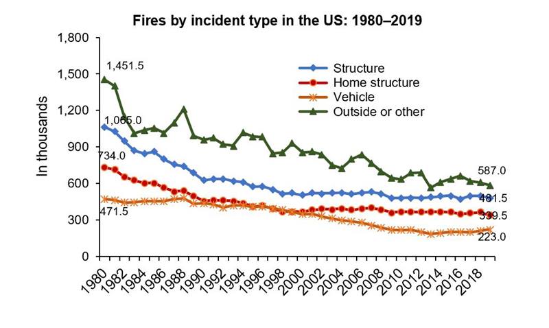
Fire Incidents

NFPA report – Fire loss in the United States

YearOutsideStructureVehicle
19801,4001,000470
19901,000650450
2000900550350
2010700500220
2020600500220

As with most well-defined problems and risks, the incidence or occurrence of fires has declined through time. In the last 40 years, the incident rate has been cut in half for outside, structure and vehicle fires. The US population grew by 45%, from 227M to 330M during this period. Hence, the incident rate per person declined by 70%.

Fire Deaths

Fire-related Fatalities and Injuries – Injury Facts (nsc.org)

YearDeathsUS Pop (M)Deaths/M
19787,50022334
19885,80024524
19983,90027614
20083,60030412
20183,60032711

Fire deaths have been cut in half over the last 50 years. The population has increased by 47%. The number of fire deaths per million has decreased by two-thirds, from 34 to just 11.

Real Cost of Fires Per Person

Archived Tables | III

US Population by Year (multpl.com)

Consumer Price Index, 1913- | Federal Reserve Bank of Minneapolis (minneapolisfed.

YearNominal Cost $B2019 Real Cost/Person
19991269
20001472
20011787
20021888
200321102
20041781
20052193
20062087
200724101
200831121
200928110
20102078
20112072
20122486
20131966
20142275
20152067
20162478
201737116
201847146
201937113

While the incident and deaths figures show a clear pattern of significant decline from 1980 to 2010, with relative stability from 2010 to 2020, the real cost of fires per person has much greater annual variability and a less certain trend in the last 20 years. Using 1990-2016 as the time period, the trend is clearly downward, from $90 to $80 per person per year. Adding the last 3 years, with their higher costs, the trend line moves upward from $80 to $100 per person per year.

Overall, the cost of fires per person is flat in the last 20 years, even though the outside incident rate has declined by one-third, the vehicle fire rate has declined by one-third and the structure rate has declined by 10%. Clearly, structure fires have the greatest weight on the cost measure. The unusually high costs in the last 3 years must be driven by a greater number of very high cost incidents.

Good News: US STEM Degrees Up 50% in 8 Years

Number and percentage distribution of science, technology, engineering, and mathematics (STEM) degrees/certificates conferred by postsecondary institutions, by race/ethnicity, level of degree/certificate, and sex of student: 2009-10 through 2018-19

Group201120122013201420152016201720182019
Total378404424447476512545565581
Residents322344361377393410431448468
Male210224235246255264276286297
Female112120125131138146154163171
Black232527272829313234
Hispanic242730343842475157
Asian444649505357616569

STEM degrees awarded at the bachelors, masters and doctoral level continue to increase in response to market demands from 2011 to 2019, increasing by 54% in total and by 45% for U.S. residents. Most of the increase has been at the bachelors level, from 255,000 to 379,000 degrees (+49%). Masters degrees have increased from 53,000 to 72,000 (+36%). Doctoral degrees have increased from 14,000 to 17,000 (21%).

African-American degree earners have increased by 46%. Hispanic Americans have increased by 137%. Asian-Americans have increased by 57%. White Americans have increased by 28%, from 224,000 to 287,000 (+63,000).

US resident male degree earners increased from 210,000 to 297,000 (41%). Female degree earners increased from 112,000 to 171,000 (52%).

By contrast, the US population increased by just 5% during this period, from 312M to 329M.

I don’t find many news stories highlighting this very good news. In a world that requires technological innovation, application, maintenance and understanding, the US is quickly increasing the number of graduates with these skills. Women and minorities are increasing their relative share of the graduates in these subject areas, which historically have been well paid.

Data check: U.S. producing more STEM graduates even without proposed initiatives | Science | AAAS (sciencemag.org)

More Students Earning Degrees in STEM Fields, Report Shows | STEM Solutions | US News

There is room for improvement. Women and minorities are still underrepresented. They graduate at lower rates than white whites. Non-residents earn a significant (19%) share of US degrees awarded.

6 facts about America’s STEM workforce and those training for it | Pew Research Center

STEM crisis or STEM surplus? Yes and yes : Monthly Labor Review: U.S. Bureau of Labor Statistics (bls.gov)

STEM Education Stats for 2021 | Jobs & Careers, Growth, Minorities & Degree Statistics (idtech.com)

In the prior decade, between 2000 and 2010, the number of STEM bachelors degrees awarded increased by 31%.

STEM Education Data and Trends (nsf.gov)

Bottom line: US residents are earning about one-half million STEM degrees each year. This is double the one-quarter million degrees awarded in 2000. Note that compounding of 31% and 54% growth yields 102% total growth, not just 85% (a core STEM skill).

Good News: 25-29 Year Olds, % With 4 Years of College Completed

CPS Historical Time Series Tables (census.gov)

Group194019501960197019801990200020102020
Total6811162323293239
Male71015202424282835
Female568132123303644
Black23571213181928
Hispanicnananana88101425

Since WWII, the US has increased college graduation rates overall 5-fold, from 6-8% to 39%. We now graduate 2 out of 5 individuals. We used to graduate 1 in 12 to 1 in 16.

Graduation rates have increased every decade, including a 7% increase, from 32% to 39% between 2010-2020. That increase is equal to the total college graduation rate after WWII!

Male graduation rates have increased more than 4-fold, from 7-10% to 35%.

Female graduation rates have increased 8-fold, from 5-6% to 44%.

African-Americans have increased their graduation rates 10-fold, from 2-3% to 28%. From 1 in 40 college graduates to 1 in 4.

Hispanic Americans were not tracked separately in the first 4 decades, but they have tripled from 8% to 25% in the last 40 years.

Critics can challenge the modern value/difficulty of a degree versus those after WWII. They can highlight the “pause” in 1980-1990 when degree attainment barely rose. They can note that male graduation rates paused from 1980-1990 and then again from 2000-2010. They can observe that men earned twice as many degrees in 1950-60, before being exceeded by women by 2000 and exceeded by 9% points, 44% to 35% (25% advantage) in 2020. They can point to the very rapid increase in degree attainment between 2010-2020 being suspiciously high. They can bemoan imperfect 4-year or 6-year graduation rates. They can note the financial challenges faced by college students, especially those with lower incomes or first generation attendance status.

However, even assuming that some good portion of these criticisms are appropriate and relevant, the overall results are clear. The U.S. is educating far more residents at a college graduation level. Men and women are benefitting. Minorities are improving their performance and have better access to higher education. Overall, this makes for a fairer society. It improves our ability to run a democratic form of government. It makes us a more economically competitive and creative society. Ideally, it allows more individuals to pursue their dreams, take advantage of their talents and contribute to the community.

U.S. Population Spotlight: Educational Attainment | U.S. Department of Commerce | Performance Data Pro

Good News: High School Graduation Rates

There is significant politics and complex statistics in this subject area, but the basic outcomes are clear cut and positive.

High school graduation rates in the US increased throughout much of the 20th century. 1910: 10%. 1930: 30%. 1950: 60%. 1960: 70%. 1970: peak 75%. Then, graduation rates held steady or declined for the next 30 years! Various explanations are offered: increased graduation requirements, less effective educators, social challenges, mix of students.

Could the Common Core State Standards affect high school graduation rates? by Kelly Griffith and Victor Sensenig – AJE Forum

U.S. High School Graduation Rate Hits All-Time High | Data Mine | US News

Graduation rates fluctuated between 72-74% from 1980-2008, before starting a period of positive improvements into the mid 80% range.

Government Fail: Public Education – Capital Research Center

The gold standard is the data from the National Center for Educational Statistics (NCES). We have 5 different measures. The first 3 provide 1977-2017 comparisons.

Annual dropout events have declined from 7% to 5%. They reached a minimum of less than 4% in 2007 before increasing. White dropouts declined from 6% to 4%. Black dropouts declined from 10% to 5%. Hispanic dropouts declined from 10% to 6%.

The dropout status of 16-24 year-olds collectively declined from 14% to 6% overall. Whites dropped from 12% to 5%. Blacks declined from 20% to 6%. Hispanics fell from 33% to 10%.

The percentage of 18-24 year olds who had completed high school (or GED) increased from 84% to 93%. Whites rose from 87-95%. Blacks rocketed from 74-94%. Hispanics rocketed from 59-88%.

The “adjusted graduation rate” measures on-time graduation. From 2010 to 2016 it shows overall improvement from 79% to 85%.

The “freshman graduation rate” measures on-time attainment of a regular diploma. It shows improvement from 71% in 1995-98 to 82% in 2012.

Trends in High School Dropout and Completion Rates in the United States: 2019

The media has pursued the relatively straightforward dropout rate data, covering the significant improvements in all groups from 2000 to 2015.

U.S. High School Dropout Rates Fall, Especially Among Latinos | FiveThirtyEight

High School Dropout Rates – Child Trends

Why the U.S. high school dropout rate has fallen so dramatically – CSMonitor.com

At the international comparison level, the US has improved from 18th of 21 OECD (advanced) economies in 2006 with a 75% graduation rate versus 81% average to 9th of 35 in 2018 with an 86% graduation rate versus the 81% average.

EDUCATION AT A GLANCE: International Comparison Places the United States Near the Bottom in High School Graduation Rates and College Graduates | Alliance For Excellent Education (all4ed.org)

Students – Secondary graduation rate – OECD Data

From Sputnik to “A Nation at Risk” to “No Child Left Behind”, the US has become relatively more effective at setting goals, measuring progress and adjusting educational strategies and tactics. Some groups essentially act as gadflies, pressuring politicians, educators, administrators and boards to improve.

Home – The Hechinger Report

11 Facts About High School Dropout Rates | DoSomething.org

These policy groups have become effective at identifying groups that are not meeting the goals and offering recommendations for improvements. For example, they were able to identify a relatively small number of schools that accounted for a majority of non-graduates (Pareto principle). The pejorative term “drop out factories” was applied to schools with graduation rates below 60%. A tail of low performing schools remains (for various reasons), but many low performing schools were closed or greatly improved in the last 25 years.

What is a “drop out factory” and is it still an issue in today’s educational space? (stemscopes.com)

The leading group is termed “America’s Promise”. It has focused efforts on reaching a 90% graduation rate for every state, school and subgroup by 2020. Through the latest report from 2018, that goal has not been achieved, but solid progress has been documented. Graduation rates reached 85%, with 14 straight years of improvement. Between 2011-18 Black grad rates improved from 67-79%. Hispanic grad rates improved from 71-81%. Low income grad rates improved from 70-80%. Individual state scores demonstrated that even higher rates were pragmatically possible for all groups. In 2017, 2 states reached the 90% level. In 2018, 7 states met the target. They were from all corners of the country: Iowa, Texas, Alabama, New Jersey, Kentucky, Tennessee and West Virginia. This group noted that 7% of students in 11% of high schools accounted for 28% of non-grads. It also noted that 10 states account for 56% on non-grads. It outlined specific recommendations for continued improvement.

The post 1999, “No Child Left Behind” progress is questioned by some sources. They claim that increased accountability has lead educators and administrators to simply work the system by changing graduation requirements or fudging tests. Statistical reviews of state performance discounts the effect of these alleged activities.

U.S. High School Dropout Rate [2021]: Statistics & Trends (educationdata.org)

Are America’s rising high school graduation rates real—or just an accountability-fueled mirage? (brookings.edu)

Two measures of educational performance (NAEP and PISA) focus on elementary and middle school results so they cannot be used to confirm or dispute the high school graduation improvements.

College admissions of a greater percentage of high school grads supports the positive results.

College remediation requirements remain high, but no clear increasing trend has been documented.

SAT scores have not significantly changed during the last 40 years (math up and reading down).

Average SAT Scores Over Time: 1972 – 2020 (prepscholar.com)

The number of students taking the SAT has remained relatively constant.

SAT – Wikipedia

US high school graduation rates improved from 10% to 70% between 1910 and 1970. They remained the same for 30 years as requirements were increased to meet the obvious challenges of a more competitive world (Sputnik, Japan, Asia, EU). Graduation rates have increased consistently for the last 20 years, mainly through improvements at the lowest performing schools. These improvements have slowed in the last decade, but progress continues to be made.

Good News: U.S. Charitable Giving

U.S. charitable giving to GDP ratio is 1.44%. Canada is second at 0.77%. UK is third at .54%. Italy at 0.3% is representative of Europe. U.S. giving is 5 times as high as other developed countries. (Table 27). U.S. private overseas aid is $44B. UK is second at $5B. (Table 25).

U.S. Generosity (philanthropyroundtable.org)

The World Giving Index has consistently rated the U.S. as the most generous country of 125 reviewed. Across 2010-19, US is 3rd highest percentage of those surveyed reporting they had “helped a stranger in the last year” at 72% compared with 48% global average. US was 5th highest with 42% reporting they had volunteered time for a charity in the past year versus 20% global average. US was 11th highest in percent reporting monetary donations in the last year (61%), versus global average of 30%.

WGI_2019_REPORT_2712A_WEB_101019.pdf (cafamerica.org)

In general, total US charitable giving has grown on a per capita or percent of GDP basis for more than 50 years. There is a clear “step up” in giving in the late 1990’s. Real (inflation adjusted) per capita giving has nearly doubled from representative $600 in 1970’s to $1,100 in 2000’s. (table 1). The US nonprofit sector reflects that growth, even though program fees are a much larger share of revenues, rising from less than 2% of GDP in the 1930’s-50’s to 3% in the 1970’s to more than 5% by the 2010’s. (table 6).

U.S. Generosity (philanthropyroundtable.org)

The US nonprofit sector now has 1.5M organizations and employs 10% of the US workforce. (table 5).

U.S. Generosity (philanthropyroundtable.org)

The Nonprofit Sector in Brief 2019 | National Center for Charitable Statistics (urban.org)

These sources also report that roughly one-fourth of Americans volunteer each year, donating 136 hours of work. (graph 8).

U.S. Generosity (philanthropyroundtable.org)

The Nonprofit Sector in Brief 2019 | National Center for Charitable Statistics (urban.org)

Total US charitable donations as a share of disposable income ratio has averaged roughly 2% across the last 40 years. Charitable giving as a percent of GDP averaged 1.7% in the 80’s and early 90’s, before increasing to 2.1% in the “oughts” and teens.

The most widely reported figure shows total real (inflation adjusted) US charitable giving since 1979. This has increased together with real US GDP. Representative years and amounts: 1982 ($150B), 1992 ($194), 2002 ($317), 2012 ($355) and 2019 ($450B).

FUNDRAISING INSIGHTS FROM THE GIVING USA 2020 REPORT – AskRIGHT

Giving by individuals has fallen from 80% to 70% of the total. Bequests have increased from 7-8%. Foundation giving has more than doubled as a share of the total, from 7 to 16%. Hence, the real individual giving numbers are solid and rising, but their growth rate has slowed through time. 1982 ($130B), 1992 ($160), 2002 ($250), 2012 ($250), 2019 ($310).

FUNDRAISING INSIGHTS FROM THE GIVING USA 2020 REPORT – AskRIGHT

While the total and individual charitable donation amounts have increased, the percentage of individuals donating has declined significantly. Years, percentages and average donation. 2002: 67%, $2,000. 2008: 65%, $2,300. 2012: 59%, $2,400. 2016: 53%, $2,500. Various authors speculate that the decline is caused by increasing inequality, lower confidence in institutions and changes in tax deduction laws.

Fewer Americans are giving money to charity but total donations are at record levels anyway – Lilly Family School of Philanthropy (iupui.edu)

In the early 2010’s there was a significant decrease in charitable giving percentages by non-itemizers (10%) and a much smaller decrease by itemizers (5%).

Leadership 18 Applauds New Legislation Aimed at Halting Decline in the Number of Americans Who Give to Charity | Business Wire

There are various reports that break down giving rates by state, city, religion, politics, region, marital status, generation and income. Perhaps most important is that the decrease in the giving percent from 67% to 53% means that the percentage giving zero, and dragging down the average, has increased from 33% to 47% of the population, from one-third to nearly one-half.

More than 90% of individuals with income above $125K donate to charity. 77% of those with incomes of $50-125K donate. This drops off to 58% at the $25-50K range and 37% under $25K (graph 11).

U.S. Generosity (philanthropyroundtable.org)

As a percentage of disposable income, individuals below $50K donate 1.5%, those at $50-200K donate 1.75% and those above $200K donate 2-3-4%.

Massive charitable donations by the rich and famous are making the same big splash as always (phys.org)

Many predicted that 2020 would be a reduced year for giving due to the pandemic or post-election concerns.

Presidential Elections and Charitable Giving: What Does the Data Tell Us? | CCS Fundraising

Percentage of Americans Donating to Charity at New Low (gallup.com)

One source indicates that actual 2020 giving increased by 5%, with 1% more people making donations. This report also indicated that 23% of affluent donors increased their contributions to local projects and increased their unrestricted contributions.

One way wealthy people changed their charitable giving during the pandemic – MarketWatch

Another source indicates that 2020 donations were up by 11% and the number of donors was up by 7%. They reported a 15% increase in small donations (<$250), an 8% increase in medium-sized donations and a 10% increase in large donation ($1,000+).

Fundraising Effectiveness Project: Giving Increases Significantly in 2020, Even as Donor Retention Rates Shrink | Association of Fundraising Professionals (afpglobal.org)

The US has a solid track record of individual charity. Donations have risen in real terms through time. Americans support nonprofits through cash and time donations. The decline in the percentage of individuals making donations is a concern. The “one-time” tax deduction for non-itemizing filers may help to spur increased contribution habits.

Charitable Giving Statistics & Facts for 2021 | Balancing Everything

Illegal Immigration

U.S. Border Patrol alien apprehensions on the southwest border averaged 1.2M per year from 1990-2006, with a minimum of 931,000 in 2011.

In the 5 years of 2011-2015, apprehensions averaged 390,000. Apprehensions were reduced by two-thirds. This does not prove that the number of alien attempts at illegal entry to the country was down by two-thirds, but absent compelling evidence of negative changes to compliance effectiveness or alternate entry methods, this indicates that the number of successful illegal immigrants also fell by two-thirds between this 17 year period and the 5 years prior to the 2016 election where this was successfully raised as a major issue.

• U.S. border patrol: alien apprehensions 1990-2020 | Statista

The next 3 years, 2016-17-18, averaged the same level, at 376,000. 2020 recorded 405,000, another statistically identical number.

During the base 17 years, the number of non-Mexicans apprehended was 50,000 or less, essentially immaterial. In the last decade, this number has grown to 200,000, meaning that Mexican immigrants have fallen from 1.2M per year to only 0.2M per year. The steps taken by the U.S. (both parties) through these 3 decades have reduced Mexican immigration by 85%.

Migrant apprehensions at U.S.-Mexico border fell sharply in 2020 fiscal year | Pew Research Center

Based on early 2021 figures, the “problem” is clearly not “solved”, despite the construction of 80 miles of new walls and the replacement of 452 miles of wall at a cost of $15B during the Trump presidency. The U.S. has 734 miles of walls along the border today, up from 654 miles before the Trump presidency. Trump representatives claim that the replaced walls were ineffective.

Trump’s wall: How much has been built during his term? – BBC News

Migrant apprehensions at U.S.-Mexico border are surging again | Pew Research Center

The estimated number of illegal immigrants living in the U.S. from all countries grew from 3.5M in 1990 to 11.1M in 2005, and has since slowly declined. The peak year was 2007 with 12.2M people. The latest year (2018) shows 10.5M people. The number of immigrants has declined by 14%, while the U.S. population increased by 9% from 300M to 327M. The ratio of immigrants to population has declined by 23%, from 4.1% (1/25) to 3.2% (1/33). Mexican born individuals are estimated to account for half of the total.

• Unauthorized immigrant population U.S. 2017 | Statista

The U.S. Border Patrol budget has increased by orders of magnitude to address the issue. Early 1990’s budgets average $0.3B per year. Early 2000’s budgets were more than 3 times as high at $1.1M. Budgets doubled again to 2.2M in 2006-8, Budgets grew by another 50% to 3.5M in 2011-2015. That’s 3 times as high as the early 2000’s and 10 times as high as the early 1990’s. The Trump budgets increased by another $1.2B dollars per year to $4.7B per year. Spending is now 4 times as high as in the early 2000’s.

The Cost of Immigration Enforcement and Border Security | American Immigration Council

U.S. aid to Central America fell from $750M to less than $500M (33%) during the Trump administration in an attempt to “force” these countries to control their borders and stop the emigration to the U.S.

U.S. Strategy for Engagement in Central America: An Overview (fas.org)

The Biden administration has proposed adding $300M to this aid budget.

U.S. unveils $310 mln in Central America aid | Reuters

The Obama administration had increased aid, believing that it could help to stabilize conditions in these countries.

President Obama’s $1 Billion Foreign Aid Request for Central America (fas.org)

FACT SHEET: The United States and Central America: Honoring Our Commitments | whitehouse.gov (archives.gov)

Obama Had A Plan For Central America. Then Came Trump. (buzzfeednews.com)

Some sources show that the net immigration rate from Mexico to the United States turned negative (more moving from the U.S. to Mexico) as early as 1998.

Mexico Net Migration Rate 1950-2021 | MacroTrends

Other sources show that the reversal began around 2010.

Net Migration from Mexico Falls to Zero—and Perhaps Less | Pew Research Center

More Mexicans Leaving Than Coming to the U.S. | Pew Research Center

This reverse flow continued throughout the 2010’s. The number of Mexican born residents in the U.S. declined by 800,000, from 11.7M to 10.9M.

Article: Mexican Immigrants in the United States | migrationpolicy.org

Far fewer Mexican immigrants are coming to the US — and those who do are more educated (theconversation.com)

PolitiFact | Yes, we are experiencing a net outflow of illegal, undocumented workers from America back to Mexico

Nearly 1 million of the 11 million estimated “illegal immigrants” comprise one-half of the annual U.S. hired farm labor force. The legal immigrant visa program accounts for one-fourth and domestic workers account for one-fourth. The history of legal and illegal immigrant farm labor is not for those with a weak stomach. Bipartisan efforts exist today to revise existing laws to make them more effective for workers and farmers.

Immigrant Farmworkers and America’s Food Production – 5 Things to Know – FWD.us

Many policy analysts have recommended a formally required, effective citizenship verification for all employment. The U.S. has developed the e-Verify program and required federal agencies to use it. Some states have adopted the same requirement for state employment and contractors. However, the federal government and most states have chosen to not implement this approach to dis-incentivizing illegal immigration.

E-verify-background-web-10-2-2_format.pdf (bipartisanpolicy.org)

Fact Sheet: E-Verify – National Immigration Forum

E-Verify – Wikipedia

The underground, black market or shadow economy in the U.S., where employees are paid in cash and not reported to state or federal agencies, is a relatively small share of the economy compared with other countries. Most estimates are in the 6-12% range.

ACCA finds ‘shadow economy’ is smaller in U.S. than abroad | Accounting Today

How Big Is America’s Underground Economy? (investopedia.com)

Illegal immigration is a complex and emotional topic. Most/many individuals have a deeply felt need/desire to protect their family, community, state or nation from threatening “others”.

The Righteous Mind: Why Good People Are Divided by Politics and Religion: Haidt, Jonathan: 9780307455772: Amazon.com: Books

The U.S. is an attractive destination for individuals from many other countries. The U.S. has opened and closed its borders through many cycles. U.S. immigration policies have been relatively open and closed to people from outside of western Europe through time.

Historically, U.S. businesses and farmers have supported relatively open legal, restricted and illegal immigration to keep their labor costs low. Labor unions and their political allies have been less welcoming.

Presidential candidate Trump opened his campaign in 2015 highlighting the “threat” of immigrants and illegal immigrants.

Donald Trump’s Presidential Announcement Speech | Time

Illegal immigration has dropped dramatically. U.S. spending on walls and border enforcement has increased dramatically. The political issue remains. It appears that solutions such as aid/threats to Central America, required employment verification and more effective seasonal farm worker programs could “solve” much of the remaining issue.

Good News: Traffic Fatalities Decline

Year Deaths/100M miles B Miles M Population Miles/Person

1940 11 300 132 2,200

1950 7 460 152 3,000

1960 5 720 181 4,000

1970 5 1,100 205 5,400

1980 3 1,530 227 6,700

1990 2 2,140 249 8,600

2000 1.5 2,750 282 9,700

2010 1.1 2,970 309 9,600

2019 1.1 3,220 327 9,900

Motor vehicle fatality rate in U.S. by year – Wikipedia

Between 1940 and 2010, traffic fatalities per mile travelled declined by 90%!!! This is an amazing story that received/receives limited media coverage. Year by year the death rate declined. Not as sensational as a single fatal crash; all of which were covered.

At the human level, this is great news. 90% fewer deaths. Less loss of humanity. Less loss of human potential. Fewer children without parents. Fewer funerals.

This reflects several positive drivers. Better cars. Auto manufacturers investing in safety. Fewer older/unsafe cars on the road. Better government regulations. Better driving. Better drivers training. Better policing. Better maintenance. Better roads. Better expectations. Better media coverage. Limited access highways. More roundabouts. Better signage. Better maps. Americans believe in “continuous improvement” and make it happen.

Unsafe at Any Speed – Wikipedia

It also shows the greater mobility/freedom of American citizens. The miles travelled per person increased 5-fold in 60 years. Greater freedom of choice. More options for work, goods, services and leisure. More travel baseball. More vacations. More weekend trips. More visits with relatives.

2019 Fatality Data Show Continued Annual Decline in Traffic Deaths | NHTSA

In 2020, we have had a temporary reversal of the long-term trend, driven by bad driving on empty roads. This WAS covered by the media.

Pandemic travel: Traffic deaths up 8% in 2020 despite driving less (usatoday.com)

Driving Was Down In 2020, But Traffic Fatality Rates Surged : NPR

The rapid growth of safe travel in the 50’s, 60’s and 70’s was captured in popular media.

Top 25 Car Songs of All Time as Voted by the HOT ROD Readers

My boomer favorites (enjoy):

BEEP BEEP ~ THE LITTLE NASH RAMBLER ~ The PLAYMATES ~ ANIMATION – YouTube

Golden Earring – Radar Love (1973) – YouTube

409-the Beach Boys – YouTube

william devaughn – Diamond In the Back – YouTube

Deep Purple – Highway Star 1972 Video HQ – YouTube

hot rod lincoln – YouTube

Ronnie & The Daytonas – ‘Little GTO’ – YouTube