Ronald Reagan skewered Jimmy Carter with this taunt in the 1980 presidential debate. Joe Biden’s approval rating is falling quickly in recent months. US voters need to assess the true state of the US economy under Biden’s leadership after 2 years of a global pandemic, last seen in 1918.
Real Disposable Personal Income Per Capita
Real, inflation adjusted income per person continues to rise. In 2000, average income was just $33,000 per year. It rises quite significantly to $38,000 in booming 2007-10. It remains at this level through 2013. This is a 15% increase over 13 years, a little better than 1% per year. The economy adds another $6,000 in the next 7 years before the pandemic. That’s growth twice as fast, 2% per year during this boom time. Real income has grown another $2,000 to $47,000 in the last 2 years, 2% annually, after the pandemic. Very good news.
Employed Persons
US employment was typically 130M from 2000-2012. Great growth occurred from 2012 to 2020, reaching an unprecedented 152M. The pandemic dropped employment to 130M, an incredible 22M lower. Employment quickly rebounded about half-way to 142M during 2020. It has grown by another 6M in the last year. The employment growth from 2010-20 averaged 2M per year. The 2021 record is a very strong performance, reflecting a healthy economy that has robustly adapted to the challenges of a pandemic environment.
Unemployment Rate
Unemployment averaged about 5% during the first decade of the century, a generally good result compared with 20th century history. It doubled to 10% during the “Great Recession” and then slowly declined to 5% by 2015 and then even further, exceeding economists’ expectations, to 3% in 2018-2020. The pandemic rocketed it up to 15%, but it quickly recovered to 7%. It has since declined to less than 5%, which has historically been the typical definition of “full employment”.
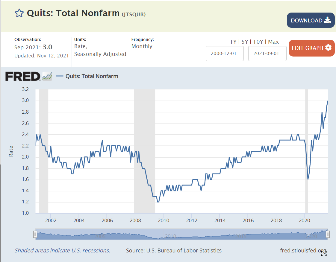
Job Quits
From 2000-2008, about 2% of employees voluntarily left their positions in any given month. The quit rate dropped to 1.5% in the aftermath of the “Great Recession” (2010-13). It very slowly recovered to 2.2% during 2016-18. It increased a little bit to 2.3% in 2019-2020. It rebounded to 2.3% in 2020, and has since increased to an unprecedented 3%. This reflects a labor market where 50% more employees are making a voluntary choice to leave their current employer, apparently confident that they can find an equal or better position.
Job Openings
Job openings averaged 4M from 2000-2014. Openings fell to 3M in 2010-12 after the “Great Recession”. Job openings then grew to 6M in 2017-18 and further to 7M in 2019-20. Job openings quickly returned to 7M early in the pandemic and then began their climb to the current 11M level. Again, these are unprecedented levels, twice as many open jobs as in any time from 2000-15.
Unemployed Persons Per Job Opening
The 2006-7 baseline was 1.5 unemployed persons per open position. The “Great Recession” peak was 6 to 1, an incredibly different labor market, where many older people “retired”; new college graduates went to graduate school, accepted lower positions or remained unemployed; and mid-career professionals accepted positions at 20% lower salary levels. It took 5 years to return to the typical 1.5/1 ratio. This ratio declined a little bit further to 1/1 during 2017-2020 in a tight labor market. The ratio very quickly returned to the historical 1.5 baseline during 2020. It is now at an unprecedented 0.8/1 level. Fewer unemployed people than jobs, not 1.5 to 1, but 0.75/1, half as many potential applicants. This is the first “employees” labor market since the 1960’s.
Home Values
The US Home Price Index was set to 100 in 2000. It increased to 180 during 2005-7. It dropped back to 140 in 2010-13, indicating that part of the rise before “the Great Recession” was a bubble. Prices climbed steadily from 140 to 210 (50% increase) from 2013 to 2020. Despite the pandemic, house prices have continued their climb, exceeding 260, another 25% increase in the last 2 years.
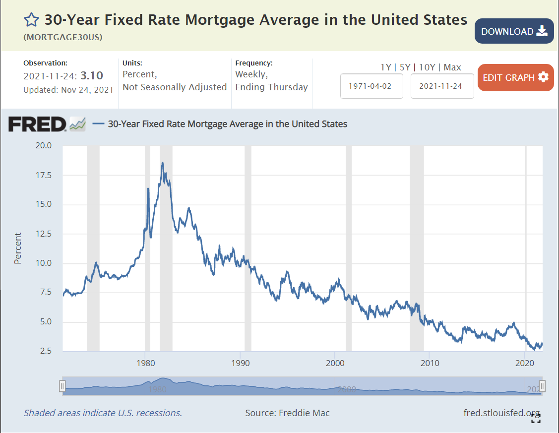
Mortgage Interest Rates
Mortgage interest rates averaged 8% during the 1990’s. They averaged 7% in the 2000’s. They declined even further to 4% during the 2010’s. They fell even further to 3% in 2020-21. The interest cost to finance a house is at an all-time low.
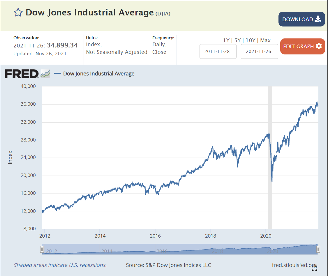
Stock Market
The US stock market averaged 16,000 points from 2014-16. It increased by 50% to 24,000 in 2018, and then climbed to 26,000 and 28,000 before the 2020 pandemic crash. Despite the real financial costs of the pandemic, the market quickly rebounded to 25,000 in the middle of 2020. It has since continued its climb to 36,000, 20% above the pre-pandemic level.
In 1992 James Carville claimed that “it’s the economy, stupid”.
If so, voters should provide some support to president Biden’s results. Real income is up 2% annually, a record level. Reduction in number of unemployed is 6M in 1 year, another record. Unemployment rate is at 4.6%, below historical “full employment” level. Voluntary quit rate is 50% higher than history, indicating tremendous worker confidence. Nearly twice as many job openings as the historical level, providing great options for job seekers to find their “best” opportunities. Mortgage interest rates remain at historical lows, supporting home purchases. House values have grown by another 25%. The stock market is 20% higher.
This is all at a time when the pandemic unfortunately continues to claim lives and greatly disrupt life and the economy. Overall, the recovery is proceeding at a rate far faster what anyone thought was possible during 2020.
In 1970, GM owned a 39% market share in the US with its 6 brands. It now sells less than one-half at 19%. Ford sold 28% and now sells about one-half as much at 15%. Chrysler-Lincoln-Mercury-Jeep has done better, selling 12% in 2020 versus 15% in 1970.
In 1970 there were only 6 firms with 1% or greater market share. Today, there are 16 firms.
In 1970, the top 4 cornered the market with 88% market share. That has declined to 62%.
In the last 50 years, 11 new firms have earned 1% or greater market share. Consumer options are 3 times as great as in 1970!
A similar change has taken place for most manufactured goods. Legacy high cost American and European manufacturers have lost market share. Asian manufacturers have gained significantly (Japan, Korea, China, Taiwan, SE Asia, India). Latin American and African manufacturers have recently started to provide a fourth option.
For consumers, this is great news. More choices. More competitors. Lower prices. Improved products.
Compare the 2021 Honda Accord LX sedan with the 1970 Chevy Impala option to get a sense of the improved features available on a standard “family sedan” today versus 50 years ago.
State parks contain another 14 million acres. State parks had 807 million visitors in 2017, more than two and one-half times the national parks, despite their smaller areas. In total, that’s 1.1 million annual visits or 3.4 for each of the 330 million U.S. citizens. Between 1984 and 2017 attendance has increased by 30%.
My experience in Indiana, Ohio and Illinois indicates that the total “local” parks acreage is at least twice as great as this indicator. For example, 42 of Ohio’s 88 counties have a parks district.
There are an additional 56 million acres in voluntary land trust conservation areas. While these areas often have limited access and improvements, they served another 6 million visitors in 2015.
The total federal, state, local and private “parks” areas equals 161 million acres, nearly 7% of the total U.S. land area.
Federally managed forests contain 238 million acres and state forests contain 83 million acres. Most of these lands provide significant access for hiking, hunting and riding. At 321 million acres, they represent 13% of the total U.S. land area.
I formally retired this Spring at age 65. I started working in 1966 at age 10 as a newspaper delivery boy. I’d like to reflect on the big changes in the economy during these 5 decades.
The US Bureau of Labor Statistics tracks the real output per hour in the nonfarm business sector, or “labor productivity”. The media reports this number as it has “real” and “political” importance. The average annual improvement has been 1.9%. That is a 95% increase in 50 years, nearly a doubling, on an arithmetic basis. However, productivity compounds geometrically, just like compound interest, so the 2020 worker is actually 159% more productive. Or, the 1970 worker was 39% as effective as the 2020 worker!!! The 2020 worker delivered 5 units of output for every 2 units of output in 1970!!! Expressed in these terms, it’s clear to see this is a really important measure.
The annual productivity increase has ranged from -1.6% (1974, when I finished high school) to 4.5% (1992). 3 times below 0% and 3 times above 4%. The measured productivity growth increases and decreases through time. From 1970-76, labor productivity grew by 2.4% annually, a very good result. This was the end of the post WWII boom period. Japanese and European competition, oil cartels, sleepy consolidated industries, environmental laws and stagflation disrupted this progress. The next 13 years (1977-89) were a time of transition (disco). Labor productivity grew by just 1.4% per year, despite the early positive effects of the computer revolution. 1% per year lower doesn’t look like much, but it means that output in 1989 was 13% less than it would have been if the country had maintained it’s early 1970’s productivity improvements. The impact of the “Reagan Revolution” in freeing American capitalism from regulations and taxation was not clear during his presidency. The next 8 years (1990-97) showed some improvement, to 1.7% annually, but not a true revolution that either Bush or Clinton could celebrate. The next 13 years (1998-2010) were the golden years for improved labor productivity, averaging 2.9% annually, DOUBLE the improvements from 1977-89. The later Clinton years and the whole George W Bush presidency witnessed these results. The next 6 years (2011-16) reflected the slow recovery from the Great Recession with labor productivity growing by just 0.7% annually, half of the poor 1977-89 time frame. Productivity growth started to recover in the last 4 years, averaging 1.7%.
Economists tend to focus on the role of “capital” in driving labor productivity. In essence, if workers have more or better machines and computers, they will produce more per hour. In very rough terms, about one-half of labor productivity improvements come from better tools.
The economists who try to measure the output part of labor productivity (real GDP) try to be consistent and conservative. That means that they understate real GDP. They don’t include the value of reduced pollution. They try to adjust for the improved quality of goods and services, but count only the obvious benefits. In a world dominated by services, this is a major gap. They make no attempt to estimate the benefits of less time spent buying goods and services. They make no estimate of the value of shorter delivery times. They are unable to account for the benefits of transparent and deep markets for goods and services.
Finally, they do not account for the value of product variety, broader consumer choices and customized goods. The fact that modern products more exactly fit consumer needs adds no value to GDP. By the 1990’s firms understood the universal customer value framework (QSFVIP) outlined by Deming, Juran, Shingo, Schonberger and others.
Firms understood Marshall Field’s dictum to “give the lady what she wants” and pursued it with a vengeance in order to gain market share, fight imports and improve margins. Based on my experience, firms devoted at least as much time to delivering upon these “soft”, qualitative, unmeasured productivity factors throughout the last 50 years. Hence, true productivity growth may have been twice as high as officially reported.
What changed in 50 years?
Secretaries and administrative assistants disappeared. Managers and professionals learned to do their own “paperwork”.
Clerks disappeared. Fewer transactions. Lower transaction costs. Standardized transactions. Automated transactions. No data entry operators.
All processes were subject to measurements like Ford’s assembly line.
More “analysts” working to improve all functions. Not just chemistry and engineering specialists. Financial analysts, marketing analysts, pricing analysts, logistics specialists, forecasters, inventory specialists, brand managers, compensation analysts, trainers, quality specialists, process engineers, systems engineers, professional purchasing analysts, etc.
Documentation revolution. Policies and procedures. Standardization. Say what you do.
Quality/process/TQM/lean 6 sigma revolution. Every activity can be defined and improved. Do what you say. Improve.
Process management via Goldratt’s theory defined in “The Goal”.
Import substitution due to lower transport, finance and transaction costs.
Outsourcing and specialization. Finance, accounting, HR, engineering, IT, facilities, marketing, advertising, logistics, distribution, legal, labor, manufacturing, design, project management, testing, returns, maintenance, leasing, equipment rental, etc. Stick to your core functions.
New product introduction as a well-defined process that can be improved and outsourced.
Business viewed as a portfolio of products and channels and markets.
Competitive banking. Competitive equity markets. Venture capitalists. Bankruptcy processes. Leveraged buyouts. Asset based financing. Leases. Portfolio theory. International funds flows.
Reduced barriers to international trade. Tariffs. Regulations. Lower shipping costs due to containerization. Rule of law reducing costs like letters of credit. Fax machines. Reduced foreign travel costs. Japanese supplier partner concepts.
Improved suppliers. Supplier partnerships. Supplier measures. Contracts. Supplier improvement plans. Less bidding, negotiations or transactions.
Capital allocation/investment within firms. Basic ROI/NPV education. Portfolio of products. New products, new channels, new brands, process improvements, supplier improvements. Improved supplier opportunities. Acquisition value. Improved project management and risk management.
Jack Welch view: be number 1 or 2 or else. Walmart or niche service positioning, not JC Penney or Sears or Kmart. Firms dedicated their products to what customers would willingly buy.
Benchmarking to world class standards. Belief that reaching this performance level is possible and required.
Computerization of all processes. Transactions. Planning. Scheduling. Forecasting. Controls. Budgets.
Improved current and futures markets for all commodities and business inputs.
Reduced costs for transportation, agriculture, manufacturing, minerals and standardized inputs.
Reduced construction costs through design, standardization, sourcing, project management tools.
Greatly improved hiring frameworks and tools (fill the bucket). Management development training. Employee evaluation and feedback tools.
Social support for necessary “downsizing” at larger firms during economic downturns.
Basic productivity improvements from Microsoft Office tools: spreadsheets, word processing, publishing, web publishing, forms, database structure, queries, reporting, projects, etc.
Internal planning, analysis and control tools. Activity based costing. Balanced scorecard.
Much of the productivity improvements of the last 50 years have been due to improvements in “administration”. The lean 6 sigma quality revolution points to continued improvements in the future, perhaps with a lesser measured impact.
Breakthrough improvements in chemistry, biotechnology, physics, nanotechnology, DNA, plastics, materials, communications and energy may be required to drive productivity improvements in the next 50 years.
I’m an optimist. Science delivers opportunities. Profit oriented firms in competitive market find and apply these opportunities. Output per labor hour will be 150% higher again in 2070 (5/2 X). That means that workers in 2070 will be more than 6 times as productive as those in 1970!
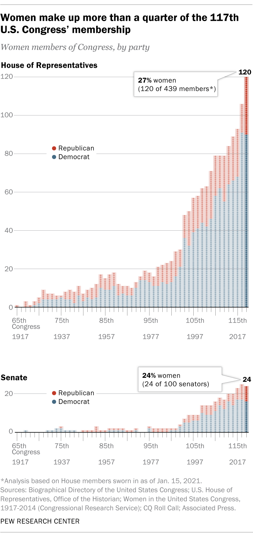
27% in the House and 24% in the Senate.. Consistent increases, especially since the large increase in 1992. Democrats have more than twice as many women representatives, at 38% versus 14% for Republicans.
Women hold 31% of the seats in state legislatures. This number was flat at 25% from 2009 through 2018 before increasing to 29% in 2019. Two-thirds of these reps were Democrats. States that lean Democratic have significantly more women representatives. Only one state, Nevada, has a majority of female legislators.
The Pew Research Organization tracks several other measures of female participation in leadership positions. Biden’s cabinet has a record 48% female proportion. 7% of Fortune 500 CEOs are women. 27% of corporate board seats are now held by women. 31% of college presidencies are held by women.
In general, the growth in participation by women in these public and private leadership positions has been relatively consistent for the last 25 years. Additional progress appears highly likely during the next 25 years.
Politico takes a more negative view of progress, highlighting the continuing inequality, weak progress in some states and stalled progress by some measures. It provides helpful state level data.
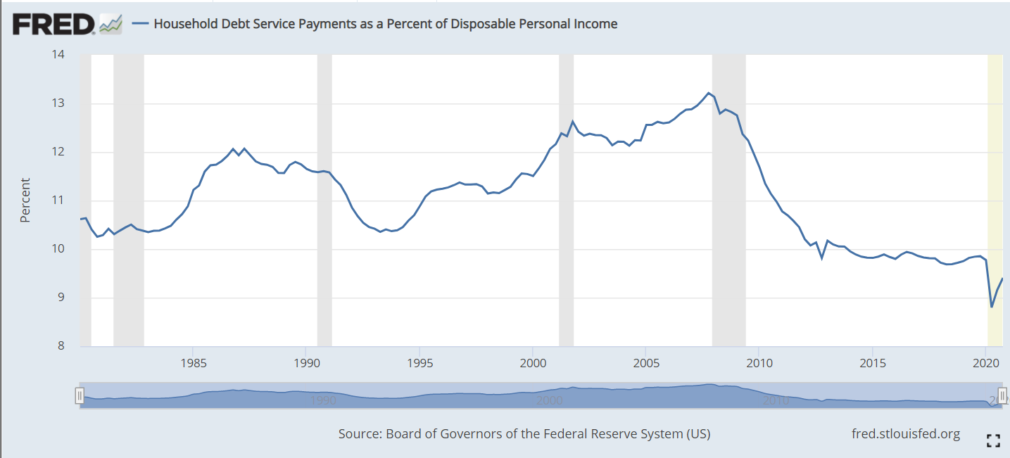
The ratio of household debt service (loan payments) to disposable personal income includes both mortgage payments and consumer debt payments. From 1980-2000 it fluctuated between 10.5% and 12%. Following the 2001 recession it increased to more than 13% before falling steeply to 10% in 2012. During the long recovery from the Great Recession it remained just below 10%. During the pandemic time it fell as low as 9% as personal incomes were boosted through stimulus payments. In total, this is a healthy situation. American families worked through an unsustainable runup of debt and payment during the “ought” decade, the Great Recession and the pandemic. They are well positioned at les than 10% to either save or spend, depending on their preferences. This is good news for the economy, the housing market and risks to financial markets. This is often called the Debt Service Ratio (DSR).
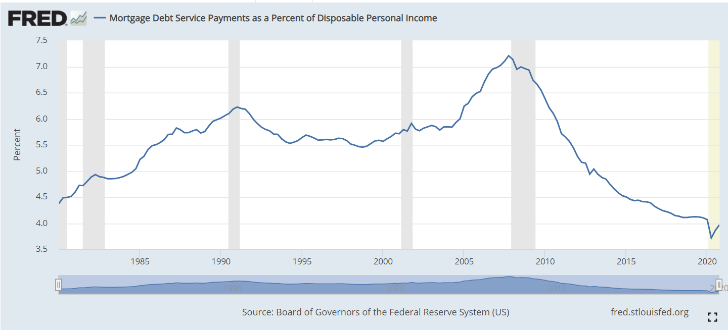
The mortgage component averaged 5.5% of personal income from 1980-2000. It remained below 6% through 2004, before increasing quickly to 7% in 2007. This was unsustainable. Mortgage foreclosures and revised lending standards reduced mortgage lending balances quickly. The Fed reduced interest rates and kept them low. Mortgage payments as a percent of disposable personal income fell to just above 4%. This is a 40% drop (3/7). Even compared with the 5.5% average, this is a 27% reduction in debt service expenditures. This ratio is threatened by future interest rate increases, but current mortgage holders will benefit from years of low mortgage rates and refinancing for decades to come.
Consumer debt has also fluctuated across these 40 years, reaching an early peak of 6.4% in 1986 during the confusing era of stagflation. In the next 6 years, families reduced their debt percentage by 1.7% to a safe minimum of 4.7%. Consumers were more confident through the 1990’s and took on more debt, allowing the payment ratio to rise to a new record of 6.6% before the 2000-2001 recession triggered less borrowing. Although mortgage payments increase during the 2000’s, consumer debt payments eased back to just 6.0%. Families were scared by the Great Recession and reduced their debt levels (and helped by lower interest rates) and payments to just 5% in 2010. The ratio remained low for 2 years, before resuming a familiar optimistic climb to 5.8% of disposable income before the pandemic.
The Household Financial Obligations Ratio (FOR) follows the same pattern as the Debt Service Ratio (DSR). It is a higher percentage as it includes other “fixed” obligations such as rent. We see relative stability between 16-17% through 2004. The mortgage driven increase to 18% by 2008 is evident, followed by a very rapid fall to 15% in 2012. This broader ratio has remained flat since then. The pandemic drop is due to extra stimulus income.
The composition of total consumer debt for the last 20 years highlights the rise and fall and rise of mortgage debt and the increase in student loan debt.
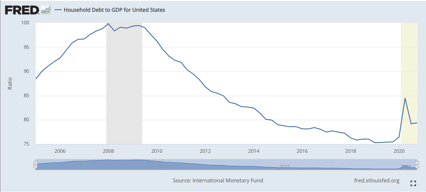
Household debt to GDP peaked at 100% before the Great Recession and has fallen by one-fourth in the next 10 years. Unpaid mortgages and other consumer debt have begun to accumulate in the last year.
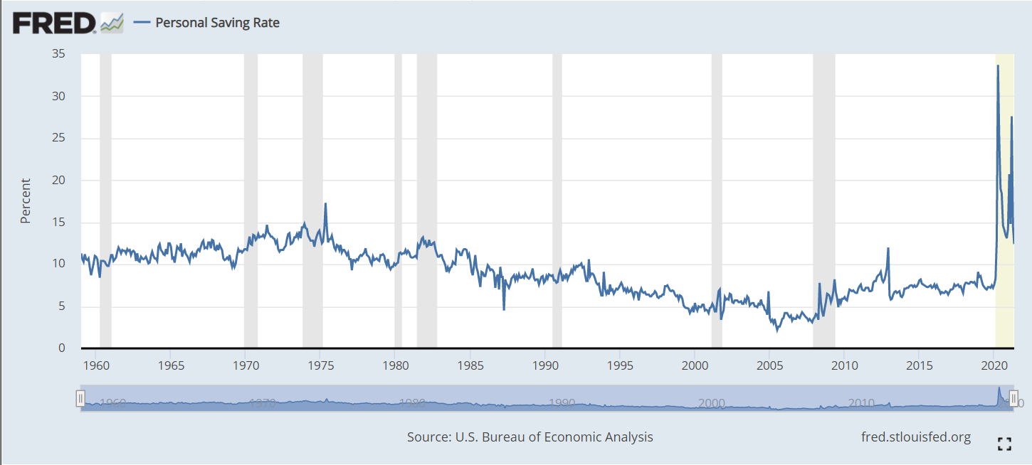
The personal savings rate averaged 10-13% from 1960-1985. The country’s economic challenges lead families to save less to maintain their standard of living, falling in half (5%) by 1999. It remained in the 4-5% range through the next expansion. The Great Recession triggered families to replenish their savings, with a 7-8% rate. The pandemic period shows a 15% savings rate. In all likelihood, this rate will fall back below 10% soon.
The overall US labor force participation rate is the ratio of those employed plus those actively looking for work among the non-institutional (military, prison, etc.) working age (16-64) population. It rose a quite substantial 8 points, from 59% in 1950 to 67% in 1990, mainly due to increased female participation rates. It remained in the 66-67% range through 2007, before declining by 5% in the last 14 years, a quite rapid decline. Note that the years selected are the ends of business cycle expansions plus the current year.
The overall rate mirrors the White rate as White’s make up the largest share of the population and because other racial participation rates are similar to the White rate. Black labor force participation has followed the White pattern, but been 2-3% lower than the White rate for most periods. The Hispanic rate started just below the White rate, but exceeded it by 1990, growing to a 3% advantage in 2021 at 65% versus 62%. The Asian participation rate has matched the White rate, sometimes being 1% higher.
The decline in the White share of the US population, especially in new births and school age children has been highly publicized and politicized for 40 years. The White share of the population has fallen from 5/6ths to just 3/5ths since 1950. African-American share grew by 2% in the 50’s and 60’s before settling at 12%. The Hispanic population has grown rapidly, from just 2% to 19%, passing the Black share by 2001. The broadly defined Asian population has grown from less than 1% to 6%. This breakdown does not include multi-race categories, which now amount to 3%. For labor force participation purposes, racial composition plays a minor role in the total rate.
Male participation in the labor force has fallen by 20 percentage points, from 87% to 67%. The increase in the 65+ age group from less than 4% to almost 8% of the total population accounts for more than 4% of this 20% decline, but 3/4ths or more is due to other factors. Female participation rates, working against this same 4% reduction due to the mix of older residents, grew from just 33% to a peak of 60% in 2001 before declining by 4%, about half of the male decline from 2001 to 2021. The expansion of opportunities for women and their choices to pursue the opportunities in the US is well understood. The increased share of aged 65+ women accounts for almost 3% of the 4% female decline. The reduction in male labor force participation is the big story.
Women, aged 55+ averaged just 22% participation through 1990. Most of the increased labor force participation in these 40 years was among younger women. More than one-third (35%) of women aged 55+ are now active labor market participants.
Their male counterparts in this age bracket show a 21 point decline, mirroring the overall male decline, but starting at the lower rate of 67% and ending at 46%. There is a mix variance here, as 55-64 year olds made up 4% of the population in the first 50 years, but now account for 6%, while the 65+ age group started at 4% for the first 25 years and then grew to 8%, so the share of 65+ citizens out of the 55+ total has risen from 45% to 56%. The mix variance accounts for a 5% decline in the participation rate, but the other 16% is due to other factors.
Demographers refer to the 25-54 year age group as the prime labor force. Here, we see women double their participation rate from 1950 (39%) to 2001 (77%) before falling off a bit to 74%.
For prime age men, we see a 9% point drop, from a near universal participation rate (97%) in 1950-60 down to 88% by 2018.
The White women data follows the total. A majority of Black women were labor force participants in 1970, 10 points higher than White women. They increased their labor force participation by 14 points, to a peak of 65% in 2001, before falling back by 5 points to 60% in 2021. This generally matches the pattern of White women, except that Black women have averaged an extra 4 participation points. Hispanic women started between the other two groups, at 45% in 1970 and then climbing to 60% in 2001. Their participation has remained close to 60%. Overall, relatively minor racial differences in female participation. About a 25 point increase in the second half of the 20th century followed by a 2 point decline in the last 20 years.
White men make up the largest share of the male total, so their data is close to the total, declining by 18 points, from 88% to 70%: from 7 out of 8 in the labor force to just 7 in 10. Black men follow the same Total pattern, but are consistently 4% less active in the labor market versus White men. Hispanic men first appear in the data in 1970, with an 85% participation rate, just above the 83% White male rate. However, Hispanic males stay at this level through 2007, while the White rate falls by 7%. In the last 14 years, the Hispanic male participation rate has dropped by the same 5% as the White and Black male rates, ending at 79%, 9 points above the 70% White rate.
Let’s start with the prime age labor force (25-54). From 1950 to 2001, we see a 19 point increase, from 65% to 84%. This is all due to the increase in female participation, which more than offset the significant decline in male participation. In total, from an economic point of view, this is great news. The total participation rate has slipped back a bit, from 84% to 81% in the last 2 decades, with men and women both falling back, but men falling faster. Aside from the distortion of the baby boom when it declined to 46%, the prime age group has typically been about 52-53% of the population. It has fallen by 1% in the last decade as the growth in older population groups has been faster than the decline in the childhood group.
The non-working age 0-15 year old childhood group reached a full 31% of the population total in 1960 and has since fallen to 19%. From an economic point of view, this too is good news, as the dependency ratio of non-workers to workers declines.
The teenager participation averaged 46% from 1950-1970. It averaged 55% in the mid-70’s to mid-90’s, but has quickly declined to just 34% in recent years. As teenagers make up 11% of the working age population, this drives a 2% decrease in the overall workforce participation rate. From an economic point of view, it is possible that the other activities of teens today are more valuable in creating human capital than the part-time entry level work that many more were performing in the 1970’s-90’s.
The labor force participation for young 20’s rose quickly from 64% to 77% by 1979 with increased participation by young women in the economy. The rate has declined to 70%. As this group accounts for 11% of the work age population, this has driven a nearly 1% point decrease in the overall work age participation rate.
The 55-64 year old group has a different pattern, averaging 61% in the 1950’s to 1970’s, decreasing 5 points to 56% in the mid-70’s through mid 90’s, before growing all the way back to 65% recently. The increased female participation rate did not impact this group significantly. During the 1975-95 time, more men took advantage of early retirement possibilities, some forced and some voluntary. This group increased from 9% to 12% of the total population. The 9 point participation rate increase since 1990 adds about one and one-half points to the overall participation rate, offsetting some of the 16-25 year old reduction.
The 65+ group pattern is similar to the 55-64 year olds, starting above 20%, falling down to 11% and returning to 20%. Economically, this recovery adds to the nation’s output, even if this group is not considered part of the work age population. This group has more than doubled as a share of the total population, reaching 15%.
With men and women combined, the total participation rate drops 5 points, from 67% in 2001 to 62% in 2021. The prime age group accounts for one-half of the working age population and shows a 3 point decline from 84% to 81%, with a one and one-half percent negative impact on the total rate. The significant declines in the 16-25 age group drives the rest of the 5 point decrease.
Data on labor force participation by educational attainment for ages 25-64 is available for 1970 through 2018. During this nearly 50 year period, the total participation rate increased from 70% to 79%, with a peak of 81% in 2001. Recall that the official total participation rate included the 16-24 year age brackets where participation fell significantly. We have only a 2 point decline from 2001 to 2018 rather than 5 points.
The big take-away is that participation rates for each group don’t change much through time. Those who didn’t complete high school average 61% pretty consistently. There are changes in the male and female participation rates and racial composition rippling through the data, but on average 3 of 5 people without a high school diploma participate in the labor market.
High school graduates average 76%, with a 3 point decline to 73% for 2018.
Individuals with some college classes have averaged 82% participation, except in 1970 when it was only 74%.
Those holding a college degree have averaged 86% participation, except in 1970 when they averaged 82%.
The proportion of citizens in each group has changed dramatically. Less than high school graduates dropped from 45% to just 10% of the post college working age population. College degree holders increased from11% to 35%. College attendees grew from 10% to 26%. High school grads started at 33%, increased to 38% and then declined to 29%. In total, the country shifted one-third of the population from non-high school education to college degree holders (BA and AA).
Given the consistency of labor force participation by level of educational attainment, the overall increase from 70% to 79% makes sense. Applying “typical” participation rates to each group (61.8, 74.5, 80.5, 85.7) produces an estimated participation rate for each year: 70, 73, 74, 77, 78 and 79. The 1990 and 2001 years stand out as having significantly higher actual than estimated labor force participation rates (+5 and +4). Perhaps some of the decrease in various rates since 1990 is due to there being an unusually high participation rate during this period as the economy expanded for relatively long periods with relatively mild recessions.
The prime age category is more than one-half of the labor force and contains individuals with the greatest earning power. Most attention has been focused on the 3 point drop from 2001 to 2021. It is also important to note the 19 point increase from 1950. We have data for men and women in this age group. Female participation essentially doubled from 1950 to 2001, before flattening out (down 2 points).
The male participation rate declines throughout the 70 year period, not just in the last 20 years. It falls from near universal 97% to 88%, meaning that 1 in 8 prime age males is not in the work force. As usually, the White rate matches the Total rate. Hispanic men have seen a 5 point decline from 1970-2018 while Whites fell 8 points. Hispanic men in 2018 had a higher participation rate than Whites. Black men started 7 points behind Whites at 90% and declined by an even larger 11% to just 79%. Whatever factors are driving prime age White men out of the labor force appear to be negatively impacting Hispanics and Blacks as well.
The overall participation rate for work age individuals (16-64) increased from 59% in 1950 to 67% in 1990 and has since dropped to 62%. The prime age group (25-54) increased from 65% to 84% before sliding back to 81%. For various age groups, the female participation rate doubled from mid 30 percent to high 60 percent range between 1950 and 2000 before slipping back a little. This drove the overall participation increase through 2001. The male participation rate for ages 16+ fell from 87% to 67% between 1950 and 2021. The prime age male (25-54%) rate dropped from 97% to 88%. Similar declines were seen for all races. The Obama white paper above (CEA) provides relevant details. The IBD article below is a good summary of this situation.
The EPA provides consistent raw data from 1980 to 2020 showing very rapid improvements from 1980-2000 and continued, but slower improvements in the last 20 years on 7 measures of air quality. For each item, reductions from 1980-2020 and from 2010-2020 are listed.
Carbon monoxide: -81%, -12%
Lead: N/A, -86%
NO2: -64%, -21%
Ozone: -33%, -10%
Particulate Matter 10 (medium): -26% since 1990, +9%
The EPA publishes an annual report/web page to summarize results. In addition to the colorful graphs, its shows sources of pollution and describes the effects of individual pollutants. It provides statistics that normalize pollution measures against GDP which has grown greatly across 40 years, highlighting the even greater achievements by that measure. It shows pollution by city. It details EPA program areas and improvements. It notes that measures of more than 100 “toxic” air pollutants are down (but not zero). It shows that annual “unhealthy days” in the nation’s 35 largest cities have fallen by two-thirds, from 2,100 to 700/year between 2000 and 2015. It shows that “visibility” in scenic areas continues to improve. This report provides significant extra detail in an easy to drill down format.
The particulate matter measures have historically had the slowest reductions of the 7 measures. The medium particle (10 microns or less) rate increased between 2010 and 2020. The fine particles measure stopped falling at the end of the decade.
The Trump administration has loosened regulations, reduced funding and attempted to limit the ability of states to set tougher standards than those at the federal level.
Interest groups, like the American Lung Association, portray the data to show that the glass is half-empty. The ALA focuses on the two weakest measures (fine particles and ozone). They drill down to daily peak events rather than average annual rates. They drill down to the city or county level to highlight the lower performers. They take the national quality standards and construct a “grading system”, so that the worst “F” cities and their scores can be emphasized. They use these results to show how many people are negatively effected by poor air quality. They emphasize that most of these cities are in the west and southwest. They point out that minority groups are disproportionately impacted by pollution. They link extreme heat and wildfires as causes of recent pauses in progress, noting that global warming is the underlying driver.
A recent United Nations article evaluates the last 50 years in the US, highlighting the improvements summarized above. The article emphasizes the health costs of poor air quality and the economic benefits of improved air quality. The “tone” and the “title” are negative. The report highlights the recent uptick in particle measures. It points to the lack of a decrease in CO2/greenhouse gases. It notes that the US is one of the top 10 worst air polluters ranked by number of deaths (not per capita). Finally, it says that the US EPA also agrees that there are major problems.
Like many public policy issues, especially environmental issues, there are competing ways to assess the current situation. The big picture data clearly shows ongoing improvements across 40 years. The fine particulate matter measure stands out as one that may be threatened by climate and fire issues. Federal, state and local regulators, together with businesses, governments, not-for-profits and individuals have taken steps to improve air quality and appear likely to continue in this direction.
On the other hand, air pollution above certain levels, in specific locations, especially for toxic substances, even for short periods of time, does have negative health and economic impacts. There are opportunities for improvement. The U.S. measures are just average compared with similar highly developed economies.
The world, including the US, has made great strides in reducing the emission of gases that threaten the ozone layer. However, CO2 levels in the US in 2020 are the same as in 1990. While US GDP has increased significantly since 1990, so we are more environmentally “efficient”, that does not matter when trying to globally reduce “greenhouse gases”.


