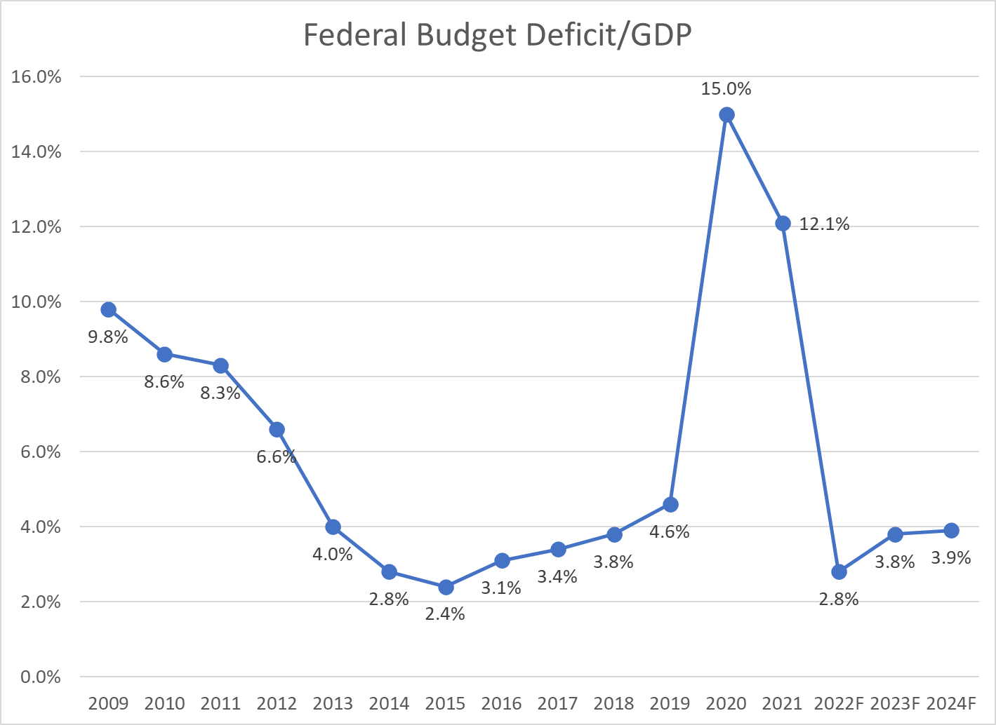
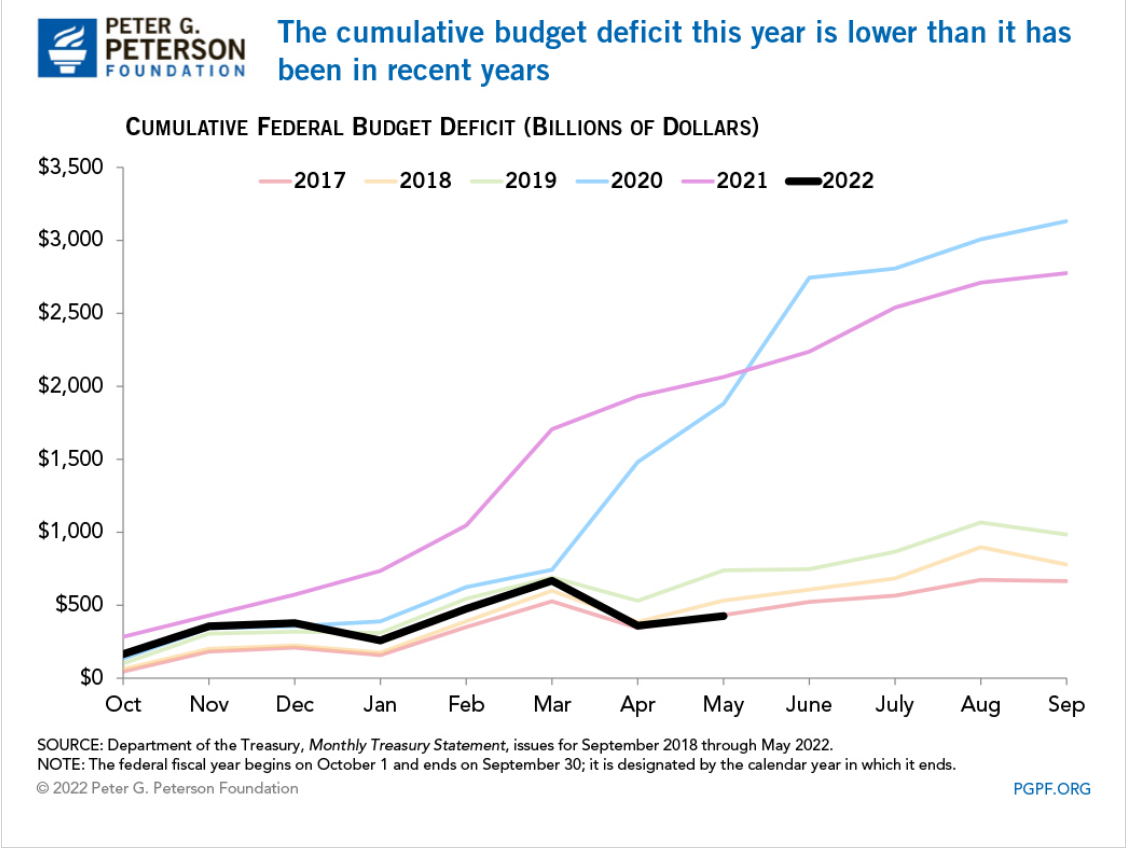
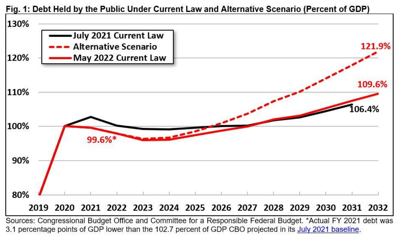
The May YTD deficit for fiscal year ending in September, 2022 was $426B, down 79.4% from the $2,064B level of FY 2021. The total FY 2021 deficit was $2,772B, so the same percentage reduction for the whole year estimates a $572B deficit for FY 2022. Visually, the year-to-date pattern most closely matches 2017 which ended with a $666B deficit. In fiscal years 2018 and 2019, the additional deficit for the last 4 months of the year was $245B and $247B, respectively. That gives us a forecast of $672B for FY 2022. DC insider, Wrightson ICAP, recently forecast a deficit of $600-700B.
The conservative forecast of $700B deficit for FY 2022 is 2.8% of the CBO estimate of FY 2022 GDP at $24,694B. The CBO forecast Deficit/GDP ratios of 3.8% and 3.9% for the next 2 years, roughly the same as the pre-pandemic 2018 rate.
Good News: Government Fiscal Stimulus is a 3.5% Annual Drag on the Economy
The reduced federal deficit and state/local deficits compared with history provided a very large drag on first quarter GDP, but the economy recovered in the second quarter and is forecast by the CBO to deliver 3% overall real GDP in FY2023 after a very strong 4.4% in FY2022.
Revenue increases are not sustainable, coming in as much as 2% of GDP higher than trend or expectations. The 2021 economy was very healthy, resulting in spillover tax receipts in 2022 that will not continue.
Our economy has operated effectively for the last 4 decades with a federal budget deficit averaging 2.5% across the business cycle. Starting with 2.8% in 2022 is an unexpectedly good place. Congress and the president will struggle to maintain this level without significant spending or revenue changes in the next budgets.
North Dakota, Wisconsin, Oklahoma, Kansas, South Dakota, Minnesota and Nebraska form a low unemployment core in the Great Plains area. Utah, Idaho and Montana represent the Rocky Mountains. Vermont and New Hampshire lead in New England. Alabama leads the South, while Indiana leads the Midwest.
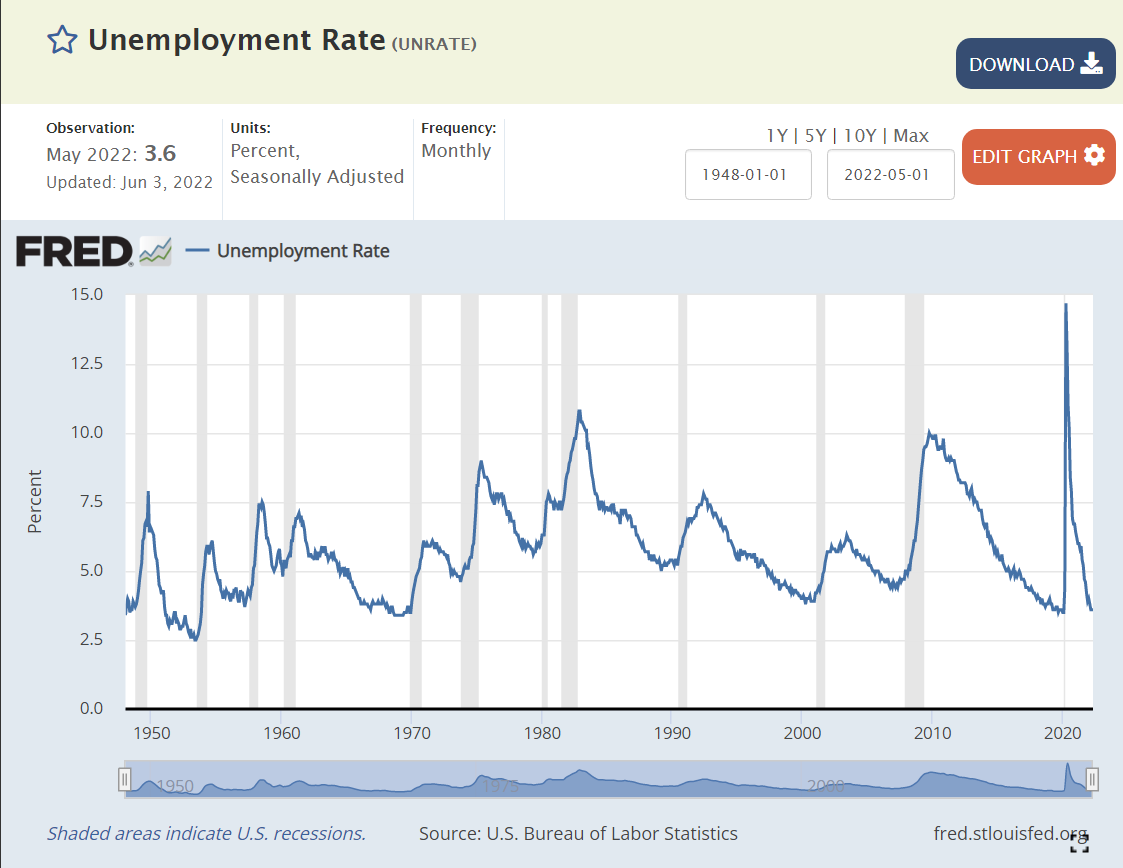
Jan, 2016: 4.8% through Feb, 2020: 3.5%. 4 years “below full employment”.
Estimates of Natural (Non-accelerating Inflation) Rate of Unemployment (NAIRU) Have Been Biased Upwards and Influenced by One Period of High Inflation and Supply Chain Disruptions
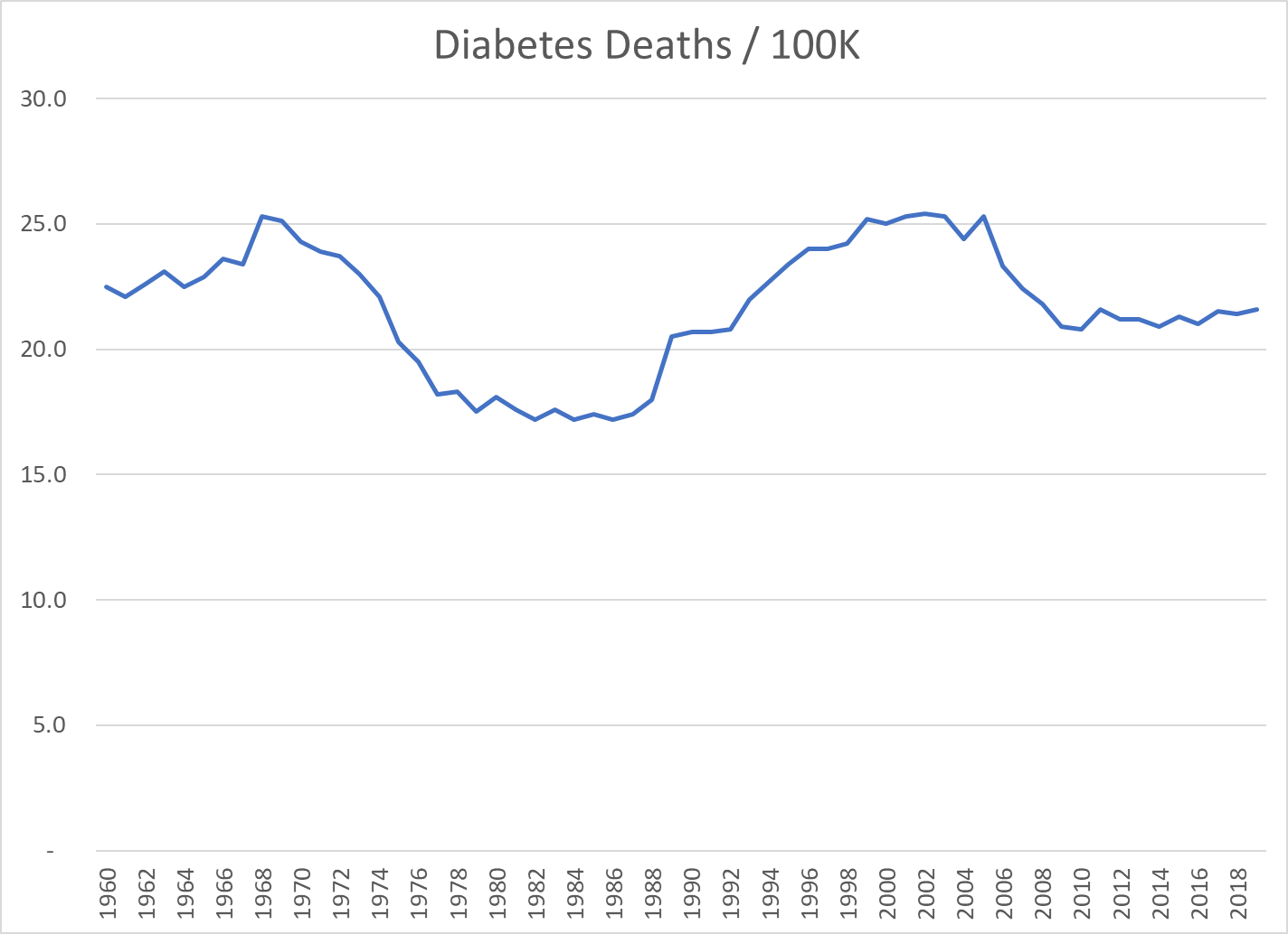
In retrospect, the period before 1976 (oil, trade, inflation shocks) should have used a 4.5% NAIRU for policy decisions. The jump to 6% in the late 70’s and early 80’s is supported by history. The NAIRU was deemed to be 5% or higher as late as 2010, but could have been pegged lower. Based on the lack of inflation during the teens, the rate probably should have been set at 4% or lower.
Macroeconomic Theory
Classical economics asserted that labor markets will naturally find equilibrium wages and quantities of labor employed at the individual labor market (micro) and total economy level. The Keynesian view, embraced by 90% of professional economists, is that there are market imperfections at both the individual market level and total economy level. Most importantly, wages are “sticky downwards”. Currently employed workers resist “losing” wages by accepting pay cuts when demand is lower. Aggregate supply (production) does not automatically create an equal amount of aggregate demand in the short-run, as businesses, individuals, banks and governments often choose to save more during economic downturns or periods of greater risk. Hence, a downturn in the economy caused by any source may result in a prolonged negative spiral, rather than automatically delivering lower prices in product, money and labor markets, which could help to recover these markets.
Microeconomic Theory: Why is There Any Unemployment?
Economists point to frictional and structural factors. Frictional unemployment occurs because labor market information and decisions are not perfect and instantaneous. As with other markets: housing, commercial real estate, offices, bank loans, farm fields, airport gates, container ships, utilities, R&D, IPO’s, private equity, M&A, retail inventories, etc, labor markets are imperfect. It takes time for equilibrium to be found. Given the increased concentration of labor in major metropolitan markets and internet-based recruiting systems, frictional unemployment has decreased in the last 20-30 years.
Structural unemployment occurs because of mismatches between the current skills possessed and skills demanded in a given place or due to legal or regulatory limitations. Binding minimum wages have been a smaller factor in the last 40 years but may have greater impact in the future. Regulatory requirements for professional licensing have increased significantly in the last 50 years (with some “liberalization” seen in recent years), slowing the ability for individuals to move between professions.
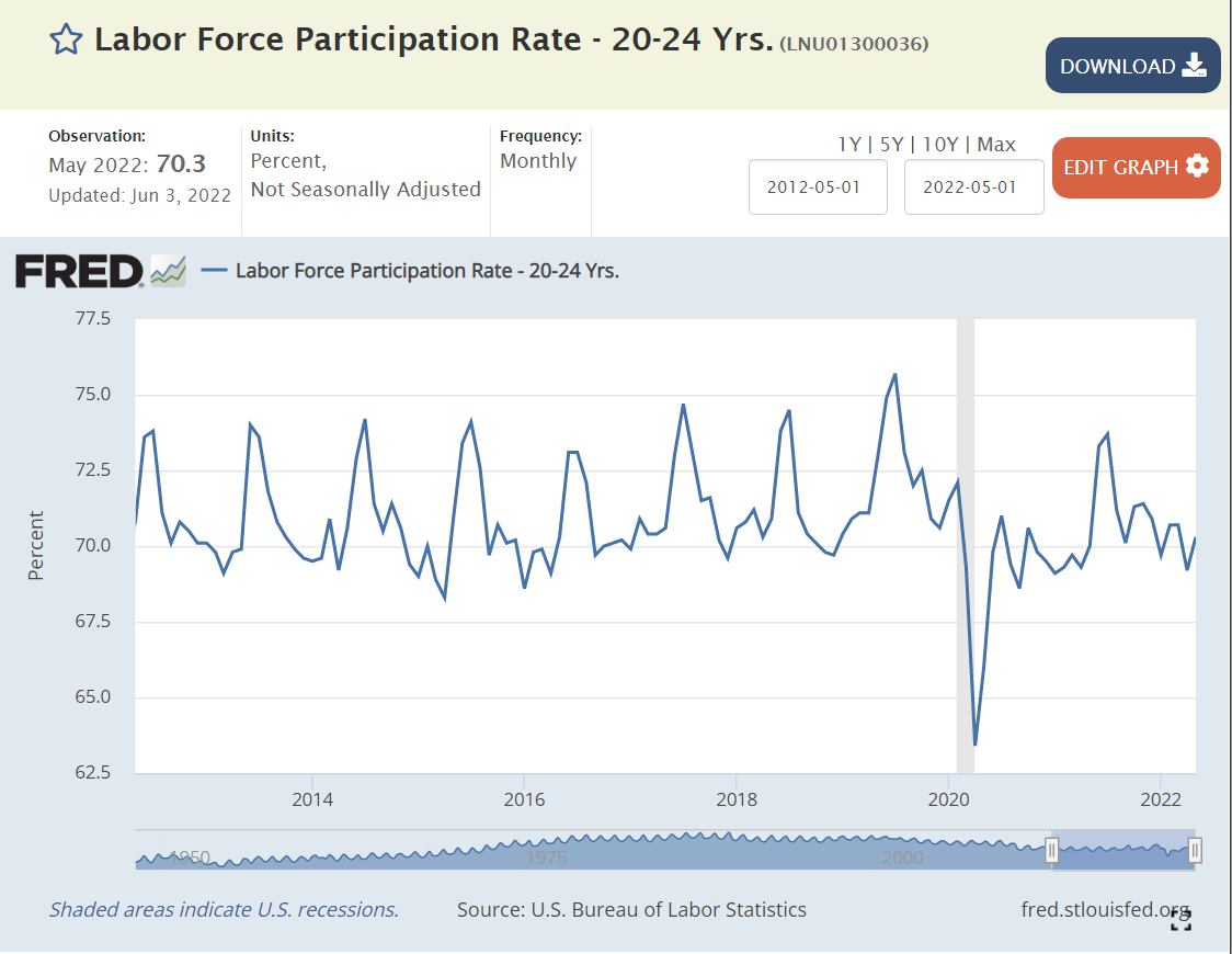
The overall labor force participation rate increased for many years as women entered the workforce, but has declined significantly in the last 20 years for men and for women. I’ll provide a detailed analysis of these factors next week. For our purposes, focusing on short-term changes, recent history shows that the labor force participation rate can be 1-2% higher overall. Some workers have not returned from the pandemic challenges. Some early retirees may return to the labor force. Teens and college students may join the labor force at recent wage rates. Marginal groups (elderly, long-term unemployed, handicapped, drug/alcohol recovery, crime history, minorities, limited language skills, inexperienced) may be considered for more positions.
The media tends to emphasize the increased specialization and technical content required for modern jobs. This has resulted in greater structural unemployment, especially among lower-skilled individuals who held and lost manufacturing jobs between 1970-2000. It has also reduced movement between industries which require a core base of knowledge to be effective, with health care being a prime example.
On the other hand, modern corporations that worked through a dozen post-WW II business cycles eventually adapting to the “business cycle”. First, based on Japanese manufacturing, TQM or lean six sigma manufacturing principles, they reduced their operating leverage. Companies devised factories, offices, distribution centers, product lines and national businesses that could be equally profitable from 70-95% of capacity, rather than 85-95% of capacity. Second, they reduced their unavoidable “fixed costs” by importing goods, outsourcing business functions (manufacturing, IT, accounting, legal, marketing, distribution, sales, R&D) and employing temporary labor. Third, businesses systematized their processes so that core production processes could be operated by individuals with limited specialized or tribal knowledge, including managers and support staff. Fourth, businesses increasingly used matrix and project structures to effectively redeploy staff to any areas of need. So, while variable production staff is a smaller share of employment, the remaining “fixed cost” support staff can be more flexibly deployed. Fifth, after 40 years of process re-engineering, data warehouses, activity based costing and balanced scorecard reporting, companies deeply understand variable costs and incremental benefits driven by sales, production, product lines, facilities, territories and projects. “Knee-jerk” reactions to business cycle downturns are less common as firms better understand short-term incremental profits and medium-term costs of hiring and training. Sixth, firms have improved their ability to define “critical success factors” for every position. This has eliminated many irrelevant experience, degree, culture, personality and other factors from hiring screens. Seventh, firms have increasingly rotated staff through line and staff roles, allowing talented individuals to move between these roles and function effectively. Eighth, firms are more strategically oriented, growing profitable product lines and territories and dropping or “selling off” marginal channels. This means that the incremental positive value of most positions persists, even in an economic downturn.
Overall, firms have learned their “applied intermediate microeconomics” and clearly defined the marginal benefits and costs of every position. They understand exactly what incremental profit can be delivered from each position. Hence, the demand for labor services is significantly greater than it was historically, including through the downside of the business cycle. That means that the natural unemployment level is lower than in the past. Firms can profitably put more people to work than ever before.
Economists, Forecasters and Pundits are Reluctant to Predict Unemployment Below 3% Because it Was Rare Historically.
Lobbyists, Journalists, Politicians and Analysts Highlight the Downsides to “Very Low” Unemployment
From a firm’s perspective, a low unemployment labor market causes increased recruiting, hiring and training costs. It results in less well-matched staff to job roles resulting in lower initial productivity. Companies might even, aghast, inadvertently hire some staff with marginally negative profit results. Hence, very low unemployment rates will increase labor costs, reduce profits, reduce demand for labor and possibly bankrupt previously functional firms.
Trade-off Between Unemployment and Inflation: The Phillips Curve
In the 1970’s fight between Keynesians and Monetarists/Classical Economists/Rational Expectations teams, the Keynesians emphasized the historical existence of a short-term trade-off between unemployment and inflation, especially when unemployment was very low due to a high level of aggregate demand. The conservative side noted that the historical data was inconsistent. The “rational expectations” camp emphasized that unexpected increases in inflation would lead to increased wage demands by labor. In the long-run, there is no such thing as a “free lunch”, so effective real wages would return to the level determined by the “marginal productivity of labor”. Based on recent data (pre-pandemic), it appears that the US economy can run at 3.5-4.0% unemployment without triggering significant upward wage pressures. In the post-pandemic world, the “natural” unemployment rate (NAIRU) is unclear. The labor supply has basically recovered to the pre-pandemic level. Wages are up 5% in nominal terms but are down 2% in real terms (see below).
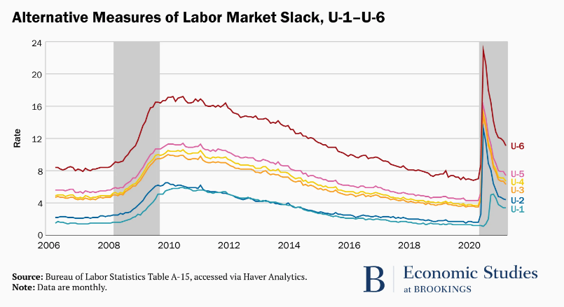
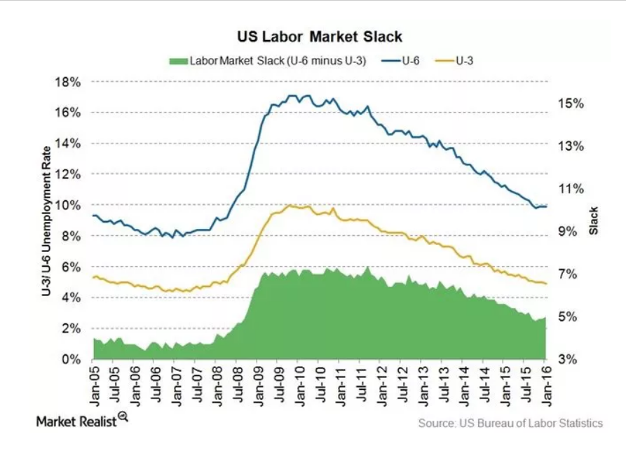
There are Many Unemployment Measures. They Move Together.
Underemployed individuals provide the logical next best full-time employees. The current slack measure is 3.5%, (7.1% – 3.6%) on the low side, but not so low that conversions from this underemployed group to full-time employment cannot be expected.
Jun, 2020 – Jun 2022. Nominal wages up 4.7%/year. CPI up 6.1%. 1.4% real wage decrease.
Dec, 2020 – Dec, 2021. Nominal wages up 4.9%. CPI up 7.3%. 2.4% real wage decrease.
May, 2021 – May, 2022. Nominal wages up 5.2%. CPI up 7.9%. 2.7% real wage decrease.
Nominal wage rates have increased by 5% annually in a period of 7% inflation. Employers have been able to economically justify these increases while adding 7 million people to the labor force.
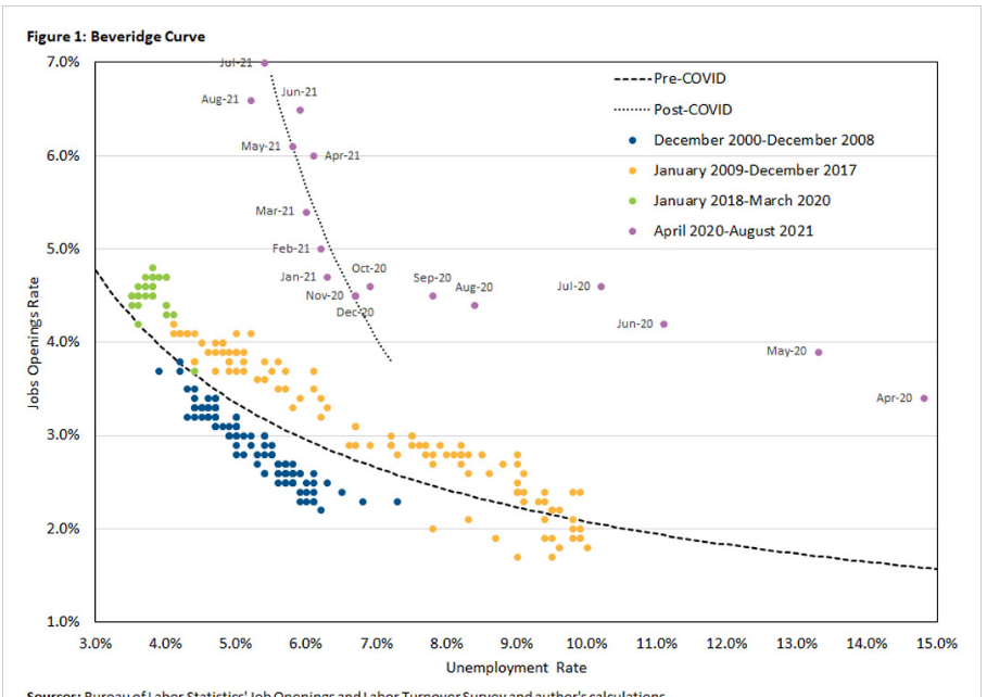
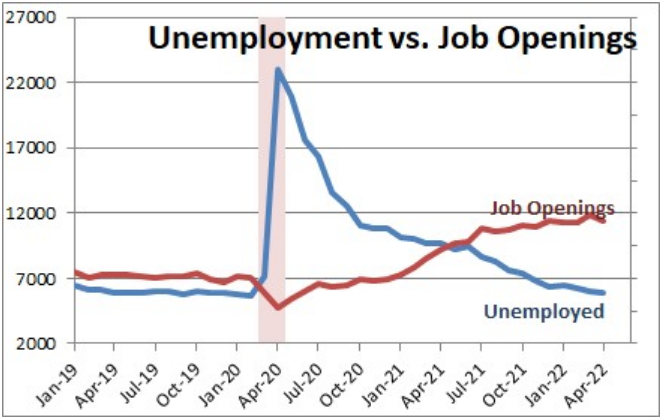
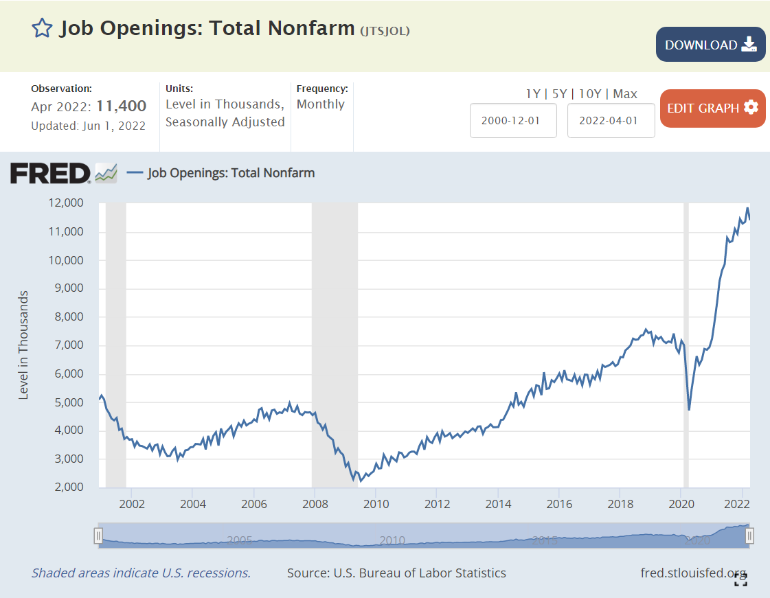
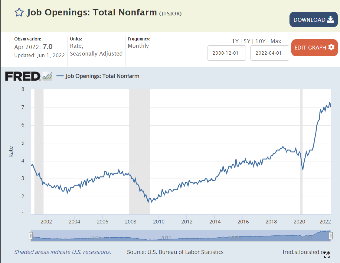
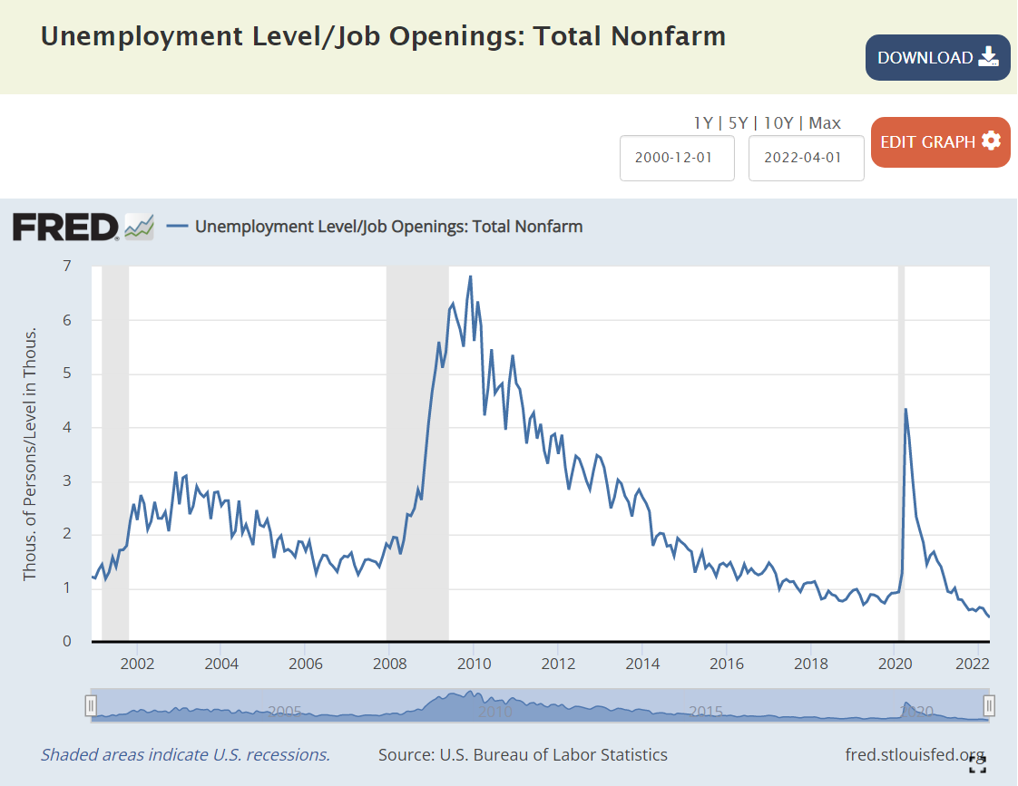
Beveridge Curve: Job Openings Versus Unemployment Rate.
Historically, there was a well-defined relationship between the national level of job openings as a percent of the labor force and the unemployment rate. Job openings were a low 2-2.5% of the labor force at the beginning of the business cycle, accompanied by higher (6-10%) unemployment, but improved to 4% openings and 4% unemployment. The current labor market has far more job openings, up to 11 million, almost twice as many job openings as unemployed workers, but the unemployment rate has only fallen to 3.6% so far. This is uncharted territory. There are more voluntary quits, so employees are switching jobs at a faster rate. The labor force participation rate has increased with these jobs and higher wages offered. But firms have not found enough acceptable hiring matches to significantly reduce the open positions level. Through time, they are likely to achieve their hiring goals, driving the unemployment rate down below 3%.
The demand for labor already exists. 11 million open positions is 7% of the labor force. We have enough active demand for ZERO % unemployment.
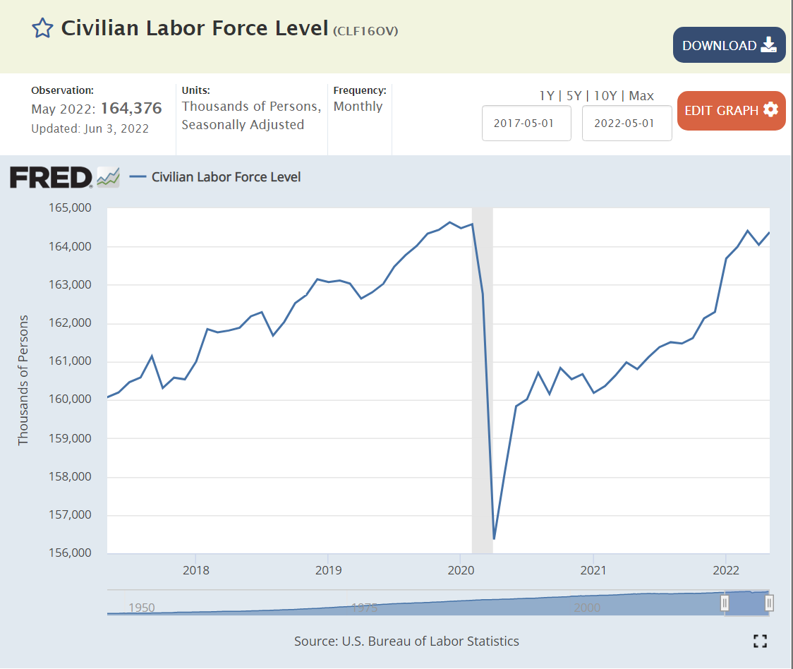
The supply of labor increased by 7 million people since the depths of the pandemic. The rate of monthly additions has slowed from 500-600,000 to 300,000, but that is still 3.6 million jobs added on an annual basis. We only have 6 million total people unemployed!
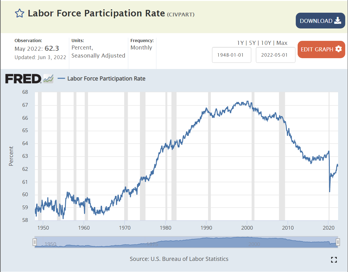
3. The labor force participation rate is only 62.5%. There is room for millions to return to the labor market. Before the “Great Recession” in 2008 it was at 67%. Many metro areas, large and small, enjoy labor force participation rates above 65%.
4. The underemployed population can provide up to 3% of the total labor market’s full-time jobs.
5. Frictional unemployment is minimal in the internet age. Structural unemployment may be lower than described in the media, as firms have been adapting to the “information age”, high technology and the service economy for 40-50 years.
Finally, many states and metro areas currently have unemployment rates in the “twos”. Nebraska and Utah stand at 1.9%. Minneapolis (1.5%), Birmingham (1.9%) and Indianapolis (2.0%) demonstrate that otherwise unremarkable (!!!) metro areas can function with very low unemployment rates.
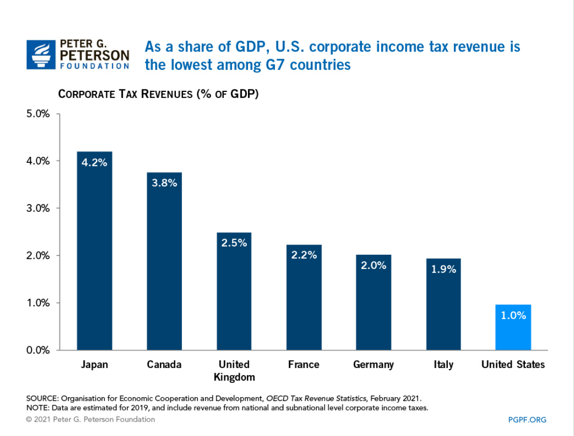
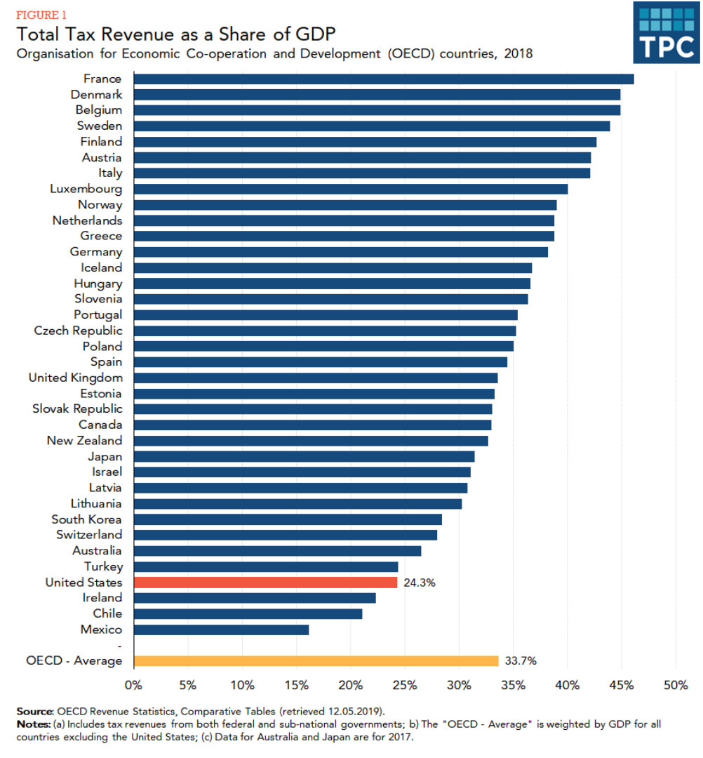
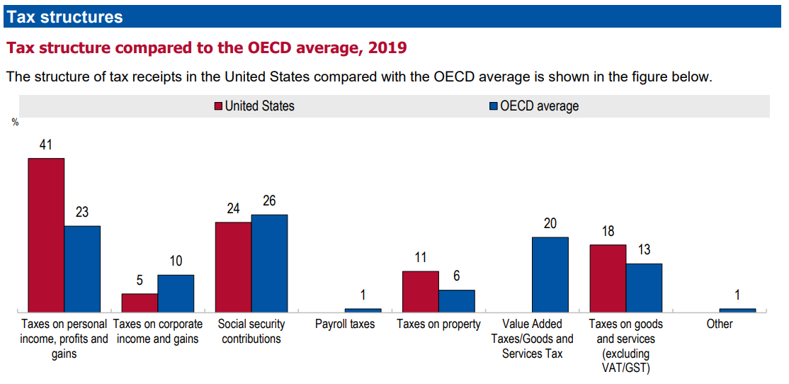
US income and property taxes are relatively higher than other developed countries, but corporate taxes are half as high, and the US does not use value added taxes (VAT) to quietly collect revenues.
Record high of 6.6 million hires per month, above pre-pandemic record 6.0M.
Record low layoffs at 1.3M per month, down from 1.8M pre-pandemic record. Yes 5 new hires for every layoff!
Record 11 million plus, up from pre-pandemic record of 7 million.
Record 7% of jobs are open, far above pre-pandemic 4.4% record level.
Job seekers to open positions ratio is less than 1/2, all-time record low, down from pre-pandemic record that was just below 1:1.
Average hourly wage up 12% to record $31.95.
Hours worked is slightly higher than before the pandemic.
Record high 2.9% versus pre-pandemic record of 2.3%.
Unemployment rate is 3.6%, just above pre-pandemic 3.5%. Prior 3.5% rate was in 1969. This is the best in 50 years.
Underemployment rate at 7.1% is just above 7.0% pre-pandemic level. Underemployment rate was last this low in 2000.
Long-term unemployment is at 1.2%, same as pre-pandemic level. The economy last delivered this positive level in 2000.
African-American unemployment rate is at a near-record 6% low. It was a little lower briefly before the pandemic.
Initial unemployment claims reached the pre-pandemic low of 190,000 during 2022, but has increased slightly to 210,000. This compares with typical levels of 400,000 in recent decades.
Continued unemployment claims are at a 50-year record low of 1.3 million, down from the pre-pandemic level of 1.8M. 1.3M was last seen in 1969!
Civilian labor force at 164.4M is just below the all-time record of 164.6M.
Prime age labor force participation rate fell from 84% to 81% by 2014. It recovered to 83% by the end of 2019. It has reached 82.5% so far in 2022.
Teen labor force participation has slowly increased for a decade.
College age labor force participation has remained the same.
“Older” age labor force participation hit an all-time low of 29% in the early 1990’s, and then began to climb all the way to 41% in 2012. It remained at 40% throughout that decade. It dropped with the pandemic and has since recovered to 39%.
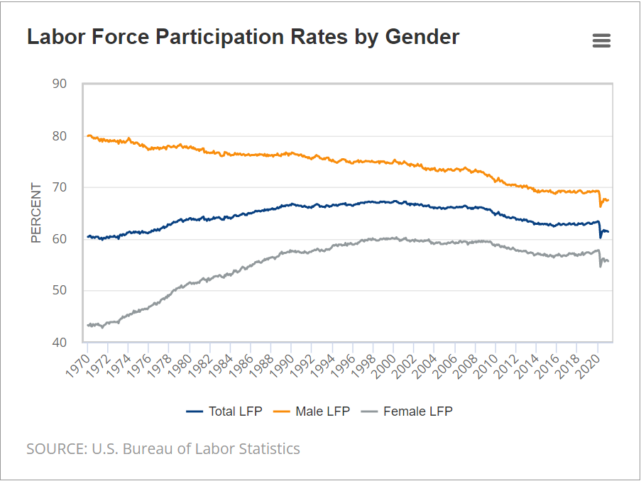
Female labor force participation continued its long climb to a peak of 60% in the late 1990’s. It dropped below 57% by 2014. It increased to 58% in the last 2 years of the decade. It has recovered to 57% after the pandemic.
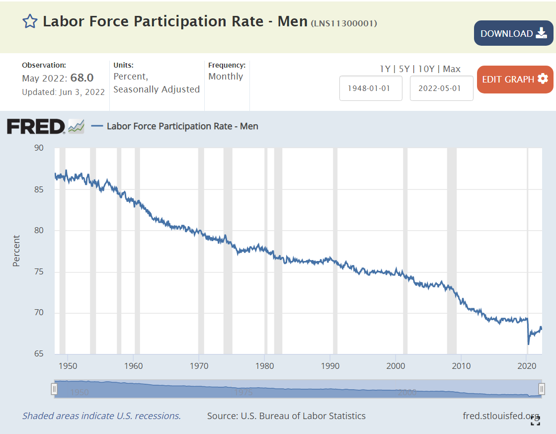
The male labor force participation rate has been declining for 70 years. It reached 69% in 2014 and remained there, without falling, throughout the decade. The rate dropped to 66% during the pandemic and has since recovered to 68%.
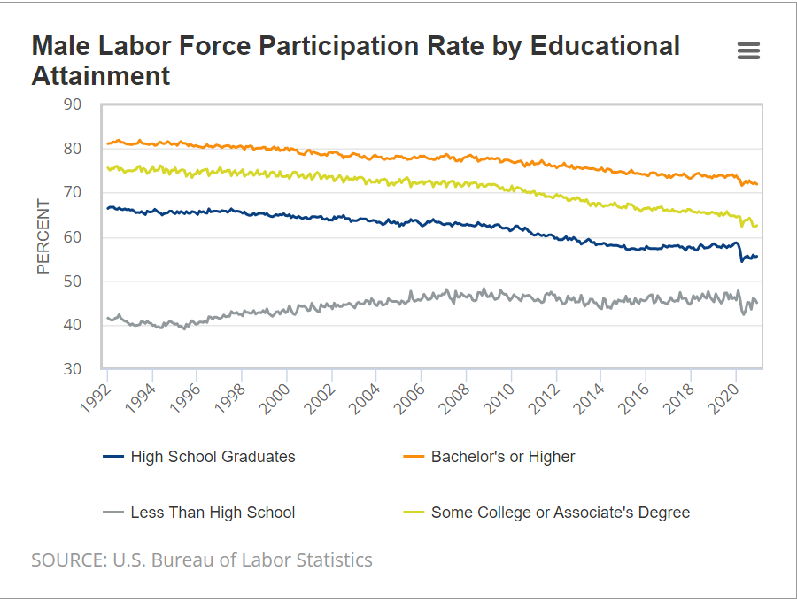
Labor force participation has declined by about 10% for HS grads, some college and college grad groups. Non-HS grads’ participation has actually increased. The similarity of participation changes by education and gender points to broader social factors playing a major role in these “economic” changes.
Summary
The measures of demand for labor are all at record levels. Unemployment rates are at long-term lows, just above the pre-pandemic levels which were driven by a decade long economic recovery. Labor force participation is down by 1% compared with pre-pandemic levels. Overall, this recovery from the pandemic challenges exceeds all expectations.
In 1974, when I graduated from high school, there were 3 national TV networks that delivered “over the air” content from major city TV stations. Major cities usually had a public broadcasting station focused on “educational TV” and perhaps an “independent” TV station that catered to reruns of movies, cartoons and TV shows, local news and weather, variety shows, political commentators, sports and traffic. At night, you might sometimes be able to get a fuzzy picture from 2-3 other TV stations 60-100 miles away if you moved the roof or tv antenna around a bit. “Maximum TV” was 10 stations.
We now have cable, satellite and internet connections to provide hundreds or thousands of channels to most citizens for viewing now or later. It is challenging to convey this “two orders of magnitude” change.
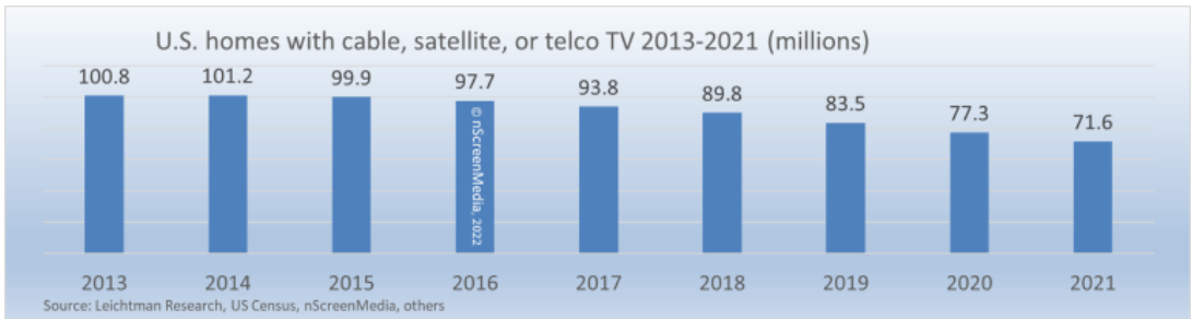
The US TV market grew from zero to 100M homes with cable access by 2005, before beginning a slow decline in direct connections replaced by internet connections.
Close to 30% of TV content is now consumed in a time-shifted manner versus zero historically. When “The Wizard of Oz” was played on TV every 2-3 years, we all watched it.
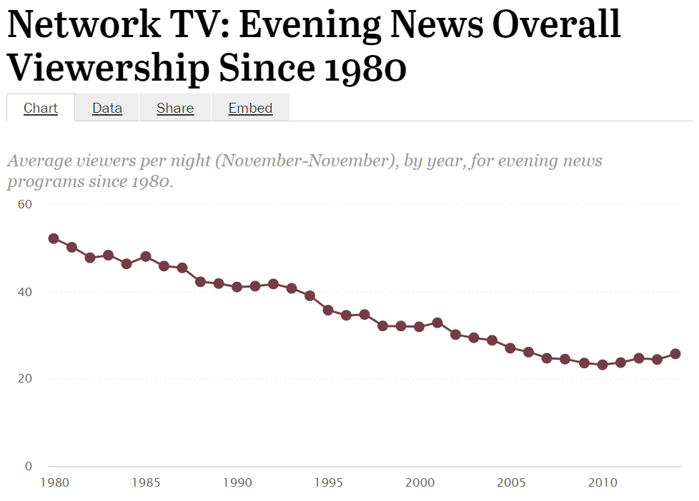
Decline of the Big 3/4 Networks’ TV Market Share
1980 – 85-90%
1990 – 60%
2000 – 40%
2010 – 35%
2021 – 30%
Conversely, this means that “independent” content increased from 10% to 70% of available programs.
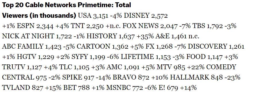
Of the top 29 in 2010, 14 remain strong competitors in 2021. ESPN, Fox News, TBS, History, Ion, Discovery, HGTV, Lifetime, Food, TLC, Bravo, Hallmark, TV Land, MSNBC. 5 retain more than 500K average daily visitors, but dropped by at least 50% from 2010 to 2021: USA, TNT, A&E, FX and AMC. 10 dropped by more than 50% to less than 500K daily viewers: Disney, Nick, Cartoon, SyFy, TruTV, MTV, Comedy, Spice, BET and E! 8 networks moved up to more than 500K viewers per day: CNN, telemundo, CW, Insp, Me, Invest, Hallmark movie and Unimas. This is a very competitive marketplace.
Most states and local governments have chosen to pay their employees less than market salaries and higher than market fringe benefits since the WW II era. The Republican focus on reducing the size, pay and power of government has increased significantly in the post-Reagan era. Grover Norquist summarized this in 2001: “I don’t want to abolish government. I simply want to reduce it to the size where I can drag it into the bathroom and drown it in the bathtub.” Hence, Republicans have focused the spotlight on the “underfunded” status of state and local government fringe benefit plans, especially defined benefit pension plans.
Although the rhetoric is sometimes grating to the “left” ear, this spotlight does serve as a disinfectant, requiring political leaders to be more accountable for their decisions, especially in “one party” states where accountability was lacking historically.
On the other hand, pension accounting, funding, goals and policies are inherently complex and difficult to simply summarize or explain. This is true for both government and corporate defined benefit pension plans. It is easy to “cherry pick” pension statistics and overexaggerate the “crisis” in state pensions.
I will focus on the data and commentary from just 2 sources: Reason.org, a right-leaning policy group that cleverly adopted a left-side name and Pew Research, a centrist research group that has chosen to emphasize right-leaning data and commentary on this topic.
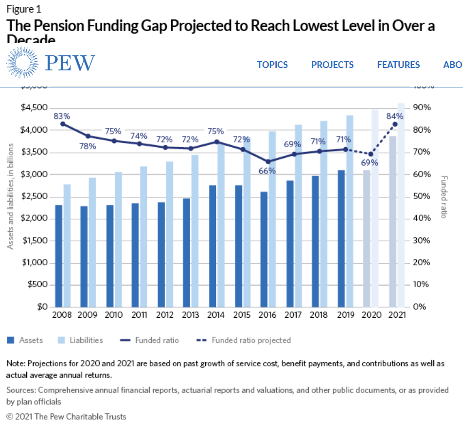
The average state pension plan funding level, the ratio of assets to forecast liabilities, is expected to reach 84% when final 2021 data is summarized. This is a huge improvement from the 70% average of the prior 5 years. It is the highest level since 2008.
2. The system is working. Plan assets were $2.3T versus $2.8T in 2008. Assets grew by $1.5T to $3.8T, while liabilities grew by $1.8T to $4.6T. Since the added $1.5T/$1.8T is 5/6ths or 86%, the overall ratio increased. The “system” of policies, accounting, audits, contributions, investment strategies and actual investment returns, etc. appears to be functional across a quite challenging economic period. The funding ratio was relatively consistent throughout this period, even if it was not at the 100% level highlighted by some as “the goal”.
3. The gap between estimated liabilities and funded assets is less than $1T for the first time since 2014.
4. For the first time in this time period, the minimum expected funding level has been met. This is defined as a year in which contributions exceed benefits plus the “amortized” funding requirements based on past funding shortfalls. In 2014 only 17 states met this standard. In 2019, 35 states complied. Again, this is not perfection, but it is significant progress.
5. Overall contributions have increased by 8% annually. The states with the lowest funding ratios have increased their contributions even faster. The lowest 10 rated states growing by 15% annually and the 4 worst states by 16%.
6. A measure of benefits paid minus funding contributions, as a percentage of plan assets, has improved from 3% more benefits to 2.5% more benefits paid versus new funding contributions.
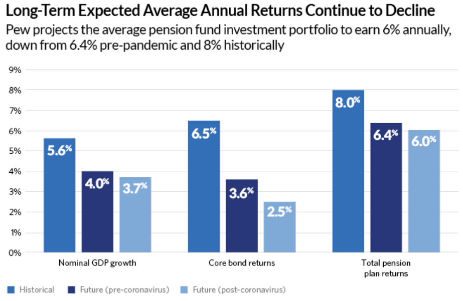
The Funding Gap (2016). Funding ratio 66%. Few states reach 90%.
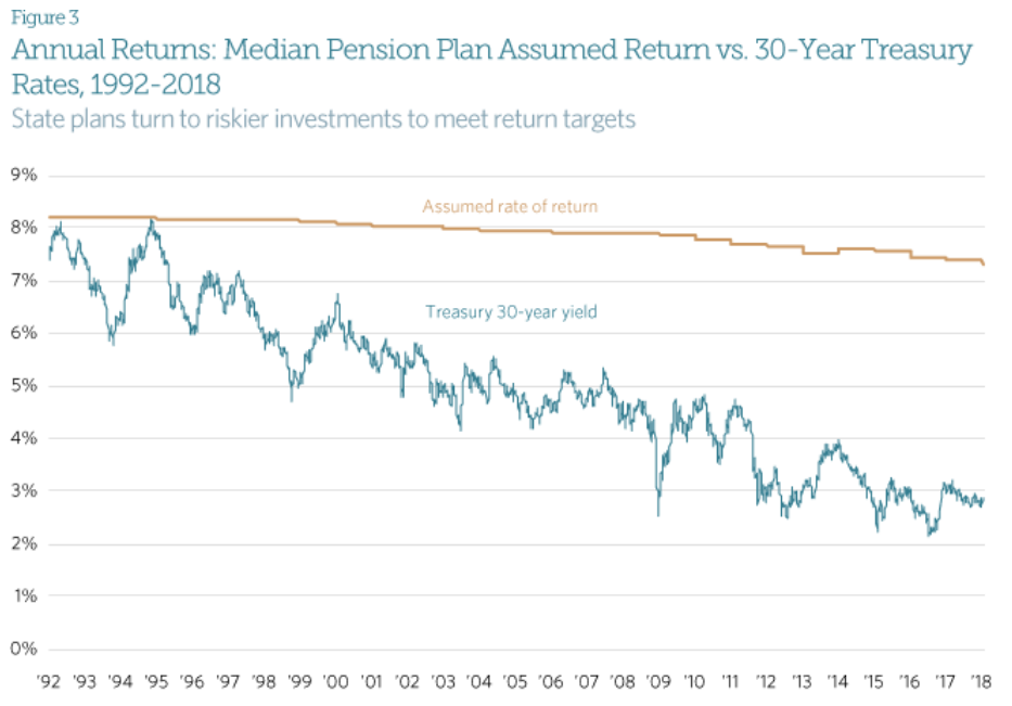
Bond interest rates have fallen faster than pension plan expected returns. Of course, because equity returns are much higher, more volatile, difficult to forecast and a higher share of plan assets.
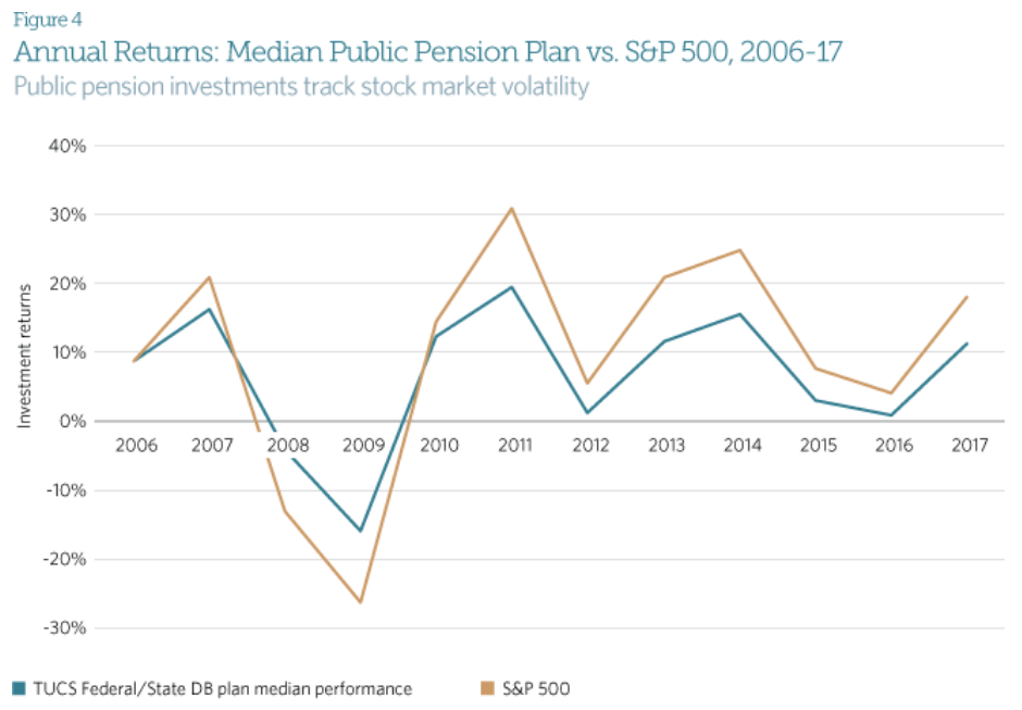
State pension plan returns trail the S&P 500 returns. Of course, because plans hold significant (30-40-50%) in lower yielding bonds.
A lower “discount rate”, the assumed future interest rate used to calculate the present value of future pension benefits/liabilities, will increase current liabilities and the current net liability. Yes, this is how discounting works. As market interest rates and stock returns have been reduced with lower inflation rates, the discount rate used by financial professionals in all applications has slowly declined for the last 20 years. This “sensitivity analysis” is misleading. The sensitivity of present liabilities is inherent, it cannot be avoided.
Some states have amortization rates, the amount of new contributions required to eventually offset prior funding or investment return shortages, that are quite high compared to their annual payrolls. This is true. 7 are above 5% deficits, but 7 are above 5% surpluses.
Pew highlights what they call the “operating cash flow” ratio as another sign of trouble. Contributions minus benefits paid as a ratio to assets is the definition. The result is negative!!!! And increasing to negative 3%! Contributions should almost always be less than benefits paid in a long-term (20-30-40 year) pension plan because the plan trustees assume that there will be some positive return on plan assets. Given a 2/1 equity to debt mix, with 7% to 3% expected returns, the expected plan return is more than 5%, so a 3% “negative” return is not a concern. The insurance industry operates in the same way with “negative” operating ratios being offset by investment returns.
Reason.org Graphics
This group highlights the extraordinary 100% ratio in 2001 versus the more normal ratios of 82% in 2005, the quite low level of 66% in 2012 and the still below average 74% level in 2019. They provide state by state graphics to highlight the decline since the very high 2001 baseline and to emphasize the count of states that are below 90%, 80% and 60% “funded”.
Their websites do not allow their graphs to be linked/captured.
Reason.org breaks 2 rules. First, they implicitly assume that a 100% funding level is the “obvious” goal. That is untrue. Historically, US corporations and actuaries considered 80% to be a “fully funded” target. More was better. A little less was worth watching (70-75%). Much lower required increased focus and contributions. Due to the inherent uncertainties in investment returns and participant assumptions (lifespan, retirement dates, turnover, average salaries, etc.) short-term movements of 2-3-5% were never considered to be an issue. Long-term or persistent ratios significantly below 80% were considered to be a concern.
Second, they assume that all states will perform at the same level. The “laws” of probability prohibit this “ideal” result. In a normally shaped (bell curve) probability distribution, there will always be underperforming and overperforming states. This is inherent in a multiple probability-based system. Of course, if a state remains at the bottom of the funded percentage list for more than 5 years, it probably does have a challenge to face.
Greater state pension contributions have “crowded out” other spending and reduced states’ ability to respond to emergencies. Well, you can’t have it “both ways”. States have responded to the shortfalls highlighted since 2000 with greater contributions. This has improved the funding level despite the Great Recession, the slow recovery and the pandemic challenge.
The recent funding level improvement is due to a “one-time” stock market return in 2021. Yes, stock market returns, both gains and losses, are volatile. That is why pension plans use long-term expected returns for stocks and bonds. That is why pension funds use longer time periods (10 years) to amortize the annually calculated gains or losses into the “required” contributions. Yes, a significant part of the increase from 70% to 84% funded is a short-term increase of investment returns, and probably unsustainable.
The stock market is volatile. Recently. Yes, a once in a century pandemic drives increased volatility. Stock market volatility through time and across markets is well understood as a probability function with mean expected real percentage returns and a predictable range of returns volatility. All investors face this volatility and manage portfolios accordingly. As state pension plans have grown in value, they have been able to hire competent investment advisors.
4. Economic growth is slowing. Some assert this. Others disagree.
5. Future stock and bond returns will be lower, per Pew. The long-term decline in inflation does drive investment returns lower. The increased efficiency of financial markets, including global investment flows, also drives returns lower. However, pension plans have reduced their expected annual returns. Recent stock market volatility indicates that equity returns may not decline.
6. Increased funding of underfunded pension plans can be portrayed as “increased spending”, rather than the required adjustments for those plans which had historically lower investment returns, contributions or higher ultimate benefits.
Summary
State and local governments are faced with managing inherently variable pension plan decisions. They have choices to make about plan policies, goals, funding, investment policies, audits, advisors, etc. An 80% funded level goal (not 100%) is supported by 100 years of experience around the globe, in public, private and not for profit sectors. The increased publicity/focus on underperforming states and municipalities has forced these public bodies to make tough choices regarding defined benefit versus defined contribution plans, benefit levels, retirement ages, investment policies and advisors. Following the Great Recession, states struggled to increase their funding, but they did not allow the average funding level to fall below 70% for more than a year at a time. On a cumulative basis, they have increased their contributions, reduced benefits and captured the long-run benefits of equity investments.
The increased scrutiny of funding levels in state and local government defined benefit pension plans has forced elected officials and their professional advisors to address shortfalls in pension funding. This is very good news.
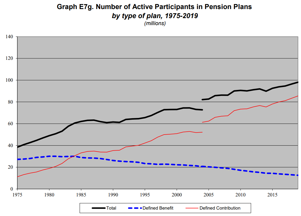
2.5 times as many active plan participants since 1975.
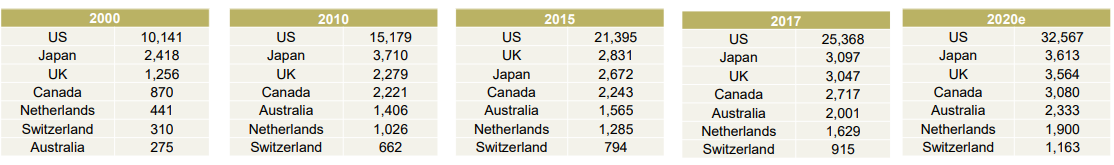
Plan assets have doubled since 2008, quadrupled since 1995, quintupled since 1991 and grown 10-fold since 1984.
The growth of plan assets is mainly due to investment returns, as contributions and disbursements have grown at similar rates.
US pension plans account for more than one-half of global pension plan assets.
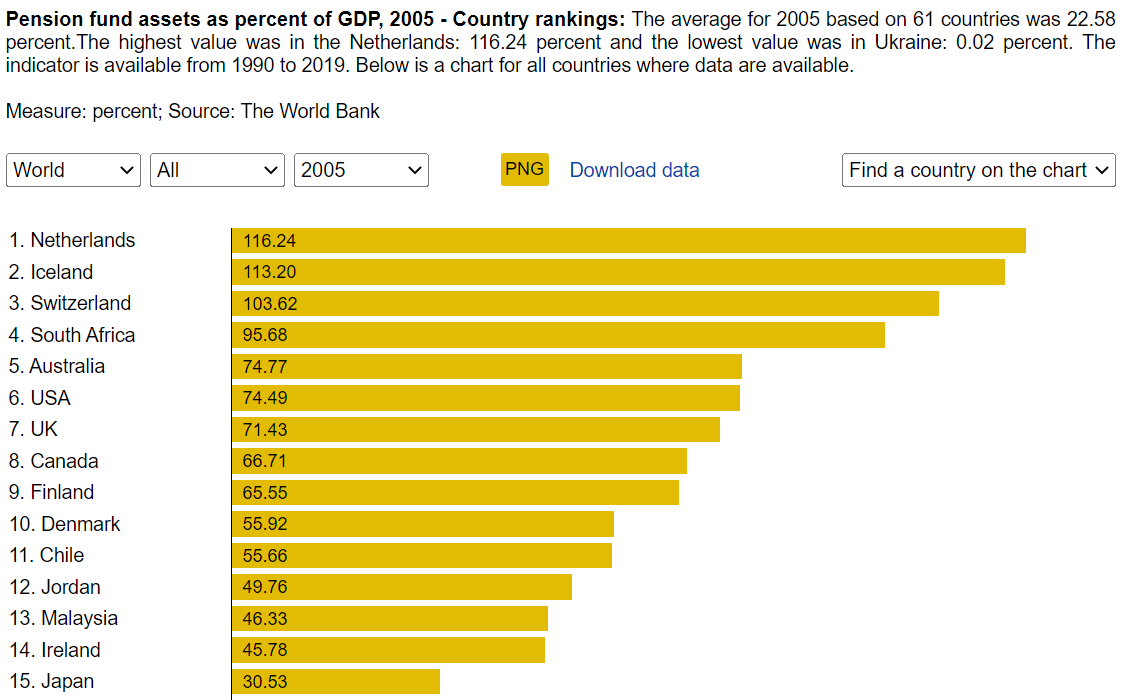
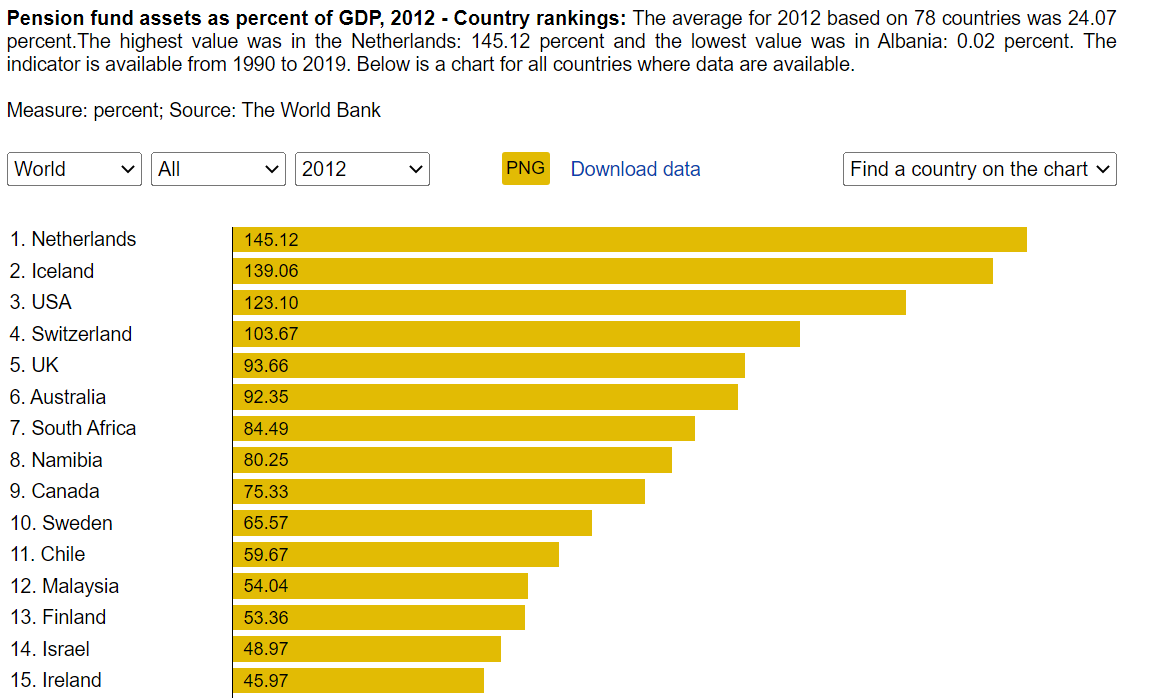
The US ratio of plan assets to GDP is typically 5th out of the 30-50 countries tracked by the World Bank.
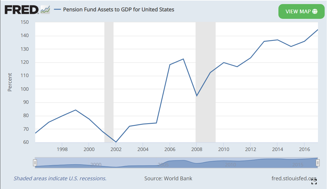
US plan assets as a percentage of GDP grew from just above 100% in 2010 to 157% in 2020. US plan assets from 1996-2005 averaged just 70% of GDP, so the relative amount of savings has doubled from 2005 to 2020.
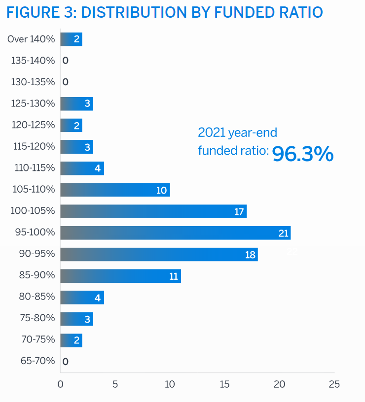
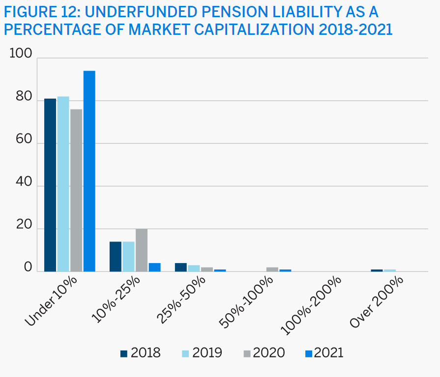
Just 5% of the largest plans have a funded status (assets/liabilities) less than 80%.
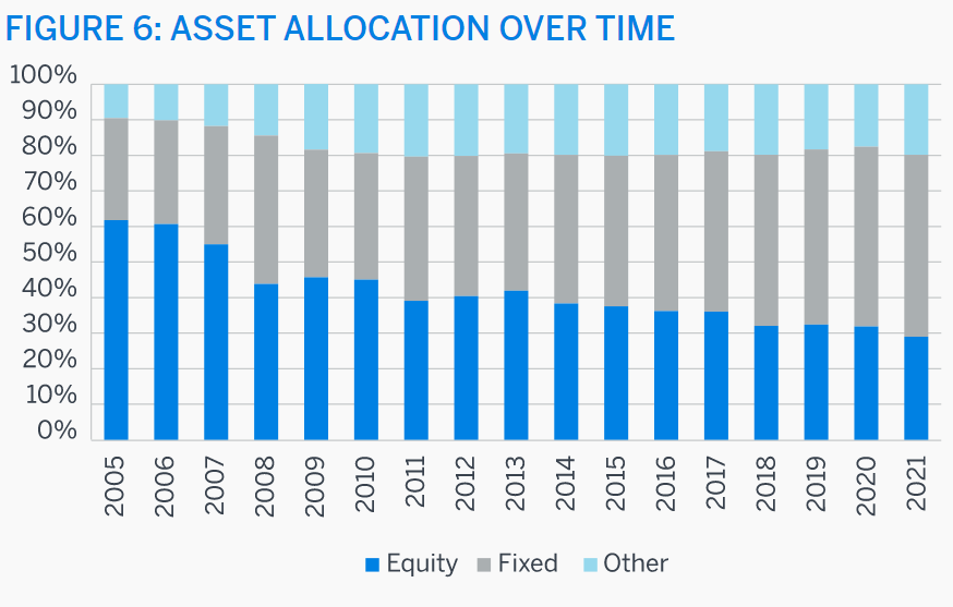
This is in spite of an increase in lower risk/lower return fixed income/bond funding growing from 30% to 50% of invested assets.
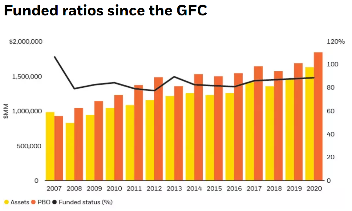
Plan assets took a big hit in 2008 but have slowly recovered.
Historically, 80% funded was considered to be “fully funded”. Corporations increased contributions after 2008 to slowly ensure plan funding ratios would increase. The 96% level in 2021 is unusually high, driven by many years of increased corporate cash contributions and higher than expected investment returns that have offset planned future investment returns which have dropped from 9% to 6.5%, thereby decreasing the ability of firms to simply rely upon investment returns to fund their pension liabilities.
Almost one-half of the largest firms have funded ratios of 90-105%, a very safe level. More firms have greater than 105% funding than have less than 90% funding.
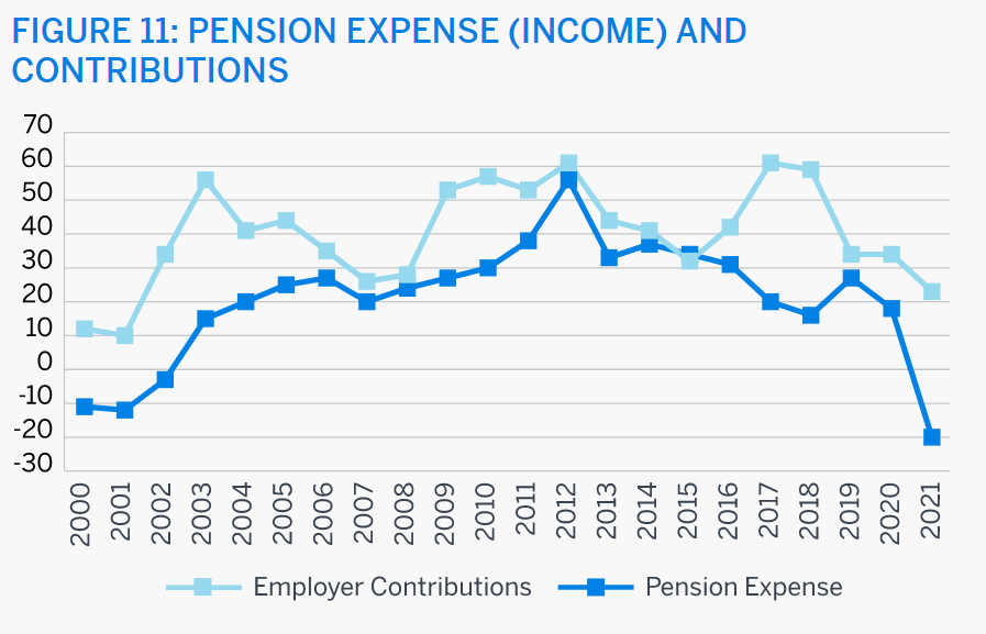
Pension accounting is a complex and subjective area. Cash contributions have consistently exceeded the accounting basis expenses recognized. This reflects a conservative actual funding strategy.
The net unfunded pension liability is an immaterial share of the value of major corporations.
Blackrock summarizes funded status for 200 large defined benefit pension plans. The funded ratio declined in 2008 and has slowly recovered. It reached 95% in 2021.
Mercer summarizes 1,500 defined benefit pension plans. 80% funded is pretty typical since the Great Recession. Mercer reports 97% funded status at the end of 2021.
Summary
Defined benefit pension plans are an increasingly smaller share of all retirement savings plans. However, corporations are funding their future liabilities at a fully adequate level.
I have mapped this data onto the “Red vs. Blue” states list based on current senators.
Red (Republican) States Benefit Greatly
Democratic states pay 63% of all taxes, 5% more than their population share and 13% more than their senators’ (power) share.
Federal expenditures in Democratic states are 58% of the total, more than 4% less than their share of revenues contributed. Federal expenditures in Republican states are 42% of the total, more than 4% above their share of revenues contributed. Hence the total gap is almost 9% of the total.
The referenced article focused on two measures: net dollar subsidy (expenses > revenues) and net dollar subsidy per person.
I’m going to use a slightly different measure. The large (20%) difference between total expenditures and revenues skews these figures. I’d like to assume that the “equal” situation is one in which each party’s states pays the same ratio of revenues to expenses (or conversely, expenses to revenues). I’ve standardized the figures assuming that the “neutral” state receives 10.6% more expenditures than it pays in taxes, the same level as the Democratic states. Hence, by definition, the Democratic states, in total, are “neutral”. Their $2.155T expenditure is 10.6% higher than their $1.948T revenues.
The Republican states have $1.168T of revenues paid to the federal government but receive $1.555T of local expenditures. This is 33% more expenditures than revenues, a huge extra (22%) budget deficit. If the Republican spending was just 10.6% higher than revenues, it would be $1.292T, with a deficit of “just” $0.123T. This is $0.264T less than the actual deficit of $0.387T.
Subsidized States (>$10B)
6 Democratic states receive subsidies of more than $10 billion, totaling $180B.
Georgia (15), Michigan (16), New Mexico (17), Arizona (26), Maryland (29) and Virginia (78). Most of this is due to the DC employment and contracting bias.
Twice as many Republican states receive major subsidies, totaling $246B; $66B more than the Democratic states.
Indiana (10), Oklahoma (13), Arkansas (13), Louisiana (14), Tennessee (19), Mississippi (19), Missouri (19), South Carolina (21), Florida (26), North Carolina (26), Alabama (29) and Kentucky (38). Ironically, much of this excess spending was started when Democrats controlled southern states through much of the twentieth century.
Subsidizing States
Texas sends $19B more revenues to the federal government than it receives in expenditures, the only large subsidizing Republican state.
Seven Democratic states provide major subsidies to the federal government, totaling $218B, for a net subsidy versus Republican states (Texas) of $199B.
Washington (10), Illinois (19), Connecticut (20), Massachusetts (26), New Jersey (34), California (46) and New York (63). These states have the highest per capita incomes, so with a progressive income tax system, they pay a disproportionate share of federal taxes. (The state and local tax limit on deductions for federal taxes is a big issue in these states).
Summary
The Senate’s seats are based on geography, providing a major benefit to states with more rural and less urban/metro populations, benefitting the Republican party today more than in previous decades when Democrats were competitive in some of these states. Southern and rural states (Red, Republican) have lower incomes and receive more federal spending than coastal states (Blue, Democratic). In total, the Democratic states are paying 63% of taxes, while receiving 58% of federal expenditures, yet have just one-half of the senators and political power to determine taxing and spending policies. This discrepancy serves to reinforce the increasingly polarized political environment in the US.