Presidential candidate Ronald Reagan skewered the incumbent Jimmy Carter in the 1980 presidential debate with this question and framing of economic issues.
We are economically better off today than we were in 2019, 2016, 2012 or 2008. As a nation, we need to recognize the strong economy that has been built across several 4-year periods.
Let’s focus on just 2 measures: unemployment and real gross domestic product (GDP).
The US encountered its worst or “tied for worst” economic downturn in almost a century in 2008-9 with the Great Recession.

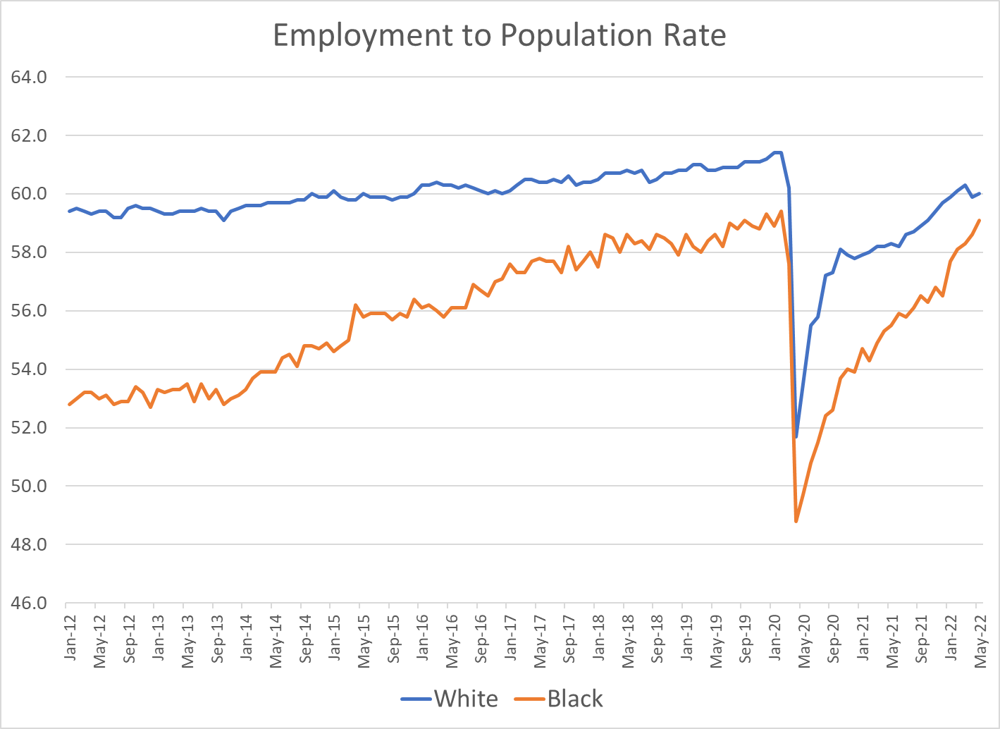
The economic recovery was relatively slow, but the economic expansion continued for a RECORD 10 years! This was followed by the pandemic recession which drove unemployment up to 15% in a mere 3 months!! In 2 years, with a never before encountered global pandemic raging and evolving, the US unemployment rate dropped from 15% back to 3.6%!!! It has since levelled off at 3.6%, just shy of the 3.5% rate before the pandemic. This is an AMAZING outcome for the economy and our citizens
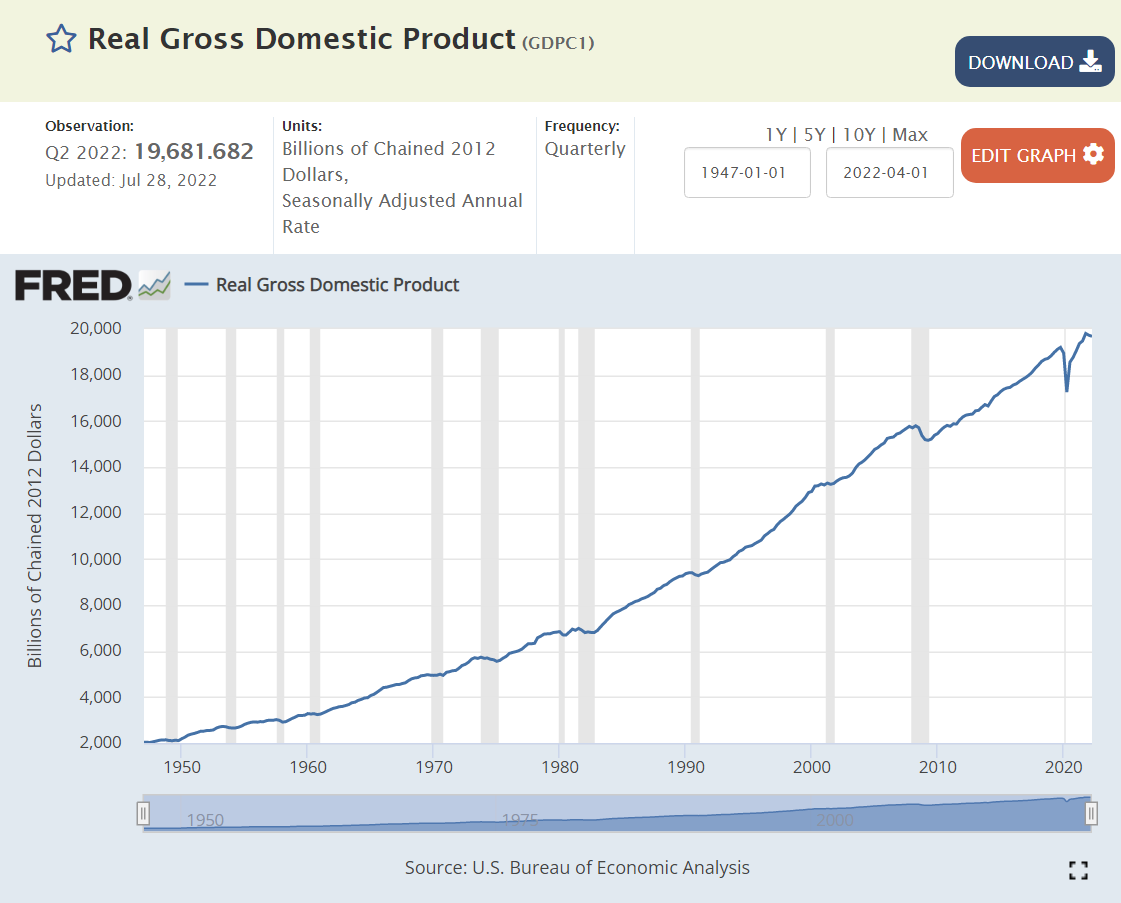
Since WWII (1947), the real, inflation adjusted, “no fooling”, GDP of the US has increased TEN-FOLD! We can honor the “greatest generation” and the country’s sacrifices to win WWII, but the economy in the 1940’s was less than 10% of the size that it is today. This is a true “order of magnitude” change. The economy has rotated from agriculture to manufacturing to services and trade.
The real economy is THREE TIMES as large as it was when Reagan was debating Carter in 1980.
It is 25% higher in 2022 than it was in 2008, despite two major recessions.
Unemployment measures the available labor capacity that is unused. The Depression saw extended periods of 20% unemployment. The post-war period enjoyed low 4% level unemployment through 1957. The next 7 years were above 5%, setting a new expectation of what the reasonable, long-term, natural, non-accelerating inflation rate of unemployment (NAIRU) was. The next 6 years of Vietnam and social welfare spending drove a 4% average unemployment rate which most economists believed was unsustainable and which eventually drove significant increases in inflation. The 1970 recession drove unemployment above 5% where it stayed for nearly 30 years, before finally starting with a 4 in 1997. Unemployment remained below 5% for 3 years, touching a 4% low before the millennium recession. Unemployment then averaged a sustainable 5%+ for the next 6 years, reaching a low of 4.5%.
So, when unemployment rocketed up to 10% in the Great Recession, no mainstream economist expected it to return to less than 4% soon, maybe never. Unemployment eventually reached 5.0% by the end of 2015. Professional economists were sure that it had reached its bottom. But Mr. Market, Dr. Copper and Senor Economy had news for the pundits. Consistently through the next 4 years, unemployment declined another 30% from 5.0% to 3.5% without triggering increased inflation.
The subsequent reduction of unemployment from 15% to 3.6% in 2 years is an incredible result reflecting a robust economy.
Next, let’s turn to a set of global comparisons to gauge if we are “better off”.
Just 12 Countries Account for 70% of Global GDP
US, China, Japan, Germany, UK, India, France, Italy, Canada, S Korea, Russia and Brazil provide the framework for evaluating global economic results today.
https://data.worldbank.org/indicator/NY.GDP.MKTP.CD?locations=JP-DE-BR
US Unemployment Rate is Low
India, France, Italy and Brazil are saddled with 7% unemployment rates, double the US level. Canada and China encounter 5% unemployment. The UK, South Korea and Russia enjoy below 4% unemployment rates with the US. Japan and Germany glory in sub-3% rates. The 12 country average is 5.3%, almost 2 points above the US 3.6% rate.
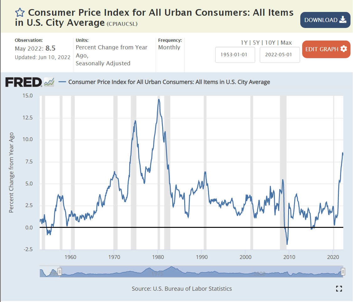
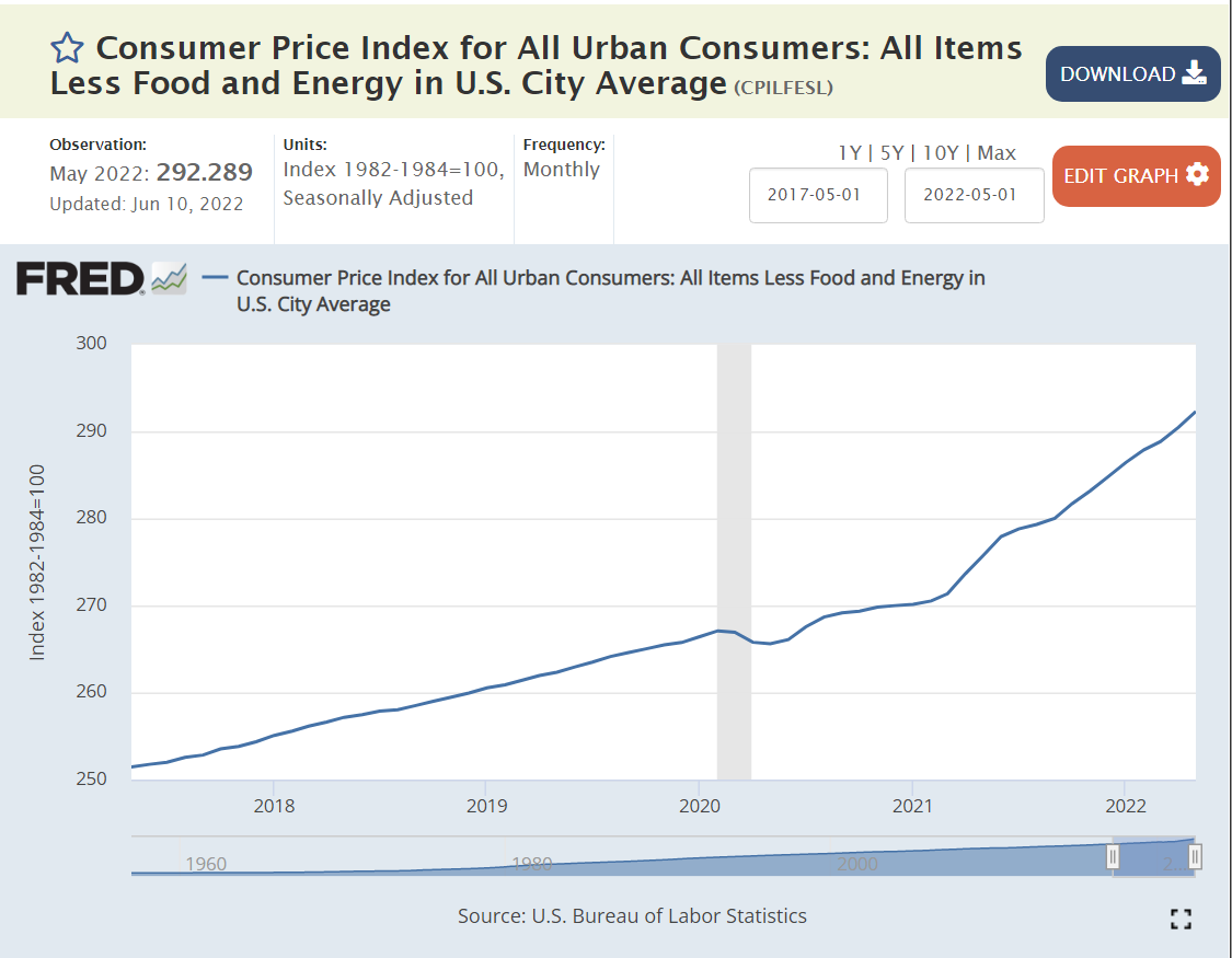
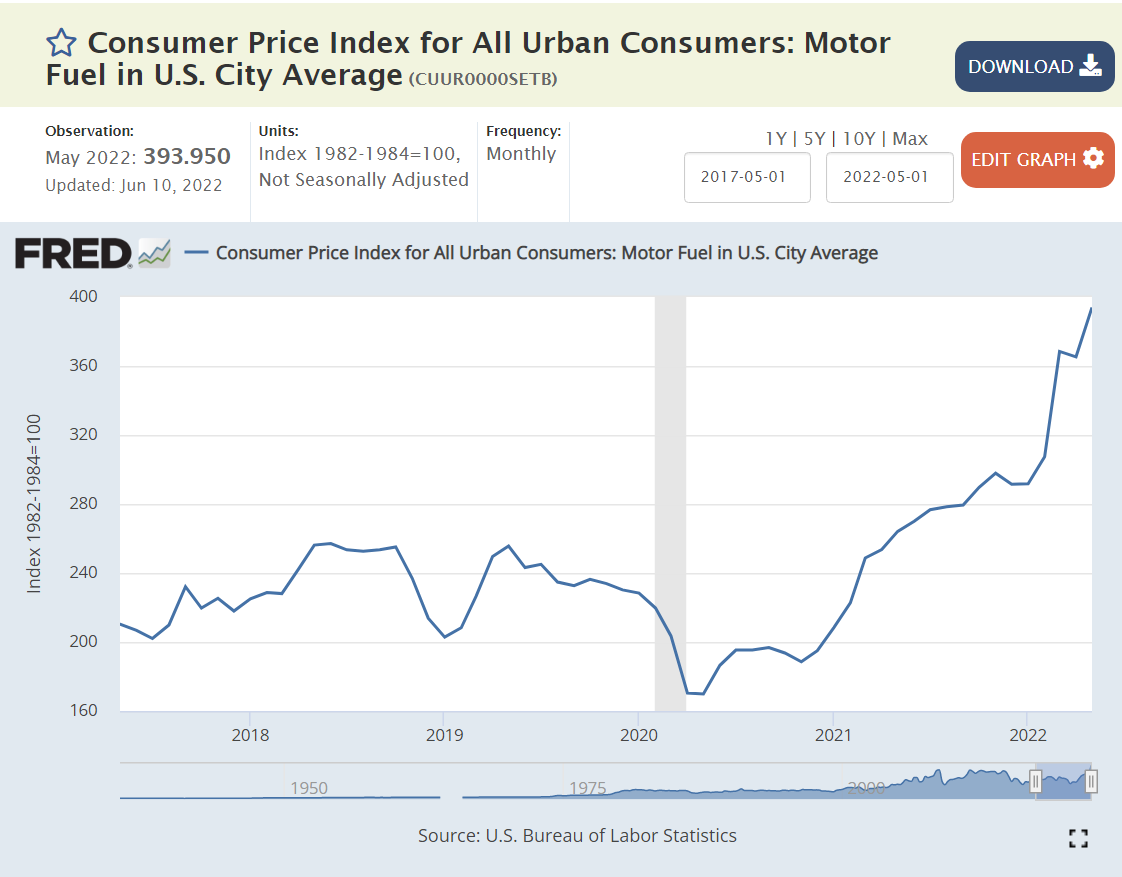
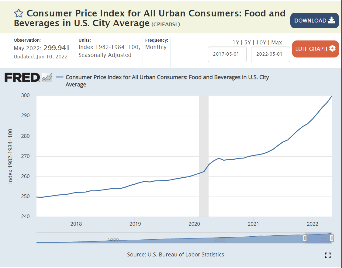
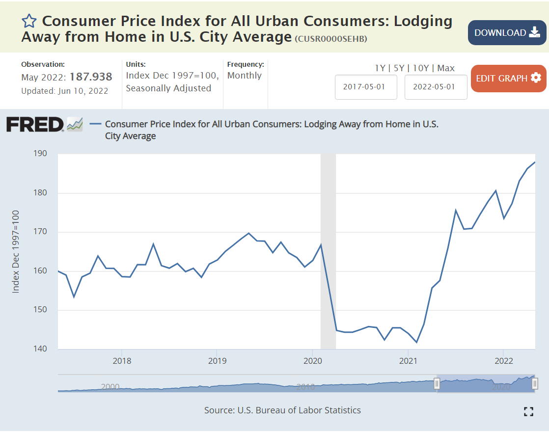
US Inflation Rate is Above Average
The most recent 9.1% annualized US inflation rate is above the 7.7% average. Russia and Brazil are struggling with 10%+ inflation. Canada, Italy, India, UK and Germany face 6-7% inflation. France and South Korea encounter 5% inflation. Japan and China see just 2% inflation.
Combining the unemployment rate and inflation rates to create a “misery index”, the US scores 12.7%, just above the 12.2% average.
The US Remains the “Big Dog” in the Global Economy
At 24% of global GDP, it is first. China and Japan together add up to 24%. The remaining 9 large countries add up to just less than 24%. Being large provides the advantage of a larger domestic market that attracts investors, entrepreneurs, researchers, supplier, labor, traders, etc. On the other hand, continuing to grow in the same percentage terms through history or compared with smaller countries as the largest economy is a handicap. (This is a great graphic worth exploring for a few minutes)
US Leads in Per Capita Income by a Wide Margin
US reports $63,200 per year. Germany, Canada, UK, Japan and France range from $39K – $46K, roughly two-thirds of the US level. Italy and South Korea check-in at $32K, about one-half of the US level. China and Russia earn $10K annually, while Brazil ($7K) and India ($2K) lag further behind.
https://www.investopedia.com/insights/worlds-top-economies/
US Gross Domestic Product Increased 8% from 2019 to 2021
GDP figures are not widely available for the first half of 2022 for countries, so we can use the pre-pandemic 2019 compared with the late pandemic 2021 to gauge recent economic performance.
The US GDP in 2021 was 8% higher than in record breaking 2019. It increased by $1.63 trillion in 2 years. Global GDP in 2021 was $90T. US GDP grew from $21.37 to 23.0 trillion.
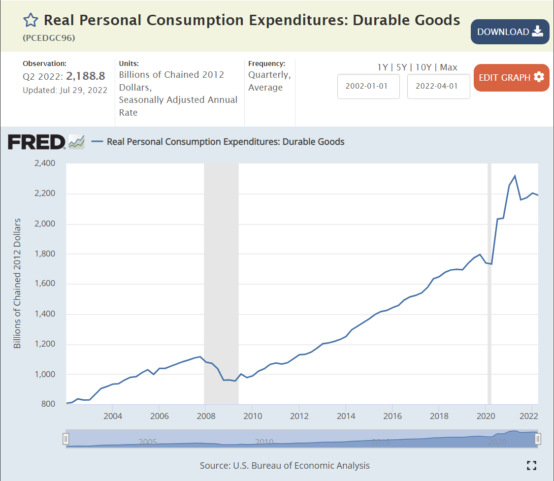
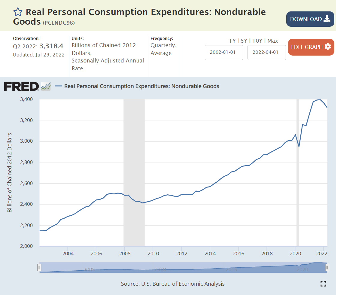
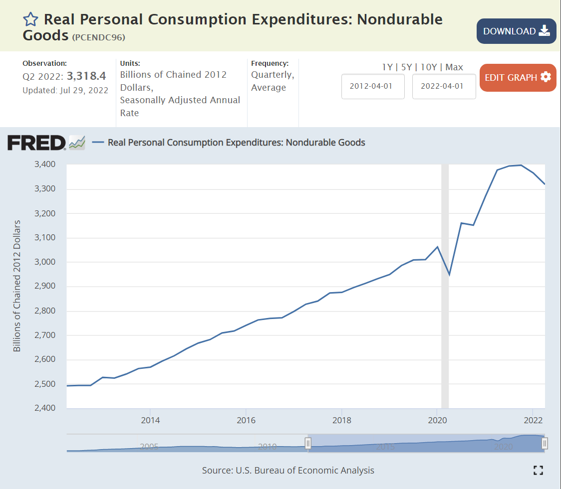
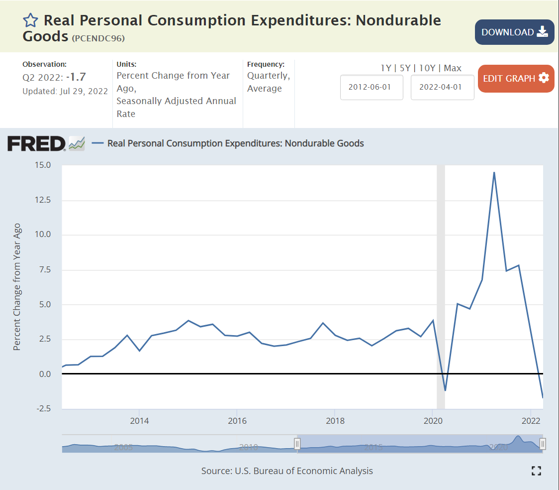
China (factory to the world), in a period when demand for durable goods increased by 20% and nondurable goods by more than 10%, grew even faster, from $14.3 to 17.7 trillion, an increase of $3.4 trillion. I believe this is overstated somehow, given other data that indicates 6-7% annual growth in China each year, but it’s first place two-year ranking is clear.
The other 10 major economies combined grew from $26.4 to $27.7 trillion, an increase of $1.3 trillion, totaling less than the US $1.6 trillion growth. Their 5% combined growth rate trails the US 8% growth rate.
In percentage terms, the UK, India and Canada grew by 10% or more. Germany, France and South Korea grew by 8-9%. Russia and Italy grew by 5%. Japan and Brazil endured economic declines.
https://data.worldbank.org/indicator/NY.GDP.MKTP.CD?locations=JP-DE-BR
US Leads Long-term Stock Market Gains
From the end of 2012 through July, 2022, almost 10 years, the US Standard & Poor’s stock index gained 175%. Fast growing India and previously undervalued Japan reported the same kind of amazing 10 year returns, compounding at more than 11% annually. Germany, France and Brazil grew by a decent 75%. Resource based Canadian and previously overvalued Chinese stocks gained a modest 50%. The UK, Italy and South Korea edged up by 25%, while Russia dropped by 25%.
Stock market returns reflect relative initial evaluations, changes in investor preferences, terms of trade and the underlying profitability/sustainability of each country’s economy. By this measure, the US has a very bright future.
US Leads Short-term Stock Market Returns
Comparing July, 2022 with a pre-pandemic base of December 31, 2019 shows a 25% gain for the US, Japan and India, even with the 20%ish stock market declines in the first half of 2022. Canada and South Korean markets are up a respectable 10%. China and France report a modest 5% gain. Germany and the UK show no gain. Italy, Russia and Brazil are in the 10% loss range. Even with strong gains from 2012 through 2019, the US stock market lead the world through the pandemic recovery period.
Summary: Very Solid US Economy
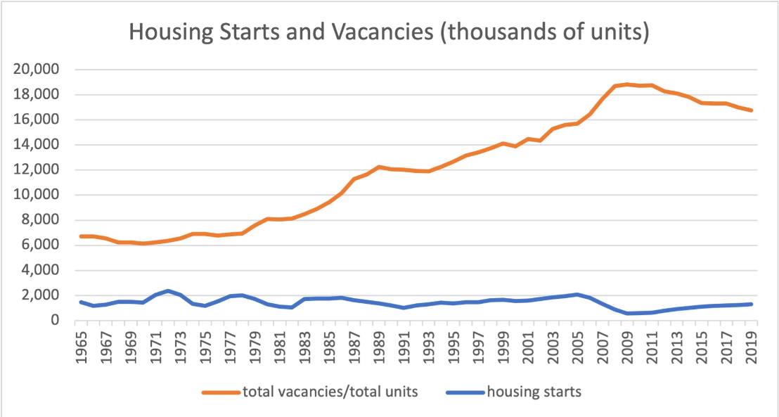
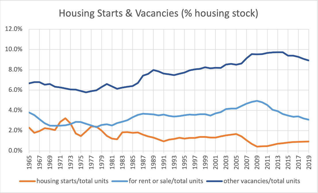
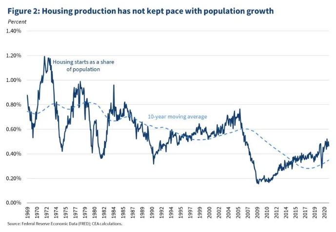
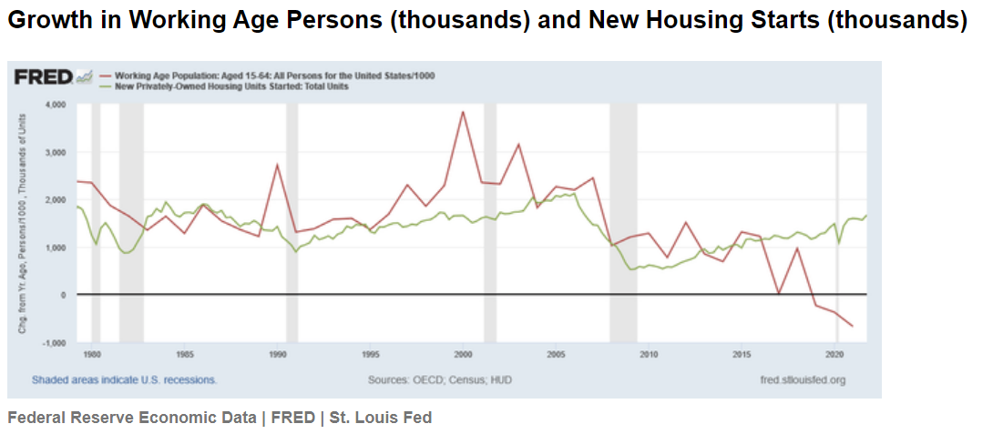
US inflation has returned to threatening levels and consumer confidence has fallen sharply while confidence in the incumbent president has continued to decline. The current “mood” is negative despite many positive economic factors such as the labor market and growth in GDP, housing and stock values. We are having journalistic, academic and partisan debates about hanging the “recession” label on the economy.
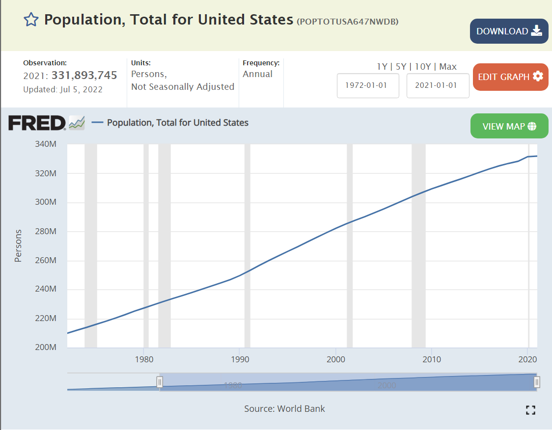
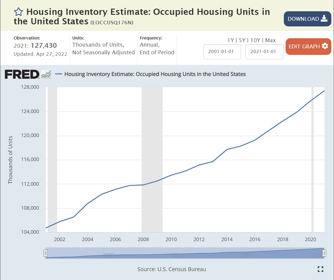
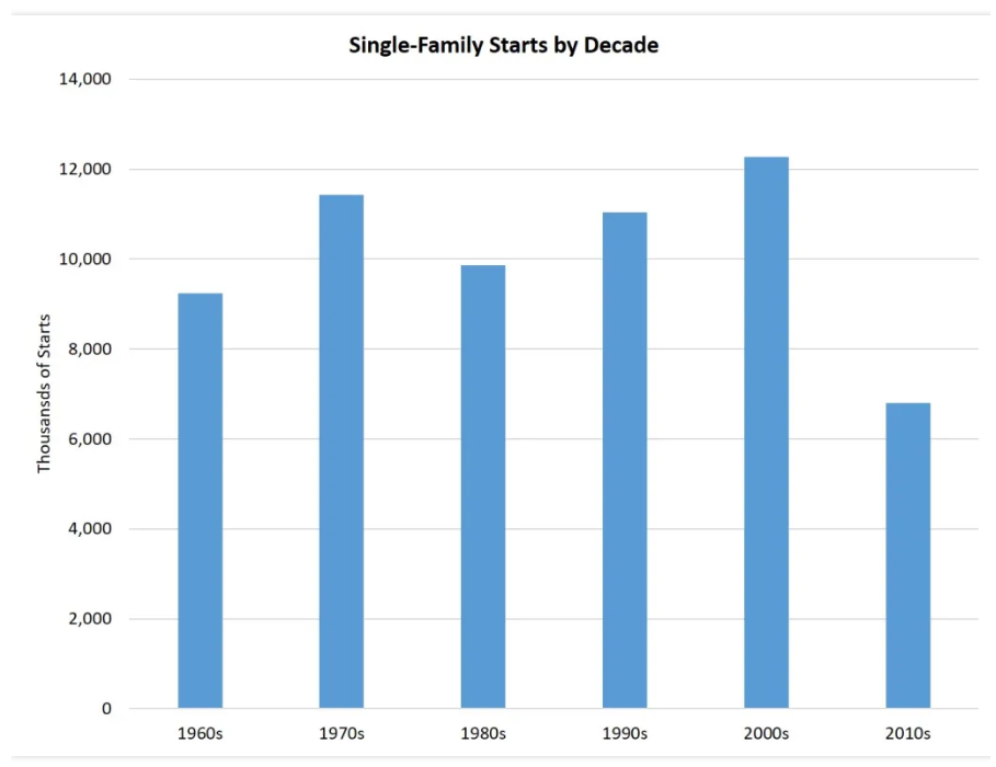
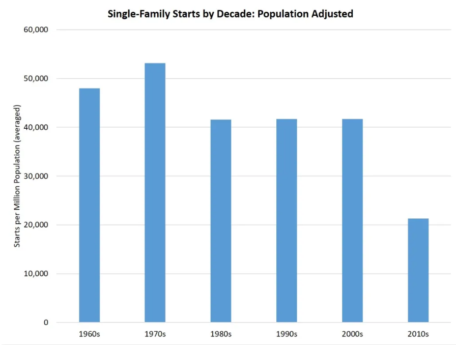
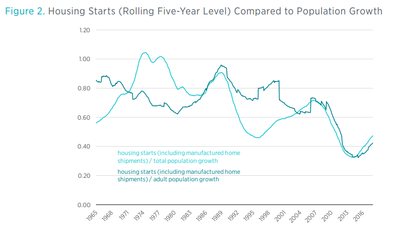
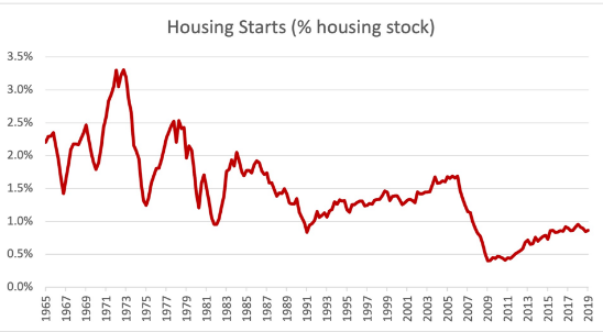
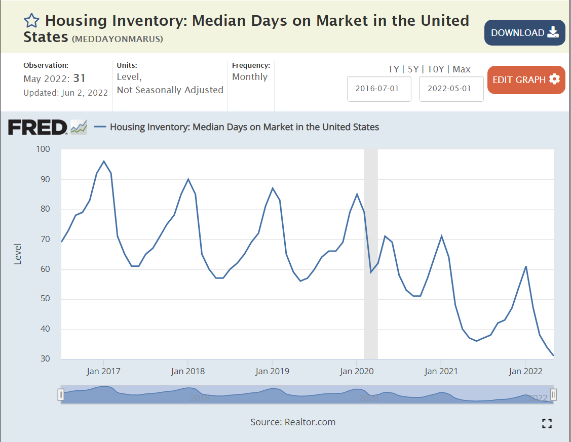
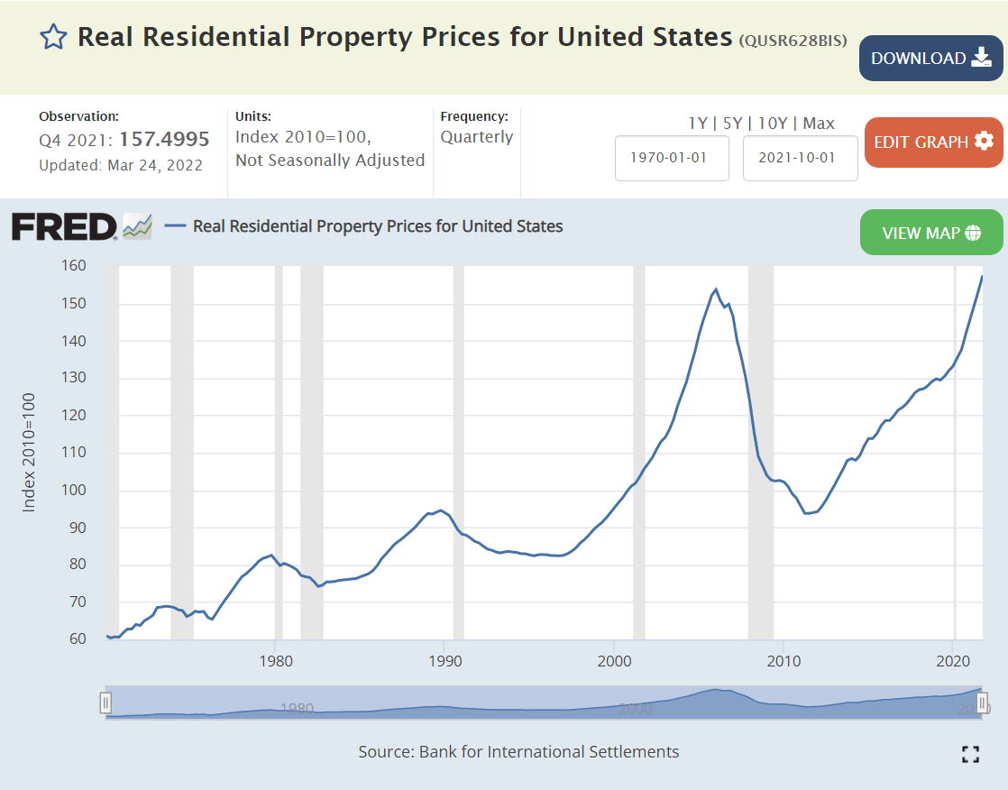
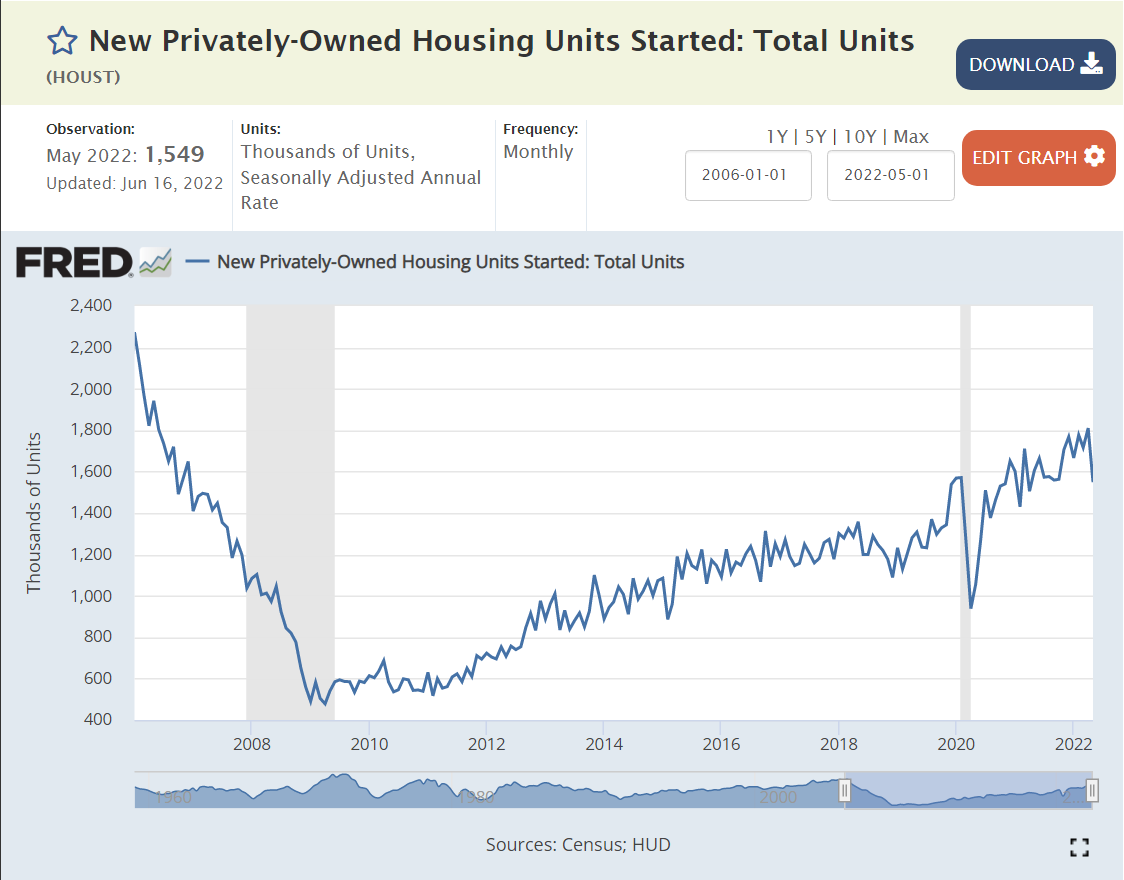
Big picture, the US economy is in great shape. It continues to grow, employ labor, increase wages, export, generate profits and build asset values. The economy worked through a “once in 100 years” global pandemic, with limited long-term economic damage.
There is a risk of a recession, even a moderately painful 3-5% downturn. There is a risk that inflation will remain elevated for more than 1 year, reducing the value of wages and assets. But these are normal business cycle issues, not the “end of the world”. The responses of consumers, investors, suppliers, businesses, bankers, central bankers, regulators and … politicians to the last two recessions were constructive and helpful. We have the ability to work through our current economic headwinds if we choose to do so.