Good News: State Pension Funding is at a 13 Year High!

Background

Most states and local governments have chosen to pay their employees less than market salaries and higher than market fringe benefits since the WW II era. The Republican focus on reducing the size, pay and power of government has increased significantly in the post-Reagan era. Grover Norquist summarized this in 2001: “I don’t want to abolish government. I simply want to reduce it to the size where I can drag it into the bathroom and drown it in the bathtub.” Hence, Republicans have focused the spotlight on the “underfunded” status of state and local government fringe benefit plans, especially defined benefit pension plans.

Although the rhetoric is sometimes grating to the “left” ear, this spotlight does serve as a disinfectant, requiring political leaders to be more accountable for their decisions, especially in “one party” states where accountability was lacking historically.

On the other hand, pension accounting, funding, goals and policies are inherently complex and difficult to simply summarize or explain. This is true for both government and corporate defined benefit pension plans. It is easy to “cherry pick” pension statistics and overexaggerate the “crisis” in state pensions.

I will focus on the data and commentary from just 2 sources: Reason.org, a right-leaning policy group that cleverly adopted a left-side name and Pew Research, a centrist research group that has chosen to emphasize right-leaning data and commentary on this topic.

Current (2021) Good News

https://www.pewtrusts.org/en/research-and-analysis/issue-briefs/2021/09/the-state-pension-funding-gap-plans-have-stabilized-in-wake-of-pandemic
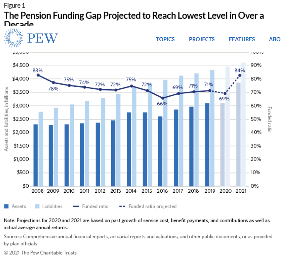
  1. The average state pension plan funding level, the ratio of assets to forecast liabilities, is expected to reach 84% when final 2021 data is summarized. This is a huge improvement from the 70% average of the prior 5 years. It is the highest level since 2008.

2. The system is working. Plan assets were $2.3T versus $2.8T in 2008. Assets grew by $1.5T to $3.8T, while liabilities grew by $1.8T to $4.6T. Since the added $1.5T/$1.8T is 5/6ths or 86%, the overall ratio increased. The “system” of policies, accounting, audits, contributions, investment strategies and actual investment returns, etc. appears to be functional across a quite challenging economic period. The funding ratio was relatively consistent throughout this period, even if it was not at the 100% level highlighted by some as “the goal”.

3. The gap between estimated liabilities and funded assets is less than $1T for the first time since 2014.

4. For the first time in this time period, the minimum expected funding level has been met. This is defined as a year in which contributions exceed benefits plus the “amortized” funding requirements based on past funding shortfalls. In 2014 only 17 states met this standard. In 2019, 35 states complied. Again, this is not perfection, but it is significant progress.

5. Overall contributions have increased by 8% annually. The states with the lowest funding ratios have increased their contributions even faster. The lowest 10 rated states growing by 15% annually and the 4 worst states by 16%.

6. A measure of benefits paid minus funding contributions, as a percentage of plan assets, has improved from 3% more benefits to 2.5% more benefits paid versus new funding contributions.

Historical Commentary

The Trillion Dollar Gap (2010)

https://www.pewtrusts.org/en/research-and-analysis/reports/2010/02/10/the-trillion-dollar-gap

The Funding Gap (2016). Funding ratio 66%. Few states reach 90%.

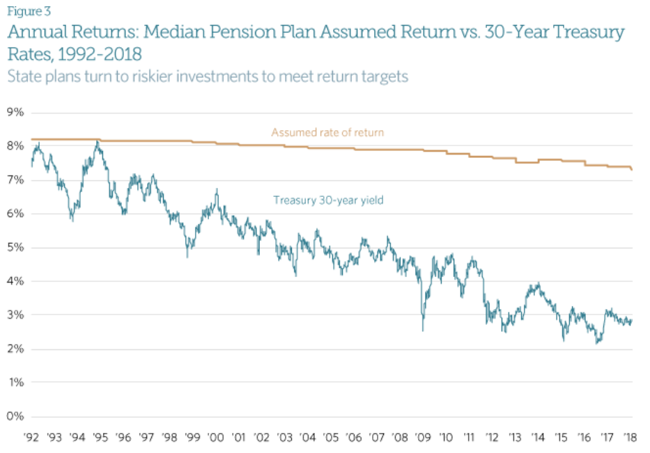
Bond interest rates have fallen faster than pension plan expected returns. Of course, because equity returns are much higher, more volatile, difficult to forecast and a higher share of plan assets.

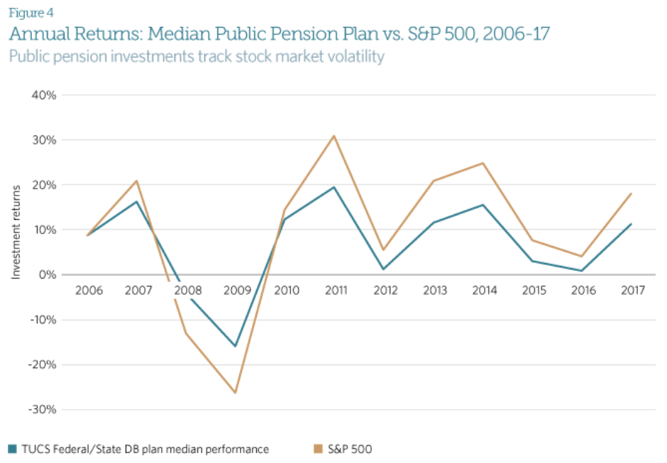
State pension plan returns trail the S&P 500 returns. Of course, because plans hold significant (30-40-50%) in lower yielding bonds.

A lower “discount rate”, the assumed future interest rate used to calculate the present value of future pension benefits/liabilities, will increase current liabilities and the current net liability. Yes, this is how discounting works. As market interest rates and stock returns have been reduced with lower inflation rates, the discount rate used by financial professionals in all applications has slowly declined for the last 20 years. This “sensitivity analysis” is misleading. The sensitivity of present liabilities is inherent, it cannot be avoided.

Some states have amortization rates, the amount of new contributions required to eventually offset prior funding or investment return shortages, that are quite high compared to their annual payrolls. This is true. 7 are above 5% deficits, but 7 are above 5% surpluses.

Pew highlights what they call the “operating cash flow” ratio as another sign of trouble. Contributions minus benefits paid as a ratio to assets is the definition. The result is negative!!!! And increasing to negative 3%! Contributions should almost always be less than benefits paid in a long-term (20-30-40 year) pension plan because the plan trustees assume that there will be some positive return on plan assets. Given a 2/1 equity to debt mix, with 7% to 3% expected returns, the expected plan return is more than 5%, so a 3% “negative” return is not a concern. The insurance industry operates in the same way with “negative” operating ratios being offset by investment returns.

Reason.org Graphics

This group highlights the extraordinary 100% ratio in 2001 versus the more normal ratios of 82% in 2005, the quite low level of 66% in 2012 and the still below average 74% level in 2019. They provide state by state graphics to highlight the decline since the very high 2001 baseline and to emphasize the count of states that are below 90%, 80% and 60% “funded”.

Their websites do not allow their graphs to be linked/captured.

Reason.org breaks 2 rules. First, they implicitly assume that a 100% funding level is the “obvious” goal. That is untrue. Historically, US corporations and actuaries considered 80% to be a “fully funded” target. More was better. A little less was worth watching (70-75%). Much lower required increased focus and contributions. Due to the inherent uncertainties in investment returns and participant assumptions (lifespan, retirement dates, turnover, average salaries, etc.) short-term movements of 2-3-5% were never considered to be an issue. Long-term or persistent ratios significantly below 80% were considered to be a concern.

Second, they assume that all states will perform at the same level. The “laws” of probability prohibit this “ideal” result. In a normally shaped (bell curve) probability distribution, there will always be underperforming and overperforming states. This is inherent in a multiple probability-based system. Of course, if a state remains at the bottom of the funded percentage list for more than 5 years, it probably does have a challenge to face.

Pew Emphasizes Risks in 2021

https://www.pewtrusts.org/en/research-and-analysis/issue-briefs/2021/09/the-state-pension-funding-gap-plans-have-stabilized-in-wake-of-pandemic

  1. Greater state pension contributions have “crowded out” other spending and reduced states’ ability to respond to emergencies. Well, you can’t have it “both ways”. States have responded to the shortfalls highlighted since 2000 with greater contributions. This has improved the funding level despite the Great Recession, the slow recovery and the pandemic challenge.
  2. The recent funding level improvement is due to a “one-time” stock market return in 2021. Yes, stock market returns, both gains and losses, are volatile. That is why pension plans use long-term expected returns for stocks and bonds. That is why pension funds use longer time periods (10 years) to amortize the annually calculated gains or losses into the “required” contributions. Yes, a significant part of the increase from 70% to 84% funded is a short-term increase of investment returns, and probably unsustainable.
  3. The stock market is volatile. Recently. Yes, a once in a century pandemic drives increased volatility. Stock market volatility through time and across markets is well understood as a probability function with mean expected real percentage returns and a predictable range of returns volatility. All investors face this volatility and manage portfolios accordingly. As state pension plans have grown in value, they have been able to hire competent investment advisors.

4. Economic growth is slowing. Some assert this. Others disagree.

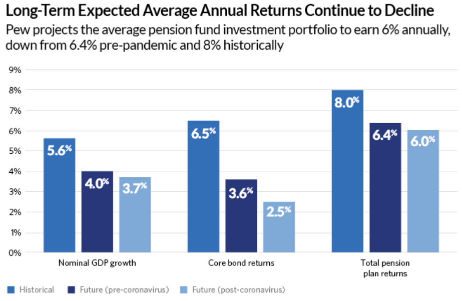
5. Future stock and bond returns will be lower, per Pew. The long-term decline in inflation does drive investment returns lower. The increased efficiency of financial markets, including global investment flows, also drives returns lower. However, pension plans have reduced their expected annual returns. Recent stock market volatility indicates that equity returns may not decline.

6. Increased funding of underfunded pension plans can be portrayed as “increased spending”, rather than the required adjustments for those plans which had historically lower investment returns, contributions or higher ultimate benefits.

Summary

State and local governments are faced with managing inherently variable pension plan decisions. They have choices to make about plan policies, goals, funding, investment policies, audits, advisors, etc. An 80% funded level goal (not 100%) is supported by 100 years of experience around the globe, in public, private and not for profit sectors. The increased publicity/focus on underperforming states and municipalities has forced these public bodies to make tough choices regarding defined benefit versus defined contribution plans, benefit levels, retirement ages, investment policies and advisors. Following the Great Recession, states struggled to increase their funding, but they did not allow the average funding level to fall below 70% for more than a year at a time. On a cumulative basis, they have increased their contributions, reduced benefits and captured the long-run benefits of equity investments.

The increased scrutiny of funding levels in state and local government defined benefit pension plans has forced elected officials and their professional advisors to address shortfalls in pension funding. This is very good news.

Red and Blue States: Federal Government Net Spending Subsidies

Using Current Senators to Denote 22 Red (Republican), 22 Blue (Democratic) and 6 Mixed states

Republican states (including 1/2 of mixed) contain 43% of population. Democratic states 57% of population.

https://www.infoplease.com/us/states/state-population-by-rank

Latest (2017) Analysis Shows Federal Revenues of $3.1T and Expenses of $3.7T (20% extra spending).

https://www.voanews.com/a/which-us-states-get-more-than-they-give/4809228.html

Some States Subsidize; While Others Are Subsidized

https://www.voanews.com/a/which-us-states-get-more-than-they-give/4809228.html

I have mapped this data onto the “Red vs. Blue” states list based on current senators.

Red (Republican) States Benefit Greatly

Democratic states pay 63% of all taxes, 5% more than their population share and 13% more than their senators’ (power) share.

Federal expenditures in Democratic states are 58% of the total, more than 4% less than their share of revenues contributed. Federal expenditures in Republican states are 42% of the total, more than 4% above their share of revenues contributed. Hence the total gap is almost 9% of the total.

The referenced article focused on two measures: net dollar subsidy (expenses > revenues) and net dollar subsidy per person.

I’m going to use a slightly different measure. The large (20%) difference between total expenditures and revenues skews these figures. I’d like to assume that the “equal” situation is one in which each party’s states pays the same ratio of revenues to expenses (or conversely, expenses to revenues). I’ve standardized the figures assuming that the “neutral” state receives 10.6% more expenditures than it pays in taxes, the same level as the Democratic states. Hence, by definition, the Democratic states, in total, are “neutral”. Their $2.155T expenditure is 10.6% higher than their $1.948T revenues.

The Republican states have $1.168T of revenues paid to the federal government but receive $1.555T of local expenditures. This is 33% more expenditures than revenues, a huge extra (22%) budget deficit. If the Republican spending was just 10.6% higher than revenues, it would be $1.292T, with a deficit of “just” $0.123T. This is $0.264T less than the actual deficit of $0.387T.

Subsidized States (>$10B)

6 Democratic states receive subsidies of more than $10 billion, totaling $180B.

Georgia (15), Michigan (16), New Mexico (17), Arizona (26), Maryland (29) and Virginia (78). Most of this is due to the DC employment and contracting bias.

Twice as many Republican states receive major subsidies, totaling $246B; $66B more than the Democratic states.

Indiana (10), Oklahoma (13), Arkansas (13), Louisiana (14), Tennessee (19), Mississippi (19), Missouri (19), South Carolina (21), Florida (26), North Carolina (26), Alabama (29) and Kentucky (38). Ironically, much of this excess spending was started when Democrats controlled southern states through much of the twentieth century.

Subsidizing States

Texas sends $19B more revenues to the federal government than it receives in expenditures, the only large subsidizing Republican state.

Seven Democratic states provide major subsidies to the federal government, totaling $218B, for a net subsidy versus Republican states (Texas) of $199B.

Washington (10), Illinois (19), Connecticut (20), Massachusetts (26), New Jersey (34), California (46) and New York (63). These states have the highest per capita incomes, so with a progressive income tax system, they pay a disproportionate share of federal taxes. (The state and local tax limit on deductions for federal taxes is a big issue in these states).

Summary

The Senate’s seats are based on geography, providing a major benefit to states with more rural and less urban/metro populations, benefitting the Republican party today more than in previous decades when Democrats were competitive in some of these states. Southern and rural states (Red, Republican) have lower incomes and receive more federal spending than coastal states (Blue, Democratic). In total, the Democratic states are paying 63% of taxes, while receiving 58% of federal expenditures, yet have just one-half of the senators and political power to determine taxing and spending policies. This discrepancy serves to reinforce the increasingly polarized political environment in the US.

The US Political Split Grows

Dems Win Even Fewer Counties in 2016, But an Increased 64% of GDP!

https://www.brookings.edu/blog/the-avenue/2016/11/29/another-clinton-trump-divide-high-output-america-vs-low-output-america/

The rural versus urban split in American politics was very clear in the 2016 presidential election.

Trump Won 2016 in Rural Leaning Areas

https://www.brookings.edu/blog/the-avenue/2016/11/11/the-small-town-big-city-split-that-elected-donald-trump/

Democrats are the Metro Party, Representing Just 20% of the Land Area

Democratic Congressional Districts are Increasingly More Economically Productive

https://www.brookings.edu/blog/the-avenue/2018/11/16/americas-two-economies-remain-far-apart/

Larger Metro Areas Continue to Grow Faster

https://www.brookings.edu/research/countering-the-geography-of-discontent-strategies-for-left-behind-places/

Threat of Automation Job Reduction Haunts Republican States More

https://www.brookings.edu/blog/the-avenue/2019/03/25/automation-perpetuates-the-red-blue-divide/

Trump Counties Employment Growth Increased in 2018, Due to Cyclical Expansion of Maunfacturing

https://www.brookings.edu/blog/the-avenue/2019/05/06/trump-counties-may-be-winning-a-bit-more-but-their-prognosis-remains-dim/

Democratic versus Republican Local Economies Split Becomes Much Clearer by 2018

https://www.brookings.edu/blog/the-avenue/2019/09/10/america-has-two-economies-and-theyre-diverging-fast/

Dems represent just 20% of the US land area.

Dem GDP/district is 50% higher than Republican areas.

Dem district median income is 15% higher.

Dem district productivity is 75% higher.

Dem districts have 36% college degree holders versus 28%.

Reps have more basic manufacturing (56%) and agriculture/mining (60%).

Dem districts have more foreign-born population (20/8) and more non-white residents (50/28).

Biden Democratic Coalition Represents 71% of US $GDP

https://www.brookings.edu/blog/the-avenue/2020/11/09/biden-voting-counties-equal-70-of-americas-economy-what-does-this-mean-for-the-nations-political-economic-divide/

Democrats Represent 61% of GDP at Senate Level

Just 6 of 50 states have split US Senate representation. WV, OH, PA, ME, WI and MT account for slightly less than 10% of the 2021 US GDP.

Republicans have 2 Senators in 22 states, which account for $6.6T of GDP.

Democrats have 2 Senators in 22 states, which account for $10.8T of GDP.

Splitting the GDP for the 6 split states 50/50 results in $7.5T in Republican states and $11.7T in Democratic states. The Democratic states have 57% greater GDP in 2021.

The Democratic percentage advantage in 1997 GDP per state is identical. Republican states produced $4.5T while Democratic states produced $7.1T. Between 1997 and 2021, Democratic and Republican states grew at equal percentages. In dollar terms, Democratic states added $4.6T, while Republican states added $3.0T.

Percentages are difficult to digest. One way to compare the 2021 GDP of the two parties is to use “paired comparisons” and then examine the remaining non-paired states. 13 roughly equal pairs can be identified. WY-VT, AL-RI, ND-DE, ID-MA, KS-NV, MS-NH, AR-NM, SC-OR, LA-AZ, MO-CT, TN-MN, IN-MD and NC-MA.

The remaining Republican states have lower $GDP figures but can be mapped to equal $GDP Democratic states. IA+NE+SD=CO. FL+TX=CA. KY+AL+OK+UT=IL.

This leaves 6 states that represent the $4.5T (57%) Democratic state advantage: Michigan ($0.5T), New Jersey ($0.6T), New York ($1.5T), Virginia ($0.5T), Georgia ($0.6T) and Washington ($0.6T).

Summary

The Post-Trump Republican Party is distinctively different, representing a broader share of the American geography, but a smaller share of its income, production and diversity. This split reinforces the polarizing tendencies of recent decades, making attempts to find “common ground” at the national level more difficult.

US Murder Rates Up in 2020-21

https://www.cnn.com/2021/12/12/us/homicides-major-cities-increase-end-of-year-2021/index.html

Above: Another Murder in Bridgeport Neighborhood of Chicago, My Home 2010-18

https://crime-data-explorer.app.cloud.gov/pages/explorer/crime/crime-trend

1985-95 8/100K. 1999-2008 5.5/100K. 2009-19 5/100K.

1966-2020 Context. 1970-95 Very High Rates.

https://www.pewresearch.org/fact-tank/2021/10/27/what-we-know-about-the-increase-in-u-s-murders-in-2020/

Twentieth Century Context: US Has High Homicide Rates

https://en.wikipedia.org/wiki/Crime_in_the_United_States#/media/File:Homicide_rates1900-2001.jpg
https://www.jrsa.org/projects/Historical.pdf

Relative Violent Crime Rates

https://usafacts.org/data/topics/security-safety/crime-and-justice/crime-and-police/violent-crimes/?utm_source=google&utm_medium=cpc&utm_campaign=ND-StatsData&gclid=Cj0KCQjw8_qRBhCXARIsAE2AtRYrdjEGFcHhSe1xpRQXCK59y0pe3Dkh9pOCg2WBHhO3fRPrXWDCz0QaAuqYEALw_wcB

Firearms Involved in Homicides and Suicides

https://usafacts.org/state-of-the-union/crime/

Homicide Rate Up 30% in 2020, 5% in 2021

https://www.pewresearch.org/fact-tank/2021/10/27/what-we-know-about-the-increase-in-u-s-murders-in-2020/

Focus on Rates Per 100K for US or All Cities, Not Counts in Individual Cities

https://abcnews.go.com/US/12-major-us-cities-top-annual-homicide-records/story?id=81466453

Many Factors Proposed to Explain the Increase

https://www.vox.com/2020/8/3/21334149/murders-crime-shootings-protests-riots-trump-biden

https://www.theatlantic.com/ideas/archive/2021/09/america-having-violence-wave-not-crime-wave/620234/

Good News: US Property Crime Rates Cut in Half Since 1998

https://crime-data-explorer.app.cloud.gov/pages/explorer/crime/crime-trend
https://ncvs.bjs.ojp.gov/multi-year-trends/crimeType

Property Crime Rates Were Very High 1975-90

https://www.factcheck.org/2020/06/trump-wrong-on-crime-record/

FBI and Bureau of Justice Data Both Show Declines, Reporting of Crimes Remains Consistent

https://www.pewresearch.org/fact-tank/2020/11/20/facts-about-crime-in-the-u-s/

Property Crime Rates Have Fallen Despite Changes

https://porch.com/advice/most-urbanized-states
https://www.pewresearch.org/social-trends/2018/05/22/demographic-and-economic-trends-in-urban-suburban-and-rural-communities/
https://www.pewresearch.org/fact-tank/2020/08/20/key-findings-about-u-s-immigrants/
https://www.pewresearch.org/fact-tank/2021/08/23/most-americans-say-the-declining-share-of-white-people-in-the-u-s-is-neither-good-nor-bad-for-society/
https://www.pewresearch.org/social-trends/2020/01/09/trends-in-income-and-wealth-inequality/
https://theconversation.com/gun-violence-has-fuelled-enduring-trust-issues-for-many-americans-144413
https://www.pewresearch.org/social-trends/2014/03/07/millennials-in-adulthood/
https://www.pewresearch.org/fact-tank/2016/04/13/americans-divided-on-how-much-they-trust-their-neighbors/

Good News: US Coal Usage is Falling

https://en.wikipedia.org/wiki/Coal_mining_in_the_United_States
https://www.eia.gov/todayinenergy/detail.php?id=48696
https://en.wikipedia.org/wiki/Coal_mining_in_the_United_States

Exports First Exceeded 10% of Production in 2012

https://www.eia.gov/coal/annual/pdf/acr.pdf
https://www.eia.gov/coal/annual/
https://www.eia.gov/todayinenergy/detail.php?id=38172
https://www.eia.gov/todayinenergy/detail.php?id=37692
https://www.eia.gov/todayinenergy/detail.php?id=43895

Coal Accounts for 20% of Electricity Generation

https://www.csis.org/analysis/phasing-out-coal-us-electricity-increasingly-regional-challenge

https://en.wikipedia.org/wiki/List_of_coal-fired_power_stations_in_the_United_States

30% of Coal-Fired Power Plants Closed 2010-19

https://en.wikipedia.org/wiki/List_of_coal-fired_power_stations_in_the_United_States

https://www.eia.gov/todayinenergy/detail.php?id=50658

Up to Two-thirds of 240 Remaining Coal-Fired Power Plants to Close by 2028

https://www.reuters.com/business/energy/us-coal-fired-power-plants-scheduled-shut-2021-10-28/

https://www.eia.gov/todayinenergy/detail.php?id=50658

https://abcnews.go.com/US/wireStory/coal-fired-power-plants-close-wastewater-rule-81328300

https://www.newsweek.com/26-coal-fired-power-plants-14-states-plan-stop-burning-coal-due-new-rule-1652009

Remaining Coal-Fired Power Plants are Concentrated in a Dozen States

https://pubs.usgs.gov/of/1996/of96-092/Comp/main.gif
https://www.csis.org/analysis/phasing-out-coal-us-electricity-increasingly-regional-challenge

Coal Production and Consumption Temporarily Rebounded in 2021 as the Economy Recovered from the Pandemic and the Cost of Natural Gas Increased

https://www.iea.org/news/coal-power-s-sharp-rebound-is-taking-it-to-a-new-record-in-2021-threatening-net-zero-goals

https://www.cnn.com/2021/10/18/business/coal-power-climate-crisis/index.html

Good News: US Forests Are Growing

Forest Coverage is Up for a Century

Added 51M Sq Miles, 1987-2017: Size of North Carolina

Added 28M Sq Miles, 1990-2020: Size of South Carolina

Timberland Has Grown as Part of Total Forest

Healthy Stock by Volume, Diameter, Age, Carbon

https://usafacts.org/articles/how-us-forests-affect-the-environment-and-help-stabilize-the-climate/

https://crsreports.congress.gov/product/pdf/R/R46313

Annual Growth and Harvest are Sustainable

Ownership, Preservation, Management Plans

US in Global Context

Threats are Real, But Often Exaggerated

“Many challenges are associated with drought, wildfire, invasive species, and outbreaks of insects and disease—all made worse by climate change. Warming temperatures mean more energy in the atmosphere, which is consistent with severe weather events, such as floods, tornadoes, blizzards, ice storms, and hurricanes.” 

https://www.fs.usda.gov/speeches/state-forests-and-forestry-united-states-1

https://www.cnn.com/2019/07/20/health/iyw-cities-losing-36-million-trees-how-to-help-trnd/index.html

https://www.treehugger.com/more-trees-than-there-were-years-ago-its-true-4864115

https://usafacts.org/articles/how-us-forests-affect-the-environment-and-help-stabilize-the-climate/

https://ourworldindata.org/grapher/proportion-of-forest-area-with-long-term-management-plan?time=2020

Good News: US Foreign Aid

US Spends 1% of Federal Budget on Aid, Not 25%

Aid is 1% of Budget, Down from 1.6% in 1980

Aid is 1% of Budget, Down from 1.4% in 2006

https://crsreports.congress.gov/product/pdf/R/R40213

Real $ Spending Increase Driven by Terrorism Threats with Bipartisan Support

https://crsreports.congress.gov/product/pdf/R/R40213

US Leads in Dollar Spending, Trails in $/Person

US Accounts for 23% of Global Aid

US 0.2% of GDP is Very Low for Developed Nation

https://crsreports.congress.gov/product/pdf/R/R40213

Where Does the Money Go?

41% to economic development and commercial interests

35% to military aid and national security

20% for humanitarian purposes

The congressional report splits up the $48B as

Peace/security 16B

Health, Ed $9B

Humanitarian $9B

Economic Growth $4B

Governance $3B

https://crsreports.congress.gov/product/pdf/R/R40213

Where Does the Money Go?

Africa 25%. Middle East 25%. Afghanistan $5B, Israel $3B, Jordan $2B, Egypt, Iraq, Ethiopia, Yemen, Colombia, Nigeria, Lebanon $1B each. Top 10 $16B, one-third of total.

Criticisms of Foreign Aid

Limited evidence that specific country investments provide political returns

Limited evidence of anti-terrorism campaign effectiveness (counterexamples)

Weak administrative structure and oversight at all levels

Direct evidence of individual country economic growth due to aid is limited

Some autocratic governments have benefitted from aid

Some aid is diverted to corrupt governments and individuals

Specific high priority countries have provided weak returns (Egypt, Pakistan, Afghanistan, Iraq)

Higher returns could be gained from investing in Western Hemisphere, Eastern Europe.

https://www.cfr.org/backgrounder/how-does-us-spend-its-foreign-aid

https://www.npr.org/sections/goatsandsoda/2018/09/18/649155725/why-the-u-s-ranks-at-the-bottom-in-a-foreign-aid-index

Benefits

Health measures, disease rates, lifespans. Global health. Economic development results globally and in individual countries. US trade benefits from developing trade lanes. Global education. Increased number of democracies, commitment to mixed capitalist economies. Lower cost of defense. Terrorism activities thwarted. Improved strength of US alliances. Improved flow through NGOs, multilateral organizations improves effectiveness. Dollar allocation provides US policy leverage.

https://www.cfr.org/backgrounder/how-does-us-spend-its-foreign-aid

https://www.concernusa.org/story/foreign-aid-myths-facts/

https://www.pbs.org/newshour/world/column-addressing-myths-surrounding-u-s-foreign-aid

Good News: US and Immigrants

US is top desired destination for immigrants

https://news.gallup.com/poll/245255/750-million-worldwide-migrate.aspx

https://www.weforum.org/agenda/2017/11/these-are-the-countries-migrants-want-to-move-to/

New Zealand is Most Attractive Based on Immigrant Desires Per Destination Population

Best Countries to Migrate to

Immigrants “Vote With Their Feet”. 50 Million in US.

https://www.migrationpolicy.org/programs/data-hub/charts/top-25-destinations-international-migrants

US Remains a Welcoming Country, Overall