https://abc13.com/houston-we-have-a-problem-weve-had-remember-when-history/1869513/
Introduction
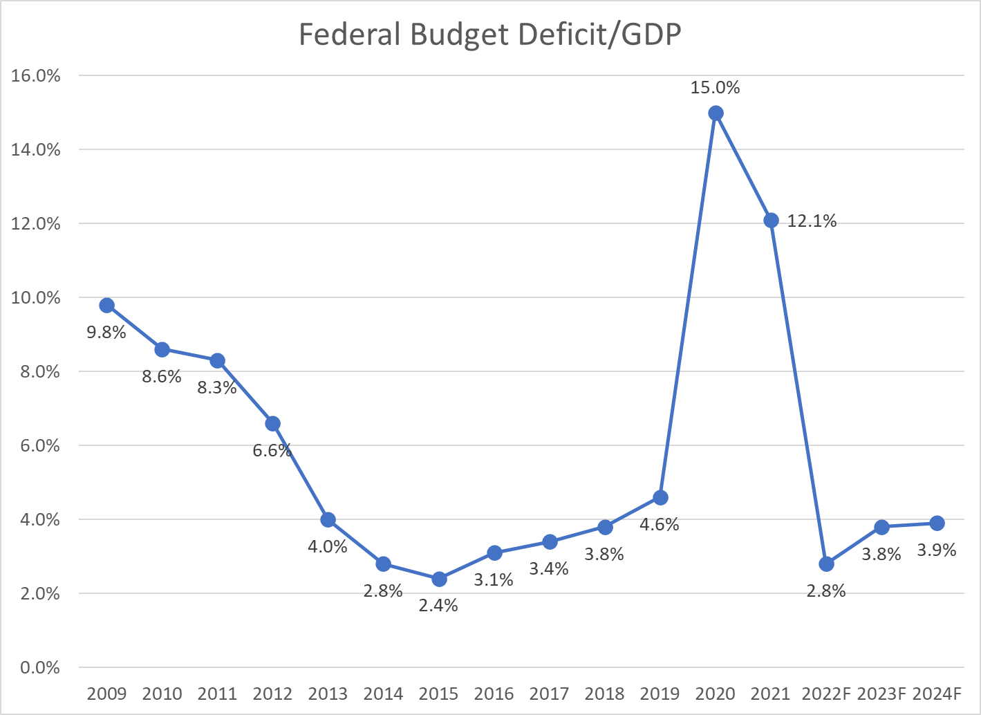
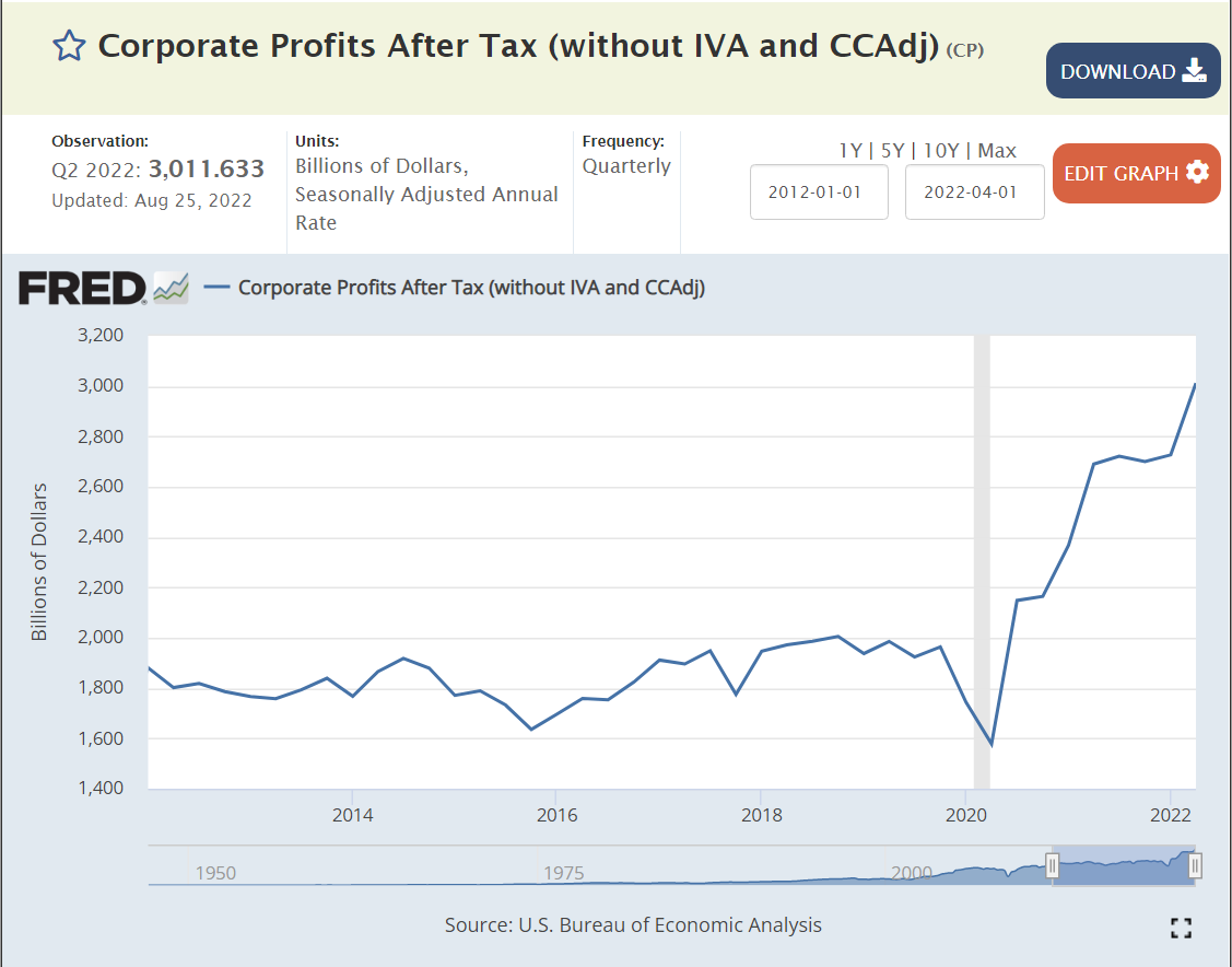
US Corporate profits grew from $1.9 Trillion(T) on an annual basis in the second quarter of 2019 before the pandemic to $3.0T in the second quarter of 2022; plus $1.1T (+57%)!!! US nominal gross domestic product (GDP) grew by 17%, from $21.3T to $24.9T, an increase of $3.6T. Real, inflation-adjusted, GDP grew by just 4%, accounting for a $0.8T increase in the real economy. Inflation grew by 13%, causing the other $2.8T of measured GDP. The $1.1T of increased corporate profits represents 39% of the inflation which has occurred in the last 3 years.
Analysis
Let’s look at the growth of US corporate profits from a half-dozen starting points to try to put this into perspective.


| Year | Profit | Real Profit | Annl Incr Stage | Cum Annl Incr |
|---|---|---|---|---|
| 1970 | 55 | 142 | ||
| 1980 | 273 | 271 | 7% | 6.7% |
| 1995 | 468 | 307 | 1% | 3.1% |
| 2006 | 1,388 | 628 | 8% | 4.5% |
| 2012 | 1,880 | 819 | 3% | 4.3% |
| 2018 | 1,947 | 775 | -1% | 3.6% |
| 2022 | 3,012 | 1,023 | 7% | 3.9% |
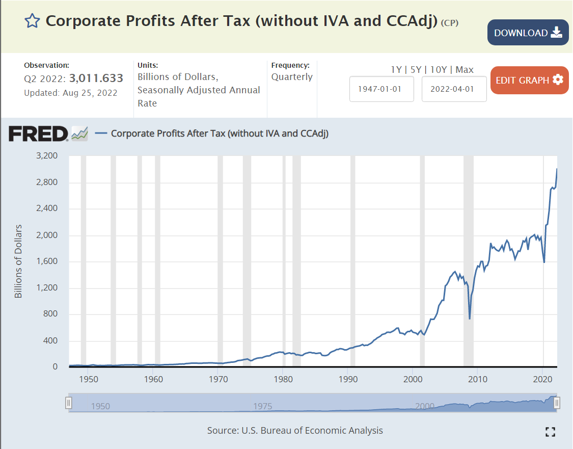
US corporate profits reached $3 Trillion in 2022, up from essentially zero in 1950. I’ve selected 7 peak profit years to outline this growth. Nominal profits increased from $55B in 1970 to $3.0T in 2022. In real, inflation-adjusted terms, profits have grown from $142B to $1,023B, a 7-fold increase in 52 years! Annual profit growth has been erratic, increasing by a high of 8% from 1995 to 2006 and a low of -1% from 2012 to 2018. The cumulative annual real profit growth has stayed near 4% throughout the period. 4% compounded for 52 years is a little more than 7x.
The US population grew from 200.3M to 338.3M during this period, 1.0% per year. So, corporate earnings grew by 3% per year above the rate of population growth for 52 years!!!! This kind of compound growth rate cannot continue for long periods of time without greatly impacting other sectors of the economy.
https://www.macrotrends.net/countries/USA/united-states/population

Corporate profits fluctuated in the 4-6% of GDP range from 1947 through 2000. Profits jumped up to 10% of GDP by 2010 and have largely remained at this two-fold elevated level for a decade. Profits reached a new record of 12% in 2022!


This measure shows profits growing eight-fold since 1970. (I’m going to ignore the detailed differences between the various measures of profit. They are important, but not necessary to see the major growth in profits, which is broadly consistent across the various measures.)

A tighter measure of corporate profits shows an increase from 4.5% to 7% of GDP, even before the most recent profit growth.

An alternate measure of just “domesticly earned” corporate profits shows a flatter trend.
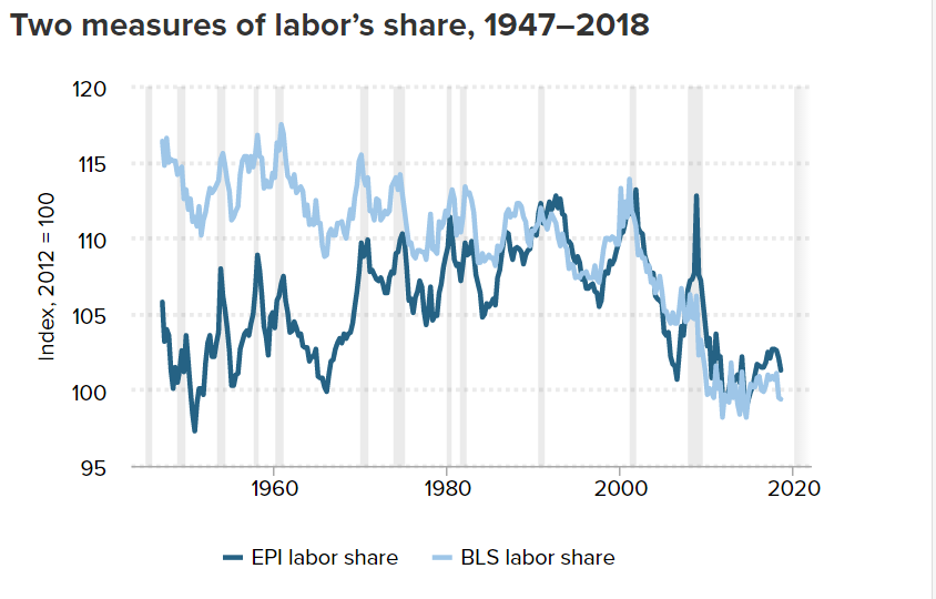
Another way to consider profits is to view its complement, the share of national income received by labor.
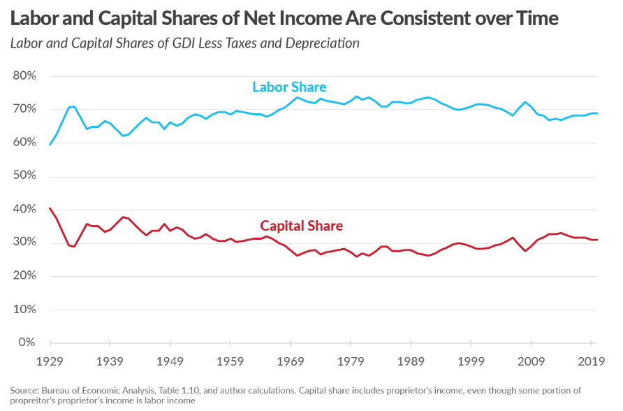
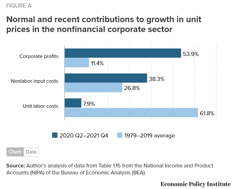
By this measure, labor has lost 10% of its income, while capital has gained 10% since 1980.

6% of GDP was moved from labor to capital.
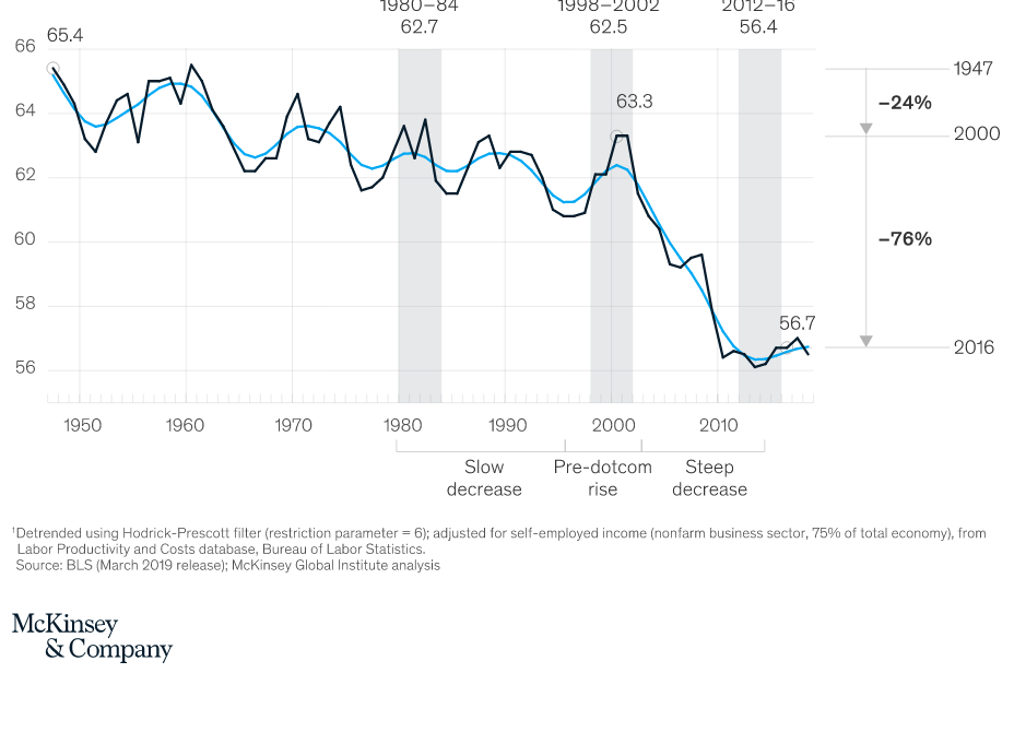
Consulting firm McKinsey shows an 8% of GDP transfer and provides 5 explanations.

Most analyses of the growth in profits and decline in relative wages note that labor productivity has continued to rise by 2% or more annually, but labor has received almost no portion of those gains in the last 30 years.

Labor share of total income has dropped by 15% in the long-run by this measure.

This author calculates a 6-8% decline for labor.
A right-leaning think tank adjusts the data and claims that labor’s share remains constant in the long-run. The Tax Foundation does delve into the various measures of income and provides arguments for their preferred measure.
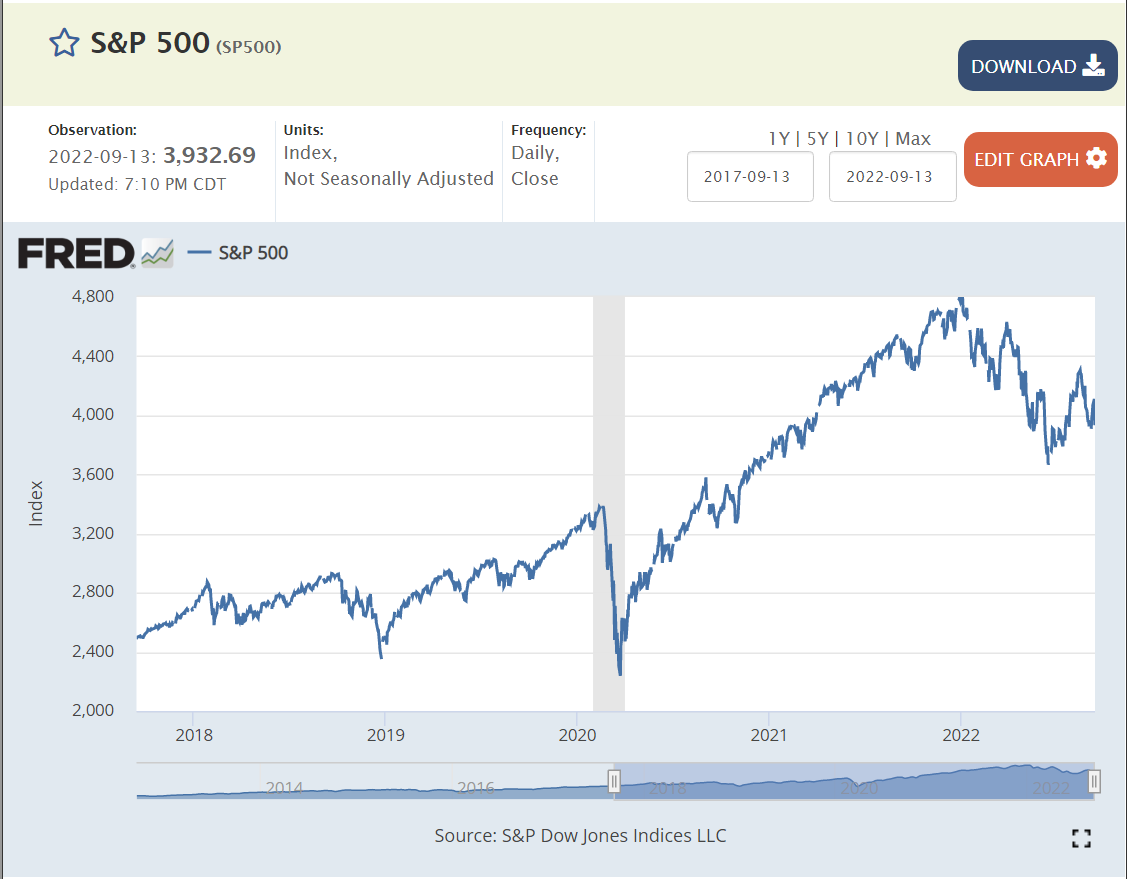
Stock prices tend to follow profits. The S&P 500 index has grown by 50% in the last 2 years (despite the recent decline), reflecting the amazing growth in corporate profits during a “once in a century” pandemic driven recession.
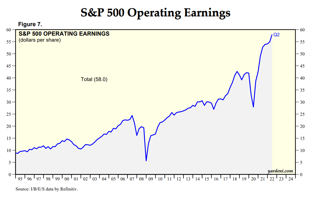
S&P 500 company earnings (a subset of total profits earned) continued to grow strongly through and after the pandemic.

This investment advisor says that profits increased by 5% of GDP.
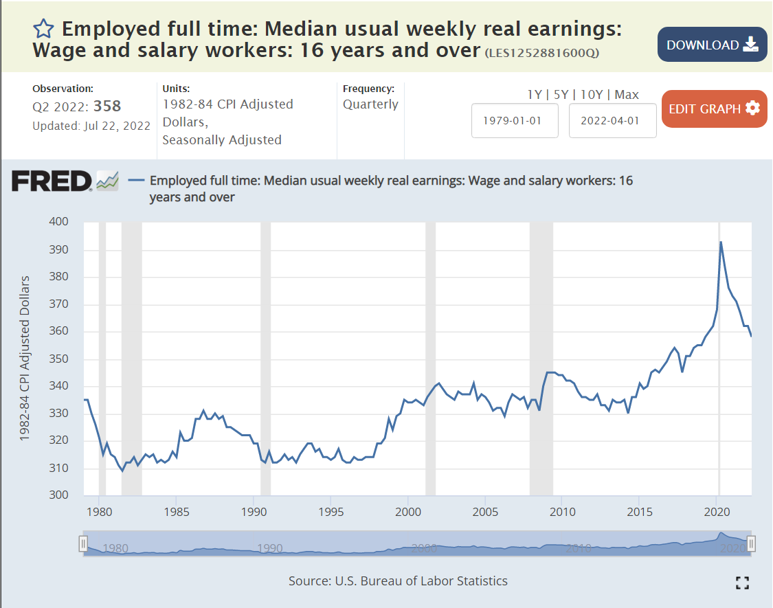
Median REAL, inflation-adjusted, earnings remained flat at $330/week from 1979 through 2014, a period of 35 years! This is during periods where profits were growing at 4% per year in REAL terms. In the last 8 years, REAL wages have increased by 9%, a bit better than 1% per year on average.
The media has published many articles, especially noting the increase of profits, overall, since before the pandemic. This is a popular topic because the result is certainly counterintuitive and because President Biden and the more left-leaning national Democrats have been criticizing corporations for “price gauging” and causing the recent inflation spike.
https://www.cbsnews.com/news/corporate-profits-boom-may-lead-to-higher-wages/
A variety of sources provide compelling data and logic to indicate that corporations are “taking advantage of” the post-pandemic inflation caused by supply chain issues and expansive fiscal and monetary policies to boost prices at rates faster than their costs of inputs (suppliers, labor, capital).
https://abcnews.go.com/US/record-corporate-profits-driving-inflation/story?id=87121327

Most economists and analysts point to the increased concentration of firms (fewer) by industry increasing their pricing power and allowing them to raise prices during periods of change.
https://academic.oup.com/rof/article/23/4/697/5477414
https://www.uschamber.com/finance/antitrust/industrial-concentration-in-the-united-states-2002-2017
This is pretty dense and dry stuff. There is a general consensus among economists who focus on this topic that concentration and pricing power have risen very significantly. This is partly due to the simple aging of industries with fewer players left standing. The winners in a world of global competition are simply “much better” than the losers so they continue to take market share. US anti-trust enforcement in the last 40 years has been very limited, following the theory that “open competition” in the long run (Schumpeter’s creative destruction) eventually undermines leading companies with innovative products, processes and market strategies.
The US Chamber of Commerce argues that industry concentration has not increased, noting that consumer choices in broadly defined industries have increased greatly through time.
https://www.uschamber.com/finance/antitrust/industrial-concentration-in-the-united-states-2002-2017
Summary
By a dozen measures, profit has consistently grown as a share of the American economy in the last 40-50 years. This necessarily means that the share of output and income received by labor is much smaller as a percentage of the total pie. The recent surprising ability of American corporations to effectively work through the pandemic supply chain disruptions, lose more than 10% of their labor force, increase nominal wages significantly, encounter severe input price inflation and still engineer price increases to come out much further ahead on profits is a major story for our time.
It is attracting attention to what I believe is an even more important story: the ability of corporations to incrementally capture nearly all of the increased value added by the productive American economy across 40-50 years and share very little with labor. This structural advantage of a very effective corporate sector “doing its job” within the relatively low-tax and low-regulation US political context is now completely proven.
In an ideal world, we would be developing and considering serious policy options that would limit this excess power without “killing the goose that lays the golden eggs”. Unfortunately, the Republican party remains focused on tax and regulation cuts as the main economic tools and the Democratic party alternates between 1960-70’s era Biden “centrist” policies and much further-left Bernie Sanders style policies.