I hiked in each of the 200 counties within 3 hours (210 miles) of Indianapolis during 2020-2021. I’d like to share hikes in 10 of the 60 counties within 110 miles of Indy.
Morgan-Monroe State Forest
Morgan-Monroe State Forest offers a variety of moderately challenging woods and stream valley hikes just an hour southwest of Indy. You might combine this with a hike in Yellowwood State Forest just 30 miles further south.
Portland Arch Nature Preserve is less than 90 minutes NW of Indy via I-74 and US 41 near the Illinois border. It features deep stream valleys, cliffs and a small “arch” with a stream running through it. Combine this hike with a visit to 90 foot high Williamsport Falls just 8 miles to the north or Shades State Park 35 miles to the south.
McCloud Nature Park is 40 miles WNW of Indy. Trails follow the hills and valley of Big Walnut Creek. Combine this with a hike in Big Walnut Nature Preserve 8 miles west, Sugar Creek Nature Park 30 miles NW or Fern Cliff Nature Preserve 30 miles SW.
Spring Mill State Park is 90 miles south of Indy, past Bloomington and Bedford via IN-37. This is limestone country. The park features history, steep valleys, hills, forests, lakes and an inn. Combine this with a stop at Cedar Bluffs Nature Preserve 30 miles north or Hardin Ridge Recreation Area on Lake Monroe 30 miles north.
Clifty Falls State Park is 90 miles SE of Indy. It features several trails that view waterfalls or rapidly flowing streams that are moving from the standard elevation of SE Indiana down to the Ohio River. Combine this hike with a visit to Madison, IN or Versailles State Park 30 miles north.
Calli Nature Preserve is located 70 miles southeast of Indianapolis along the Muscatatuck River. The short trail explores a small stream valley and the river valley. It is best visited when Spring wildflowers are in bloom. Combine this hike with a visit to Selmier State Forest just 5 miles north or Muscatatuck National Wildlife Refuge 12 miles to the west.
Versailles State Park is located 75 miles southeast of Indianapolis. The park features a lake and trails that follow streams/historic roads upland to the east. Combine this hike with a stop at Calli Nature Preserve or Selmier State Forest 20 miles to the west.
France Park is located 80 miles north of Indy in the Wabash River Valley. The park features a lake in an old quarry, overlooks, waterfall, a beach and some geological history. Combine this hike with a stop on the Nickel Plate Rail Trail between Peru and Kokomo 25 miles east.
Ouabache State Park is located 110 miles northeast of Indy, south of Ft. Wayne, about 30 miles from the start of the Wabash River in Ohio. This is still relatively flat, agricultural Indiana, but the park features pines forests, wetlands, a small lake and a herd of bison. Combine this hike with a stop at the JE Roush Fish and Wildlife Area 25 miles to the NW or the Loblolly Marsh 16 miles south.
Kickapoo State Recreation Area is 100 miles NW of Indy, just across the Illinois border. It features trails along the Versailles River in an area that was once only strip mines. Combine this with a visit to the Forest Glen Preserve 20 miles to the south or the Portland Arch 30 miles to the east.
Follow the Cardinal Greenway from Richmond, IN to Losantville to Muncie to Gas City to Marion. 60 miles of gently rolling terrain on a rail-trail, part of the American Discovery Trail.
Southwest of Bedford, IN, adjacent to Hoosier National Forest, Martin State Forest offers a variety of moderate to challenging hikes in the forested hills.
This area is mostly flat or slightly rolling and dominated by agriculture. Small forest preserves closer to Indianapolis. Larger parks in the Whitewater River valley east towards Ohio.
Large FWA adjacent to an active military base. Flat hiking trails.
Knobstone Trail is the highlight of Indiana Hiking. Pick a trailhead and enjoy. Check with your doctor to be sure you’re ready for repeated 400 foot climbs and descents.
Nice variety of rail trails, state and county parks, nature preserves, a quarry and an arboretum. This is mostly flat walking. St. Joseph County offers many options.
A village, a historic canal, a deep valley and a rail trail provide options in Delphi, along the Wabash. The bridge is under reconstruction, but you can hike up to one end and you can hike beneath it in the valley.
Travelers have come to know and love the outdoor recreational facilities of France Park, with scenic trails, beautiful waterfall, clear swimming lake with picturesque cliffs, quiet fishing areas, and spacious camping facilities.
The Nickel Plate Trail runs from Kokomo to Rochester. There are a dozen trailheads along its 40 mile length. Although mostly flat, this is a surprisingly scenic trail where it crosses 3 major rivers and approaches Lake Manitou south of Rochester.
The prairie and stream trails are enjoyable. The Gabis arboretum resources and gardens are nice. But the highlight is the outdoor model train and landscaping.
Potato Creek is west of South Bend. The trails take advantage of a lake, historical and planted areas. The state is investing in this park for the future.
The Erie Trail is a straight 20 mile rail-trail segment of the American Discovery Trail, starting north of the Tippecanoe River SP and heading WNW to North Judson, IN.
Located out of the way, near the headlands of the Wabash, this state park is more developed than expected, with a dammed lake, pine woods and bison area.
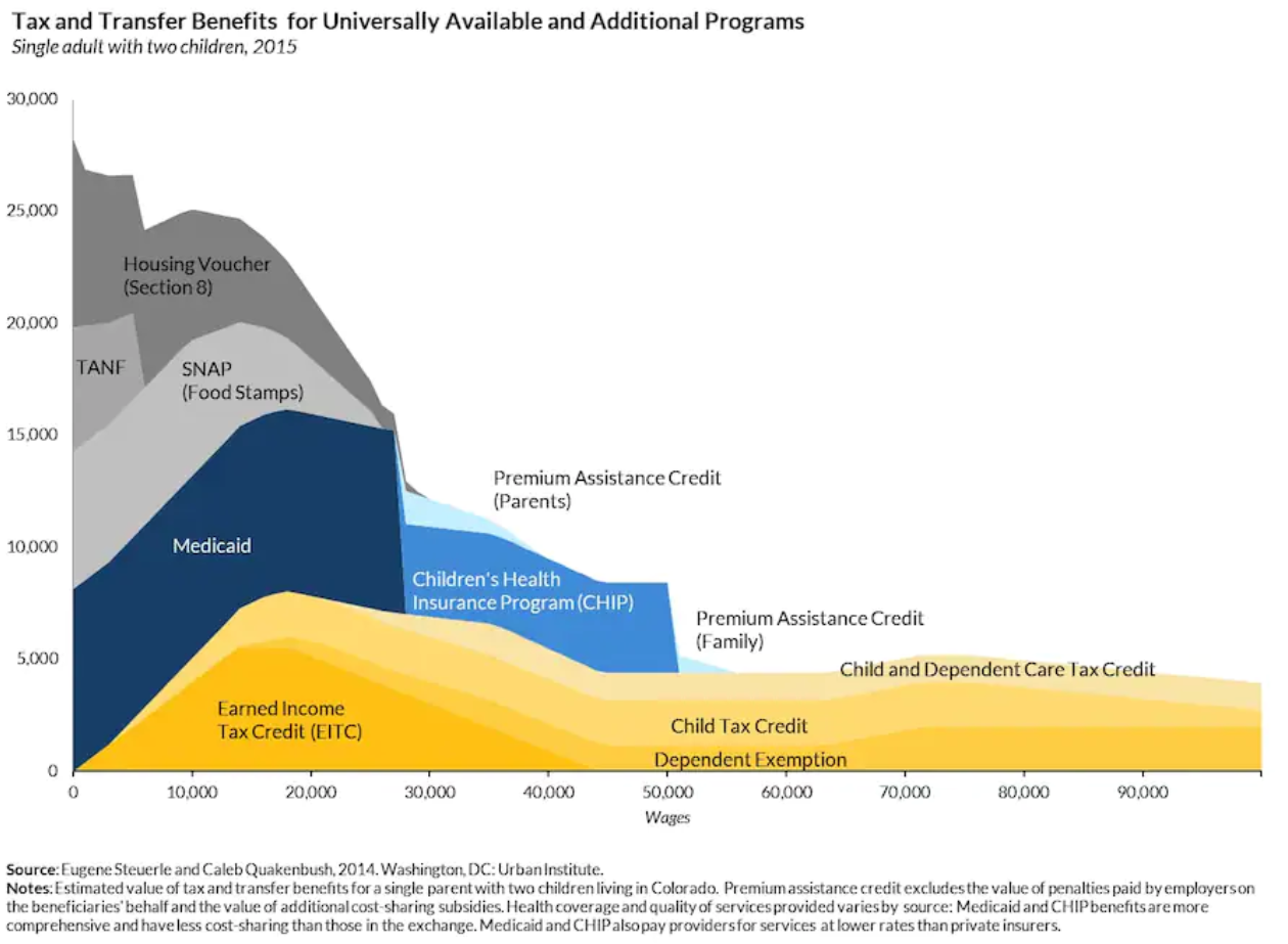
“Typical welfare family”, a single parent and 2 children (cue the video), receives $35,000 of welfare benefits annually claims the Wisconsin congressman in 2014. That number has stuck in our minds, just like the “welfare queen” and escaped prisoner “Willie Horton”.
Fact checkers debunked this claim, but it’s important to work through the details to get back to a reasonable “order of magnitude” estimate of “welfare benefits”.
If a family has ZERO income, they may receive maximum benefits. The Clinton “welfare reforms” limited the primary benefits to a total of 60 months. Families cannot receive benefits “forever”. Most household heads do work and have some income during the year. The maximum benefit number is an inappropriate “anchor”.
Temporary Assistance for Needy Families (TANF) (welfare) participation rates have fallen from 80% of those eligible to less than 25% since “reform” was implemented. The reform has had it’s intended effect. Two-thirds of those previously participating no longer do so. Some have become more productive and income earning members of society. Others “make do”.
Current average TANF benefits in my home state of Indiana are $346/month or $4,152. That’s a long way from $35,000 of cash benefits, which is the “anchor” that needs to be removed. $4,000 per year of cash is the typical Indiana welfare benefit. The maximum is $700/month or $8,400/year, twice as high. More kids, no income, still eligible. This is possible, but it’s not a useful reference point. The normal received benefit is just one-half of the maximum.
Supplemental Nutritional Assistance Program (SNAP of food stamps) is the next welfare program. For an Indiana family of 3, current benefit value is $6,240 per year. A family of 3 can earn up to $25,000 annually before benefits start to decline. The national ratio of SNAP to TANF recipients is 82%. In Indiana, just 75% of those eligible receive ANY SNAP benefits.
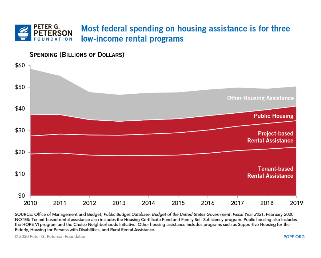
Housing assistance is listed at $9,000. There are various federal and state programs. This is like “winning the lottery” for low income families. In Indiana, 1 in 8 eligible families (12%) receive housing subsidies. These average $736/month or $8,832 per year. On an “expected value” basis, this is only $1,060 per year. From a public policy point of view, this is the relevant number.
In the Wisconsin representative’s model, there is $7,000 of higher education benefits. This is clearly irrelevant to public policy. Individuals do not make ongoing annual work choices based on education benefits.
The Cato Institute started this “conversation” about “welfare versus work” in 1995 and updated their analysis in 2013.
Like the congressman, they note that the “welfare benefits” received are in “after-tax” dollars, so they “should” be translated back into pre-tax dollars to be “fair”. Since the marginal tax rate for low-income wage earners is often just 10%, this is immaterial. More importantly, the emotional, political currency is cash. “how much do THEY receive?” is THE question. This is an after-tax amount. No “grossing up” is required.
The Cato folks also include the full value of Medicaid benefits received by those below the eligible income transition. The value paid per child ($2,145) and per adult ($4,211) yields an $8,501 annual “benefit” currently. Is this a “welfare” benefit or a “citizen” benefit? The US health care system is primarily funded through tax-deductible employer plans. Medical plan subsidies are now available up to 400% of the federal poverty level. From a federal budget perspective, lowest income families receive more value. From an “incentive” perspective, low income families are generally indifferent between federal and employer sponsored plans. This $9,000 does not belong in “the cost of welfare”.
The Cato analysis includes the cost of the “earned income tax credit” (EITC) as a welfare benefit. The EITC was created and enhanced as an incentive for unemployed persons to work and earn some income, thereby providing themselves with short-term and long-term benefits and reducing the cash level welfare benefits. It grows quickly with earned income up to about $18,000 and then falls back down nearly as quickly as income grows to $40,000 per year. This is not what most people think of as a “welfare benefit”.
The Cato analysis also focuses on welfare benefits versus the minimum wage, emphasizing that overly generous welfare benefits provide a disincentive for recipients to seek paid employment (ignoring the 60 month TANF benefits limit). As the effective minimum wage in 2021 approaches $15/hour and $31,200/year, we won’t be hearing this comparison again.
As a professional “cost accountant” since 1978, I was often asked to provide the “exact cost” of various products or services. College courses, residence hall rooms, food service meals, buildings for rent, account managers, computer hardware, installed cables, telephone services, computer maintenance, software development, dresses, tops, retail stores, extension cords, surge protectors, imported goods, cell phones, returned cell phones, etc. The answer is always “it depends”. This is never a popular answer. It depends on what decision you are making. Short-term, medium-term or long-term timeframe. Do we include opportunity costs? Which externalities should we consider, if any? Do we include strategic, brand or cultural consistency as factors?
For the “welfare benefits” question, I think that the relevant public policy/budget and personal incentive numbers are largely the same. Welfare/TANF and food stamps/SNAP matter. EITC, medicaid, education benefits, housing assistance, and income taxes don’t matter.
Welfare/TANF for an Indiana family of 3 is worth $4,152 annually. The complementary food stamp/SNAP benefits are worth $6,240. The total quasi-cash welfare payment is $10,392 per year of eligibility. Maximum of 5 years. This is the right “anchoring” number: $10,000 per year for a family of 3. They will be going to the local food pantry every week. They will be seeking family and private charity. They will be leaning on friends, relatives and neighbors for “subsidized” child care. They will be working and seeking to advance themselves.
There are disincentive challenges remaining in our current systems.
But, these technical, marginal, incremental, opportunity rates are not the heart of the matter. Lower income families are not “optimizing” their benefits. I volunteered to provide low income/elderly federal income tax services for several years. The benefit and tax rules are complex beyond comprehension.
The core public policy question is “Is $10,000 of annual benefits a reasonable amount for our state to pay to a family of 3 with no income?”. I would argue that it is too low, half what it ought to be.
Support for a universal basic income (UBI) has grown in recent years, as the economy, productivity and equity returns have grown by 3% annually but wages have remained flat for 40-50 years in the US.