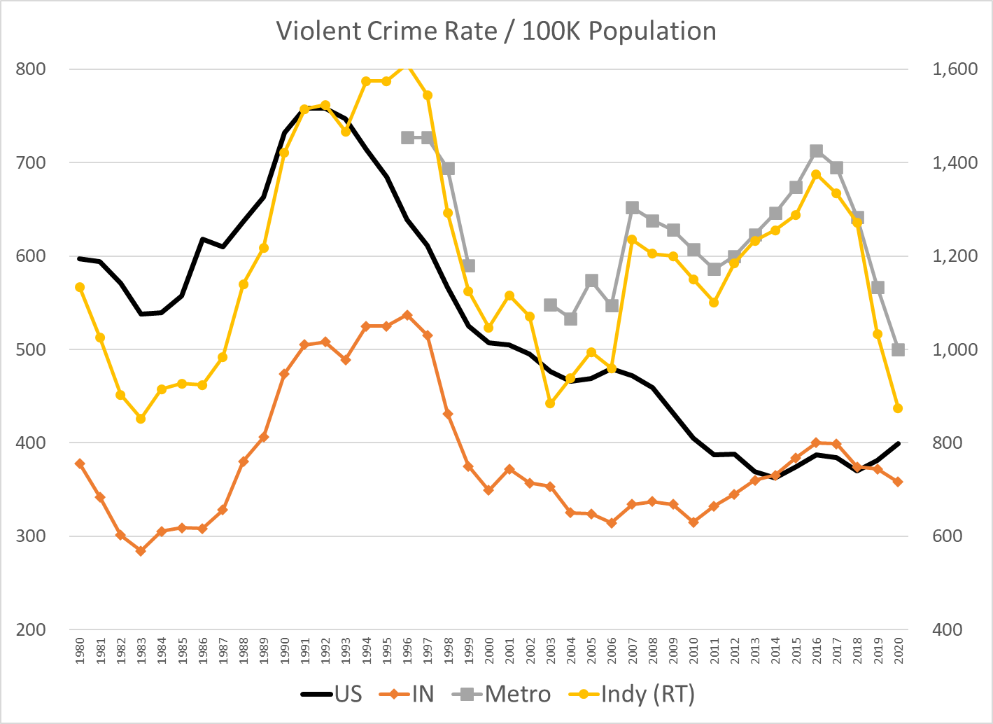
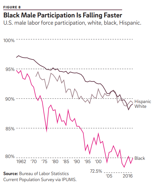
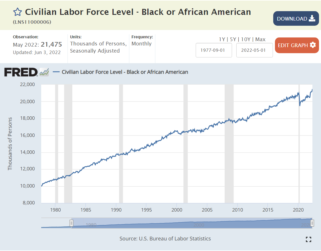
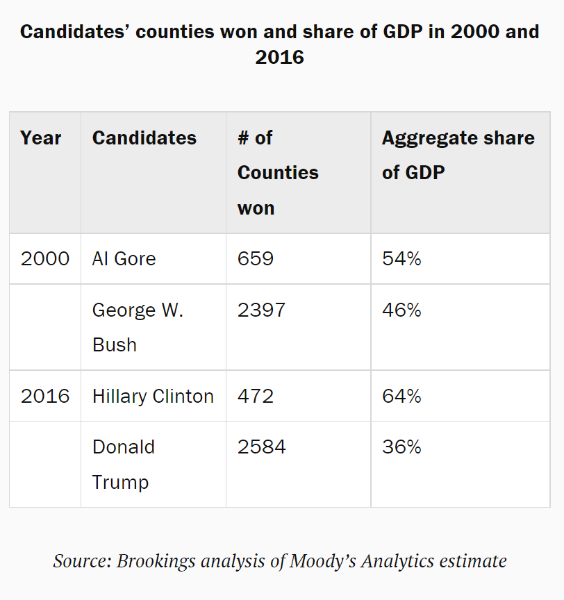
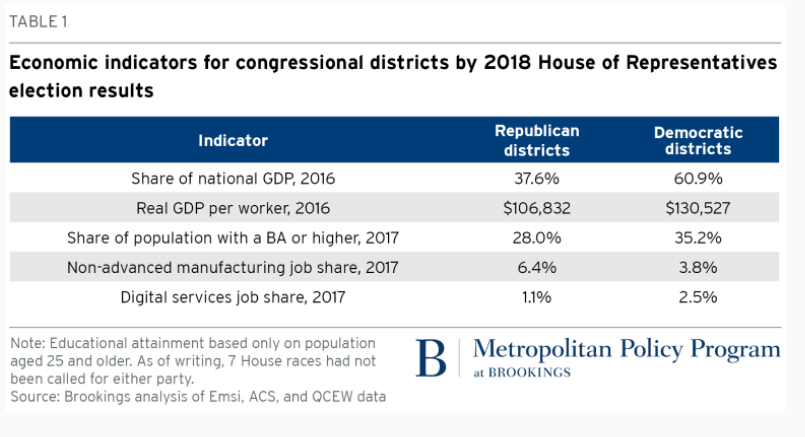
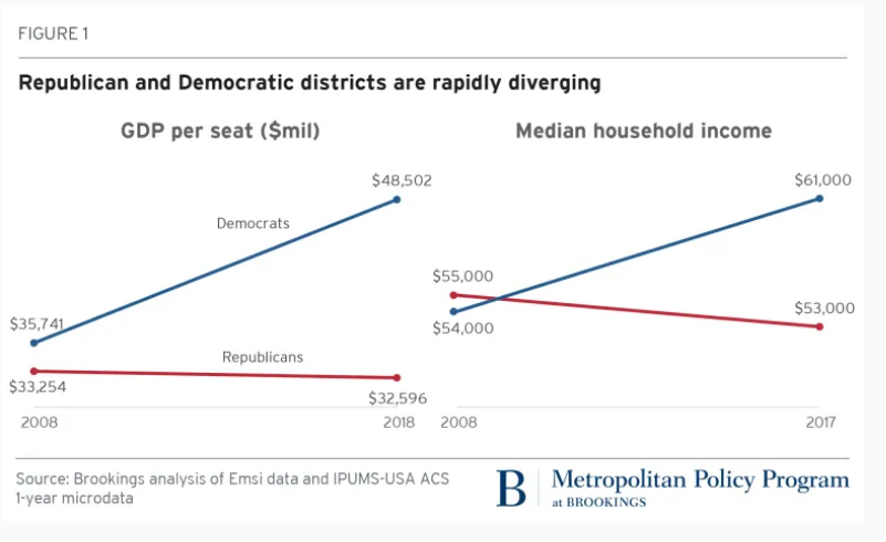
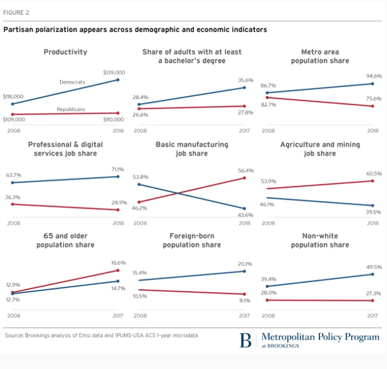
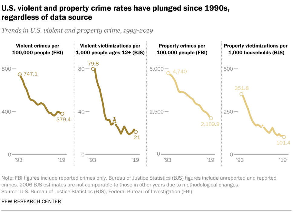
Years of Missing Housing

The Housing Market is Tighter than Ever

20% housing price inflation.

Typical house sells in one month.

Listings down by 70%.

https://eyeonhousing.org/2020/01/a-decade-of-home-building-the-long-recovery-of-the-2010s/
https://www.whitehouse.gov/cea/written-materials/2021/09/01/alleviating-supply-constraints-in-the-housing-market/

Existing homes available for sale cut in half, even before the recent decline.

https://www.realtor.com/research/topics/housing-supply/

Even with record prices, new listings lagged during 2020-22.

The supply of new homes available for sale, has remained flat at 300,000 for the last 50 years, while the population has grown by 50%.

The home vacancy rate is at one-half of its historic level.

Housing Units

The ratio of housing units to population in 2021 is 0.38, a little higher than the 0.37 in 2001.

The “American dream” of single family home-ownership remains. Buyers continue to try to recover from the decline from 69% in 2006 to less that 64% in 2015.

The number of owner-occupied (single-family) homes reached a peak of 76 million in 2006 and then flat-lined for eleven (11) years through 2017. An estimated 8 million homes have been added in the last 5 years, about 1.8M per year after zero per year for 11 years.

Supply Has Not Recovered from the Great Recession

https://www.freddiemac.com/research/insight/20181205-major-challenge-to-u.s.-housing-supply

A thorough analysis of supply and demand would include dozens of factors and 100 metro housing markets. However, at the simple trend-based macro level, we see 1.5-1.6 million units per year added from 1960-2010. We see a trough from 2007-2020 with a deficit of more than 5 million missing housing starts.

Even Worse, Starter Homes and Manufactured Housing Have Almost Disappeared, Driving an Affordability “Crisis”.

https://www.freddiemac.com/research/insight/20210507-housing-supply

https://myhome.freddiemac.com/blog/research-and-analysis/20211013-starter-homes

https://www.mercatus.org/system/files/erdmann_-mophousing_was_undersupplied_during_the_great_housing_bubble-_v1.pdf
https://multifamily.fanniemae.com/news-insights/multifamily-market-commentary/manufactured-housing-landscape-2020

Aging of the Housing Stock: The 2010-19 Decade Was a Huge Outlier

https://www.huduser.gov/datasets/ahs/ahs_taskc.pdf

During every decade, except WW II, the US added 10 million+ housing units. They have an expected life of nearly 100 years.

https://eyeonhousing.org/2020/01/a-decade-of-home-building-the-long-recovery-of-the-2010s/
https://eyeonhousing.org/2022/06/the-aging-housing-stock-5/

The US added less than one-half of the usual amount in the teens, driving the median housing stock (owner-occupied) age up from 33 to 39 years. So, it’s even more than the 5 million housing units that weren’t built. The whole stock is older. More units require maintenance. More people are waiting to have the new or “newer” home ownership experience.

Many Ratios Echo the Simple “Missing” Housing Stock Claim

https://www.mercatus.org/system/files/erdmann_-mophousing_was_undersupplied_during_the_great_housing_bubble-_v1.pdf

Housing units per capita has declined. New housing starts have not kept up with population growth.

https://www.mercatus.org/bridge/commentary/us-data-housing-starts-can-be-misleading

Compared with the overall size of the market, housing starts have become a smaller and smaller share.

https://www.freddiemac.com/research/forecast/20170726-lean-inventory-of-houses
https://www.whitehouse.gov/cea/written-materials/2021/09/01/alleviating-supply-constraints-in-the-housing-market/

The last graph is most persuasive for me. Housing starts are less than one-half of what they were in the 1970’s. That’s a big drop. It’s possible that consumers have just chosen to consume less housing and more of other goods and services, but that does not appear to be the case.

https://www.mercatus.org/system/files/erdmann_-mophousing_was_undersupplied_during_the_great_housing_bubble-_v1.pdf

Overall, we’re missing 5-8 million units out of 128 million units in a market that is struggling to deliver 1.6 million units to meet the normal demand.

The Freddie Mac experts come up with a smaller number, just 3.8 million.

https://www.freddiemac.com/research/insight/20181205-major-challenge-to-u.s.-housing-supply

https://www.freddiemac.com/research/insight/20210507-housing-supply

Contrary Views: Supply is OK, Too Much Short-term Demand

https://seekingalpha.com/article/4498666-us-housing-is-a-dead-man-walking
https://www.forbes.com/sites/billconerly/2021/02/03/housing-boom-will-end-after-2021/?sh=27038d981e41

As noted earlier, the total housing units per capita ratio is relatively consistent. “Everybody gotta be somewhere”. The total housing units level has grown, with rental units replacing the desired and missing single-family units. The other graphs are comparing two rates of change and concluding that the rates of change are roughly equal, so there cannot be a shortage. I believe that the very deep and historically unprecedented (except for WW II) catastrophic decline in single family home construction from 2006-2020 created a material deficit in the stock of single family homes. The very weak economic recovery after the “Great Recession” held back new household formation and effective demand for new single family homes, so the construction industry did not recover back to its prior level for a full decade or more. The deficit remains.

Summary

One of the most important concepts in Economics 101 is “stocks and flows”. Stocks are a summary quantity at a single point in time, like all of the gallons of water in Lake Erie behind Niagara Falls. Flows are a quantity per unit of time, like the gallons of water flowing over Niagara Falls per minute, hour or day. Our economy contains both “stocks and flows”, especially relevant in the housing market. The flow of new home construction (single family or multi-family) is one of the most volatile components of GDP (flow of $ produced per year).

Historically, major changes in home construction have driven a majority of all business cycle declines. Bank runs and changes in interest rates account for another one-third. Supply shocks and international trade/currency changes account for the remainder.

Most markets “clear” in a relatively short time period and we collectively quickly benefit from the increases in prices that attract producers and drive consumers to find “next best” options and from the decreases in prices that force producers to leave an industry and reallocate capital elsewhere and the relative increase in consumer demand that limits price declines.

Unfortunately, the real estate industry works across much longer time frames. Consumers “want” to own single-family homes, but they can rent or live with relatives for many years. Construction firms are unable to quickly increase their supply capacity when demand increases. This is an industry where “learning by doing” remains a core factor.

The construction industry was truly “decimated” in 2006-7-8. One-half, two-thirds, three-fourths or four-fifths of all firms in any local market (general contractors and suppliers) were bankrupted. It has been slow to recover as banks were “burned” by construction loans and slow to extend credit to anyone.

The remaining construction firms reached new “critical mass” by 2017 and have been expanding rapidly, subject to zoning, land acquisition, labor and materials constraints.

Nonetheless, the cumulative supply deficit is quite large and will drive housing price increases for many years, perhaps another decade!

Good News: Black Labor Force Participation Exceeds National Average, First Time in 50 Years

https://www.bloomberg.com/news/articles/2022-06-03/black-americans-lead-recovery-in-may-labor-force-participation#xj4y7vzkg
https://www.brookings.edu/blog/the-avenue/2022/06/17/three-questions-for-the-labor-markets-near-future/

African-American men and women have increased participation rates quickly since the depths of the pandemic.

https://www.epi.org/indicators/unemployment/
https://www.bls.gov/webapps/legacy/cpsatab2.htm

The African-American employment to population ratio has been increasing through time, closing a 5 point gap to just 2 points before the pandemic, and squeezing it to less than 1 point most recently.

Context Since March, 1990 Peak Overall Rate

4 point decline before the pandemic. 1.5% pandemic hit. Almost 50% recovery.

3 point decline for prime age workforce, but 2 point improvement at the end of the prior economic recovery period. 2 point pandemic hit. More than 3/4ths recovered.

6 point slide before pandemic. 1.5 point pandemic hit. Perhaps 1/3rd recovered.

Up 3 points. Down 3 points. Up 3 points. Down 2 points. 80% recovered.

Context: History and Trends Through 2015+ Were Negative or Unclear for African-American LFP

https://www.philadelphiafed.org/-/media/frbp/assets/economy/articles/economic-insights/2017/q4/eiq417.pdf
https://www.bls.gov/spotlight/2018/blacks-in-the-labor-force/pdf/blacks-in-the-labor-force.pdf
https://www.bls.gov/spotlight/2020/african-american-history-month/pdf/african-american-history-month.pdf

Challenges Make Black LFP Rate Improvement Even Better News

https://www.clevelandfed.org/en/newsroom-and-events/publications/economic-commentary/2021-economic-commentaries/ec-202123-whats-holding-back-employment-in-the-recovery-from-the-covid19-pandemic.aspx
https://www.bls.gov/spotlight/2020/african-american-history-month/pdf/african-american-history-month.pdf
https://www.epi.org/indicators/unemployment/

Historically high concentrations of Black workers were hard hit by the pandemic.

https://www.bls.gov/spotlight/2020/african-american-history-month/pdf/african-american-history-month.pdf
https://www.pgpf.org/chart-archive/0255_poverty_by_race

Positive Factors Supporting the Increase

https://www.bls.gov/spotlight/2018/blacks-in-the-labor-force/pdf/blacks-in-the-labor-force.pdf

Size, growth and share all matter. Black workers may have quietly reached a “critical mass” where they face less obstacles and benefit from more positive network effects.

https://www.bls.gov/spotlight/2018/blacks-in-the-labor-force/pdf/blacks-in-the-labor-force.pdf
https://www.bls.gov/spotlight/2020/african-american-history-month/pdf/african-american-history-month.pdf

A history of higher than average labor force participation by those with some college education and a growing share of people in that category.

https://www.bls.gov/spotlight/2020/african-american-history-month/pdf/african-american-history-month.pdf

Black men have worked full-time schedules about the same as all men, while Black women have worked full-time more often than other women.

Context: The Labor Market

Real wages are up for African-Americans.

From 1975-97, African-American unemployment rates were 10% or higher. They briefly found the 7-8% level at the end of the Clinton presidency/expansion. They popped back up to 10% and recovered to about 8% before the “Great Recession”. They jumped up to 17% and then slowly declined to 10% by 2015. The extended recovery brought them down below 7% in 2018 and to a record low of less than 6%, briefly during 2018-19. The pandemic flirted with 17% rates once again. Instead of taking a decade to recover, unemployment rates have recovered in 2 years.

https://www.bls.gov/spotlight/2020/african-american-history-month/pdf/african-american-history-month.pdf
https://www.epi.org/indicators/unemployment/

Black unemployment continues to be higher than other groups, but the gap is smaller than it once was.

References: Many Challenges Remain for African-Americans in the US Labor Market.

https://www.clevelandfed.org/en/newsroom-and-events/publications/economic-commentary/2021-economic-commentaries/ec-202123-whats-holding-back-employment-in-the-recovery-from-the-covid19-pandemic.aspx

https://www.mckinsey.com/featured-insights/diversity-and-inclusion/race-in-the-workplace-the-black-experience-in-the-us-private-sector

Good News: Widespread 2% Unemployment Rates

14 States Are Currently Below 3%

North Dakota, Wisconsin, Oklahoma, Kansas, South Dakota, Minnesota and Nebraska form a low unemployment core in the Great Plains area. Utah, Idaho and Montana represent the Rocky Mountains. Vermont and New Hampshire lead in New England. Alabama leads the South, while Indiana leads the Midwest.

https://www.bls.gov/news.release/laus.nr0.htm

22 Metro Areas with 1M+ Population (of 51) Enjoy Unemployment Rates Under 3%

https://www.bls.gov/web/metro/laulrgma.htm

Large and Small Metro Areas Have Many Low Unemployment Areas

https://www.bls.gov/web/metro/laummtrk.htm

Low Unemployment Rates in US History

https://fred.stlouisfed.org/series/UNRATE

May, 1953: 2.5%

Feb, 1968 – Dec, 1969: 3.5-3.8%

Oct, 2000: 3.9%

Dec, 2006: 4.4%

Jan, 2016: 4.8% through Feb, 2020: 3.5%. 4 years “below full employment”.

Estimates of Natural (Non-accelerating Inflation) Rate of Unemployment (NAIRU) Have Been Biased Upwards and Influenced by One Period of High Inflation and Supply Chain Disruptions

https://www.chmura.com/blog/2019/july/19/how-low-can-the-unemployment-rate-goauthormikechmura

In retrospect, the period before 1976 (oil, trade, inflation shocks) should have used a 4.5% NAIRU for policy decisions. The jump to 6% in the late 70’s and early 80’s is supported by history. The NAIRU was deemed to be 5% or higher as late as 2010, but could have been pegged lower. Based on the lack of inflation during the teens, the rate probably should have been set at 4% or lower.

Macroeconomic Theory

Classical economics asserted that labor markets will naturally find equilibrium wages and quantities of labor employed at the individual labor market (micro) and total economy level. The Keynesian view, embraced by 90% of professional economists, is that there are market imperfections at both the individual market level and total economy level. Most importantly, wages are “sticky downwards”. Currently employed workers resist “losing” wages by accepting pay cuts when demand is lower. Aggregate supply (production) does not automatically create an equal amount of aggregate demand in the short-run, as businesses, individuals, banks and governments often choose to save more during economic downturns or periods of greater risk. Hence, a downturn in the economy caused by any source may result in a prolonged negative spiral, rather than automatically delivering lower prices in product, money and labor markets, which could help to recover these markets.

https://www.economist.com/the-economist-explains/2017/09/22/how-low-can-unemployment-go

https://www.economist.com/the-economist-explains/2017/09/22/how-low-can-unemployment-go

Microeconomic Theory: Why is There Any Unemployment?

Economists point to frictional and structural factors. Frictional unemployment occurs because labor market information and decisions are not perfect and instantaneous. As with other markets: housing, commercial real estate, offices, bank loans, farm fields, airport gates, container ships, utilities, R&D, IPO’s, private equity, M&A, retail inventories, etc, labor markets are imperfect. It takes time for equilibrium to be found. Given the increased concentration of labor in major metropolitan markets and internet-based recruiting systems, frictional unemployment has decreased in the last 20-30 years.

Structural unemployment occurs because of mismatches between the current skills possessed and skills demanded in a given place or due to legal or regulatory limitations. Binding minimum wages have been a smaller factor in the last 40 years but may have greater impact in the future. Regulatory requirements for professional licensing have increased significantly in the last 50 years (with some “liberalization” seen in recent years), slowing the ability for individuals to move between professions.

The overall labor force participation rate increased for many years as women entered the workforce, but has declined significantly in the last 20 years for men and for women. I’ll provide a detailed analysis of these factors next week. For our purposes, focusing on short-term changes, recent history shows that the labor force participation rate can be 1-2% higher overall. Some workers have not returned from the pandemic challenges. Some early retirees may return to the labor force. Teens and college students may join the labor force at recent wage rates. Marginal groups (elderly, long-term unemployed, handicapped, drug/alcohol recovery, crime history, minorities, limited language skills, inexperienced) may be considered for more positions.

https://fred.stlouisfed.org/series/LNU01300060

The media tends to emphasize the increased specialization and technical content required for modern jobs. This has resulted in greater structural unemployment, especially among lower-skilled individuals who held and lost manufacturing jobs between 1970-2000. It has also reduced movement between industries which require a core base of knowledge to be effective, with health care being a prime example.

On the other hand, modern corporations that worked through a dozen post-WW II business cycles eventually adapting to the “business cycle”. First, based on Japanese manufacturing, TQM or lean six sigma manufacturing principles, they reduced their operating leverage. Companies devised factories, offices, distribution centers, product lines and national businesses that could be equally profitable from 70-95% of capacity, rather than 85-95% of capacity. Second, they reduced their unavoidable “fixed costs” by importing goods, outsourcing business functions (manufacturing, IT, accounting, legal, marketing, distribution, sales, R&D) and employing temporary labor. Third, businesses systematized their processes so that core production processes could be operated by individuals with limited specialized or tribal knowledge, including managers and support staff. Fourth, businesses increasingly used matrix and project structures to effectively redeploy staff to any areas of need. So, while variable production staff is a smaller share of employment, the remaining “fixed cost” support staff can be more flexibly deployed. Fifth, after 40 years of process re-engineering, data warehouses, activity based costing and balanced scorecard reporting, companies deeply understand variable costs and incremental benefits driven by sales, production, product lines, facilities, territories and projects. “Knee-jerk” reactions to business cycle downturns are less common as firms better understand short-term incremental profits and medium-term costs of hiring and training. Sixth, firms have improved their ability to define “critical success factors” for every position. This has eliminated many irrelevant experience, degree, culture, personality and other factors from hiring screens. Seventh, firms have increasingly rotated staff through line and staff roles, allowing talented individuals to move between these roles and function effectively. Eighth, firms are more strategically oriented, growing profitable product lines and territories and dropping or “selling off” marginal channels. This means that the incremental positive value of most positions persists, even in an economic downturn.

Overall, firms have learned their “applied intermediate microeconomics” and clearly defined the marginal benefits and costs of every position. They understand exactly what incremental profit can be delivered from each position. Hence, the demand for labor services is significantly greater than it was historically, including through the downside of the business cycle. That means that the natural unemployment level is lower than in the past. Firms can profitably put more people to work than ever before.

Economists, Forecasters and Pundits are Reluctant to Predict Unemployment Below 3% Because it Was Rare Historically.

https://www.reuters.com/business/feds-bullard-says-unemployment-rate-can-go-below-3-this-year-2022-02-01/

https://www.economist.com/the-economist-explains/2017/09/22/how-low-can-unemployment-go

https://www.cnn.com/2021/11/15/economy/unemployment-rate-goldman-sachs/index.html

https://www.federalreserve.gov/faqs/economy_14424.htm

https://theweek.com/articles/696915/how-low-unemployment

Lobbyists, Journalists, Politicians and Analysts Highlight the Downsides to “Very Low” Unemployment

From a firm’s perspective, a low unemployment labor market causes increased recruiting, hiring and training costs. It results in less well-matched staff to job roles resulting in lower initial productivity. Companies might even, aghast, inadvertently hire some staff with marginally negative profit results. Hence, very low unemployment rates will increase labor costs, reduce profits, reduce demand for labor and possibly bankrupt previously functional firms.

https://www.investopedia.com/insights/downside-low-unemployment/

https://www.imf.org/external/pubs/ft/fandd/basics/32-unemployment.htm

https://www.uschamber.com/economy/the-divide-between-job-openings-and-willing-workers-widens

https://www.umassglobal.edu/news-and-events/blog/low-unemployment-rates

Trade-off Between Unemployment and Inflation: The Phillips Curve

In the 1970’s fight between Keynesians and Monetarists/Classical Economists/Rational Expectations teams, the Keynesians emphasized the historical existence of a short-term trade-off between unemployment and inflation, especially when unemployment was very low due to a high level of aggregate demand. The conservative side noted that the historical data was inconsistent. The “rational expectations” camp emphasized that unexpected increases in inflation would lead to increased wage demands by labor. In the long-run, there is no such thing as a “free lunch”, so effective real wages would return to the level determined by the “marginal productivity of labor”. Based on recent data (pre-pandemic), it appears that the US economy can run at 3.5-4.0% unemployment without triggering significant upward wage pressures. In the post-pandemic world, the “natural” unemployment rate (NAIRU) is unclear. The labor supply has basically recovered to the pre-pandemic level. Wages are up 5% in nominal terms but are down 2% in real terms (see below).

There are Many Unemployment Measures. They Move Together.

https://www.brookings.edu/blog/up-front/2021/02/18/what-does-the-unemployment-rate-measure/
https://www.richmondfed.org/research/national_economy/non_employment_index

Labor Market Slack

In a period of healthy economic growth, the economy is constrained by the limited availability of labor as an input to drive the economic engine.

https://www.richmondfed.org/research/national_economy/non_employment_index

Underemployed individuals provide the logical next best full-time employees. The current slack measure is 3.5%, (7.1% – 3.6%) on the low side, but not so low that conversions from this underemployed group to full-time employment cannot be expected.

Real Wage Rates in a Growing Economy

https://fred.stlouisfed.org/series/CES0500000003
https://fred.stlouisfed.org/series/CPIAUCSL

Jun, 2020 – Jun 2022. Nominal wages up 4.7%/year. CPI up 6.1%. 1.4% real wage decrease.

Dec, 2020 – Dec, 2021. Nominal wages up 4.9%. CPI up 7.3%. 2.4% real wage decrease.

May, 2021 – May, 2022. Nominal wages up 5.2%. CPI up 7.9%. 2.7% real wage decrease.

Nominal wage rates have increased by 5% annually in a period of 7% inflation. Employers have been able to economically justify these increases while adding 7 million people to the labor force.

Beveridge Curve: Job Openings Versus Unemployment Rate.

https://www.bls.gov/opub/ted/2014/ted_20140513.htm

https://www.richmondfed.org/publications/research/economic_brief/2021/eb_21-36

Historically, there was a well-defined relationship between the national level of job openings as a percent of the labor force and the unemployment rate. Job openings were a low 2-2.5% of the labor force at the beginning of the business cycle, accompanied by higher (6-10%) unemployment, but improved to 4% openings and 4% unemployment. The current labor market has far more job openings, up to 11 million, almost twice as many job openings as unemployed workers, but the unemployment rate has only fallen to 3.6% so far. This is uncharted territory. There are more voluntary quits, so employees are switching jobs at a faster rate. The labor force participation rate has increased with these jobs and higher wages offered. But firms have not found enough acceptable hiring matches to significantly reduce the open positions level. Through time, they are likely to achieve their hiring goals, driving the unemployment rate down below 3%.

https://numbernomics.com/unemployment-vs-job-openings-2/

Summary

  1. The demand for labor already exists. 11 million open positions is 7% of the labor force. We have enough active demand for ZERO % unemployment.
  2. The supply of labor increased by 7 million people since the depths of the pandemic. The rate of monthly additions has slowed from 500-600,000 to 300,000, but that is still 3.6 million jobs added on an annual basis. We only have 6 million total people unemployed!

3. The labor force participation rate is only 62.5%. There is room for millions to return to the labor market. Before the “Great Recession” in 2008 it was at 67%. Many metro areas, large and small, enjoy labor force participation rates above 65%.

4. The underemployed population can provide up to 3% of the total labor market’s full-time jobs.

5. Frictional unemployment is minimal in the internet age. Structural unemployment may be lower than described in the media, as firms have been adapting to the “information age”, high technology and the service economy for 40-50 years.

Finally, many states and metro areas currently have unemployment rates in the “twos”. Nebraska and Utah stand at 1.9%. Minneapolis (1.5%), Birmingham (1.9%) and Indianapolis (2.0%) demonstrate that otherwise unremarkable (!!!) metro areas can function with very low unemployment rates.

Good News: US Death Rates Cut in Half From 1960-2019

https://www.cdc.gov/nchs/data/nvsr/nvsr70/nvsr70-08-508.pdf

https://www.cdc.gov/nchs/products/nvsr.htm

https://www.infoplease.com/us/health-statistics/deaths-major-causes-1960-2011

Heart Disease Deaths Down 2/3rds

Cancer Deaths Down 1/4th

Strokes Down 3/4ths

Accidents Down 1/6th

Flu + Pneumonia Down 2/3rds

Liver Disease Deaths Down 1/3rd

Diabetes Deaths Flat

Suicide Deaths Flat / Up 5%

Chronic Respiratory Diseases Up 2X, 20/100K

Alzheimer’s Disease Up 2X (reporting issues), 20/100K

Kidney Disease Up 2X; 7/100K

Blood Diseases Up 2X: 1/100K

Deaths from Top 12 Causes Cut in Half

The US Political Split Grows

Dems Win Even Fewer Counties in 2016, But an Increased 64% of GDP!

https://www.brookings.edu/blog/the-avenue/2016/11/29/another-clinton-trump-divide-high-output-america-vs-low-output-america/

The rural versus urban split in American politics was very clear in the 2016 presidential election.

Trump Won 2016 in Rural Leaning Areas

https://www.brookings.edu/blog/the-avenue/2016/11/11/the-small-town-big-city-split-that-elected-donald-trump/

Democrats are the Metro Party, Representing Just 20% of the Land Area

Democratic Congressional Districts are Increasingly More Economically Productive

https://www.brookings.edu/blog/the-avenue/2018/11/16/americas-two-economies-remain-far-apart/

Larger Metro Areas Continue to Grow Faster

https://www.brookings.edu/research/countering-the-geography-of-discontent-strategies-for-left-behind-places/

Threat of Automation Job Reduction Haunts Republican States More

https://www.brookings.edu/blog/the-avenue/2019/03/25/automation-perpetuates-the-red-blue-divide/

Trump Counties Employment Growth Increased in 2018, Due to Cyclical Expansion of Maunfacturing

https://www.brookings.edu/blog/the-avenue/2019/05/06/trump-counties-may-be-winning-a-bit-more-but-their-prognosis-remains-dim/

Democratic versus Republican Local Economies Split Becomes Much Clearer by 2018

https://www.brookings.edu/blog/the-avenue/2019/09/10/america-has-two-economies-and-theyre-diverging-fast/

Dems represent just 20% of the US land area.

Dem GDP/district is 50% higher than Republican areas.

Dem district median income is 15% higher.

Dem district productivity is 75% higher.

Dem districts have 36% college degree holders versus 28%.

Reps have more basic manufacturing (56%) and agriculture/mining (60%).

Dem districts have more foreign-born population (20/8) and more non-white residents (50/28).

Biden Democratic Coalition Represents 71% of US $GDP

https://www.brookings.edu/blog/the-avenue/2020/11/09/biden-voting-counties-equal-70-of-americas-economy-what-does-this-mean-for-the-nations-political-economic-divide/

Democrats Represent 61% of GDP at Senate Level

Just 6 of 50 states have split US Senate representation. WV, OH, PA, ME, WI and MT account for slightly less than 10% of the 2021 US GDP.

Republicans have 2 Senators in 22 states, which account for $6.6T of GDP.

Democrats have 2 Senators in 22 states, which account for $10.8T of GDP.

Splitting the GDP for the 6 split states 50/50 results in $7.5T in Republican states and $11.7T in Democratic states. The Democratic states have 57% greater GDP in 2021.

The Democratic percentage advantage in 1997 GDP per state is identical. Republican states produced $4.5T while Democratic states produced $7.1T. Between 1997 and 2021, Democratic and Republican states grew at equal percentages. In dollar terms, Democratic states added $4.6T, while Republican states added $3.0T.

Percentages are difficult to digest. One way to compare the 2021 GDP of the two parties is to use “paired comparisons” and then examine the remaining non-paired states. 13 roughly equal pairs can be identified. WY-VT, AL-RI, ND-DE, ID-MA, KS-NV, MS-NH, AR-NM, SC-OR, LA-AZ, MO-CT, TN-MN, IN-MD and NC-MA.

The remaining Republican states have lower $GDP figures but can be mapped to equal $GDP Democratic states. IA+NE+SD=CO. FL+TX=CA. KY+AL+OK+UT=IL.

This leaves 6 states that represent the $4.5T (57%) Democratic state advantage: Michigan ($0.5T), New Jersey ($0.6T), New York ($1.5T), Virginia ($0.5T), Georgia ($0.6T) and Washington ($0.6T).

Summary

The Post-Trump Republican Party is distinctively different, representing a broader share of the American geography, but a smaller share of its income, production and diversity. This split reinforces the polarizing tendencies of recent decades, making attempts to find “common ground” at the national level more difficult.

Good News: Urban America is Growing Very Nicely

Rural America Grew Very Slowly in the 20th Century, Flattened and May Now be Declining

There are a variety of measures of “rural” US population. The Census Bureau has used local populations of 2,500+ to define urban. It focuses on population density and commuting to define urban counties that map to metropolitan (urban) areas. Other federal agencies use other definitions. Overall, the basic trends are clear.

https://www.hrsa.gov/rural-health/about-us/what-is-rural

The US Census Bureau’s detailed measure of “urban areas” essentially says that any area with 2,500+ people is an “urban” area. This clearly exaggerates the urban population, but this approach has been used for more than a century on a consistent basis, providing useful data. The 2020 measure of urban has been proposed using about 5,000 as the minimum for “urban”, but this definition has not been finalized.

I have focused on the Metropolitan Statistical Areas (MSA) as defined in 2020 and recreated their populations back to 1900 based upon the county to MSA maps.

The measure of “percent urban” based upon the metro areas with 100K+ population or 250K+ populations very closely tracks the US Census Bureau’s detailed definition of urban areas (and therefor rural areas).

In summary, US urban population grew from 40% of the total in 1900 to 70% in 1970, about 3/7ths (0.42) of a percent more urban every year for 70 years. The move to “urban” continued in the next 50 years, but at a much slower rate, just 1/5th of a percent per year. But, this accumulates to move the urban percentage from 70% to 80%.

Growth of Very Large Metro Areas Has Driven the Growth in Urban Areas

The 4M+ metro areas have grown the most. The 2M+ and 1M+ areas have also grown. The smaller metro areas have made a smaller contribution to the growth of “urban” America.

The 50th Largest US Metro Area’s Population Has Increased 5-Fold Between 1900 and 2020

The Number of US Metro Areas with 1M, 2M or 4M Populations Has Expanded for a Century

Decade Reaching 1 Million Population                    

1900 New York Chicago Philadelphia Boston Pittsburgh St. Louis
1910
1920 Detroit Cleveland
1930 Los Angeles San Francisco Mpls-St Paul Baltimore Cincinnati Providence
1940 Washington
1950 Dallas-Ft Worth Houston Atlanta Seattle
1950 Kansas City Milwaukee Buffalo
1960 San Diego Columbus, OH Indianapolis
1970 San Bernardino Phoenix Tampa-St. Pete Denver Portland, OR
1970 Charlotte San Jose Virginia Beach New Orleans Hartford
1980 Miami Sacramento San Antonio
1990 Orlando Nashville Memphis Rochester
2000 Austin Las Vegas Louisville Oklahoma City Richmond Jacksonville
2010 Birmingham Salt Lake City Raleigh
2020 Tulsa Fresno Tucson

Decade Reaching 2 Million Population                    

1900 New York Chicago Philadelphia
1910 Boston
1920 Pittsburgh
1930 Detroit Los Angeles
1940
1950 San Francisco
1960 St. Louis Cleveland
1970 Mpls-St Paul Baltimore Washington Dallas-Ft Worth Houston
1980 Atlanta Seattle
1990 San Diego San Bernardino Phoenix Tampa-St. Pete Miami
2000 Cincinnati Denver
2010 Kansas City Portland, OR Charlotte Sacramento San Antonio Orlando
2020 Columbus, OH Indianapolis Austin Las Vegas

Decade Reaching 4 Million Population            

1900 New York
1910
1920
1930 Chicago
1940
1950 Los Angeles
1960 Philadelphia
1970 Detroit
1980
1990 Boston Washington Dallas-Ft Worth Miami
2000 San Francisco Houston Atlanta
2010 San Bernardino Phoenix
2020 Seattle

The Rapid Growth of the Largest US Metro Areas Has Driven the Growth of the Total Population

The Tipping From Very Slow Rural Growth to Possible Decline Has Attracted Attention from Demographers and Political Commentators

https://www.census.gov/library/visualizations/2021/dec/percent-change-county-population.html
https://carsey.unh.edu/publication/rural-depopulation
https://www.pewtrusts.org/en/research-and-analysis/blogs/stateline/2021/08/10/shrinking-rural-america-faces-state-power-struggle
https://www.ers.usda.gov/data-products/charts-of-note/charts-of-note/?topicId=4e8a0642-e40d-4299-906e-906bbaaf9e4d

https://www.businessinsider.com/how-the-2020-election-revealed-divide-in-american-dream-2020-11

https://dailyyonder.com/rural-population-declines-slightly-over-last-decade-census-shows/2021/09/07/

https://www.richmondfed.org/publications/research/econ_focus/2020/q1/district_digest

Summary

The disproportionate growth of “urban” and very large urban metro areas has continued in the last 50 years. This has a tremendous impact on the lives and perspectives of those in relatively declining rural and growing urban areas.

US Murder Rates Up in 2020-21

https://www.cnn.com/2021/12/12/us/homicides-major-cities-increase-end-of-year-2021/index.html

Above: Another Murder in Bridgeport Neighborhood of Chicago, My Home 2010-18

https://crime-data-explorer.app.cloud.gov/pages/explorer/crime/crime-trend

1985-95 8/100K. 1999-2008 5.5/100K. 2009-19 5/100K.

1966-2020 Context. 1970-95 Very High Rates.

https://www.pewresearch.org/fact-tank/2021/10/27/what-we-know-about-the-increase-in-u-s-murders-in-2020/

Twentieth Century Context: US Has High Homicide Rates

https://en.wikipedia.org/wiki/Crime_in_the_United_States#/media/File:Homicide_rates1900-2001.jpg
https://www.jrsa.org/projects/Historical.pdf

Relative Violent Crime Rates

https://usafacts.org/data/topics/security-safety/crime-and-justice/crime-and-police/violent-crimes/?utm_source=google&utm_medium=cpc&utm_campaign=ND-StatsData&gclid=Cj0KCQjw8_qRBhCXARIsAE2AtRYrdjEGFcHhSe1xpRQXCK59y0pe3Dkh9pOCg2WBHhO3fRPrXWDCz0QaAuqYEALw_wcB

Firearms Involved in Homicides and Suicides

https://usafacts.org/state-of-the-union/crime/

Homicide Rate Up 30% in 2020, 5% in 2021

https://www.pewresearch.org/fact-tank/2021/10/27/what-we-know-about-the-increase-in-u-s-murders-in-2020/

Focus on Rates Per 100K for US or All Cities, Not Counts in Individual Cities

https://abcnews.go.com/US/12-major-us-cities-top-annual-homicide-records/story?id=81466453

Many Factors Proposed to Explain the Increase

https://www.vox.com/2020/8/3/21334149/murders-crime-shootings-protests-riots-trump-biden

https://www.theatlantic.com/ideas/archive/2021/09/america-having-violence-wave-not-crime-wave/620234/

Good News: US Property Crime Rates Cut in Half Since 1998

https://crime-data-explorer.app.cloud.gov/pages/explorer/crime/crime-trend
https://ncvs.bjs.ojp.gov/multi-year-trends/crimeType

Property Crime Rates Were Very High 1975-90

https://www.factcheck.org/2020/06/trump-wrong-on-crime-record/

FBI and Bureau of Justice Data Both Show Declines, Reporting of Crimes Remains Consistent

https://www.pewresearch.org/fact-tank/2020/11/20/facts-about-crime-in-the-u-s/

Property Crime Rates Have Fallen Despite Changes

https://porch.com/advice/most-urbanized-states
https://www.pewresearch.org/social-trends/2018/05/22/demographic-and-economic-trends-in-urban-suburban-and-rural-communities/
https://www.pewresearch.org/fact-tank/2020/08/20/key-findings-about-u-s-immigrants/
https://www.pewresearch.org/fact-tank/2021/08/23/most-americans-say-the-declining-share-of-white-people-in-the-u-s-is-neither-good-nor-bad-for-society/
https://www.pewresearch.org/social-trends/2020/01/09/trends-in-income-and-wealth-inequality/
https://theconversation.com/gun-violence-has-fuelled-enduring-trust-issues-for-many-americans-144413
https://www.pewresearch.org/social-trends/2014/03/07/millennials-in-adulthood/
https://www.pewresearch.org/fact-tank/2016/04/13/americans-divided-on-how-much-they-trust-their-neighbors/

Indy Metro Area vs Rest of Indiana (1970-2020)

The Indy Metro Area is comprised of Marion County plus the 7 surrounding “donut” counties. Marion has grown throughout the half-century, adding 175,000 people (22%). Rural Morgan and Shelby counties have not grown much. Hancock, Boone and Johnson counties have doubled their populations. Hendricks has grown from 50,000 to 175,000. Hamilton has grown exponentially from 50,000 to 350,000. This relatively rapid growth has made the metro area grow from 21% to 28% of the state total, adding state senators and representatives and causing increasing tensions between the one large, growing area and the slower growing, largely rural, rest of the state. There are suburban Chicago, Louisville and Cincinnati counties that have shown decent percentage growth, but they are a small share of the state. Lake County (Gary) is a special case, declining in population decade after decade.

The Indy Metro counties started 1970 with slightly higher per capita personal incomes, so the share of the state total was 24%, a bit above the 21% population share. By 2020, the Indy Metro area had captured one-third of the state’s personal income (34%), much higher than its 28% share of the population. Per capita incomes and population had both grown in the capital region.

Gross Domestic Product, the value of goods and services produced in Metro Indy, was one-third of the state total in 2001, the first year of available statistics. This measure increased to 38% by 2020. Nearly 2 out of every 5 dollars of statewide value-added output was generated by the Indy Metro area in 2020.

Indiana is a mostly rural state with Indy, a dozen small cities, a cluster of northern Indiana manufacturing counties, Gary (Lake County), Ft. Wayne (Allen) and Evansville (Vanderburgh). The Indy Metro Region has 9 times the density of people, income and production as the most rural counties. For example, it takes the 67 lowest population counties to equal the 1.9 million people living in the Indy Metro area.

The Indianapolis Metro area grew by a respectable 72% during this period, above the national average of 63%. The other Indiana counties grew by only 19%, about one-fourth as fast.

The Indy Metro area added 900,000 people, the same growth as the rest of the state.

With population and per capita income gains, the Indy Metro area’s real personal income grew almost four-fold, while the rest of the state grew by roughly 150%.

Indy Metro per capita income was 15% above the rest of the state in 1970 and twice as high (30%) by 2020.

The Indy Metro area has improved its per capita income versus the US average by 4 points, from 101 to 105. The other-Indiana counties have declined from 88% to 81% of the national average.

While the per capita income in the Indy Metro area is 30% higher than the rest of the state, the value of goods and services produced (GDP) per person is more than 50% higher than the rest of the state.

These wide, and growing, disparities in economic results may lead to increasing tensions between the relatively prosperous center and the largely “left behind” periphery. Fortunately, the real personal income per capita in the “other” counties did increase by 95%, from 24 to 48K during these 5 decades, even though the Indy folk’s income grew by 120%, from 28 to 62K.

https://www.stats.indiana.edu/population/PopTotals/historic_counts_counties.asp

Good News: God is NOT Dead In the US

Nietzsche Declared It In 1882: 7 Generations Ago

https://philosophybreak.com/articles/god-is-dead-nietzsche-famous-statement-explained/

Time Magazine Taunted 1966: 3 Generations Ago

80-90% Believe in God or a “Higher Power”

https://www.pewtrusts.org/en/trust/archive/fall-2018/when-you-say-you-believe-in-god-what-do-you-mean

56% believe in God as described in the Bible. Another 23% have a less literal belief in God. Of the 20% who answer “no”, fully one-half believe in some kind of higher power or spiritual force. Only 10%, in 2017, fully rejected any supreme being/force/concept.

Time Says 90% Believe in God

https://time.com/4283975/god-belief-religion-americans/

Gallup Poll Reinforces 80-90% Belief

https://news.gallup.com/poll/268205/americans-believe-god.aspx

US Belief In God Is Twice as High as In Europe

56% in US believe in Biblical God versus 27% in Europe.

https://www.pewtrusts.org/en/trust/archive/fall-2018/when-you-say-you-believe-in-god-what-do-you-mean

U.S. adults are more religious than Western Europeans

Belief in God Forecast to Grow Globally

The Future of World Religions: Population Growth Projections, 2010-2050

However: Non-Religion Affiliated Folks Grew

https://www.christianitytoday.com/news/2019/march/evangelical-nones-mainline-us-general-social-survey-gss.html

From 7% to 22% by this measure!

PRRI summarizes their data and Pew data to assert that the unaffiliated population grew from 16% to 25% but has recently fallen back to 23%.

Other analysts conclude that the “nones” account for up to 30% of the population.

https://www.deseret.com/faith/2022/4/14/23022509/god-is-not-dead-religion-data-politics-faith-in-america

https://www.nbcnews.com/think/opinion/2010s-spelled-end-white-christian-america-ncna1106936

This survey shows the “unaffiliated” category increases from 20% to 26%.

Fewer Young Adults Belong to Churches

Religious Believers Maintain Same Activities

https://www.deseret.com/faith/2022/4/14/23022509/god-is-not-dead-religion-data-politics-faith-in-america

Mainstream Protestants Fell, Bottomed, Recovered

https://www.christianitytoday.com/news/2019/march/evangelical-nones-mainline-us-general-social-survey-gss.html

From 28% to 12%, or from 18% to 13%.

Evangelicals Grew, Then Declined

https://www.christianitytoday.com/news/2019/march/evangelical-nones-mainline-us-general-social-survey-gss.html

About Three-in-Ten U.S. Adults Are Now Religiously Unaffiliated

Based on a “born again” definition, evangelicals have declined by 6%.

https://www.cnn.com/2021/07/10/opinions/american-evangelicals-protestantism-butler-bass/index.html

Evangelicals Increasingly Overlap With Republican Party Identification

https://www.christianitytoday.com/news/2019/march/evangelical-nones-mainline-us-general-social-survey-gss.html

https://www.sltrib.com/opinion/commentary/2021/10/27/ryan-burge-why/

Summary

US citizens belief in God remains strong, between 80-90%. Church affiliation has declined to 70%. Mainline (liberal-centrist) Protestant believers have declined dramatically, but recently stabilized. Evangelical Protestant believers increased in the 1980’s and 1990’s, but have declined somewhat since then. Catholic membership has remained roughly constant, with Hispanics replacing Whites.

The decline in Whites as a percentage of the US population, combined with the increase in non/other believers has lead to headlines proclaiming the end of a majority White Christian America. This is true statistically, with politicians attempting to take advantage of the situation.

https://www.nbcnews.com/think/opinion/2010s-spelled-end-white-christian-america-ncna1106936