
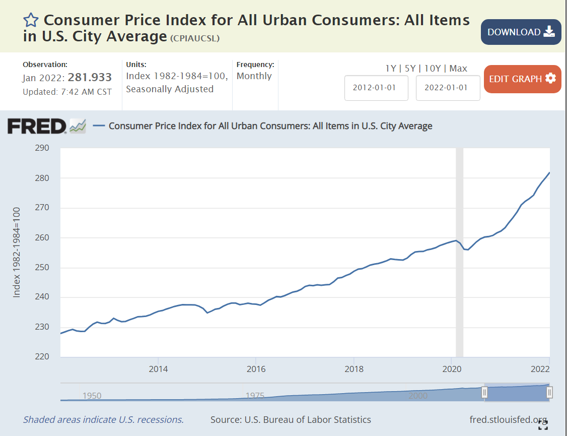
https://fred.stlouisfed.org/series/CPIAUCSL
Easy Monetary Policy
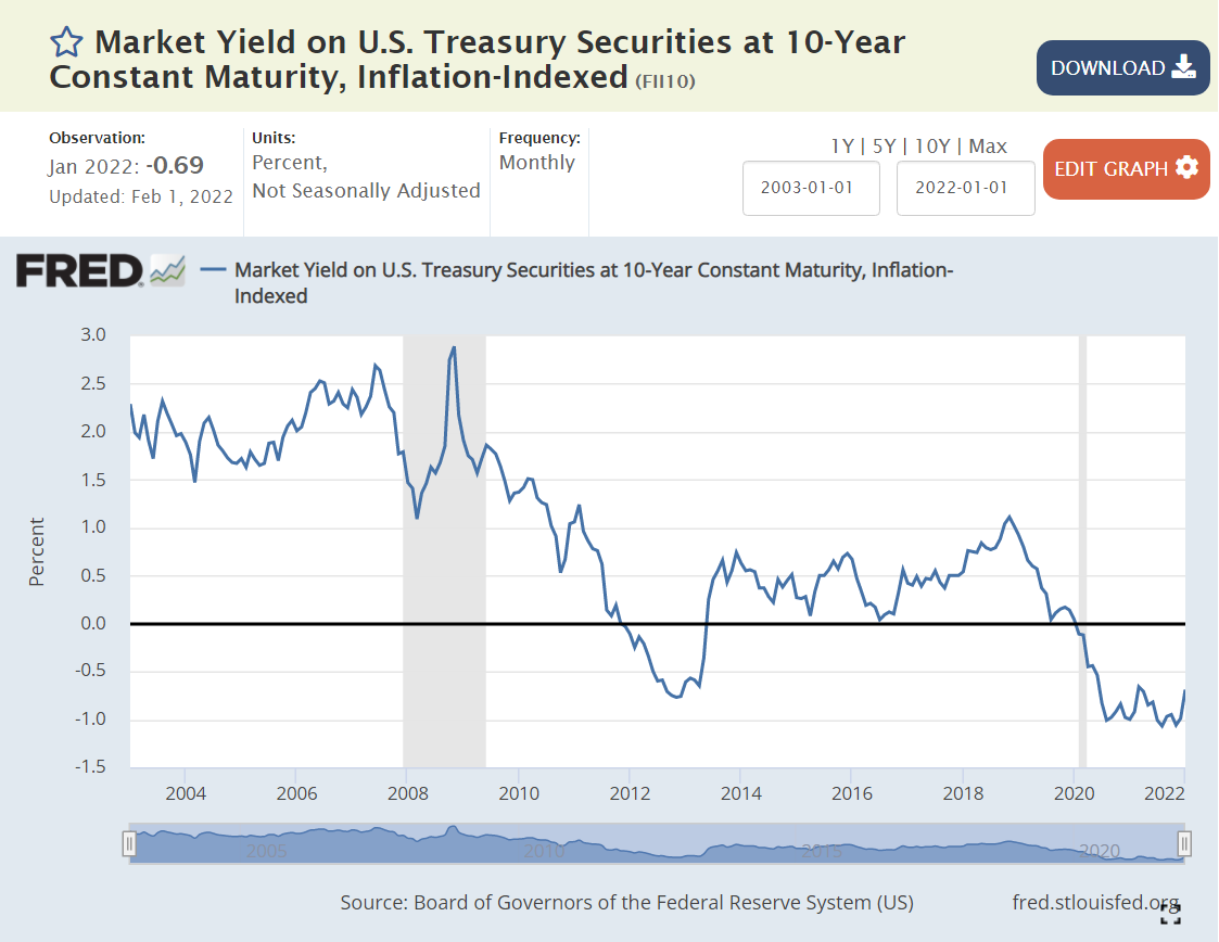
https://fred.stlouisfed.org/series/FII10
The “real” interest rate is the nominal interest rate minus the inflation rate. It reflects the “real” cost of borrowing. Prior to the “Great Recession”, 2% was a typical “real cost” of borrowing money. To entice lenders to lend, borrowers had to pay some “real” amount extra per year, 2%.
The Federal Reserve did what it could to “ease” monetary conditions and lower interest rates to offset the negative impact of the Great Recession in 2008-9.
By the end of 2011, real rates were ZERO or negative. In other words, the Fed went too far. By June, 2013, rates returned to positive territory, but only reached 0.5%, where they remained through the end of 2017, despite president Trump’s complaints that the Fed was constraining the Trump economy. Monetary policies were “easy” for a very long 7-year period.
By May, 2019, real interest rates were back to just 0.5%, having reached a peak of just 1% for 3 months at the end of 2018. With further “easy” money policy, real rates dropped back to ZERO percent by August, 2019. The economy was now 9 years into recovery. Interest rates should have been higher.
The Fed found new ways to “ease” monetary policy as the pandemic struck in 2020. Real interest rates dropped to -1% and stayed there. Monetary policy has been “easy” for more than a decade. Time for inflation. “Too much money chasing too few goods”. “Inflation is always and everywhere a monetary phenomenon”.
Supply Chain Disruption
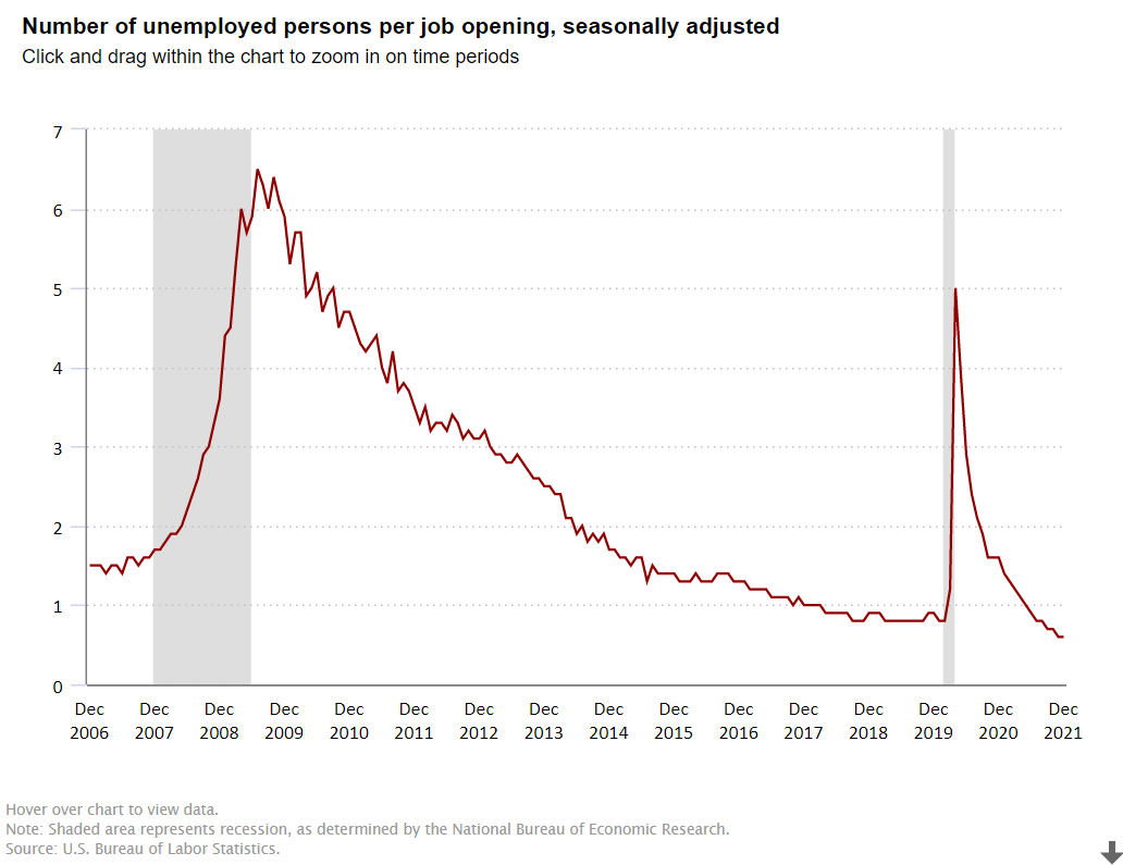
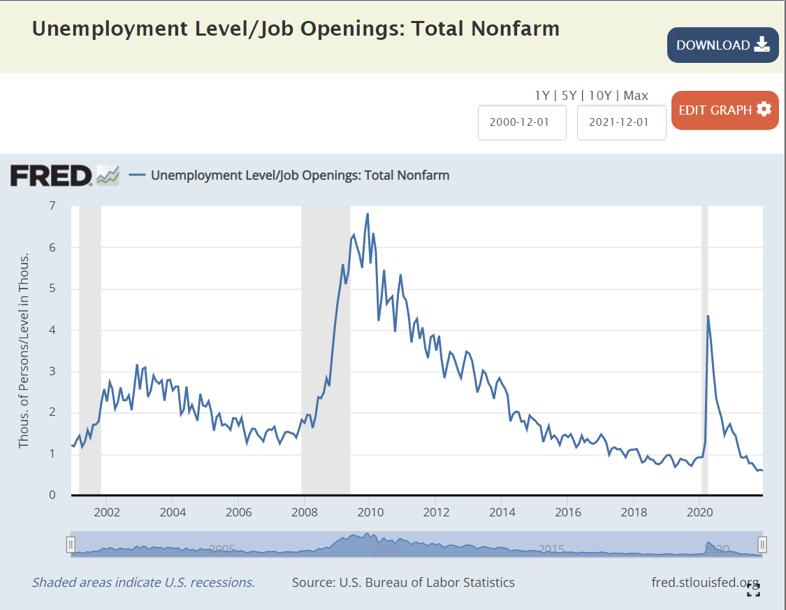
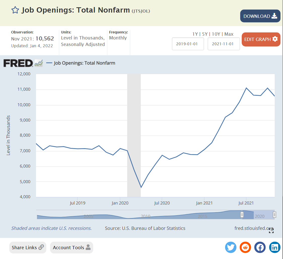
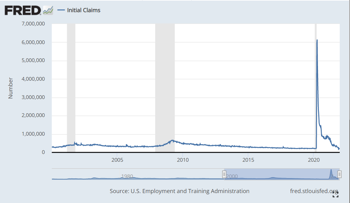
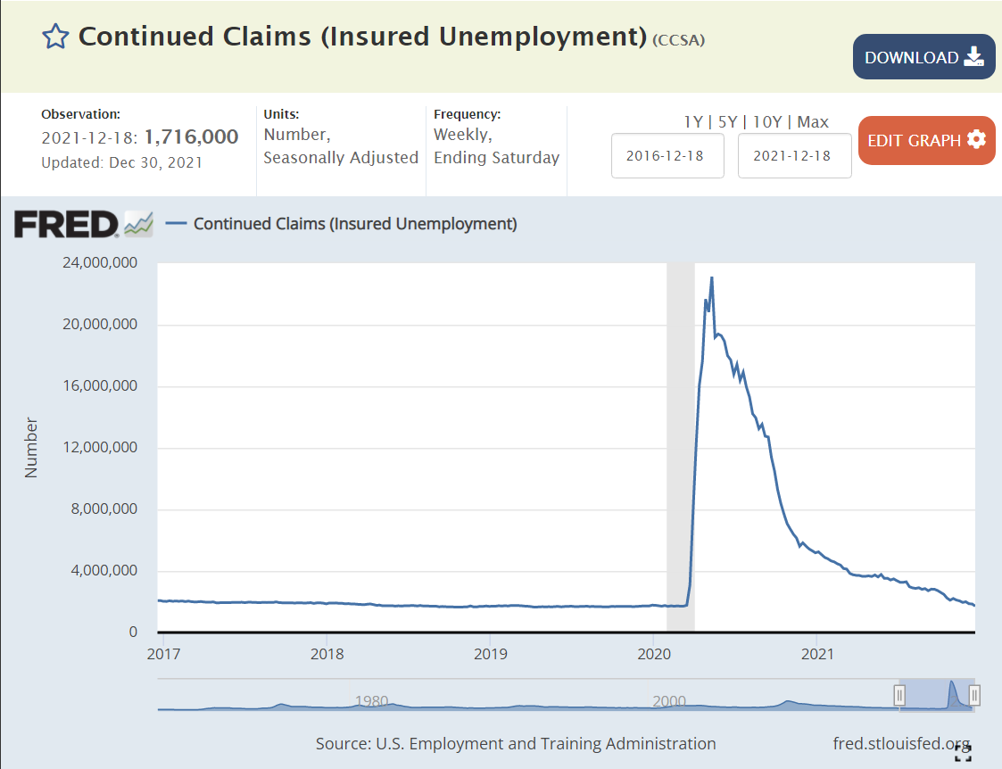
The recovery has been faster than anyone expected, but most critically, with consumers less eager to buy “in-person” services, they have greatly increased their purchases of goods. The modern US economy relies on imports and modern manufacturers and retailers hold lower inventories to buffer changes.
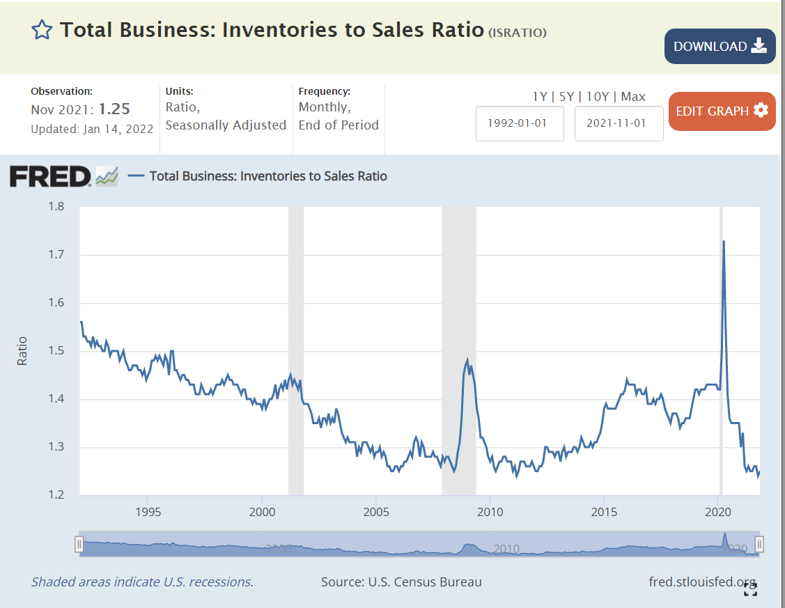
https://fred.stlouisfed.org/series/ISRATIO

https://fred.stlouisfed.org/series/PCEDGC96
Yes, durable goods purchases jumped by 20% in 1 year, from $1.8T to $2.2T. Businesses have simply been unable to adapt to that scale of change.
Easy Fiscal Policy / Large Budget Deficits
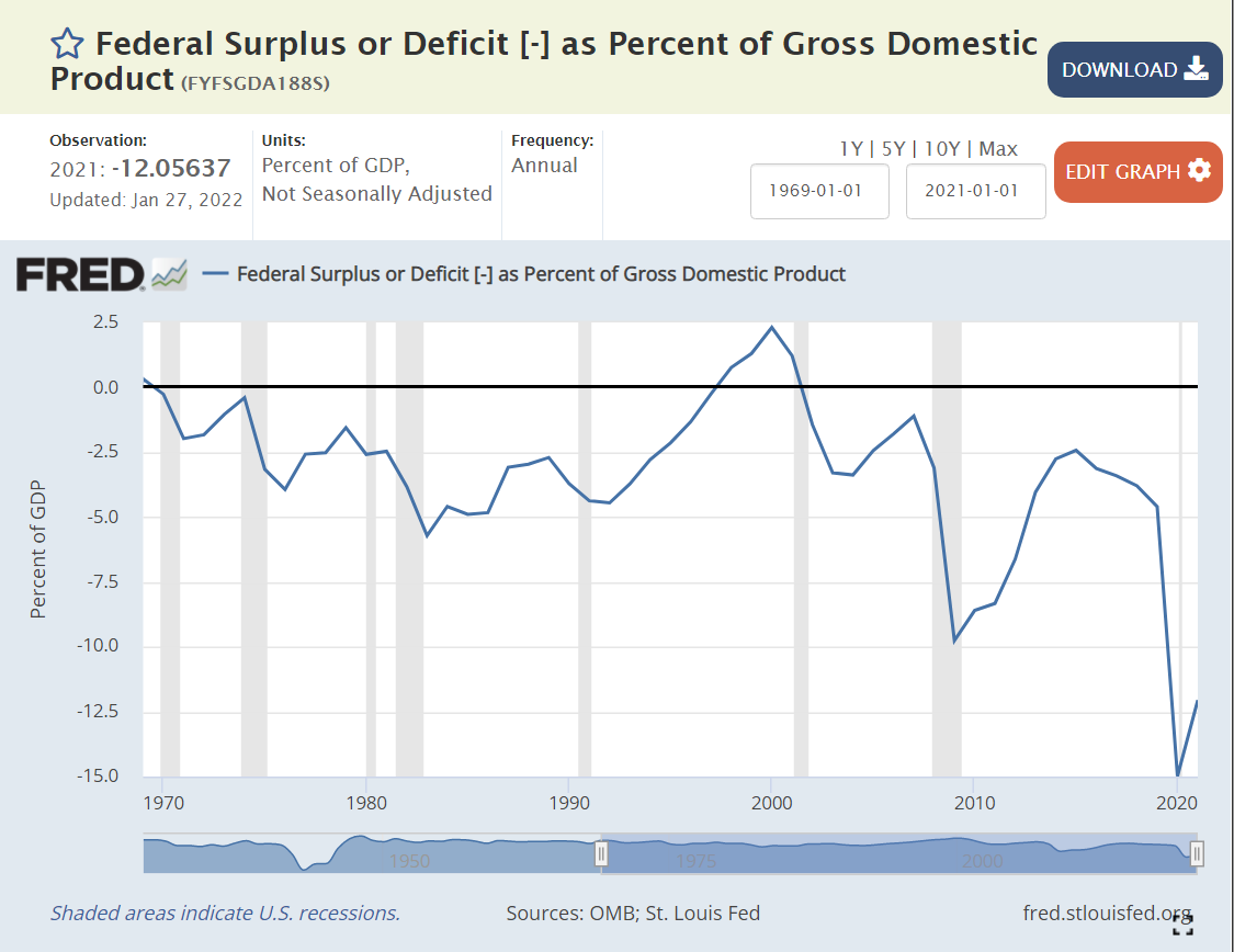

https://fred.stlouisfed.org/series/FYFSGDA188S
Standard macroeconomic theory focuses on aggregate demand versus aggregate supply as the key driver of output, unemployment and inflation. When total demand grows faster than remaining excess capacity of total supply, inflation results. The biggest driver of changes in aggregate demand is the level of government spending (demand) minus government taxation (reduces demand).
Historically, various pressures have kept the federal budget deficit between -3% and +3% of GDP, allowing the government to buffer change in private demand through the business cycle. The large drop from -2.5% to -5% in 1979-82 was a factor that contributed to the last major round of US inflation. A similar decline from -2.5% to -4% in 1989-91 increased inflation, but not on such a large scale. It also served to convince President Clinton and congress to reduce the deficit to ZERO by 1997 and run a surplus for a few years.
The 2001 recession caused a 2.5% decrease in this ratio, from a surplus to a deficit. Bush tax cuts, foreign wars and congressional agreement lead to deeper deficits at 3.3% in 2003-4, before some recovery to -1% in 2007, prior to the Great Recession.
Bush, Obama and congress agreed to spend more to fight the Great Recession, pushing the deficit to a worryingly low -9.8% in 2009. There was no agreement on a second major round of spending, so the deficit improved a bit to -6.6% by 2012 and then to a more reasonable -2.5% in 2014-15. Instead of continuing to improve with the economic recovery, it fell a little, to 3.1% in the last year of the Obama economy.
President Trump’s first order of business was to enact “job creating” tax cuts. Unfortunately, the desired boost to economic growth to fund these tax cuts did not occur. The budget deficit increased from 3.1% to 4.6% of GDP, as the economy reached a record long recovery period of a full decade.
To address the pandemic, congress and Trump agreed to spend money to protect the economy and workers, leading to very large budget deficits of 15% and 12% in 2020 and 2021, respectively. Too much aggregate demand for the level of aggregate supply, so we have major inflation.
Summary
Easy money, easy fiscal policy and a 20% increase in demand for goods leads to major inflation. Like a frog getting boiled as a pot slowly warms up, we became complacent based on the apparently “just right” conditions of the late teens (2012-19). The federal budget deficit needs to get back above -5%, real interest rates need to become positive and consumers need to rebalance to consume more services and less goods. I don’t think we’ll see 7% inflation for 2022, but it looks like 4-5% is a good bet. Hold on.
Politics
Biden deserves a good share of responsibility for the government spending budget deficit, as he was seeking to make it even larger. I give him a “pass” on consumer demand for durable goods since it mostly occurred before he started. I also give him a “pass” for the loose Fed monetary policy which has been going on for a decade or so. He was wise to reappoint the Fed chairman, who I believe will raise interest rates as needed to get the real interest rate back to a proper level. In the meantime, Biden will pay politically for higher inflation, which has a “real” impact on the wallets of voters.


