Unemployment: We Should Be Dancing in the Streets

Record high of 6.6 million hires per month, above pre-pandemic record 6.0M.

Record low layoffs at 1.3M per month, down from 1.8M pre-pandemic record. Yes 5 new hires for every layoff!

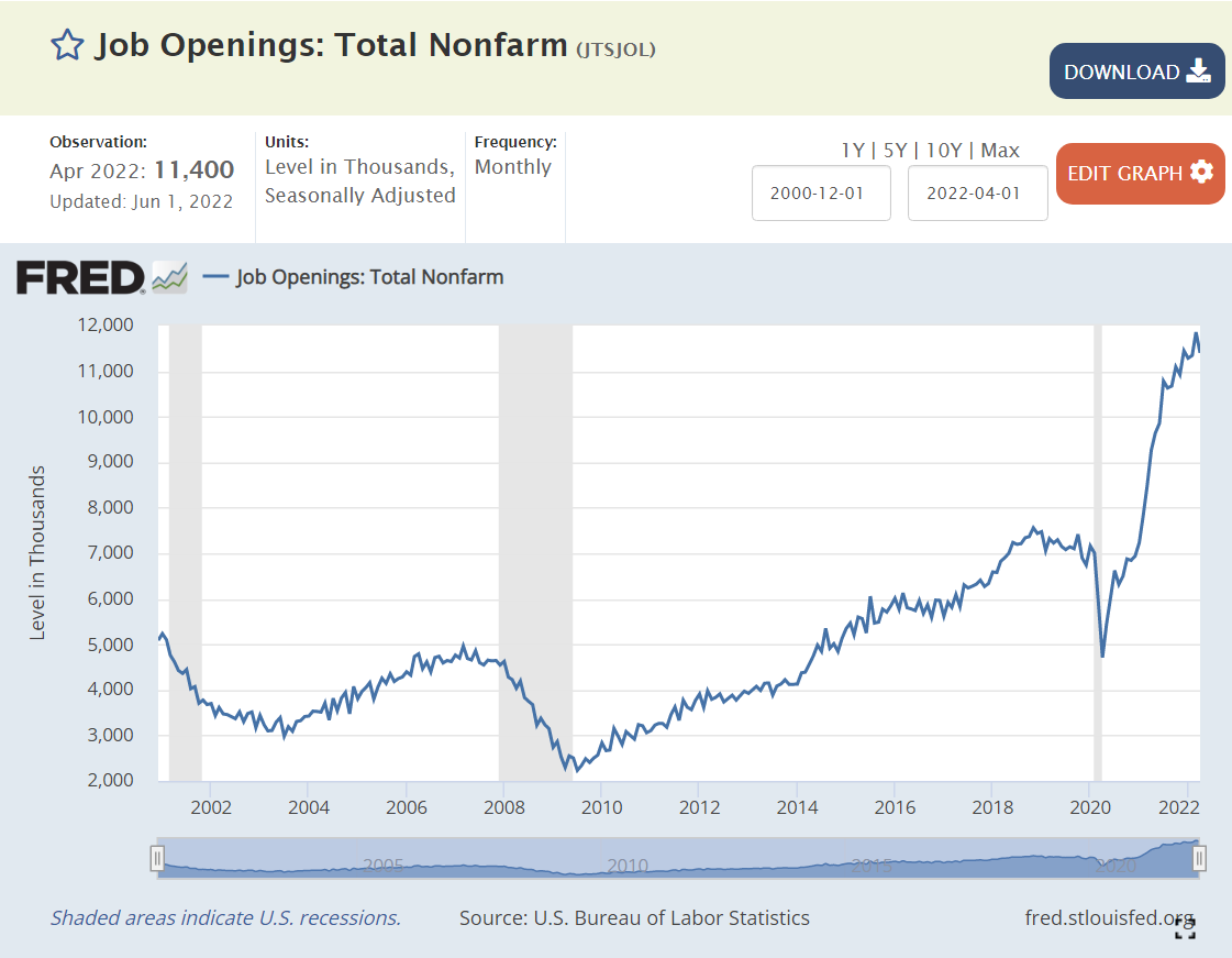
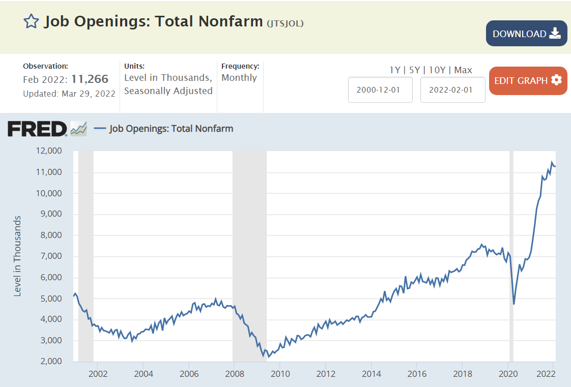
Record 11 million plus, up from pre-pandemic record of 7 million.

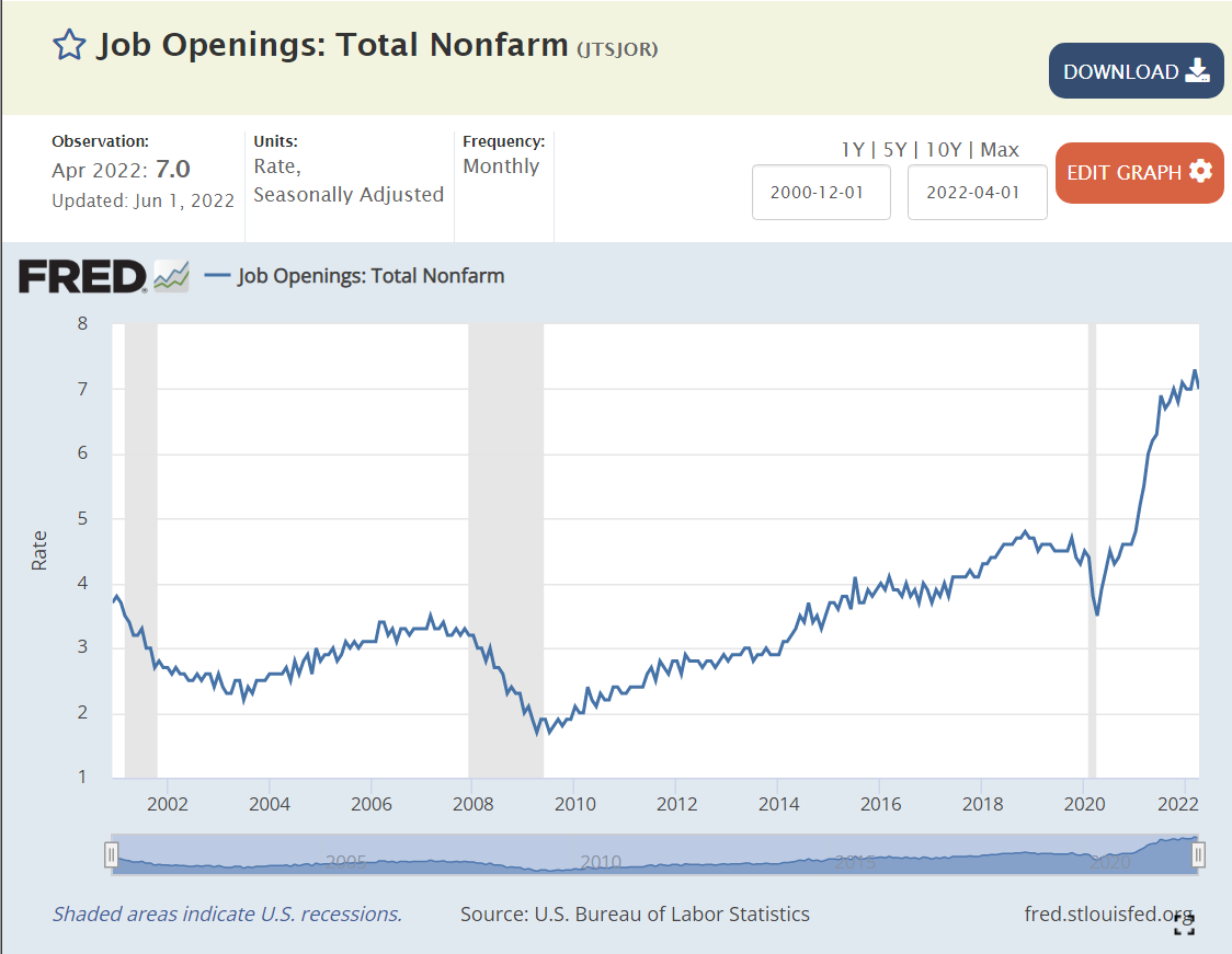
Record 7% of jobs are open, far above pre-pandemic 4.4% record level.

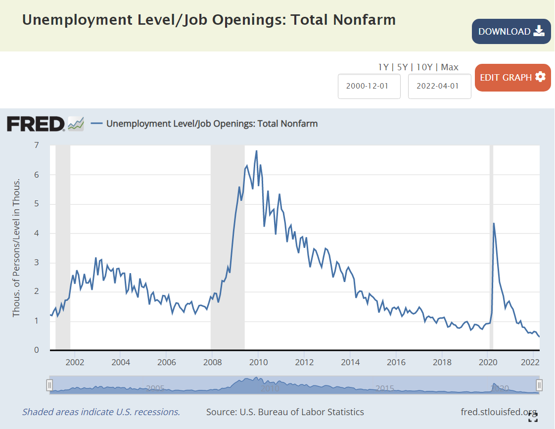
Job seekers to open positions ratio is less than 1/2, all-time record low, down from pre-pandemic record that was just below 1:1.

Average hourly wage up 12% to record $31.95.

Hours worked is slightly higher than before the pandemic.

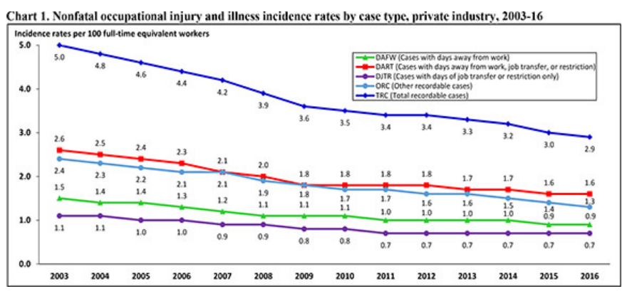
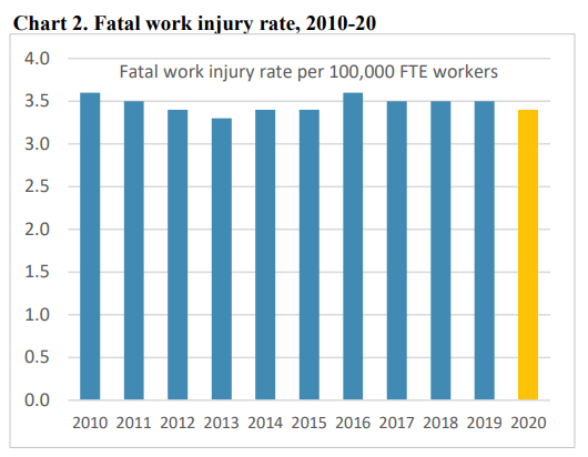
Record high 2.9% versus pre-pandemic record of 2.3%.

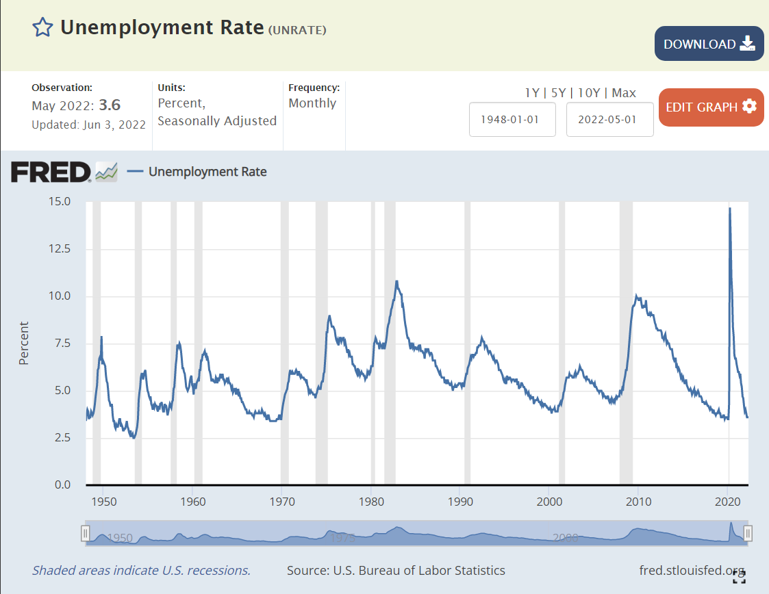
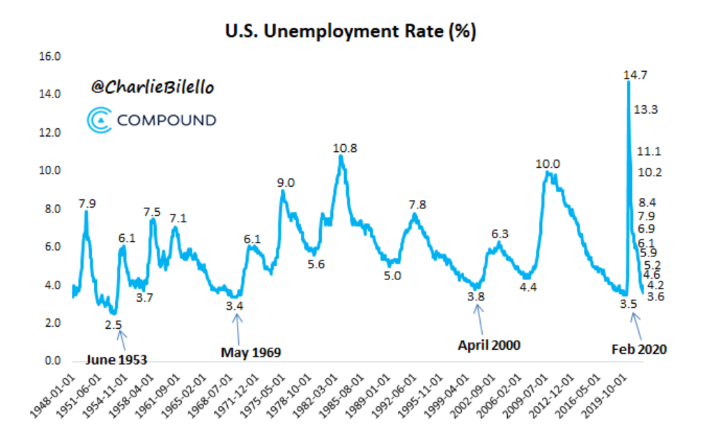
Unemployment rate is 3.6%, just above pre-pandemic 3.5%. Prior 3.5% rate was in 1969. This is the best in 50 years.

Underemployment rate at 7.1% is just above 7.0% pre-pandemic level. Underemployment rate was last this low in 2000.

Long-term unemployment is at 1.2%, same as pre-pandemic level. The economy last delivered this positive level in 2000.

African-American unemployment rate is at a near-record 6% low. It was a little lower briefly before the pandemic.

Initial unemployment claims reached the pre-pandemic low of 190,000 during 2022, but has increased slightly to 210,000. This compares with typical levels of 400,000 in recent decades.

Continued unemployment claims are at a 50-year record low of 1.3 million, down from the pre-pandemic level of 1.8M. 1.3M was last seen in 1969!

Civilian labor force at 164.4M is just below the all-time record of 164.6M.

Prime age labor force participation rate fell from 84% to 81% by 2014. It recovered to 83% by the end of 2019. It has reached 82.5% so far in 2022.

Teen labor force participation has slowly increased for a decade.

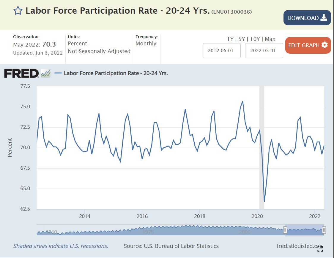
College age labor force participation has remained the same.

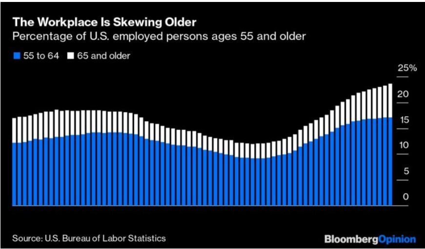
“Older” age labor force participation hit an all-time low of 29% in the early 1990’s, and then began to climb all the way to 41% in 2012. It remained at 40% throughout that decade. It dropped with the pandemic and has since recovered to 39%.

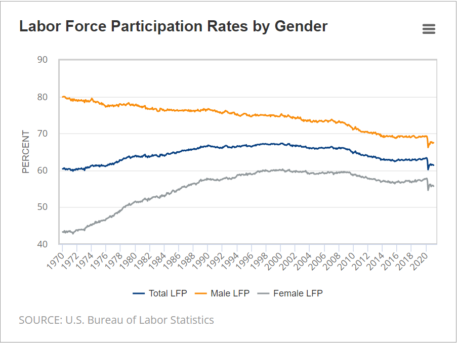
Female labor force participation continued its long climb to a peak of 60% in the late 1990’s. It dropped below 57% by 2014. It increased to 58% in the last 2 years of the decade. It has recovered to 57% after the pandemic.

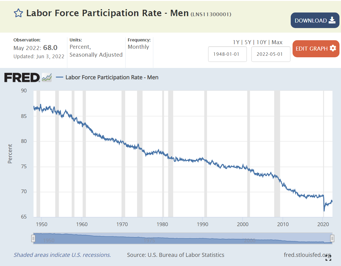
The male labor force participation rate has been declining for 70 years. It reached 69% in 2014 and remained there, without falling, throughout the decade. The rate dropped to 66% during the pandemic and has since recovered to 68%.

https://www.richmondfed.org/publications/research/econ_focus/2021/q1/district_digest#:~:text=Over%20the%20past%2050%20years,pandemic%2C%20it%20has%20fallen%20further.

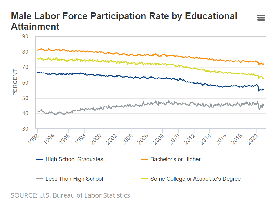
Labor force participation has declined by about 10% for HS grads, some college and college grad groups. Non-HS grads’ participation has actually increased. The similarity of participation changes by education and gender points to broader social factors playing a major role in these “economic” changes.

Summary

The measures of demand for labor are all at record levels. Unemployment rates are at long-term lows, just above the pre-pandemic levels which were driven by a decade long economic recovery. Labor force participation is down by 1% compared with pre-pandemic levels. Overall, this recovery from the pandemic challenges exceeds all expectations.

Good News: Lower US Workplace Injury and Death Rates

Injuries

https://fitsmallbusiness.com/workplace-injury-statistics/
https://www.bls.gov/charts/injuries-and-illnesses/total-nonfatal-work-injuries-and-illnesses-by-year.htm#
https://www.bls.gov/opub/mlr/2015/article/the-quest-for-meaningful-and-accurate-occupational-health-and-safety-statistics.htm
https://www.globaltrademag.com/industries-with-the-highest-rates-of-workplace-injuries/
https://www.workerscompensation.com/news_read.php?id=27835
https://www.bls.gov/charts/injuries-and-illnesses/number-and-rate-of-nonfatal-work-injuries-and-illnesses-by-industry.htm
https://www.bls.gov/iif/oshwc/osh/os/osch0054.pdf
https://www.bls.gov/opub/mlr/2015/article/the-quest-for-meaningful-and-accurate-occupational-health-and-safety-statistics.htm
https://www.bls.gov/iif/oshwc/osh/os/osch0054.pdf

Workplace Fatalities

https://www.insurancejournal.com/news/national/2020/02/21/558963.htm
https://www.bls.gov/news.release/pdf/cfoi.pdf
https://govfailure.com/item/osha-didnt-speed-decline-in-workplace-deaths/

1915 rate estimated to be 60.

https://www.bls.gov/opub/mlr/2016/article/the-life-of-american-workers-in-1915.htm

https://www.bls.gov/news.release/pdf/cfoi.pdf
https://www.bls.gov/iif/oshwc/cfoi/cfch0016.pdf
https://www.bls.gov/charts/census-of-fatal-occupational-injuries/number-of-fatal-work-injuries-by-employee-status-self-employed-wage-salary.htm
https://www.bls.gov/iif/oshwc/cfoi/worker_memorial.htm
https://www.cdc.gov/mmwr/preview/mmwrhtml/mm4822a1.htm
https://www.bls.gov/news.release/pdf/cfoi.pdf
https://www.cdc.gov/mmwr/preview/mmwrhtml/mm4822a1.htm
https://www.bls.gov/iif/oshwc/cfoi/worker_memorial.htm
https://www.cdc.gov/mmwr/preview/mmwrhtml/mm4822a1.htm
https://www.bls.gov/charts/census-of-fatal-occupational-injuries/number-and-rate-of-fatal-work-injuries-by-industry.htm
https://www.bls.gov/iif/oshwc/cfoi/worker_memorial.htm
https://www.bls.gov/iif/oshwc/cfoi/cfch0016.pdf
https://www.bls.gov/charts/census-of-fatal-occupational-injuries/civilian-occupations-with-high-fatal-work-injury-rates.htm
https://www.bls.gov/iif/oshwc/cfoi/cfch0013.pdf
https://www.bls.gov/charts/census-of-fatal-occupational-injuries/number-and-rate-of-fatal-work-injuries-by-occupation.htm
https://www.publichealthpost.org/databyte/men-hard-at-work/
https://www.insurancejournal.com/news/national/2020/02/21/558963.htm
https://www.bls.gov/charts/census-of-fatal-occupational-injuries/rate-of-fatal-work-injuries-per-100000-fte-by-age.htm

The baby boomers have caused the relatively higher death rate aged 55+ groups to almost double their share of total workers. While the death rate for EACH age group has gone down in the last 20 years, the blended average has been flat for the last decade.

Covid Provided Special Challenges and the Results Could Always Be Even Better

https://www.bls.gov/news.release/pdf/osh.pdf

https://www.cnbc.com/2021/12/29/bls-estimates-that-13-us-workers-die-on-the-job-per-day-on-average.html

https://aflcio.org/reports/death-job-toll-neglect-2021

Good News: US Workers Are Much More Engaged at Work

https://www.gallup.com/workplace/352949/employee-engagement-holds-steady-first-half-2021.aspx

In the last 20 years, 40% more employees are “engaged” at their workplace and one-sixth less are “disengaged”. American employers have bought into claims by Gallup and others that “engaged workers are productive workers” and made the investment in building culture, training managers, measuring managers and work teams and attending to basic employee satisfaction dimensions. Firms have made these changes out of self-interest, believing that the investment in helping employees to be engaged will pay off.

While 26% or 36% “engaged” may seem like poor numbers, consider that the global average in Gallup surveys is just 20%. Gallup defined “engaged” at a high enough level in their survey to ensure that corporations would see the low numbers and turn to Gallup and other organizational development consultants for help.

Note that even with 36% engaged, that means that 64% are un-engaged or actively dis-engaged. Hence, the “Great Resignation” is not unexpected in a tight labor market.

https://www.mckinsey.com/business-functions/people-and-organizational-performance/our-insights/great-attrition-or-great-attraction-the-choice-is-yours

How Did They Do It? (Firms Improve Workplaces)

Gallup points to 4 factors.

https://www.gallup.com/workplace/284180/factors-driving-record-high-employee-engagement.aspx

More companies now take culture and management seriously, from CEO to front-line workers, making real, sustained changes as they did with total quality, lean six sigma operations and branding. Firms define mission, vision and values and operationalize these “soft” dimensions in performance reviews, promotion and retention.

Second, firms focus their organizational development efforts on front line managers, the people who impact the most employees. Good front-line managers are then prepared to be good middle managers, so this makes sense. Companies embrace organizational behavior research which says that managers must consider both task and people dimensions. Managers must be the responsible parties, adjusting their style and decisions to the situation. Gallup published a book that helps to train managers in applied situational leadership.

Other consulting firms and authors provide training materials and seminars to help managers be more effective.

Third, firms take communications seriously, overcommunicating, teaching communications, reviewing communications, etc.

Fourth, firms hold managers accountable for results. These measured results include employee satisfaction. Firms have learned to use 360-degree feedback systems to identify very weak managers, help average managers to develop and promote the most effective managers to greater responsibility and impact.

Most firms employ some version of “The Balanced Scorecard”, ensuring that managers are evaluated on, and therefor focus upon all four dimensions: earnings/mission, customer satisfaction/sales, operations effectiveness, asset management (including human resources).

Higher Paid Employees are More Satisfied

How Does Gallup Measure Engagement?

Gallup statisticians crunched numbers from prior work to identify a small number of questions that are correlated to results such as turnover, productivity, sales, profits, etc. The Q12 survey is disarmingly simple. It can be administered monthly for all work teams and employees. Once managers are trained to understand the meaning of the results, opportunities for improvement are straightforward. Once employees see that managers are responding to their feedback, a positive feedback loop can be started. Q12 is not a “magic bullet”, but the questions touch on dimensions that employees truly value and improvements in management performance are noticed by employees.

https://www.gallup.com/workplace/356063/gallup-q12-employee-engagement-survey.aspx

PostScript: Engagement Fell Back a Bit in Late 2021

https://www.gallup.com/workplace/388481/employee-engagement-drops-first-year-decade.aspx

Latest Good News

Twice as many passport holders

American eagles recover from extinction threat

More voting in recent elections

Stable US steel production

Less smoking.

Record low unemployment

US universities lead global rankings

US is Energy Self-Sufficient

Flat real gas prices

Less oil/energy intensive economy

Good News: US Steel Production Steady Since 1980’s

Unfortunately, this followed a 30%+ decline from the 1970’s.

https://fred.stlouisfed.org/series/IPN3311A2RSQ

Finished Steel Imports Have 20% Market Share

Imported Steel Share of All Production is 30%

Canada, Mexico and Brazil Account for Half of US Steel Imports

US Steel Employment Has Levelled Off Since 2004

https://fred.stlouisfed.org/series/IPUEN331110W200000000

The reduction in employment has been due to improved productivity, not to imports.

Good News: Record Low US Unemployment

Fastest Ever Post-Recession Labor Market Recovery

https://fred.stlouisfed.org/series/UNRATE

9 States Reached All-Time Record Low Unemployment Rates in February

Nebraska, Utah, Indiana, Kansas, Arkansas, Mississippi, Montana, Oklahoma and West Virginia. The Republican leaning states are “winning”. The Bureau of Labor Statistics (BLS) has been reporting state data since 1976, so this is a GREAT result.

https://www.bls.gov/news.release/laus.nr0.htm

27 states reported unemployment rates below the optimistic “full employment” level of 4%. Another 17 were in the 4.0-4.9% range. Just 6 states were burdened with unemployment rates above 5.0%, with New Mexico at 5.6% the highest.

https://www.bls.gov/web/laus/laumstrk.htm

4 of the 51 “Large” Metro Areas Reported All-Time Record Unemployment Rate Lows This Year

Salt Lake City, Indianapolis, Oklahoma City and Atlanta set new records.

Geographically dispersed Nashville, Tampa, San Jose, Phoenix and Louisville are very close to setting new records.

https://fred.stlouisfed.org/series/SALT649URN

https://fred.stlouisfed.org/series/INDI918URN

https://fred.stlouisfed.org/series/OKLA440URN

https://fred.stlouisfed.org/series/ATLA013URN

As with the states, the distribution of results for the 51 metro areas with 1 million + populations is quite convincing. 8 metro areas are below the “unsustainable” 3.0% gold standard. 29 metro areas are below the 4.0% “full employment” level. 43 metro areas are below 5%. 8 areas exceed 5%. Detroit is second worst at 5.4%. Cleveland is in last place, struggling with 6.4%.

https://www.bls.gov/web/metro/laulrgma.htm

Unemployment Rate Will Fall: Record Open Jobs

https://fred.stlouisfed.org/series/JTSJOL

Unemployment Rate Will Fall: 500K Net Jobs Added Each Month in the Last 12 Months

https://fred.stlouisfed.org/series/PAYEMS

Unemployment Rate Will Fall: Labor Force Participation Rate May Increase 0.5% – 1.0%, But Not Further

https://fred.stlouisfed.org/series/CIVPART

Unemployment Rate Will Fall: Blue State Employee Returns From Covid Have Lagged

Red states have roughly returned to pre-Covid employment levels. Blue states have lagged by 3.5%. Mixed states have lagged by 2%. This can provide 3 million workers to fill some of the 11 million open jobs.

Unemployment Rates Will Fall: Wages are Up 11%

https://fred.stlouisfed.org/series/CES0500000003

Summary

I expect the overall unemployment rate will set a 68-year record in the next 3 months. The February 2020 3.5% and May 1969 3.4% lows will be eclipsed! Unemployment will be at the lowest rate in my lifetime (Jul 1956)! This is despite the many, many issues and risks we have on both the supply and demand sides of the labor market.

IMHO, there are many factors driving this GREAT NEWS. (1) American firms are making record profits based on domestic and global demand, so they are incentivized to hire more workers, even at higher than usual wages. (2) American firms are finding that they can pay higher than historic wages and still generate incremental profits from the incremental workers (see Costco). (3) The definition of “employable” workers is clear, but employers are slowly loosening their irrational requirements (college degrees). (4) Baby Boomers have accumulated unprecedented retirement assets, so they have slowly left the labor force in a “one way” exit. (5) The “informal” labor market has been institutionalized with Uber, gig, contract and temporary worker arrangements. (6) Reduced unemployment benefits have incentivized many (older, less skilled non-unionized) unemployed workers to reduce their “reserve wage” expectations and accept new employment at lower wages than their best historical experience. (7) With less stigma for “laying off” workers, employers are more actively hiring workers to fill all economically justified positions. (8) With lower recent illegal immigration, the “reserve army” of the unemployed is lower. (9) Modern recruiting systems provide employers with so many candidates that they are assured of finding matching workers relatively quickly.

In essence, we have a much more “efficient” labor market than in years past, so the minimum unemployment rate has been reduced from 5% to perhaps as low as 2%. This too, is good news.

President Biden certainly did not drive any of the above structural factors. However, he has not disrupted these forces or pushed fiscal or monetary policy to undo the good news. Sometimes, “leave well enough alone” is all that is required.

Indiana Population Grew Half as Fast as the US from 1970-2020.

The US population increased by 61%, from 205 to 330 million.

Indiana population increased by 30%, from 5.2 to 6.8 million. Indiana added nearly 1.6 million people during these 5 decades. It would have added another 1.6 million if it grew as fast as the US average.

Indy Metro Area Grew by a Strong 72%.

The 8-county area grew from 1.1 to 1.9 million, adding 800,000 people and accounting for one-half of the whole state’s growth during this period. Growth has been consistently strong in each of the last 3 decades, adding 230,000, 220,000 and 220,000. The Indy Metro area has grown from 21% to 28% of the state’s total population.

6 Other Suburbs Grew by 76%

Porter (CHI) added 84K. Dearborn (CIN) added 20K. Warrick (EVN) added 35K. Harrison (20K), Floyd (23K) and Clark (43K) added to the metro Louisville population. In total, these 6 counties added 226,000 people to their 296,000 base, reaching 523,000 in 2020. They grew from 6% to 8% of the Indiana total.

Indiana and Purdue University Counties Grew by 79%

Monroe (76%) and Tippecanoe Counties (81%) displayed very similar growth rates. Their combined population increased by 153K, from 194K to 348K. Their share of the Indiana total increased from 4% to 5%.

These 18 counties out of Indiana’s 92, accounted for 76% of the population growth, increasing by 1.2M, from 1.6M to 2.8M people! Their share of the state total grew from 31% to 41%!

Northern Indiana Tier (South Bend, Elkhart, Ft. Wayne) Added 38%

The 10 counties stretching from St. Joseph (South Bend) to Allen (Ft. Wayne) showed modest, but consistent growth throughout the period. Elkhart was most successful, adding 81,000 people (64%). Ft. Wayne added 101,000 people, but just 36% growth. St. Joseph managed to add 27,000, but just an 11% growth rate. Marshall, Kosciusko, LaGrange, Noble, Whitley, Steuben and DeKalb counties each added at least 10,000 residents.

In total, this section added 326,000 citizens, growing from 860,000 to 1,190,000. It’s share of Indiana’s population shaded up from 16% to 17%.

Lake County (Gary) Lost 11%

Population dropped by 62K, from 546K to 484K. Lake County reduced its Indiana population share from 10.5% to 7.2%.

8 Small City Counties Lost 5%

These stand-alone counties each had at least 75,000 citizens in 1970. Together, with 902,000 people they accounted for 17.4% of Indiana’s total. Their population fell by 48,000 to 855,000, representing just 12.4% of the Indiana total in 2020. From best to worst population growth, using their main city for easy identification: Evansville (+13K), LaPorte (+1K), Kokomo (-1K), Terre Haute (-8K), Anderson (-9K), Richmond (-14K), Muncie (-15K) and Marion (-19K).

57 Rural Counties Added 13%

These counties all started with populations of less than 60,000 in 1970. The average county had 23,000 residents. This increased to 25,000 by 2020. 17 counties actually lost population across 50 years. Another 24 counties added less than 5,000 people. Just 16 counties added 6,000 people or more (including the next 5). Jaspers, Dubois, Jackson and Putnam each added more than 10,000 people. Bartholomew (Columbus) was the outlier, adding 28,000 people, growing by 48%, from 57,000 to 85,000 people.

In total, this group added 167,000 people, growing slowly from 1.283 to 1.449 million. Their share of the state total population dropped from 24.7% to 21.4%.

These 3 slower growing areas represent 66 counties, or 70% of the Indiana total. Their combined population increased by 2% in a half-century, edging up from 2.7 to 2.8 million. Their share of the Indiana total has declined from 53% to 41%, so possible future slow growth will have a relatively lesser impact on the state total.

Summary

The Indianapolis area, 6 other suburban counties and the homes of Indiana and Purdue Universities grew nicely at 75%, above the 61% national growth rate. 10 counties in the northern tier and Columbus showed modest growth. Two-thirds of Indiana’s counties grew at close to zero percent across 50 years. The 2000-2010 and 2010-2020 periods showed the same overall results.

Indiana shares these stagnant rural and old tech manufacturing county challenges with its neighboring states.

Good News: More “Doctors”

https://nces.ed.gov/programs/digest/d12/tables/dt12_310.asp

https://nces.ed.gov/programs/digest/d20/tables/dt20_318.20.asp

The annual number of “academic” and “professional” doctoral degrees awarded has increased 10-fold since 1960.

https://www.insidehighered.com/news/2021/12/03/survey-shows-annual-decline-number-phds-awarded

The number of “academic” doctoral degrees awarded has increased 5-fold since 1960.

The increase in degrees has been totally accounted for by “scientific and engineering” degrees awarded.

https://www.insidehighered.com/news/2021/12/03/survey-shows-annual-decline-number-phds-awarded

More details on the decline of humanities doctoral degrees.

https://www.amacad.org/humanities-indicators/higher-education/humanities-share-all-advanced-degrees-conferred

Detailed annual academic data.

https://ncses.nsf.gov/pubs/nsf22300/data-tables

Women earn an increasing share of doctoral degrees.

https://www.forbes.com/sites/michaeltnietzel/2021/10/13/ten-ways-us-doctoral-degrees-have-changed-in-the-past-20-years/?sh=1e23eef32a71

Minority identified individuals earn an increasing share of doctoral degrees.

https://www.census.gov/library/stories/2019/02/number-of-people-with-masters-and-phd-degrees-double-since-2000.html

The cumulative number of advanced degree holders continues to increase.

Good News: US Housing Market

Real Interest Rates Remain at Record Lows

Real, inflation-adjusted, interest rates have declined greatly since 1980. At that time, with the risks of variable inflation and surging oil prices, the real mortgage interest rate was 8%. It declined to 5% in the 1990’s and 4% in the 2000’s before falling to 2% in the 2010’s. The financial cost of owning property has rarely been lower.

House Values are Up, Way Up

House prices grew relatively consistently from 1970 through 2000, with a spike in 2005-9 and a return to trend values in 2010-12. In the last 10 years, house prices have increased by 6% annually in nominal terms, or 4% annually in real terms.

Home Ownership Rate is Rebounding, Up 2%

The US homeownership rate averaged 47% from 1900-40. It increased smartly in post WWII times to 60% by 1955 and 64% by 1965. Homeownership averaged 64%+ for the decade of 1969-78. It increased by 1% during 1979-81. In the midst of a difficult depression, homeownership rates dropped back to 64% by 1985, about the same for the last 20 years, setting a “normal” level. Homeownership rates stayed at 64% for the next decade. Ownership rates increased from 64% to 69% in the next decade before declining right back to 63% by 2015. In the last 7 years, despite many headwinds, the home ownership rate has increased by 2%.

Number of Homeowners has Jumped by 7 Million

In 2000, there were 69M owner-occupied homes in the US. This increased by a solid 7M to 76M by 2005. The housing market hit a lull and the number of owner-occupied homes essentially stayed flat for a dozen years, through 2017. The supply of owner-occupied homes then rose by a strong 7M in the next 4 years to 83M!

International Comparisons

https://en.wikipedia.org/wiki/Home-ownership_in_the_United_States

https://www.urban.org/urban-wire/us-homeownership-rate-has-lost-ground-compared-other-developed-countries

US homeownership rates are similar to other developed economies.

Housing Supply

https://www.mercatus.org/bridge/commentary/what-are-homeownership-rates-telling-us


The housing market is inherently volatile, typically rising by 2 times the trend and then falling to one-half of the trend. Annual housing starts averaged 1.6M from 1960-2008. They declined by a severe 75% to just 0.5M in 2009. Housing starts have subsequently grown 3-fold to 1.6M annual housing starts, but the accumulated lack of new supply is impacting housing markets today.

Housing Market by Segments

By Age Group

https://www.mercatus.org/bridge/commentary/what-are-homeownership-rates-telling-us

The period from 1982-2000 showed homeownership rates by the 5 age segments remaining relatively constant; 65+ 78%, 55-64 80%, 45-54 76%, 35-44 67% and <35 40%. The 65+ group increased homeownership from 75% to 80%. During this time, the overall US homeownership rate increased from 65% to 69%, mostly due to the aging of the population, now more heavily weighted towards the groups with 76-80% homeownership versus the 40-67% younger groups.

Homeownership rates grew from 2000 to peak rates in 2004, before declining significantly for all groups except for the 65+ cohort which essentially held it’s own. The adjacent 55-64 class fell 4%. The middle 45-54 group dropped 7%. The typically homeownership growing 35-44 group cratered by 9%. The young <35 group fell by 5%. Hence, the overall rate fell dramatically during this time.

https://www.bloomberg.com/opinion/articles/2021-04-15/home-ownership-for-millennials-may-finally-be-within-reach

This difference in home ownership experience is reflected in generational wealth summaries.

By Marital Status

https://en.wikipedia.org/wiki/Home-ownership_in_the_United_States

There is a 30 point gap between married couples and other groups, with 84% of married couples owning homes versus about 55% for other family structures.

By Location Type

https://www.census.gov/library/stories/2017/09/rural-home-ownership.html#:~:text=Rural%20areas%20have%20higher%20homeownership,holds%20in%20all%20four%20regions.

https://www.census.gov/newsroom/blogs/random-samplings/2016/12/homes_on_the_range.html

https://www.freddiemac.com/research/insight/20210602-rural-home-purchases

81% of rural households own their homes versus just 60% for urban households.

By Income Group

Historically, 80% of the top half of household incomes have been homeowners, while in the bottom half, just 50-60% have owned their homes.

By Racial Group

The US shows dramatically different homeownership rates by racial category. The differences between the 1995 non-Hispanic White rate (70%) and Others/Asians (50%), Hispanics (42%) and Blacks (42%) remain large in 2021 where we see White (74%), Other (57%), Hispanic (48%) and Black (44%). The groups homeownership share gain from 1995 to 2005 were similar, ranging from 6-10%, but the decline from 2005-2015 was only 3-4% for Whites and Hispanics, but 7% for Blacks and Others. The improvement from 2015 to 2021 has been 2% for 3 groups and 4% for the Other/Asian group.

Summary

The Great Recession flattened the housing market. The number of owner-occupied homes in the US remained level at 76 million from 2006 – 2017. The number of housing starts plummeted from 2.0M to 0.5M per year, compared with an historic average of 1.6M. New home construction first exceeded 1.2M units (75% of historic average) again only in 2020, a dozen years later. New home-owning households have increased by 7M units in the last 4 years! The homeownership rate is up 2 points, from 63.5% to 65.5%. Supply is responding to increased demand and higher home prices. Homeownership rates will increase with the economic recovery, but be constrained by higher home prices.