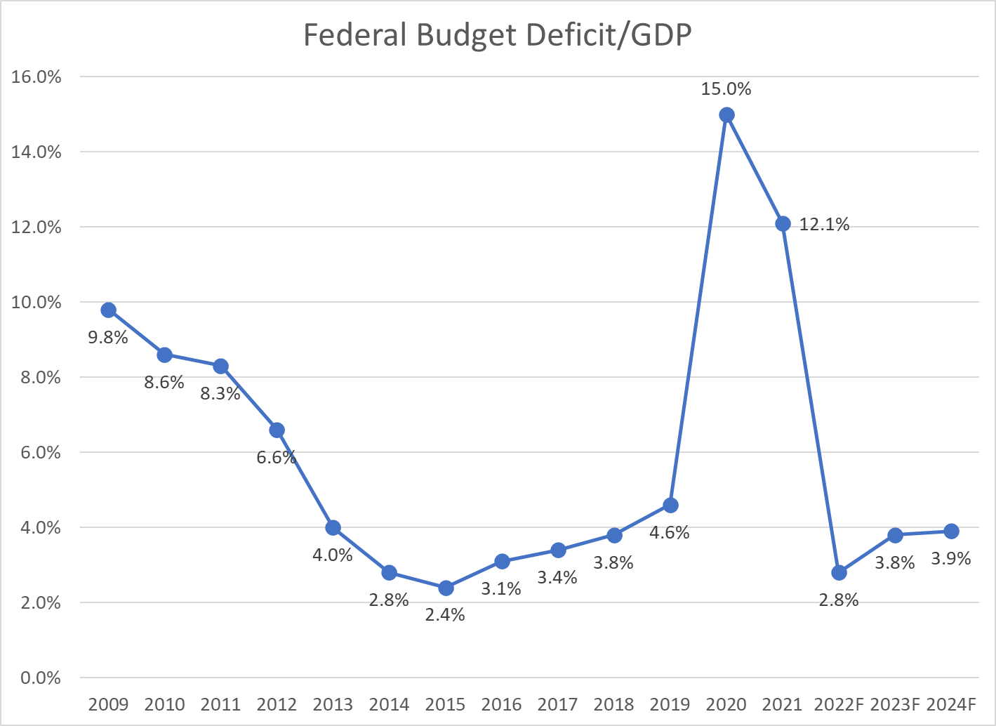
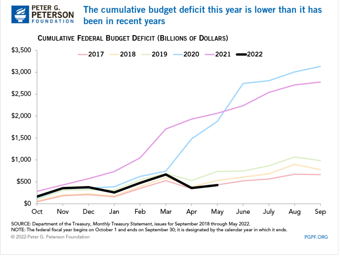
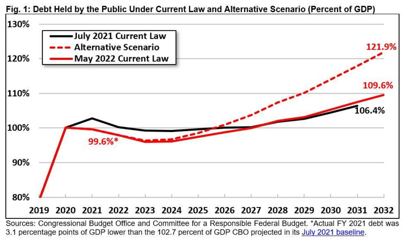
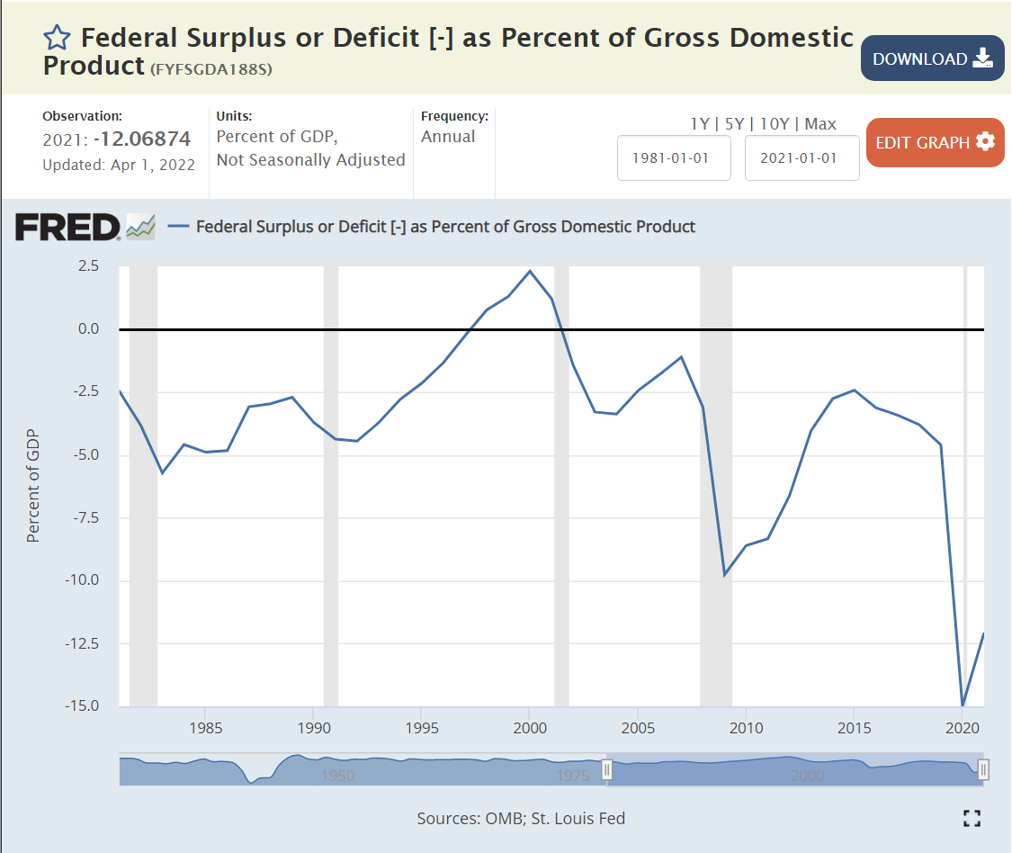
The May YTD deficit for fiscal year ending in September, 2022 was $426B, down 79.4% from the $2,064B level of FY 2021. The total FY 2021 deficit was $2,772B, so the same percentage reduction for the whole year estimates a $572B deficit for FY 2022. Visually, the year-to-date pattern most closely matches 2017 which ended with a $666B deficit. In fiscal years 2018 and 2019, the additional deficit for the last 4 months of the year was $245B and $247B, respectively. That gives us a forecast of $672B for FY 2022. DC insider, Wrightson ICAP, recently forecast a deficit of $600-700B.
The conservative forecast of $700B deficit for FY 2022 is 2.8% of the CBO estimate of FY 2022 GDP at $24,694B. The CBO forecast Deficit/GDP ratios of 3.8% and 3.9% for the next 2 years, roughly the same as the pre-pandemic 2018 rate.
Good News: Government Fiscal Stimulus is a 3.5% Annual Drag on the Economy
The reduced federal deficit and state/local deficits compared with history provided a very large drag on first quarter GDP, but the economy recovered in the second quarter and is forecast by the CBO to deliver 3% overall real GDP in FY2023 after a very strong 4.4% in FY2022.
Revenue increases are not sustainable, coming in as much as 2% of GDP higher than trend or expectations. The 2021 economy was very healthy, resulting in spillover tax receipts in 2022 that will not continue.
Our economy has operated effectively for the last 4 decades with a federal budget deficit averaging 2.5% across the business cycle. Starting with 2.8% in 2022 is an unexpectedly good place. Congress and the president will struggle to maintain this level without significant spending or revenue changes in the next budgets.
North Dakota, Wisconsin, Oklahoma, Kansas, South Dakota, Minnesota and Nebraska form a low unemployment core in the Great Plains area. Utah, Idaho and Montana represent the Rocky Mountains. Vermont and New Hampshire lead in New England. Alabama leads the South, while Indiana leads the Midwest.
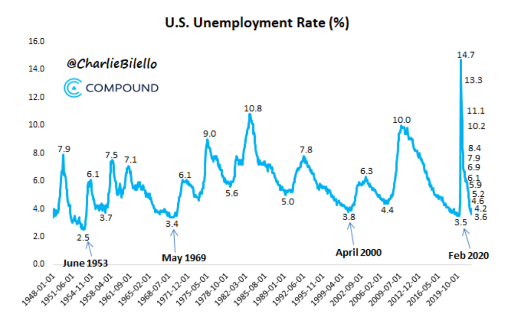
Jan, 2016: 4.8% through Feb, 2020: 3.5%. 4 years “below full employment”.
Estimates of Natural (Non-accelerating Inflation) Rate of Unemployment (NAIRU) Have Been Biased Upwards and Influenced by One Period of High Inflation and Supply Chain Disruptions
In retrospect, the period before 1976 (oil, trade, inflation shocks) should have used a 4.5% NAIRU for policy decisions. The jump to 6% in the late 70’s and early 80’s is supported by history. The NAIRU was deemed to be 5% or higher as late as 2010, but could have been pegged lower. Based on the lack of inflation during the teens, the rate probably should have been set at 4% or lower.
Macroeconomic Theory
Classical economics asserted that labor markets will naturally find equilibrium wages and quantities of labor employed at the individual labor market (micro) and total economy level. The Keynesian view, embraced by 90% of professional economists, is that there are market imperfections at both the individual market level and total economy level. Most importantly, wages are “sticky downwards”. Currently employed workers resist “losing” wages by accepting pay cuts when demand is lower. Aggregate supply (production) does not automatically create an equal amount of aggregate demand in the short-run, as businesses, individuals, banks and governments often choose to save more during economic downturns or periods of greater risk. Hence, a downturn in the economy caused by any source may result in a prolonged negative spiral, rather than automatically delivering lower prices in product, money and labor markets, which could help to recover these markets.
Microeconomic Theory: Why is There Any Unemployment?
Economists point to frictional and structural factors. Frictional unemployment occurs because labor market information and decisions are not perfect and instantaneous. As with other markets: housing, commercial real estate, offices, bank loans, farm fields, airport gates, container ships, utilities, R&D, IPO’s, private equity, M&A, retail inventories, etc, labor markets are imperfect. It takes time for equilibrium to be found. Given the increased concentration of labor in major metropolitan markets and internet-based recruiting systems, frictional unemployment has decreased in the last 20-30 years.
Structural unemployment occurs because of mismatches between the current skills possessed and skills demanded in a given place or due to legal or regulatory limitations. Binding minimum wages have been a smaller factor in the last 40 years but may have greater impact in the future. Regulatory requirements for professional licensing have increased significantly in the last 50 years (with some “liberalization” seen in recent years), slowing the ability for individuals to move between professions.
The overall labor force participation rate increased for many years as women entered the workforce, but has declined significantly in the last 20 years for men and for women. I’ll provide a detailed analysis of these factors next week. For our purposes, focusing on short-term changes, recent history shows that the labor force participation rate can be 1-2% higher overall. Some workers have not returned from the pandemic challenges. Some early retirees may return to the labor force. Teens and college students may join the labor force at recent wage rates. Marginal groups (elderly, long-term unemployed, handicapped, drug/alcohol recovery, crime history, minorities, limited language skills, inexperienced) may be considered for more positions.
The media tends to emphasize the increased specialization and technical content required for modern jobs. This has resulted in greater structural unemployment, especially among lower-skilled individuals who held and lost manufacturing jobs between 1970-2000. It has also reduced movement between industries which require a core base of knowledge to be effective, with health care being a prime example.
On the other hand, modern corporations that worked through a dozen post-WW II business cycles eventually adapting to the “business cycle”. First, based on Japanese manufacturing, TQM or lean six sigma manufacturing principles, they reduced their operating leverage. Companies devised factories, offices, distribution centers, product lines and national businesses that could be equally profitable from 70-95% of capacity, rather than 85-95% of capacity. Second, they reduced their unavoidable “fixed costs” by importing goods, outsourcing business functions (manufacturing, IT, accounting, legal, marketing, distribution, sales, R&D) and employing temporary labor. Third, businesses systematized their processes so that core production processes could be operated by individuals with limited specialized or tribal knowledge, including managers and support staff. Fourth, businesses increasingly used matrix and project structures to effectively redeploy staff to any areas of need. So, while variable production staff is a smaller share of employment, the remaining “fixed cost” support staff can be more flexibly deployed. Fifth, after 40 years of process re-engineering, data warehouses, activity based costing and balanced scorecard reporting, companies deeply understand variable costs and incremental benefits driven by sales, production, product lines, facilities, territories and projects. “Knee-jerk” reactions to business cycle downturns are less common as firms better understand short-term incremental profits and medium-term costs of hiring and training. Sixth, firms have improved their ability to define “critical success factors” for every position. This has eliminated many irrelevant experience, degree, culture, personality and other factors from hiring screens. Seventh, firms have increasingly rotated staff through line and staff roles, allowing talented individuals to move between these roles and function effectively. Eighth, firms are more strategically oriented, growing profitable product lines and territories and dropping or “selling off” marginal channels. This means that the incremental positive value of most positions persists, even in an economic downturn.
Overall, firms have learned their “applied intermediate microeconomics” and clearly defined the marginal benefits and costs of every position. They understand exactly what incremental profit can be delivered from each position. Hence, the demand for labor services is significantly greater than it was historically, including through the downside of the business cycle. That means that the natural unemployment level is lower than in the past. Firms can profitably put more people to work than ever before.
Economists, Forecasters and Pundits are Reluctant to Predict Unemployment Below 3% Because it Was Rare Historically.
Lobbyists, Journalists, Politicians and Analysts Highlight the Downsides to “Very Low” Unemployment
From a firm’s perspective, a low unemployment labor market causes increased recruiting, hiring and training costs. It results in less well-matched staff to job roles resulting in lower initial productivity. Companies might even, aghast, inadvertently hire some staff with marginally negative profit results. Hence, very low unemployment rates will increase labor costs, reduce profits, reduce demand for labor and possibly bankrupt previously functional firms.
Trade-off Between Unemployment and Inflation: The Phillips Curve
In the 1970’s fight between Keynesians and Monetarists/Classical Economists/Rational Expectations teams, the Keynesians emphasized the historical existence of a short-term trade-off between unemployment and inflation, especially when unemployment was very low due to a high level of aggregate demand. The conservative side noted that the historical data was inconsistent. The “rational expectations” camp emphasized that unexpected increases in inflation would lead to increased wage demands by labor. In the long-run, there is no such thing as a “free lunch”, so effective real wages would return to the level determined by the “marginal productivity of labor”. Based on recent data (pre-pandemic), it appears that the US economy can run at 3.5-4.0% unemployment without triggering significant upward wage pressures. In the post-pandemic world, the “natural” unemployment rate (NAIRU) is unclear. The labor supply has basically recovered to the pre-pandemic level. Wages are up 5% in nominal terms but are down 2% in real terms (see below).
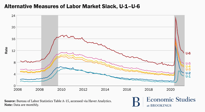
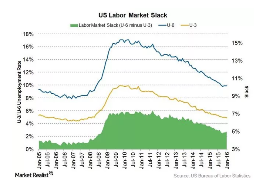
There are Many Unemployment Measures. They Move Together.
Underemployed individuals provide the logical next best full-time employees. The current slack measure is 3.5%, (7.1% – 3.6%) on the low side, but not so low that conversions from this underemployed group to full-time employment cannot be expected.
Jun, 2020 – Jun 2022. Nominal wages up 4.7%/year. CPI up 6.1%. 1.4% real wage decrease.
Dec, 2020 – Dec, 2021. Nominal wages up 4.9%. CPI up 7.3%. 2.4% real wage decrease.
May, 2021 – May, 2022. Nominal wages up 5.2%. CPI up 7.9%. 2.7% real wage decrease.
Nominal wage rates have increased by 5% annually in a period of 7% inflation. Employers have been able to economically justify these increases while adding 7 million people to the labor force.
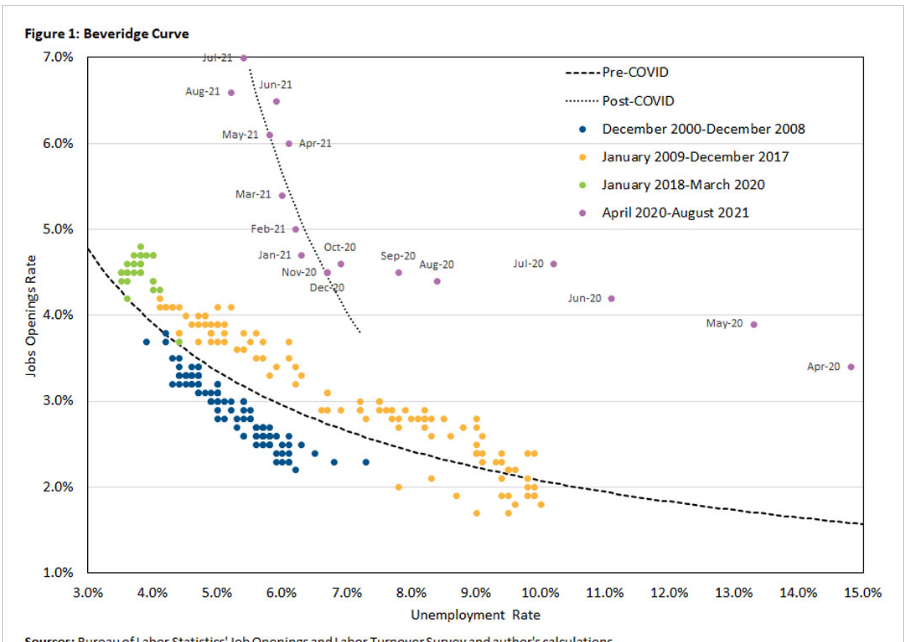
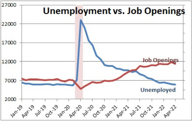
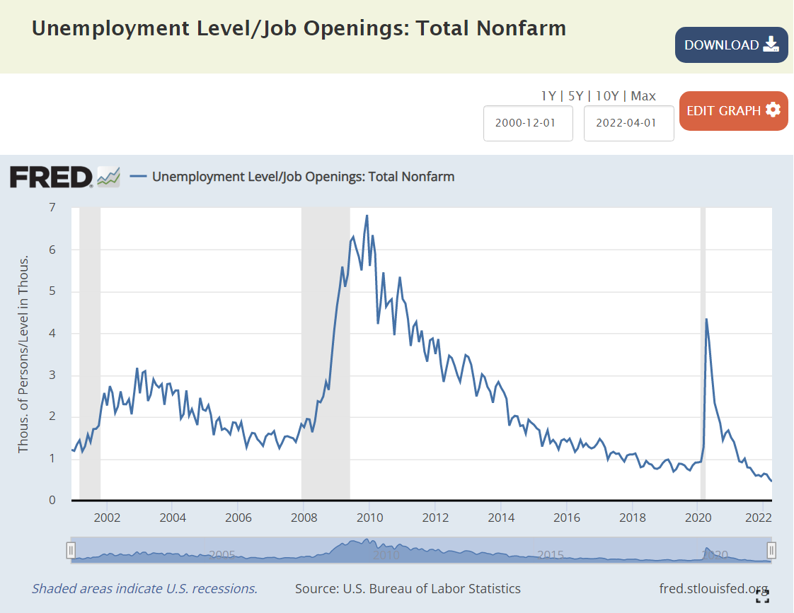
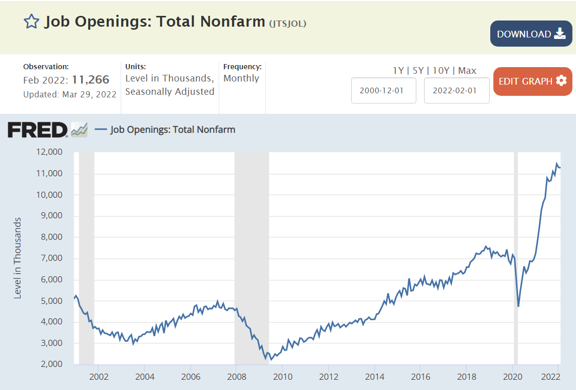
Beveridge Curve: Job Openings Versus Unemployment Rate.
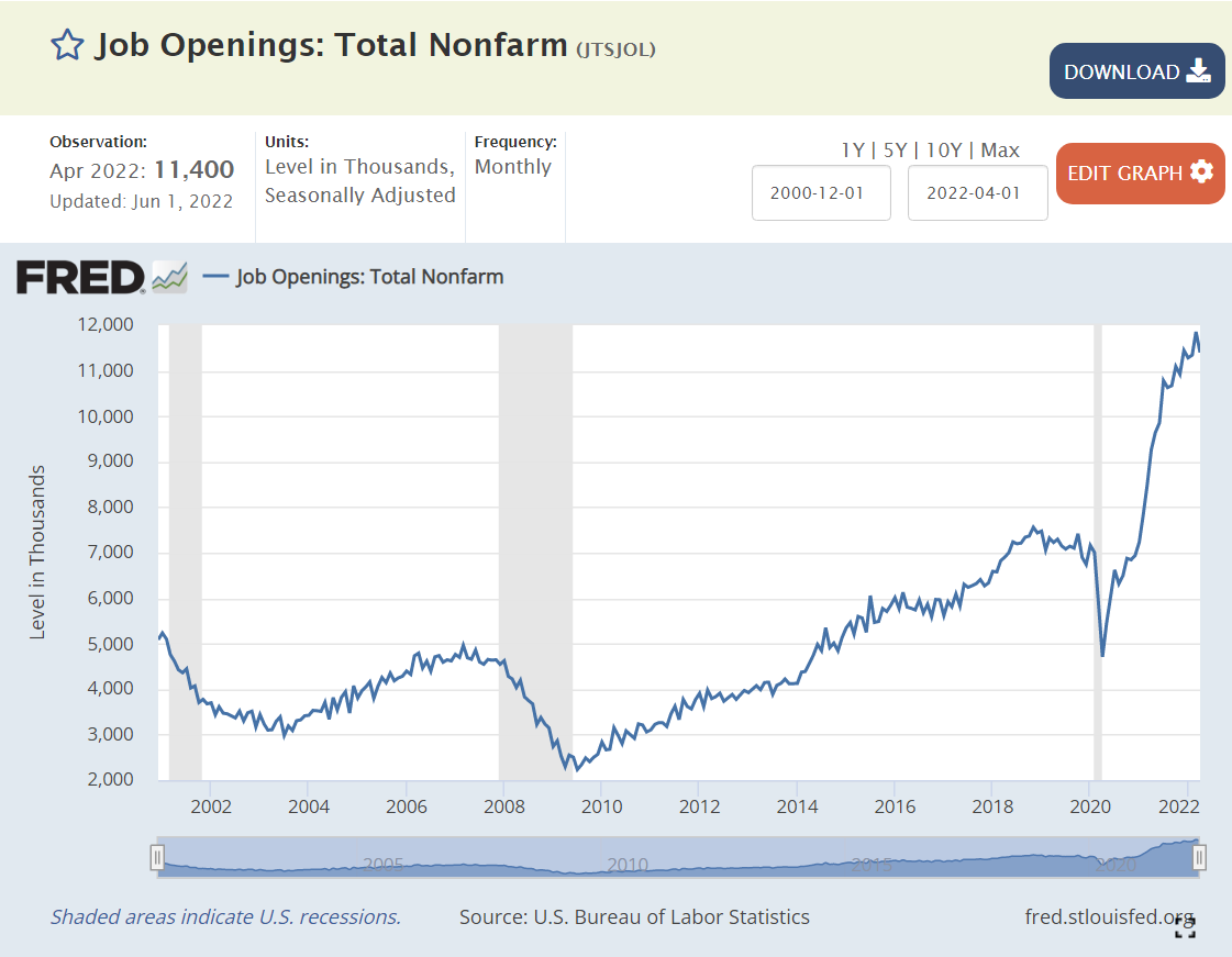
Historically, there was a well-defined relationship between the national level of job openings as a percent of the labor force and the unemployment rate. Job openings were a low 2-2.5% of the labor force at the beginning of the business cycle, accompanied by higher (6-10%) unemployment, but improved to 4% openings and 4% unemployment. The current labor market has far more job openings, up to 11 million, almost twice as many job openings as unemployed workers, but the unemployment rate has only fallen to 3.6% so far. This is uncharted territory. There are more voluntary quits, so employees are switching jobs at a faster rate. The labor force participation rate has increased with these jobs and higher wages offered. But firms have not found enough acceptable hiring matches to significantly reduce the open positions level. Through time, they are likely to achieve their hiring goals, driving the unemployment rate down below 3%.
The demand for labor already exists. 11 million open positions is 7% of the labor force. We have enough active demand for ZERO % unemployment.
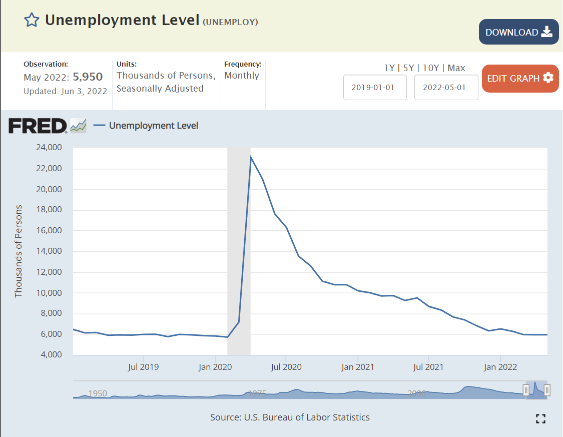
The supply of labor increased by 7 million people since the depths of the pandemic. The rate of monthly additions has slowed from 500-600,000 to 300,000, but that is still 3.6 million jobs added on an annual basis. We only have 6 million total people unemployed!
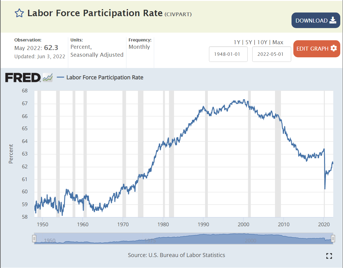
3. The labor force participation rate is only 62.5%. There is room for millions to return to the labor market. Before the “Great Recession” in 2008 it was at 67%. Many metro areas, large and small, enjoy labor force participation rates above 65%.
4. The underemployed population can provide up to 3% of the total labor market’s full-time jobs.
5. Frictional unemployment is minimal in the internet age. Structural unemployment may be lower than described in the media, as firms have been adapting to the “information age”, high technology and the service economy for 40-50 years.
Finally, many states and metro areas currently have unemployment rates in the “twos”. Nebraska and Utah stand at 1.9%. Minneapolis (1.5%), Birmingham (1.9%) and Indianapolis (2.0%) demonstrate that otherwise unremarkable (!!!) metro areas can function with very low unemployment rates.
Record high of 6.6 million hires per month, above pre-pandemic record 6.0M.
Record low layoffs at 1.3M per month, down from 1.8M pre-pandemic record. Yes 5 new hires for every layoff!
Record 11 million plus, up from pre-pandemic record of 7 million.
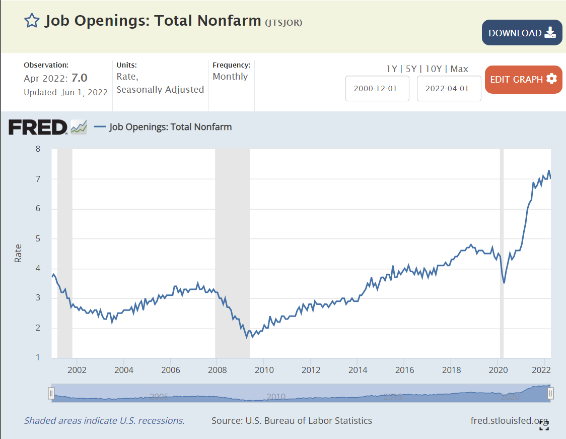
Record 7% of jobs are open, far above pre-pandemic 4.4% record level.
Job seekers to open positions ratio is less than 1/2, all-time record low, down from pre-pandemic record that was just below 1:1.
Average hourly wage up 12% to record $31.95.
Hours worked is slightly higher than before the pandemic.
Record high 2.9% versus pre-pandemic record of 2.3%.
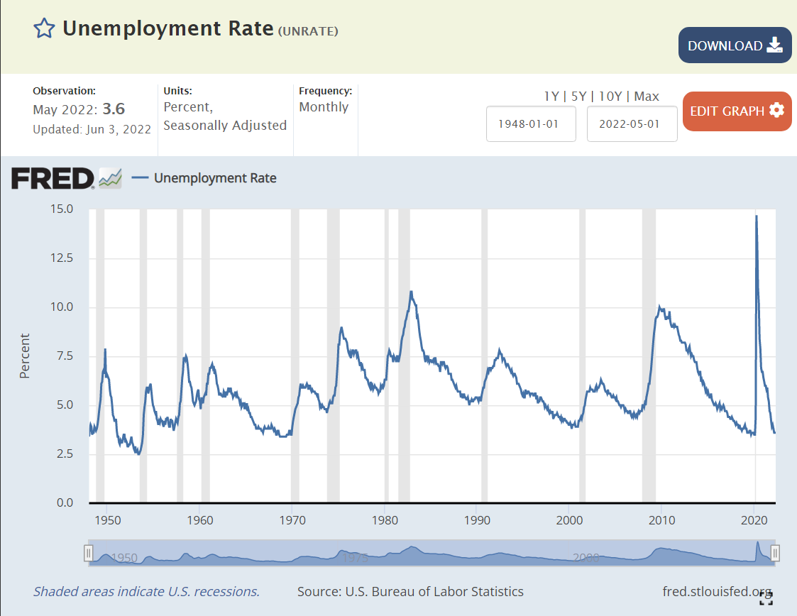
Unemployment rate is 3.6%, just above pre-pandemic 3.5%. Prior 3.5% rate was in 1969. This is the best in 50 years.
Underemployment rate at 7.1% is just above 7.0% pre-pandemic level. Underemployment rate was last this low in 2000.
Long-term unemployment is at 1.2%, same as pre-pandemic level. The economy last delivered this positive level in 2000.
African-American unemployment rate is at a near-record 6% low. It was a little lower briefly before the pandemic.
Initial unemployment claims reached the pre-pandemic low of 190,000 during 2022, but has increased slightly to 210,000. This compares with typical levels of 400,000 in recent decades.
Continued unemployment claims are at a 50-year record low of 1.3 million, down from the pre-pandemic level of 1.8M. 1.3M was last seen in 1969!
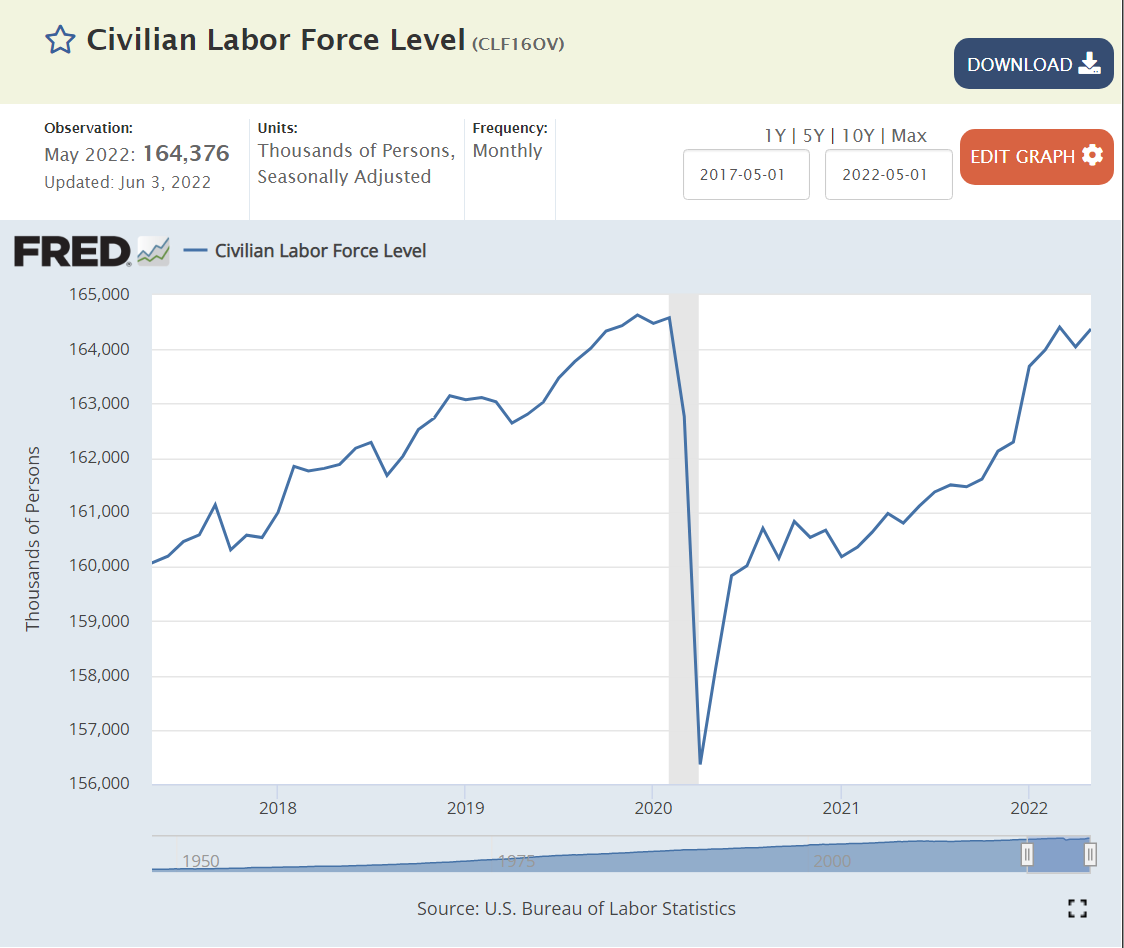
Civilian labor force at 164.4M is just below the all-time record of 164.6M.
Prime age labor force participation rate fell from 84% to 81% by 2014. It recovered to 83% by the end of 2019. It has reached 82.5% so far in 2022.
Teen labor force participation has slowly increased for a decade.
College age labor force participation has remained the same.
“Older” age labor force participation hit an all-time low of 29% in the early 1990’s, and then began to climb all the way to 41% in 2012. It remained at 40% throughout that decade. It dropped with the pandemic and has since recovered to 39%.
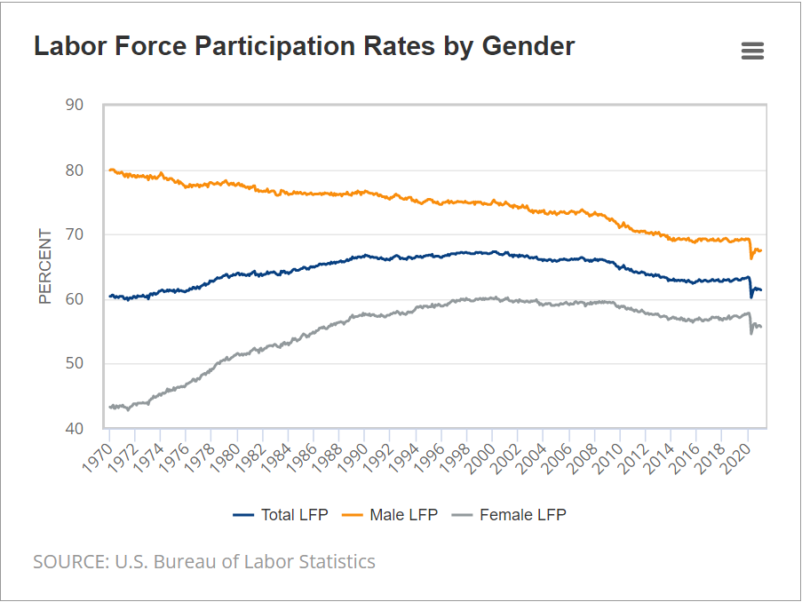
Female labor force participation continued its long climb to a peak of 60% in the late 1990’s. It dropped below 57% by 2014. It increased to 58% in the last 2 years of the decade. It has recovered to 57% after the pandemic.
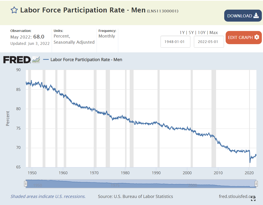
The male labor force participation rate has been declining for 70 years. It reached 69% in 2014 and remained there, without falling, throughout the decade. The rate dropped to 66% during the pandemic and has since recovered to 68%.
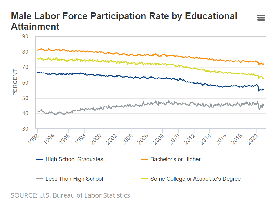
Labor force participation has declined by about 10% for HS grads, some college and college grad groups. Non-HS grads’ participation has actually increased. The similarity of participation changes by education and gender points to broader social factors playing a major role in these “economic” changes.
Summary
The measures of demand for labor are all at record levels. Unemployment rates are at long-term lows, just above the pre-pandemic levels which were driven by a decade long economic recovery. Labor force participation is down by 1% compared with pre-pandemic levels. Overall, this recovery from the pandemic challenges exceeds all expectations.
9 States Reached All-Time Record Low Unemployment Rates in February
Nebraska, Utah, Indiana, Kansas, Arkansas, Mississippi, Montana, Oklahoma and West Virginia. The Republican leaning states are “winning”. The Bureau of Labor Statistics (BLS) has been reporting state data since 1976, so this is a GREAT result.
27 states reported unemployment rates below the optimistic “full employment” level of 4%. Another 17 were in the 4.0-4.9% range. Just 6 states were burdened with unemployment rates above 5.0%, with New Mexico at 5.6% the highest.
As with the states, the distribution of results for the 51 metro areas with 1 million + populations is quite convincing. 8 metro areas are below the “unsustainable” 3.0% gold standard. 29 metro areas are below the 4.0% “full employment” level. 43 metro areas are below 5%. 8 areas exceed 5%. Detroit is second worst at 5.4%. Cleveland is in last place, struggling with 6.4%.
Unemployment Rate Will Fall: Blue State Employee Returns From Covid Have Lagged
Red states have roughly returned to pre-Covid employment levels. Blue states have lagged by 3.5%. Mixed states have lagged by 2%. This can provide 3 million workers to fill some of the 11 million open jobs.
I expect the overall unemployment rate will set a 68-year record in the next 3 months. The February 2020 3.5% and May 1969 3.4% lows will be eclipsed! Unemployment will be at the lowest rate in my lifetime (Jul 1956)! This is despite the many, many issues and risks we have on both the supply and demand sides of the labor market.
IMHO, there are many factors driving this GREAT NEWS. (1) American firms are making record profits based on domestic and global demand, so they are incentivized to hire more workers, even at higher than usual wages. (2) American firms are finding that they can pay higher than historic wages and still generate incremental profits from the incremental workers (see Costco). (3) The definition of “employable” workers is clear, but employers are slowly loosening their irrational requirements (college degrees). (4) Baby Boomers have accumulated unprecedented retirement assets, so they have slowly left the labor force in a “one way” exit. (5) The “informal” labor market has been institutionalized with Uber, gig, contract and temporary worker arrangements. (6) Reduced unemployment benefits have incentivized many (older, less skilled non-unionized) unemployed workers to reduce their “reserve wage” expectations and accept new employment at lower wages than their best historical experience. (7) With less stigma for “laying off” workers, employers are more actively hiring workers to fill all economically justified positions. (8) With lower recent illegal immigration, the “reserve army” of the unemployed is lower. (9) Modern recruiting systems provide employers with so many candidates that they are assured of finding matching workers relatively quickly.
In essence, we have a much more “efficient” labor market than in years past, so the minimum unemployment rate has been reduced from 5% to perhaps as low as 2%. This too, is good news.
President Biden certainly did not drive any of the above structural factors. However, he has not disrupted these forces or pushed fiscal or monetary policy to undo the good news. Sometimes, “leave well enough alone” is all that is required.
In the last 50 years, the last 600 months, the US unemployment rate has been below the current 3.8% for just 9 months (less than 2% of the time).
This is less than 2 years after the rate hit a modern HIGH of 15%.
9 states set all-time lows this month: Nebraska (2.1%), Vermont (2.1%), Indiana (2.3%), Kansas (2.5%), Montana (2.6%), Oklahoma (2.6%), Arkansas (3.1%), West Virginia (3.9%) and Mississippi (4.5%).
In February, 31 states had material decreases, while 19 had immaterial changes and NO states had material increases.
At the metropolitan area level, 50 areas sported unemployment rates of 3% or less, far below historical results.
11 areas were at crazy low 2.3% unemployment rates or lower: Lincoln, NE and Madison, Wi. Logan, Provo and Ogden UT. Elkhart, Columbus, Bloomington, Lafayette, Ft Wayne and Indianapolis, IN.
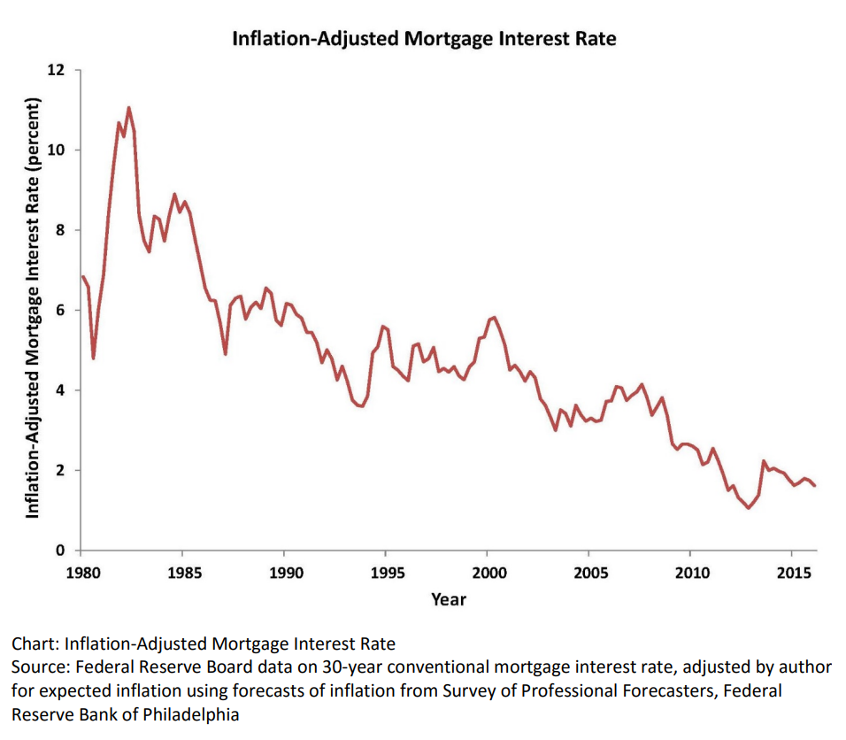
Real, inflation-adjusted, interest rates have declined greatly since 1980. At that time, with the risks of variable inflation and surging oil prices, the real mortgage interest rate was 8%. It declined to 5% in the 1990’s and 4% in the 2000’s before falling to 2% in the 2010’s. The financial cost of owning property has rarely been lower.
House Values are Up, Way Up
House prices grew relatively consistently from 1970 through 2000, with a spike in 2005-9 and a return to trend values in 2010-12. In the last 10 years, house prices have increased by 6% annually in nominal terms, or 4% annually in real terms.
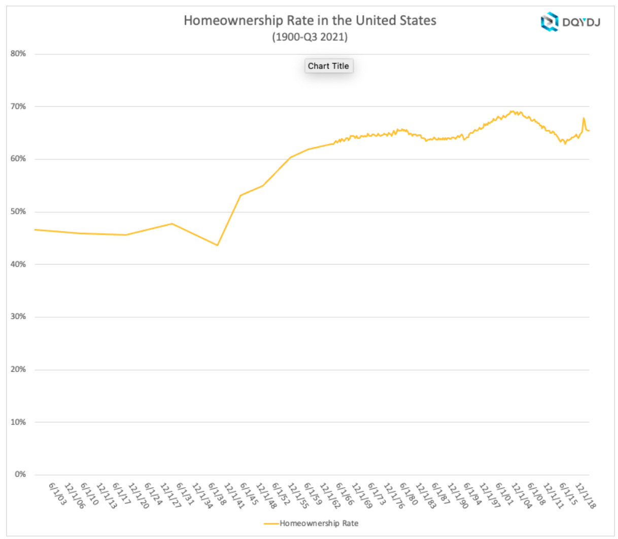
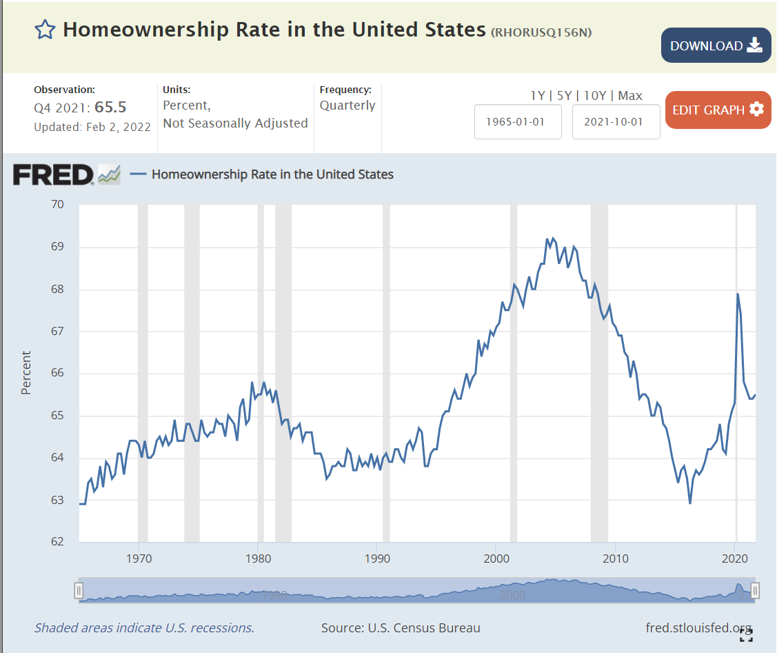
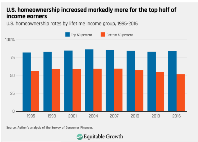
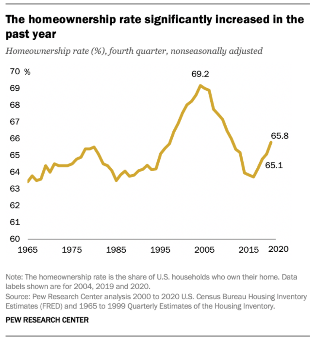
Home Ownership Rate is Rebounding, Up 2%
The US homeownership rate averaged 47% from 1900-40. It increased smartly in post WWII times to 60% by 1955 and 64% by 1965. Homeownership averaged 64%+ for the decade of 1969-78. It increased by 1% during 1979-81. In the midst of a difficult depression, homeownership rates dropped back to 64% by 1985, about the same for the last 20 years, setting a “normal” level. Homeownership rates stayed at 64% for the next decade. Ownership rates increased from 64% to 69% in the next decade before declining right back to 63% by 2015. In the last 7 years, despite many headwinds, the home ownership rate has increased by 2%.
Number of Homeowners has Jumped by 7 Million
In 2000, there were 69M owner-occupied homes in the US. This increased by a solid 7M to 76M by 2005. The housing market hit a lull and the number of owner-occupied homes essentially stayed flat for a dozen years, through 2017. The supply of owner-occupied homes then rose by a strong 7M in the next 4 years to 83M!
The housing market is inherently volatile, typically rising by 2 times the trend and then falling to one-half of the trend. Annual housing starts averaged 1.6M from 1960-2008. They declined by a severe 75% to just 0.5M in 2009. Housing starts have subsequently grown 3-fold to 1.6M annual housing starts, but the accumulated lack of new supply is impacting housing markets today.
The period from 1982-2000 showed homeownership rates by the 5 age segments remaining relatively constant; 65+ 78%, 55-64 80%, 45-54 76%, 35-44 67% and <35 40%. The 65+ group increased homeownership from 75% to 80%. During this time, the overall US homeownership rate increased from 65% to 69%, mostly due to the aging of the population, now more heavily weighted towards the groups with 76-80% homeownership versus the 40-67% younger groups.
Homeownership rates grew from 2000 to peak rates in 2004, before declining significantly for all groups except for the 65+ cohort which essentially held it’s own. The adjacent 55-64 class fell 4%. The middle 45-54 group dropped 7%. The typically homeownership growing 35-44 group cratered by 9%. The young <35 group fell by 5%. Hence, the overall rate fell dramatically during this time.
There is a 30 point gap between married couples and other groups, with 84% of married couples owning homes versus about 55% for other family structures.
The US shows dramatically different homeownership rates by racial category. The differences between the 1995 non-Hispanic White rate (70%) and Others/Asians (50%), Hispanics (42%) and Blacks (42%) remain large in 2021 where we see White (74%), Other (57%), Hispanic (48%) and Black (44%). The groups homeownership share gain from 1995 to 2005 were similar, ranging from 6-10%, but the decline from 2005-2015 was only 3-4% for Whites and Hispanics, but 7% for Blacks and Others. The improvement from 2015 to 2021 has been 2% for 3 groups and 4% for the Other/Asian group.
Summary
The Great Recession flattened the housing market. The number of owner-occupied homes in the US remained level at 76 million from 2006 – 2017. The number of housing starts plummeted from 2.0M to 0.5M per year, compared with an historic average of 1.6M. New home construction first exceeded 1.2M units (75% of historic average) again only in 2020, a dozen years later. New home-owning households have increased by 7M units in the last 4 years! The homeownership rate is up 2 points, from 63.5% to 65.5%. Supply is responding to increased demand and higher home prices. Homeownership rates will increase with the economic recovery, but be constrained by higher home prices.
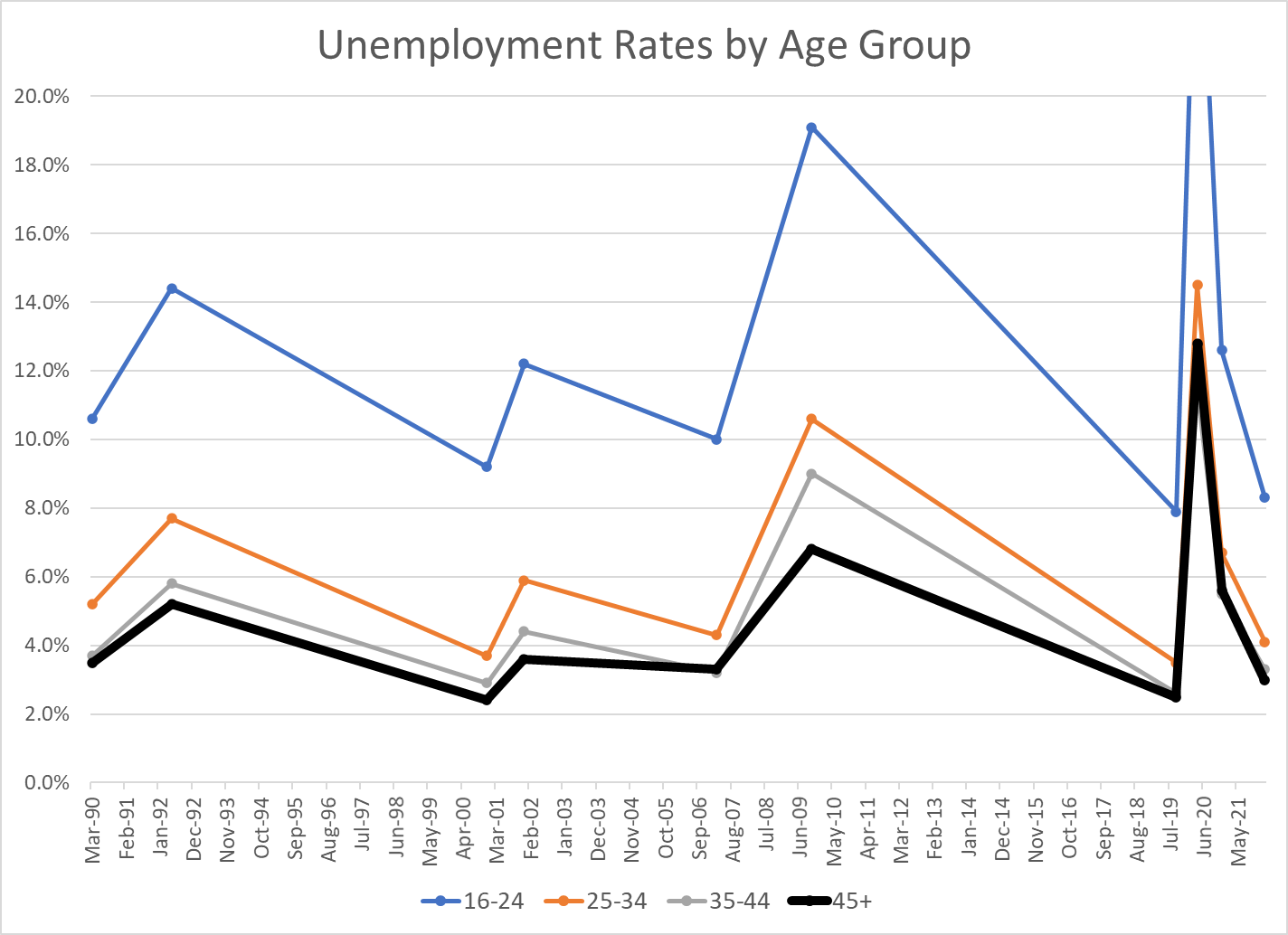
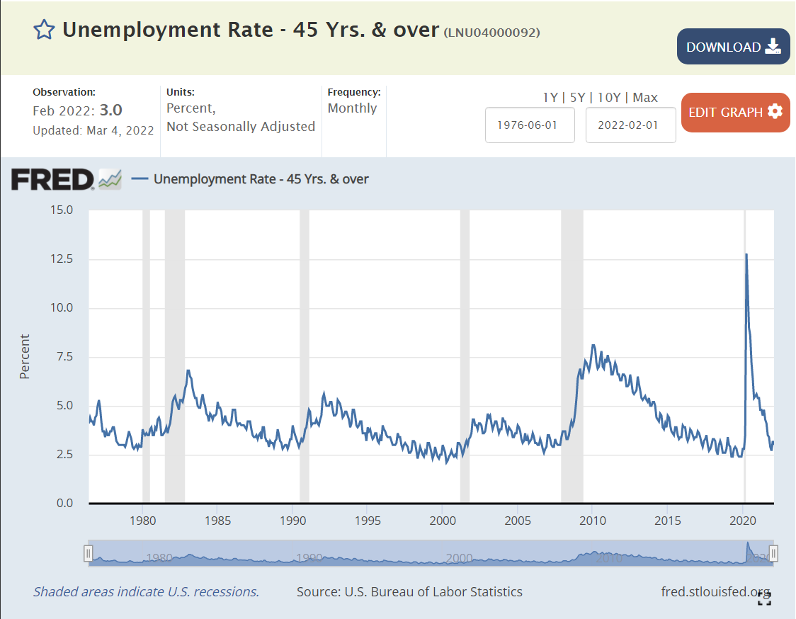
I’ve summarized the last 30+/- years of US labor market experience with just the peak unemployment rates of the business cycle, plus December, 2020 as a secondary indicator of the peak Covid/pandemic impact, since the actual peak numbers in April, 2020 were so extreme and short-lived.
Less experienced individuals have historically had higher unemployment rates in the US. Compared with the 45+ age group, the 35-44 age group has averaged 0.3% higher unemployment; 5.2% versus 4.9%, a relatively minor difference. The 25-34 year age group has averaged 6.6% unemployment, a substantial 1.7% higher rate. The job-seeking 16-24 year age group has averaged 13.2% unemployment, more than twice as high as the 25-34 year age group and more than 2.5 times the 45+ age group (8.3% extra).
The “extra” unemployment for 35-44 year olds versus the 45+ group has been zero for the last 15 years, versus a minor 0.5% premium historically. It appears that workers are reaching full employment value at an earlier age.
The “extra” unemployment for 25-34 year olds versus the 45+ group has been 1.0% for the last 15 years, a small reduction from the prior 1.5% premium.
The “extra” unemployment for 16-24 year olds at the peak of the business cycle versus the 45+ group averaged just 5.3% recently versus 7% historically.
The 2007-2009 recession showed a greater impact on modestly younger (25-44 year old) workers, with their unemployment rates increasing by 2.5% more than the 45+ group.
Despite the reduction in the inexperience penalty for youngest workers (16-24) in the last few years, they did experience much higher “extra” unemployment during both the 2007 and 2020 recessions.
Very young workers continue to be penalized for their inexperience, but other workers from ages 25+ seem to have relatively equal economic value today.
Note that the current unemployment rates for those aged 25+ already matches the average MINIMUM rates of the last 4 business cycles: 3-4%. The 8.3% unemployment rate for the 16-24 year age group is below the minimum in 1990, 2000 and 2007, and just above the 7.9% level of Sep, 2019.
Hotel capacity increased by 50% from 1995 to 2019.
Demand grew at the same 50% rate, although not always in lockstep.
Occupancy averaged a healthy 63% (almost two-thirds) through this period, with significant differences due to changes in construction and the economy.
The price per room averaged about $125 per night in real 2020 dollars, again varying based on supply and demand, but overall, relatively constant.
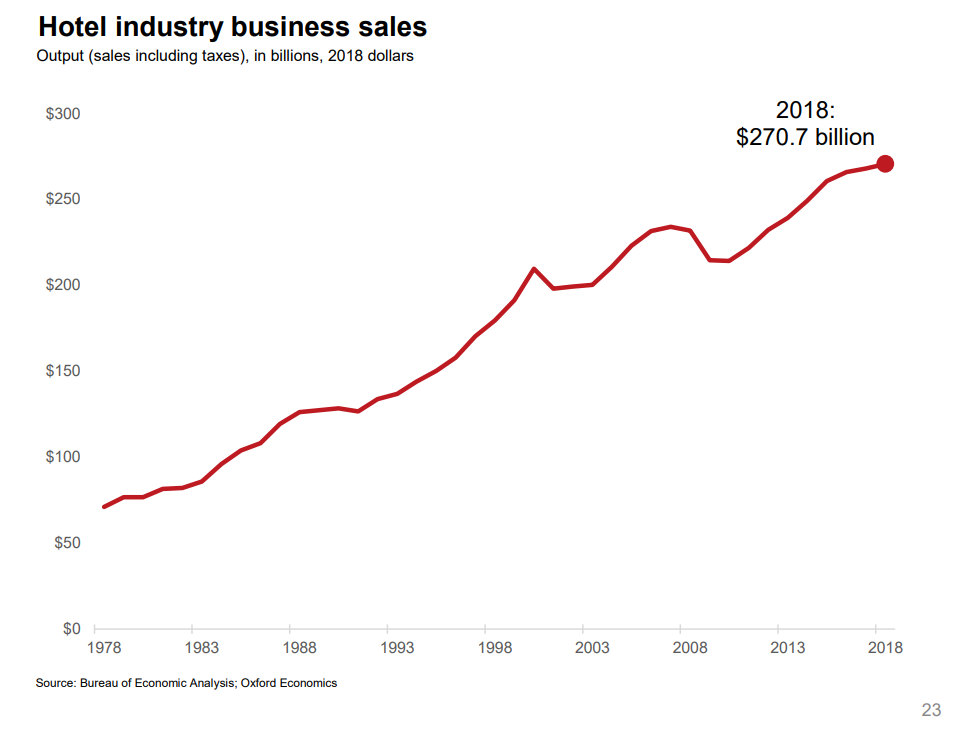
Total hotel industry real revenue ($2020) for the 21 years from 1998 through 2019 increased by a little less than 50% according to Bureau of Economic Analysis (BEA) figures.
Real consumer only (leisure) sales increased by nearly 100% during this period.
Real consumer sales per person increased by about two-thirds.
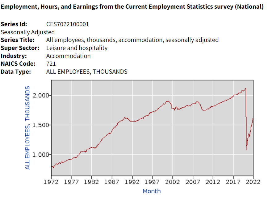
Hotel industry operating statistics before 1995 are not readily available. The tremendous growth of the industry in the last 30 years of the twentieth century is illustrated by the more than three-fold growth in industry employment, from one-half million to 1.8 million. Note that employment did not follow the growth of rooms during the first 20 years of the next century.
Oxford Economics developed an industry promotion brochure in 2019 that has some longer-term data. Total real (inflation adjusted) revenue is up more than 4 times in 40 years. Our 1995-2018 data shows relatively small changes in average hotel prices. I suspect that there were “real” increases from 1978 – 1995 as the industry was growing quickly in response to consumer demand.
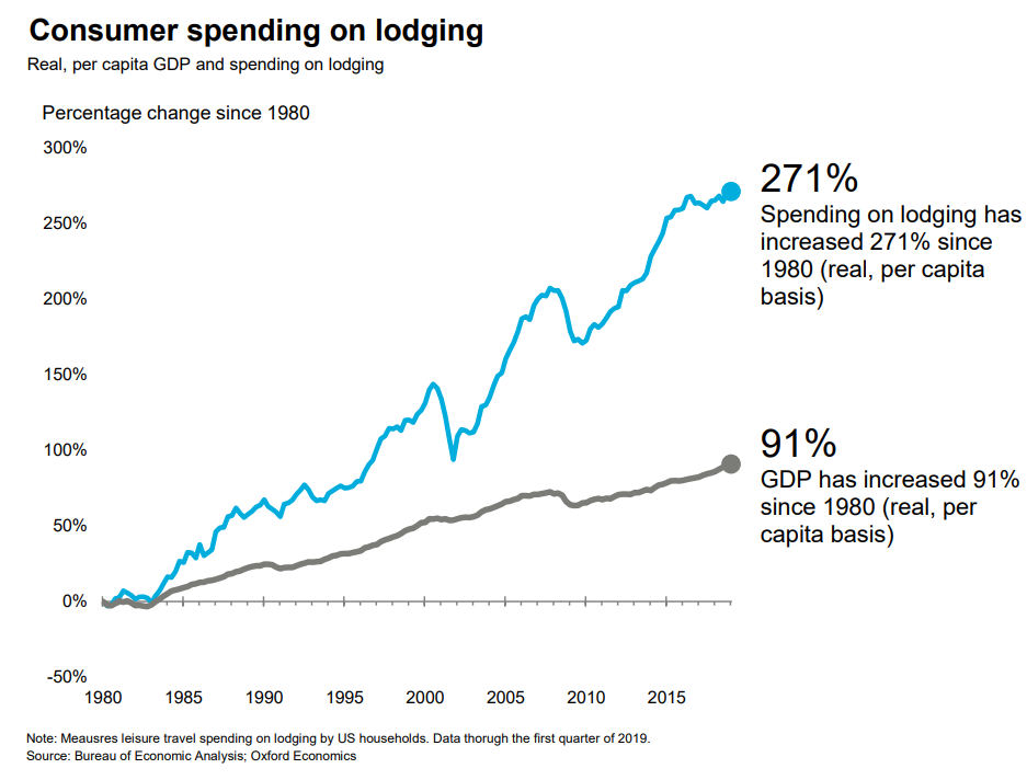
A similar measure, gross domestic product (GDP), or production value added, net of the cost of inputs, increased 3-fold in 40 years.
Consumer spending on accommodations has increased about 3 times as fast as GDP overall in the last 40 years.
Hotel purchases as a share of total consumer spending has increased by more than 80% in these 40 years.
Overall demand for hotel rooms per citizen for all uses (personal, business, government and foreign travelers) has increased by 20% across 30 years. Personal and foreign travel have grown at a faster rate.
The short-term rental market (personal vacation rentals, Airbnb) has grown from zero to 10% of the hotel room volume and appears to have years of growth ahead of it. This growth is not included in the industry summary figures.
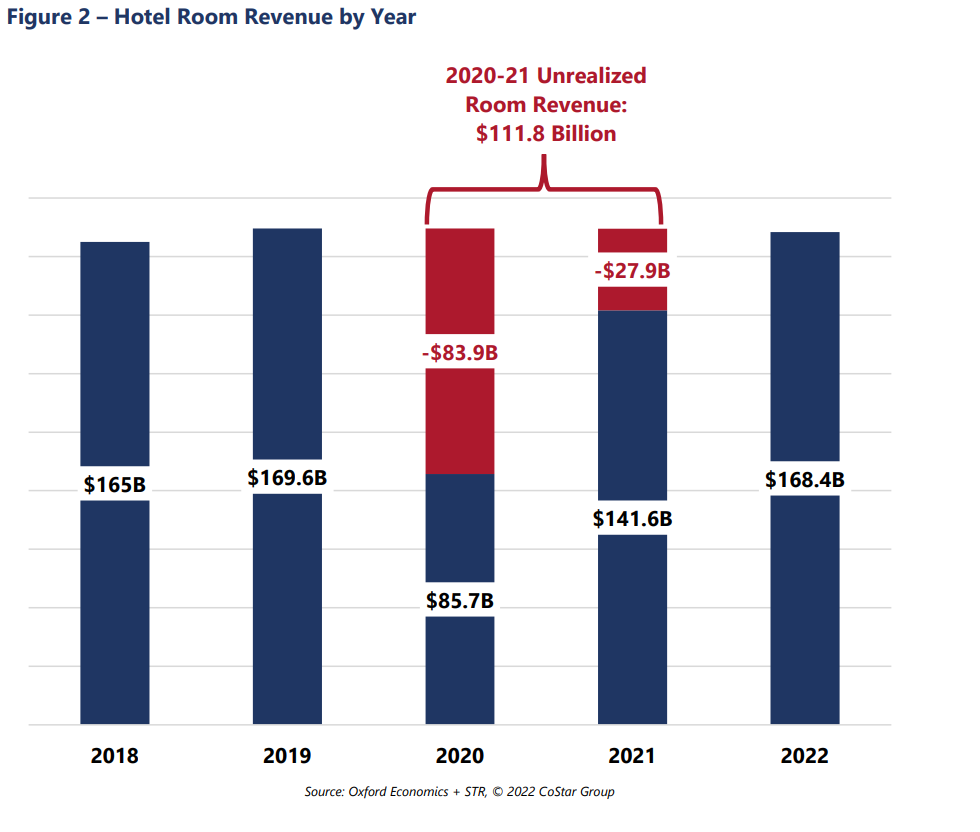
Occupancy is forecast to return to the historical average of 63% for 2022 and increase further in the following years. The industry “lost” more than $100B of revenues due to the pandemic, so analysts estimate that the industry will return to “normal” employment, prices, profitability and reserves by 2025.
Consumer access to hotels and private rentals has increased by 3 or 4 times in the last 50 years, at a faster rate in the first 25 years, and somewhat slower in the last 25 years. Hotel business models at 63% occupancy seem to justify continued capital investments in new supply. Prices have been relatively flat for 25 years. Competition between brands, pricing segments, corporations and private owners seem to be effective at providing adequate capacity and service options at competitive prices.
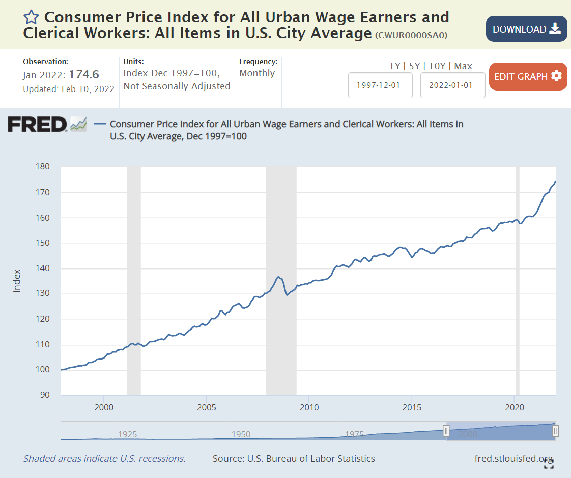
Inflation is back in the news after several quiet decades. The components of the All Urban Wage Earners and Clerical Workers are listed above, comparing Feb 2020 with a 1997 base of 100, and then Jan 2022 with the same base. The most recent weighting of categories is in the rightmost column.
Overall, consumer prices have risen by a modest 2-2.5% annually, just 59% through Feb 2020 and 75% through Jan 2022. Yes, that is a 10% price increase in the last 2 years: 175/159.
The 3 largest components have shown price rises close to the overall average. The biggest sector, Housing (39%), displays slightly higher inflation, at 72% and 85%, closer to 3% annually, with a possibility of higher rises for the next few years. Transportation (22%) reveals lower than 2% annual inflation with a 45% increase across the full period. Food and Beverage (15%) is close to the average with 64% and 82% growth.
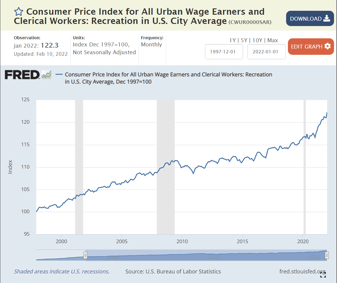
Some smaller areas have seen slow price growth. Apparel (3%) has declined in actual prices during this period. Recreation prices (4%) have grown by less than 1% annually.
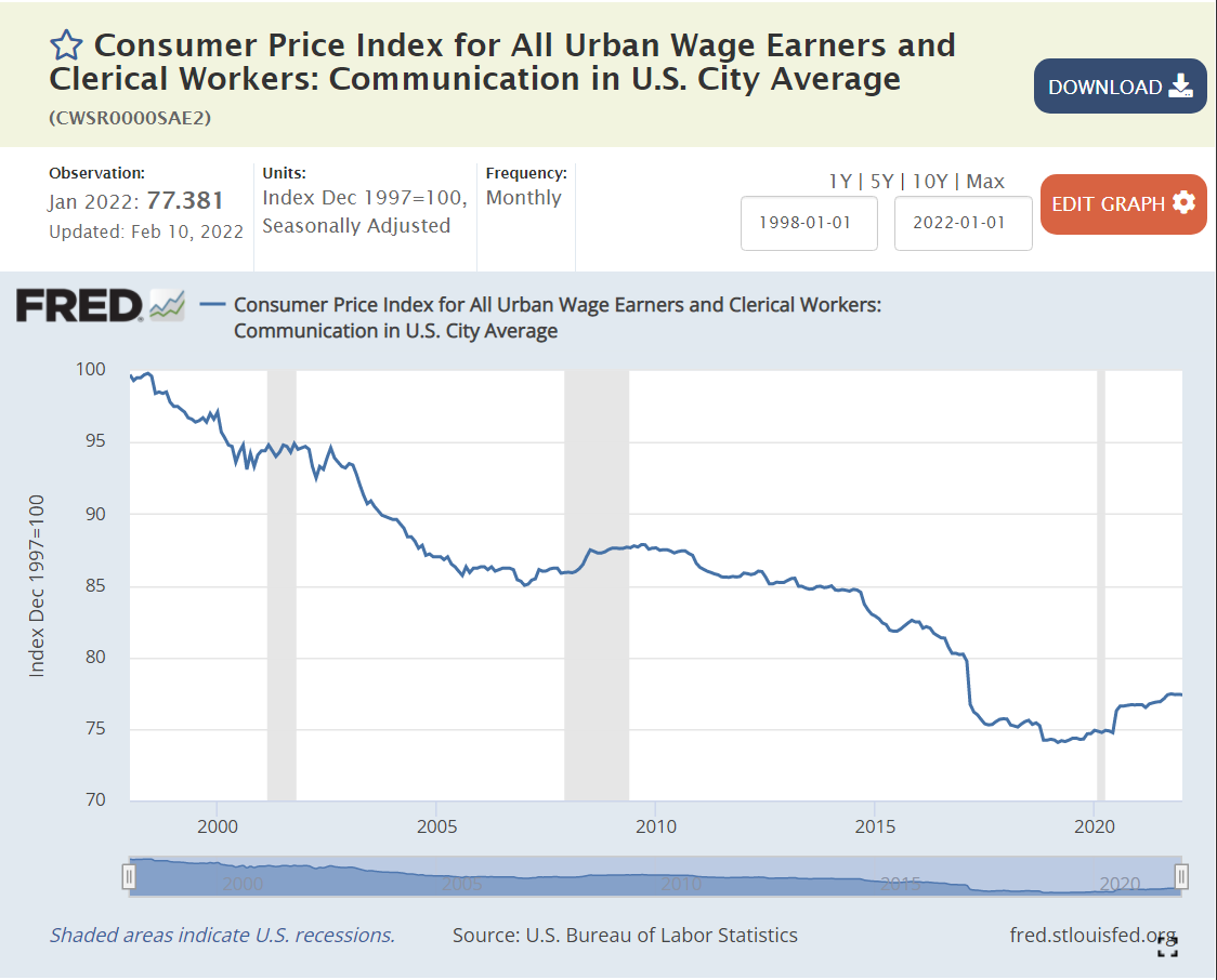
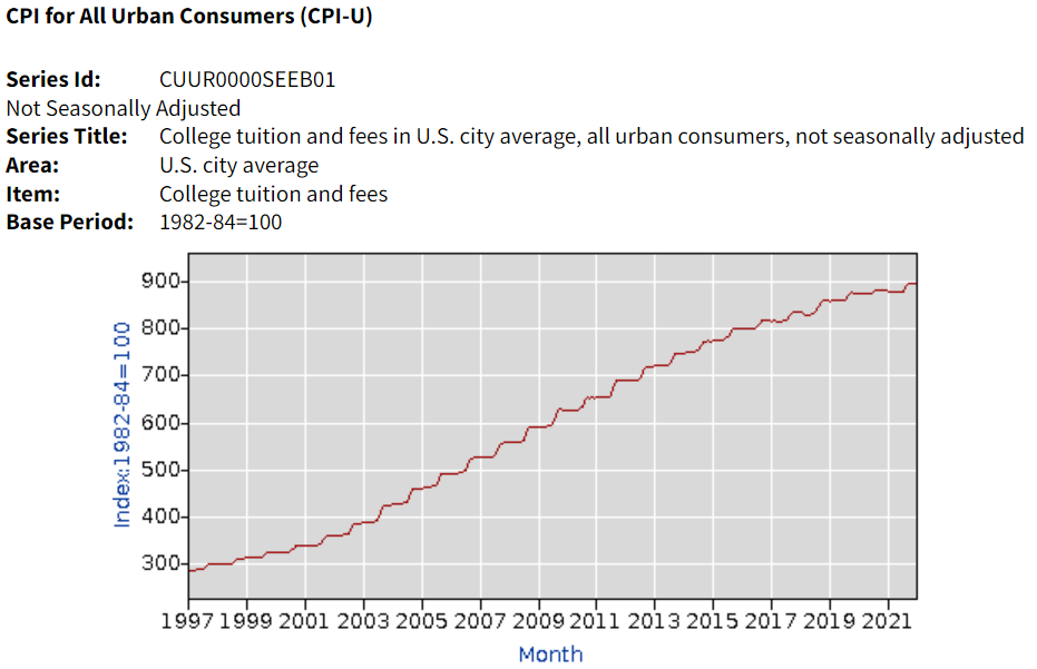
Education and Information (6%) prices have grown by 1% annually, but this category includes 3 very different subsectors. Information Technology prices have declined throughout the period. No simple 25- year summary is available. Communications prices have dropped by an average of 1% annually. Education prices have grown much faster, more than offsetting the decline in IT and communications prices. The Tuition, Fees and Child Care measure of prices increased by 165% and 171%, more than twice as fast as overall inflation, roughly 4% annually. College tuition (data not in Fred database) increased by 191% and 196%, about 4.5% per year.
The Other Goods and Services (3%) category mostly contains miscellaneous items that don’t fit cleanly in Housing or Food/Beverage. The category displays faster price increases (3.5%) on average due to the very sharp increase in Tobacco prices (taxes) which have grown 4-fold in 25 years (7%/year). Note that alcoholic beverage prices increased by a little more than 2% annually
Finally, Medical Care (7%) has grown by 116% – 125% during these 25 years, about 3.5% annually.
Overall goods prices have grown slowly and service prices more rapidly. Medical care and college prices stand out for their increases, while the price of housing/rentals is flashing warning signs.