Hiking: Southern Michigan

A nice walk in the woods.

http://www.berriencounty.org/1299/Love-Creek-County-Park

No photo description available.

Greatly exceeds expectations in the midst of an urban environment.

https://www.michigan.org/property/ott-biological-preserve

Historic mill and adjacent river lands.

https://www.stjosephcountymi.org/parks/parks_rawsons.php

OK/TK walk in the woods.

Dr. T.K. Lawless Park

https://www.michigan.org/property/dr-tk-lawless-park

Small town/in town walk around the lake.

First Lake/Baw Beese Lake

https://www.cityofhillsdale.org/parksrec/page/baw-beese-lake

Very nice, many hiking options.

https://www.michigan.org/property/fort-custer-recreation-area

Basic woods hike, a stream and some wetlands.

https://www.stjosephcountymi.org/parks/parks_timmpreserve.php

The trails are so so, but the dunes provide a challenge and a view. Lake Michigan and the shoreline are awesome.

https://www.michigan.org/property/van-buren-state-park

Welfare Benefits: Order of Magnitude

“Typical welfare family”, a single parent and 2 children (cue the video), receives $35,000 of welfare benefits annually claims the Wisconsin congressman in 2014. That number has stuck in our minds, just like the “welfare queen” and escaped prisoner “Willie Horton”.

https://www.washingtonpost.com/news/fact-checker/wp/2014/12/05/grothman-single-parents-welfare/

Fact checkers debunked this claim, but it’s important to work through the details to get back to a reasonable “order of magnitude” estimate of “welfare benefits”.

If a family has ZERO income, they may receive maximum benefits. The Clinton “welfare reforms” limited the primary benefits to a total of 60 months. Families cannot receive benefits “forever”. Most household heads do work and have some income during the year. The maximum benefit number is an inappropriate “anchor”.

Temporary Assistance for Needy Families (TANF) (welfare) participation rates have fallen from 80% of those eligible to less than 25% since “reform” was implemented. The reform has had it’s intended effect. Two-thirds of those previously participating no longer do so. Some have become more productive and income earning members of society. Others “make do”.

Click to access what_was_the_tanf_participation_rate_in_2016_0.pdf

The percentage of families “in poverty” receiving welfare benefits has fallen from 68% to 23%.

https://www.cbpp.org/research/family-income-support/temporary-assistance-for-needy-families-tanf-at-25

Current average TANF benefits in my home state of Indiana are $346/month or $4,152. That’s a long way from $35,000 of cash benefits, which is the “anchor” that needs to be removed. $4,000 per year of cash is the typical Indiana welfare benefit. The maximum is $700/month or $8,400/year, twice as high. More kids, no income, still eligible. This is possible, but it’s not a useful reference point. The normal received benefit is just one-half of the maximum.

https://www.needhelppayingbills.com/html/indiana_cash_assistance.html

Supplemental Nutritional Assistance Program (SNAP of food stamps) is the next welfare program. For an Indiana family of 3, current benefit value is $6,240 per year. A family of 3 can earn up to $25,000 annually before benefits start to decline. The national ratio of SNAP to TANF recipients is 82%. In Indiana, just 75% of those eligible receive ANY SNAP benefits.

https://www.fns.usda.gov/usamap/2018#

https://www.in.gov/fssa/dfr/snap-food-assistance/about-snap/income/

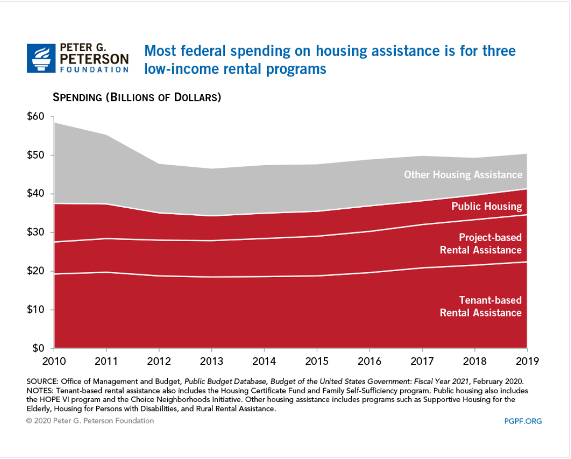
Housing assistance is listed at $9,000. There are various federal and state programs. This is like “winning the lottery” for low income families. In Indiana, 1 in 8 eligible families (12%) receive housing subsidies. These average $736/month or $8,832 per year. On an “expected value” basis, this is only $1,060 per year. From a public policy point of view, this is the relevant number.

See pages 23-24.

Support has not increased materially since 2013.

https://www.pgpf.org/blog/2020/07/how-does-the-federal-government-support-housing-for-low-income-households

In the Wisconsin representative’s model, there is $7,000 of higher education benefits. This is clearly irrelevant to public policy. Individuals do not make ongoing annual work choices based on education benefits.

The Cato Institute started this “conversation” about “welfare versus work” in 1995 and updated their analysis in 2013.

Like the congressman, they note that the “welfare benefits” received are in “after-tax” dollars, so they “should” be translated back into pre-tax dollars to be “fair”. Since the marginal tax rate for low-income wage earners is often just 10%, this is immaterial. More importantly, the emotional, political currency is cash. “how much do THEY receive?” is THE question. This is an after-tax amount. No “grossing up” is required.

The Cato folks also include the full value of Medicaid benefits received by those below the eligible income transition. The value paid per child ($2,145) and per adult ($4,211) yields an $8,501 annual “benefit” currently. Is this a “welfare” benefit or a “citizen” benefit? The US health care system is primarily funded through tax-deductible employer plans. Medical plan subsidies are now available up to 400% of the federal poverty level. From a federal budget perspective, lowest income families receive more value. From an “incentive” perspective, low income families are generally indifferent between federal and employer sponsored plans. This $9,000 does not belong in “the cost of welfare”.

The Cato analysis includes the cost of the “earned income tax credit” (EITC) as a welfare benefit. The EITC was created and enhanced as an incentive for unemployed persons to work and earn some income, thereby providing themselves with short-term and long-term benefits and reducing the cash level welfare benefits. It grows quickly with earned income up to about $18,000 and then falls back down nearly as quickly as income grows to $40,000 per year. This is not what most people think of as a “welfare benefit”.

https://en.wikipedia.org/wiki/Earned_income_tax_credit

The Cato analysis also focuses on welfare benefits versus the minimum wage, emphasizing that overly generous welfare benefits provide a disincentive for recipients to seek paid employment (ignoring the 60 month TANF benefits limit). As the effective minimum wage in 2021 approaches $15/hour and $31,200/year, we won’t be hearing this comparison again.

As a professional “cost accountant” since 1978, I was often asked to provide the “exact cost” of various products or services. College courses, residence hall rooms, food service meals, buildings for rent, account managers, computer hardware, installed cables, telephone services, computer maintenance, software development, dresses, tops, retail stores, extension cords, surge protectors, imported goods, cell phones, returned cell phones, etc. The answer is always “it depends”. This is never a popular answer. It depends on what decision you are making. Short-term, medium-term or long-term timeframe. Do we include opportunity costs? Which externalities should we consider, if any? Do we include strategic, brand or cultural consistency as factors?

For the “welfare benefits” question, I think that the relevant public policy/budget and personal incentive numbers are largely the same. Welfare/TANF and food stamps/SNAP matter. EITC, medicaid, education benefits, housing assistance, and income taxes don’t matter.

Welfare/TANF for an Indiana family of 3 is worth $4,152 annually. The complementary food stamp/SNAP benefits are worth $6,240. The total quasi-cash welfare payment is $10,392 per year of eligibility. Maximum of 5 years. This is the right “anchoring” number: $10,000 per year for a family of 3. They will be going to the local food pantry every week. They will be seeking family and private charity. They will be leaning on friends, relatives and neighbors for “subsidized” child care. They will be working and seeking to advance themselves.

There are disincentive challenges remaining in our current systems.

https://www.washingtonpost.com/news/fact-checker/wp/2014/12/05/grothman-single-parents-welfare/

But, these technical, marginal, incremental, opportunity rates are not the heart of the matter. Lower income families are not “optimizing” their benefits. I volunteered to provide low income/elderly federal income tax services for several years. The benefit and tax rules are complex beyond comprehension.

The core public policy question is “Is $10,000 of annual benefits a reasonable amount for our state to pay to a family of 3 with no income?”. I would argue that it is too low, half what it ought to be.

Support for a universal basic income (UBI) has grown in recent years, as the economy, productivity and equity returns have grown by 3% annually but wages have remained flat for 40-50 years in the US.

https://www.investopedia.com/news/history-of-universal-basic-income/

Typical welfare benefits at $10,000 are now irrelevant compared with $30,000 effective minimum wage.

The Great Resignation: Labor Markets Run Amuck

Lots of press on the topic of a “new” labor market. Some of the experience seems to be genuinely new, some of the situation seems to be our old favorites, supply and demand.

Derek Thomson’s recent Atlantic article is a good one,

https://www.theatlantic.com/ideas/archive/2021/10/great-resignation-accelerating/620382/

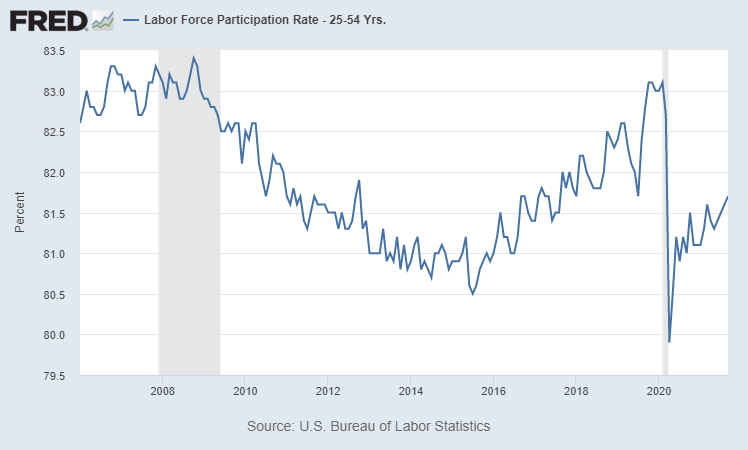
On the supply side, labor force participation is the big driver.

Focus on the core 25-54 age group to avoid the impact of various “mix variances” with changing enrollment rates and different retirement patterns. HUGE increase from 1950 to 1990, 65% to 84%, as women joined the US workforce across 4 decades. The rate stayed roughly constant for 2 more decades, through 2010, falling back a little to 83% in the late 2010’s.

Since 2006, we’ve had some modest changes. The rate fell from the relatively stable 83% rate through 2009 down to 81% in 2012. The recession knocked 2% of the population out of the workforce. For the next 4 years, through 2016, the participation rate remained at 81%. This is a variable that does not change quickly. People make long-term decisions, knowing that re-entering the work force requires very significant “effort”, investments, networking and accepting lower wages versus history. By the middle of 2016, almost 8 years after the decline that started in early 2009, the participation rate started to increase again. Note the many articles about the “jobless recovery” during W Bush’s time and Obama’s first term. The labor markets are not quite as responsive as desired. In the next 4 years, the participation rate returned to its prior level. That’s an increase of 0.5% per year during a prolonged economic boom period. Again, this measure of available supply does not change rapidly in normal times.

The pandemic dropped participation back to 81% in a short few months! In the last year, the participation rate has risen by a little more than 0.5% to 81.7%. We can expect to see this same kind of improvement for each of the next 3 years based upon recent history. But, even with all of the measures of underemployment and open positions, it is unlikely that the labor market will attract new employees faster than this rate.

The number of nonfarm workers employed reflects the results of labor markets. This is another measure that typically changes slowly.

The number of US employees stayed relatively flat from 2000-2004. The W Bush (jobless) recovery DID add 6 million workers. The “Great Recession” dropped the headcount by 8 million, back down to the 130 million level of the prior recession. Note that we had 11 years with essentially ZERO net job growth.

The economy found its footing in 2010 and we had 9 years or growth, adding 22 million employees, a truly remarkable period of prosperity. This recovery is remarkable for the steady pace of job growth, a constant 2.4 million per year.

By the end of the 2020 pandemic year, employment was down to 143 million, a decline of 9 million. This is similar in size to the “Great Recession’s” 8 million job loss. In the last year, the economy has added 5 million jobs, a pace TWICE the level of the prior recovery. We may be slowing down, or the job adds may continue between the 2.4 – 5 million annual rate. This is VERY GOOD news.

In the long-run, the US economy struggles to reduce and hold unemployment below 5%.

In the post-WW II boom times, 4% was reached several times, but thereafter quickly increased back above 5%. The “stagflation” era of the 1970’s indicated that “full employment” might be as high as 6%. The boom periods of the late 1990’s and 2000’s drove actual unemployment below the presumed 5% unemployment rate, but always just briefly. The long and smooth 2010’s recovery broke the rules. Unemployment rates fell and fell down to an unexpected 3.5%.

By the end of 2020, the unemployment rate had dropped to a more reasonable 6.7% from the measured peak of 15%.

It has recovered by a very strong and quick 2% in the last year, reaching 4.8%. This is near the long-term level of “full employment”, where demanders must provide increasingly attractive offers to entice supply.

This recent disconnect between supply and demand is seen in the unusually high job openings rate.

From 2000-2014, the economy averaged a 3% rate of job openings to labor market participants. About 1 in 30 or 33 jobs were “open”. The “Great Recession” drove this ratio as low as 2%, with just 1/50 jobs open. Following the “Great Recession” this ratio of job market demand increased for a full decade, from 2% to 4.5%, where only 1 in 22 jobs were open. Note that this is more than twice as many as in the depths of the “Great Recession”.

The job openings rate snapped back to the recent 4.5% level in the second half of 2020. It has since grown to a record 7%, or 1 in 14 positions unfilled. This is a “loose” labor market of historic proportions. Demand is clearly exceeding the slow response of supply in the labor force participation rate.

The “quits” rate has attracted the most media attention as it is even more extreme.

The voluntary quits rate averaged 2% from 2001-2008, 1 in 50 workers. It dropped to just 1.5% (1/66) during the Great Recession. It slowly increased with the recovery to 2.3% in the heady days of 2018-19 (1/44). The quit rate returned to its recent level very quickly by July, 2020. It has since increased to 2.8% or 1 in 36 workers each month. On an annual basis, this is 1 in 3 workers voluntarily leaving their employment!

As we’ve seen with the supply chain bottlenecks, the labor market is currently unable to recover quickly enough.

The economy did employ 152 million workers before the pandemic. We need 4 million more to reach that level. Based on recent history, this is an achievable level, but it will require 18 months or more to achieve.

In the mean time, employers will raise wages and provide more flexible terms to attract marginal workers back into employment.

As the “great resignation” pundits say, the pandemic experience changed the expectations of potential employees. They have found that they can “survive” rather than accept low wage positions with poor work conditions. This will change their behavior for years to come.

Romantic Songs from 1950’s Movies

Set aside an hour and enjoy the (color) movies and music.

(HD 1080p CC) Theme From “An Affair To Remember”, Our Love Affair – YouTube

Some enchanted evening – South Pacific – YouTube

Love is a many splendored thing (Old Film) – MiraLove – YouTube

Percy Faith & His Orchestra – A Summer Place – 1959 – YouTube

To Sir, with Love • Theme Song • Lulu – YouTube

The Music Man Shirley Jones “Till There Was You” – YouTube

ON THE STREET WHERE YOU LIVE – YouTube

Nat King Cole – Unforgettable – YouTube

Swingrowers – Via Con Me (It’s Wonderful) – (Official Music Video) Rome in the 50s – YouTube

Doris Day – Fly me to the moon – YouTube

Zorba le Grec – Sirtaki – YouTube

Yul Brynner and Deborah Kerr perform “Shall We Dance” from The King and I – YouTube

Dean Martin – That’s Amore (HD) – YouTube

Lara’s Theme from Doctor Zhivago – YouTube

Sway with me Rita Hayworth – YouTube

Moon River – Breakfast at Tiffanys – YouTube

Doris Day – Que Sera Sera – YouTube

Good News: Auto Choices

U.S. Auto Market Share by Manufacturer

Mfgr1970198019902000201020162020
GM39443528191719
Ford28202423161515
Toyota2689151416
FCA159121491312
Honda3671099
Nissan2549896
Hyundai11544
Kia1343
Subaru111234
Volkswagen6312332
Daimler112232
BMW1222
Mazda121222
Mitsubishi121
Volvo1111
Porsche Audi2
Tesla2
1% Offerings Count6111315131416
Top 4 % Share88797974605962

2020 U.S. Auto Sales Figures by Brand | GCBC (goodcarbadcar.net)

Top Vehicle Manufacturers in the US Market, 1961-2016 – knoema.com

Animated chart of the day: Market shares of US auto sales, 1961 to 2018 | American Enterprise Institute – AEI

In 1970, GM owned a 39% market share in the US with its 6 brands. It now sells less than one-half at 19%. Ford sold 28% and now sells about one-half as much at 15%. Chrysler-Lincoln-Mercury-Jeep has done better, selling 12% in 2020 versus 15% in 1970.

In 1970 there were only 6 firms with 1% or greater market share. Today, there are 16 firms.

In 1970, the top 4 cornered the market with 88% market share. That has declined to 62%.

In the last 50 years, 11 new firms have earned 1% or greater market share. Consumer options are 3 times as great as in 1970!

A similar change has taken place for most manufactured goods. Legacy high cost American and European manufacturers have lost market share. Asian manufacturers have gained significantly (Japan, Korea, China, Taiwan, SE Asia, India). Latin American and African manufacturers have recently started to provide a fourth option.

For consumers, this is great news. More choices. More competitors. Lower prices. Improved products.

Compare the 2021 Honda Accord LX sedan with the 1970 Chevy Impala option to get a sense of the improved features available on a standard “family sedan” today versus 50 years ago.

2021 Honda Accord Prices, Reviews, and Pictures | Edmunds

Chevrolet Impala (fourth generation) – Wikipedia

Good News: Parks and Forests

The 65 official national parks contain 52 million acres of land, about 2% of the total U.S. land area (2,430 acres).

A complete break down of the US National Parks by Size – National Park Obsessed

There are 423 national park “areas” accounting for 85 million acres in total (3% of U.S.).

Frequently Asked Questions (U.S. National Park Service) (nps.gov)

NPS-Acreage-9-30-2020.pdf

National park system areas continue to be added each year.

Park Anniversaries – NPS Celebrates! (U.S. National Park Service)

National Park Visitors

YearVisitors (M)
2019328
2010281
2000286
1990256
1980220
1970168
196072
195033

Annual national park visitors count has increased ten-fold in 70 years.

Visitation Numbers (U.S. National Park Service) (nps.gov)

State parks contain another 14 million acres. State parks had 807 million visitors in 2017, more than two and one-half times the national parks, despite their smaller areas. In total, that’s 1.1 million annual visits or 3.4 for each of the 330 million U.S. citizens. Between 1984 and 2017 attendance has increased by 30%.

Parks and Recreation in the United States: State Park Systems (rff.org)

Attendance trends threaten future operations of America’s state park systems | PNAS

During the pandemic, state parks attendance increased significantly, although national parks attendance fell due to mandated closures.

Summertime Visitors Swarm State Parks and Budgets | The Pew Charitable Trusts (pewtrusts.org)

Data for local (county and city) parks is not readily available. One summary shows more than 2 million acres of “city” parks in selected major cities.

CityParkFacts_2017.4_7_17.FIN_.LO_.pdf (tpl.org)

Parks and Recreation in the United States: Local Park Systems (rff.org)

My experience in Indiana, Ohio and Illinois indicates that the total “local” parks acreage is at least twice as great as this indicator. For example, 42 of Ohio’s 88 counties have a parks district.

Parks and Natural Areas – (ohiobiota.com)

There are an additional 56 million acres in voluntary land trust conservation areas. While these areas often have limited access and improvements, they served another 6 million visitors in 2015.

56 Million Acres Voluntarily Conserved in America, National Land Trust Census Reveals | Land Trust Alliance

The Nature Conservancy: A World Where People & Nature Thrive

Home Page | ACRES Land Trust

The total federal, state, local and private “parks” areas equals 161 million acres, nearly 7% of the total U.S. land area.

Federally managed forests contain 238 million acres and state forests contain 83 million acres. Most of these lands provide significant access for hiking, hunting and riding. At 321 million acres, they represent 13% of the total U.S. land area.

Forest Ownership Statistics – National Association of State Foresters

Grand total of 482 million acres of parks and forest lands, fully 20% of the U.S. land area.

This has nearly all been created since 1900.

History of the National Park Service – Wikipedia

Good News: Labor Productivity from 1970 to 2020, A Personal Perspective

Nonfarm Business Sector: Real Output Per Hour of All Persons (OPHNFB) | FRED | St. Louis Fed (stlouisfed.org)

I formally retired this Spring at age 65. I started working in 1966 at age 10 as a newspaper delivery boy. I’d like to reflect on the big changes in the economy during these 5 decades.

The US Bureau of Labor Statistics tracks the real output per hour in the nonfarm business sector, or “labor productivity”. The media reports this number as it has “real” and “political” importance. The average annual improvement has been 1.9%. That is a 95% increase in 50 years, nearly a doubling, on an arithmetic basis. However, productivity compounds geometrically, just like compound interest, so the 2020 worker is actually 159% more productive. Or, the 1970 worker was 39% as effective as the 2020 worker!!! The 2020 worker delivered 5 units of output for every 2 units of output in 1970!!! Expressed in these terms, it’s clear to see this is a really important measure.

The annual productivity increase has ranged from -1.6% (1974, when I finished high school) to 4.5% (1992). 3 times below 0% and 3 times above 4%. The measured productivity growth increases and decreases through time. From 1970-76, labor productivity grew by 2.4% annually, a very good result. This was the end of the post WWII boom period. Japanese and European competition, oil cartels, sleepy consolidated industries, environmental laws and stagflation disrupted this progress. The next 13 years (1977-89) were a time of transition (disco). Labor productivity grew by just 1.4% per year, despite the early positive effects of the computer revolution. 1% per year lower doesn’t look like much, but it means that output in 1989 was 13% less than it would have been if the country had maintained it’s early 1970’s productivity improvements. The impact of the “Reagan Revolution” in freeing American capitalism from regulations and taxation was not clear during his presidency. The next 8 years (1990-97) showed some improvement, to 1.7% annually, but not a true revolution that either Bush or Clinton could celebrate. The next 13 years (1998-2010) were the golden years for improved labor productivity, averaging 2.9% annually, DOUBLE the improvements from 1977-89. The later Clinton years and the whole George W Bush presidency witnessed these results. The next 6 years (2011-16) reflected the slow recovery from the Great Recession with labor productivity growing by just 0.7% annually, half of the poor 1977-89 time frame. Productivity growth started to recover in the last 4 years, averaging 1.7%.

Economists tend to focus on the role of “capital” in driving labor productivity. In essence, if workers have more or better machines and computers, they will produce more per hour. In very rough terms, about one-half of labor productivity improvements come from better tools.

How Capital Deepening Affects Labor Productivity (stlouisfed.org)

The economists who try to measure the output part of labor productivity (real GDP) try to be consistent and conservative. That means that they understate real GDP. They don’t include the value of reduced pollution. They try to adjust for the improved quality of goods and services, but count only the obvious benefits. In a world dominated by services, this is a major gap. They make no attempt to estimate the benefits of less time spent buying goods and services. They make no estimate of the value of shorter delivery times. They are unable to account for the benefits of transparent and deep markets for goods and services.

Finally, they do not account for the value of product variety, broader consumer choices and customized goods. The fact that modern products more exactly fit consumer needs adds no value to GDP. By the 1990’s firms understood the universal customer value framework (QSFVIP) outlined by Deming, Juran, Shingo, Schonberger and others.

Amazon.com: Building a Chain of Customers eBook: Schonberger, Richard J.: Books

Firms understood Marshall Field’s dictum to “give the lady what she wants” and pursued it with a vengeance in order to gain market share, fight imports and improve margins. Based on my experience, firms devoted at least as much time to delivering upon these “soft”, qualitative, unmeasured productivity factors throughout the last 50 years. Hence, true productivity growth may have been twice as high as officially reported.

What changed in 50 years?

Secretaries and administrative assistants disappeared. Managers and professionals learned to do their own “paperwork”.

Clerks disappeared. Fewer transactions. Lower transaction costs. Standardized transactions. Automated transactions. No data entry operators.

All processes were subject to measurements like Ford’s assembly line.

More “analysts” working to improve all functions. Not just chemistry and engineering specialists. Financial analysts, marketing analysts, pricing analysts, logistics specialists, forecasters, inventory specialists, brand managers, compensation analysts, trainers, quality specialists, process engineers, systems engineers, professional purchasing analysts, etc.

Documentation revolution. Policies and procedures. Standardization. Say what you do.

Quality/process/TQM/lean 6 sigma revolution. Every activity can be defined and improved. Do what you say. Improve.

Process management via Goldratt’s theory defined in “The Goal”.

Import substitution due to lower transport, finance and transaction costs.

Outsourcing and specialization. Finance, accounting, HR, engineering, IT, facilities, marketing, advertising, logistics, distribution, legal, labor, manufacturing, design, project management, testing, returns, maintenance, leasing, equipment rental, etc. Stick to your core functions.

Flatter organizations. Fewer middle management layers.

New product introduction as a well-defined process that can be improved and outsourced.

Business viewed as a portfolio of products and channels and markets.

Competitive banking. Competitive equity markets. Venture capitalists. Bankruptcy processes. Leveraged buyouts. Asset based financing. Leases. Portfolio theory. International funds flows.

Reduced barriers to international trade. Tariffs. Regulations. Lower shipping costs due to containerization. Rule of law reducing costs like letters of credit. Fax machines. Reduced foreign travel costs. Japanese supplier partner concepts.

Improved suppliers. Supplier partnerships. Supplier measures. Contracts. Supplier improvement plans. Less bidding, negotiations or transactions.

Capital allocation/investment within firms. Basic ROI/NPV education. Portfolio of products. New products, new channels, new brands, process improvements, supplier improvements. Improved supplier opportunities. Acquisition value. Improved project management and risk management.

Jack Welch view: be number 1 or 2 or else. Walmart or niche service positioning, not JC Penney or Sears or Kmart. Firms dedicated their products to what customers would willingly buy.

Benchmarking to world class standards. Belief that reaching this performance level is possible and required.

Computerization of all processes. Transactions. Planning. Scheduling. Forecasting. Controls. Budgets.

Immediate communications. Supplier transactions. Product development. Project management. Inventory management.

Digital replacement of analog publishing.

Role of network effects. Clear standards.

Internal planning and scheduling tools.

Improved current and futures markets for all commodities and business inputs.

Reduced costs for transportation, agriculture, manufacturing, minerals and standardized inputs.

Reduced construction costs through design, standardization, sourcing, project management tools.

Greatly improved hiring frameworks and tools (fill the bucket). Management development training. Employee evaluation and feedback tools.

Social support for necessary “downsizing” at larger firms during economic downturns.

Basic productivity improvements from Microsoft Office tools: spreadsheets, word processing, publishing, web publishing, forms, database structure, queries, reporting, projects, etc.

Internal planning, analysis and control tools. Activity based costing. Balanced scorecard.

Much of the productivity improvements of the last 50 years have been due to improvements in “administration”. The lean 6 sigma quality revolution points to continued improvements in the future, perhaps with a lesser measured impact.

Breakthrough improvements in chemistry, biotechnology, physics, nanotechnology, DNA, plastics, materials, communications and energy may be required to drive productivity improvements in the next 50 years.

I’m an optimist. Science delivers opportunities. Profit oriented firms in competitive market find and apply these opportunities. Output per labor hour will be 150% higher again in 2070 (5/2 X). That means that workers in 2070 will be more than 6 times as productive as those in 1970!

Good News: More Women in Political Leadership Roles

A record number of women are serving in the 117th Congress | Pew Research Center

27% in the House and 24% in the Senate.. Consistent increases, especially since the large increase in 1992. Democrats have more than twice as many women representatives, at 38% versus 14% for Republicans.

Details on congressional data.

Women in Congress | US House of Representatives: History, Art & Archives

History of Women in the U.S. Congress | CAWP (rutgers.edu)

Women now hold 36% of state and federal judgeships.

Statistics | National Association of Women Judges (nawj.org)

Women hold 31% of the seats in state legislatures. This number was flat at 25% from 2009 through 2018 before increasing to 29% in 2019. Two-thirds of these reps were Democrats. States that lean Democratic have significantly more women representatives. Only one state, Nevada, has a majority of female legislators.

Women in State Legislatures 2021 | CAWP (rutgers.edu)

Women hold just 18% of governorships. Here, Democrats and Republicans have performed equally well.

History of Women Governors | CAWP (rutgers.edu)

The Pew Research Organization tracks several other measures of female participation in leadership positions. Biden’s cabinet has a record 48% female proportion. 7% of Fortune 500 CEOs are women. 27% of corporate board seats are now held by women. 31% of college presidencies are held by women.

The Data on Women Leaders | Pew Research Center

In general, the growth in participation by women in these public and private leadership positions has been relatively consistent for the last 25 years. Additional progress appears highly likely during the next 25 years.

Politico takes a more negative view of progress, highlighting the continuing inequality, weak progress in some states and stalled progress by some measures. It provides helpful state level data.

Why state legislatures are still very white — and very male (politico.com)

Indiana Music (1880 – 1980)

https://en.wikipedia.org/…/On_the_Banks_of_the_Wabash…

https://www.youtube.com/watch?v=9qVjOJq9IXQ

https://en.wikipedia.org/wiki/Back_Home_Again_in_Indiana

https://www.youtube.com/watch?v=7wcgaRkHAWY

Hoagy Carmichael – Stardust / Georgia on my mind

https://www.youtube.com/watch?v=Em3xyZz_mow

https://www.youtube.com/watch?v=5k0bKSJOywc

Cole Porter (#3)-Anything Goes

https://www.youtube.com/watch?v=3aeQ3DmKU7A

https://www.youtube.com/watch?v=5WX_fKVWX2s

https://www.youtube.com/watch?v=cCYGyg1H56s

https://www.youtube.com/watch?v=7qf_QorYgDE

https://www.youtube.com/watch?v=1T6SG0t9jfQ

Ink Spots – I don’t want to set the world on fire

https://www.youtube.com/watch?v=6l6vqPUM_FE

Bill Monroe -Southern Flavor

https://www.youtube.com/watch?v=9NcCgsAMxhs

Four Freshmen – Poinciana

https://www.youtube.com/watch?v=l4NafK3NFhA

j j Johnson trombone – buzzy (Charlie parker)

https://www.youtube.com/watch?v=J6uT4WPbTz0

Wes Montgomery – Round Midnight / Full House

https://www.youtube.com/watch?v=MOm17yw__6U

https://www.youtube.com/watch?v=fP1Bw0wKZtU

Bill Gaither – He Touched Me

https://www.youtube.com/watch?v=5m–ptwd_i

Freddie Hubbard – Cantaloupe Island (Herbie Hancock)

https://www.youtube.com/watch?v=8B1oIXGX0Io

Michael Jackson / Jackson 5 (#1)

https://www.youtube.com/watch?v=s3Q80mk7bxE

https://www.youtube.com/watch?v=ho7796-au8U

https://www.youtube.com/watch?v=sOnqjkJTMaA

https://www.youtube.com/watch?v=oRdxUFDoQe0

https://www.youtube.com/watch?v=Zi_XLOBDo_Y

McCoys

https://www.youtube.com/watch?v=TlTKhPkZSJo

Crystal Gayle

https://www.youtube.com/watch?v=C9lz_yzrGZw

John Mellencamp (#2)

https://www.youtube.com/watch?v=h04CH9YZcpI

https://www.youtube.com/watch?v=4dOsbsuhYGQ

https://www.youtube.com/watch?v=qOfkpu6749w

https://www.youtube.com/watch?v=0CVLVaBECuc

https://www.youtube.com/watch?v=joNzRzZhR2Y

R Dean Taylor DeLong

https://www.youtube.com/watch?v=fZL_tZxyBDo

Van Halen – David Lee Roth !!!!!

https://www.youtube.com/watch?v=fZL_tZxyBDo

John Hiatt

https://www.youtube.com/watch?v=fZL_tZxyBDo

Guns N Roses – Axl Rose Shannon Hoon

https://www.youtube.com/watch?v=8SbUC-UaAxE

Joshua Bell

https://www.youtube.com/watch?v=laGT9IB2bFo

Janet Jackson

https://www.youtube.com/watch?v=OAwaNWGLM0c

Kenny Edmonds

https://www.youtube.com/watch?v=GbrSO81KhBY

Tom Petty – Mary Jane’s last dance

https://www.youtube.com/watch?v=aowSGxim_O8

Josh Garrels

https://www.youtube.com/watch?v=DzCRgIg-VnI

Good News: Consumer Debt Payments at Record Low

Household Debt Service Payments as a Percent of Disposable Personal Income (TDSP) | FRED | St. Louis Fed (stlouisfed.org)

The ratio of household debt service (loan payments) to disposable personal income includes both mortgage payments and consumer debt payments. From 1980-2000 it fluctuated between 10.5% and 12%. Following the 2001 recession it increased to more than 13% before falling steeply to 10% in 2012. During the long recovery from the Great Recession it remained just below 10%. During the pandemic time it fell as low as 9% as personal incomes were boosted through stimulus payments. In total, this is a healthy situation. American families worked through an unsustainable runup of debt and payment during the “ought” decade, the Great Recession and the pandemic. They are well positioned at les than 10% to either save or spend, depending on their preferences. This is good news for the economy, the housing market and risks to financial markets. This is often called the Debt Service Ratio (DSR).

Mortgage Debt Service Payments as a Percent of Disposable Personal Income (MDSP) | FRED | St. Louis Fed (stlouisfed.org)

The mortgage component averaged 5.5% of personal income from 1980-2000. It remained below 6% through 2004, before increasing quickly to 7% in 2007. This was unsustainable. Mortgage foreclosures and revised lending standards reduced mortgage lending balances quickly. The Fed reduced interest rates and kept them low. Mortgage payments as a percent of disposable personal income fell to just above 4%. This is a 40% drop (3/7). Even compared with the 5.5% average, this is a 27% reduction in debt service expenditures. This ratio is threatened by future interest rate increases, but current mortgage holders will benefit from years of low mortgage rates and refinancing for decades to come.

Consumer Debt Service Payments as a Percent of Disposable Personal Income (CDSP) | FRED | St. Louis Fed (stlouisfed.org)

Consumer debt has also fluctuated across these 40 years, reaching an early peak of 6.4% in 1986 during the confusing era of stagflation. In the next 6 years, families reduced their debt percentage by 1.7% to a safe minimum of 4.7%. Consumers were more confident through the 1990’s and took on more debt, allowing the payment ratio to rise to a new record of 6.6% before the 2000-2001 recession triggered less borrowing. Although mortgage payments increase during the 2000’s, consumer debt payments eased back to just 6.0%. Families were scared by the Great Recession and reduced their debt levels (and helped by lower interest rates) and payments to just 5% in 2010. The ratio remained low for 2 years, before resuming a familiar optimistic climb to 5.8% of disposable income before the pandemic.

Household Financial Obligations as a percent of Disposable Personal Income (FODSP) | FRED | St. Louis Fed (stlouisfed.org)

The Household Financial Obligations Ratio (FOR) follows the same pattern as the Debt Service Ratio (DSR). It is a higher percentage as it includes other “fixed” obligations such as rent. We see relative stability between 16-17% through 2004. The mortgage driven increase to 18% by 2008 is evident, followed by a very rapid fall to 15% in 2012. This broader ratio has remained flat since then. The pandemic drop is due to extra stimulus income.

File:Total US household debt and its composition over time.png – Wikimedia Commons

The composition of total consumer debt for the last 20 years highlights the rise and fall and rise of mortgage debt and the increase in student loan debt.

Household Debt to GDP for United States (HDTGPDUSQ163N) | FRED | St. Louis Fed (stlouisfed.org)

Household debt to GDP peaked at 100% before the Great Recession and has fallen by one-fourth in the next 10 years. Unpaid mortgages and other consumer debt have begun to accumulate in the last year.

Personal Saving Rate (PSAVERT) | FRED | St. Louis Fed (stlouisfed.org)

The personal savings rate averaged 10-13% from 1960-1985. The country’s economic challenges lead families to save less to maintain their standard of living, falling in half (5%) by 1999. It remained in the 4-5% range through the next expansion. The Great Recession triggered families to replenish their savings, with a 7-8% rate. The pandemic period shows a 15% savings rate. In all likelihood, this rate will fall back below 10% soon.

Education | How has the percentage of consumer debt compared to household income changed over the last few decades? What is driving these changes? (frbsf.org)

How Stretched are Today’s Borrowers? Debt Service Levels in Fourth District States (clevelandfed.org)

Not Every Household Feels Relief amid Our Record-Low National Household Debt Service Ratio | Urban Institute

Household debt jumps the most in 12 years, Federal Reserve report says (cnbc.com)

Household Debt Service Drops to a Record Low – AIER

Household Debt Rising, but Payments Remain Under Control | LPL Financial Research (lplresearch.com)