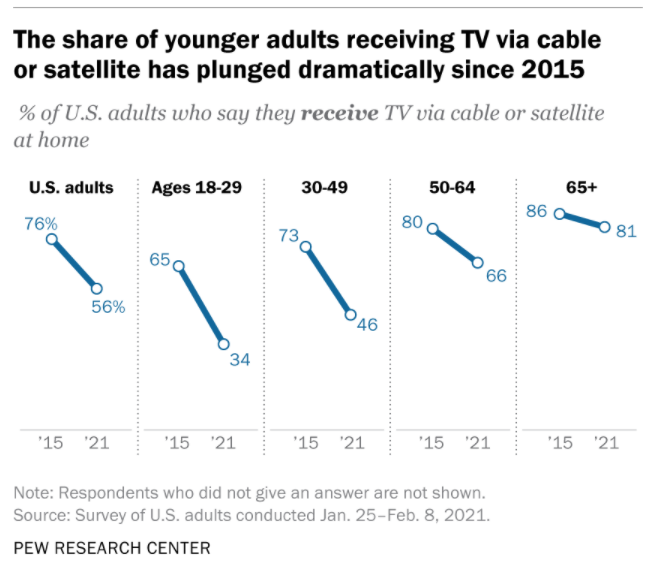
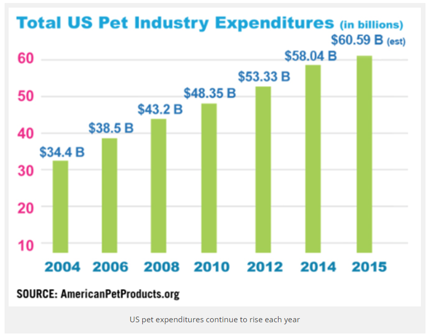
Cable TV subscribers and networks grew rapidly through the 1980’s and 1990’s reaching near universal availability. US subscribers plateaued from 2009-2014 at 100 million before rapidly declining to 74million in 2021. As the first graph shows, much of the decline has been a substitution of internet for cable access to media content. This is “good news” because everyone that wants it has access, but a new, better product has started to rapidly displace this 50 year-old technology.
Ownership of a home desktop or laptop computer also remains near universal, at 77% in 2021. The ownership of tablet computers has risen from 14% in 2012 to a majority of homes (53%) in 2021.
Broadband internet access has rapidly grown from 1% of homes in 2000 to 58% in 2008 to 77% in 2021. The retired generation (65+) lags behind at 64% connectivity. Black (71%) and Hispanic (65%) homes are below the average. Rural residents are also less connected (72%).
Internet Users
Pew Research also reports that the percentage of individuals that are internet users has nearly doubled from 52% in 2000 to (near universal) 93% in 2021. About three-fourths of older individuals (65+) are “surfing the web”. 97% of others are connected. There is no major difference between racial categories. Rural citizens are little less engaged (90%).
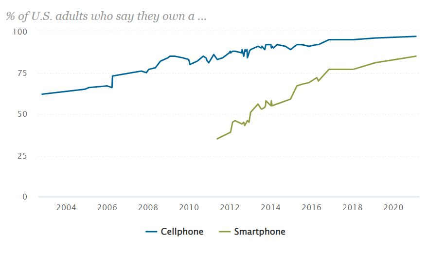
Mobile phone ownership has grown from 62% in 2002 to 97% today. Seniors (65+) have slightly lower ownership rates (92%). Racial groups have the same ownership. Rural residents have slightly lower ownership rates (94%).
Smart phone ownership has grown rapidly from 35% in 2011 to 77% in 2016 to 85% in 2021. Ownership rates vary by age: 18-49 (95%), 50-64 (83%) and 65+ (61%). There is no racial ownership gap. Rural residents have an 80% ownership rate.
Summary
Although we saw news coverage during the pandemic which highlighted the imperfect access to electronic devices and network required for effective on-line learning, the US is approaching a state where nearly everyone has access. Cable TV access is now post-peak. TV network access is increasingly through the internet. Broadband access is the weakest measure at 77% ownership. Cell phone ownership is universal and smart phone ownership will reach that level before the end of the decade.
Postscript: Economic Impact = 10% of GDP
Industry associations, journalists and consultants wrestle with each other to capture and communicate the economic value added by personal computers, smart phones and the internet. In rough terms, about 10% of GDP is due to the direct and indirect value of these technologies that did not exist in any economically material amount in 1980, just 40 years ago. Good news? No, GREAT NEWS.
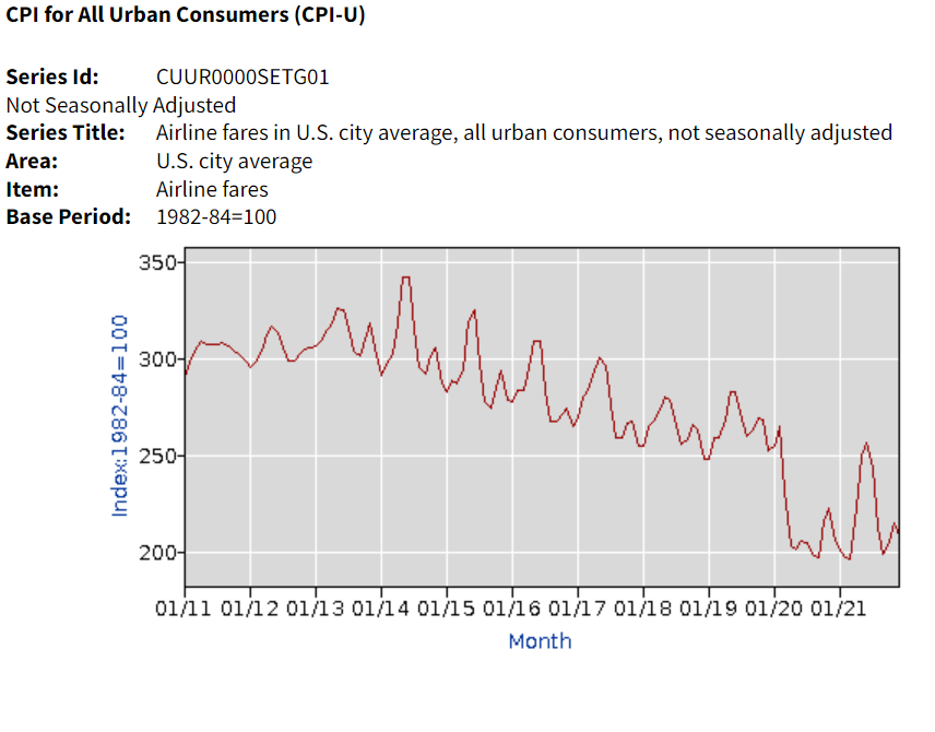
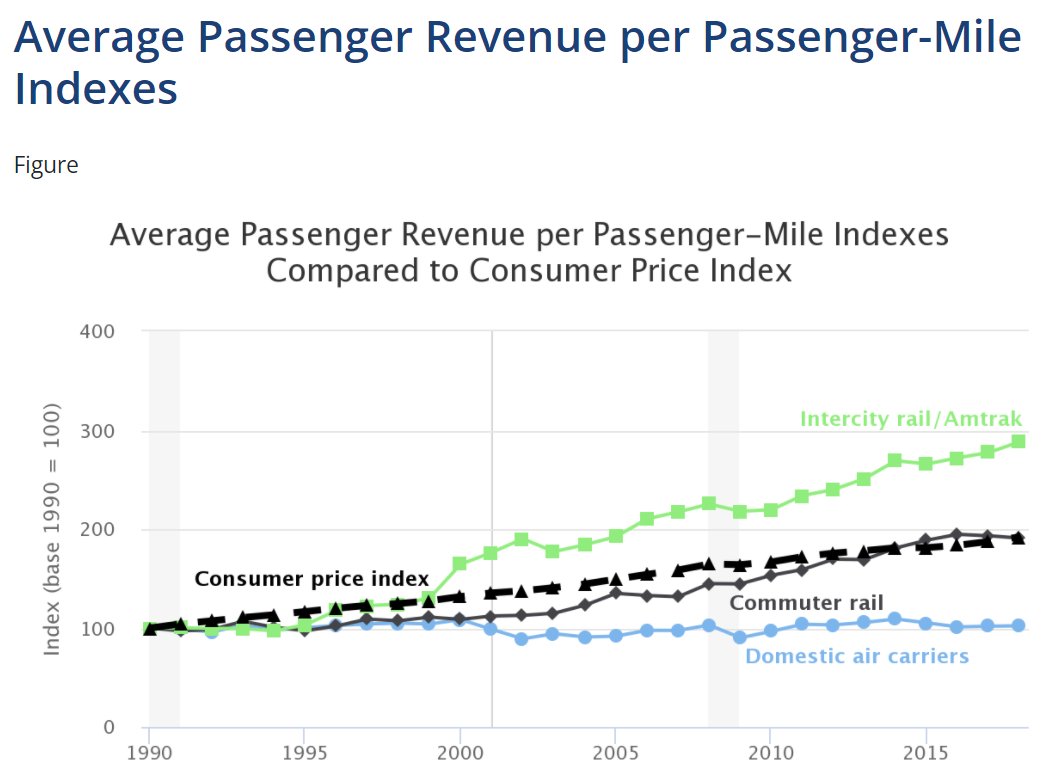
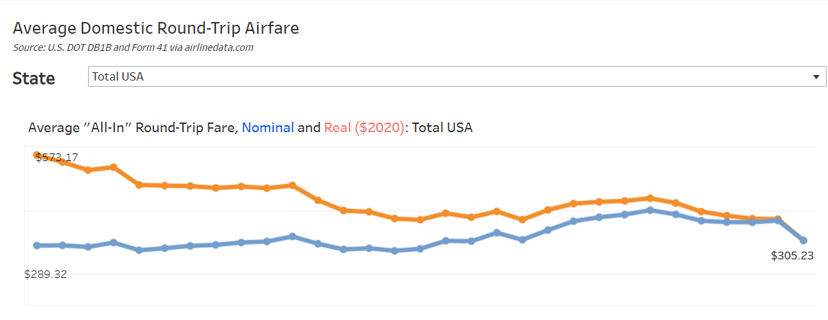
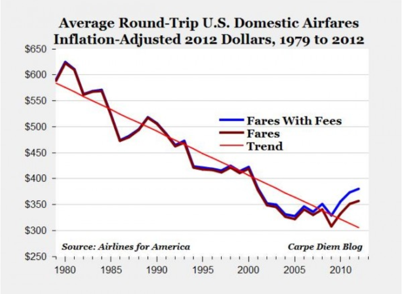
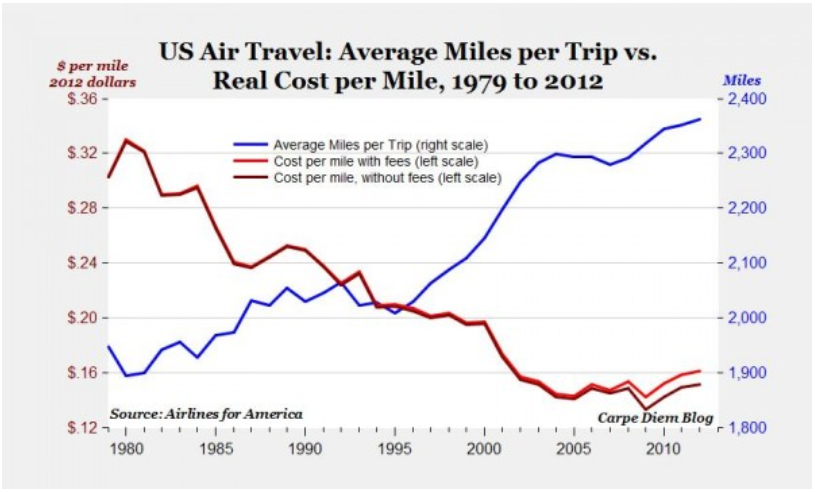
This article combines data from 4 sources with slightly different data. Airfares were flat at the end of the 20th century, but then dropped by 19% by 2004. They remained flat, in real terms, through 2009. Airlines pushed through 8% higher prices in 2010-11 and maintained real fares at the same level through 2014. After 19 years, real airfares were 14% lower than in 1995.
Fares then dropped year after year through 2019, reaching 26% below the 1995 baseline. They have fallen further in the pandemic years to 43% below the level of 25 years ago.
Bureau of Labor Statistics / CPI
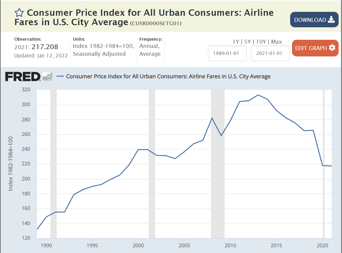
The Bureau of Labor Statistics compiles a consumer price index for air travel as part of the overall CPI. It compiles average prices and tries to adjust for changes in the quality of the product.
Real airfares declined consistently throughout the period, but no data source is fully compatible with the 4 summarized above. It appears that the real cost of flying declined by about one-third between 1979 and 1995 as the airline industry was deregulated.
Many states have legislatures and governors from the same party and voted for this party in both the 2016 and 2020 presidential elections. These states have adopted quite different Covid management strategies. There are 14 solidly Democratic states and 21 solidly Republican states, leaving 15 states with some level of “mixed” political control and influence.
Democratic states average 80%, Republican states 66% and Mixed states 73%. The national average is 72%. Nevada (69%) is the only Blue state below 75%. Alabama, Wyoming and Mississippi have the lowest scores for the GOP at 59-60%. Florida has the highest rate at 75%. The split in world views is confirmed by this measure. The mixed group ranges from Louisiana and Georgia at 63% to Massachusetts (85%) and Vermont (86%).
The overall death rate for the country is 256. The mixed states are similar at 265. The Democratic states average 221 deaths per 100K people. The Republican states average 282 deaths per 100K people. If the Republican states had the same rate as the Democratic states, they would have 59 fewer deaths per 100K people, for a cumulative total of 70,000. Economists use $10M as the value of a life in many cost-benefit calculations, so one measure of the difference is $700B.
California (196) and New York (227) drive the lower D result, but the Dems include higher fatality states such as Rhode Island (305) and New Jersey (344). The mixed states include some relatively high death rates in Michigan (315), Louisiana (329) and Arizona (350). The Republican group includes 3 states below the D average in Utah, Alaska and Nebraska, but 7 states at 300 or higher: Oklahoma, Indiana, West Virginia, Arkansas, Tennessee, Alabama and Mississippi.
Nonfarm Employment Recovery: Nov 2021 vs. Feb 2020
Overall employment is within 2% of the February, 2020 peak for the country as a whole. The “mixed” states have recovered to within 2.3% of the peak. The Democratic states are only at 96.4% of the peak, while the Republican states, on average, are just below breakeven at 99.9%. If the D states had the same level of recovery, there would be 1.8M jobs added in the recovery to date. At the recent median $1,000 per week wage, this would generate $94 billion of income annually.
I used the Feb 2015 to Feb 2020 period to generate a pre-Covid trend growth rate. This was 6.4% for the country, 5.4% for the mixed states, 7.0% for the D states and 6.7% for the R states. This indicates that the Republican faster recovery is not due to prior momentum. I used the 2020/2015 growth rate to create a solid estimate of the 2021/2020 recovery rate for each state (r = 0.63). It confirmed the 3%+ gap between the 2 parties was not due to prior trends. I also checked the percentage of 2019 employment in the leisure and hospitality sector, to see if this was driving the difference, but it did not have a material effect.
At the height of the cold war, in the year on my birth (1956), Soviet First Secretary Nikita Khrushchev warned the US that “we will bury you”. Agriculture was still a very large share of the USSR and US economies. He couldn’t have been more wrong.
US statisticians have long separated the farm and nonfarm economies. A “census of agriculture” is conducted every 5 years to complement other economic statistics collected. The USDA Economic Research Service (ERS) does a great job of compiling statistics for the narrow (farming), moderate (fishing, timber) and broad (ag based production) agriculture industries.
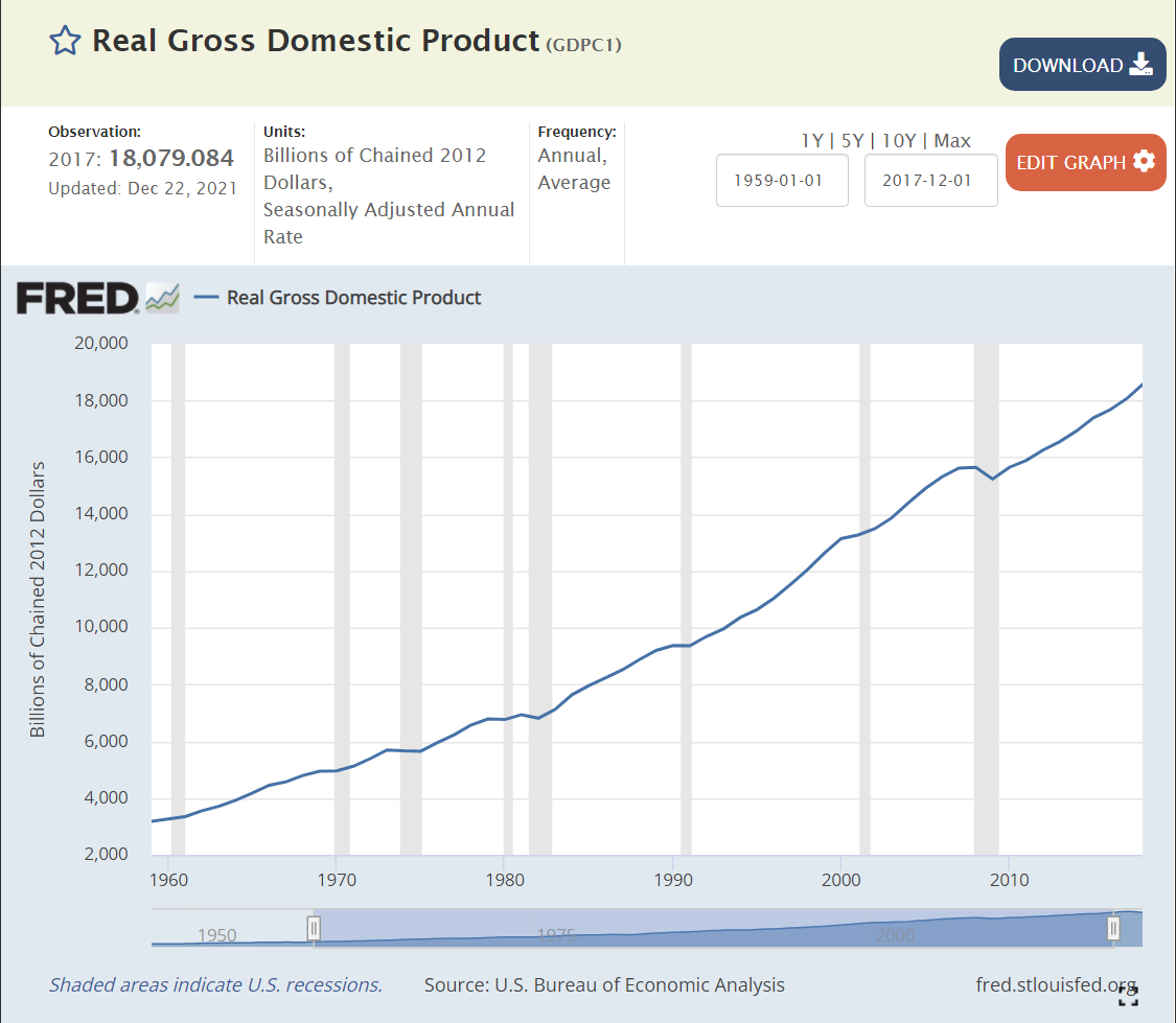
I’ve chosen to examine the near 60-year period from 1959-2017 covered by the censuses of agriculture. During this time, Real (inflation adjusted) US Gross Domestic Product (GDP), the value of all goods and services produced, increased from $3 to $18 trillion dollars, a near 6-fold increase, or 3% annually, year after year after year.
We don’t have an economic series that tracks wage and salary income back before 1979, but real disposable income per capita exists for this whole time period. This indicator or labor costs increased 3.4 times, from $12,600 to $42,900, or 2.1% annually. Given the strong growth of the US economy and its many new opportunities AND the increase in labor costs facing the oldest industry, one might have agreed with the Soviet premier back in 1956, at least regarding US agriculture. But, that prediction was wrong.
Index of Unit Outputs
The US agricultural economy grew to more than 2.5 times its 1959 base by 2017. It grew by 75% in the first 30 years and an additional 50% on top of that new base. The consistent pattern of growth is striking.
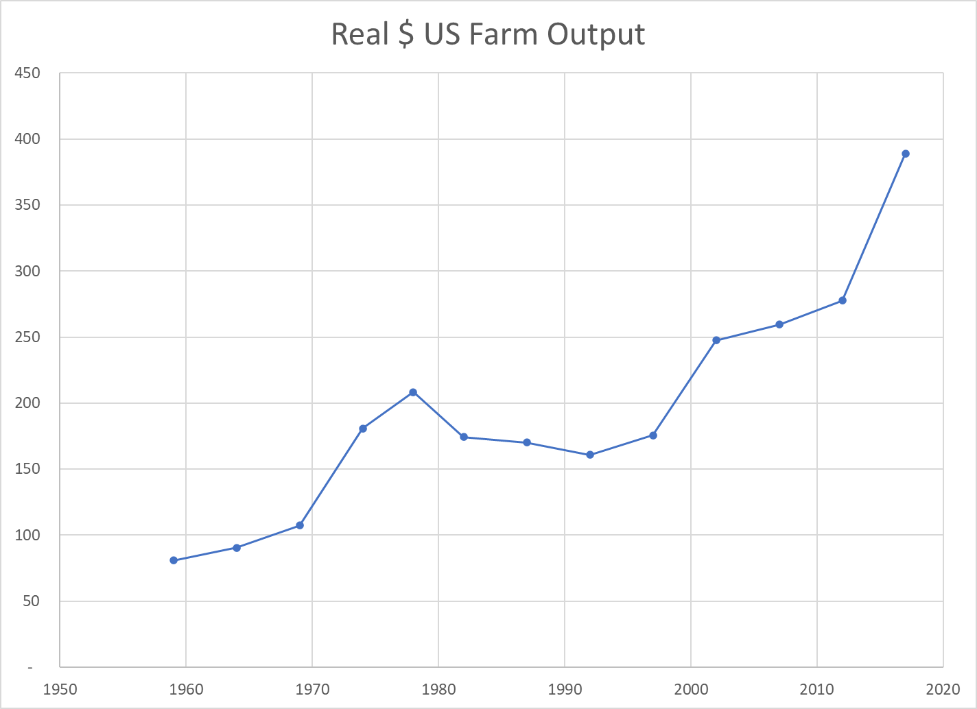
Real Market Value Produced
The Ag economy grew (based on variable market prices) 5-fold from $80B to $390B during these six decades, increasing by 110% in the first 30 years and a compounded 130% in the most recent 30 years.
Land Input (Acres)
The amount of land dedicated to production agriculture has decreased by 20% during our period of focus, from 1.1B to 0.9B. The decline was faster in the first 30 years (14%) than the second 30 years (7%). Despite this reduced demand for agricultural land, the value of such land has increased in real terms as its productivity has grown.
Labor Inputs FTE
The full-time equivalent labor force in the ag industry, as best as the USDA can measure it, dropped by nearly two-thirds in our six decades, from 2 million to about 700,000. It fell more rapidly in the first 30 years (50%), but a solid 25% in the most recent 30 years.
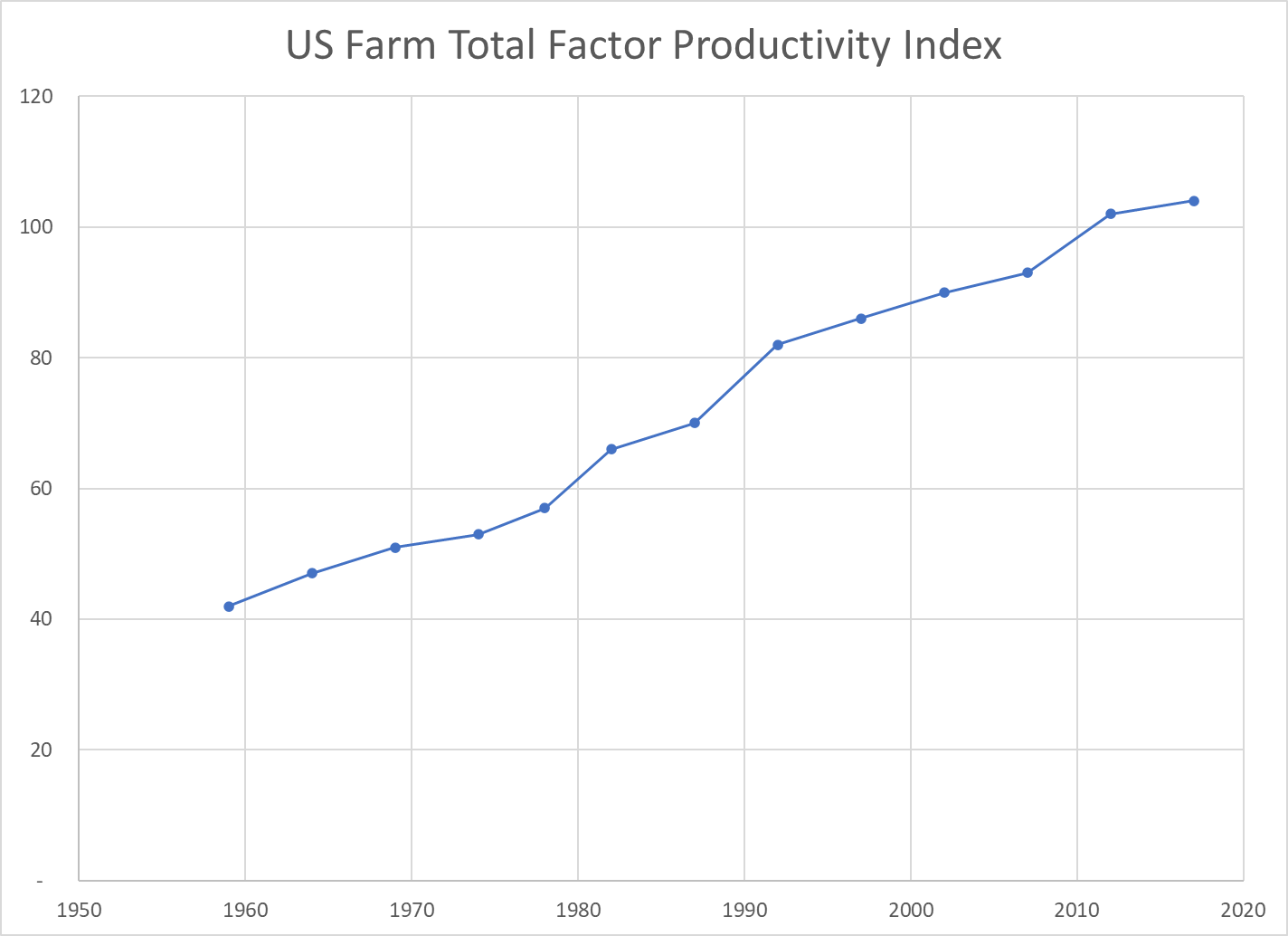
Total Factor Productivity
Economists try to measure land, labor and capital as inputs to the agricultural production process. As noted above, land and labor have declined. Capital – equipment, improvements, patents, inventory, etc. has increased. Overall, the total inputs have remained roughly flat for 60 years. Hence, almost ALL of the increased unit output is due to increases in productivity. Better crops, better labor skills, better processes, better methods, better irrigation, better crop rotation and selection, etc. Economists call this “total factor productivity”. After accounting for measurable increased inputs, the remaining improvement is called “productivity”.
The oldest industry in the world, increased its productivity in the US by 150% in these six decades; by two-thirds in the first 30 years and by one-half on the higher base in the second 30 years.
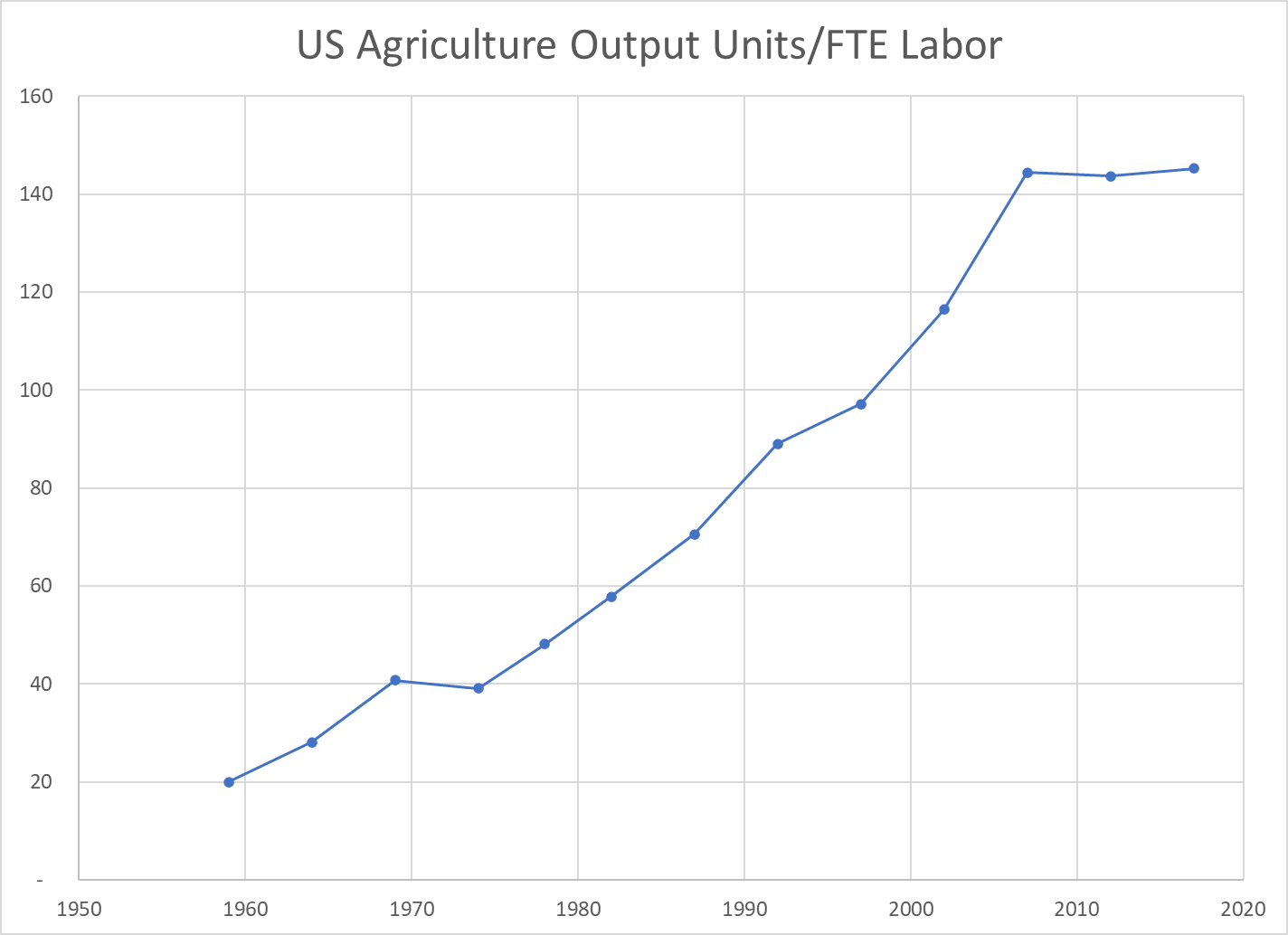
Output per Labor Unit (Labor Productivity)
The strong increase in production combined with the two-thirds reduction in FTE labor required resulted in a 7-fold measure of improved labor productivity. The land input was down by 20% and the capital input increased significantly, but in simple terms, each hour of labor in 2017 delivered 7 times as much output as the labor in 1959. The increase was 2.5x in the first 30 years and a solid 2x in the more recent 30 years.
US Agriculture Output Price Index
The index of agricultural industry output prices has increased by 3-4x versus 8x for the consumer price index or GDP price index.
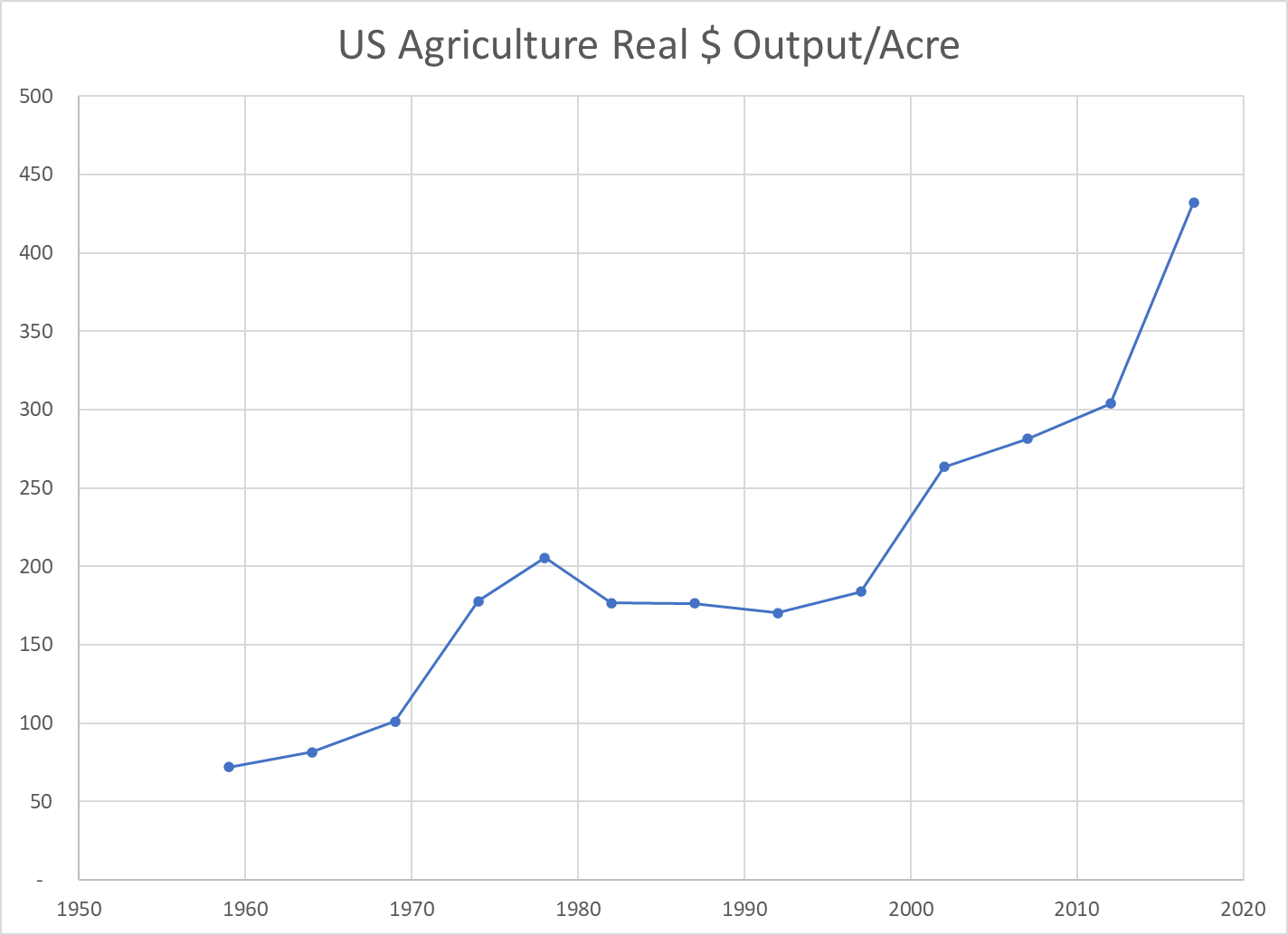
Real Market Value Produced Per Acre
The real market value of ag goods produced increased 5-fold. The land acres required declined by 20%. The output value per acre figure improved 6-fold. Again, labor inputs declined and capital inputs increased. This measure of land productivity improved by 150% in both of the first and second 30-year periods.
Real Agricultural Exports
Real ag exports increased 4-fold in these 6 decades, doubling in the first and second 30-year periods.
Summary
Less land and labor. More capital (equipment). Much better R&D and processes. Total factor productivity up by 150% across 6 decades, an average of 1.6% year after year after year.
The US ag industry faces many challenges today. Environmental issues and climate change. Water shortages. Lower public and private R&D investment. Brain drain. Political polarization. Concentration of key property rights. Low wage labor access. Changing trade rules. Nonetheless, the last 60 years indicates that this industry is capable of delivering further increases in production and productivity for the next 60 years.
US GDP/Capita remains the world leader among large countries in 2018. I’ve extracted comparison data for a dozen representative countries covering the period of 1900 through 2018.
Kuwait/Qatar/Brunei, Singapore/Hong Kong and Iceland/Norway/Luxembourg have higher GDP/Person. For reference, Saudi Arabia is just below the US, while other potential key comparison countries are much lower: South Korea ($39), Russia ($26) and China ($17).
Taking the long view (120 years), this above (table) set of countries grew their real (inflation adjusted) GDP per person 9-fold, from just $4,000 to $36,000. The US increased 7-fold, from an $8,000 initial position (twice as high) to $55,000 (still 60% higher).
Sweden (14x), Brazil (16x) and Japan (18x) lead the way in century long growth. Argentina (4x) and the UK (5x) were the only countries with slower percentage growth than the US. The US was the world-leader in 1900, providing an advantage for generating growth dollars and a governor on generating percentage growth. The history of the twentieth century was one of less developed countries using technology transfer and increased trade to “catch up” with the historic leaders.
Prior to WW II, most countries grew by the average 60%. Germany and Brazil grew a little faster (80%). Japan and Sweden grew much faster (130%).
Growth from 1960 until 2018 averaged a remarkable 240%! Japan grew 5-fold, leading the way for the “Asian Tigers”. Brazil, Hungary and Germany grew 4-fold. The UK continued its subpar performance (180%), despite the alleged Thatcher revolution and Argentina fell even further behind (110%). US growth was a little slower than average (210%) in the last 60 years, from a starting base of $18,000 versus the average of $10,000 (80% higher).
On a percentage basis, the US growth in output per person was slower than average. On a dollars basis, it remained the market leader overall and added more value than all other countries.
For the whole 120 year period, the US added $47,000 to its GDP/person, growing from $8,000 to $55,000. Australia (43), Germany (41), Sweden (41) and Canada (40) were solid competitors. Japan, France, UK and Italy added more than $30,000 per person. Hungary, Argentina, Mexico and Brazil lagged, adding just $10-20,000.
In the last 60 years, the US added $37,000 to $GDP/capita, tripling its $18,000 base. Australia (36), Germany (34), Sweden (31), Canada (31) and Japan (32) were close competitors. France, UK, Italy and Hungary added $20-27,000. Argentina, Mexico and Brazil grew more slowly ($10-12,000).
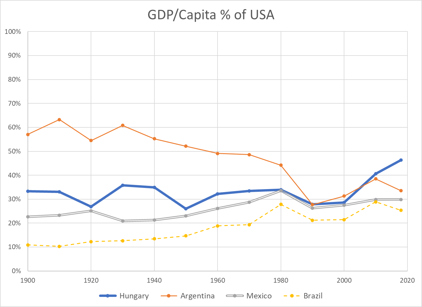
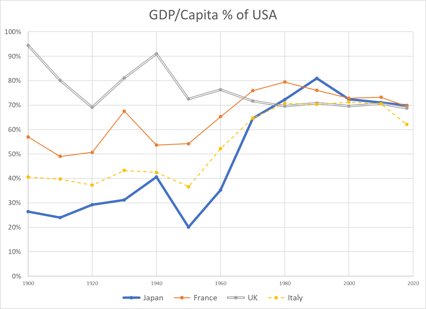
Per Capita GDP as % of USA
Another way to place the US performance in perspective is to use it as the baseline and plot other countries’ per capita GDP as a percentage of the US level.
There are different ways to compare GDP across countries. There is not a full consensus among economists. I’m using data from the Maddison Project Database. The data shown on the Worldometer website uses a different method, but the basic results are comparable.
First, we see that the US has had the highest $GDP/capita throughout the 120 year period. In 1900, the US was at $8,000 and second place UK was at $7,600, beginning its long relative decline from being THE imperial power to a mid-level (nuclear armed) European country. In 2018, the US produces $55,000 per person versus second place Australia at $50,000 and third place Germany at $46,000. Adjacent Canada generates 20% less value at $45,000. Formerly high-flying Japan now rests at $39,000 per person.
Argentina is an outlier, dropping from 60% to just 35% of US income per person for various political, financial, economic and trade reasons. Hungary is representative of smaller eastern European nations that remained at just 35% of US levels until the fall of the Berlin wall and subsequent integration into the European economy, allowing them to grow towards 50% of the US level. Mexico has slowly grown from 20% to 30% of the US level, but not been able to accelerate further. Brazil has grown from just 10% to nearly 30% of the US level, with significant volatility.
The UK fell from 90% to 70% of the US value added per citizen level by 1970, where it has remained. France weathered the 2 world wars at 55% of the US income level. It recovered nicely to 75% by 1970, peaked near 80% and then drifted back to 70% with its 4-day work weeks. Italy remained at just 40% of the US level through the war years. It grew remarkably to 70% of the US level by 1970, where it remained, before falling back somewhat in the last decade. Japan also struggled through the war years, averaging 30% of the US level. It rocketed to 80% of the US level by 1990, riding total quality management, manufacturing, peacetime and expanded trade. It has dropped back to 70% of the US level.
Australia level pegged the US at 80% for much of the period, until the China lead commodities demand boom pulled it up to 90% recently. Canada grew from a rural, thinly populated, commodities-oriented country at 60% of the US up to 80% by 1970 and has remained in the low 80 percents since then. Germany began the century at 60% of the US level. Following two failed wars, it attained 70% of the US level by 1960. Digesting East Germany was a challenge, but Germany was at 75% of US levels in the early 2000’s and exceeded 80% soon thereafter, riding its manufacturing export capabilities.
Summary
US $GDP/Capita continues to lead the world, as it has done for more than a century. The US percentage growth rate has slowed, but the incremental value added has remained first among large countries. Some other countries have shown periods of relatively strong growth, but none has demonstrated an ability to challenge the US. A number of European countries have found a “mixed” market approach that is competitive with the US, leveraging lower trade barriers within the EU and across the world.
China Postscript
China $GDP/capita (000’s) numbers for 1950 through 2018 are 0.8, 1.1, 1.4, 1.9, 3.0, 4.7, 9.7 and 13.1. Low scoring Argentina (19), Mexico (16) and Brazil (14) each have higher productivity per person. China per capita GROWTH per decade figures are 0.3, 0.3, 0.5, 1.1, 1.6, 5.0, and 3.4 (thousands). The percentage figures are very impressive. Considering China’s 1.4 billion population, they are very impressive. Comparable US decade growth (thousands/person) figures are 3, 6, 5, 7, 9, 3 and 6.
The US has a century-long track record of generating an extra $5,000 per person of value-added output each decade. China has leveraged its low-wage labor, a young work force, manufacturing technology transfer, willing investors, willing importers and an international free trade system to drive its growth. The country has maintained political stability and invested in its economic infrastructure, using economic progress and some level of economic freedom to offset the risks of its political and social restrictions. It faces a flat population and shrinking working-age population before it transitions its remaining rural work force into the manufacturing or urban environment.
It is facing what economists call the “middle income trap”, where countries with rapid economic growth based upon manufacturing or resource extraction need to transition a large part of their economy to higher value-added services and advanced manufacturing. Many countries have failed to make this transition. Some have done so.
I’ve worked closely with Chinese electronics firms for more than 25 years. Their capabilities are much greater than what is recorded in the US media. They have solid manufacturing capabilities, including Japanese-style process improvement. They have very strong sales, marketing and account management capabilities, focused on their global business-to-business customers. They have strong product development engineering capabilities and growing project management skills. They have modern MBA management skills and business styles. Their “clusters” of manufacturing, parts, R&D, resources and logistics skills point to long-term competitive advantages in many industries.
I believe that China will continue to be a manufacturing powerhouse, despite trade restrictions. China is well positioned to deliver products to growing markets in Asia, Africa, the Middle East and Latin America.
That being said, I am not concerned that China will eclipse the US in total productivity per citizen in the next 50 years. The gap is simply too large. In 50 years, the US will very conservatively grow from $55,000 to $80,000 of output per person (8%/decade). Mathematically, this requires 3.7% growth in China each year for 50 years, or 44% growth per decade compounded to reach 6.2 times the current level. The historical data contains 1 or 2 decades of 40% growth for some exceptional countries, but not 8 (3 in the bank, plus 5 in the future). If China can grow by 6% annually for one decade (79%) and 5% annually for the next decade (63%), it COULD then grow by just 2.5% annually (28%/decade) to catch the US in 2070.
China has 1.4 billion people versus 330 million in the US. Even including Canada and Mexico, the North American population is just 0.5 million. Europe has roughly 750 million people. Japan, South Korea, Australia and New Zealand have just over 200 million people. Indian has 1.4 billion people, Africa 1.2 billion and Latin America 0.7 billion. China will be a growing world economic and military power, even with its population peaking in 2025-30. The US should consider China to be its primary global rival, perhaps with less “us versus them” posturing. China aims to protect its economic, political and military interests, never again to be dominated and humiliated by outsiders. But, China truly considers itself to be the “center of the universe” and has no “need” to dominate the rest of the world or export its ideology. There are low confrontation options available.
Real (inflation adjusted) Gross Domestic Product (GDP), the value of all goods and services produced in the US reached $20.8 trillion in 2020, compared with only $0.7 trillion in 1900. This is a nearly 30-fold growth across 120 years.
Year
Real $GDP (T)
Added $GDP
Percent
1900
0.7
1910
1.0
0.3
46%
1920
1.3
0.3
21%
1930
1.5
0.3
22%
1940
1.8
0.3
20%
1950
2.7
0.8
45%
1960
3.7
1.1
41%
1970
5.6
1.9
50%
1980
7.8
2.1
38%
1990
10.6
2.9
37%
2000
14.9
4.3
40%
2010
17.6
2.7
18%
2020
20.8
3.2
18%
It’s difficult to “digest” 20.8 trillion dollars. But, it is true that the US economy in 2020 was ten (10) times as large as it was in 1952, well into the post-war economic boom period. The population had more than doubled and the productivity of the economy had increased more than three-fold across this period.
The economy is 3 times as large as it was in 1975, when it was entering a challenging period of stagflation, foreign competition, high interest rates, energy shortages, environmental concerns and divided politics.
The economy is twice as large (in real terms) as it was in 1990.
The economy grew by an average of 42% per decade from 1940 through 2000. The last two decades have grown by 18% each, similar to the growth from 1910 through 1940.
However, the amount of growth, measured in real dollars, has continued at a very strong pace. The economy averaged growth of $2.8 trillion per decade from 1970 through 2020. That is roughly the size of the whole economy in 1950! The latest decade recorded a $3.2 trillion increase, larger than the output of the whole economy in 1950, and the second largest growth ever.
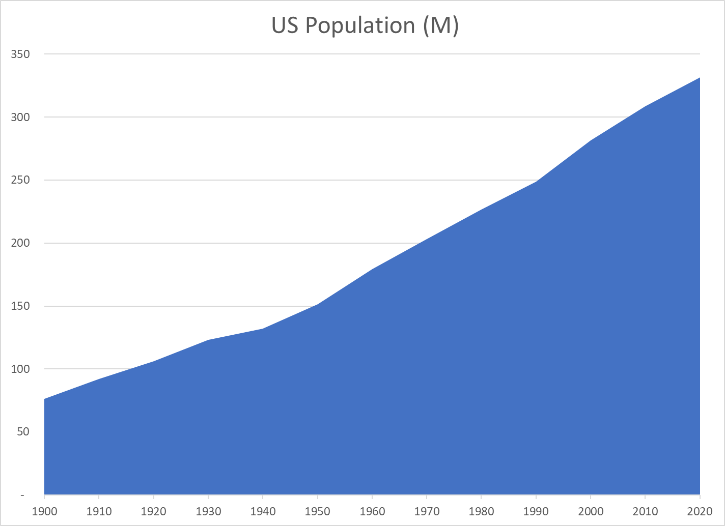
US Population
Year
Population (M)
Added (M)
Percent
1900
76
1910
92
16
21%
1920
106
14
15%
1930
123
17
16%
1940
132
9
7%
1950
151
19
14%
1960
179
28
19%
1970
203
24
13%
1980
227
23
12%
1990
249
22
10%
2000
281
33
13%
2010
309
27
10%
2020
331
23
7%
The US population has increased by 4.3 times since 1900, from 76 to 331 million people.
The population doubled from 1900 to 1950 and then doubled again since 1955.
The US added an average of 25 million new residents per decade from 1940 to 2020 (12%).
In the last 30 years, the US has added 85 million residents; the same number as its total population in 1905!
Despite many challenges in the last century, the US population has grown consistently and significantly.
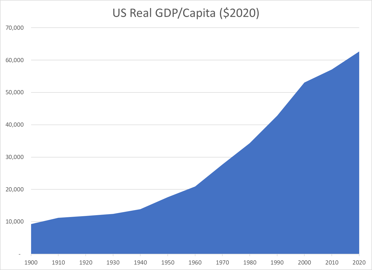
Real $GDP Per Capita
Year
Real $GDP/Capita
$ Added
Percent
1900
9,300
1910
11,200
1,900
20%
1920
11,800
600
5%
1930
12,400
600
5%
1940
13,900
1,500
12%
1950
17,600
3,700
27%
1960
20,900
3,300
19%
1970
27,700
6,800
33%
1980
34,300
6,600
24%
1990
42,800
8,500
25%
2000
53,100
10,300
24%
2010
57,100
4,000
8%
2020
62,700
5,600
10%
Real (inflation-adjusted) output per person has grown 6.7 times since 1900!
It has doubled since 1975, tripled since 1960 and quadrupled since 1945. Yes, today’s economy produces four times as much, per person, as the supercharged Word War II winning “arsenal of democracy”. It produces twice as much per person as the 1975 economy which then appeared to plateau in the face of Japanese import competition.
From 1960 through 2020, the economy has added an average of $7,000 more output per American for each decade.
While improved output/productivity in the last 2 decades has not matched that of 1960-2000, it still added $9,600 of output per resident, more than the total output per resident in 1900. In the last 3 decades combined, the economy has added nearly $20,000 of output/income per person, an amount equal to the total output/income per person in the late 1950’s.
Political views are rationalizations of moral intuitions. They are demonstrably not the result of dispassionate analysis by individuals.
A small number of moral intuitions are broadly held across time and cultures and can be “explained” on the basis of evolutionary pressures on mankind.
The prevalence of the six logically defined and statistically confirmed dimensions differ markedly between liberal and conservative minded people in various cultures.
1. Care/Harm
Desire to protect children and weaker others from harm. Caring, kindness, gentleness, nurturance, compassion, feelings, empathy. Liberals and conservatives both show an interest in this dimension of morality. Liberals value this dimension most highly. Conservative men and libertarians, on average, show much less interest in this dimension.
2. Fairness/Reciprocity/Cheating
In a social setting, there is a need to rely upon others keeping their word, being honest, doing their share of work, etc. Justice, rights, cooperation, deception, trust. Liberals tend to interpret this in terms of equality. Equal rights, equal opportunity and equal results. Conservatives are closer to the evolutionary basis as seen in game theory / the prisoners dilemma / “tit for tat” winning strategy. They highly value proportionality, closely linking results to inputs or effort.
3. Liberty/Oppression
No one wants the “alpha dog” to take advantage of their position. Individual and group opposition to domination, tyranny, restrictions, bullies and cruelty. Liberals and conservatives both value this dimension in modern, western, secular, commercial societies. They define the oppressor differently, with liberals focusing on business and institutional sources of power and conservatives focusing on government and regulators. Libertarians value this dimension most highly. These first 3 sources of morality are more individual oriented, mediating the tensions between individuals and groups.
4. Group Loyalty
Clear commitment to the group. More than “limited liability”. Betrayal, in-group attachment, patriotism, nationalism, betrayal, self-sacrifice, us vs. them, tribe, religion, party, flag, clan, neighbors, family. Conservatives value this dimension very highly, with felt loyalties to several groups. Liberals value this dimension, but not nearly as highly; with a tendency to value the largest groups: nation, humanity, nature. The liberal focus on “diversity” and valuing others, outgroups and the “oppressed” is very different from the conservative worldview. Western, secular, commercial societies value this dimension less.
5. Authority/Respect
Larger groups require some degree of hierarchy. Leader and follower. This is a complement to the liberty/oppressor value. Respect for authority, leader, institution, rules, history. Safety, order, predictability. Obedience, deference, submission. Against subversion, revolution. This is the classic conservative value, supporting the known value/benefits of a given system against the potential value/risks of change. Modern, individualistic liberals tend to not value this dimension highly, instead choosing to “challenge authority”.
6. Purity/Sanctity
The sixth dimension differs from the first 5. It is not so clearly about managing the “individual to group” challenges. It focuses on the disgust/gag reflex to things or situations that are so threatening as to be beyond consideration. This takes place at both the practical and the abstract levels. Degradation, disgust, disease, infection, dirt, germs, contamination, carnality, body, sex. Piety, chastity, temperance, compliance, burning, cleanliness, food rules. Everyone has some sensitivity to this dimension, but conservatives have much higher concern. Research says that conservatives, on average, have a lower interest in new (unsafe, novel) activities or experiences. Moral values 4-6 retain higher priority outside of western, commercial, secular societies. Liberal references to purity may focus on things like the environment.
Haidt is a self-professed “liberal” who intuitively/instinctively rejected the “rational” morality theories he learned in graduate school in the 1980’s. During his early research on alternate approaches, he had the “aha” insights that 1) other cultures have very different moral values and that 2) moral/political views are intuitive and rationalized. He hoped/hopes that liberals can see that their more limited moral palate (3 items) is not the only one and that this difference between including or not including the other 3 bases is a huge insight, even if liberals choose to not value the other 3 dimensions. He analyzed national politics in each election cycle from 2000, highlighting the large advantage that Republican politicians have in monopolizing the 3 other dimensions. In 2016, he advised the Dems to fight against Trump on the “conservative” moral dimensions of loyalty (Putin?), authority/order (Trump chaos/revolution/policy changes), and purity (sex allegations) instead of policy positions or personal character.
Haidt collaborated with a CATO scholar to analyze the 2016 Democratic and Republican candidates for the presidency, analyzing their supporters in terms of the Moral Foundations Theory.
The basic conclusions are supported, but all details are not. The 1 Care / 2 Fairness versus other dimensions emphasis between liberals and conservatives is supported. But, statistically, there may just be individual versus group moral foundations (2 dimensions versus 5-6).
Group? Which group? Small or large? In-group or out-group? Research is now focused on defining questions that clarify in-group versus out-group attraction and then, the difference between liberals versus conservatives, if any.
Academics have been busy working on the details. One criticism is that the 5 or 6 dimensions were defined in an ad hoc manner, rather than part of an overall theory of how man evolved. One group has stepped up to propose a theory that is solely based upon the various forms of cooperation, resulting in 7 dimensions.
On the academic left, Haidt’s “moral equivalence” approach to the 3 modern, secular, liberal values and the 3 historic, religious, conservative values has been sharply criticized. An alternate view that highlights bias/bigotry, social dominance, right-wing authoritarianism, Schwartz Value Theory and Evolutionary/Coalitional Theory (ECT) has been proposed.
Haidt and his colleagues have defined 6 dimensions of moral thinking which underly modern political views that make sense based on evolution. The “west” could clearly learn something about the moral/political views of other societies that did not have the same historical evolution into a commercial/largely secular situation. Politicians could seek to more effectively target their messages to trigger all of these 6 values in their target audiences. Civic minded individuals could promote greater understanding of these insights to lessen the Manichaean “good versus evil” polarization we see in politics today.
Today’s news releases show 6.0M jobs added during 2021 according to the household survey and 6.5M jobs added according to the employer survey. The ADP employer jobs survey released this week showed 6.2M jobs added. The employer reported number of open jobs increased from 6.8M to 10.6M this year. Hence the total filled plus open jobs increased by 10.6M, from 149.3M to 159.6M, a truly incredible expansion of the US economy’s production potential and demand for labor. This is 1M more filled plus open jobs than the December, 2019 peak of 158.6M. Employers are clearly struggling to work this backlog down from the 10-11M range back to the pre-pandemic 6-7M level. This provides the demand side for another 8-12 months’ worth of 500K filled jobs added per month.
The 3 underlying measures use different definitions and survey methods, but in the long-run they generally agree.
The monthly changes are much less consistent. Much of the media highlighted that the employer survey data showed just 200K jobs added in December. The household survey indicated 600K jobs added, while ADP reported 900K jobs.
It’s best to look at all 3 measures to try to get a best estimate of the most recent changes. I see roughly 500K new jobs added each month from July through December. A flat number, not an increasing one. The first half of the year was probably adding a few more jobs each month, closer to 600K each.
From 2000-2009, the dynamic US labor market laid off workers at a consistent 2M per year rate. This declined a bit to 1.8M per year in the next decade. After the pandemic, the economy quickly returned to this 1.8M per year rate from July to December, 2020.
It has dropped and remained at a 1.4M per year rate at the end of 2021, fully 30% lower than its normal level. Good news, indeed.
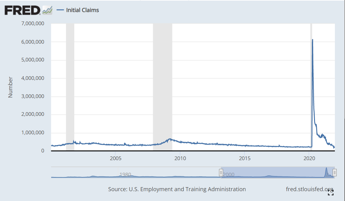
Unemployment Claims
Historically, the US economy generated 350,000 new unemployment claims each week. This measure declined slowly after the Great Recession, reaching a nice 300,000 level in 2014. It slowly declined to a record low of 205,000 in Feb, 2020. The disruption rate dropped back down to the very high but stable 800,000 level from Aug, 2020 through Apr, 2021. In the last 8 months the rate has dropped very quickly back down to the record low 200,000 level!
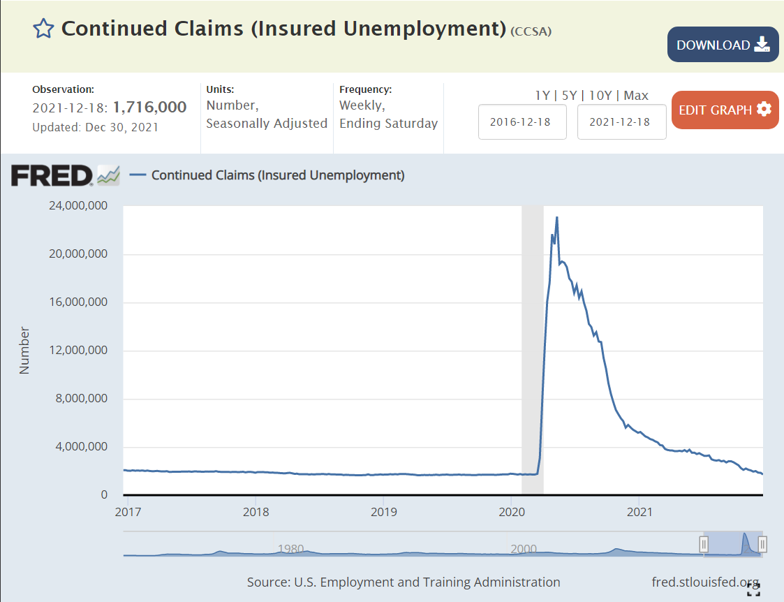
Cumulative individuals claiming unemployment benefits has historically varied with the business cycle. We can see the increase from 2M to 4M at the turn of the century. The “Great Recession” had a greater negative impact, driving this number from 2M – 4M – 7M. This number fell throughout the extended business cycle recovery period, breaching 2M in Feb, 2017 and reaching a low of 1.7M in Feb, 2020. The unemployed number reached a full order of magnitude higher at 23M during the pandemic, then dropping to 13M in Sep, 2020 and 4M in Mar, 2021 and 2M in Nov, 2021 and finally equaling the record low in December, 2021 at 1.7M. This is great news!
Unemployment Rate
The unemployment rate has reached 4.2% and will return to its historical low of 3.5% in the next 4-6 months.
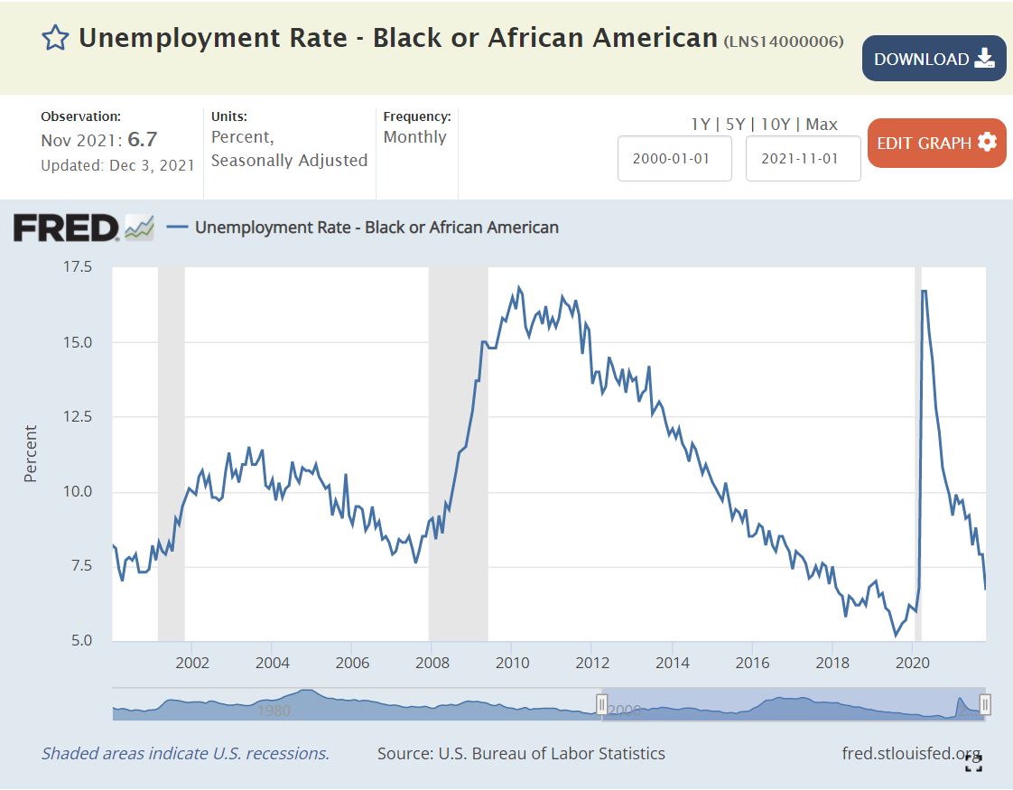
African-American unemployment was typically in the 8-10% range. It was driven down to the 5-6% level after the Great Recession during the extended business cycle expansion period. The rate is now below 7% and falling.
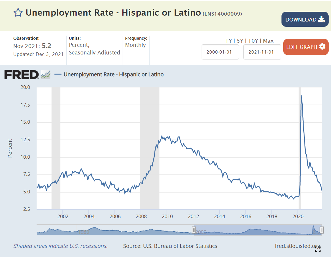
Hispanic American unemployment averaged 5-7% in the 2000’s. It spiked after the Great Recession to 13%, then slowly declined to 4.3%. It has since recovered to 5.2% and is dropping quickly.
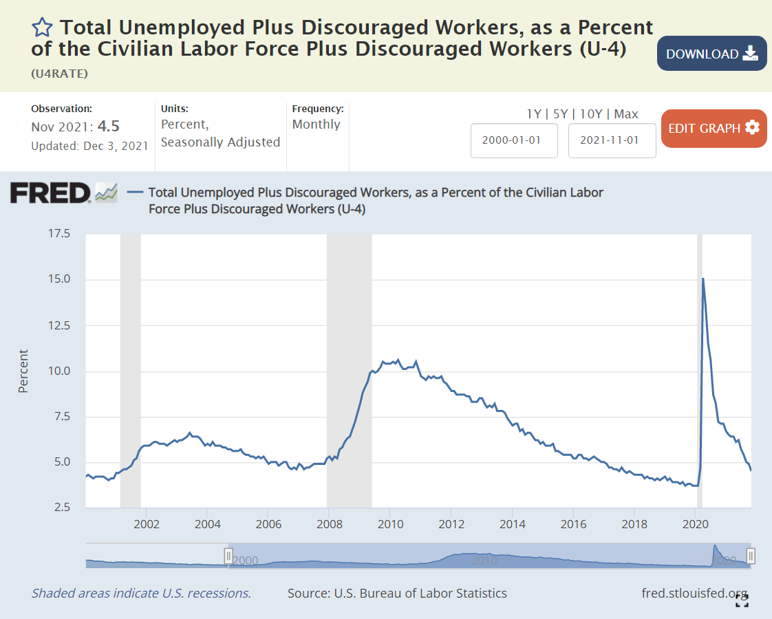
Broadly Defined Unemployment
Broader definitions of unemployment show the same swift recovery from the pandemic situation.
Labor Force Participation
Labor force participation among the core 25-55 year age group reached an historic, and possibly unsustainable high of 83% in late 2019. It stayed around 81% at the end of 2020 and has since improved to 81.8%. This is one of the few labor market indicators that clearly shows that we have NOT “fully recovered”. There is 1% of the population waiting to be attracted back into the labor force.
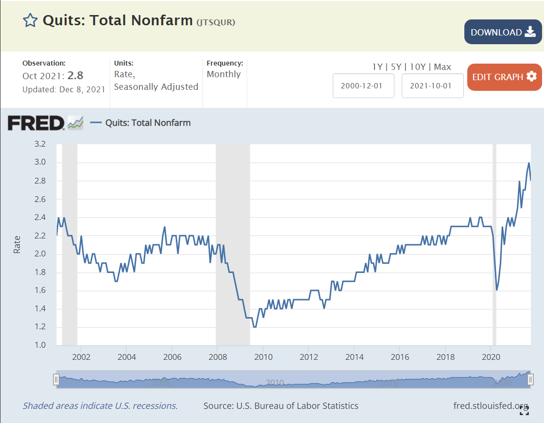
The voluntary “quit” rate has doubled since the good side of the “Great Recession”. It is 50% higher than during the very favorable labor market of 2018-2020. Employees are confident that they can leave their current employer and find another position quickly.
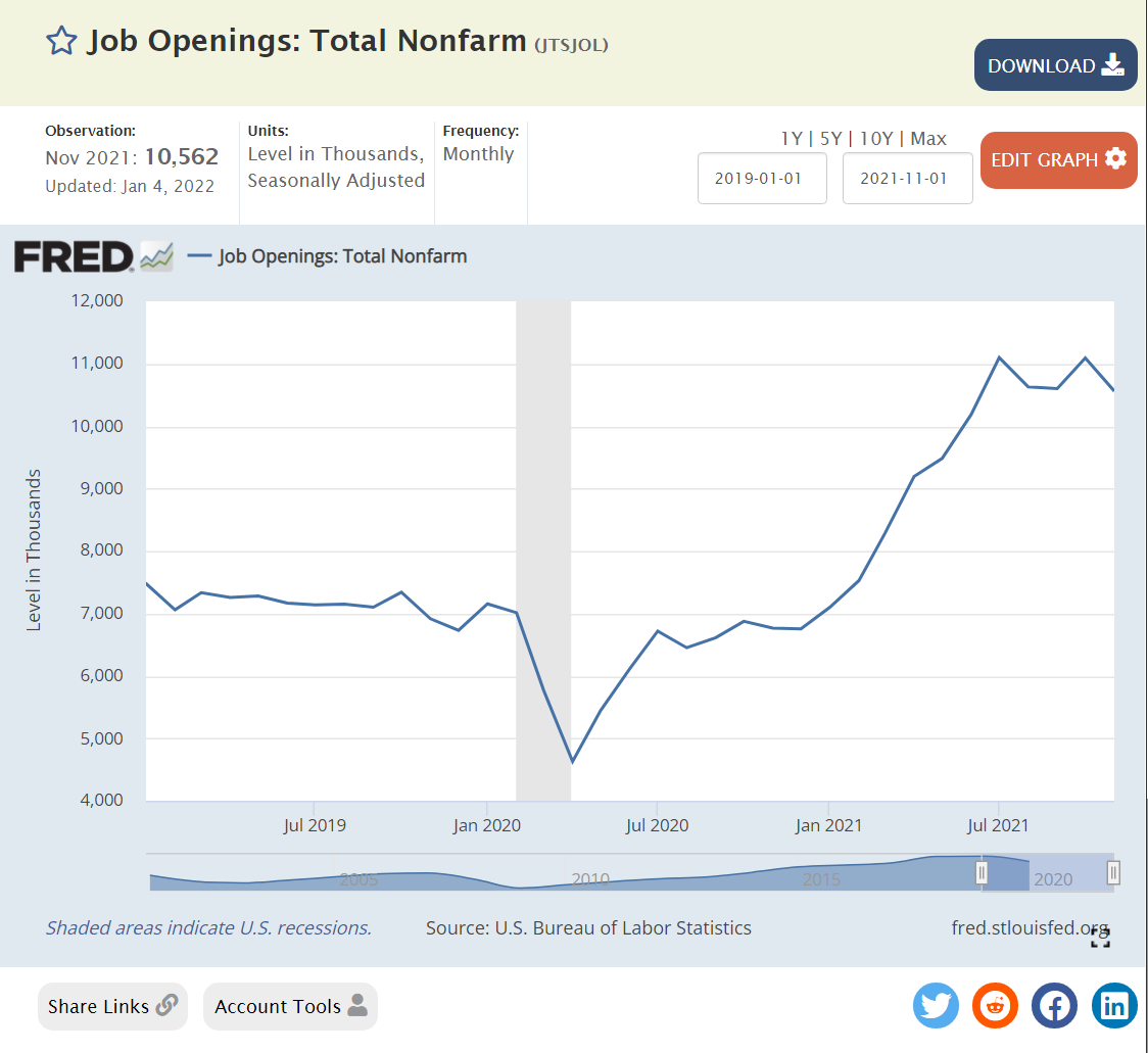
This is the CRAZY positive labor market chart. Historically, we see 3-5M job openings. Expansion to 6M in 2016-17 as the post Great Recession recovery faced its “end”. But, the expansion continued even further, with 7M open positions available in 2018-20. The economy recovered to 6.8M open positions in Dec, 2020. This figure has since climbed to an incredible 11M open positions, more than double the historic norm.