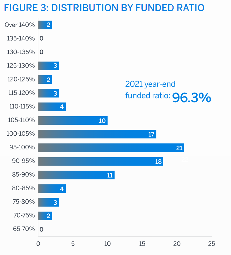
Just 5% of the largest plans have a funded status (assets/liabilities) less than 80%.
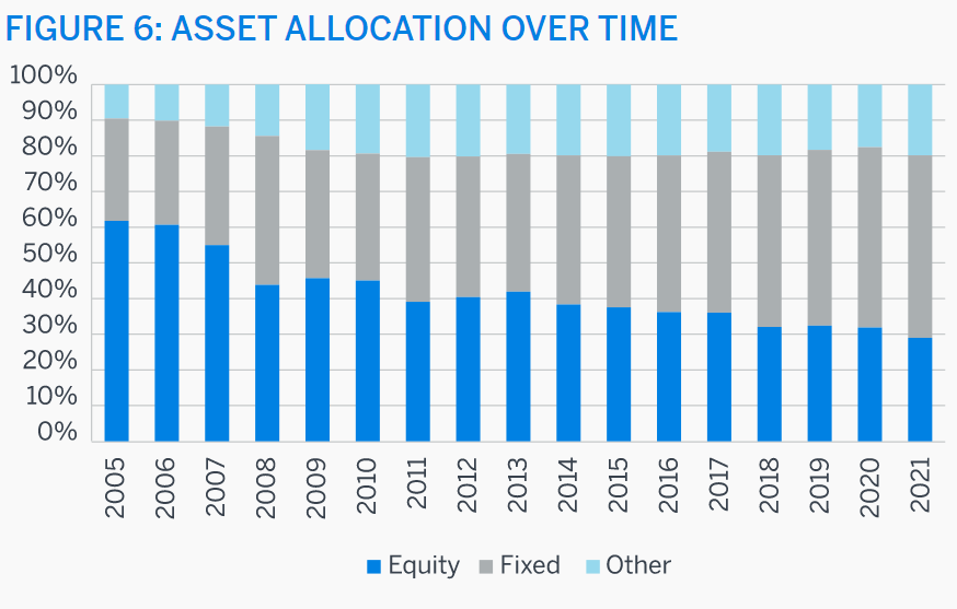
This is in spite of an increase in lower risk/lower return fixed income/bond funding growing from 30% to 50% of invested assets.
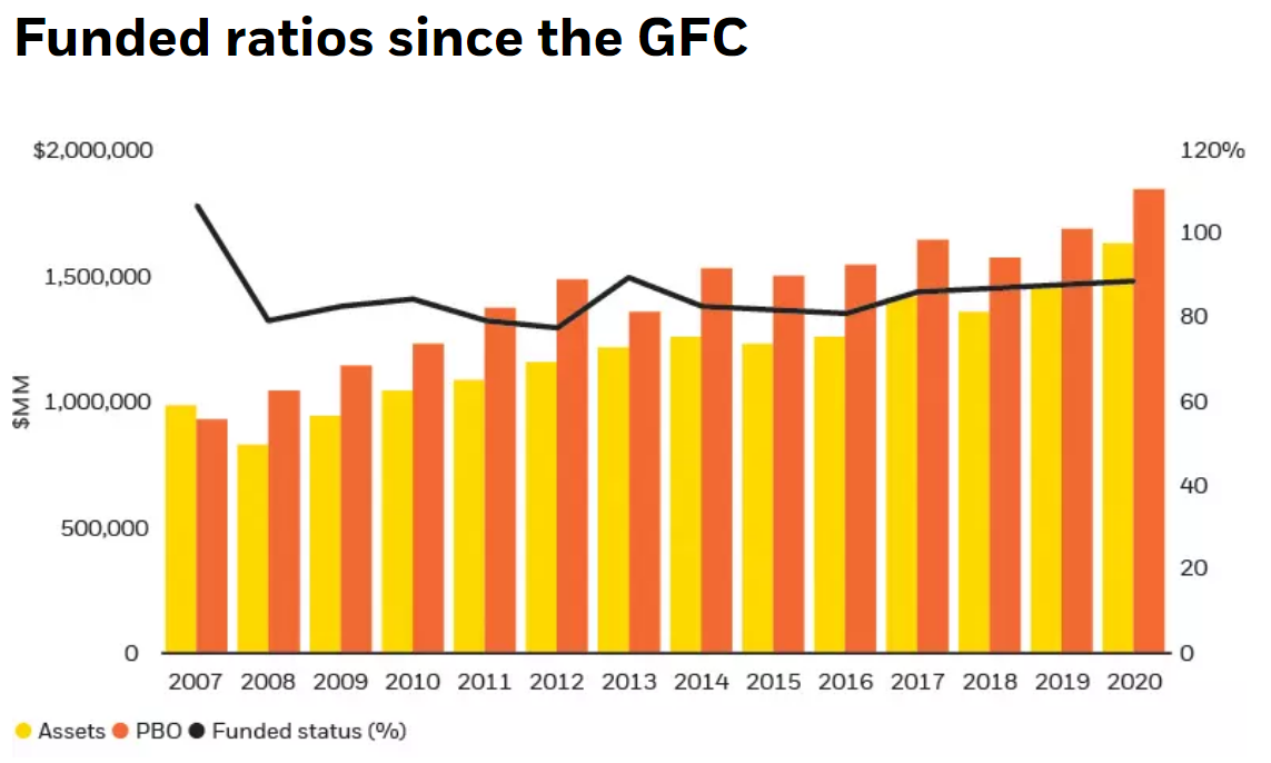
Plan assets took a big hit in 2008 but have slowly recovered.
Historically, 80% funded was considered to be “fully funded”. Corporations increased contributions after 2008 to slowly ensure plan funding ratios would increase. The 96% level in 2021 is unusually high, driven by many years of increased corporate cash contributions and higher than expected investment returns that have offset planned future investment returns which have dropped from 9% to 6.5%, thereby decreasing the ability of firms to simply rely upon investment returns to fund their pension liabilities.
Almost one-half of the largest firms have funded ratios of 90-105%, a very safe level. More firms have greater than 105% funding than have less than 90% funding.
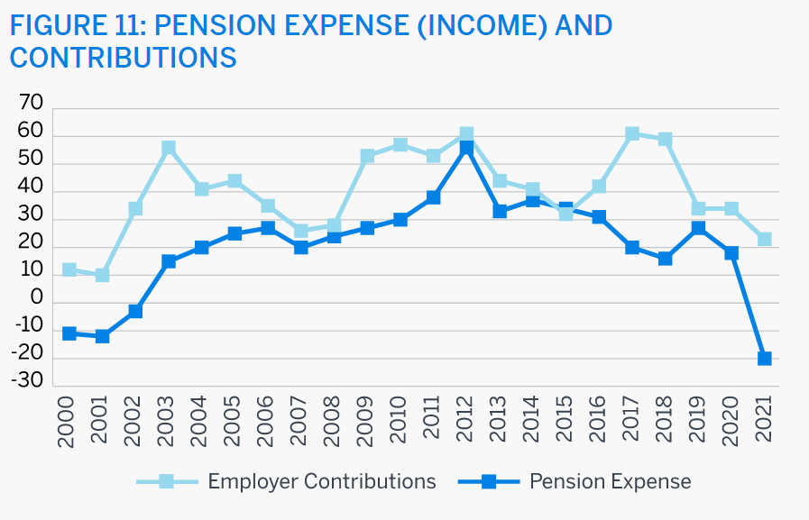
Pension accounting is a complex and subjective area. Cash contributions have consistently exceeded the accounting basis expenses recognized. This reflects a conservative actual funding strategy.
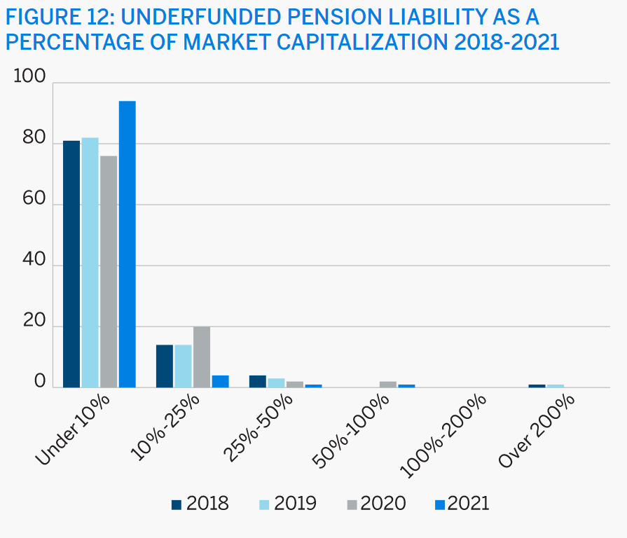
The net unfunded pension liability is an immaterial share of the value of major corporations.
Blackrock summarizes funded status for 200 large defined benefit pension plans. The funded ratio declined in 2008 and has slowly recovered. It reached 95% in 2021.
Mercer summarizes 1,500 defined benefit pension plans. 80% funded is pretty typical since the Great Recession. Mercer reports 97% funded status at the end of 2021.
Summary
Defined benefit pension plans are an increasingly smaller share of all retirement savings plans. However, corporations are funding their future liabilities at a fully adequate level.
I have mapped this data onto the “Red vs. Blue” states list based on current senators.
Red (Republican) States Benefit Greatly
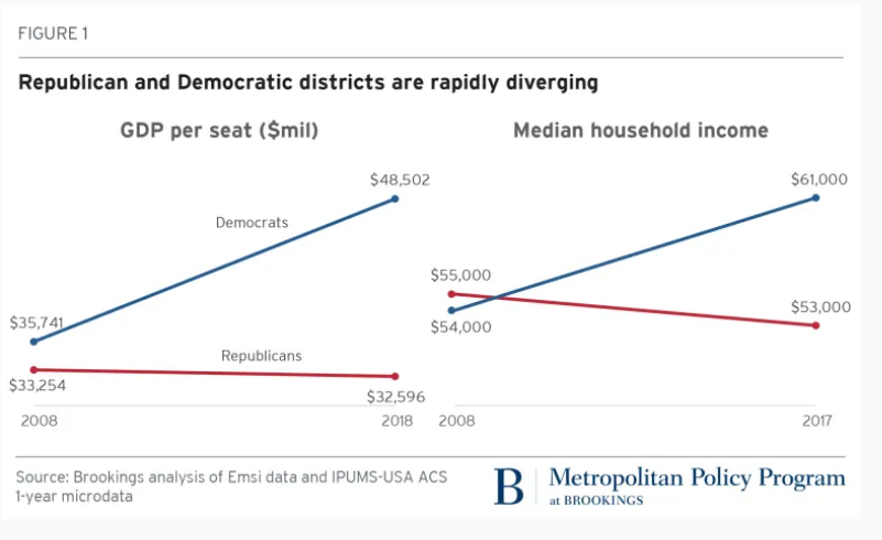
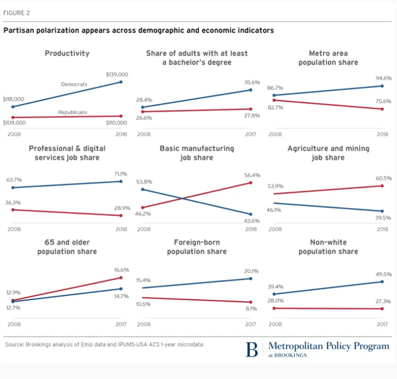
Democratic states pay 63% of all taxes, 5% more than their population share and 13% more than their senators’ (power) share.
Federal expenditures in Democratic states are 58% of the total, more than 4% less than their share of revenues contributed. Federal expenditures in Republican states are 42% of the total, more than 4% above their share of revenues contributed. Hence the total gap is almost 9% of the total.
The referenced article focused on two measures: net dollar subsidy (expenses > revenues) and net dollar subsidy per person.
I’m going to use a slightly different measure. The large (20%) difference between total expenditures and revenues skews these figures. I’d like to assume that the “equal” situation is one in which each party’s states pays the same ratio of revenues to expenses (or conversely, expenses to revenues). I’ve standardized the figures assuming that the “neutral” state receives 10.6% more expenditures than it pays in taxes, the same level as the Democratic states. Hence, by definition, the Democratic states, in total, are “neutral”. Their $2.155T expenditure is 10.6% higher than their $1.948T revenues.
The Republican states have $1.168T of revenues paid to the federal government but receive $1.555T of local expenditures. This is 33% more expenditures than revenues, a huge extra (22%) budget deficit. If the Republican spending was just 10.6% higher than revenues, it would be $1.292T, with a deficit of “just” $0.123T. This is $0.264T less than the actual deficit of $0.387T.
Subsidized States (>$10B)
6 Democratic states receive subsidies of more than $10 billion, totaling $180B.
Georgia (15), Michigan (16), New Mexico (17), Arizona (26), Maryland (29) and Virginia (78). Most of this is due to the DC employment and contracting bias.
Twice as many Republican states receive major subsidies, totaling $246B; $66B more than the Democratic states.
Indiana (10), Oklahoma (13), Arkansas (13), Louisiana (14), Tennessee (19), Mississippi (19), Missouri (19), South Carolina (21), Florida (26), North Carolina (26), Alabama (29) and Kentucky (38). Ironically, much of this excess spending was started when Democrats controlled southern states through much of the twentieth century.
Subsidizing States
Texas sends $19B more revenues to the federal government than it receives in expenditures, the only large subsidizing Republican state.
Seven Democratic states provide major subsidies to the federal government, totaling $218B, for a net subsidy versus Republican states (Texas) of $199B.
Washington (10), Illinois (19), Connecticut (20), Massachusetts (26), New Jersey (34), California (46) and New York (63). These states have the highest per capita incomes, so with a progressive income tax system, they pay a disproportionate share of federal taxes. (The state and local tax limit on deductions for federal taxes is a big issue in these states).
Summary
The Senate’s seats are based on geography, providing a major benefit to states with more rural and less urban/metro populations, benefitting the Republican party today more than in previous decades when Democrats were competitive in some of these states. Southern and rural states (Red, Republican) have lower incomes and receive more federal spending than coastal states (Blue, Democratic). In total, the Democratic states are paying 63% of taxes, while receiving 58% of federal expenditures, yet have just one-half of the senators and political power to determine taxing and spending policies. This discrepancy serves to reinforce the increasingly polarized political environment in the US.
Just 6 of 50 states have split US Senate representation. WV, OH, PA, ME, WI and MT account for slightly less than 10% of the 2021 US GDP.
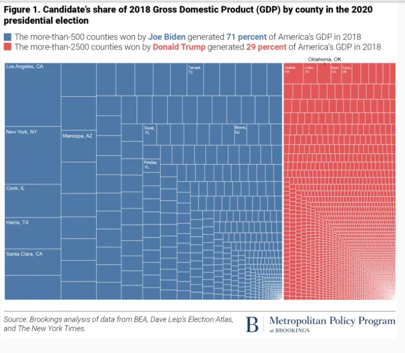
Republicans have 2 Senators in 22 states, which account for $6.6T of GDP.
Democrats have 2 Senators in 22 states, which account for $10.8T of GDP.
Splitting the GDP for the 6 split states 50/50 results in $7.5T in Republican states and $11.7T in Democratic states. The Democratic states have 57% greater GDP in 2021.
The Democratic percentage advantage in 1997 GDP per state is identical. Republican states produced $4.5T while Democratic states produced $7.1T. Between 1997 and 2021, Democratic and Republican states grew at equal percentages. In dollar terms, Democratic states added $4.6T, while Republican states added $3.0T.
Percentages are difficult to digest. One way to compare the 2021 GDP of the two parties is to use “paired comparisons” and then examine the remaining non-paired states. 13 roughly equal pairs can be identified. WY-VT, AL-RI, ND-DE, ID-MA, KS-NV, MS-NH, AR-NM, SC-OR, LA-AZ, MO-CT, TN-MN, IN-MD and NC-MA.
The remaining Republican states have lower $GDP figures but can be mapped to equal $GDP Democratic states. IA+NE+SD=CO. FL+TX=CA. KY+AL+OK+UT=IL.
This leaves 6 states that represent the $4.5T (57%) Democratic state advantage: Michigan ($0.5T), New Jersey ($0.6T), New York ($1.5T), Virginia ($0.5T), Georgia ($0.6T) and Washington ($0.6T).
The Post-Trump Republican Party is distinctively different, representing a broader share of the American geography, but a smaller share of its income, production and diversity. This split reinforces the polarizing tendencies of recent decades, making attempts to find “common ground” at the national level more difficult.
Rural America Grew Very Slowly in the 20th Century, Flattened and May Now be Declining
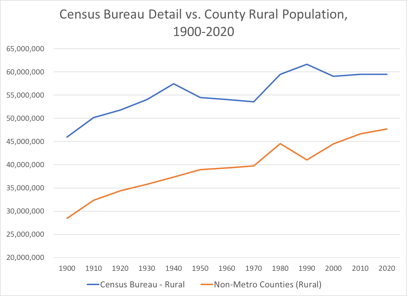
There are a variety of measures of “rural” US population. The Census Bureau has used local populations of 2,500+ to define urban. It focuses on population density and commuting to define urban counties that map to metropolitan (urban) areas. Other federal agencies use other definitions. Overall, the basic trends are clear.
The US Census Bureau’s detailed measure of “urban areas” essentially says that any area with 2,500+ people is an “urban” area. This clearly exaggerates the urban population, but this approach has been used for more than a century on a consistent basis, providing useful data. The 2020 measure of urban has been proposed using about 5,000 as the minimum for “urban”, but this definition has not been finalized.
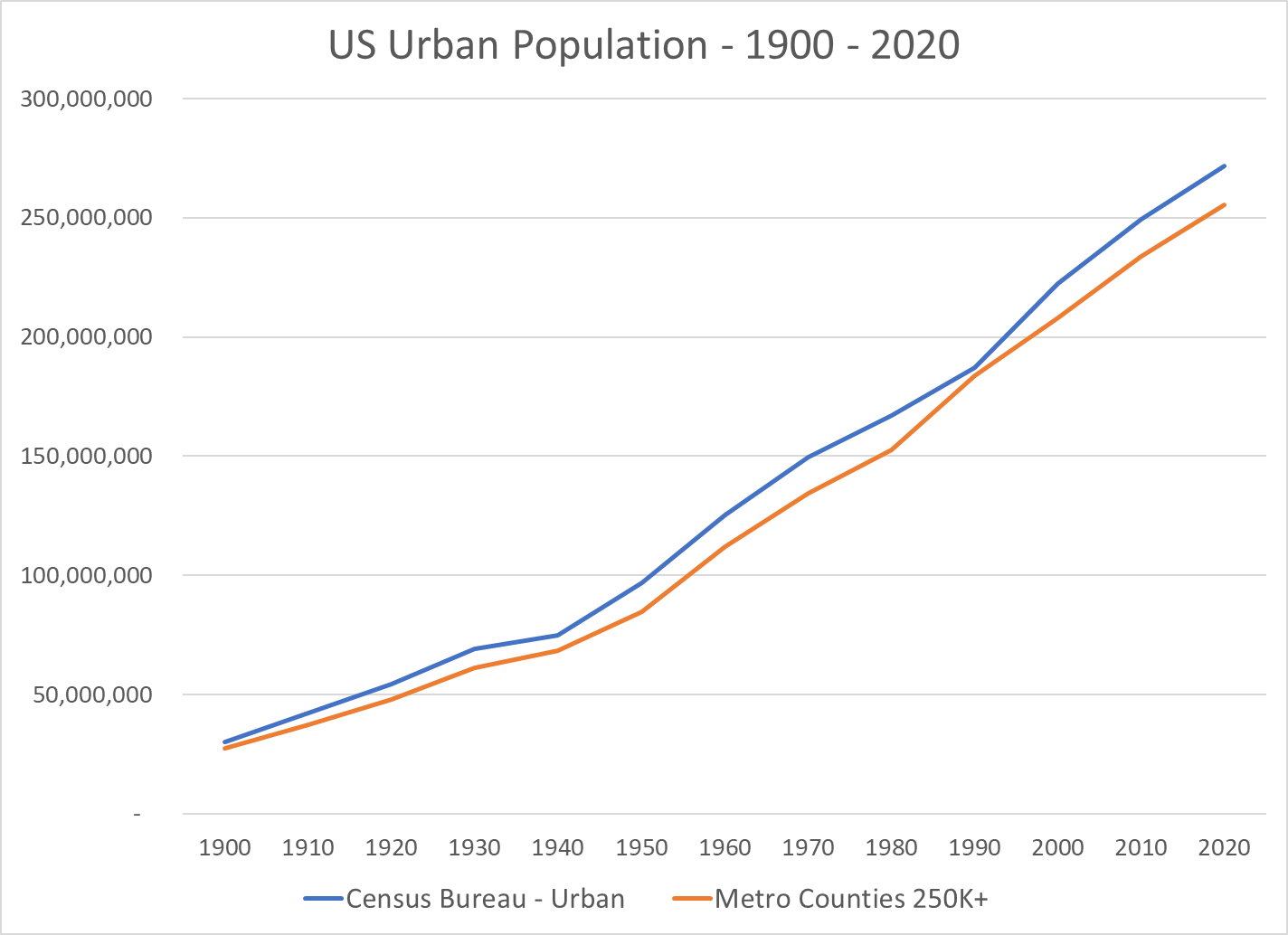
I have focused on the Metropolitan Statistical Areas (MSA) as defined in 2020 and recreated their populations back to 1900 based upon the county to MSA maps.
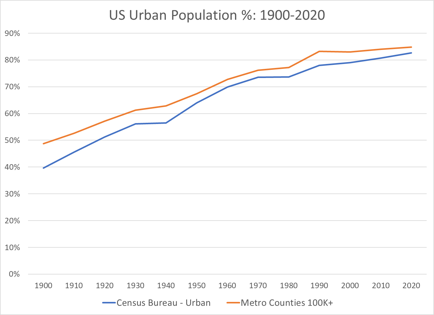
The measure of “percent urban” based upon the metro areas with 100K+ population or 250K+ populations very closely tracks the US Census Bureau’s detailed definition of urban areas (and therefor rural areas).
In summary, US urban population grew from 40% of the total in 1900 to 70% in 1970, about 3/7ths (0.42) of a percent more urban every year for 70 years. The move to “urban” continued in the next 50 years, but at a much slower rate, just 1/5th of a percent per year. But, this accumulates to move the urban percentage from 70% to 80%.
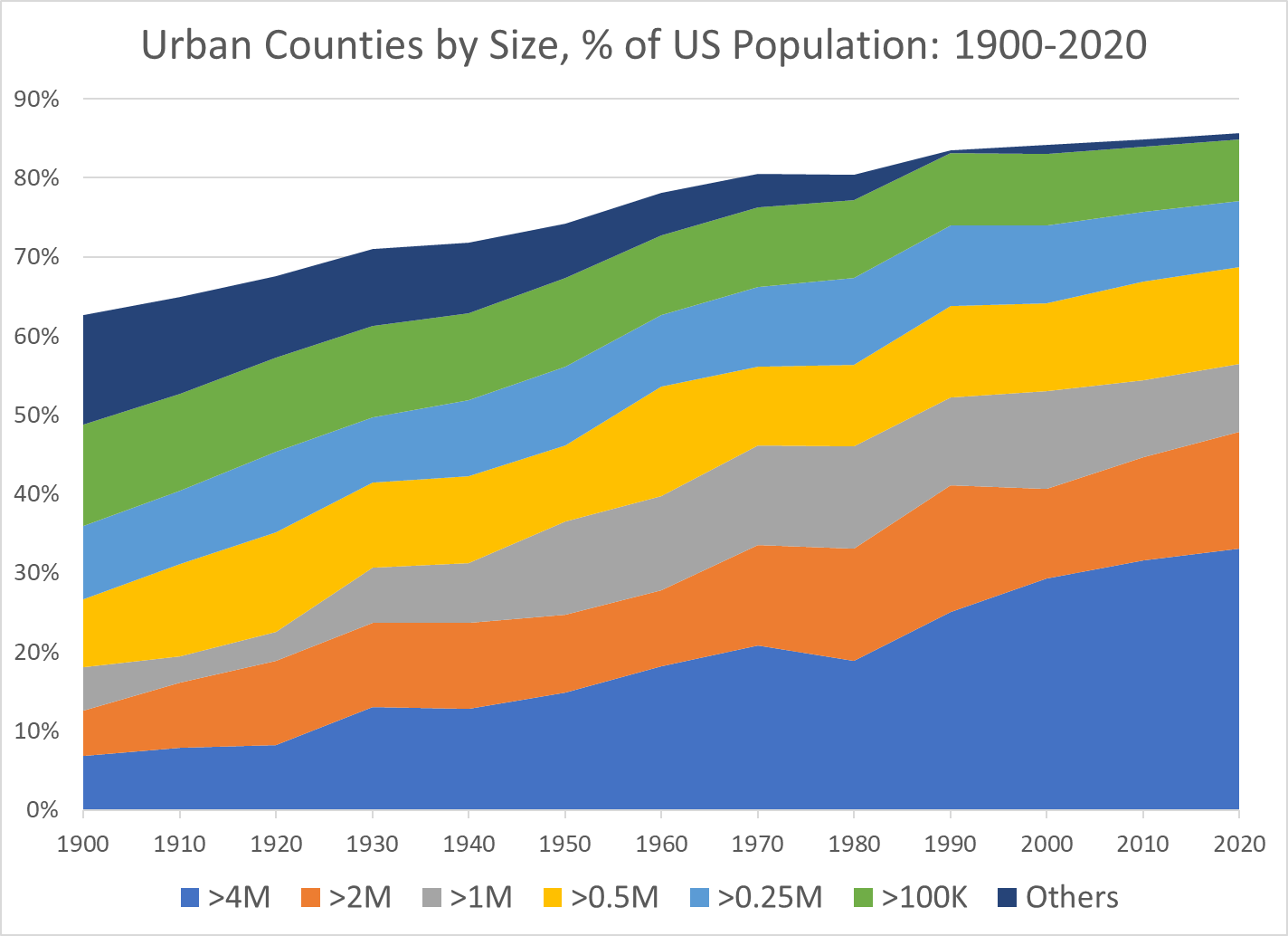
Growth of Very Large Metro Areas Has Driven the Growth in Urban Areas
The 4M+ metro areas have grown the most. The 2M+ and 1M+ areas have also grown. The smaller metro areas have made a smaller contribution to the growth of “urban” America.
The 50th Largest US Metro Area’s Population Has Increased 5-Fold Between 1900 and 2020
The Number of US Metro Areas with 1M, 2M or 4M Populations Has Expanded for a Century
Decade Reaching 1 Million Population
1900 New York Chicago Philadelphia Boston Pittsburgh St. Louis 1910 1920 Detroit Cleveland 1930 Los Angeles San Francisco Mpls-St Paul Baltimore Cincinnati Providence 1940 Washington 1950 Dallas-Ft Worth Houston Atlanta Seattle 1950 Kansas City Milwaukee Buffalo 1960 San Diego Columbus, OH Indianapolis 1970 San Bernardino Phoenix Tampa-St. Pete Denver Portland, OR 1970 Charlotte San Jose Virginia Beach New Orleans Hartford 1980 Miami Sacramento San Antonio 1990 Orlando Nashville Memphis Rochester 2000 Austin Las Vegas Louisville Oklahoma City Richmond Jacksonville 2010 Birmingham Salt Lake City Raleigh 2020 Tulsa Fresno Tucson
Decade Reaching 2 Million Population
1900 New York Chicago Philadelphia 1910 Boston 1920 Pittsburgh 1930 Detroit Los Angeles 1940 1950 San Francisco 1960 St. Louis Cleveland 1970 Mpls-St Paul Baltimore Washington Dallas-Ft Worth Houston 1980 Atlanta Seattle 1990 San Diego San Bernardino Phoenix Tampa-St. Pete Miami 2000 Cincinnati Denver 2010 Kansas City Portland, OR Charlotte Sacramento San Antonio Orlando 2020 Columbus, OH Indianapolis Austin Las Vegas
Decade Reaching 4 Million Population
1900 New York 1910 1920 1930 Chicago 1940 1950 Los Angeles 1960 Philadelphia 1970 Detroit 1980 1990 Boston Washington Dallas-Ft Worth Miami 2000 San Francisco Houston Atlanta 2010 San Bernardino Phoenix 2020 Seattle
The Rapid Growth of the Largest US Metro Areas Has Driven the Growth of the Total Population
The Tipping From Very Slow Rural Growth to Possible Decline Has Attracted Attention from Demographers and Political Commentators
The disproportionate growth of “urban” and very large urban metro areas has continued in the last 50 years. This has a tremendous impact on the lives and perspectives of those in relatively declining rural and growing urban areas.
The US Bureau of Justice recently revised its definitions of urban, suburban and rural locations. The rural violent crime rate appears to be 20-25% lower than the urban crime rate. Note that rural property crime rates are 60% lower than urban rates.
Rural Versus Urban Violent Crime Trends
I’m not finding any consistent long-term “rural versus urban” crime rate statistics. As a substitute, I’m comparing the 15 most rural states versus the 15 most urban states based upon the “538” definition.
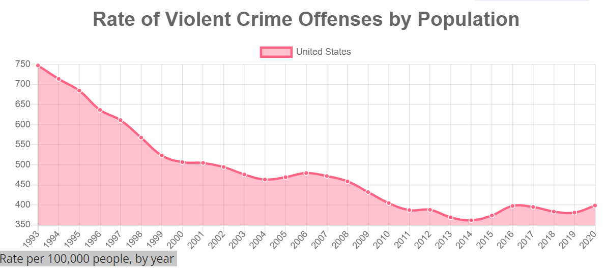
I’m choosing to focus on 2000-2010-2020 to simplify the analysis. Crime rates were dropping “like a rock” from 1993-2000 everywhere (see above).
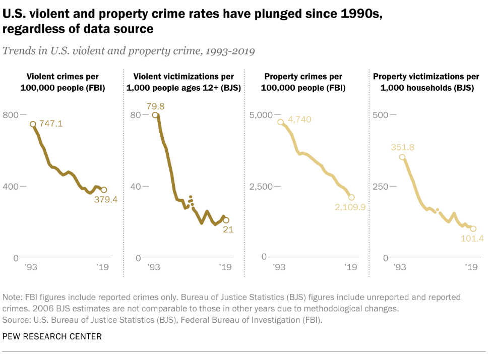
The total US violent crime rate dropped by an additional 22% from 2000 to 2010. It was flat between 2010 and 2020.
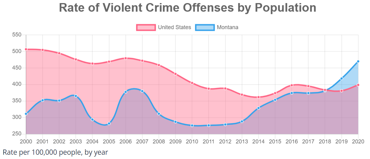
15 Urban States
The 15 most “urban” states averaged 508 events/100,000 people in 2000, above the national average. This group dropped by 19% in the first decade to 413 incidents per 100K people. This subset of states continued its downward trend by 13% in the next decade, reaching 361 reported violent crimes per 100K in 2020. At 361 incidents, these 15 relatively urban states had a violent crime rate 10% below the national average of 400.
Urban 15: WA, PA, CO, TX, AZ, CT, FL, IL, MD, RI, NV, MA, CA, NJ, NY.
The greatest reductions in violent crime rates in these “urban” states occurred in Florida, Maryland, New Jersey and Connecticut.
The 15 most rural states had crime rates of 321, 309 and 400 versus the national averages of 510, 400 and 400. The 15 rural states in 2000 had violent crime rates more than one-third lower than the national average. By 2020, they had increased to match the national average.
Six of the 15 states had very high violent crime rate increases. North Dakota and South Dakota based upon the “fracking” boom disruptions and Vermont, Montana, Arkansas and Alaska based upon other drivers.
Despite the news media’s focus on urban homicide rates in 2019-20-21, the overall US violent crime rate continued to fall from 2000-2010 after an amazing drop from 1993-2000 and then stayed constant/flat for the next 10 years. This “flat” crime rate from 2010 to 2020 was AFTER a 40% drop in violent crime measured by the FBI stats and a 75% drop measured by the Bureau of Justice surveys of crime victims from 1993-2010.
The 15 urban states’ violent crime rates fell by 29% between 2000 and 2020. The 15 rural states’ violent crime rates INCREASED by 25% between 2000 and 2020, then roughly equaling the national average.
Violent crime rates fell by another 10% between 2010 and 2014, reaching a modern low. Unfortunately, they increased back to the 2010 level in 2020.
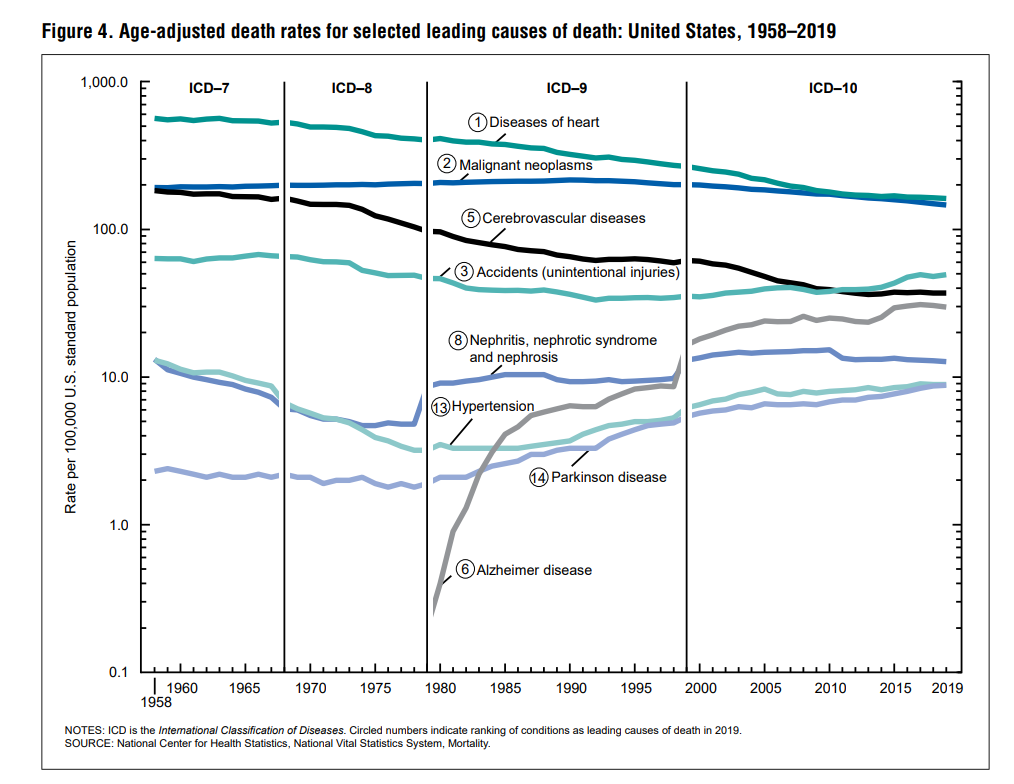
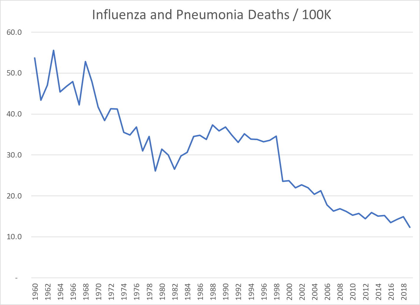
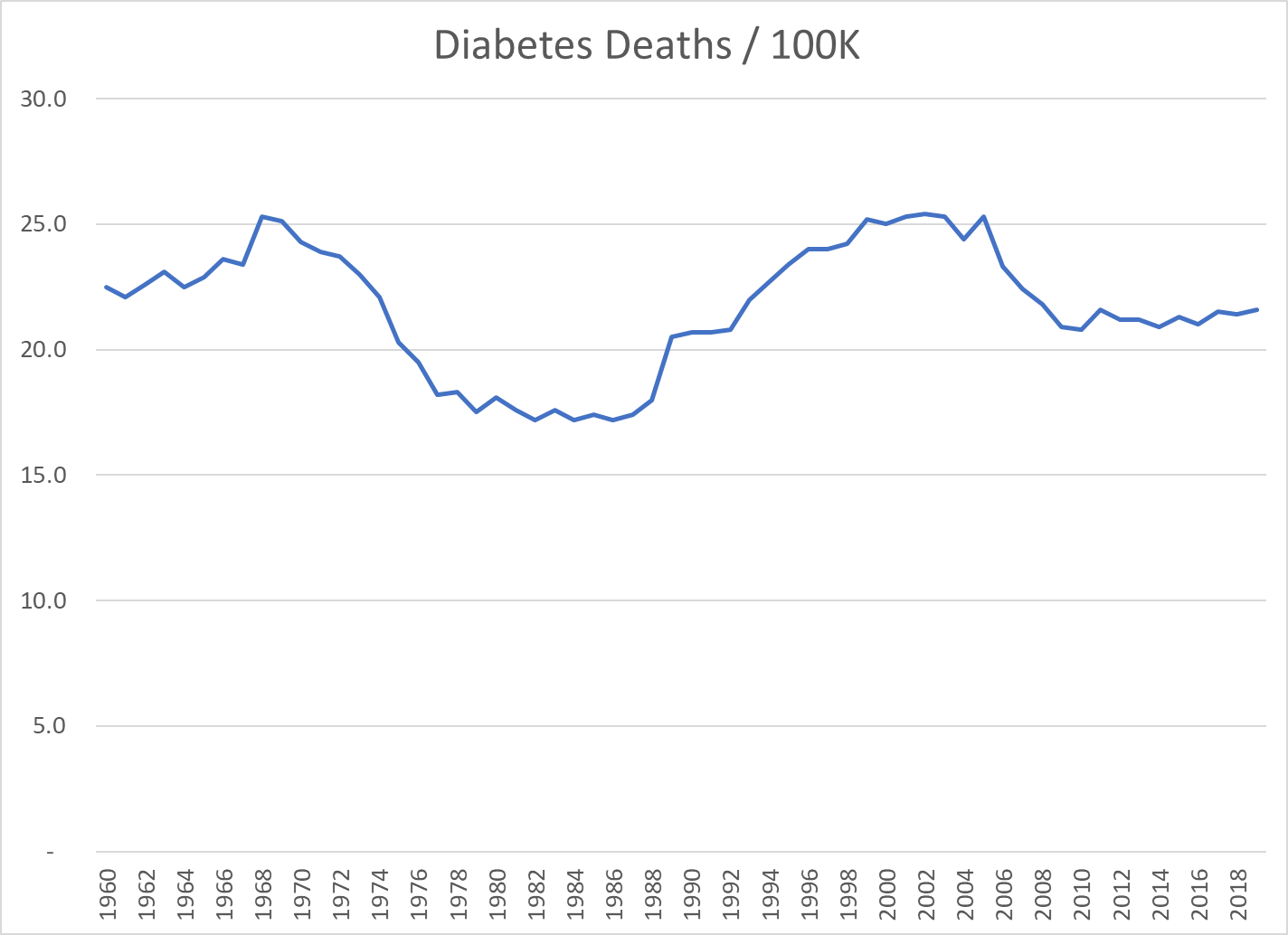
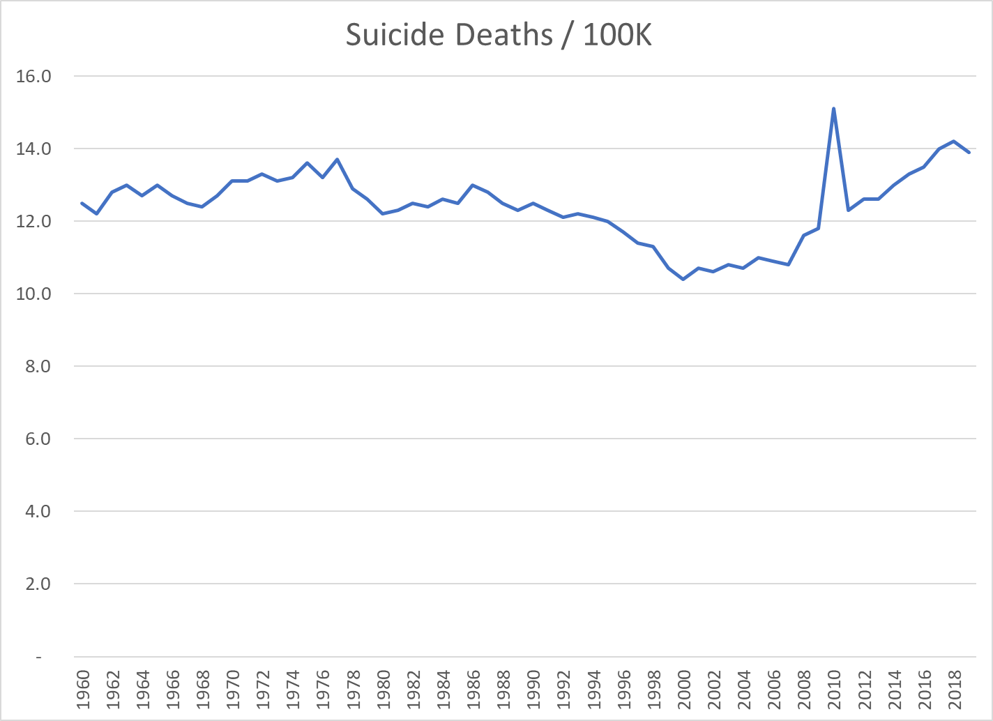
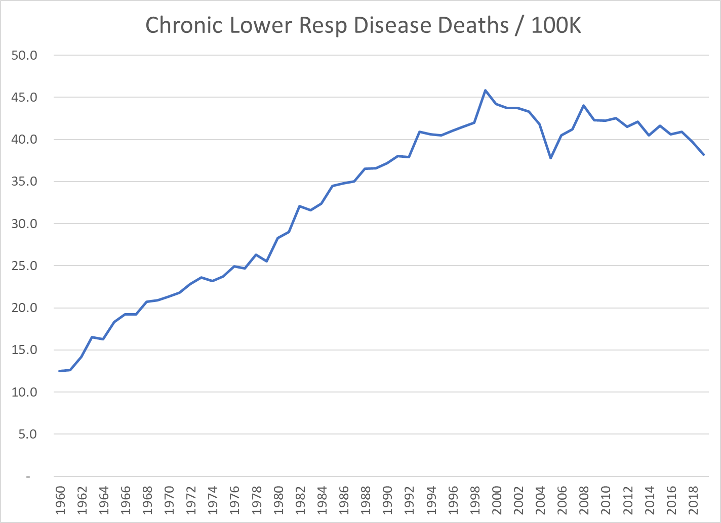
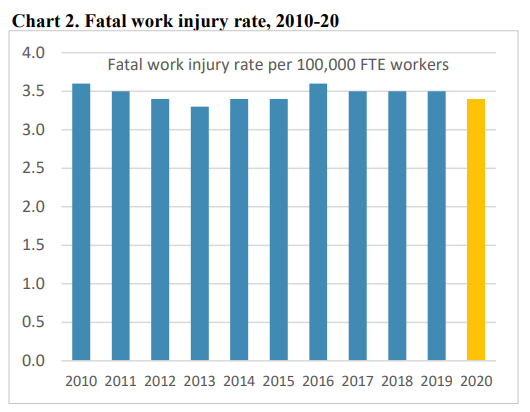
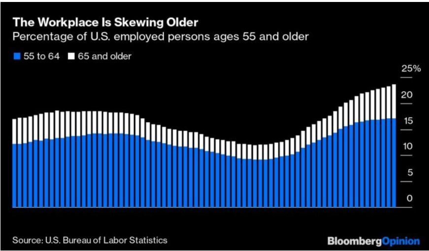
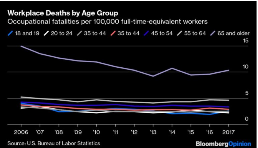
The baby boomers have caused the relatively higher death rate aged 55+ groups to almost double their share of total workers. While the death rate for EACH age group has gone down in the last 20 years, the blended average has been flat for the last decade.
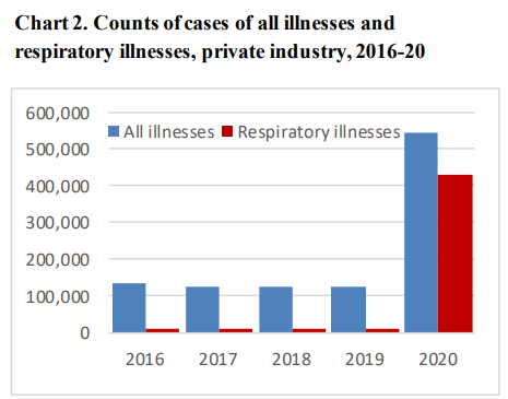
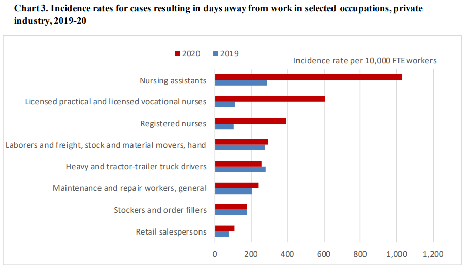
Covid Provided Special Challenges and the Results Could Always Be Even Better


