

Positive Media Coverage
https://www.imdb.com/search/keyword/?keywords=medical-drama
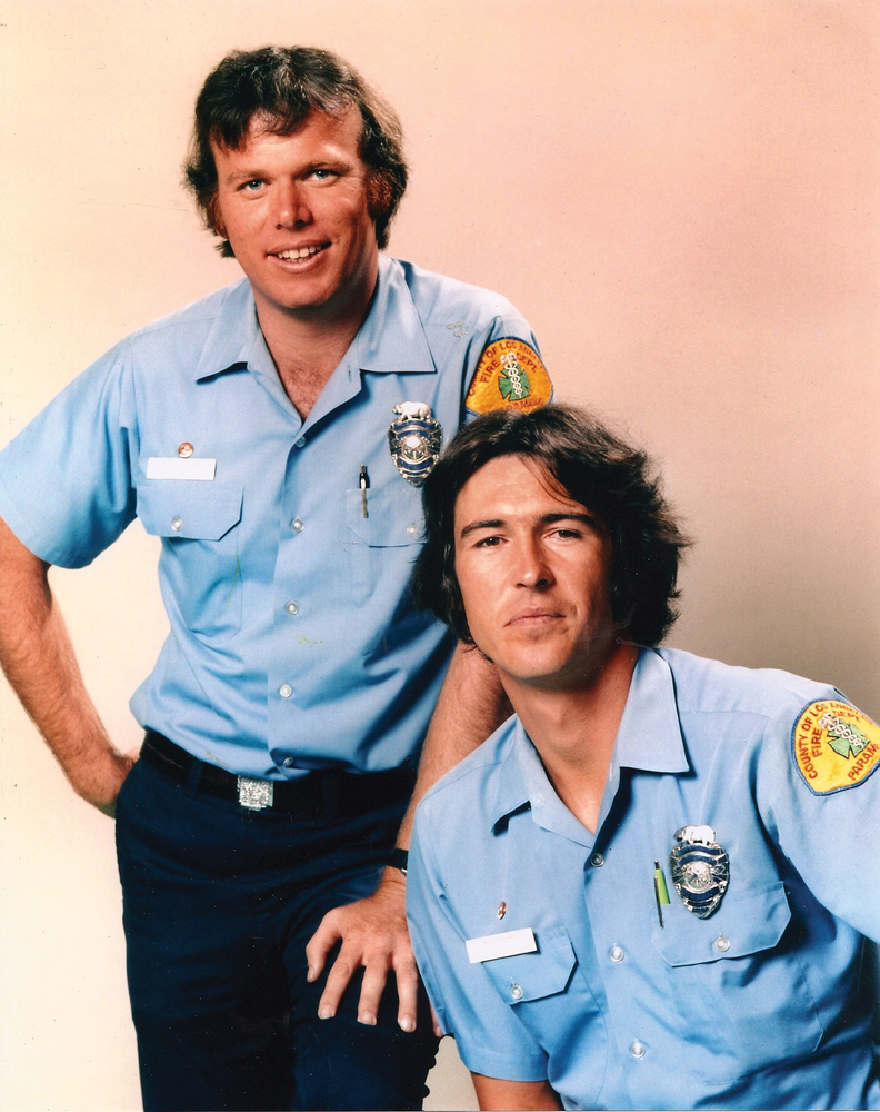
Since the pioneering 1972 drama Emergency! there have been dozens of TV shows highlighting the critical role of emergency medical services (EMS) personnel.
https://www.imdb.com/search/keyword/?keywords=medical-drama
Vehicles
Modern Emergency Medical Services (EMS) vehicles today are designed to help EMS medical professionals provide world class care. They now meet national standards (1974, 1990) for space, equipment, supplies and client care. These vehicles are stocked with supplies and equipment to meet all typical emergency care needs.

https://www.nremt.org/about/history
Air Medical Services
Helicopter based emergency services started in 1974 in Baltimore, Jacksonville, Pittsburgh, Seattle and Denver leveraging the equipment and pilot experiences of the Vietnam War. Emergency helicopters are staffed with qualified personnel and equipment to handle the most extreme situations. Emergency personnel are staged across the country to respond to emergency situations.


Emergency Medical Profession
The National Registry of Emergency Medical Technicians (NREMT) was established in 1970. This organization has driven the development of a true profession.
https://www.nremt.org/about/history
In 1975 the AMA recognized emergency medicine as a physician specialization and recognized paramedics as allied health professionals. Prior to this time, the training, skills, employers, supervision, equipment and medical protocols of the emerging profession were so varied that initial efforts to define and enhance the professional identity and roles of paramedics and EMTs were often opposed by physicians, nurses, lawyers and hospital administrators. In the 1970’s states began to pass legislation that defined the legal roles which paramedics and EMTs could play without concern for lawsuits from their customers. Specialized emergency physician training was also developed during the 1970’s highlighting the role of paramedics, immediate care, transport care, triage issues, communications and the emergency room admitting and medical services. Emergency medical dispatching programs started in the 1980’s. Military paramedics/EMTs adopted national standards in 1986, aligning the two groups. Paramedic manager standards for training have been defined for most states.
Paramedics and EMTs are regulated at the state level. Definitions of roles, titles, allowable drugs/procedures, supervision requirements, certifications, examinations, renewals and education programs varied widely in the 1970’s. The role of national certification as an option or requirement grew throughout the 1980’s and 1990’s. Today, differences between states remain, but most states (45+) largely conform to recommended national standards for all dimensions.
While most people think of paramedics and EMT’s as specialized staff or extra skills held by first responders, the profession now includes military personnel, dispatchers, air staff, emergency room, jail, blood bank, medical labs, education and interhospital transportation roles. This increased breadth of experiences has helped the profession to improve the content of its services, education, certification and allowable procedures.
https://en.wikipedia.org/wiki/Paramedics_in_the_United_States
Professional Certification
As states defined various paramedic and EMT legal roles, they created state professional certification agencies. The first national EMT exam was administered in 1971 to 1,500 applicants. By 1984 one-half of states required the national exam for certification. By 2005, 46 states recognized or used the standardized national exams.
The national exams incorporated American Heart Association standards in 1986. Major national standards changes were implemented in 1994-95 to include 2 decades of lessons learned, a systems approach to paramedic/EMT roles and a dual focus on theory and practice.
A single national organization (NREMT) sets national standards and reviews those states and programs which adopt them. Certification standards are defined for 5 typical levels in each state and at the national level. A majority of states simply adopt the national standards and almost all accept candidates who met the national standards rather than specific state standards. The “level” of skills, training and experience in states that do not adopt the national standards are generally comparable, with a few exceptions. A national standard curriculum is available which is aligned with the testing requirements. Candidates are evaluated on theory and practice, individual diagnosis/treatment and situation/scenario evaluation. Certification requires a period of field internships. A majority of firefighters earn some level of EMT certification. Almost all states recognize certifications from other states. The national agency accredits training programs and agencies.
https://www.emsmemorial.org/ems-history
https://indianahealth.care/history-of-ems
https://wvde.state.wv.us/abe/Public%20Service%20Personnel/HistoryofEMS.html
Professional Education
Ambulance staff training was first defined in the late 1960’s. The first EMT curriculum was nationally recognized in 1969. Prior to this time, ambulance staff had basic first aid training. National training standards were set in 1973 together with the emerging certification exams. A full national paramedic curriculum was released in 1977. A comprehensive “emergency care” manual was published in 1979. Early training was largely done by individual hospitals in urban areas. Training soon moved to universities and community colleges where it is focused today. While associates and bachelor’s degrees are not required for most paramedic/EMT licenses, they are now commonplace. The number and variety of procedures provided by paramedics and EMTs has grown throughout the period. As emergency room physicians became commonplace and their confidence in EMS staff increased, they supported this growth in “standing procedures” to be taken without physician coordination. With increased experience, documentation, best practices and scientifically based standards improved. The medical profession adopted a “systems approach” to health care beginning in the 1990’s and EMS staff have adopted this approach.
Cardiac Care
Prior to 1972, CPR training was defined and more broadly offered in the US. Portable defibrillators were invented but not broadly available. Emergency cardiac treatment programs were rare.
In the 1970’s heart resuscitation guidelines were published, more portable defibrillators were available and related EMT training began.
Cardiac care has been a key curriculum and certification exam component for paramedics/EMTs since the 1980’s.
The American Red Cross introduced defibrillator training into its first aid course in 1999.
The easier to use AED defibrillator was approved for sale in 2004 and is now widely placed in many communities and millions have been trained to use them.
Pediatric Care
Pediatric care was upgraded in the 1984 curriculum and exam standards for EMS staff. Specialized pediatric care hospitals were clearly established.
Emergency Rooms
Hospitals invested in emergency room space, equipment and staff after 1975 when emergency room physicians became a specialty. In 1983 Level 1 trauma centers and pediatric critical care centers were defined and began to be implemented. Disaster resource centers were defined in 2004. Stroke centers were defined in 2009. While these specialty care centers were defined, a wide variety of immediate care centers were established in many areas, providing additional options for EMS services.
Medical Protocols
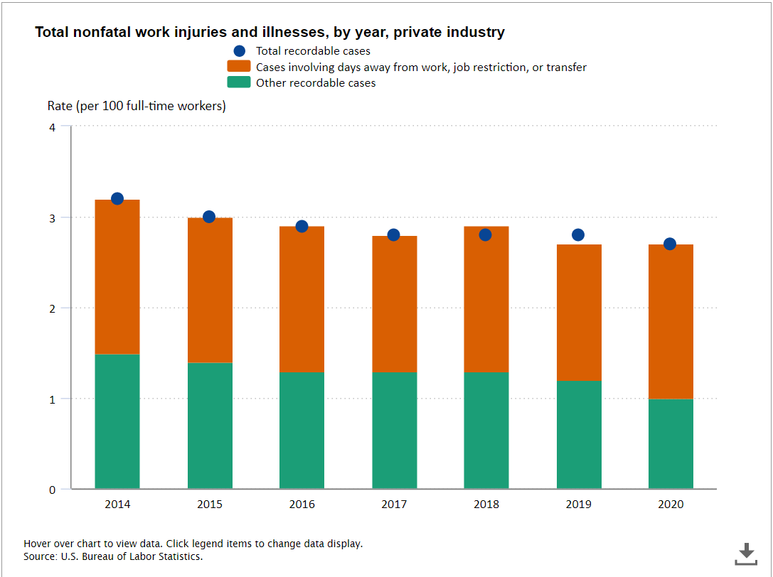
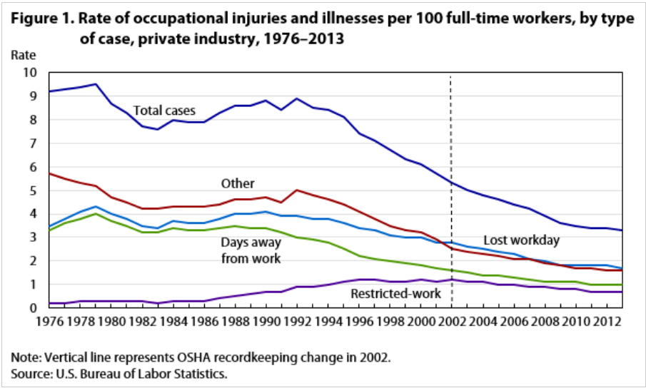
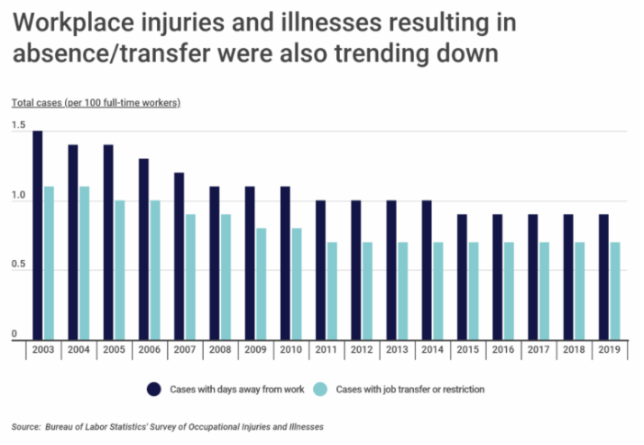
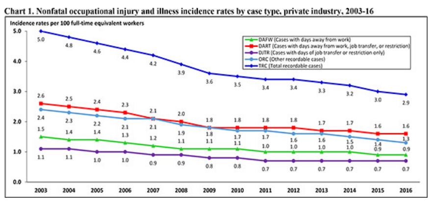
EMS professionals have benefitted from the global “process revolution” of the 1980’s. Health care professionals view each patient and situation within a “process framework”. This has allowed paramedics and EMTs to increase the variety and depth of first response diagnosis and treatment which they can legally and effectively provide. Evidence based medical standards replaced the previous “trial and error” standards in the 1990’s. Standard operating procedures were defined for most situations. This allowed EMS staff to act immediately without emergency physician approval in more situations. “Standing field treatment protocols” were widely defined and adopted in 1997 clarifying the roles of paramedics/EMTs. EMS standards were further revised in 2000 using the “medical systems” approach. Standardized EMS data recording and sharing began in 2000 and has expanded since then, allowing improved systems, evidence and medical based changes to accumulate. States generally approve both procedure and medical treatment options for individuals holding each level of EMT/paramedic certification.
Communications
In 1972, police and fire vehicles had basic special purpose radio communications and dispatchers as did taxi fleets. Improved medical dispatching skills accompanied the growth of EMS resources. Revised EMS radio communication standards were adopted in 1973. EMS staff benefitted from the expansion of cellular phone services. 911 emergency call services began in 1968 and expanded nationally throughout the 1970’s. Dedicated EMS to hospital communications as increasingly adopted in the 1990’s. Video services were added after 2000.
Funding
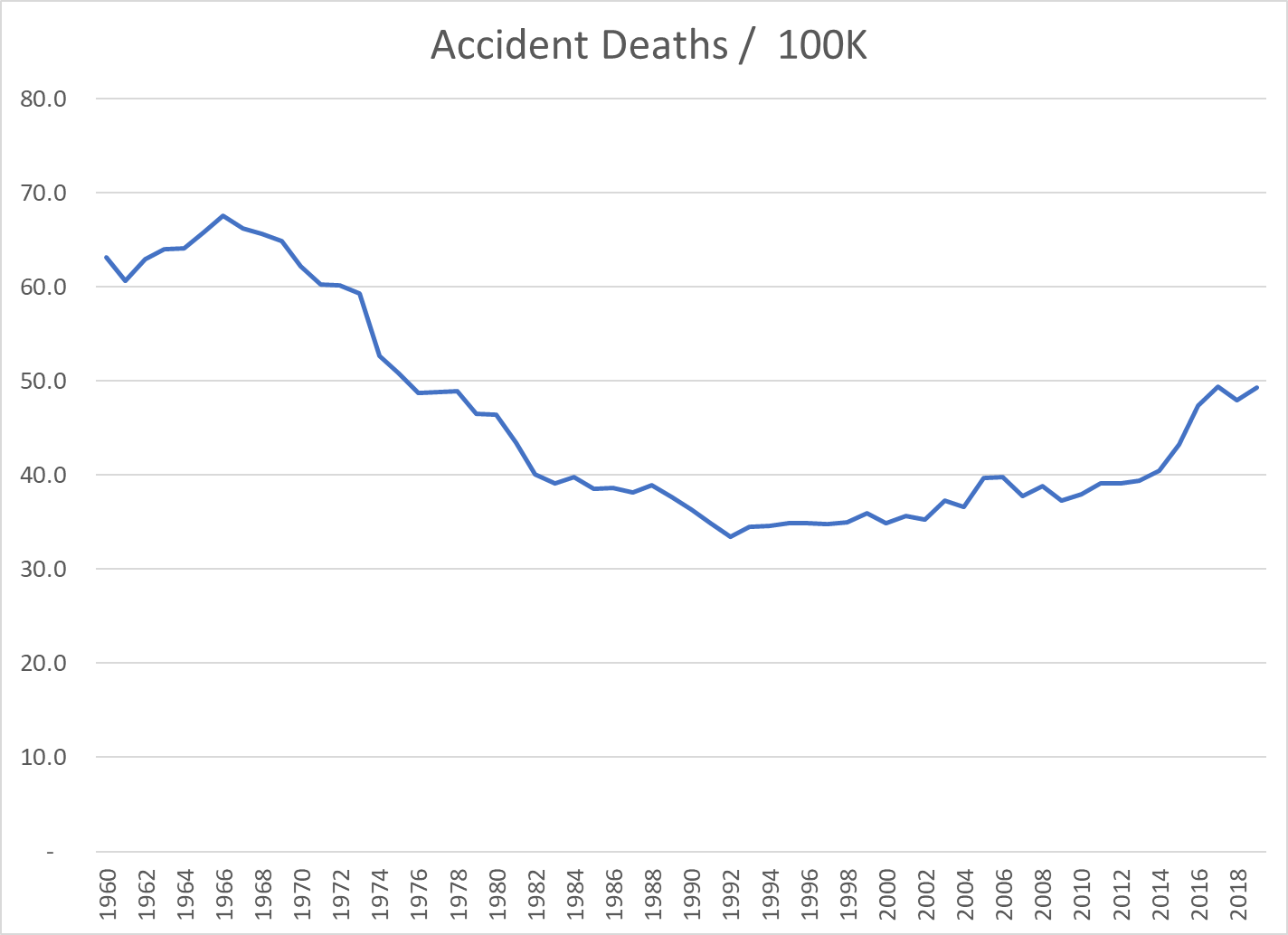
In 1966 a National Academy of Sciences study titled “Accidental Death and Disability” highlighted the comparatively high casualty rates of domestic vehicle accident victims versus those with war injuries! Thousands of Americans were disabled, mistreated and died each year versus the standard treatment offered by the military in combat zones. Congress responded by moving lead responsibility for EMS from the US DOT to US HEW in 1972. 5 demonstration EMS programs were funded in 1972. Further federal investments were made in the 1970’s. However, by 1980, Congress and the president decided that states should manage and fund this component of the health care system.
EMS Professional Skills
Today, when you dial 911 in an emergency, you can expect a nationally certified, trained and supervised team to quickly arrive and provide a high-quality level of services.
Assessment of incident, accident, patient situation.
Compliance with standard care protocols and escalation to physicians.
Triage in mass casualty situations.
Safe movement and extraction of patients from accident situations.
First aid treatment.
Intravenous fluid administration.
ECG, EKG administration and defibrillation (manual and electric).
Intubation.
Drug administration.
Acute asthma treatment.
Heart rhythm assessment and rate correction.
Spinal immobilization.
Transportation to the best next level care facility.
One Million EMS Professionals!


About one-half of the total were certified at the national level.


