

https://www.friendsofnotredamedeparis.org/cathedral/artifacts/rose-windows/
Since WW II pollsters have tracked Americans’ opinions on the most important problems or issues facing the nation. Politicians learned early that “framing” the issues was their most important tool. Helping the media and thought leaders to prioritize and highlight the “most important” issues became job one. Framing policy responses as positive, negative or “beyond the pale” became job two. The pollsters ask the questions in different ways and get slightly different responses, but the overall results are usually pretty clear. The media tends to focus on the “top 5” or the increasing differences between Democrats, Republicans and Independents. Through time there are nearly 50 items that appear as material, most important for at least 4% of Americans in a survey. This focus on the “top” and the “differences” tends to hide major changes in public perceptions.
I’ve tracked the surveys back to 1948. I group the issues as policies versus institutions. I split the issues as foreign and domestic. I split the domestic issues as economic and social. I divide the social issues into those generally favoring Democrats versus Republicans. This summary shows the public’s views on the most important issues from 1948-2020 grouped by presidency.
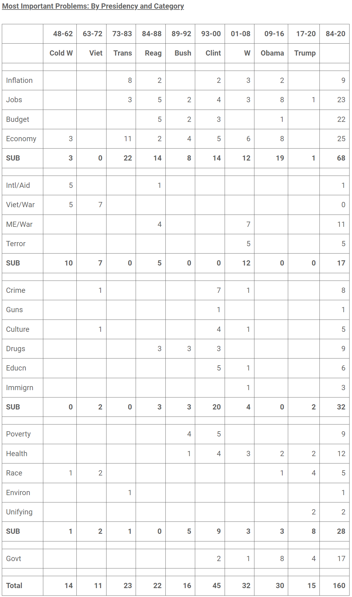
Big Changes from 1948-2020 to Today
War, terrorism, international trade and nuclear weapons were 12% (1/8) of the top issues historically. They are close to 0% today. Republicans have been more hawkish historically, emphasizing the threats to the US. This has been a political winner for them, criticizing Democrats for being “soft on defense”, “soft on terrorism” and “soft on China”. This appears to be a relatively minor political issue today with Democrats maintaining Trump’s more hawkish policies.
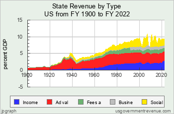
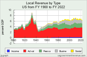
The economy is the top priority today for 30% of poll respondents versus 44% historically. Within the last 75 years the US economy has progressed from a moderate business cycle to stagflation to a minor business cycle plus disruptions model. Booms and busts were normal in the prewar period and the early post-war period. This pattern was moderated in the sixties, but the “guns AND butter” approach of Johnson and Nixon drove a stagflation period during Carter’s presidency. Since that time business cycle expansions have been longer, recoveries have been quicker and recessions have been mainly triggered by “exogenous” factors like oil prices, stock market crashes, real estate busts and pandemics. The economy is not as important today as it was historically. That benefits the incumbent president/party on the down cycle and limits the benefits to the president/party on the up cycle.
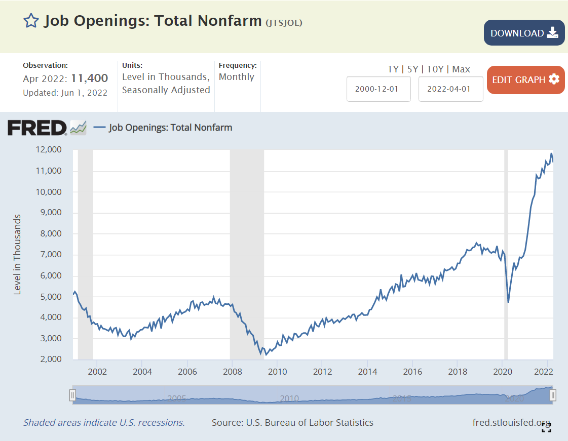
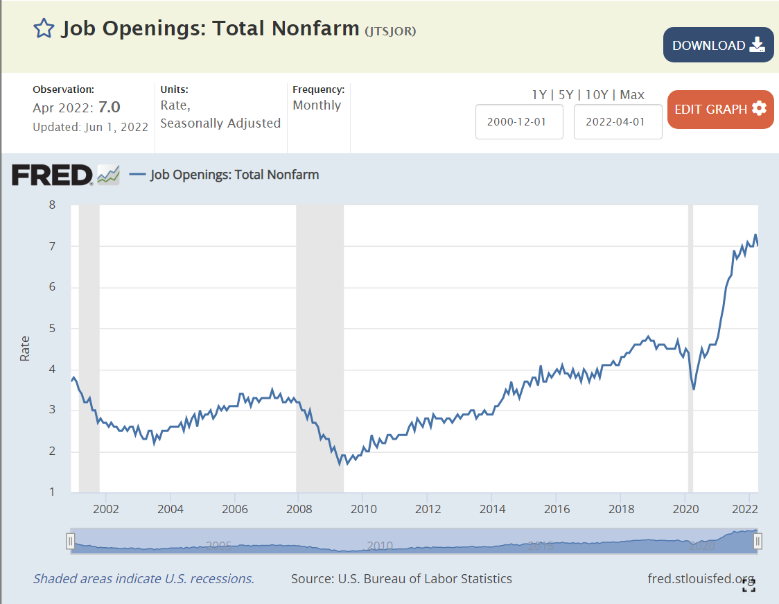
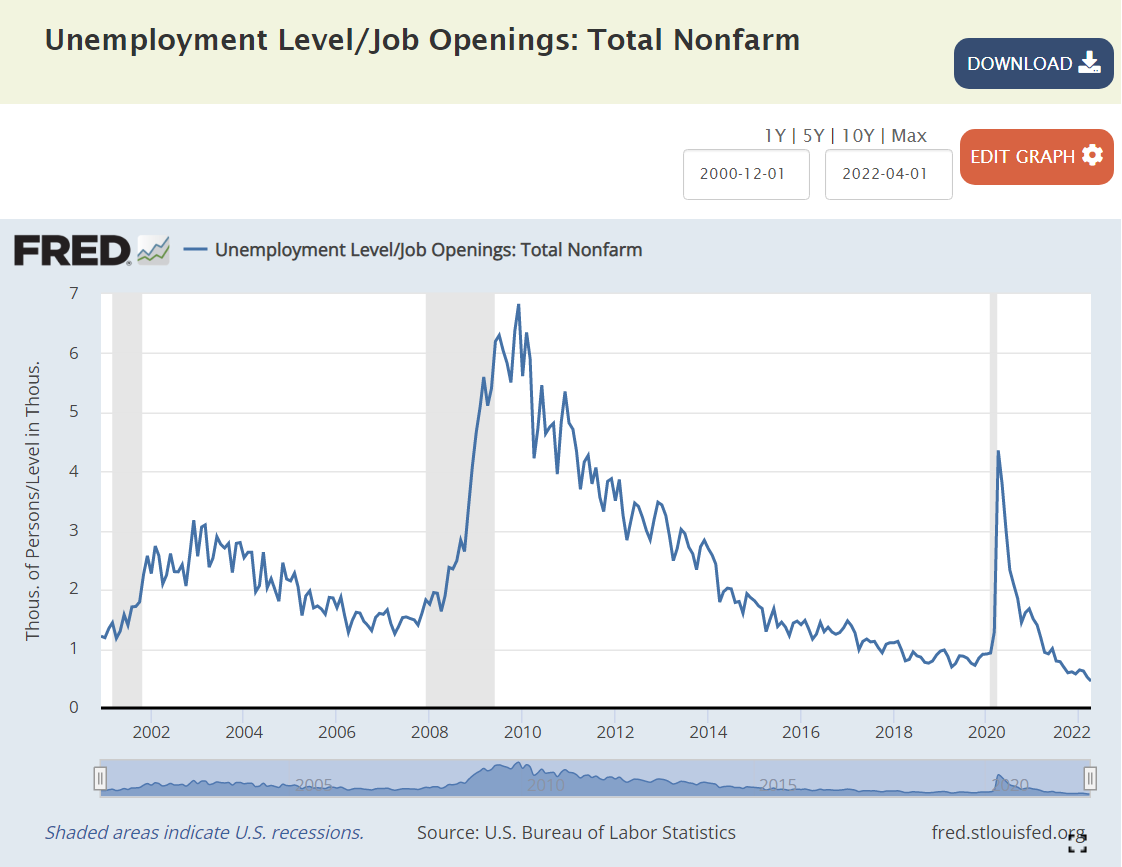
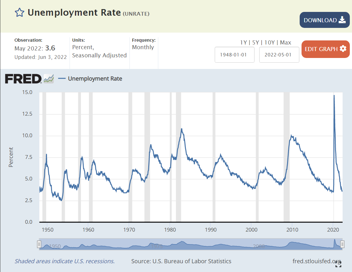
Democrats are benefitting today from the best job market in 50 years. Jobs were a top priority for 12% of respondents in the past, a top 4 issue. Jobs are a minor 1% concern today.
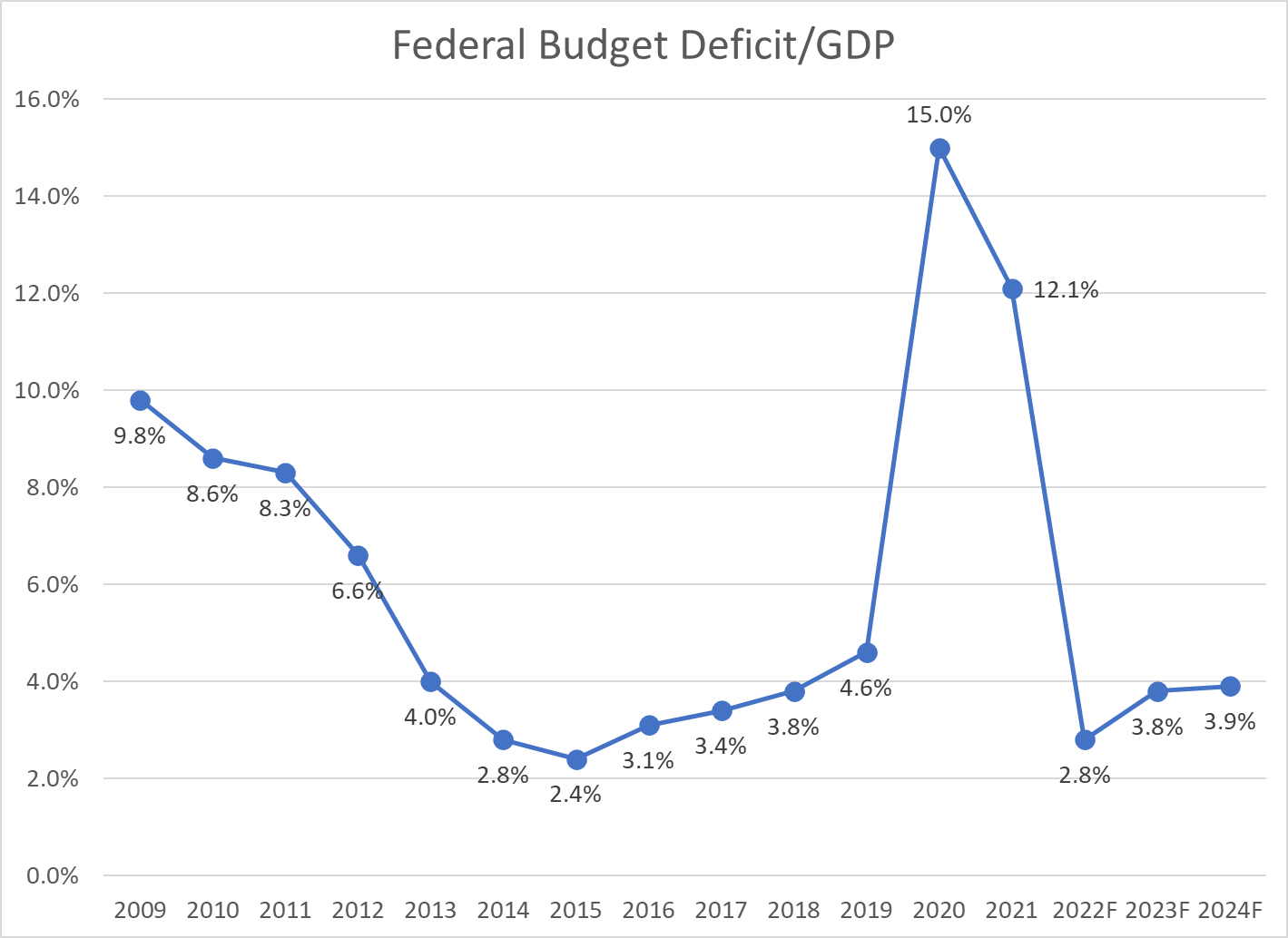
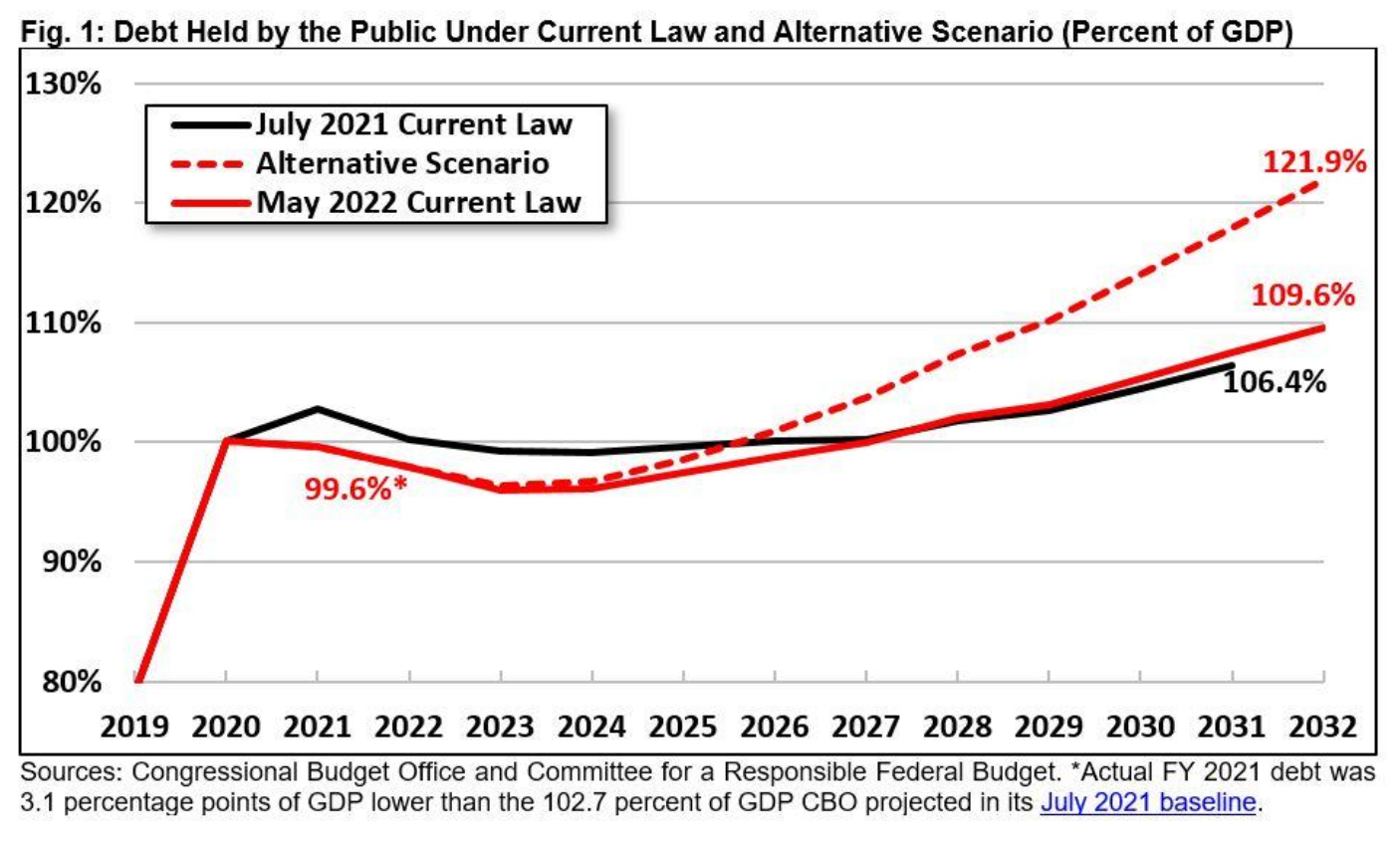
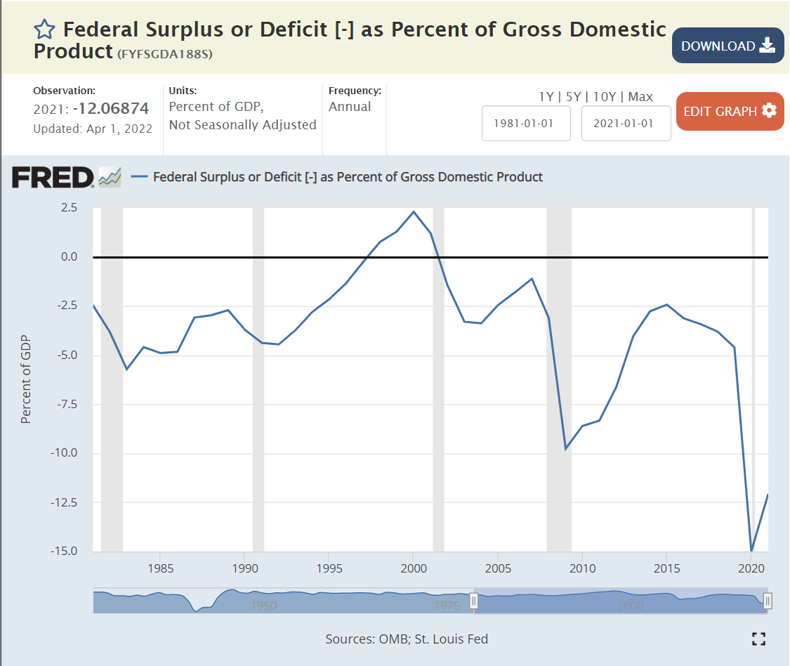
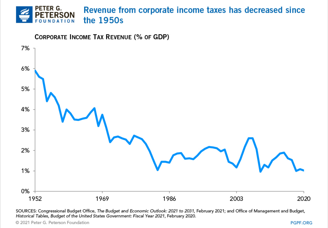
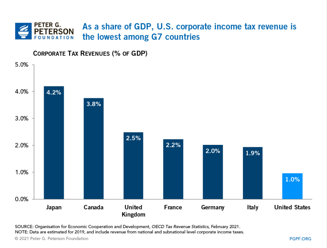
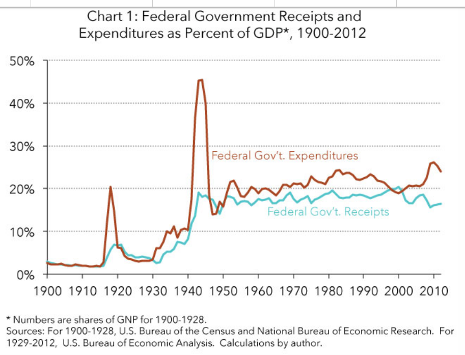
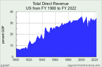
The federal budget deficit has been a political weapon for Republicans against Democrats who generally believe that some degree of deficit spending in pursuit of other policy goals has a neutral effect on the economy. This was a top issue for 12% of the people historically. It is a top issue for just 1% today. Citizens have witnessed business cycle and ongoing deficits that have not created havoc. Republican presidents have overspent as much (or more) as Democratic presidents. This issue was a lower priority today in the second half of the Obama presidency and Trump presidency. It is becoming a somewhat larger issue today, but mostly just among Republicans.
The overall “economy” was top-rated by 15% historically and 13% today. This has become a very partisan measure, with opposing parties criticizing the results of the incumbent presidents. The US economy has proved resilient and better at creating value than other countries throughout the last 75 years. Despite current Republican criticisms, Biden is winning this one.
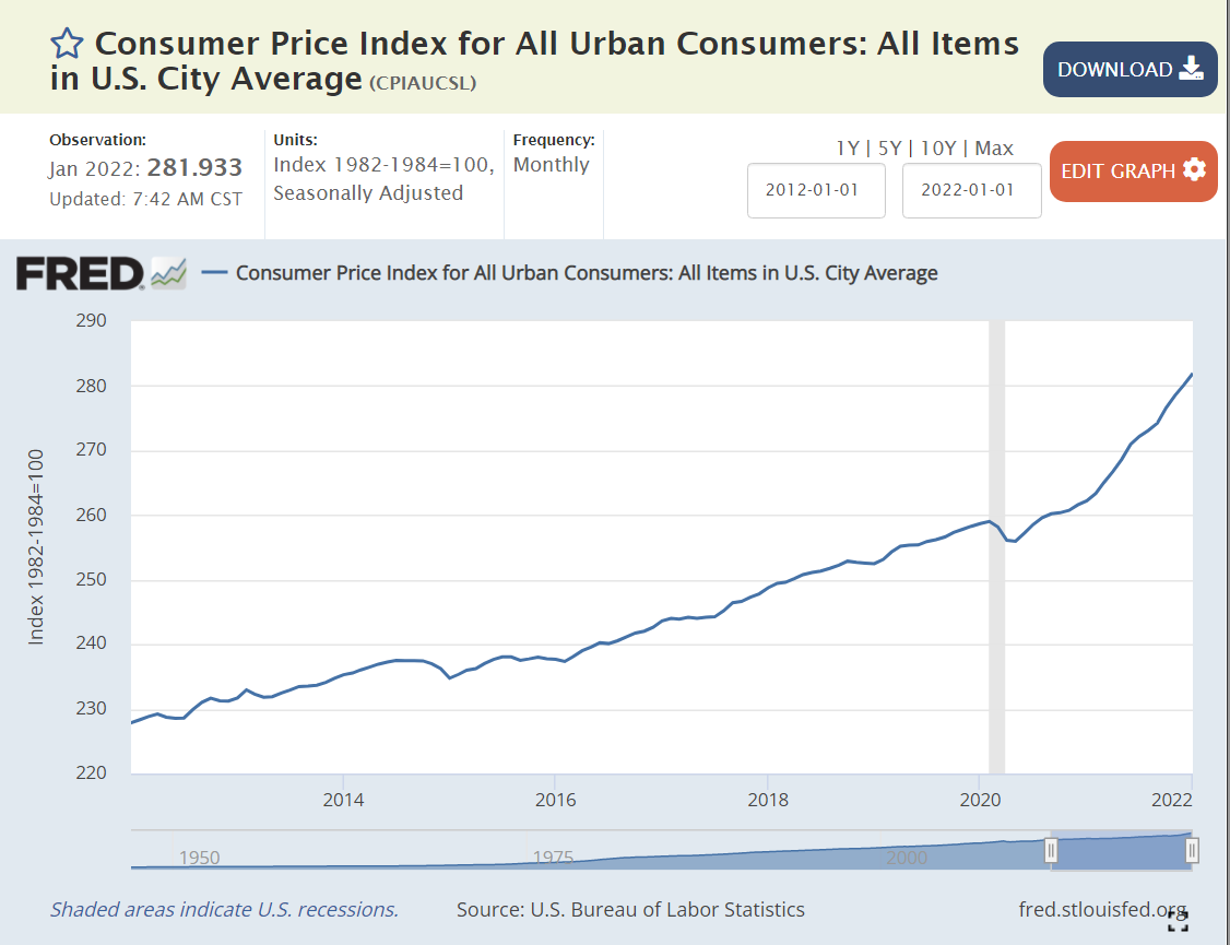
Inflation is another important economic measure. Inflation grew through several business cycles in the 1970’s-1980’s before becoming a non-factor for 30 years. The pandemic, supply chain disruptions, Ukraine export limits and rapid recovery of goods demand after the pandemic shock drove high inflation beginning in 2021. Inflation averaged 5% of the top political priorities, but it was mostly focused on a small period of time. Today, inflation/gas prices are a large 15% priority. This hampers the incumbent Democratic presidential party.
Social issues that tend to benefit the Republican party have grown slightly from 18% to 22% of the total. Culture/morality and education remain minor at 3% each. Concerns about crime are at 6%, comparable to the historical average. Concerns about drugs have fallen from 5% to just 1%, despite the “opioid crisis” which greatly impacts the white middle class. Concerns about immigrants have more than quadrupled from 2% to 9%. Trump resurrected a powerful wedge issue despite a downward trend in illegal immigration. The recent increase in immigration from central America and Venezuela has given this issue strong legs.
Social issues that tend to benefit the Democratic party have increased by two-thirds as top priorities in recent years, from 15% to 25%. Poverty, wages, inequality and affordable housing combined remain in the 4-5% range, mostly just a progressive Democrat issue. Health care funding, coverage, obesity and nutrition have declined from 7% to 4% as a top issue. Obamacare is now accepted (even if grudgingly) as part of the country’s “safety net”. Race and racism are just a little more important at 4% versus 3% historically despite the increased media attention paid to police killings and progressive Democrats’ attempts to elevate this as a core issue. Gun control and mass shootings have grown from near zero to 5%. Democrats, independents and a share of Republicans feel a strong need to “do something” about gun crimes. The Supreme Court decision to vacate “Roe v. Wade” and Republican states’ tight abortion laws have motivated Democrats and independents to revive this as significant issue, even though the 3% score is not as meaningful as many articles have portrayed the impact on local elections. The environment/climate change was an immaterial policy issue after the passage of basic laws in the 1970s. It has grown to a solid 5%, driven by Democrats and younger voters. One-fourth of voters make these liberal leaning issues a top priority, including a decent share of independents and moderate Democrats.
A fourth category is the role of government, politics and leadership. Concerns about polarization and lack of unity have grown from zero to 5% as a top issue. Concerns about government and leadership have grown from 10% to 18%. Combined, this is a doubling, from 11% to 23%. This is a mixture of left, right and center voters. Republican concerns about government as a threat to individual liberties grew in the 80s and 90s, and then again with the Tea Party movement in the 2010’s. Republican concerns about “deficit spending” and “funding social security” have grown with each Democratic administration. A non-negotiable commitment to no tax increases is a Republican candidate requirement for the last three decades (strangle government in the bathtub).
Some of the increase is an increased emphasis by Republicans. I believe that most (75%) of the increase is due to centrists and independents watching their power undermined by the far-right wing of the Republican party, which has eclipsed the moderate, Main Street, Wall Street, New England, RINO, philosophical conservative and neoconservative factions. Extreme economic and social issues positions were adopted by national Republicans even before Trump (think Sarah Palin).
Centrists and independents also look at the Bernie Sanders, progressive, New York, California, green, woke, media, university wing of the Democratic party as being foreign to their views and priorities.
Centrists, moderate Democrats and some Republicans express increased concern about “preserving Democracy” following the rise of concentrated single party state power, partisan gerrymandering, politicized judiciaries, politicized local elections (school boards), unlimited campaign financing, debt ceiling brinkmanship, decreased civility, Supreme Court nomination politics, various Trump attacks on the independent power of federal agencies and the January 6th threat to a peaceful transition of power.
Overall, I’d say that the 23% that identify government/politics as a top issue is roughly balanced between the two parties, with the concerns driven by quite different reasons.
Category Recap
The economy is a lesser political factor today, garnering 30 percent versus 44 percent historically. The economy has done very well in the last 20 years, despite the Great Recession and the Pandemic.
International issues, trade, war and terrorism have declined from 12 percent to zero. The middle eastern wars and “war on terrorism” have left most Americans with little appetite for foreign wars. Funding Ukraine’s war and imposing maximum sanctions against Russia are supported, but any escalation is taboo. Similarly, the country is ready to support a “tougher stance” on China, but not ready for real escalation or a fight for Taiwan.
Republican leaning issues that emphasize fear of attacks from “others” maintain a slightly increased 22% share of top priorities. The increased emphasis on preserving individual/family choice on education, libraries, religion, media, and university wokeness is not yet apparent in the numbers, but media coverage of these issues has grown in the last few years.
Democratic leaning wedge issues on guns, abortion and climate have grown from near zero to 13% as a top priority. Traditional concerns about race and inequality have not grown as priorities despite data and situations that might be expected to move public opinion.
Republicans increasingly doubt the legitimacy of government activities and politics. Democrats increasingly doubt the legitimacy of government actors, processes and polarization.
This is one blog post that I won’t file under the “good news” category.
Reference Summary Reports

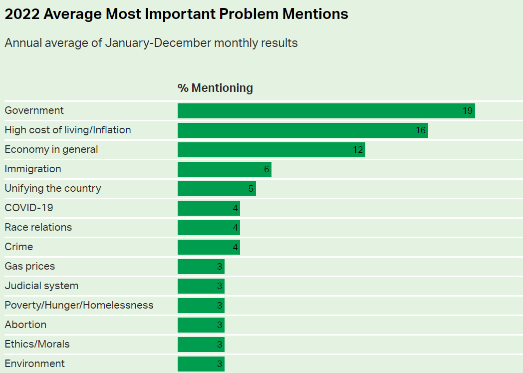
https://news.gallup.com/poll/406739/government-remains-americans-top-problem-2022.aspx

https://news.gallup.com/poll/468983/cite-gov-top-problem-inflation-ranks-second.aspx


https://www.heritage.org/americas-biggest-issues
https://www.livenowfox.com/news/2023-poll-what-is-americas-biggest-problem-right-now
https://www.newsweek.com/most-important-problems-facing-us-poll-1729903
https://www.yahoo.com/now/15-biggest-issues-america-companies-140313579.html


