Good News: Healthy State & Local Government Finances

https://www.oecd-ilibrary.org/sites/c6217390-en/index.html?itemId=/content/component/c6217390-en

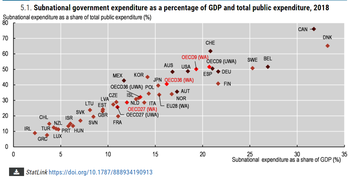
One-half of US government spending is managed at the state and local level. Only 3 OECD (developed economy) countries have a higher share at the local level. The median level is one-third of the total and some countries limit local spending to just 10-20% of the total. The US federal government model ensures that a significant share of government is managed closer to “the people”, which is even more important today with 330 million people than it was 200 years ago.

State and local expenditures as a percentage of GDP is 19% for the US, on the high side compared with other OECD nations as expected based on the 50/50 local/national split.

Government employment is even more concentrated at the more responsive state and local government level. State and local government employees comprise three-fourths of total government employment. This total increased from 21 to 23 million across 20 years while total US employment grew from 132 to 152 million. The share of government to total employment eased down from 16% to 15%. Note that this is much lower than the 38% government share of GDP.

https://fred.stlouisfed.org/series/PAYEMS#0

Federal government employment has been essentially flat for many decades.

https://www.cbpp.org/research/state-budget-and-tax/its-time-for-states-to-invest-in-infrastructure

Setting aside land and defense assets, states and local governments hold a supermajority of government assets.

https://en.wikipedia.org/wiki/Government_spending_in_the_United_States#/media/File:Federal_state_local_percent_of_gdp.webp

The share of total government spending to GDP is the most important ratio to track. Since the 1960’s the federal government has moved spending responsibilities to the state for many programs. Spending drifted up to 25% of a growing post-war GDP by 1966. The Vietnam War and the Great Society programs pushed this up to 29% in 1975. The oil crisis, Japanese competition, inflation and recession pushed it up to 32% in 1976. Spending was still 33% of GDP 30 years later in 2007. The Great Recession drove spending up to 40% of GDP and then it declined back to 34% in 2014. State and local government spending has been relatively constant since 1976.

https://www.usgovernmentspending.com/local_spending_chart

Local government spending reached its modern level at 9-10% of GDP by 1990 and has mostly remained at that level.

https://www.urban.org/policy-centers/cross-center-initiatives/state-and-local-finance-initiative/state-and-local-backgrounders/state-and-local-expenditures

federalism.us

https://www.pgpf.org/budget-basics/how-is-k-12-education-funded

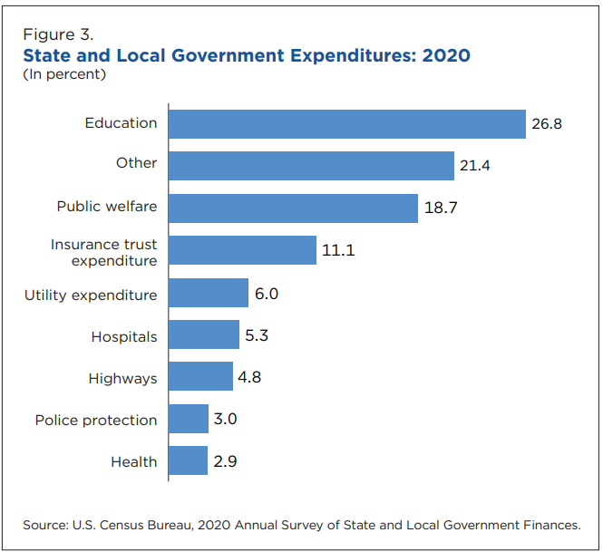
State and local governments provide a wide variety of services.

https://fred.stlouisfed.org/series/L319411A027NBEA

States and local governments routinely deliver solid budget surpluses in normal years and greatly exceeding the deficits encountered in recessionary years. State and local governments rely more on property and sales taxes which do not vary as much as income taxes. States have proactively reduced spending budgets whenever they have encountered recessions.

https://www.pewtrusts.org/en/research-and-analysis/articles/2022/05/10/budget-surpluses-push-states-financial-reserves-to-all-time-highs

States have built up a nearly 3 month cushion of reserves to buffer recessionary periods. States and local governments did much better during the pandemic recession than anyone expected. They reacted quickly to ensure fiscal stability and found ways to put the federal government transfers to good use. Some states have provided rebates to their taxpayers.

https://www.pewtrusts.org/en/research-and-analysis/articles/2021/10/15/states-financial-reserves-estimated-to-surpass-pre-pandemic-levels

https://fred.stlouisfed.org/series/SLGTFFQ027S

https://fred.stlouisfed.org/series/SLGTANA027N

State and local governments have continued to accumulate valuable assets, especially in the last 10 years.

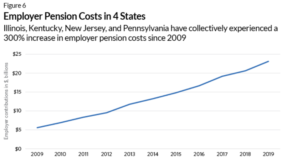
States have generally improved their credit ratings since 2006, before the Great Recession. At that time, 9 states had the very highest AAA rating. 39 held very strong AA ratings. Just 2, Louisiana and California held “upper medium” A ratings. Recent data shows 7 more states, for a total of 16, at AAA ratings. 29 have strong AA ratings. 3 are at single A: Pennsylvania, Connecticut and Kentucky. 2 have fallen a step lower to BBB: Illinois and New Jersey. The median rating has improved from AA to AA+.

https://en.wikipedia.org/wiki/List_of_U.S._states_by_credit_rating

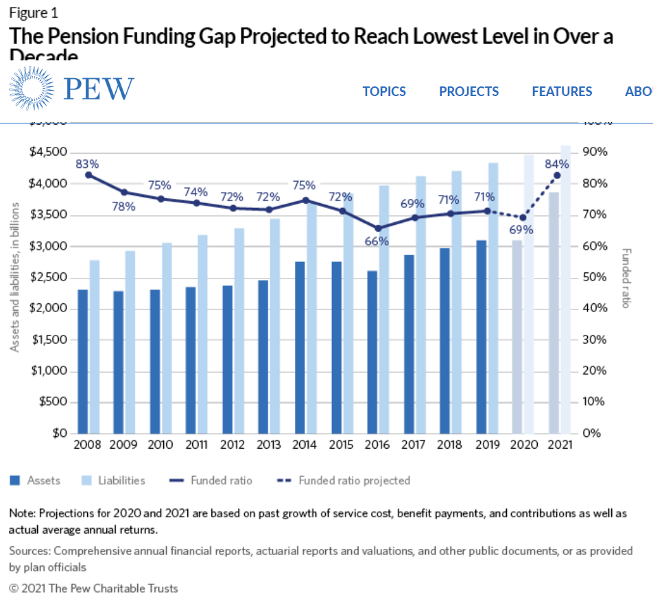
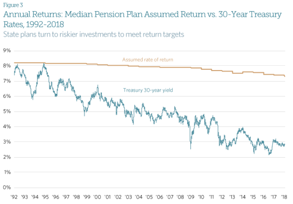
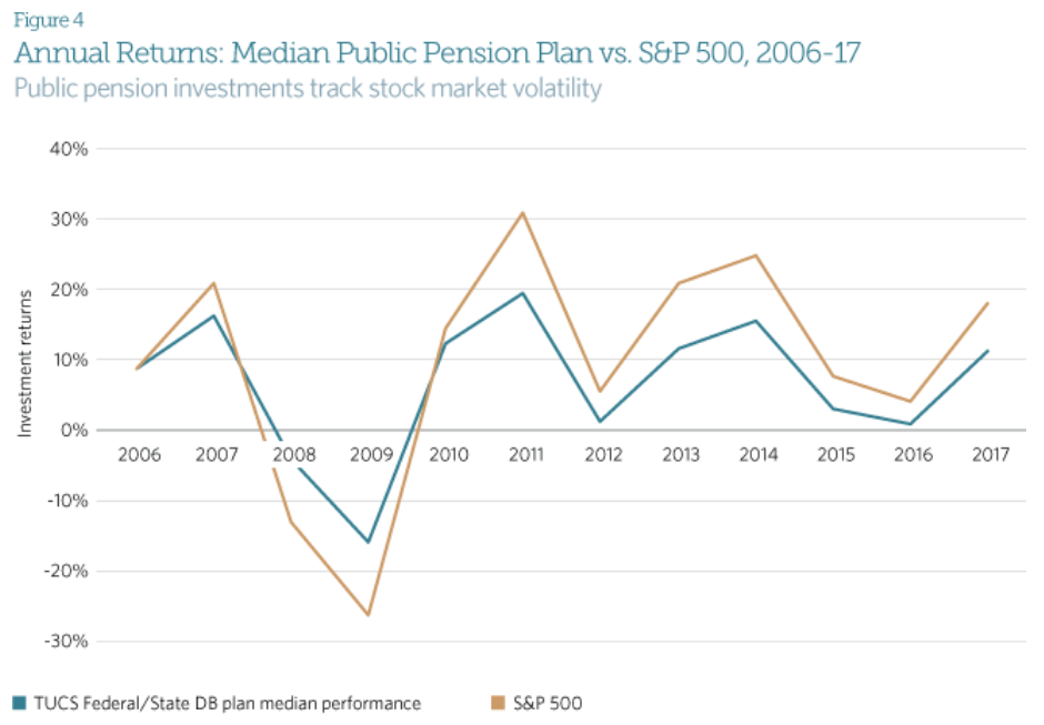
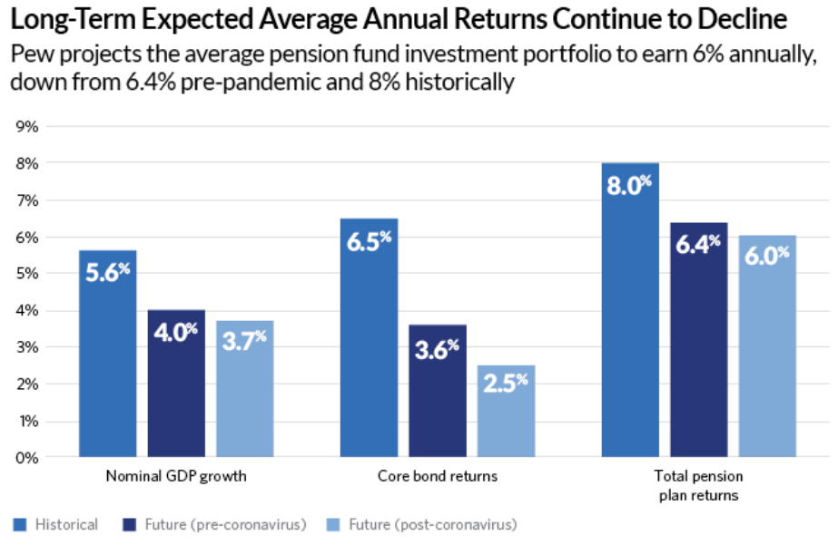
States have improved their pension fund percentage funding ratios, although some states remain at some risk of defaulting on their obligations.

https://www.urban.org/policy-centers/cross-center-initiatives/state-and-local-finance-initiative/state-and-local-backgrounders/state-and-local-expenditures

federalism.us

https://www.taxpolicycenter.org/statistics/state-and-local-general-expenditures-capita

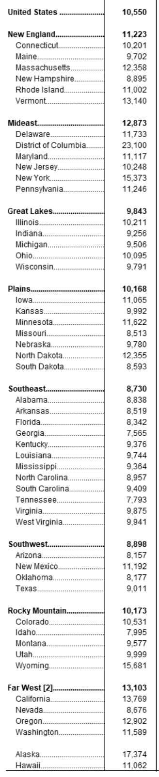
State and local government spending per capita varies widely, reflecting local preferences. The mideast and far west are 15% above the national average while the southeast and southwest are 10% below the national average.

State spending varies even more widely. The national average is $6,900 per capita. California is 12th highest at $9,000 but neighbor Washington is much lower at $7,000 (26th). Massachusetts is also at $9,000 but its neighbor New Hampshire is at a very low $5,000 (46th). New York is lower than might be expected at $8,600 (15th). Nearby New Jersey, Pennsylvania and Virginia spend $7,200-7,500, a bit above the national average. Michigan, Ohio and Illinois spend less than the national average at $6,100-6,300, but nearby Indiana ($5,500), Kentucky ($8,500) and West Virginia ($10,300) have much different priorities. Georgia ($5,700), Alabama ($6,300) and Mississippi ($6,700) spend less than the national average. Texas spends only $4,700 per capita (48th) while its neighbor Arkansas spends $9,200 (10th). Florida is the lowest spending state at just $4,000 per person, an amazing 42% less than the national average.

Another way to look at these differences is to compare the spending of 5 states. Rhode Island $10,400 (6th), Kentucky $8,500 (16th), Washington $7,000 (26th), Colorado $6,200 (36th) and New Hampshire $5,000 (46th). Rhode Island spends twice as much on state government than New Hampshire, a few miles away. This is the range in the US, reflecting vastly different local priorities.

Summary

In our federal system, state and local governments are called upon to manage one-half of total government spending. They routinely deliver budget surpluses and adapt during recessions, even the pandemic driven recession. They have accumulated significant real and financial assets to buffer difficult times. They have managed pension liabilities appropriately and improved their bond ratings and ability to borrow. They have taxed and spent to match local preferences. In aggregate, their spending has remained at the same percentage of GDP for many years.

30 Indiana Workforce Development Recommendations

https://www.indystar.com/story/money/2022/11/18/indiana-governor-workforce-cabinet-recommends-new-programs/69657309007/

The IndyStar reported on the final recommendations of the “Governor’s Taskforce” earlier this month. I didn’t see much response locally. I believe this is a HUGE opportunity to cooperatively invest in Indiana’s future, by both parties. Indiana’s governor and two houses have been governed by a single party for many years. The historical low-tax, low-service, selective investment strategy has delivered low taxes, responsible local government services, respectable education, solid infrastructure, a diversified economy but mostly growth in just the Indy metro area and lower average incomes for the other 80 counties. The current very low unemployment rates are further squeezing employers reliant upon abundant relatively low wage/skills employees.

Focus. 30 Items are Too Many.

Eliminate One-third of the Lowest Value Initiatives.

  1. Digital development grants. Employers will invest in high ROI projects by themselves.

2. Indiana Talent Agency. No extra bureaucracy.

3. Career Network. No extra bureaucracy. Finding jobs on-line is easy today.

6. College retention incentives. Colleges already have incentives.

10. Immigration reform. Yes, but Indiana will not drive this nationally.

11. Miscellaneous student grants. These would help, but not critically.

12. Transportation funding. Helpful, but not critical.

21. High school diploma flexibility. Critical thinking skills or true CTE skills are essential, Don’t dilute them further.

23. Incentivize CTE credentials. Not needed. If credentials were clearly defined and understood, students and workers would pursue them out of self-interest.

24. STEM curriculum, courses, etc. Focus on schools and teachers first.

29. Scholarship for dual credit completers. These highly talented and motivated students are already moving in the right direction.

Digital Skills (1)

No need for #4 bureaucracy. Basic digital skills should be completed in junior high school. Is the state requirement clear? Advanced digital skills courses should be required in HS and community college for graduation. Make existing courses available for free to firms for remedial on-site training. Make relevant Western Governor’s University courses free. Digital skills should be like “breathing” for Indiana residents. No extra state overhead is required.

University STEM Degrees (2)

No incentives to universities required (5). Provide STEM degree completers with a $25K graduation cash rebate. IU/Purdue (7) should offer more diverse STEM degrees, but so should all Indiana publicly funded universities. Let the students drive the faculty levels.

Career and Technical Education Certifications (3)

Fine-tune the certification program to really recognize workplace, digital, team, industry and technical skills. If the program was recognized like a CPA, licensed plumber, six sigma blackbelt, PMP project manager, Microsoft IT skills, state licensed professional, etc., it would have great value, increasing employee pay and transferable value. (8, 9, 22, 30).

Early Childhood Education (4)

Fund pre-K and K for all. Fix the detailed regulatory limits (13). Defining pre-K detailed results is not essential (26).

Community College (5)

Clearly define “advanced manufacturing” curriculum and degree (1). Reduce community college tuition fees further with state subsidies to encourage universal participation in higher education (like Tennessee). Radically change community college to be local county (or county groups) funded and managed educational institution. Ivy Tech has failed repeatedly as a state-run organization to graduate students. Let local counties decide if they want to invest in education and actively manage this.

Reading (6)

Invest whatever it takes to ensure that all 3rd graders can read at grade level. This is the most essential gateway (28).

Administrative Improvements/Investments (7)

15. Offer employers a $1K fee per class to offer on-site classes.

16. Simplify criminal expungement.

17. Auto enroll eligible students in 21st C scholars.

18. Require HS seniors to file FAFSA.

19. Increase college funding grants for lower income students.

20. Increase credit for prior learning.

28. Fund Dolly Parton library to encourage reading.

High School STEM Classes (8)

25. Allow any person with a BS degree to teach any STEM class at HS and community college level. No need for more detailed subject matter or education course qualifications. They will “figure it out”.

Background on Indiana’s Historical Progress

https://tomkapostasy.com/2021/06/10/is-indiana-better-off/

Summary

Indiana is not winning the modern global competition for value added jobs and firms. Students and adults must have modern skills. Educational institutions must provide these skills. This requires focused investments and administrative changes.

Hamilton County Growth Continues

https://www.chacompanies.com/news/chas-96th-street-and-keystone-parkway-project-awarded-indy-chamber-monumental-award/

Fishers has overtaken Carmel to become the largest city. Westfield is growing at the fastest percentage rate, with Noblesville close behind.

The county continues to add about 7,000 people each year to its base of 360,000, the fourth largest county in Indiana.

https://www.census.gov/data/datasets/time-series/demo/popest/intercensal-2000-2010-cities-and-towns.html

https://www.stats.indiana.edu/population/sub_cnty_estimates/2020/e2020_townships.asp

The net assessed valuation for property taxes has grown in line with the population, with faster growth in the last 5 years.

Property values have grown less rapidly, but still significantly, on an inflation adjusted basis.

https://fred.stlouisfed.org/series/CPIAUCSL#0

The real property value per person has remained roughly flat as the county has grown during the last decade. Carmel has higher real estate values and Noblesville has lower real estate values.

Real estate taxes levied by the county itself increased for payments due in 2020, but the real taxes per person remain 20% lower than they were in the “teens”. The county consolidated the provision of certain “emergency” services from the towns and cities in 2020.

https://www.hamiltoncounty.in.gov/ArchiveCenter/ViewFile/Item/214

https://www.hamiltoncounty.in.gov/ArchiveCenter/ViewFile/Item/95

https://gateway.ifionline.org/public/pts/pts-overview.aspx

Summary

Hamilton County’s growth looks to continue at a sustainable rate, with open land in Fall Creek, Westfield, Noblesville available for development.

Indianapolis Crime Rate

I’m using data from the FBI Unified Crime Reports. Total country violent crime increased by 25% from 600 events per 100,000 people in 1980 to 758 events in 1991 (thick black line). Violent crimes dropped dramatically to 500 events (33%) by 2001. There was a minor decline to 479 in the next 5 years and then another major decline to a minimum of 362 events, a 52% decline from the peak. Violent crime has increased to 399 in 2020, a 10% increase from the 4-decade minimum, but still 47% below the 1991 peak rate. In summary, the total country violent crime rate increased by 25% in the 1980’s, dropped by more than half in the next 25 years and has bumped back up to a level about one-half of the peak and one-third lower than the 1980 start. This is a quite positive result.

Indiana’s (orange line) general pattern mirrors the national figures. However, Indiana started at 378 violent events per 100K people in 1980, more than one-third lower than the national average. This is a quite significantly lower crime rate. Indiana’s violent crime rate increased by a larger 42% to a peak of 537 events in 1996. This was half again faster than the 27% increase for the country as a whole. Indiana was becoming more like the rest of the nation. Indiana’s violent crime rate dropped very quickly to just 349 events by 2000 (-35%), returning to 69% of the national level from 84% of the national level in 1996, a modest amount above the 63% ratio in 1980. Indiana violent crime inched down by 10% to 314 by 2010. The national crime rate was falling twice as fast, so Indiana was now at 78% of the average. In the “teens” decade, Indiana violent crime increased by 10%, returning to where it had been in 2000. National violent crime was flat during the “teens”, ending at 400 events. Indiana violent crime rate was essentially the same as the national rate during the “teens”, no longer one-third lower. It had returned to its starting point of roughly 400 events per year.

The city of Indianapolis (yellow line) is measured by the right hand scale, twice as high as the other 3 measures. Like most central cities, its violent crime rate is much higher than the national average. The Indianapolis crime chart follows the nation from 1980 through 2006. It starts at 1,134 events per 100K people, increases by 42% (like IN) to 1,611 in 1996, then drops by 45% to 884 events in 2003. The city’s violent crime rate is 1.9 times the national average at the beginning and the end of this 23-year period, but peaked at 2.5 times the average in 1996. The crime rate leapt up by 28% in 2007, reaching 2.6 times the national average. Violent crime in Indianapolis grew by 11% by the peak in 2016, 3.6 times the national average. The reported Indy crime rate has fallen by more than one-third in the last four years, ending at 2.2 times the national average. Looking at ten-year averages to smooth out the difficult to interpret variability, Indy has increased from 1.8 to 3.0 times the national average. The last 2 years look suspiciously low, just like 2007 looked suspiciously high. The 1,300 level for most of the last decade is more than 10% below the 1,500 peak level of the 1990’s. So … Indiananapolis violent crime is now down a little compared with the peak, up very significantly compared with the national average and roughly within the range of the first 30 years.

The Indy metro data follows the city of Indianapolis pattern very closely.

The national homicide rate per 100,000 people averaged 9 from 1980 to 1995. It dropped by one-third to just 6 by 2000 and stayed at that level through 2007. It declined to an average of just 5 for the next decade, before spiking up in 2020 (and 2021, FBI official data unavailable). The national homicide rate is up significantly, but one-third lower than in the eighties and early nineties.

Indiana started at an unusually high 9 homicides per 100,000 people in 1980, but averaged just 6 for most of the eighties, just two-thirds of the national level. Indiana homicides jumped quickly to a peak of 8.2 in 1992 and remained near 8 for six years. The national homicide rate fell rapidly from 10 to 6 during the nineties, leading to a six-year period (1997-2002) where Indiana homicide rates were slightly above the national average. Indiana homicide rates closely matched the national average for the next decade, falling to 5 in 2008. Indiana homicides increased by 50% between 2014 and 2020, from 5.0 to 7.5 while the national average increased about 50% from 4.4 to 6.5 events per 100K people. Indiana has averaged about 6 homicides per 100K people during this 4-decade period except for the 8 homicides rate in the mid-nineties. The most recent murder rate has returned to that peak level.

The city of Indianapolis very closely matches the Indiana pattern for the first two decades, with 12 homicides per 100K people in 2000, about double the national average of 6. The Indy rate pops back up to 14.2 in 2001 versus the 5.6 rate for the country (2.5 times higher). Indy follows the slow national decline through 2012 to 11.6 events versus the 4.7 country level (2.5X). Indy’s murder rate jumped 31% to 15.2 in 2013, and has climbed steeply since then. It reached 19.5 in 2019, a two-thirds increase in 7 years. It jumped again in 2020 to 24.2 and is estimated to be more than 28 in 2021. Indy averaged about 14 murders per 100,000 people in the first 32 years of this period. 2019 was a 40% increase. 2020 was a 73% increase. 2021 is a doubling.

The Indy metro area pattern follows the city of Indianapolis. Metro Indy’s homicide rate averaged 1.35 times the national rate from 2003-2011. It has averaged 1.76 times the national average from 2012 to 2020.

Summary

Indianapolis has a huge violence and murder problem. Period. Violence at the national level is way down. Murders at the national level are much lower than the peak period. Indianapolis’ violence rate shot up in 2007 and only declined in the past 2 years. Indianapolis’ murder rate shot up in 2013 and has continued to climb. I try to highlight the “good news”. I emphasize long-term data to provide context. I try to minimize/offset the sirens of local and national journalists. But, for this topic, there is no apparent “silver lining” or “on the other hand” conclusion.

https://www.fbi.gov/services/cjis/ucr/publications

https://ucr.fbi.gov/crime-in-the-u.s/1999

https://www.macrotrends.net/cities/us/in/indianapolis/crime-rate-statistics

https://www.disastercenter.com/crime/incrime.htm

https://crime-data-explorer.app.cloud.gov/pages/explorer/crime/crime-trend

https://ucr.fbi.gov/crime-in-the-u.s/2019/crime-in-the-u.s.-2019

https://www.themarshallproject.org/2016/08/18/crime-in-context

https://www.savi.org/feature_report/equity-and-criminal-justice-the-cradle-to-prison-pipeline-in-indianapolis/

https://abcnews.go.com/US/12-major-us-cities-top-annual-homicide-records/story?id=81466453

https://www.wrtv.com/news/local-news/crime/2022-indianapolis-homicide-map

https://www.wrtv.com/news/local-news/crime/indianapolis-had-271-homicides-in-record-breaking-2021

https://fox59.com/news/indycrime/crime-mapping-neighborhoods-impacted-the-most-by-homicides-in-2021/

https://www.wthr.com/article/news/crime/762-people-shot-in-indianapolis-in-2021-shooting-cold-case-violence-indiana-impd/531-7e477cf2-31cc-4147-9005-4e4dab7b3366

https://www.wfyi.org/news/articles/law-enforcement-community-work-to-solve-more-homicides

Lake County, Ohio: A Swing County for Presidential Elections (1952-2008)

https://en.wikipedia.org/wiki/My_Little_Town

Historically, Ohio was a critical “swing state” in presidential elections.

https://en.wikipedia.org/wiki/United_States_presidential_elections_in_Ohio#:~:text=Ohio%20is%20considered%20a%20swing,regular%20swing%20state%20since%201980.

My “little” hometown of Fairport Harbor is part of Lake County, Ohio which once was the most sensitive county to changing presidential voting patterns after 1952. Lake County is a suburban or exurban county in the Greater Cleveland area. The population doubled from 29K to 60K between 1920 and 1944 while it retained a mixture of agricultural and manufacturing employment. The county grew very rapidly on its western side as Cleveland residents moved away from the city, reaching 149K by 1960. Another 50,000 new residents arrived by 1972, pushing the total above 200K. Growth slowed with the decline of the Cleveland metro area, but the population reached 228K by 2000. The population has been relatively fixed for the last 20 years.

https://wikiless.org/wiki/Lake_County,_Ohio?lang=en

From 1952 through 2008, Lake County voted with the national presidential election winner in all but one of the 15 elections. In 1992, Lake County provided George Bush, Sr with 38% of the vote, the same as he won nationally, but only provided Bill Clinton with 36% of the vote, offering a very high 26% of the vote to “protest candidate” Ross Perot, far above his national 19% share.

https://wikiless.org/wiki/Lake_County,_Ohio?lang=en

https://en.wikipedia.org/wiki/2020_United_States_presidential_election

From 1920 to 1932, Lake County voted 70% Republican, a solid 16% above the national average. Lake County took pride in its role as part of the Connecticut “New Western Reserve” and its road, rail and ship based east to west transportation role at this time. The county was also the proud home of Republican President Garfield.

https://www.whitehouse.gov/about-the-white-house/presidents/james-garfield/

While the country gave FDR 57% of the vote in 1932, Lake County offered just 35%, preferring to re-elect President Hoover.

From 1936 to 1956, the county continued to lean Republican, offering an average of 6% more votes to the Republican head of the ticket than the average state. The county supported FDR in 1936 but opposed him in 1940 and 1944 and opposed Truman in 1948.

The county started its remarkable 14/15 presidential winners string in 1952, supporting Eisenhower by 5 points more than the country at large and repeating this support in 1956.

The county surprisingly supported Kennedy over Nixon 51/49 in 1960, dropping those 5 extra points of Republican support. Kennedy visited the small county during the election. This may have helped shift enough marginal voters.

https://www.jfklibrary.org/asset-viewer/archives/JFKSEN/0912/JFKSEN-0912-002

This was a time of change, with future 20-year congressman Frank Stanton serving as a county commissioner.

https://www.latimes.com/archives/la-xpm-2002-apr-13-me-stanton13-story.html

From 1960 to 2004, the county’s Republican vote percentage matched the national average.

Democrats earned a record high 62% vote share for LBJ in 1964, with Goldwater falling to a stunning 38% Republican low. Lake County “faced east”, looking to the New England/New York and Midwest Republicans (Taft) for inspiration. Goldwater’s Texas, Arizona, California “western” message gained little local traction.

The 1968 election was completely different. Nixon edged Humphrey by 0.8%, with Wallace receiving 14%, as he did nationally. I was just 12 years old, but as a newspaper carrier for 3 years, I had read many editorials from the Cleveland Press, Cleveland Plain Dealer, Lake County News-Herald and Painesville Telegraph. The race riots of 1966-67, Vietnam protests and counterculture demonstrations and activities were beyond the lived experience of my neighbors. Nixon and Agnew leveraged a “patriotic” message to win voters in “my little town”. George Wallace earned a remarkable 14% as a modern populist, promising simple solutions to all of the nation’s problems. I don’t believe that Wallace’s “racist” message was a significant part of his appeal in this heartland. He was an early version of the right-side “anti-establishment” candidate.

In 1972, Nixon cruised to victory by 61/38 against a weak McGovern candidacy. Lake County agreed: 59/38. The “Kent State Riots” were part of this vote. Governor Rhodes was very popular in Ohio, winning 3 terms.

https://en.wikipedia.org/wiki/Jim_Rhodes

https://en.wikipedia.org/wiki/Kent_State_shootings

In 1976, Jimmy Carter sold Lake County on a moderate Democratic platform and his promise to “never lie”, winning 51/46, about the same as the national 50/48.

In the same year, the county’s largest employer, Diamond Shamrock, announced that it was permanently closing its chemical plant that had employed as many as 5,000 workers historically.

https://www.rsworld.com/snix66/diamond.html

Reagan solidly won Lake County and the country by 50/41 and 59/41 in 1980 and 1984. His positive, traditional, patriotic, common-sense, reassuring message was well-received in a county and metropolitan region that was very hard hit by the start of a long-term downturn in manufacturing employment and regional population and economic growth.

George W. Bush was a little more popular in Lake County than the country as a whole, earning a 57/42 win, better than the national 53/46. Bush, Sr.’s WWII pedigree, executive experience and countenance played well in Lake County.

The 1992 election, pitting Bush, Sr.’s continuity, generation, broken tax promise, moderate social and economic views against Clinton’s contrasting policies was a divisive election, the true beginning of our polarized red versus blue state situation today.

In 1996, Bush’s support dropped from 57% to just 38%, while the national vote fell from 53% to 38%. Bush beat Clinton in Lake County 38% to 36%, the one non-match in the 15 elections.

Lake County was enamored with Ross Perot, offering him 26% of the vote in 1992 versus his 19-point national haul.

I worked for Ross Perot’s EDS in the 1980’s, as a headquarters financial analyst and project manager, producing the kinds of “charts and graphs” he loved to use in debates and press conferences. Ross was the most “what you see is what you get politician” I have ever seen. He believed that there are pragmatic, straightforward answers to any problem, and had lived a life demonstrating that this was true in the IT business, inventing the outsourced IT model and selling it to government agencies and corporations, just as he had sold mainframe computers in record volumes for IBM.

Ross was an anti-politician, a nationalist, a leader, a persuader, a man of integrity, a team player, a Texan, an outsider and very customer focused. Even with his significant campaign flaws, he was able to many attract voters who wanted to vote “none of the above”. I don’t believe his appeal was one of subtle racism, anti-immigration or historical pandering to a simpler, more culturally conservative time. Ross believed in progress, science and business.

Perot attracted 14% of Lake County voters in the next election, almost double the 8% national tally.

Clinton edged Dole 44/42 in Lake County in 1996, significantly behind his 49/41 national victory. In essence, this was a “none of the above” election for many in Lake County.

Lake County was an optimistic, fast-growing growing county for many years, tripling its population from 50,000 in 1940 to 149,000 in 1960 as Cuyahoga County grew, freeways opened, and people moved further from the central city. The county added another 50,000 people by 1972 as regional shopping malls such as the Great Lakes Mall opened by the Youngstown DeBartolo’s provided new attractions at the edge of the metro area. Growth slowed significantly after that, with the county adding just 20,000 people in the next 20 years through 1992 and another 14,000 people in the next 20 years. This change in the local environment from boom town to slow growth aggravated concerns about the country’s direction.

In 2000, George HW Bush, Jr. was able to capitalize on his message of “compassionate conservatism”, winning Lake County by 50/45, better than his narrow 48/49 popular vote loss. Even with the 9/11 patriotism bump, Lake County and the nation only narrowly re-elected Bush, Jr. by 51/48.

Obama’s centrist “hope and change” message attracted a few more Lake Countian’s to the Democratic ticket in 2004, earning a narrow 49.5% to 48.6% win, much tighter than the national 53/46 win.

The tables were turned in 2012, with Romney beating Obama by the same 49.5% to 48.6% result, in contrast with Obama’s 51/47-point victory. The 14/15 election match was broken. Lake County’s Republican share was 3 points higher than the nation this year, but its average Republican tilt for the last 16 elections was less than 1%.

Trump’s 2016 nationalist, populist, anti-immigrant, anti-globalization message played well in Lake County. He earned 5 points more than Romney, earning a solid 55/40 win, far ahead of his 46/48-point popular vote loss to Hillary Clinton. As with other blue collar, middle class, rust belt, Midwest states that had historically supported the Democrats, Lake County voted “no”, offering just 40% to Clinton.

2020 was very similar to 2016 in Lake County. Trump beat Biden 56/43 in Lake County, discounting Biden’s small-town Pennsylvania roots claims and centrist messages. Biden increased the Democrats’ national popular vote margin to 51/47.

It’s difficult to reconcile the 20-point swing from LBJ’s 1964 62/38 victory with Trump’s 56/43 advantage in 2020. Goldwater was a weak Republican candidate, promoting a conservative “philosophy” and radical “for the time” policies. Biden is a lifetime Washington politician, subject to obvious criticisms.

From Wallace to Anderson to Perot to Trump, a significant share of independent Lake County voters has been attracted to “outsider” national political candidates. The shared national experience of the Depression and WWII and bipartisan support for national leaders like FDR, Eisenhower, Kennedy and Reagan is nearly gone.

Since Reagan’s 1980 50/41 victory, Lake County has averaged a 51/43 Republican advantage. Based on Trump’s recent higher results (55-56%), Lake County looks to be a solid Red county today, leaving behind it’s Purple history.

Good News: State Pension Funding is at a 13 Year High!

Background

Most states and local governments have chosen to pay their employees less than market salaries and higher than market fringe benefits since the WW II era. The Republican focus on reducing the size, pay and power of government has increased significantly in the post-Reagan era. Grover Norquist summarized this in 2001: “I don’t want to abolish government. I simply want to reduce it to the size where I can drag it into the bathroom and drown it in the bathtub.” Hence, Republicans have focused the spotlight on the “underfunded” status of state and local government fringe benefit plans, especially defined benefit pension plans.

Although the rhetoric is sometimes grating to the “left” ear, this spotlight does serve as a disinfectant, requiring political leaders to be more accountable for their decisions, especially in “one party” states where accountability was lacking historically.

On the other hand, pension accounting, funding, goals and policies are inherently complex and difficult to simply summarize or explain. This is true for both government and corporate defined benefit pension plans. It is easy to “cherry pick” pension statistics and overexaggerate the “crisis” in state pensions.

I will focus on the data and commentary from just 2 sources: Reason.org, a right-leaning policy group that cleverly adopted a left-side name and Pew Research, a centrist research group that has chosen to emphasize right-leaning data and commentary on this topic.

Current (2021) Good News

https://www.pewtrusts.org/en/research-and-analysis/issue-briefs/2021/09/the-state-pension-funding-gap-plans-have-stabilized-in-wake-of-pandemic
  1. The average state pension plan funding level, the ratio of assets to forecast liabilities, is expected to reach 84% when final 2021 data is summarized. This is a huge improvement from the 70% average of the prior 5 years. It is the highest level since 2008.

2. The system is working. Plan assets were $2.3T versus $2.8T in 2008. Assets grew by $1.5T to $3.8T, while liabilities grew by $1.8T to $4.6T. Since the added $1.5T/$1.8T is 5/6ths or 86%, the overall ratio increased. The “system” of policies, accounting, audits, contributions, investment strategies and actual investment returns, etc. appears to be functional across a quite challenging economic period. The funding ratio was relatively consistent throughout this period, even if it was not at the 100% level highlighted by some as “the goal”.

3. The gap between estimated liabilities and funded assets is less than $1T for the first time since 2014.

4. For the first time in this time period, the minimum expected funding level has been met. This is defined as a year in which contributions exceed benefits plus the “amortized” funding requirements based on past funding shortfalls. In 2014 only 17 states met this standard. In 2019, 35 states complied. Again, this is not perfection, but it is significant progress.

5. Overall contributions have increased by 8% annually. The states with the lowest funding ratios have increased their contributions even faster. The lowest 10 rated states growing by 15% annually and the 4 worst states by 16%.

6. A measure of benefits paid minus funding contributions, as a percentage of plan assets, has improved from 3% more benefits to 2.5% more benefits paid versus new funding contributions.

Historical Commentary

The Trillion Dollar Gap (2010)

https://www.pewtrusts.org/en/research-and-analysis/reports/2010/02/10/the-trillion-dollar-gap

The Funding Gap (2016). Funding ratio 66%. Few states reach 90%.

Bond interest rates have fallen faster than pension plan expected returns. Of course, because equity returns are much higher, more volatile, difficult to forecast and a higher share of plan assets.

State pension plan returns trail the S&P 500 returns. Of course, because plans hold significant (30-40-50%) in lower yielding bonds.

A lower “discount rate”, the assumed future interest rate used to calculate the present value of future pension benefits/liabilities, will increase current liabilities and the current net liability. Yes, this is how discounting works. As market interest rates and stock returns have been reduced with lower inflation rates, the discount rate used by financial professionals in all applications has slowly declined for the last 20 years. This “sensitivity analysis” is misleading. The sensitivity of present liabilities is inherent, it cannot be avoided.

Some states have amortization rates, the amount of new contributions required to eventually offset prior funding or investment return shortages, that are quite high compared to their annual payrolls. This is true. 7 are above 5% deficits, but 7 are above 5% surpluses.

Pew highlights what they call the “operating cash flow” ratio as another sign of trouble. Contributions minus benefits paid as a ratio to assets is the definition. The result is negative!!!! And increasing to negative 3%! Contributions should almost always be less than benefits paid in a long-term (20-30-40 year) pension plan because the plan trustees assume that there will be some positive return on plan assets. Given a 2/1 equity to debt mix, with 7% to 3% expected returns, the expected plan return is more than 5%, so a 3% “negative” return is not a concern. The insurance industry operates in the same way with “negative” operating ratios being offset by investment returns.

Reason.org Graphics

This group highlights the extraordinary 100% ratio in 2001 versus the more normal ratios of 82% in 2005, the quite low level of 66% in 2012 and the still below average 74% level in 2019. They provide state by state graphics to highlight the decline since the very high 2001 baseline and to emphasize the count of states that are below 90%, 80% and 60% “funded”.

Their websites do not allow their graphs to be linked/captured.

Reason.org breaks 2 rules. First, they implicitly assume that a 100% funding level is the “obvious” goal. That is untrue. Historically, US corporations and actuaries considered 80% to be a “fully funded” target. More was better. A little less was worth watching (70-75%). Much lower required increased focus and contributions. Due to the inherent uncertainties in investment returns and participant assumptions (lifespan, retirement dates, turnover, average salaries, etc.) short-term movements of 2-3-5% were never considered to be an issue. Long-term or persistent ratios significantly below 80% were considered to be a concern.

Second, they assume that all states will perform at the same level. The “laws” of probability prohibit this “ideal” result. In a normally shaped (bell curve) probability distribution, there will always be underperforming and overperforming states. This is inherent in a multiple probability-based system. Of course, if a state remains at the bottom of the funded percentage list for more than 5 years, it probably does have a challenge to face.

Pew Emphasizes Risks in 2021

https://www.pewtrusts.org/en/research-and-analysis/issue-briefs/2021/09/the-state-pension-funding-gap-plans-have-stabilized-in-wake-of-pandemic

  1. Greater state pension contributions have “crowded out” other spending and reduced states’ ability to respond to emergencies. Well, you can’t have it “both ways”. States have responded to the shortfalls highlighted since 2000 with greater contributions. This has improved the funding level despite the Great Recession, the slow recovery and the pandemic challenge.
  2. The recent funding level improvement is due to a “one-time” stock market return in 2021. Yes, stock market returns, both gains and losses, are volatile. That is why pension plans use long-term expected returns for stocks and bonds. That is why pension funds use longer time periods (10 years) to amortize the annually calculated gains or losses into the “required” contributions. Yes, a significant part of the increase from 70% to 84% funded is a short-term increase of investment returns, and probably unsustainable.
  3. The stock market is volatile. Recently. Yes, a once in a century pandemic drives increased volatility. Stock market volatility through time and across markets is well understood as a probability function with mean expected real percentage returns and a predictable range of returns volatility. All investors face this volatility and manage portfolios accordingly. As state pension plans have grown in value, they have been able to hire competent investment advisors.

4. Economic growth is slowing. Some assert this. Others disagree.

5. Future stock and bond returns will be lower, per Pew. The long-term decline in inflation does drive investment returns lower. The increased efficiency of financial markets, including global investment flows, also drives returns lower. However, pension plans have reduced their expected annual returns. Recent stock market volatility indicates that equity returns may not decline.

6. Increased funding of underfunded pension plans can be portrayed as “increased spending”, rather than the required adjustments for those plans which had historically lower investment returns, contributions or higher ultimate benefits.

Summary

State and local governments are faced with managing inherently variable pension plan decisions. They have choices to make about plan policies, goals, funding, investment policies, audits, advisors, etc. An 80% funded level goal (not 100%) is supported by 100 years of experience around the globe, in public, private and not for profit sectors. The increased publicity/focus on underperforming states and municipalities has forced these public bodies to make tough choices regarding defined benefit versus defined contribution plans, benefit levels, retirement ages, investment policies and advisors. Following the Great Recession, states struggled to increase their funding, but they did not allow the average funding level to fall below 70% for more than a year at a time. On a cumulative basis, they have increased their contributions, reduced benefits and captured the long-run benefits of equity investments.

The increased scrutiny of funding levels in state and local government defined benefit pension plans has forced elected officials and their professional advisors to address shortfalls in pension funding. This is very good news.

Good News: Urban America is Growing Very Nicely

Rural America Grew Very Slowly in the 20th Century, Flattened and May Now be Declining

There are a variety of measures of “rural” US population. The Census Bureau has used local populations of 2,500+ to define urban. It focuses on population density and commuting to define urban counties that map to metropolitan (urban) areas. Other federal agencies use other definitions. Overall, the basic trends are clear.

https://www.hrsa.gov/rural-health/about-us/what-is-rural

The US Census Bureau’s detailed measure of “urban areas” essentially says that any area with 2,500+ people is an “urban” area. This clearly exaggerates the urban population, but this approach has been used for more than a century on a consistent basis, providing useful data. The 2020 measure of urban has been proposed using about 5,000 as the minimum for “urban”, but this definition has not been finalized.

I have focused on the Metropolitan Statistical Areas (MSA) as defined in 2020 and recreated their populations back to 1900 based upon the county to MSA maps.

The measure of “percent urban” based upon the metro areas with 100K+ population or 250K+ populations very closely tracks the US Census Bureau’s detailed definition of urban areas (and therefor rural areas).

In summary, US urban population grew from 40% of the total in 1900 to 70% in 1970, about 3/7ths (0.42) of a percent more urban every year for 70 years. The move to “urban” continued in the next 50 years, but at a much slower rate, just 1/5th of a percent per year. But, this accumulates to move the urban percentage from 70% to 80%.

Growth of Very Large Metro Areas Has Driven the Growth in Urban Areas

The 4M+ metro areas have grown the most. The 2M+ and 1M+ areas have also grown. The smaller metro areas have made a smaller contribution to the growth of “urban” America.

The 50th Largest US Metro Area’s Population Has Increased 5-Fold Between 1900 and 2020

The Number of US Metro Areas with 1M, 2M or 4M Populations Has Expanded for a Century

Decade Reaching 1 Million Population                    

1900 New York Chicago Philadelphia Boston Pittsburgh St. Louis
1910
1920 Detroit Cleveland
1930 Los Angeles San Francisco Mpls-St Paul Baltimore Cincinnati Providence
1940 Washington
1950 Dallas-Ft Worth Houston Atlanta Seattle
1950 Kansas City Milwaukee Buffalo
1960 San Diego Columbus, OH Indianapolis
1970 San Bernardino Phoenix Tampa-St. Pete Denver Portland, OR
1970 Charlotte San Jose Virginia Beach New Orleans Hartford
1980 Miami Sacramento San Antonio
1990 Orlando Nashville Memphis Rochester
2000 Austin Las Vegas Louisville Oklahoma City Richmond Jacksonville
2010 Birmingham Salt Lake City Raleigh
2020 Tulsa Fresno Tucson

Decade Reaching 2 Million Population                    

1900 New York Chicago Philadelphia
1910 Boston
1920 Pittsburgh
1930 Detroit Los Angeles
1940
1950 San Francisco
1960 St. Louis Cleveland
1970 Mpls-St Paul Baltimore Washington Dallas-Ft Worth Houston
1980 Atlanta Seattle
1990 San Diego San Bernardino Phoenix Tampa-St. Pete Miami
2000 Cincinnati Denver
2010 Kansas City Portland, OR Charlotte Sacramento San Antonio Orlando
2020 Columbus, OH Indianapolis Austin Las Vegas

Decade Reaching 4 Million Population            

1900 New York
1910
1920
1930 Chicago
1940
1950 Los Angeles
1960 Philadelphia
1970 Detroit
1980
1990 Boston Washington Dallas-Ft Worth Miami
2000 San Francisco Houston Atlanta
2010 San Bernardino Phoenix
2020 Seattle

The Rapid Growth of the Largest US Metro Areas Has Driven the Growth of the Total Population

The Tipping From Very Slow Rural Growth to Possible Decline Has Attracted Attention from Demographers and Political Commentators

https://www.census.gov/library/visualizations/2021/dec/percent-change-county-population.html
https://carsey.unh.edu/publication/rural-depopulation
https://www.pewtrusts.org/en/research-and-analysis/blogs/stateline/2021/08/10/shrinking-rural-america-faces-state-power-struggle
https://www.ers.usda.gov/data-products/charts-of-note/charts-of-note/?topicId=4e8a0642-e40d-4299-906e-906bbaaf9e4d

https://www.businessinsider.com/how-the-2020-election-revealed-divide-in-american-dream-2020-11

https://dailyyonder.com/rural-population-declines-slightly-over-last-decade-census-shows/2021/09/07/

https://www.richmondfed.org/publications/research/econ_focus/2020/q1/district_digest

Summary

The disproportionate growth of “urban” and very large urban metro areas has continued in the last 50 years. This has a tremendous impact on the lives and perspectives of those in relatively declining rural and growing urban areas.

Indy Metro Area vs Rest of Indiana (1970-2020)

The Indy Metro Area is comprised of Marion County plus the 7 surrounding “donut” counties. Marion has grown throughout the half-century, adding 175,000 people (22%). Rural Morgan and Shelby counties have not grown much. Hancock, Boone and Johnson counties have doubled their populations. Hendricks has grown from 50,000 to 175,000. Hamilton has grown exponentially from 50,000 to 350,000. This relatively rapid growth has made the metro area grow from 21% to 28% of the state total, adding state senators and representatives and causing increasing tensions between the one large, growing area and the slower growing, largely rural, rest of the state. There are suburban Chicago, Louisville and Cincinnati counties that have shown decent percentage growth, but they are a small share of the state. Lake County (Gary) is a special case, declining in population decade after decade.

The Indy Metro counties started 1970 with slightly higher per capita personal incomes, so the share of the state total was 24%, a bit above the 21% population share. By 2020, the Indy Metro area had captured one-third of the state’s personal income (34%), much higher than its 28% share of the population. Per capita incomes and population had both grown in the capital region.

Gross Domestic Product, the value of goods and services produced in Metro Indy, was one-third of the state total in 2001, the first year of available statistics. This measure increased to 38% by 2020. Nearly 2 out of every 5 dollars of statewide value-added output was generated by the Indy Metro area in 2020.

Indiana is a mostly rural state with Indy, a dozen small cities, a cluster of northern Indiana manufacturing counties, Gary (Lake County), Ft. Wayne (Allen) and Evansville (Vanderburgh). The Indy Metro Region has 9 times the density of people, income and production as the most rural counties. For example, it takes the 67 lowest population counties to equal the 1.9 million people living in the Indy Metro area.

The Indianapolis Metro area grew by a respectable 72% during this period, above the national average of 63%. The other Indiana counties grew by only 19%, about one-fourth as fast.

The Indy Metro area added 900,000 people, the same growth as the rest of the state.

With population and per capita income gains, the Indy Metro area’s real personal income grew almost four-fold, while the rest of the state grew by roughly 150%.

Indy Metro per capita income was 15% above the rest of the state in 1970 and twice as high (30%) by 2020.

The Indy Metro area has improved its per capita income versus the US average by 4 points, from 101 to 105. The other-Indiana counties have declined from 88% to 81% of the national average.

While the per capita income in the Indy Metro area is 30% higher than the rest of the state, the value of goods and services produced (GDP) per person is more than 50% higher than the rest of the state.

These wide, and growing, disparities in economic results may lead to increasing tensions between the relatively prosperous center and the largely “left behind” periphery. Fortunately, the real personal income per capita in the “other” counties did increase by 95%, from 24 to 48K during these 5 decades, even though the Indy folk’s income grew by 120%, from 28 to 62K.

https://www.stats.indiana.edu/population/PopTotals/historic_counts_counties.asp

Indiana Population Grew Half as Fast as the US from 1970-2020.

The US population increased by 61%, from 205 to 330 million.

Indiana population increased by 30%, from 5.2 to 6.8 million. Indiana added nearly 1.6 million people during these 5 decades. It would have added another 1.6 million if it grew as fast as the US average.

Indy Metro Area Grew by a Strong 72%.

The 8-county area grew from 1.1 to 1.9 million, adding 800,000 people and accounting for one-half of the whole state’s growth during this period. Growth has been consistently strong in each of the last 3 decades, adding 230,000, 220,000 and 220,000. The Indy Metro area has grown from 21% to 28% of the state’s total population.

6 Other Suburbs Grew by 76%

Porter (CHI) added 84K. Dearborn (CIN) added 20K. Warrick (EVN) added 35K. Harrison (20K), Floyd (23K) and Clark (43K) added to the metro Louisville population. In total, these 6 counties added 226,000 people to their 296,000 base, reaching 523,000 in 2020. They grew from 6% to 8% of the Indiana total.

Indiana and Purdue University Counties Grew by 79%

Monroe (76%) and Tippecanoe Counties (81%) displayed very similar growth rates. Their combined population increased by 153K, from 194K to 348K. Their share of the Indiana total increased from 4% to 5%.

These 18 counties out of Indiana’s 92, accounted for 76% of the population growth, increasing by 1.2M, from 1.6M to 2.8M people! Their share of the state total grew from 31% to 41%!

Northern Indiana Tier (South Bend, Elkhart, Ft. Wayne) Added 38%

The 10 counties stretching from St. Joseph (South Bend) to Allen (Ft. Wayne) showed modest, but consistent growth throughout the period. Elkhart was most successful, adding 81,000 people (64%). Ft. Wayne added 101,000 people, but just 36% growth. St. Joseph managed to add 27,000, but just an 11% growth rate. Marshall, Kosciusko, LaGrange, Noble, Whitley, Steuben and DeKalb counties each added at least 10,000 residents.

In total, this section added 326,000 citizens, growing from 860,000 to 1,190,000. It’s share of Indiana’s population shaded up from 16% to 17%.

Lake County (Gary) Lost 11%

Population dropped by 62K, from 546K to 484K. Lake County reduced its Indiana population share from 10.5% to 7.2%.

8 Small City Counties Lost 5%

These stand-alone counties each had at least 75,000 citizens in 1970. Together, with 902,000 people they accounted for 17.4% of Indiana’s total. Their population fell by 48,000 to 855,000, representing just 12.4% of the Indiana total in 2020. From best to worst population growth, using their main city for easy identification: Evansville (+13K), LaPorte (+1K), Kokomo (-1K), Terre Haute (-8K), Anderson (-9K), Richmond (-14K), Muncie (-15K) and Marion (-19K).

57 Rural Counties Added 13%

These counties all started with populations of less than 60,000 in 1970. The average county had 23,000 residents. This increased to 25,000 by 2020. 17 counties actually lost population across 50 years. Another 24 counties added less than 5,000 people. Just 16 counties added 6,000 people or more (including the next 5). Jaspers, Dubois, Jackson and Putnam each added more than 10,000 people. Bartholomew (Columbus) was the outlier, adding 28,000 people, growing by 48%, from 57,000 to 85,000 people.

In total, this group added 167,000 people, growing slowly from 1.283 to 1.449 million. Their share of the state total population dropped from 24.7% to 21.4%.

These 3 slower growing areas represent 66 counties, or 70% of the Indiana total. Their combined population increased by 2% in a half-century, edging up from 2.7 to 2.8 million. Their share of the Indiana total has declined from 53% to 41%, so possible future slow growth will have a relatively lesser impact on the state total.

Summary

The Indianapolis area, 6 other suburban counties and the homes of Indiana and Purdue Universities grew nicely at 75%, above the 61% national growth rate. 10 counties in the northern tier and Columbus showed modest growth. Two-thirds of Indiana’s counties grew at close to zero percent across 50 years. The 2000-2010 and 2010-2020 periods showed the same overall results.

Indiana shares these stagnant rural and old tech manufacturing county challenges with its neighboring states.

Good News: More Women in Political Leadership Roles

A record number of women are serving in the 117th Congress | Pew Research Center

27% in the House and 24% in the Senate.. Consistent increases, especially since the large increase in 1992. Democrats have more than twice as many women representatives, at 38% versus 14% for Republicans.

Details on congressional data.

Women in Congress | US House of Representatives: History, Art & Archives

History of Women in the U.S. Congress | CAWP (rutgers.edu)

Women now hold 36% of state and federal judgeships.

Statistics | National Association of Women Judges (nawj.org)

Women hold 31% of the seats in state legislatures. This number was flat at 25% from 2009 through 2018 before increasing to 29% in 2019. Two-thirds of these reps were Democrats. States that lean Democratic have significantly more women representatives. Only one state, Nevada, has a majority of female legislators.

Women in State Legislatures 2021 | CAWP (rutgers.edu)

Women hold just 18% of governorships. Here, Democrats and Republicans have performed equally well.

History of Women Governors | CAWP (rutgers.edu)

The Pew Research Organization tracks several other measures of female participation in leadership positions. Biden’s cabinet has a record 48% female proportion. 7% of Fortune 500 CEOs are women. 27% of corporate board seats are now held by women. 31% of college presidencies are held by women.

The Data on Women Leaders | Pew Research Center

In general, the growth in participation by women in these public and private leadership positions has been relatively consistent for the last 25 years. Additional progress appears highly likely during the next 25 years.

Politico takes a more negative view of progress, highlighting the continuing inequality, weak progress in some states and stalled progress by some measures. It provides helpful state level data.

Why state legislatures are still very white — and very male (politico.com)