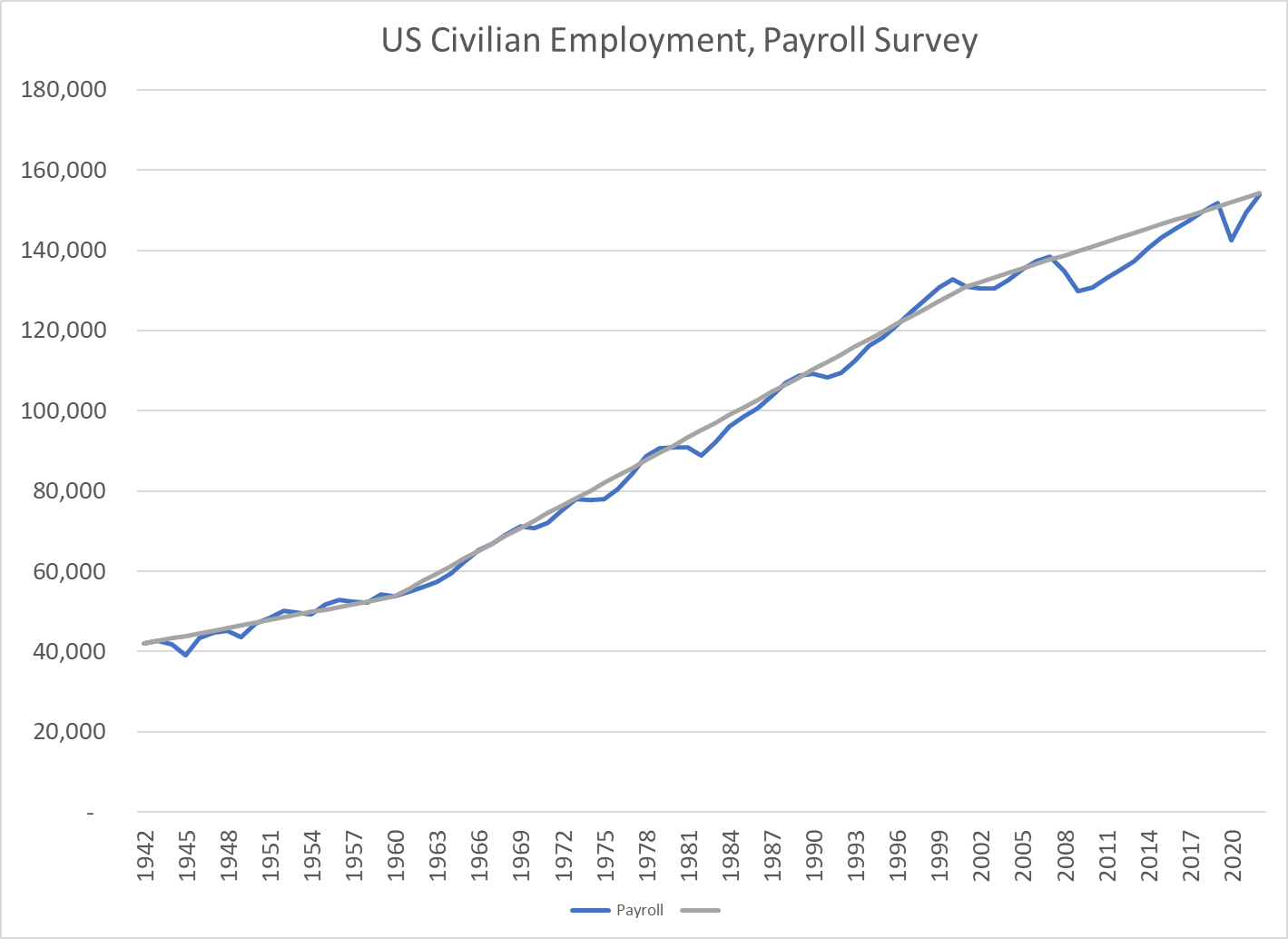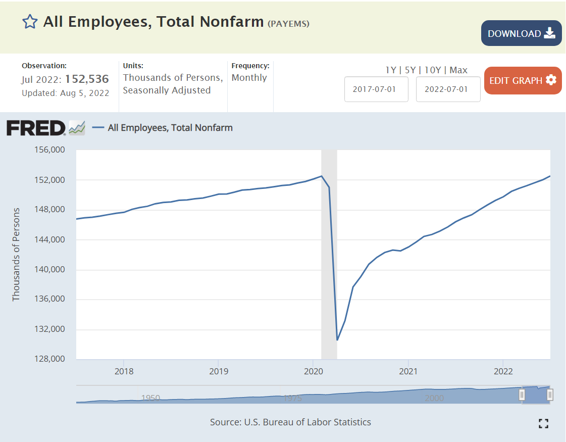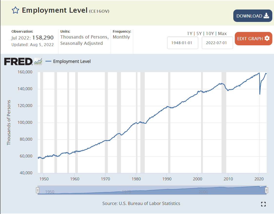
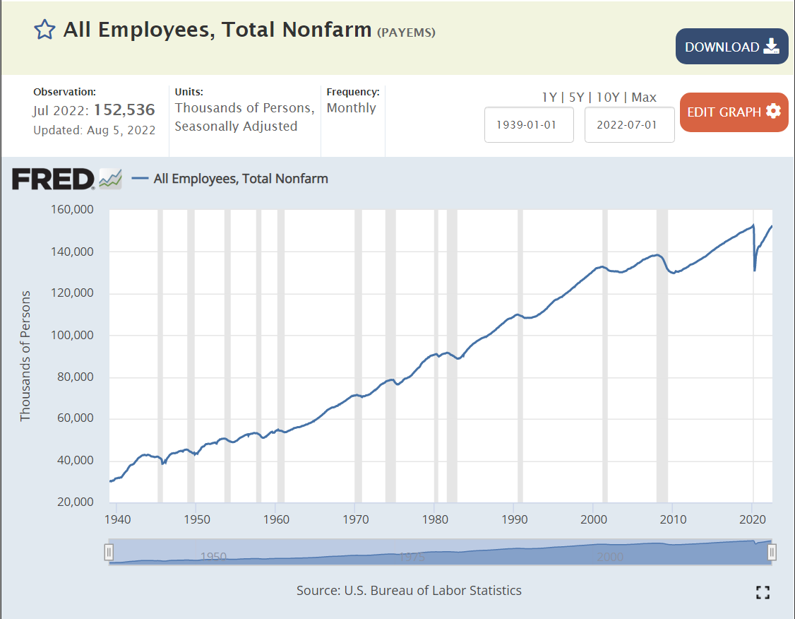
US labor force employment grows and grows. 60M employed in the very glorious 1950’s. 80M by the end of the dynamic 1960’s. 100M by the end of the transforming 1970’s. 120M by the end of the conforming 1980’s. Not quite 140M by the turn of the millennium (2M shy). Just 140M at the end of the “oughts” decade. 158M before the pandemic, resuming the 20M new jobs per decade record of the sixties, seventies, eighties and nineties in the teens decade.
That is 100 million net new jobs added in my lifetime. 160M, up from 60M.
We have two sources, a payroll survey and a household survey. They both tell the same story.
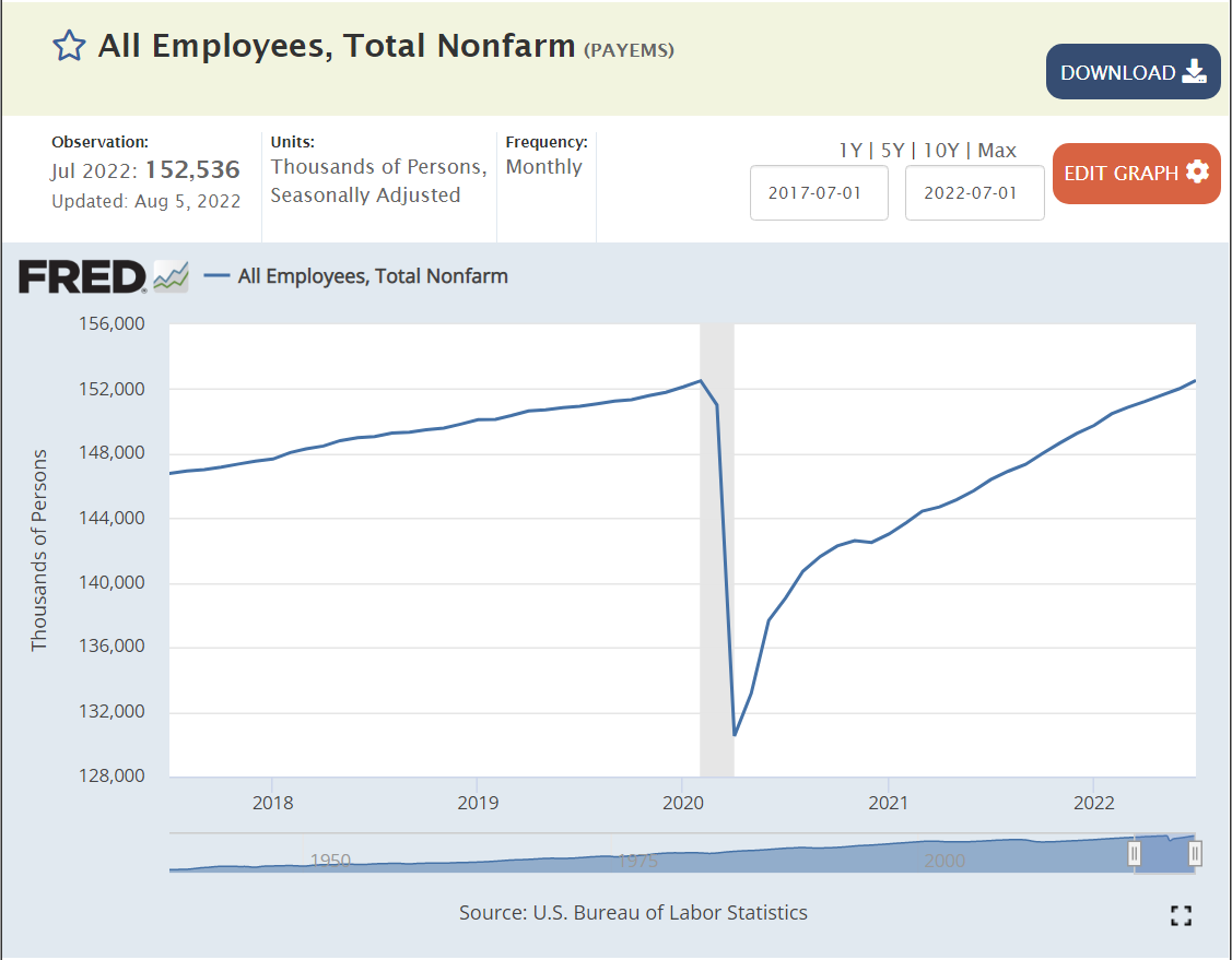
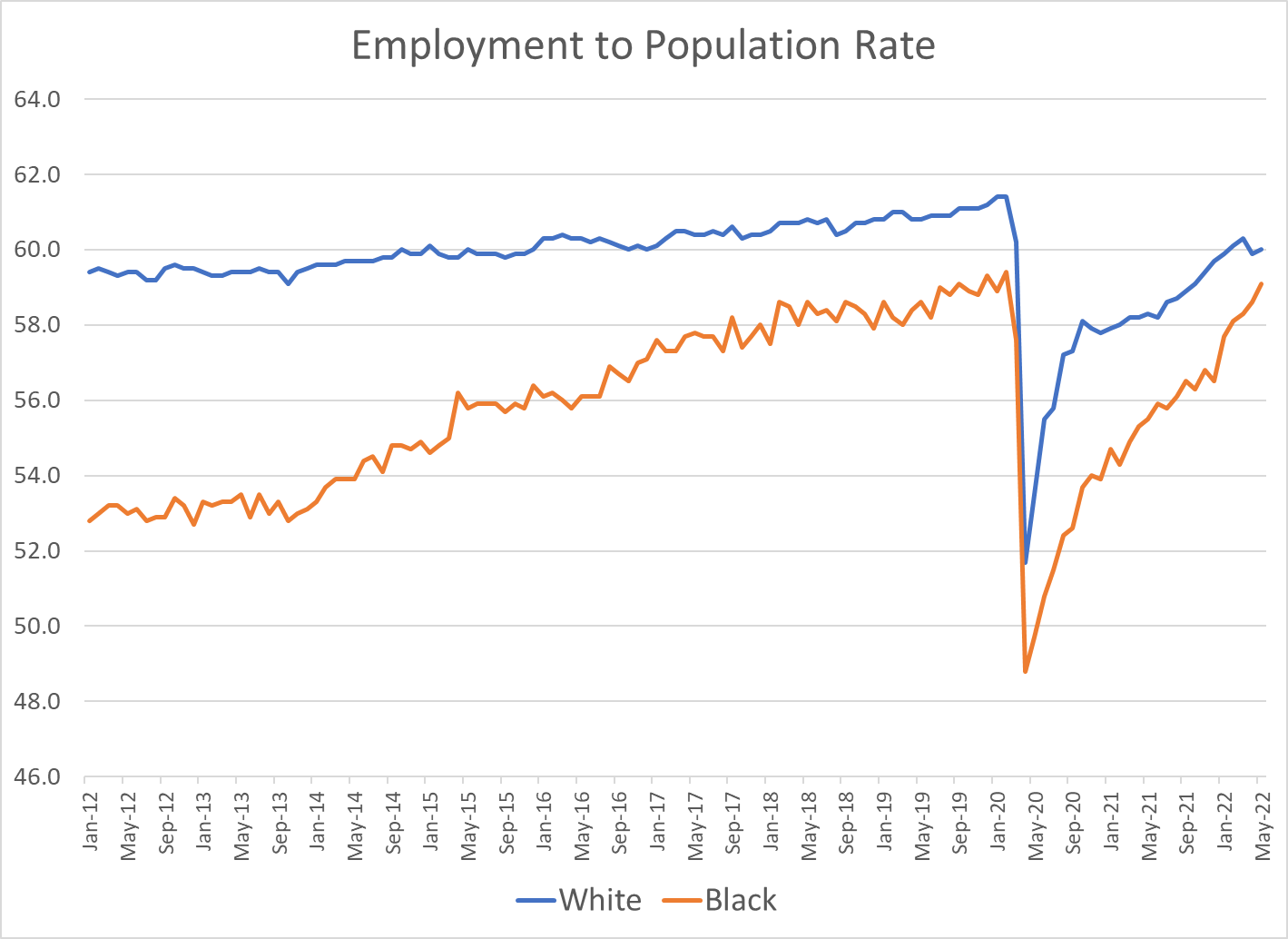
A once in a century pandemic? No problem. 27 months later, total employment has been recovered, despite a 20M worker decline! Set aside politics. This is an amazing result for the US labor market, businesses and citizens.
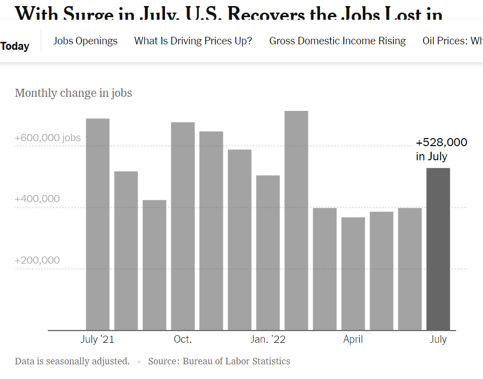
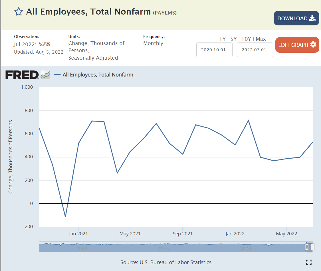
US economy continues to add about 400,000 jobs each month. This is almost 5M jobs per year, more than twice as fast as the usual 2M jobs per year in recent history.
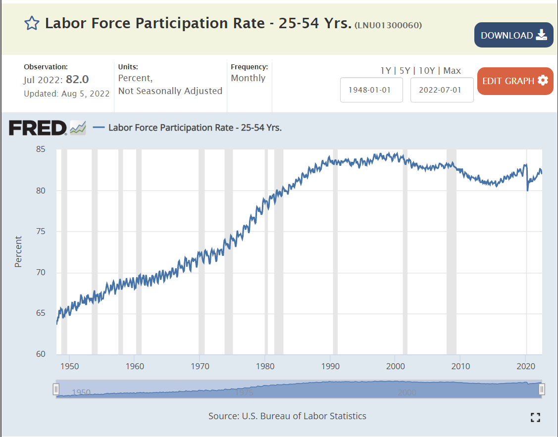
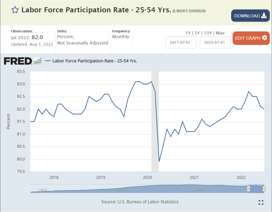
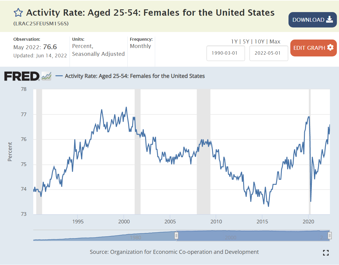
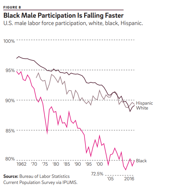
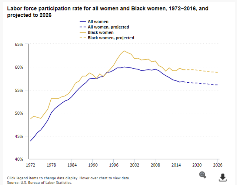
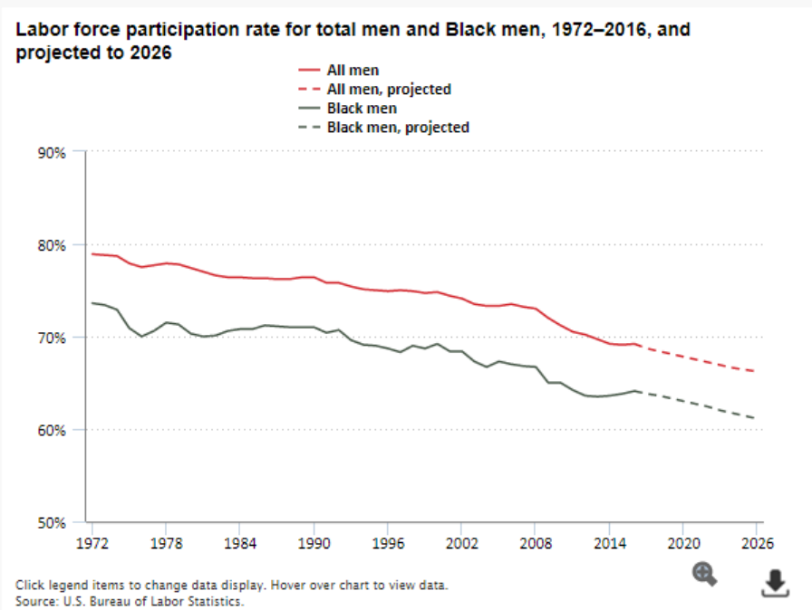
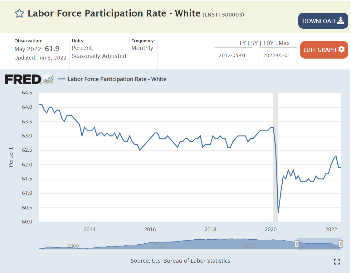
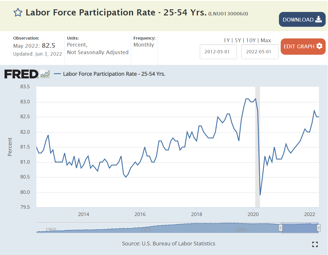
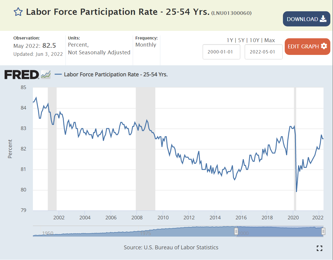
The labor force participation rate for prime aged individuals (25-54) increased from 65% to 84% between 1950 and 1990 as women were accepted into the labor force. 84% was maintained for a decade and 83% for the next decade. The teens decade saw a decline to 81%. The market has remained in the 81-82% participation rate range.
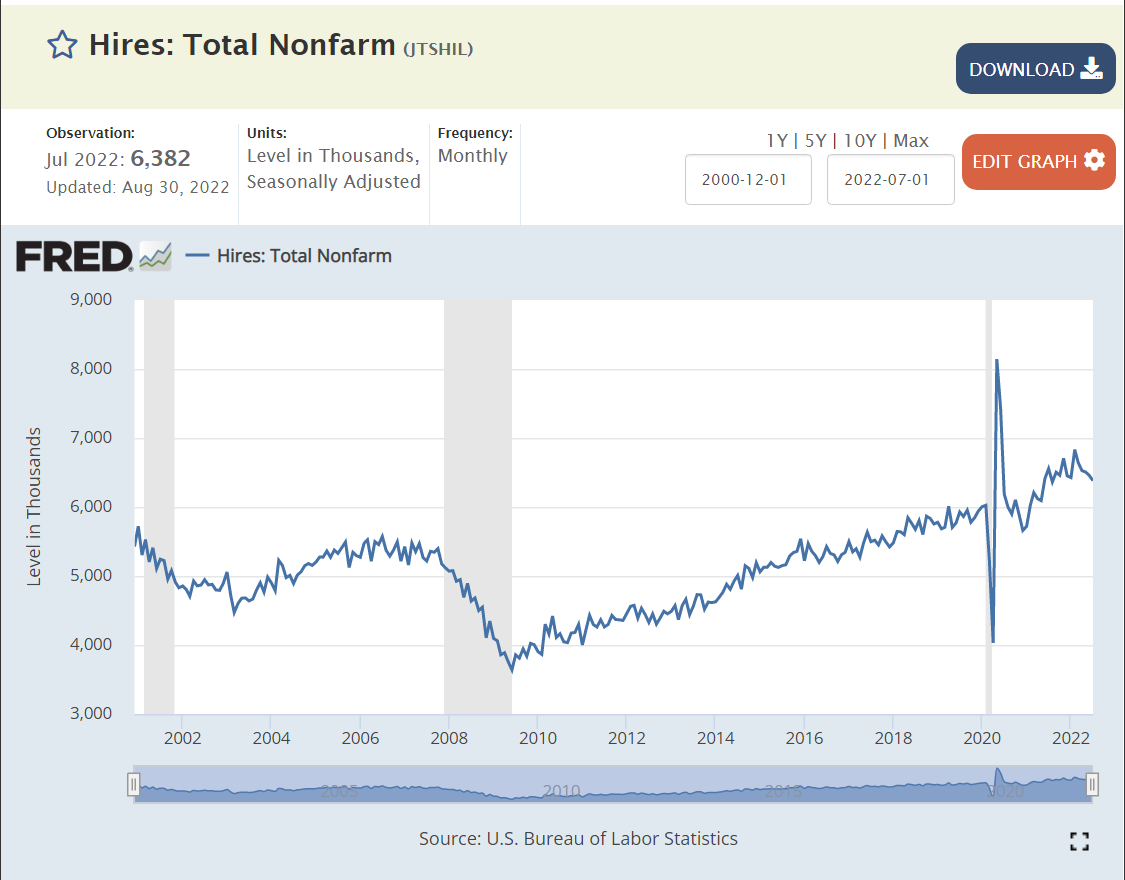
New hires averaged 5M per month in the slower growth “oughts”. New hires dropped further to just 4M per month after the Great Recession. New hires slowly built up to a new record level of 6M per month before the pandemic arrived. The pandemic had just a minor impact on new hires, with a record 6.5M new employees being hired each month in late 2021 and 2022.

Voluntary quits averaged 2%, 1 in 50 employees, during the first decade of the 21st century. Quits dropped sharply to just 1.4%, just 1 in 70 employees, in the 3 years afterwards. The quit rate slowly returned to “normal” by 2016 and climbed further to 2.3% as the economic recovery continued for a full decade.
By October, 2021 quits had returned to the solid pre-pandemic rate of 2.3%. The quit rate jumped up to 2.8% by April, 2021 and has remained at this historically high rate.
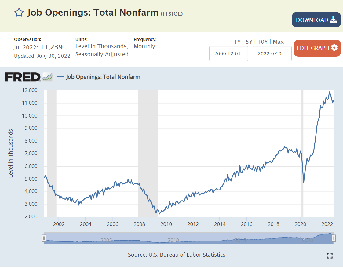
Job openings averaged 4M before the Great Recession. They dropped below 3M during 2009-13. They increased to 5M in 2014 and to 6M by 2016. They remained at the 6M level during 2017, before climbing to 7M for 2018-19. By Jan, 2021 job openings had recovered to 7.2M. By October, job openings had increased to a historic 11M and have remained at this unprecedented level.
This is a greater than 50% increase in open positions since before the pandemic, just 29 months ago. This is 120% more than the peak level before the Great Recession.
Most Important Measure
Profit maximizing businesses, managers and HR departments work through internal processes to list/post a job opening only when:
- It’s within the annual financial and headcount budget.
- Hiring managers conclude that current staff are unable to serve current demands from internal and external customers.
- Hiring managers and financial analysts believe that the incremental hired employees will generate incremental measurable profits.
- Hiring managers believe that they can hire new staff using existing processes to fill well defined positions.
- Hiring managers believe that it is worth their time to go through the firm’s hiring process.
- Hiring managers cannot find an “adequate” labor source through stretching existing staff or using temporary, contract, supplier or agent work forces.
11M job openings means that firms believe that they can generate material incremental profits by hiring up to 11M new employees.
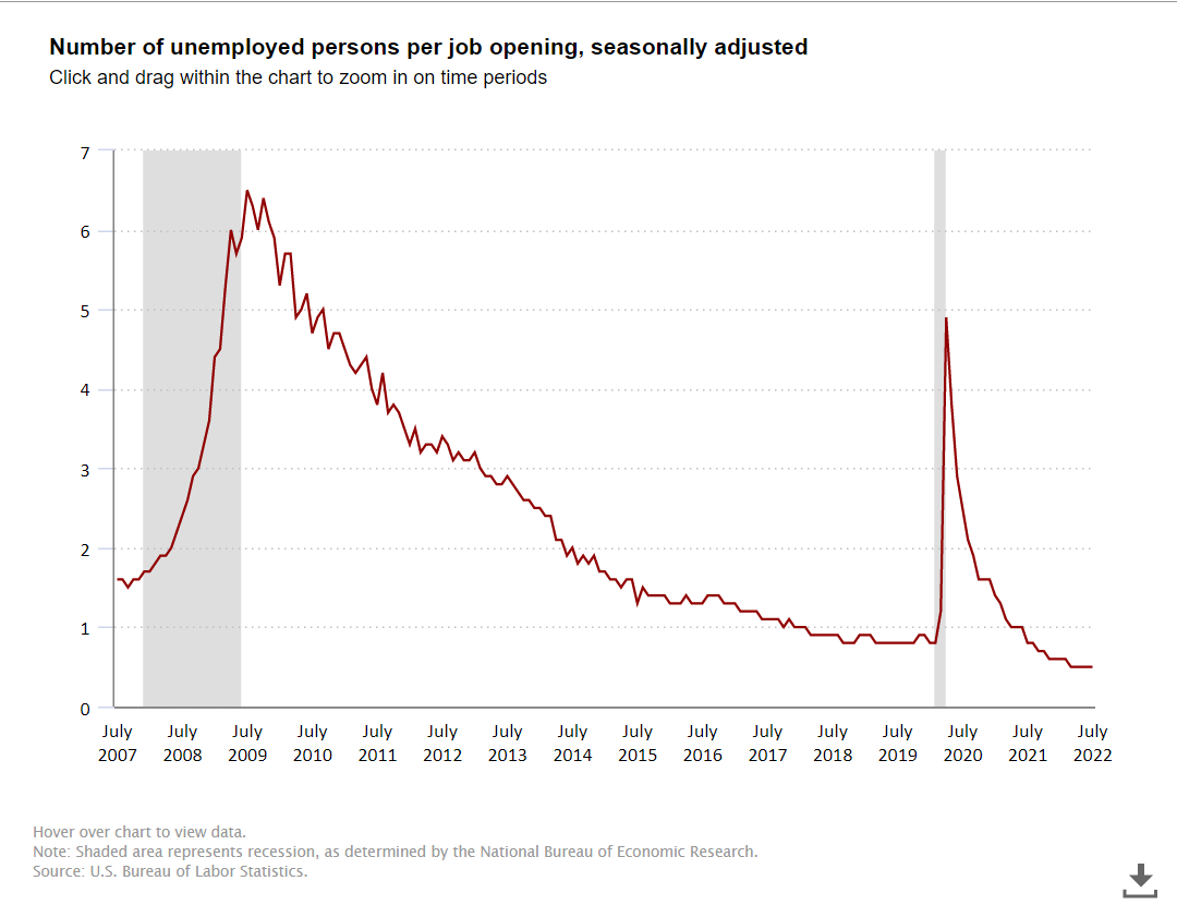
11M open jobs is a startling number, but the ratio of unemployed persons to open positions is much more important. The Great Recession created a 6 applicants per job market. This declined to 2:1 in 2014. During the historic extended expansion it declined to just below 1:1, an unprecedented low number. The ratio fell below 1:1 in 2021 to the current 0.5 level. Two open positions for every unemployed job seeker.
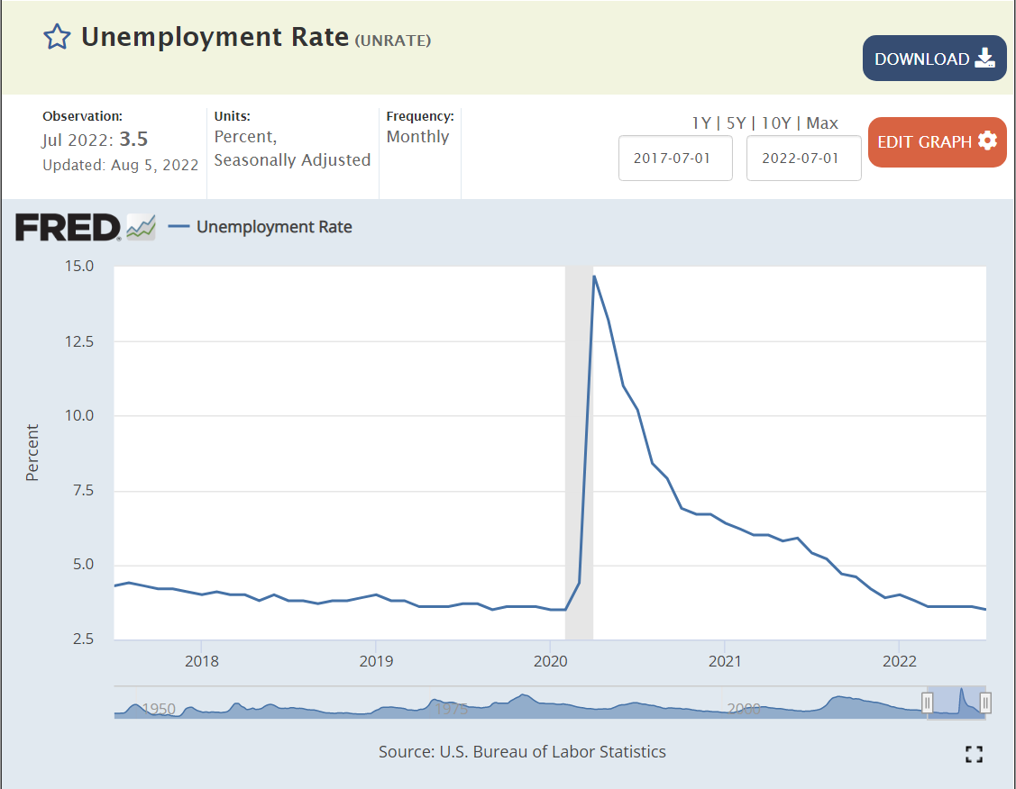
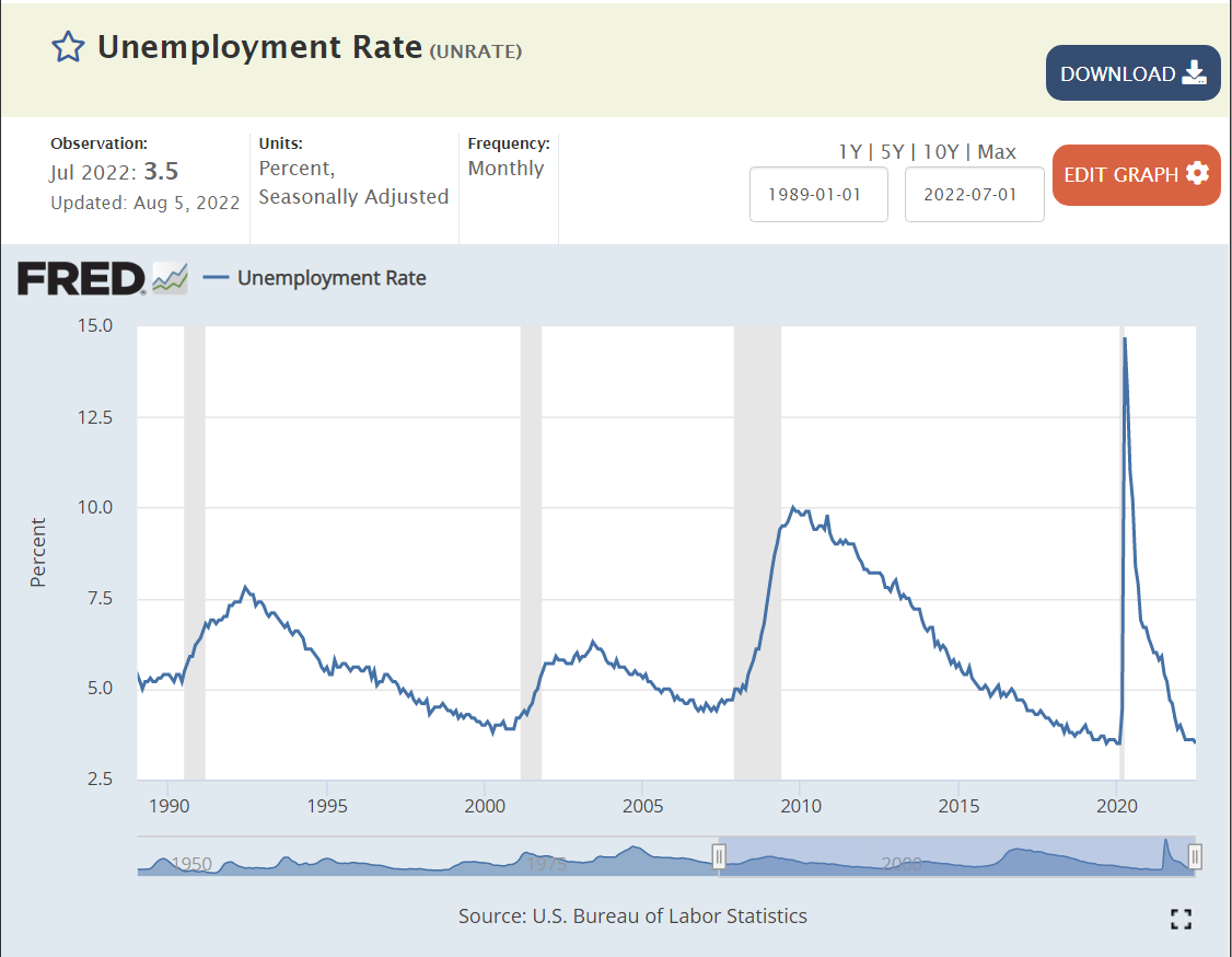
Unemployment was quickly driven to the pre-pandemic record low of 3.5% this summer. Unemployment was below its usual minimum of 5% for 5 years just before the pandemic, leading most economists to recalibrate the “non-accelerating inflation rate of unemployment” (NAIRU) down to 4% or slightly below. This is a very efficient labor market.
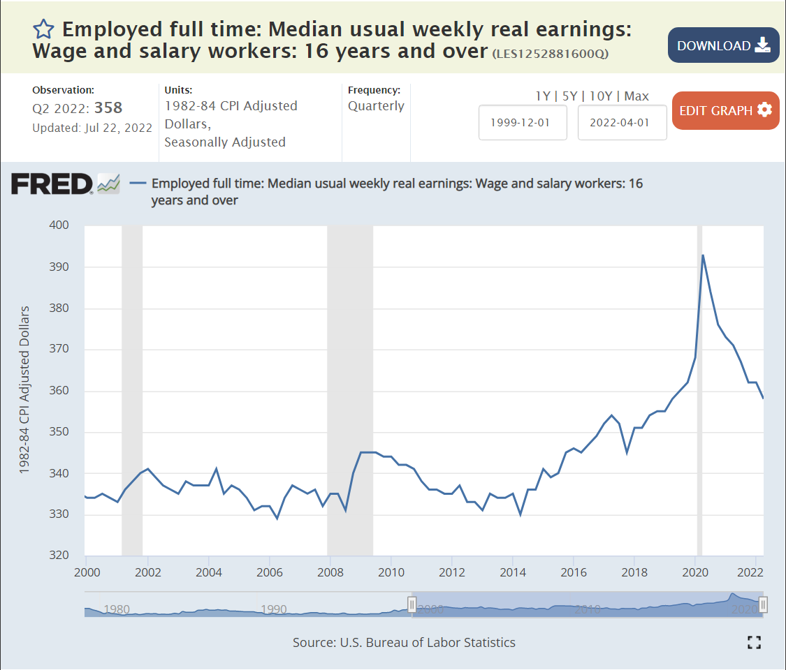
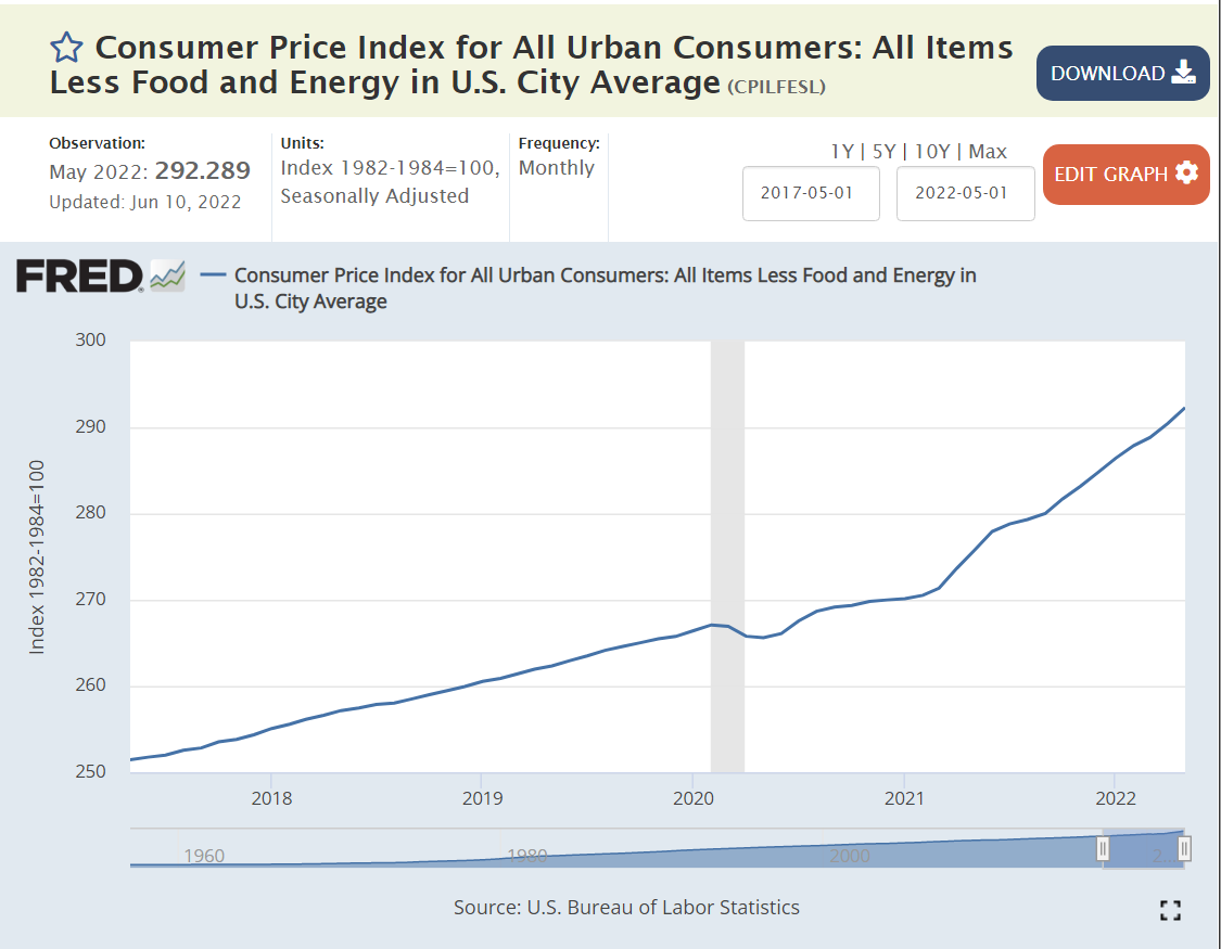
Real (inflation-adjusted) wages have reflected this labor market situation. They remained at the $335/week level from 2000 through 2014, reflecting the slow growth of employment and GDP. Wages began to raise in real terms in 2015, reaching $360 by 2019, a 7.5% real increase. Wages were growing rapidly just before the pandemic and climbed to $390/week in the second quarter of 2020, an additional 8% increase in a few months. Real wages have since declined back to the $360 per week level as high inflation has offset higher than usual nominal wage increases. Firms have chosen to live with 11 million open positions rather than increase real wages.
Summary
Firms have 11M open positions that they believe will help them to make greater profits. Real wages are the same as they were just before the pandemic started. Firms have chosen to not increase hiring and regular wages any faster because they judge that this will cost them more profits than allowing 11M positions to remain unfilled. This is the first time in at least 50 years that firms have had to manage a labor market where employees and applicants have some market power. Despite this “standoff” in the labor market, total employment is back to the pre-pandemic level, firms are hiring record numbers of employees and labor force participation is recovering towards the pre-pandemic level, which was at a 10-year high. The overall economy has clearly slowed its growth rate to near zero, but the labor market remains in a very positive state for workers.