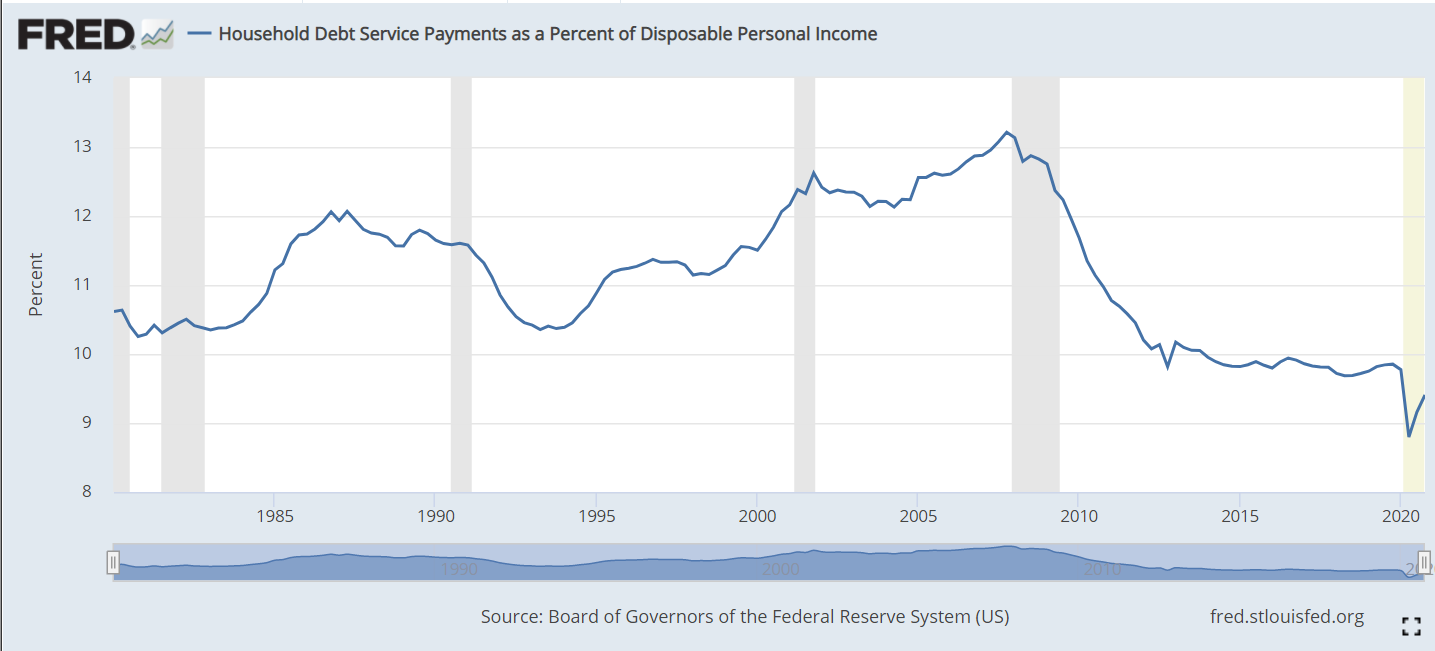
The ratio of household debt service (loan payments) to disposable personal income includes both mortgage payments and consumer debt payments. From 1980-2000 it fluctuated between 10.5% and 12%. Following the 2001 recession it increased to more than 13% before falling steeply to 10% in 2012. During the long recovery from the Great Recession it remained just below 10%. During the pandemic time it fell as low as 9% as personal incomes were boosted through stimulus payments. In total, this is a healthy situation. American families worked through an unsustainable runup of debt and payment during the “ought” decade, the Great Recession and the pandemic. They are well positioned at les than 10% to either save or spend, depending on their preferences. This is good news for the economy, the housing market and risks to financial markets. This is often called the Debt Service Ratio (DSR).
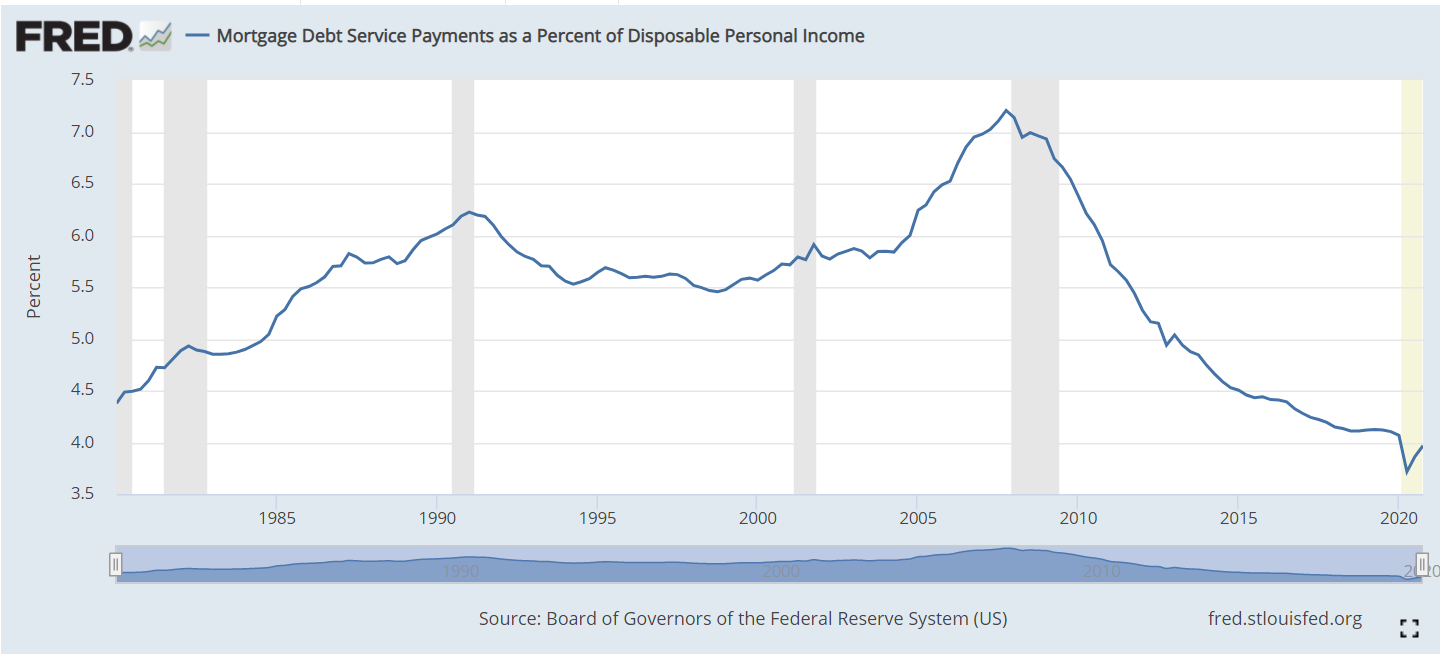
The mortgage component averaged 5.5% of personal income from 1980-2000. It remained below 6% through 2004, before increasing quickly to 7% in 2007. This was unsustainable. Mortgage foreclosures and revised lending standards reduced mortgage lending balances quickly. The Fed reduced interest rates and kept them low. Mortgage payments as a percent of disposable personal income fell to just above 4%. This is a 40% drop (3/7). Even compared with the 5.5% average, this is a 27% reduction in debt service expenditures. This ratio is threatened by future interest rate increases, but current mortgage holders will benefit from years of low mortgage rates and refinancing for decades to come.
Consumer debt has also fluctuated across these 40 years, reaching an early peak of 6.4% in 1986 during the confusing era of stagflation. In the next 6 years, families reduced their debt percentage by 1.7% to a safe minimum of 4.7%. Consumers were more confident through the 1990’s and took on more debt, allowing the payment ratio to rise to a new record of 6.6% before the 2000-2001 recession triggered less borrowing. Although mortgage payments increase during the 2000’s, consumer debt payments eased back to just 6.0%. Families were scared by the Great Recession and reduced their debt levels (and helped by lower interest rates) and payments to just 5% in 2010. The ratio remained low for 2 years, before resuming a familiar optimistic climb to 5.8% of disposable income before the pandemic.
The Household Financial Obligations Ratio (FOR) follows the same pattern as the Debt Service Ratio (DSR). It is a higher percentage as it includes other “fixed” obligations such as rent. We see relative stability between 16-17% through 2004. The mortgage driven increase to 18% by 2008 is evident, followed by a very rapid fall to 15% in 2012. This broader ratio has remained flat since then. The pandemic drop is due to extra stimulus income.
The composition of total consumer debt for the last 20 years highlights the rise and fall and rise of mortgage debt and the increase in student loan debt.
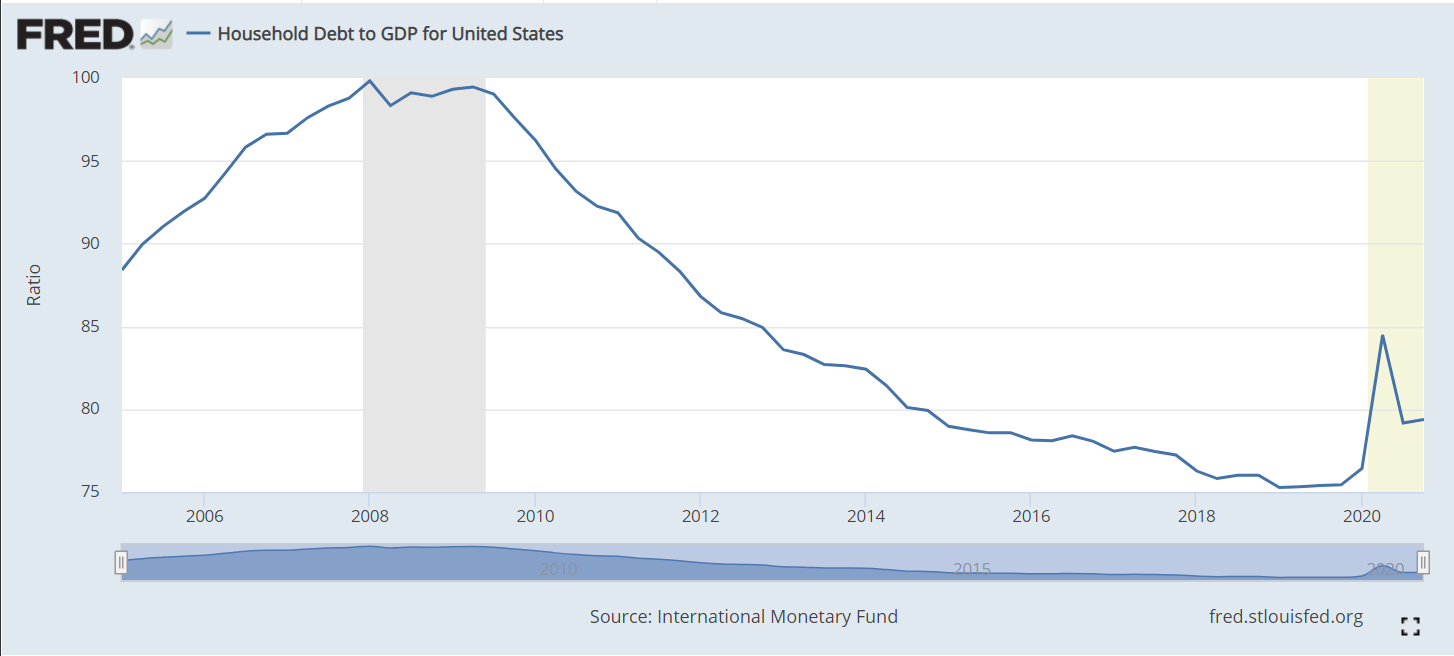
Household debt to GDP peaked at 100% before the Great Recession and has fallen by one-fourth in the next 10 years. Unpaid mortgages and other consumer debt have begun to accumulate in the last year.
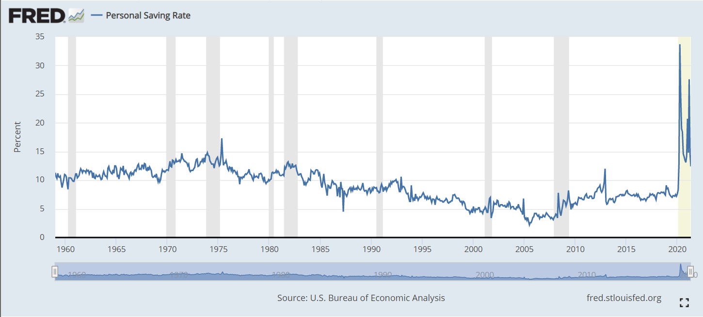
The personal savings rate averaged 10-13% from 1960-1985. The country’s economic challenges lead families to save less to maintain their standard of living, falling in half (5%) by 1999. It remained in the 4-5% range through the next expansion. The Great Recession triggered families to replenish their savings, with a 7-8% rate. The pandemic period shows a 15% savings rate. In all likelihood, this rate will fall back below 10% soon.
The United States was founded as an aspirational representative democracy. No taxation without representation. One man, one vote. Yet, the Senate was created at the 1787 Constitutional Convention to equally represent the states in the federation, not to equally represent the citizens. This was a compromise between the small states and the large states.
Recent critics focus on the extent of the distortions favoring the citizens of small versus large population states.
California’s 39M residents have the same representation as Wyoming, Vermont, Alaska and North Dakota who each have three-quarters of one million residents. This is a larger than 50 to 1 advantage for these four states. The California-Wyoming ratio is 68X, meaning that California citizens have just 1.5% as much power as Wyoming citizens.
A majority of states comprised of the 26 with the lowest populations represent 18% of the population. In theory, they could combine to outvote the other 24 states with 82% of the population. States with 57M people have more power than states with 269M citizens. The “lucky duckies” in the small population states, on average, get more than 5 times as much power as those in the large population states.
The 9 most populous states contain more than one-half of the US population, but get only 18% of the Senators. The other 41 states with less than half of the people get 82% of the Senators. The filibuster rules that allow 40% of Senators to block Senate action give 41 Senators representing 11% of the country a potential veto. The two-thirds requirement for constitutional amendments and treaties gives this power to 34 Senators representing 5% of the population.
The 50/50 Democratic/Republican split in the Senate shows Democrats representing 185M residents versus 143M for Republicans. Democrats represent 40M more people with the same number of Senators. They represent 29% more citizens each. If California (D) and Texas (R) are removed from the calculation, Democrats have 30M extra voters to represent for the same number of Senators.
Demographers estimate that the disproportionate influence of small states will increase further in the next 20 years. In 2040, the 15 largest states will have 30% of the Senators (power) and 70% of the population, while the 35 states with 30% of the population will have 70% of the power.
Republicans tend to be more popular in small states. In the 30 least populous states, Republicans have 35 Senators versus 25 for the Democrats, a 10 seat advantage. In the 20 most populous states, Republicans have 16 Senators versus 24 for the Democrats, an 8 seat disadvantage (2018).
Historically, small population states (mostly rural) have taken advantage of their relative power advantage to gain proportionately more federal spending, military bases and employment (earmarks, committee chair advantages). They have looked out for the interests of their citizens with distinctive federal policies for agriculture, natural resources/oil, highways versus mass transit, gun control/gun rights, criminal justice views, etc.
Lower population states have lower levels of immigration, fewer non-English speaking residents, higher per capita health care spending, higher % households with student debt, lower poverty rates and higher % of home owners.
Various calculations indicate that minorities lose representation and power versus Whites. Non college grad whites +12% extra representation. Non college grad blacks -20%. Non college grad Hispanics -30%.
Another author says that rural residents get 37% extra say, Whites get 13% extra compared to the average voter while non-Whites get 22% less for a total 35% minority voter penalty.
The Republican advantage is material and is likely to continue.
The country’s political parties are more clearly aligned on a single conservative-liberal dimension, making parties and voters more polarized and reducing the opportunity for compromises based on other dimensions.
Starting with Newt Gingrich, the Republican Party discovered the power of 100% party discipline in both the House and Senate, making trade-offs, compromises, deals and log rolling less likely.
While rural/urban differences have always existed in the US (Federalists vs Democratic Republicans, North/South, Farm populists), the alignment of cultural and economic interests with the 2 parties now reinforces these differences.
The electoral college includes a vote for each Senator, so distortions are reflected to a lesser, but material, extent in presidential contests. US Supreme Court nominees require Senate confirmation.
The White/minority power difference.
With a divided population, the legitimacy of government is threatened.
Not a Problem (Opposing Views)
US Congress has stood the test of time with its “checks and balances”, including the purposeful compromise between large and small population states.
In the long-run, the advantages to one political party have faded.
The Pareto Principle (80/20) rule applies to many calculations like these. The forecast 30% of people with 70% of votes is less distorted than 80/20.
The US was formed as a federation of states with equal rights, like the sovereignty rights of nation states.
Voters do get “equal representation” in the House.
Geography and property are valid dimensions of political power, with a right to be represented.
There are many dimensions to political power. Urban areas are over represented in the economy, universities, media and culture. This gives rural areas/citizens an opportunity to be heard.
Constitutional Amendment?
Article 5 states that “no state, without its consent, shall be deprived of its equal suffrage in the Senate”. Hence, some would argue that no amendment can change these voting rules. Perhaps unanimous consent of the original 13 states would be sufficient. If a regular amendment was possible, it would require the support of two-thirds of the Senators and three-fourths of the states. Realistically, any amendment would require the potential support of 40 states, with only 10 left behind. This would require support from a majority of Republican states and all Democratic states. A Constitutional Convention with all options on the table may be required to change the basic 2 Senators per state rule.
Allow states with some high ratio of the smallest or average state to divide into 2 or 3 or more states. “Encourage”/incentivize states with less than 1% of national population to merge with another state. Start with California and Texas.
Change Senate election rules to have both Senators from a state be elected in the same election. Allow 2 candidates per party. If 1st place winner does not win at least 52.5% of votes, choose second Senator from party with second highest vote total.
Provide incentives for 400,000 Democrats to move from California to Wyoming (125K), Montana (61K), Alaska (45K), North Dakota (36K) and South Dakota (132K) to narrowly win elections in 5 small states!!
The overall US labor force participation rate is the ratio of those employed plus those actively looking for work among the non-institutional (military, prison, etc.) working age (16-64) population. It rose a quite substantial 8 points, from 59% in 1950 to 67% in 1990, mainly due to increased female participation rates. It remained in the 66-67% range through 2007, before declining by 5% in the last 14 years, a quite rapid decline. Note that the years selected are the ends of business cycle expansions plus the current year.
The overall rate mirrors the White rate as White’s make up the largest share of the population and because other racial participation rates are similar to the White rate. Black labor force participation has followed the White pattern, but been 2-3% lower than the White rate for most periods. The Hispanic rate started just below the White rate, but exceeded it by 1990, growing to a 3% advantage in 2021 at 65% versus 62%. The Asian participation rate has matched the White rate, sometimes being 1% higher.
The decline in the White share of the US population, especially in new births and school age children has been highly publicized and politicized for 40 years. The White share of the population has fallen from 5/6ths to just 3/5ths since 1950. African-American share grew by 2% in the 50’s and 60’s before settling at 12%. The Hispanic population has grown rapidly, from just 2% to 19%, passing the Black share by 2001. The broadly defined Asian population has grown from less than 1% to 6%. This breakdown does not include multi-race categories, which now amount to 3%. For labor force participation purposes, racial composition plays a minor role in the total rate.
Male participation in the labor force has fallen by 20 percentage points, from 87% to 67%. The increase in the 65+ age group from less than 4% to almost 8% of the total population accounts for more than 4% of this 20% decline, but 3/4ths or more is due to other factors. Female participation rates, working against this same 4% reduction due to the mix of older residents, grew from just 33% to a peak of 60% in 2001 before declining by 4%, about half of the male decline from 2001 to 2021. The expansion of opportunities for women and their choices to pursue the opportunities in the US is well understood. The increased share of aged 65+ women accounts for almost 3% of the 4% female decline. The reduction in male labor force participation is the big story.
Women, aged 55+ averaged just 22% participation through 1990. Most of the increased labor force participation in these 40 years was among younger women. More than one-third (35%) of women aged 55+ are now active labor market participants.
Their male counterparts in this age bracket show a 21 point decline, mirroring the overall male decline, but starting at the lower rate of 67% and ending at 46%. There is a mix variance here, as 55-64 year olds made up 4% of the population in the first 50 years, but now account for 6%, while the 65+ age group started at 4% for the first 25 years and then grew to 8%, so the share of 65+ citizens out of the 55+ total has risen from 45% to 56%. The mix variance accounts for a 5% decline in the participation rate, but the other 16% is due to other factors.
Demographers refer to the 25-54 year age group as the prime labor force. Here, we see women double their participation rate from 1950 (39%) to 2001 (77%) before falling off a bit to 74%.
For prime age men, we see a 9% point drop, from a near universal participation rate (97%) in 1950-60 down to 88% by 2018.
The White women data follows the total. A majority of Black women were labor force participants in 1970, 10 points higher than White women. They increased their labor force participation by 14 points, to a peak of 65% in 2001, before falling back by 5 points to 60% in 2021. This generally matches the pattern of White women, except that Black women have averaged an extra 4 participation points. Hispanic women started between the other two groups, at 45% in 1970 and then climbing to 60% in 2001. Their participation has remained close to 60%. Overall, relatively minor racial differences in female participation. About a 25 point increase in the second half of the 20th century followed by a 2 point decline in the last 20 years.
White men make up the largest share of the male total, so their data is close to the total, declining by 18 points, from 88% to 70%: from 7 out of 8 in the labor force to just 7 in 10. Black men follow the same Total pattern, but are consistently 4% less active in the labor market versus White men. Hispanic men first appear in the data in 1970, with an 85% participation rate, just above the 83% White male rate. However, Hispanic males stay at this level through 2007, while the White rate falls by 7%. In the last 14 years, the Hispanic male participation rate has dropped by the same 5% as the White and Black male rates, ending at 79%, 9 points above the 70% White rate.
Let’s start with the prime age labor force (25-54). From 1950 to 2001, we see a 19 point increase, from 65% to 84%. This is all due to the increase in female participation, which more than offset the significant decline in male participation. In total, from an economic point of view, this is great news. The total participation rate has slipped back a bit, from 84% to 81% in the last 2 decades, with men and women both falling back, but men falling faster. Aside from the distortion of the baby boom when it declined to 46%, the prime age group has typically been about 52-53% of the population. It has fallen by 1% in the last decade as the growth in older population groups has been faster than the decline in the childhood group.
The non-working age 0-15 year old childhood group reached a full 31% of the population total in 1960 and has since fallen to 19%. From an economic point of view, this too is good news, as the dependency ratio of non-workers to workers declines.
The teenager participation averaged 46% from 1950-1970. It averaged 55% in the mid-70’s to mid-90’s, but has quickly declined to just 34% in recent years. As teenagers make up 11% of the working age population, this drives a 2% decrease in the overall workforce participation rate. From an economic point of view, it is possible that the other activities of teens today are more valuable in creating human capital than the part-time entry level work that many more were performing in the 1970’s-90’s.
The labor force participation for young 20’s rose quickly from 64% to 77% by 1979 with increased participation by young women in the economy. The rate has declined to 70%. As this group accounts for 11% of the work age population, this has driven a nearly 1% point decrease in the overall work age participation rate.
The 55-64 year old group has a different pattern, averaging 61% in the 1950’s to 1970’s, decreasing 5 points to 56% in the mid-70’s through mid 90’s, before growing all the way back to 65% recently. The increased female participation rate did not impact this group significantly. During the 1975-95 time, more men took advantage of early retirement possibilities, some forced and some voluntary. This group increased from 9% to 12% of the total population. The 9 point participation rate increase since 1990 adds about one and one-half points to the overall participation rate, offsetting some of the 16-25 year old reduction.
The 65+ group pattern is similar to the 55-64 year olds, starting above 20%, falling down to 11% and returning to 20%. Economically, this recovery adds to the nation’s output, even if this group is not considered part of the work age population. This group has more than doubled as a share of the total population, reaching 15%.
With men and women combined, the total participation rate drops 5 points, from 67% in 2001 to 62% in 2021. The prime age group accounts for one-half of the working age population and shows a 3 point decline from 84% to 81%, with a one and one-half percent negative impact on the total rate. The significant declines in the 16-25 age group drives the rest of the 5 point decrease.
Data on labor force participation by educational attainment for ages 25-64 is available for 1970 through 2018. During this nearly 50 year period, the total participation rate increased from 70% to 79%, with a peak of 81% in 2001. Recall that the official total participation rate included the 16-24 year age brackets where participation fell significantly. We have only a 2 point decline from 2001 to 2018 rather than 5 points.
The big take-away is that participation rates for each group don’t change much through time. Those who didn’t complete high school average 61% pretty consistently. There are changes in the male and female participation rates and racial composition rippling through the data, but on average 3 of 5 people without a high school diploma participate in the labor market.
High school graduates average 76%, with a 3 point decline to 73% for 2018.
Individuals with some college classes have averaged 82% participation, except in 1970 when it was only 74%.
Those holding a college degree have averaged 86% participation, except in 1970 when they averaged 82%.
The proportion of citizens in each group has changed dramatically. Less than high school graduates dropped from 45% to just 10% of the post college working age population. College degree holders increased from11% to 35%. College attendees grew from 10% to 26%. High school grads started at 33%, increased to 38% and then declined to 29%. In total, the country shifted one-third of the population from non-high school education to college degree holders (BA and AA).
Given the consistency of labor force participation by level of educational attainment, the overall increase from 70% to 79% makes sense. Applying “typical” participation rates to each group (61.8, 74.5, 80.5, 85.7) produces an estimated participation rate for each year: 70, 73, 74, 77, 78 and 79. The 1990 and 2001 years stand out as having significantly higher actual than estimated labor force participation rates (+5 and +4). Perhaps some of the decrease in various rates since 1990 is due to there being an unusually high participation rate during this period as the economy expanded for relatively long periods with relatively mild recessions.
The prime age category is more than one-half of the labor force and contains individuals with the greatest earning power. Most attention has been focused on the 3 point drop from 2001 to 2021. It is also important to note the 19 point increase from 1950. We have data for men and women in this age group. Female participation essentially doubled from 1950 to 2001, before flattening out (down 2 points).
The male participation rate declines throughout the 70 year period, not just in the last 20 years. It falls from near universal 97% to 88%, meaning that 1 in 8 prime age males is not in the work force. As usually, the White rate matches the Total rate. Hispanic men have seen a 5 point decline from 1970-2018 while Whites fell 8 points. Hispanic men in 2018 had a higher participation rate than Whites. Black men started 7 points behind Whites at 90% and declined by an even larger 11% to just 79%. Whatever factors are driving prime age White men out of the labor force appear to be negatively impacting Hispanics and Blacks as well.
The overall participation rate for work age individuals (16-64) increased from 59% in 1950 to 67% in 1990 and has since dropped to 62%. The prime age group (25-54) increased from 65% to 84% before sliding back to 81%. For various age groups, the female participation rate doubled from mid 30 percent to high 60 percent range between 1950 and 2000 before slipping back a little. This drove the overall participation increase through 2001. The male participation rate for ages 16+ fell from 87% to 67% between 1950 and 2021. The prime age male (25-54%) rate dropped from 97% to 88%. Similar declines were seen for all races. The Obama white paper above (CEA) provides relevant details. The IBD article below is a good summary of this situation.
I summarized the data in this table into 5 year buckets, just 4 years for the most recent 2016-19 period, to make it easier to review.
The poverty rate is the number of families out of 100 who meet the Census Bureau’s evolving standard of being poor, based on family size and location. For the last 4 years, 9.0% of families were considered poor.
The adjusted rate in the 3rd column calculates what the poverty rate would be in each period, if the nation had a constant 10.2% of families in the female head of household, no spouse present category (single moms), as was the case in 1965.
The adjustment is shown in the fourth column, reducing the average measured poverty rate.
The poverty rate for only single moms is shown in the 5th column.
The share of ALL families headed by single moms is in the 6th column.
The share of all POOR families headed by a single mom is displayed in the 7th column.
The poverty rate for families headed by a male is listed in column 8.
The OVERALL poverty rate dropped sharply (by 42%) from the early 1960’s at 16% to nearly 9% in the early 1970’s. The overall poverty rate was finally a shade lower in the 2016-2019 period, down to 9%. The overall poverty rate was in the 11% range throughout the 1980’s and first half of the 1990’s. It improved to 10% at the turn of the millennium, but rose back to 11% for the next decade. Overall, the rate was roughly flat for 50 years, ranging from 9-11%.
Partisans love to argue about the “war on poverty”. This data indicates that the early war was effective, but the enemy fought the proponents to a draw for the next 50 years.
Table 13 highlights the growing number and share of single female headed households. Single moms were just 10% of all households in 1965. They increased by 80% to 18% of the total by the early 1990’s, and have stayed in the 18-19% range thereafter.
The single mom poverty rate was unusually high in the early 1960’s at 40%. From 1970 through 1995 it averaged one-third. Single mom poverty rates were reduced by 10% to 30% for the next 20 years. The rate has fallen again, to 25% in the latest period. However, the single mom poverty rate has consistently been 4+ times as high as the male head of household group. Single mom headed households doubled their share of all poor households, from 26% to 52% in the last 50 years..
The male head of household group started with a 13% poverty rate. It dropped to 6% by 1970 and generally remained there for 40 years, aside from 7% rates in the 1985 and 2015 periods. Note that this is a greater than 50% reduction in the share of poor families. The “war on poverty” appears more successful from this vantage point. The rate edged down to a record low of 5.4% in the most recent period, as the extended economic recovery reduced unemployment and started to increase wages for lower skilled workers. This is a 60% reduction in poor families since the early 1960’s for this subgroup.
Column 4 shows the negative impact (mix variance) of having nearly twice as many families in the 33% poverty rate group versus the 6-7% poverty rate core group. By 1980, this change increased the poverty rate by 1%. By 1995, the impact was 2% and has remained in this range.
The adjusted poverty rate, standardized at the 1965 10.2% share of single moms may be a better measure of the effectiveness of overall policies and economic results. The adjusted rate starts with the same 16%. The effective poverty rate drops to 10% in 1970 and further to 8.5% in 1975-80. There is a spike back up above 10% in 1985 before falling back to 9% for 1990-95. The revised rate drifts down to 8% for 2000-2005 (50% reduction from 1965). It pops back up to 9% for 2010-15, before falling to 7.4%, a record low, finally less than half of the starting rate.
Adjusting for the mix of single mom households versus others provides a better view of the country’s effectiveness in reducing poverty. The adjusted poverty rate has been reduced by 60%, not just by 44%.
We can review poverty rates by age, race and education another day. The recent COVID-19 funding bills appear to be very effective at further reducing the US poverty rate. A relatively small amount of money seems to be working. The causes of more single mom headed households and focused policy solutions is also a topic for another day.
The EPA provides consistent raw data from 1980 to 2020 showing very rapid improvements from 1980-2000 and continued, but slower improvements in the last 20 years on 7 measures of air quality. For each item, reductions from 1980-2020 and from 2010-2020 are listed.
Carbon monoxide: -81%, -12%
Lead: N/A, -86%
NO2: -64%, -21%
Ozone: -33%, -10%
Particulate Matter 10 (medium): -26% since 1990, +9%
The EPA publishes an annual report/web page to summarize results. In addition to the colorful graphs, its shows sources of pollution and describes the effects of individual pollutants. It provides statistics that normalize pollution measures against GDP which has grown greatly across 40 years, highlighting the even greater achievements by that measure. It shows pollution by city. It details EPA program areas and improvements. It notes that measures of more than 100 “toxic” air pollutants are down (but not zero). It shows that annual “unhealthy days” in the nation’s 35 largest cities have fallen by two-thirds, from 2,100 to 700/year between 2000 and 2015. It shows that “visibility” in scenic areas continues to improve. This report provides significant extra detail in an easy to drill down format.
The particulate matter measures have historically had the slowest reductions of the 7 measures. The medium particle (10 microns or less) rate increased between 2010 and 2020. The fine particles measure stopped falling at the end of the decade.
The Trump administration has loosened regulations, reduced funding and attempted to limit the ability of states to set tougher standards than those at the federal level.
Interest groups, like the American Lung Association, portray the data to show that the glass is half-empty. The ALA focuses on the two weakest measures (fine particles and ozone). They drill down to daily peak events rather than average annual rates. They drill down to the city or county level to highlight the lower performers. They take the national quality standards and construct a “grading system”, so that the worst “F” cities and their scores can be emphasized. They use these results to show how many people are negatively effected by poor air quality. They emphasize that most of these cities are in the west and southwest. They point out that minority groups are disproportionately impacted by pollution. They link extreme heat and wildfires as causes of recent pauses in progress, noting that global warming is the underlying driver.
A recent United Nations article evaluates the last 50 years in the US, highlighting the improvements summarized above. The article emphasizes the health costs of poor air quality and the economic benefits of improved air quality. The “tone” and the “title” are negative. The report highlights the recent uptick in particle measures. It points to the lack of a decrease in CO2/greenhouse gases. It notes that the US is one of the top 10 worst air polluters ranked by number of deaths (not per capita). Finally, it says that the US EPA also agrees that there are major problems.
Like many public policy issues, especially environmental issues, there are competing ways to assess the current situation. The big picture data clearly shows ongoing improvements across 40 years. The fine particulate matter measure stands out as one that may be threatened by climate and fire issues. Federal, state and local regulators, together with businesses, governments, not-for-profits and individuals have taken steps to improve air quality and appear likely to continue in this direction.
On the other hand, air pollution above certain levels, in specific locations, especially for toxic substances, even for short periods of time, does have negative health and economic impacts. There are opportunities for improvement. The U.S. measures are just average compared with similar highly developed economies.
The world, including the US, has made great strides in reducing the emission of gases that threaten the ozone layer. However, CO2 levels in the US in 2020 are the same as in 1990. While US GDP has increased significantly since 1990, so we are more environmentally “efficient”, that does not matter when trying to globally reduce “greenhouse gases”.
The good news is that infant mortality rates (deaths/1,000 live births in 1st year) declined by 80% between 1950 and 2000, from 35 to just 7 and have declined an additional 14% to a little less than 6 by 2018.
The main CDC page highlights the 5 main causes of death, the significant state differences (higher rates in the south central states, Ohio and WV, and differences by race. Black infant mortality rates (IMR) remain more than twice as high as non-Hispanic Whites. Asians have lower rates than Whites. Hispanic White infant mortality rates are “close” to the White rates.
The Petersen-KFF website provides clear summaries of the main dimensions of this public health area. About 2/3rds of deaths occur in the first month and are termed neonatal. The remainder in the first year of life are termed postnatal. Both neonatal and postnatal death rates have declined in the last 20 years.
Petersen provides more details on state level death rates, showing that the Great Lakes states have high rates similar to the southern states (7), while much of the country has much lower rates (5).
Births for mothers under 20 show death rates almost twice as high as those in their twenties and thirties.
Ten factors account for two-thirds of deaths, lead by congenital defects and early delivery/low birth weight which account for one-third.
The US mortality rate (5.8) is 75% higher than other countries with similar income levels (3.5). The world-class results in Japan and Finland come in at 2. Details in the way the US reports its figures may account for one-third of the difference versus comparable countries. While the US rate has declined from 7 to 5.8 in the last 20 years, the comparable group reduced its rate from 4.6 to 3.3. Various sources propose that socioeconomic inequality, racial differences and health care system differences account for the US’s poor performance.
The US Health & Human Services website highlights black-white differences in birth weights, SIDS occurrence, early births/low birth rates and causes of death.
The statistical analyses to disentangle socioeconomic status and race are very complicated. Most show that socioeconomic status accounts for half of differences, but not nearly 100%. This study found that maternal education, maternal marital status and maternal age “explained” much of the racial differences. Of course, the authors then point to poverty and income differences as underlying factors.
Several more recent studies point to systematic racism working through a large number of lifetime events which impact the mother’s health as the primary cause of racial differences in infant mortality rates.
One study of Florida births indicated that having a black doctor reduced deaths by 40% for black infant births. White infant mortality was not effected by the race of the doctor.
In summary, great progress has been made since WW II and continues to be made in the US. However, the reduction in death rates has slowed down. The US death rates are much higher than in other higher income nations and death rates in Europe and Japan have declined faster than in the US. US state death rates range widely, from 4 to 8. Black death rates are twice as high as white death rates.
There remains room for significant progress. World class 2 deaths per 1,000 versus 4.7 for American whites, 11 for American blacks, 4.2 for Californians, 4.6 for New Yorkers, 6.1 for Illinoisans and Floridians, 7.2 for Buckeyes, Hoosiers and Georgians, more than 8 for Mississippians and Arkansans.
Life expectancy has dropped by more than one year. The recent COVID effect is overshadowing the role of “deaths of despair”: opioids, alcoholism and suicide.
The US life expectancy rate is much lower than countries at the same level of economic development. The US suffers from the negative impact of smoking, obesity, homicides, suicides, traffic fatalities, infant mortality and unequal health care access.
The difference in expected lifetimes by zip codes (income/wealth) has recently been highlighted, indicating a difference of as much as 30 years between the poorest and wealthiest locations.
US abortion rates have declined significantly for nearly 40 years. Reported abortions increased from near zero through 1967 to 1.5M in 1979 and a peak of 1.6M in 1990, before declining to one-third of that level by 2018. The abortion rate per 1,000 child-bearing women reached 16.3 in 1973 when the US Supreme Court issued its Roe vs. Wade ruling. The rate peaked at nearly twice as high in 1981 at 29.3. The rate fell back to the 1973 level by 2012 and has fallen 20% further in recent years to 13.5.
Indiana maintained its 11th place rank from 1920 through 1970.
Since 1970 it has fallen 6 places to just 17th.
Of the 9 “nearby” states, only Iowa, dropping 7 places performs worse at attracting and retaining citizens. Missouri, Wisconsin and West Virginia are essentially the same as Indiana, dropping 5 places each in this half century. Michigan and Kentucky slipped by 3 places. Illinois and Ohio, starting near the top at 5th and 6th place, declined just one place. Tennessee gained one place, from 17th to 16th, moving ahead of Indiana.
The economic recovery between 2007 and 2019 was one of the slowest after a recession. Average U.S. personal income grew by 2.0% overall. Indiana’s 4 way tie for 19th place at 1.9% is above the median state, even though it is slightly below the U.S. 2.0% average. 10 states grew by 2.4% annually or faster. 19 grew by 1.5% or less per year. Among the nearby states, Indiana was the second fastest grower, trailing only Tennessee at 2.2%. Iowa, Wisconsin, Ohio and Kentucky grew just a little less quickly, with 1.5-1.6% rates. Michigan (1.4%), Missouri (1.3%), West Virginia (1.1% and Illinois (1.0%) trailed significantly.
Indiana per capita income has trailed the national average throughout the last half century, starting at 91% of the national figure. Indiana gained a small amount in the first 30 years, reaching 92%. Indiana has slipped quite significantly to 86% in the last 20 years.
In the 20 years from 1998-2018, Indiana per capita GDP grew by an average level for the heartland, 19%, the same as Ohio, West Virginia and Tennessee. Kentucky, Missouri and Michigan grew by only 10-14%. Illinois, Wisconsin and Iowa grew by 24% or more, close to the national average.
During this time, Indiana dropped from a middling 27th rank to a lower 32nd rank. Ohio and Tennessee also dropped by 5 places. Kentucky dropped by 9, Michigan by 11 and Missouri by 15 places. Illinois and West Virginia slipped by 1 notch. Iowa and Wisconsin increased their rankings.
Over a slightly longer time period, 1984-2018, Indiana again slipped by a few places, from 30th to 34th place. Four states dropped by 8 or more places: Wisconsin, Ohio, Missouri and Michigan. Illinois and Kentucky maintained their relative positions. West Virginia, Tennessee and Iowa improved their rankings.
Indiana has been average or above average versus its “peer group” of 9 nearby states, but it has lost position versus the nation on all 5 measures. Personal income growth since 2007 is the best result, at 1.9% versus 2.0% national average. Indiana population has fallen 6 spots to 17th in 50 years. Per capita income versus the nation has slipped by 6% to just 86% of the average in 20 or 50 years. Per capita state GDP has dropped 5 places to 32nd place in 20 years. Median household income has fallen 4 places to 34th place in 34 years.
Indiana’s business friendly low tax/low service strategy has helped the state do better than its peers, but has not delivered above average growth by any measure.


